
Navy Blue and Gold: The Living Room Color Combo That Refuses to Be Boring
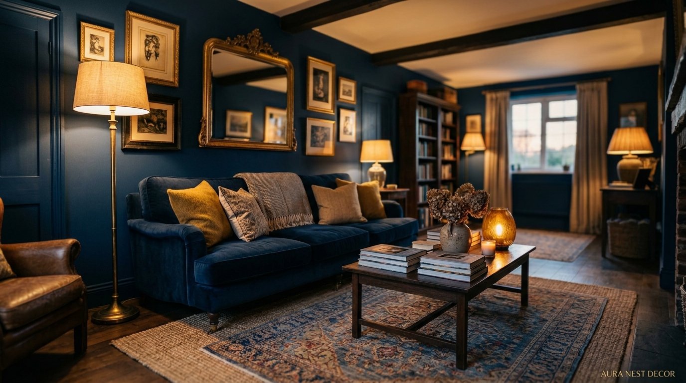
There’s a moment — maybe you’ve had it — where you’re scrolling through Pinterest at 11pm and you see a room that makes you physically stop. Navy walls, gold accents, a lamp throwing warm light across a velvet sofa. And something in your brain just goes yes. That’s the navy and gold living room. And honestly? It’s been having a moment for about three years now and it shows absolutely no signs of stopping.

—
1. Why Navy Blue Hits Different Than Every Other “Bold” Wall Color
Here’s the thing about navy that people don’t talk about enough. It’s not trying to be edgy. It’s not trying to be trendy. It just sits there looking incredibly assured, like someone who arrived to the party early and already owns the room.
Dark greens have had their time. Terracotta too. But navy has this quality that I can’t fully explain — it makes a room feel both bigger AND more intimate at the same time. Which should be a contradiction. But somehow it isn’t.
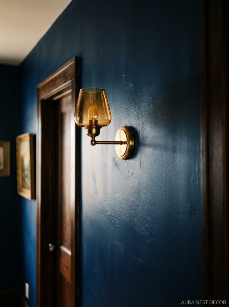
The key is what navy does to light. In the morning it reads almost purple. Around midday it’s a clean, deep blue. But at 6pm, when the sun is low and you’ve got warm bulbs on? It goes almost black in the corners and glows like the inside of a jewel box where the light catches it. That shift over the course of a day is something beige will never give you.
A lot of people are scared of navy walls because they think it’ll shrink the room. And look, if your living room is genuinely tiny and dark, that’s worth thinking about. But in most spaces — even medium-sized ones — navy on the walls just makes everything you put in front of it look MORE intentional. Your cream sofa stops looking like a cream sofa and starts looking like a statement. Your wooden coffee table stops looking like furniture and starts looking like decor. Navy is basically a really great backdrop for literally everything else in the room.
Don’t overthink the finish, either. Matte for a cozy, velvety effect. Eggshell if you’ve got kids or pets and need something wipe-able. Satin if you want the room to feel a little more dramatic and high-end. But honestly? Start with matte. It’s so good.
“Navy doesn’t just color a room — it completely changes what everything else in that room is allowed to be.”
—
2. The Specific Shade of Gold That Doesn’t Look Cheap
This is where people go wrong. Not gonna lie, I’ve seen some truly bad gold in living rooms, and the culprit is almost always the wrong SHADE.
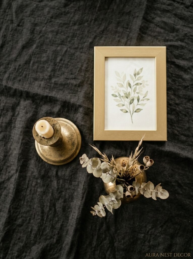
There’s gold, and then there’s gold. The stuff that looks cheap is yellow-gold — bright, almost neon, the color of a birthday balloon. That’s not what we want. What we want is antique gold. Aged gold. The kind of gold that looks like it was pulled out of a Victorian jewelry box and never quite polished back to full shine.
Think tarnished. Think warm amber undertones. Think the color of old book spines or a really good cognac in a crystal glass. THAT gold, next to navy blue, is a completely different proposition from shiny yellow-gold. One looks like a Halloween costume. The other looks like a Pinterest board you’ve been curating for two years finally came to life.
Where does this matter most in practice? Lighting, mostly. Your ceiling fixture, your floor lamp, your table lamp bases — those are the biggest “gold zones” in a living room and they set the whole tone. If you can find aged-brass or antique-gold finishes rather than polished gold, you’re already 80% of the way there. Wayfair, West Elm, and in the UK, places like Rockett St George or even John Lewis have brilliant options that won’t cost a fortune.
Soft furnishings matter too — cushion trims, throw blanket edges, picture frames. Gold picture frames especially. Go for the chunky, slightly matte ones over the thin, shiny ones. Always.
—
3. The One Piece of Furniture That Ties the Whole Room Together (It’s Not What You Think)
I’m going to say something and I want you to hear me out.
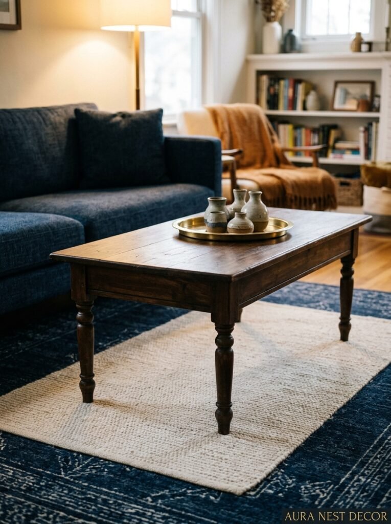
It’s not the sofa. Everyone obsesses over the sofa in a navy and gold room, but the piece that actually holds everything together is the COFFEE TABLE.
Specifically, a coffee table with some kind of warm wood or dark stone top, and — this is the bit — a gold or brass frame or legs. Something like a dark walnut top with slim antique-brass hairpin legs, or a black marble surface with a chunky gold base. That piece, sitting in the center of the room surrounded by navy and gold accents, becomes the anchor. Everything orbits around it.
The reason the sofa isn’t the star (even though it FEELS like it should be) is that the sofa is the thing you look at FROM, not at. You’re sitting on it. It’s your vantage point. So while a velvet navy sofa is beautiful — and I do love a velvet navy sofa — the thing your eye keeps returning to when you’re sitting and actually living in the room is whatever’s in the center. Make that the coffee table. Put some intention into it.
Cream or ivory sofas work brilliantly in this scheme, by the way. So do sofas in deep forest green or even a warm caramel leather. Navy on navy can work but you have to get the textures very right or it goes flat fast.
—
4. Rugs: The Part of This Color Scheme That Gives People the Most Anxiety
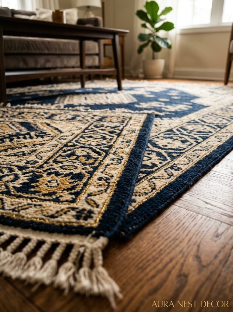
And honestly, the anxiety is justified because a bad rug in a navy and gold room is immediately, obviously a bad rug. There’s nowhere to hide.
Here’s the rule: the rug needs to BRIDGE the navy and the gold without competing with either. So what does that look like? Cream or ivory with navy and gold pattern elements — a traditional Persian-style rug is perfect for this. Or a deep charcoal with gold geometric details. Or, my personal favorite right now, a warm oatmeal or sand-colored rug with absolutely no pattern at all. Let the walls and accessories do the talking.
What to avoid: anything cool-toned. Grey rugs, silver rugs, anything that pulls blue or purple. They kill the warmth that makes navy-and-gold actually cozy rather than just dramatic. The whole point of this color scheme is that it’s BOTH luxurious AND warm at the same time — the gold is doing all the warmth-work and you can’t undermine it with a cold-toned floor situation.
Size matters enormously. Too small and the rug looks like it wandered into the wrong room. Ideally your front sofa legs should sit on it. If you can get all four legs of every piece of furniture on the rug, even better — but that’s often expensive. Front legs on is the minimum.
“The rug is doing more work than any other item in the room — it’s the thing that makes ‘dramatic’ feel like ‘home.'”
—
5. Lighting That Makes This Color Scheme Look Absolutely Alive
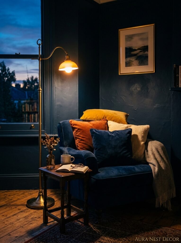
This is my favorite section to talk about because lighting is where navy-and-gold goes from “nice” to “genuinely special.”
Navy blue walls absorb light. That’s not a flaw — it’s actually the whole point. They absorb ambient overhead light and then bounce back WARM light in the most incredible way. But you have to give them warm light to work with. This means: no cool white bulbs. Not a single one. Every bulb in a navy and gold living room should be warm white — 2700K is the sweet spot, or 2200K if you want full evening-at-the-manor vibes.
The amber glow of an Edison-style bulb at 7pm, hitting a navy wall with a gold mirror above a sideboard — that’s the scene. That’s the image. If you’re not there yet, changing your bulbs is the cheapest and fastest upgrade you can make before buying a single new thing.
Layered lighting is the goal. A statement ceiling fixture (gold pendant or chandelier), a floor lamp in a corner with a fabric shade that glows warm, and at least one table lamp at a lower height for evening ambiance. Three sources minimum. The ceiling light honestly shouldn’t be your main evening light — it’s too high and too harsh for a cozy navy room. Turn it off at 6pm and live by the lamps. It’s a completely different experience.
Candles, too. I know that sounds obvious but the way candlelight moves on navy walls is genuinely magical. Put them on the coffee table. On the mantel if you’ve got one. Light them on a Tuesday for no reason.
—
6. The Textiles Situation — And Why Velvet Is Non-Negotiable

Velvet in a navy and gold room isn’t a trend. It’s practically a requirement.
The reason is texture. Navy is a deep, rich color that needs tactile depth to match its visual depth, if that makes sense. Flat, matte fabrics next to navy walls can look a little sad. Velvet — with its nap, its sheen, its slightly different color depending on which way you’re looking at it — brings the navy to LIFE.
Navy velvet cushions on an ivory sofa. A navy velvet ottoman as a coffee table alternative. A velvet armchair in a deep teal or forest green (both brilliant companions to navy, underrated alternatives to all-navy). These pieces catch the light and create that layered, expensive feel that makes a navy room look like it was professionally styled.
But don’t stop at velvet. Bring in other textures too. A chunky boucle throw over the back of the sofa. A linen cushion or two in cream or warm white. A woven basket next to the fireplace if you’ve got one. Brass candlestick holders. The combination of hard gold metal and soft textiles against the dark backdrop of navy walls — that contrast is genuinely the whole trick.
—
7. Gallery Walls: This Is Where Your Navy Room Gets a Personality
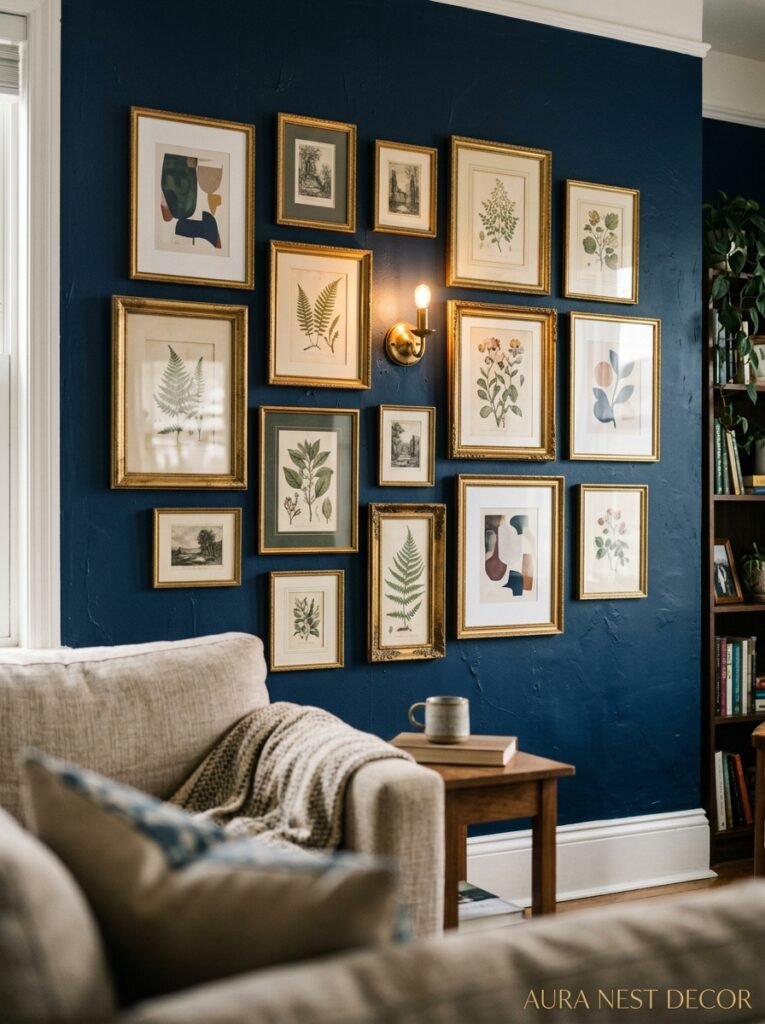
A blank navy wall is beautiful. A navy wall with a gallery arrangement done RIGHT is extraordinary.
The secret to gallery walls in this specific color scheme is gold frames. Obviously. But it’s also about what’s INSIDE the frames. Botanical prints are endlessly good — there’s something about dark-background botanical illustrations inside gold frames on navy walls that feels very collected and very real, not at all like you just bought a set of six on Etsy. Which, fine, maybe you did. Doesn’t matter. They look brilliant.
Art prints with navy or warm tonal colors work. Abstract pieces with gold and cream work. Black and white photography in gold frames works beautifully. What doesn’t work? Cool-toned modern prints that clash with the warmth you’ve built everywhere else. Or frames that are too small and too many — it starts looking fussy. Fewer, bigger frames beat many small ones almost every time.
Side note — mirrors are part of this conversation. A large, gold-framed mirror above a fireplace or on a key wall does two things at once: it adds the gold accent you need AND it bounces light around the room in a way that stops navy from ever feeling oppressive or heavy. If you’re only going to add one gold item to your living room, honestly, make it a large antique-gold mirror.
“One big gold mirror on a navy wall does more work than six smaller decorating decisions combined.”
—
8. Plants: The Thing That Stops This Room Looking Like a Hotel Lobby
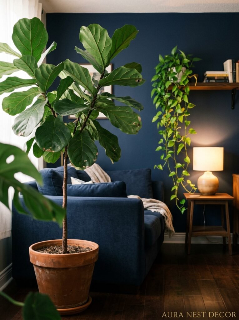
Here’s something I feel strongly about. Navy and gold without any greenery can tip over into looking stage-managed. Like a showroom. Lovely, but not LIVED in.
Plants fix this immediately. And the plants that look best in this color scheme specifically are the dramatic ones — large leaf, architectural shapes. A fiddle leaf fig in a terracotta or woven basket pot. A monstera with its big glossy leaves doing their thing in a corner. A snake plant standing tall next to a gold floor lamp. Even trailing pothos from a high shelf looks brilliant against navy walls because the green-against-navy contrast is so sharp and so alive.
Small plants in gold pots are lovely too. A little cluster on a windowsill. A single stem in a gold bud vase on the coffee table. These smaller moments of green break up the gold without competing with it.
The other thing plants do is add that certain something that signals a room is tended to and loved. Which, in a navy and gold room especially, matters. This scheme has the potential to look a little stiff and formal, and plants are one of the easiest ways to completely counter that.
—
9. Bookshelves and Alcoves Done in This Scheme Are Genuinely Special
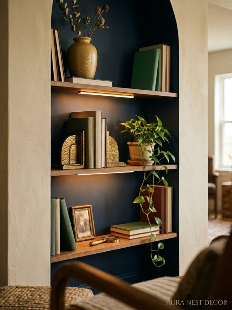
If you’ve got built-in bookshelves or alcoves, please consider this: paint the inside of the alcoves navy, even if the rest of your walls stay neutral.
This is one of the biggest underused tricks in this whole color scheme. Painted alcove interiors create these gorgeous deep pockets of color behind your books and decorative objects, and when those objects are gold-framed, brass-accessorized, and warm-lit from a little shelf light, the effect is incredible. It looks incredibly considered without being incredibly expensive.
Books arranged by color in those alcoves. Some with spines facing in (chaotic good energy, I love it). Brass bookends. A small framed print propped at the back. A trailing plant coming over the edge of a shelf. A little bud vase. This is the living room that makes guests stop in the doorway.
—
10. The Fireplace Is the Most Important Wall in a Navy Room
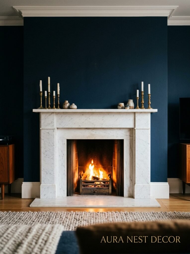
If you have a fireplace — and in the UK especially this is extremely common — it deserves serious attention in a navy and gold scheme.
The mantelpiece is a natural gallery shelf and it wants to be styled. Gold candlesticks of varying heights. A large gold or dark wooden mirror above. A few objects with real weight — a stone bookend, a small vase with a single stem, a framed print propped casually. Less is more here, but not minimalist. Curated-looking-but-not-stressful is the energy.
Navy above the fireplace in particular is very dramatic and very beautiful. If you’re doing a feature wall and have a choice, that’s the wall. The fire, when lit, against a navy backdrop with gold accessories on the mantel is peak cozy-luxury. It’s the room version of a hug.
—
11. What Navy and Gold Does to a Rented Home (Working With What You’ve Got)
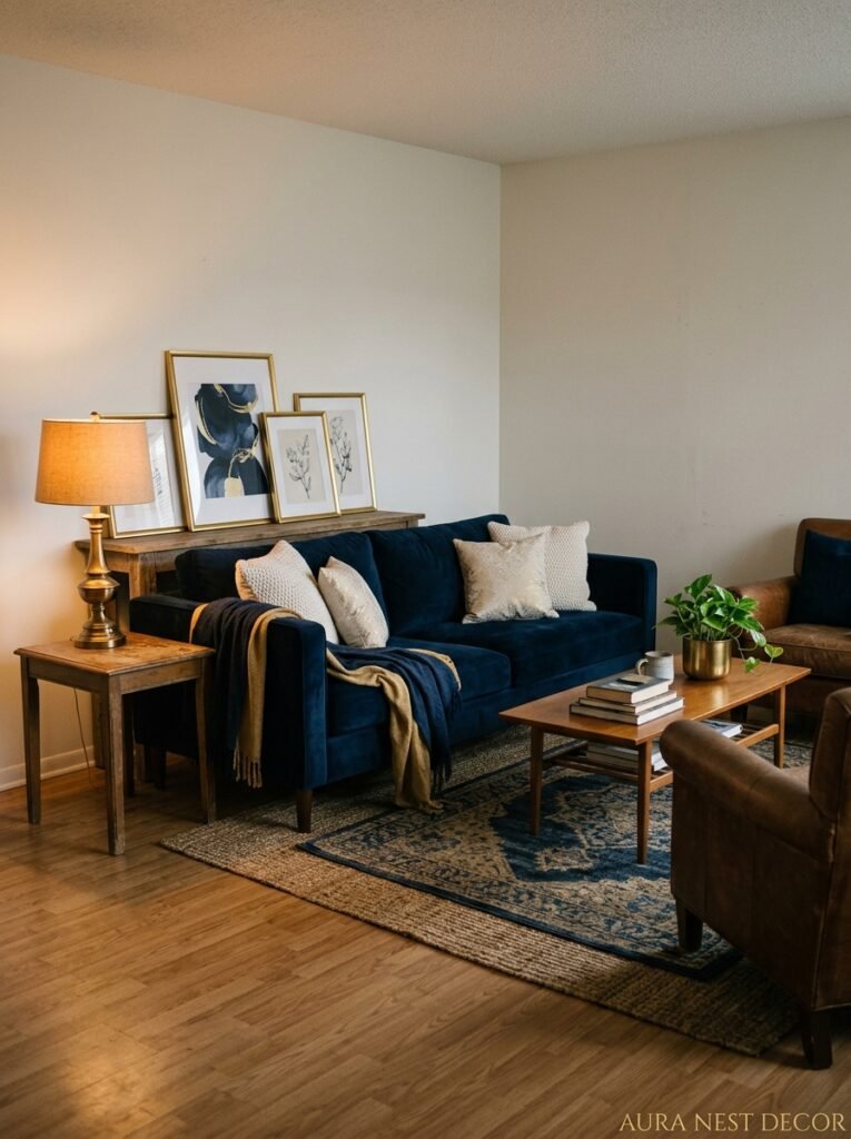
Not everyone can paint their walls. That’s a real constraint and it doesn’t mean this color scheme is off-limits.
A navy sofa against white or off-white walls with gold accents is actually a brilliant starting point. You’re leading with the navy in a different way. The walls stay light, which keeps smaller spaces feeling open, and the color drama comes from the large upholstered piece instead. A large navy velvet sofa with ivory cushions, a gold mirror, a warm rug, a brass floor lamp — that’s already a very specific and very beautiful look.
Temporary wallpaper with navy patterns is another option, particularly for renters in the US where damage-free removable wallpaper is widely available. A navy grasscloth removable wallpaper on a feature wall changes a room completely. Do it.
And curtains. Floor-length velvet curtains in navy, in a room with white walls and gold accents — they bring the whole color scheme without touching a single painted surface. Hang them high and wide, past the window frame, and they’ll make the room feel taller and the color feel intentional.
—
12. The Small Details That Separate “Nice” From “Obsessed Over”
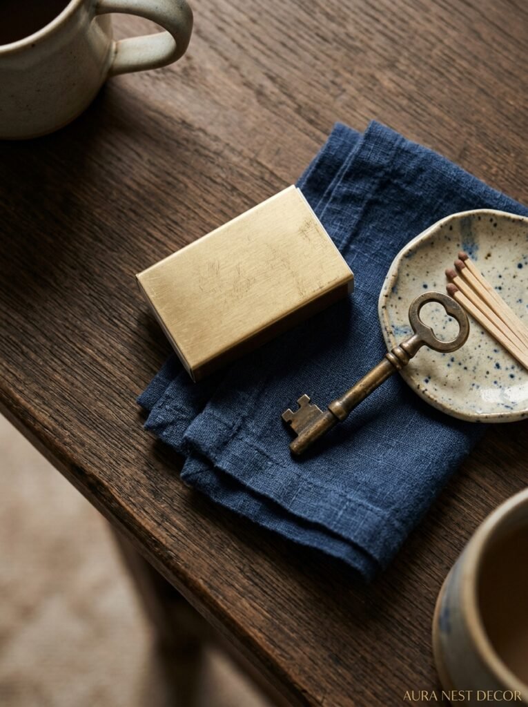
I want to talk about the finishing details because this is where most people stop too soon.
Books. Specifically, styling a few rich-spined vintage books — deep burgundy, dark green, navy and gold — on your coffee table or sideboard. They look incredible in this color scheme in a way that brand new books don’t quite manage.
Scent. I know this sounds like it doesn’t count as decor, but a room that smells like sandalwood or amber or cedar-and-vanilla feels like it looks navy and gold. There’s something deeply congruent about warm, dark scents and this color scheme and I can’t fully explain why but it’s absolutely true.
A drinks tray. This is a thing the British do brilliantly and Americans are catching on — a gold or brass tray on a sideboard or console table with a couple of glass decanters and matching tumblers. Even if you don’t use it daily, it’s a styling moment that immediately says “this room is LIVED in, luxuriously.” The combination of glass, gold tray, and dark navy backdrop is stunning.
And finally — throw pillows with personality. Don’t match them. A navy velvet one. A cream linen one. Maybe one with a pattern that brings in a little rust or deep green. Mix the sizes. Stack them slightly messily. The room will feel completely different, completely warmer, and completely you.
—
❓ FAQ
Q: Is navy blue too dark for a small living room? A: Not necessarily! Navy can actually make a small room feel more intentional rather than bigger — the key is keeping the floor light (a cream or sand rug helps enormously) and ensuring you have warm, layered lighting rather than relying on overhead light. Mirrors also do a lot of work in smaller spaces.
Q: What accent colors work with navy and gold besides cream? A: Deep forest green is an incredible third color in this scheme — particularly for velvet cushions or an accent chair. Warm terracotta or rust in small doses (a throw, a plant pot) also works beautifully. What to avoid: anything cool-toned — silver, grey, or icy white will kill the warmth you’ve built.
Q: Can I mix metals in a navy and gold living room? A: Yes, but keep gold or brass as the dominant metal and use others sparingly. A single brushed silver lamp among mostly gold fixtures is fine. What you don’t want is an even split between metals — it looks unresolved rather than eclectic.
—
💭 Final Thoughts

Navy and gold isn’t a color scheme you fall into by accident. It’s a choice — a confident, considered one — and every room done well in this combination feels like it. There’s a reason it keeps showing up on Pinterest boards for people who want their home to feel both cozy AND beautiful, both dramatic AND like somewhere you’d actually curl up on a Sunday with a book and not move for three hours.
If you’re standing at the edge of committing to it, my honest advice is: start with the gold accents. One mirror, one lamp, a few cushions. See how your room responds. You might find that the walls come next almost naturally.
Is there a room in your home that already has some of these elements without you even realizing it?




