Grey Living Rooms That Actually Feel Warm (Not Like a Car Park)
You’ve scrolled past a hundred grey living rooms and felt absolutely nothing. Then you land on one — and you stop. Something about it makes you want to live there immediately. The difference isn’t luck, and it’s not just the furniture. It’s a handful of very specific choices that most people don’t know to make.

—
1. The Grey That Keeps Showing Up in Every Stunning Living Room Right Now
Not all greys are created equal, and honestly? This is where most people go wrong.
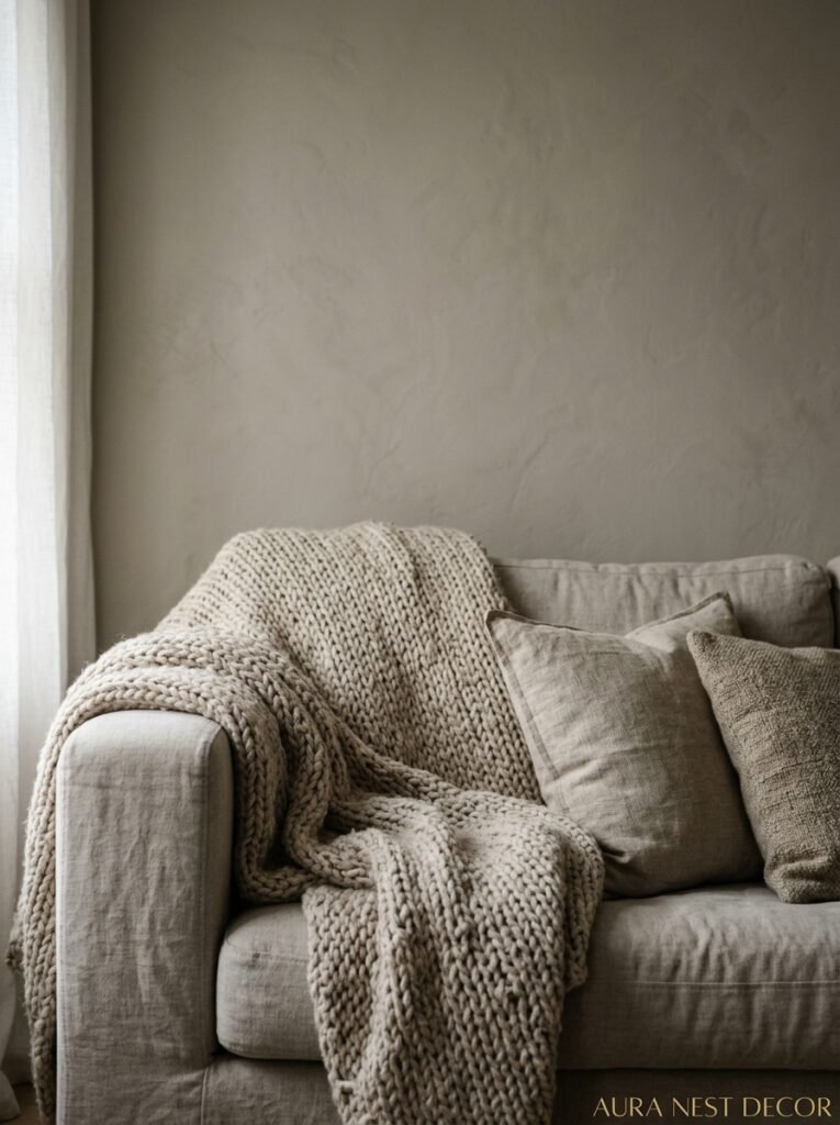
There’s a grey that feels like a rainy Monday in a basement office. And then there’s the grey that feels like cashmere. Like morning fog over the sea. Like a really good linen shirt. The difference comes down to undertones, and it’s the thing nobody talks about enough.
Warm greys — the ones with a nudge of beige, taupe, or even blush in them — are doing something completely different from cool greys right now. They’re showing up in the most pinned living rooms across both sides of the Atlantic. Think Farrow & Ball’s Elephant’s Breath, or Benjamin Moore’s Revere Pewter. These shades don’t just sit on your walls, they respond to your lighting. At midday they look almost neutral. By evening, under lamplight, they glow.
Cool greys are having a moment too, but they demand more from you. They need warmth coming from somewhere else — wood tones, candlelight, textiles — or they’ll make your room feel cold in a way that’s HARD to fix with throw pillows alone.
Pick your grey like you’re picking a mood for the room at 6pm on a Friday. That’s the version that matters most.
“Your grey doesn’t just live on the walls — it changes completely depending on the hour.”
—
2. Why Your Grey Looks Different at 9am, 2pm, and 8pm (And What To Do About It)
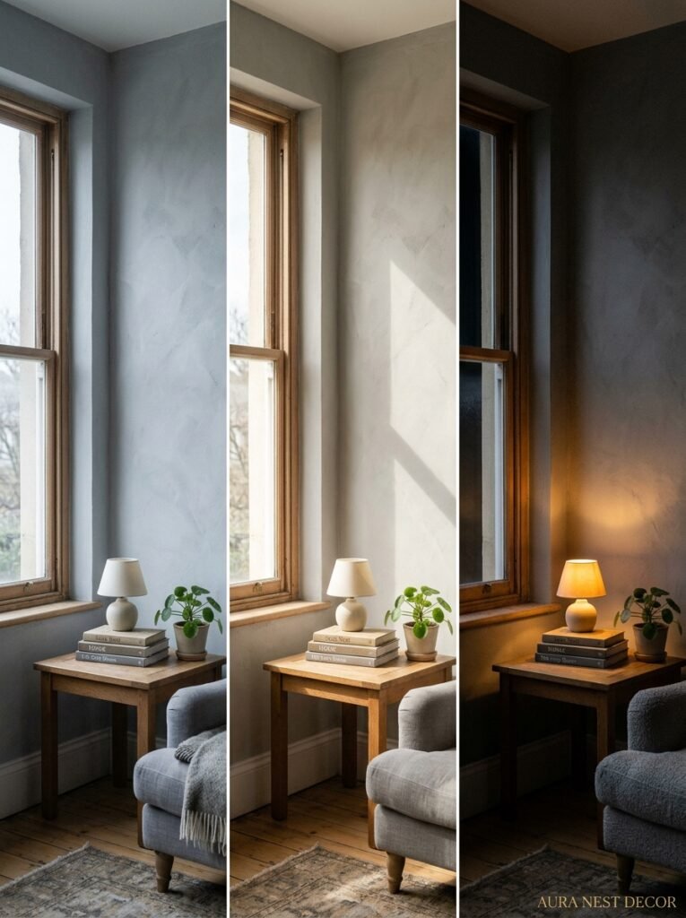
Light is doing things to grey that it doesn’t do to most other colors. This isn’t a flaw in the paint — it’s actually grey’s superpower if you know how to work with it.
South-facing rooms in the US and UK are basically blessed. They get warm light across most of the day, and grey walls in those spaces tend to look their softest and most inviting by afternoon. If that’s your room, you can lean cooler with your grey shade because the light will warm it up for you.
North-facing rooms? Whole different beast. The light in there can be flat, a bit blue, especially in winter. A cool grey on a north-facing wall can tip into grim really fast. Go warmer than you think you need to. Much warmer. Seriously.
East-facing rooms catch that beautiful morning light and then go dim by afternoon, which actually suits grey brilliantly — you get that glowy, atmospheric quality in the evening that makes a living room feel genuinely cozy. West-facing rooms are the opposite, which works really nicely if you’re someone who uses your living room most in the evenings.
The actual trick? Get a paint sample, stick it on a large piece of cardboard, and look at it at three different points in the day. Morning. Noon. Dusk. A grey that looks wrong at 10am might be PERFECT at 7pm. Don’t judge it until you’ve seen all its versions.
—
3. The Sofa Color That Either Makes or Breaks a Grey Living Room

This is where most people land in one of two camps: they play it so safe the room feels like a showroom, or they go bold and then regret the commitment.
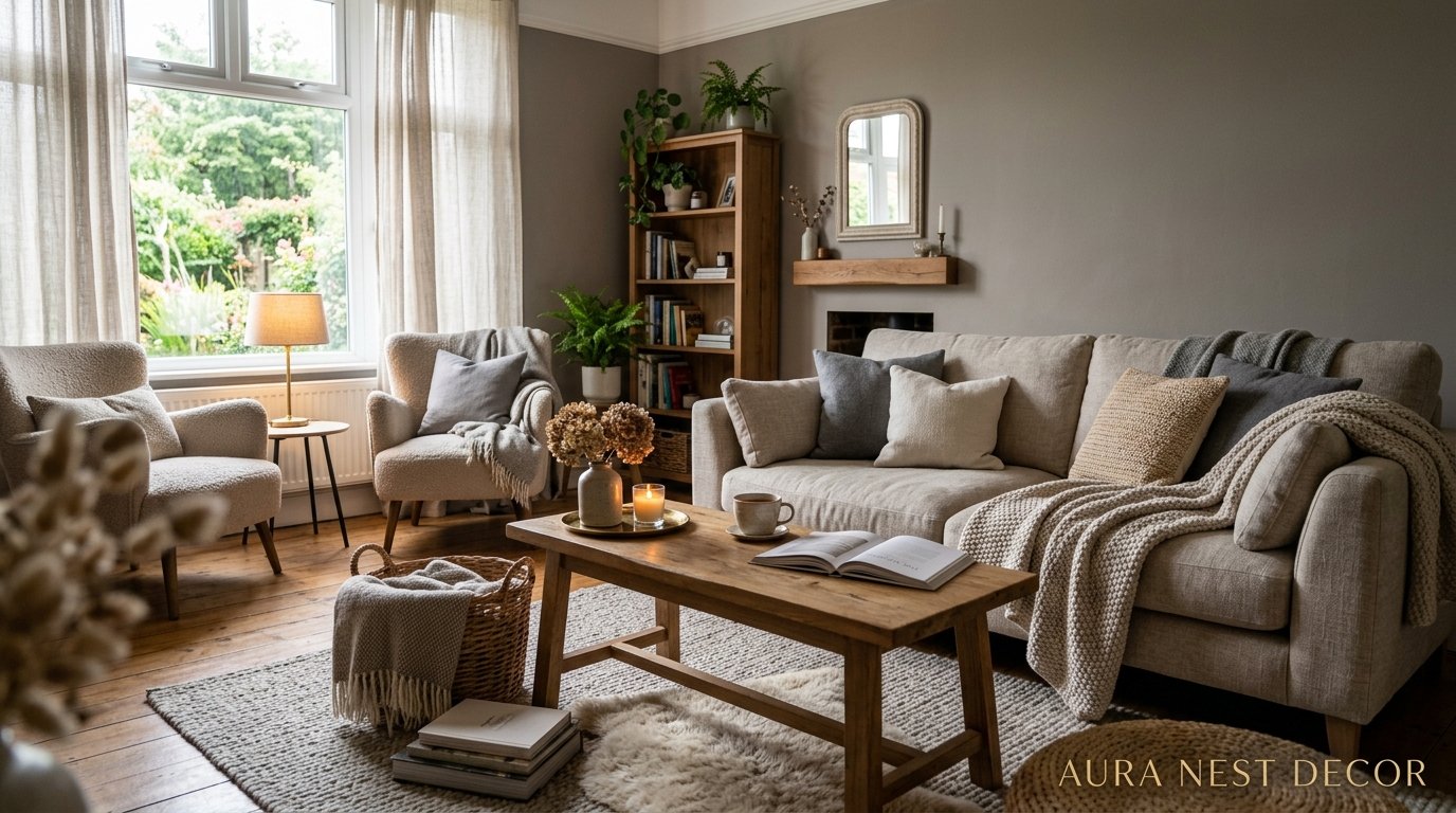
Here’s what I’ve seen work consistently. A grey room with a natural linen sofa is always going to be beautiful. That warm, undyed linen against a cool-to-mid grey is one of those combinations that just works, almost regardless of anything else you do. It’s soft. It breathes. It doesn’t compete.
But it can also feel a bit safe, so let me give you the other options.
A deep forest green velvet sofa in a grey room is something else entirely. It’s rich and moody and it references the outdoors in a way that makes the grey feel organic rather than cold. A lot of UK designers are doing this right now and it looks unbelievably good.
Terracotta or dusty rust? Yes. Absolutely yes. Against a warm grey it feels earthy and collected — like the room has been put together slowly over time rather than ordered from one website on a Sunday afternoon. Which is the dream, honestly.
The colour I’d be careful with? Bright white sofas. Against grey walls they can look startlingly clinical, almost surgical, unless you’re very intentional about the rest of the room. A slightly warm, off-white or cream works better. Much better.
—
4. What Happens When You Put Wood Into a Grey Room
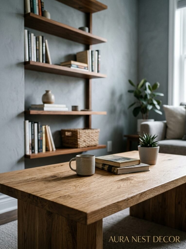
Wood saves grey rooms. I will die on this hill.
Cold, flat, going-nowhere grey rooms have one thing in common: there’s no wood in them. Add a solid oak coffee table, a walnut sideboard, some wooden picture frames — and suddenly the whole room breathes. The natural grain and warmth of wood does something to grey that no other material quite replicates. It grounds it.
And it doesn’t have to be new, expensive wood either. Actually? Old wood is BETTER. A salvaged farmhouse coffee table with patina, a pair of mismatched wooden stools, a vintage dresser that’s been in the family too long — all of this reads as warmth in a grey room. It reads as life having been lived there.
The wood tones matter too. Light, blonde woods like ash or light oak feel Scandinavian-clean against grey, which is lovely if that’s the vibe you’re after. Darker woods — walnut, mahogany, aged oak — feel more traditional and weighty, which suits a grey room that’s leaning more formal or moody.
Mid-tones just feel balanced. That’s the honest answer.
“A salvaged wooden coffee table does more for a grey room than any new piece of furniture ever could.”
—
5. The Textile Rule That Makes Grey Rooms Feel Like A Hug
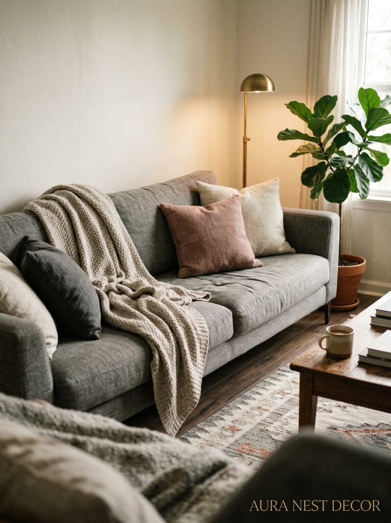
Here’s the thing about grey: it’s neutral. Which means it NEEDS texture to communicate warmth. A smooth grey wall and a smooth grey sofa and smooth grey cushions? That’s a waiting room, not a home.
Texture is what separates a grey room that feels cozy from one that feels sterile. Chunky knit throws. Velvet cushions. A jute or wool rug with visible pile. Linen curtains that puddle slightly at the floor. Boucle. Oh, boucle — that curly, loopy fabric that looks like a slightly messy cloud — it’s everywhere right now and it’s everywhere for a reason. Against grey it’s magnificent.
The key is layering different textures rather than matching them. A velvet cushion next to a linen one next to a wool one is always more interesting than three identical cushion covers. Variety of material, even in a single tonal palette, creates depth that the eye reads as warmth.
Side note — don’t sleep on the rug as a texture moment. In a grey room, the rug is doing a LOT of heavy lifting for the warmth of the space. A flatweave rug is fine, but a high-pile wool rug or a faded vintage Persian is going to do something far more interesting to the overall feel of the room.
—
6. Plants That Actually Work in Grey Living Rooms (Not Just Any Houseplant)
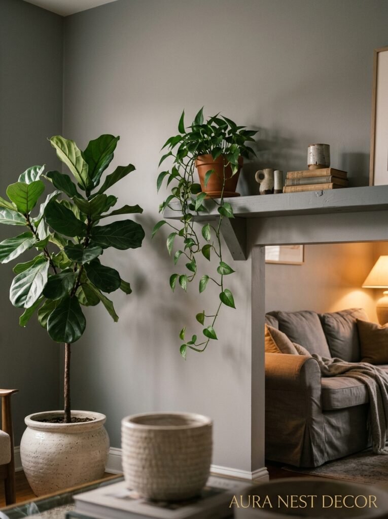
Any plant will add life to a grey room — but certain plants do something SPECIFIC.
Large-leafed plants like monsteras, fiddle leaf figs, and rubber plants create a strong visual contrast against grey walls. The dark, glossy green reads as bold and intentional, like you meant it. They also have a sculptural quality — they’re not just filling corners, they’re adding shape to the room.
Trailing plants like pothos or heartleaf philodendron bring softness and movement, which grey rooms can sometimes lack. A long trailing plant on a high shelf, leaves draping down the wall — it feels very much like a room that’s been lived in and loved.
But here’s the one most people overlook: olive trees. An indoor olive tree in a terracotta pot, sitting in the corner of a grey room, is deeply, PROFOUNDLY beautiful. The silvery-green of the leaves is almost tailor-made for grey. It’s almost annoyingly perfect, honestly.
The pots matter more than people think too. Terracotta always warms a grey room. Concrete or black pots are cool and architectural. Wicker and rattan baskets used as pot covers add texture. Just avoid the standard white plastic pot unless you’ve got a cover for it, because in a grey room it’ll just disappear and look a bit sad.
—
7. The Lighting Mistake That Makes Grey Rooms Feel Cold and Empty
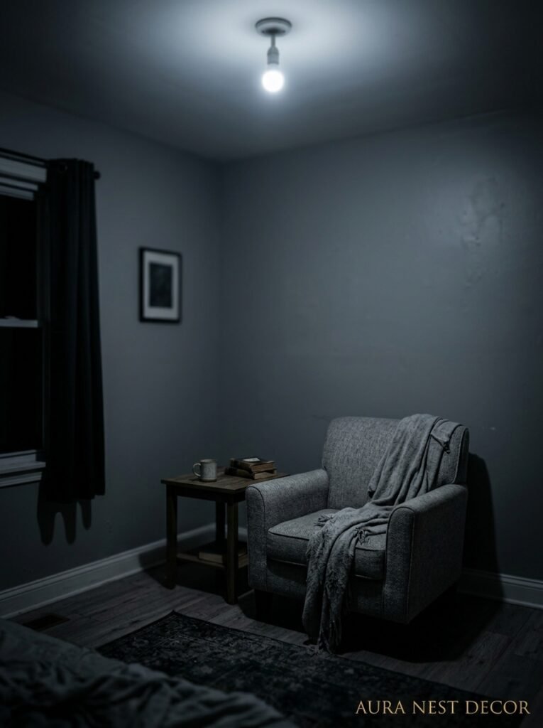
Cool white bulbs. That’s it. That’s the whole mistake.
Cool white light — anything over about 4000 Kelvin — turns a grey room into a hospital corridor so fast it’s almost impressive. Yet so many people use it without thinking because it’s what comes in the standard pack from the hardware store.
The amber glow of a warm bulb, something around 2700K, is what changes EVERYTHING in a grey room. It pulls out the warm undertones in the grey, it makes the space feel smaller in a good way, more contained and intimate. Lamp light rather than overhead light. Always. If you can avoid the overhead light after 6pm, do it. Use floor lamps and table lamps instead and just see what happens to the room.
Candles too, obviously. Not gonna lie, a grey room with a few good candles burning is genuinely hard to beat. The flicker picks up off the walls in a way it doesn’t in lighter rooms.
“Switch to warm bulbs, turn off the ceiling light, and your grey room becomes an entirely different place.”
—
8. How British and American Designers Are Styling Grey Completely Differently
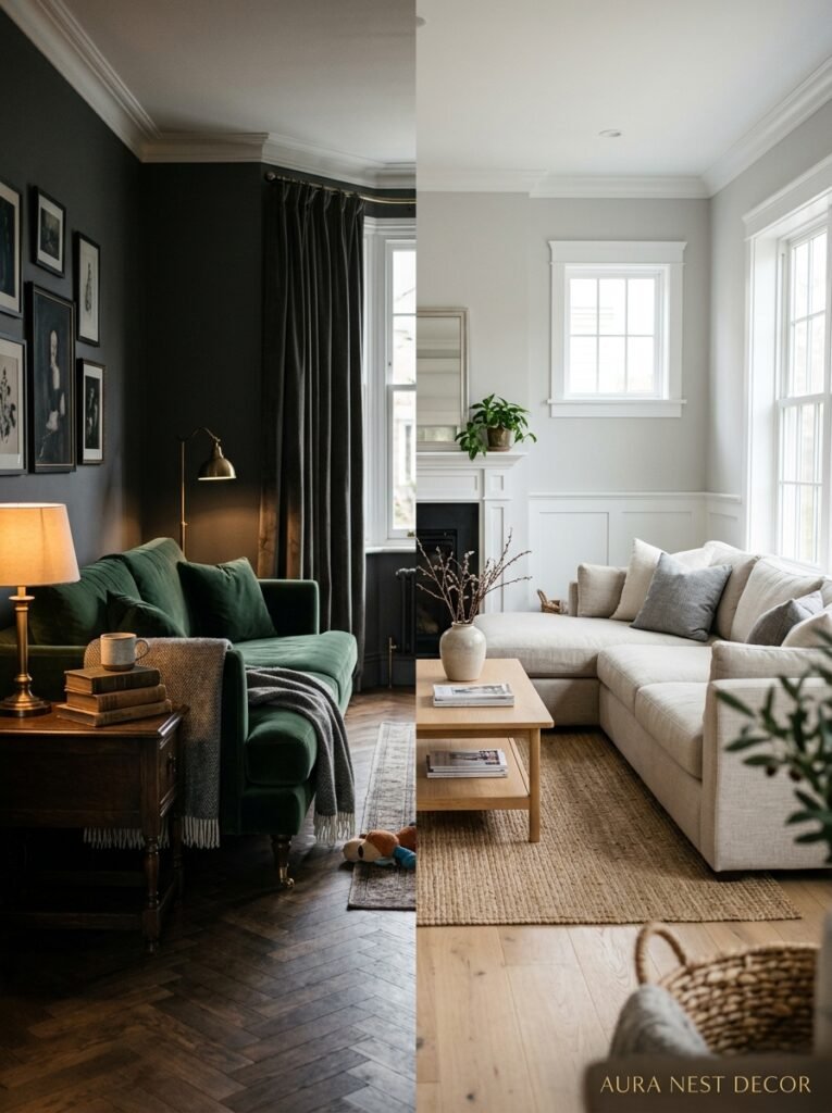
There’s a noticeable split happening and it’s fascinating to watch.
British designers — and British homes on Pinterest — are leaning into grey’s moody, atmospheric potential. Darker shades. More pattern. Plaster-effect paint over colour-blocked grey. Layered rugs, oil paintings, lots of books, aged brass hardware. The grey is almost theatrical. It’s not trying to disappear — it wants you to notice it.
American interiors are doing something different. Grey as a clean, calm backdrop for everything else. Lighter shades, more white, less pattern, cleaner lines. The grey is functional — it’s holding space rather than creating atmosphere. Very West Coast California, that approach.
Neither is wrong. But knowing which direction you’re naturally pulled helps you make decisions faster. If you’re pinning a lot of moody, layered rooms, you probably want to go darker and richer. If you’re pinning clean and minimal, stay light and lean on the materials for interest.
Personally? I find the British approach more interesting to look at. But the American approach is much easier to live with long-term. Go figure.
—
9. The One Grey Mistake You Might Not Realize You’re Making
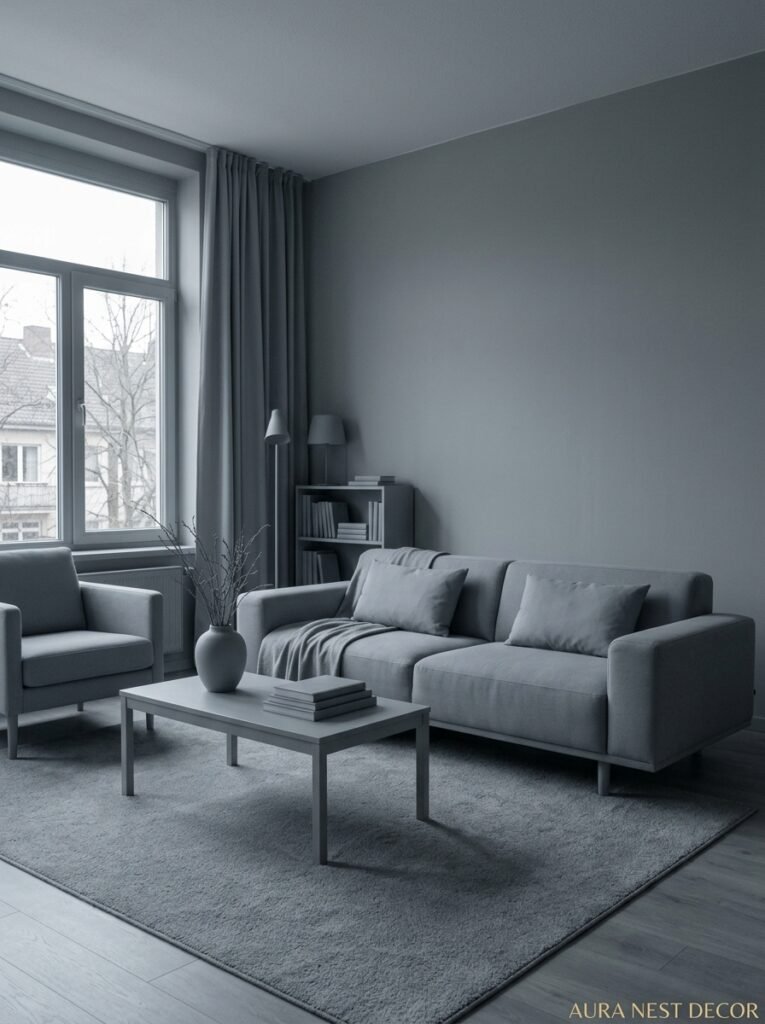
Painting one accent wall grey in an otherwise white room. I know it’s tempting. I understand why. But it almost never works the way people hope.
Grey doesn’t do what other colours do on an accent wall. A deep green accent wall can anchor a room. A warm terracotta accent wall can create a focal point. Grey? It just sort of… sits there. Looking a bit like you ran out of paint. Or changed your mind halfway through. It doesn’t pop, and it doesn’t recede nicely either — it just makes the white walls look stark by comparison.
If you want grey in your living room, commit to it. All four walls. Or two walls and a ceiling. Or just the chimney breast — but done properly, not as an afterthought. Half-measures with grey rarely look intentional.
The exception is a very dark, dramatic grey — almost charcoal — used on the chimney breast or fireplace wall in an otherwise lighter room. That can work really well because there’s enough contrast and presence that it reads as a deliberate design choice rather than a dithering one.
—
10. Grey and Colour: The Combinations People Are Actually Pinning This Year
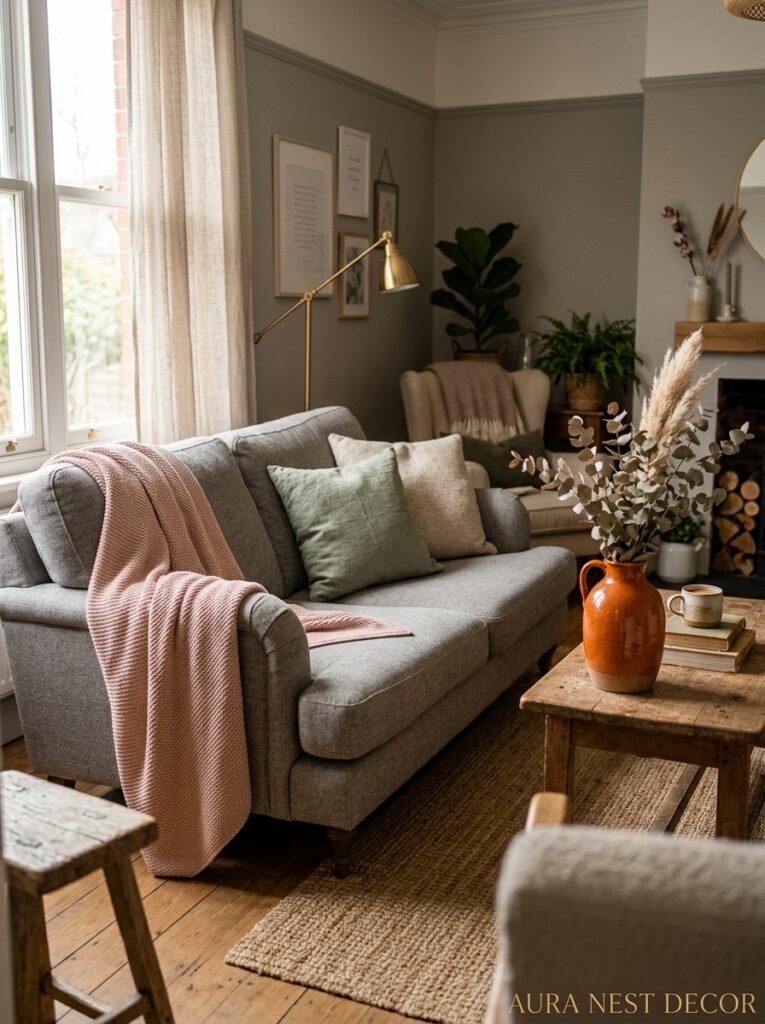
The grey-and-blush era has calmed down. We’re into something new.
Grey and earthy terracotta is everywhere right now, and it’s got staying power because it works in both modern and traditional rooms without feeling trend-specific. The warmth of terracotta pulls grey away from cold and into something much more human.
Grey with sage green is having a massive moment, especially in the UK. It’s very gentle and very considered — these two colours share enough of the same calm, muted quality that they don’t fight each other, they just layer nicely.
Grey with mustard yellow is bolder. More retro. It’s not for everyone but when it works, it REALLY works — there’s something almost 70s about it that’s suddenly feeling very relevant again.
Grey with navy? Classic. Reliable. Never not beautiful. If you’re nervous about colour combinations, this is your safe option that doesn’t look safe at all when it’s done well.
And honestly, grey with burgundy or wine is deeply underrated. It’s very European. Very cozy. A grey room with burgundy cushions and a burgundy rug is one of those combinations that just feels expensive.
—
11. Small Grey Living Rooms: The One Rule That Makes Them Feel Intentional
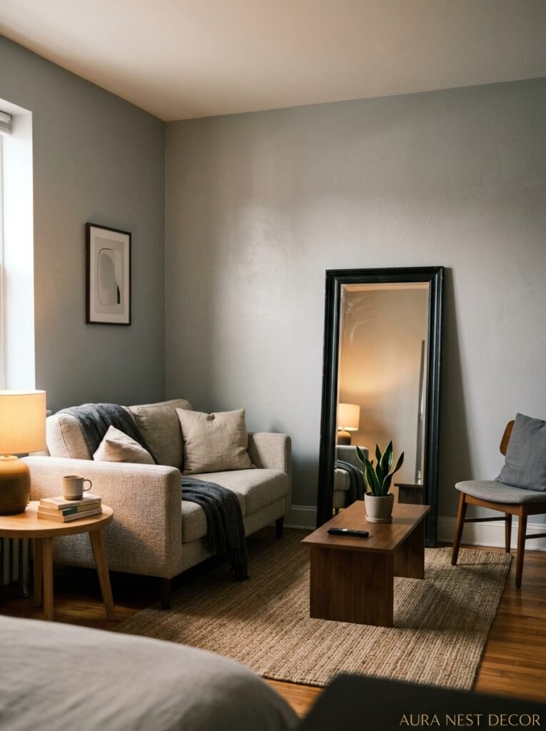
Here’s the thing about a small grey living room: you’re already halfway there.
Grey — especially mid-tone grey — does something interesting in a small space. It doesn’t try to open the room up the way white does, but it also doesn’t close it in the way a dark colour might. It creates a sense of atmosphere that makes the smallness feel DELIBERATE. Like the room is cozy on purpose.
The one rule that changes everything in a small grey room? Keep the trim white. Or very close to white. The contrast between grey walls and white trim creates clean definition and stops the room from feeling like you’re inside a grey box. It gives the eye a place to rest and makes the architectural features of the room — doors, windows, skirting boards — feel intentional and sharp.
The second thing? Don’t go too dark in a small room unless you’re really committed to the cozy-cave aesthetic, because dark grey in a small room with poor natural light is a hard thing to come back from. Go mid-tone. Be patient.
—
12. The Finishing Touches That Make a Grey Room Feel Like a Pinterest Photo Without the Filter
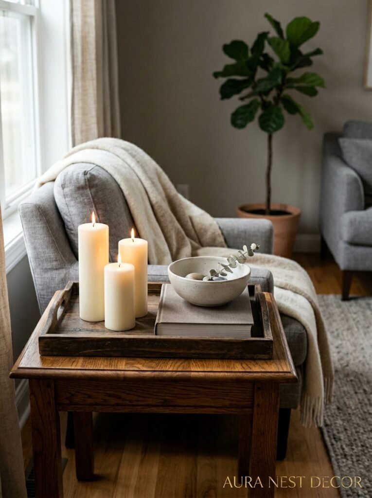
Art. This is it. This is the thing that completes a grey room.
Not just any art — art with warmth in it. Landscapes with golden light. Abstract prints with earthy tones. Oil paintings, real ones or good quality prints, with visible texture and imperfect edges. Something that looks like it was chosen because it meant something, not because it matched the cushions.
A gallery wall in a grey room is particularly good because the grey gives it a sophisticated backdrop that white walls don’t quite manage. The art gets to be the colour story, and the grey holds everything together without competing.
Mirrors too. In a grey room, a good mirror with an interesting frame — antique gold, carved wood, tarnished brass — doesn’t just add light, it adds personality. It reflects the room back at you in the most flattering way.
And then the small things: a stack of hardcover books with spines you actually like looking at, a single piece of vintage pottery on the mantlepiece, a candle that’s been burned enough to look lived-in. These are the details that make the difference between a room that looks styled and a room that looks like a home. One of those things is worth pinning. The other is worth living in.
—
❓ FAQ
Q: What’s the best grey paint color for a living room? A: It really depends on your light and your undertone preference, but consistently popular choices include Farrow & Ball’s Elephant’s Breath, Benjamin Moore’s Revere Pewter for a warmer lean, and Sherwin-Williams’ Agreeable Gray. Always sample first — and look at it at multiple times of day before you commit.
Q: Does grey make a living room look smaller? A: Mid-tone greys don’t typically make a room feel smaller, especially when paired with white trim and good lighting. Very dark greys can reduce the sense of space, though some people actually love that cave-like coziness. The key is lighting — warm, layered light makes any grey room feel more open and inviting.
Q: What colours go with grey in a living room? A: So many things work well — warm terracotta, sage green, mustard yellow, navy blue, burgundy, and blush are all popular right now. Natural wood tones are non-negotiable in most grey rooms because they add the warmth that grey alone can’t provide. Start with wood and one accent colour and go from there.
—
💭 Final Thoughts
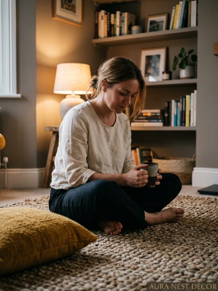
A grey living room done badly is one of the saddest things in interior design — all that potential, sitting there looking cold and lifeless. But a grey living room done well is genuinely one of the most beautiful, versatile spaces you can create, the kind that looks different every hour of the day and always good. Warm bulbs, real wood, honest texture, and a grey that you actually tested in your actual light — that’s the whole formula, more or less. So tell me: are you working with an existing grey room that isn’t quite landing, or are you starting from scratch?