Brown Is Back and It’s Not Playing It Safe This Time
You know that moment when you walk into a room and just exhale? Not because it’s minimalist or decluttered or whatever the current wellness trend is telling you to do — but because it’s warm. Like the room itself is wrapping around you. That’s what brown does. And honestly, we’ve been sleeping on it.
—
1. Why Every “Cool” Designer You Follow Is Quietly Going Brown Right Now
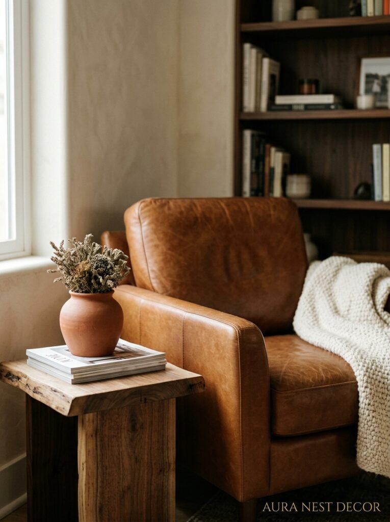
It started showing up in small ways. A terracotta throw here, a walnut coffee table there. And then suddenly — everywhere. Deep chocolate sofas. Raw sienna walls. Cognac leather next to cream plaster. Brown crept back into the conversation the way a great song gets rediscovered: slowly, then all at once.
But here’s what’s different this time. It’s not the brown of your gran’s lounge in 1987. Not the relentlessly beige carpet-and-curtains combination that haunted every rental flat or suburban family room for two decades. This is brown with backbone. Brown that knows what it’s doing.
Designers are reaching for it because it’s one of the few colors that reads as both luxury AND approachable — which is genuinely hard to pull off. A warm chocolate wall doesn’t scream “I’m trying.” It just IS. It anchors a space without dominating it. And right now, after years of everyone chasing that cool, airy, Scandi-white look, people are tired. They want rooms that feel like somewhere. Brown gives them that.
So if you’ve been feeling pulled toward it — trust that instinct. Your gut is onto something the industry is finally catching up to.
“Brown doesn’t ask for attention. It just holds the whole room together.”
—
2. The Shade of Brown That Actually Photographs Well (and Looks Good in Real Light Too)
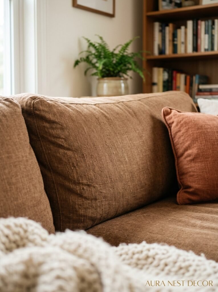
This matters more than people admit. Some shades of brown do something weird in photos — they go flat, almost gray, and you can’t tell if the room is cozy or just dark. Not all browns are created equal.
The sweet spot is what I’d call mid-depth warm browns. Think: raw umber, pecan, caramel with red undertones. Not so light that it reads as greige, not so dark it swallows the room. These are the shades that pick up light beautifully — at noon they look golden, by evening they go rich and dramatic, and in morning light they’re almost honeyed. It’s kind of the best color story a wall can tell.
For UK homes with north-facing rooms (so many north-facing rooms, I know), lean into warmer undertones. Yellowy browns and red-based browns fight the gray light. Cooler, ashier browns will just make a dim room feel sad. In brighter American homes with south-facing windows and good light? You can go darker and deeper — a rich espresso or molasses shade won’t feel heavy if there’s enough light bouncing around.
One thing I’ve noticed: walnut. Whether it’s furniture, flooring, or accessories — walnut brown photographs with this gorgeous warmth that Instagram basically invented a filter trying to replicate. If you want your room to look the way you dream your room looks, walnut is your friend.
—
3. The Combination That Keeps Showing Up in Every Beautiful Brown Living Room Right Now
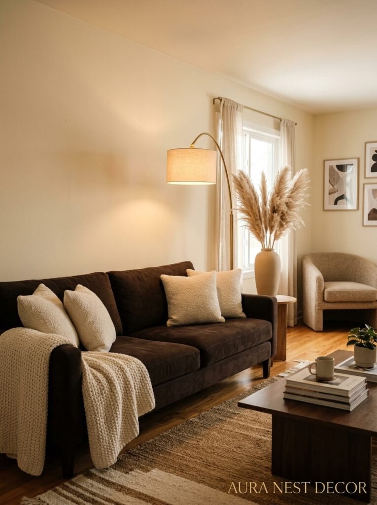
Brown and cream. Hear me out before you think that’s boring.
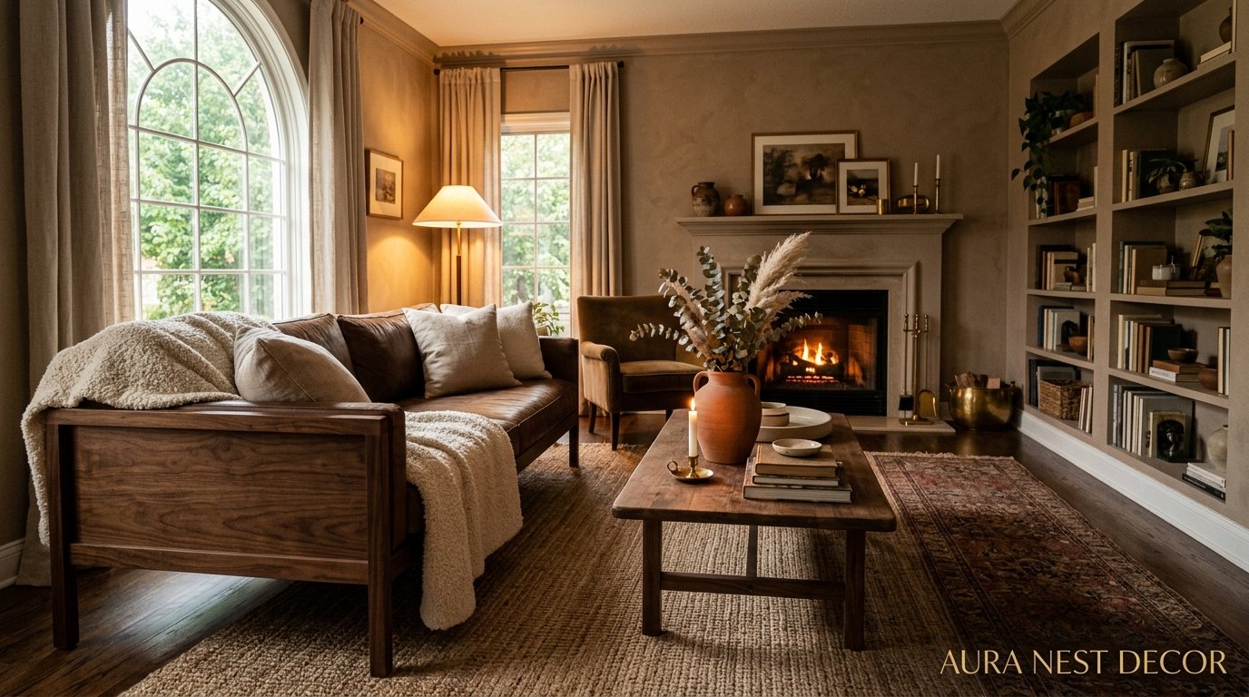
Not cream as in “safe neutral that won’t offend anyone.” Cream as in — warm, slightly yellow, aged-linen cream. That specific tone that feels like a page in an old book or the inside of a wooden cabinet. Put THAT cream next to a deep cognac leather sofa and something almost magical happens. The room goes from dated to genuinely beautiful.
This pairing is everywhere right now because it hits a very specific visual note that’s hard to achieve otherwise: richness without loudness. You’re not shouting “look at my design choices.” The room just feels… resolved. Like everything landed where it was meant to be.
A few ways to do it without it going too safe: add one unexpected texture. Rough jute rug, a chunky knit throw, anything with a little grit or rawness to it. That’s what stops cream-and-brown from feeling like a hotel lobby from 2004. It’s the texture that keeps it alive. Also — plants. Something with big, dark green leaves. The contrast against those warm tones is genuinely stunning.
—
4. That Awkward Medium Brown Furniture Everyone Inherited: Here’s What to Do With It
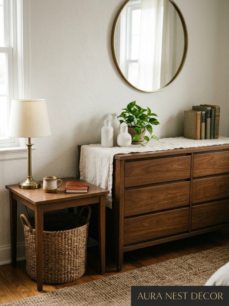
Okay, real talk. A huge number of people pin “brown living room” ideas not because they’re designing from scratch but because they have furniture they didn’t choose — wood pieces that came from a parent, a house purchase, an old relationship — and now they need to work around it. Medium-toned oak, honey pine, builder-grade brown. The stuff everyone has and nobody quite knows what to do with.
Here’s the trick: don’t fight it. Lean INTO it by making the wood look intentional. The mistake people make is surrounding medium-brown wood furniture with other neutrals that aren’t quite warm enough. Then the wood just reads as “there.” Boring. Background noise.
Instead? Go warmer in everything around it. Warm white on the walls (never cool white). Rust-toned or terracotta cushions. Amber-toned lampshades. Suddenly your inherited oak bookshelf looks like you sourced it from a vintage market in France, not dragged it out of a storage unit. Same piece of furniture, completely different story.
“You don’t have to love what you inherited — you just have to make it make sense.”
—
5. The Wall Color That Goes With Brown Sofas When You’re Tired of White

If you’ve got a brown sofa and you’re looking at your white walls thinking this isn’t it — same. White does this thing with brown sofas where it makes them look slightly wrong. Not ugly exactly, just… unresolved. The sofa sits there looking heavy against the brightness and neither element is doing the other any favors.
What actually works? A few options that I’ve seen do really beautiful things in real rooms. Sage green — not the blueish muted sage that was everywhere two years ago, but the warm, yellow-olive sage. It loves brown furniture. They’re basically made for each other. Warm terracotta for a bolder move. Or honestly, if you want something that plays it smart — go with a warm off-white that has a slight clay or sand undertone. Farrow & Ball’s “String” is genuinely perfect. So is Sherwin-Williams’ “Accessible Beige” if you’re Stateside, though I know that name does nobody any favors.
The point is: brown needs warmth around it. Give it warmth. Stop asking it to live against cold, bright walls and wondering why it doesn’t feel right.
—
6. How to Use Dark Brown Without Making Your Living Room Feel Like a Cave
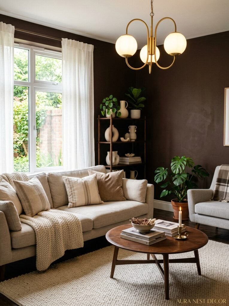
Dark brown gets a bad reputation. People pin a beautiful chocolate-walled room, get inspired, paint one wall, and then stand back and think: why does this feel like a basement? And then they repaint it beige and go back to playing it safe.
But here’s what went wrong — and it’s almost always the same thing. Lighting. And I don’t mean “get better lighting” in some vague advice-column way. I mean specifically: you need warm light sources at MULTIPLE levels. Not just an overhead light. That’s what kills dark rooms — one overhead bright light that bounces off dark walls and just flattens everything.
What actually works: a floor lamp in the corner with a warm bulb (around 2700K, not the cool daylight ones). Table lamps on side tables. Candles or candle-adjacent things — salt lamps, LED candles, whatever suits you. The light needs to pool in corners, glow from low down, and create that amber-hour quality even when it’s two in the afternoon. Then your dark brown room stops looking like a cave and starts looking like the most atmospheric, beautiful space anyone’s been in.
Mirrors also help — not to make the room look “bigger” in that tired advice-column way, but to bounce that warm light back around the space. Brass-framed mirrors are the current love language of the brown living room.
—
7. Texture Is Doing More Work Than Color in the Best Brown Living Rooms
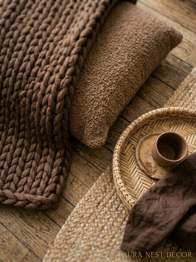
You could paint the walls exactly the right brown, choose the perfect sofa, get the lighting right — and still have a room that feels flat. Here’s why: no texture.
Brown is a naturally matte, earthy color. It doesn’t bounce light on its own. So when you have a bunch of smooth surfaces in similar tones — smooth paint, smooth fabric, smooth wood — the room goes quiet in a bad way. Everything kind of blurs together.
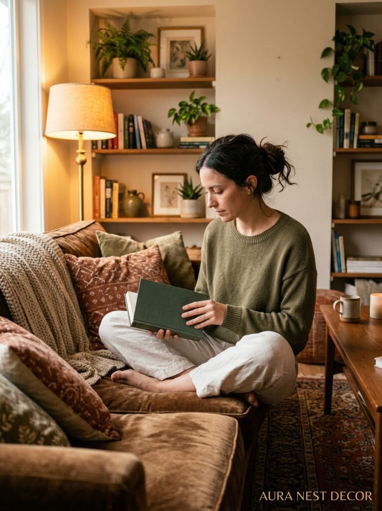
The solution is stacking textures aggressively. And I do mean aggressively. A velvet sofa next to a rough-woven throw. Smooth ceramic lamps next to chunky wooden side tables. A nubby jute rug under a polished coffee table. You want CONTRAST between surfaces, even when the colors are similar. Especially when the colors are similar.
Side note — this is why linen is having such a moment in brown-palette rooms. Linen has that beautiful slight slubby texture that catches light differently depending on where you’re standing. Against brown walls or brown furniture, it adds just enough visual movement to keep the room interesting. It’s doing a lot of the heavy lifting without drawing attention to itself.
“In an all-brown room, texture is the thing that keeps it from going silent.”
—
8. The Accent Color That Wakes Up a Brown Living Room Without Blowing Up the Whole Vibe

I’ve seen brown living rooms that are beautiful but kind of sleepy. Like everything is right, but nothing is quite alive. That’s what happens when there’s no accent color doing anything interesting.
The one that keeps surprising me: rust orange. Not loud, fire-truck orange. Rust. Burnt sienna. The color of old brickwork or autumn leaves past their peak. It sounds like a lot, but against brown it’s somehow quiet and punchy at the same time. A rust-colored pillow on a chocolate sofa. A terracotta pot on a dark wood shelf. You barely notice it consciously but the room WAKES UP.
Other options that work: forest green (especially against mid-browns, it’s almost like bringing the outdoors in without the effort). Dusty rose — I know, stay with me — it sounds pink-and-frilly but against a warm brown wall it goes soft and sophisticated. Very different energy than you’d expect. And cream-white, which I know isn’t technically an “accent” but sometimes the simplest contrast is the one the room needs most.
—
9. Brown Living Rooms That Work in Small Spaces (The One Thing You’re Probably Getting Wrong)
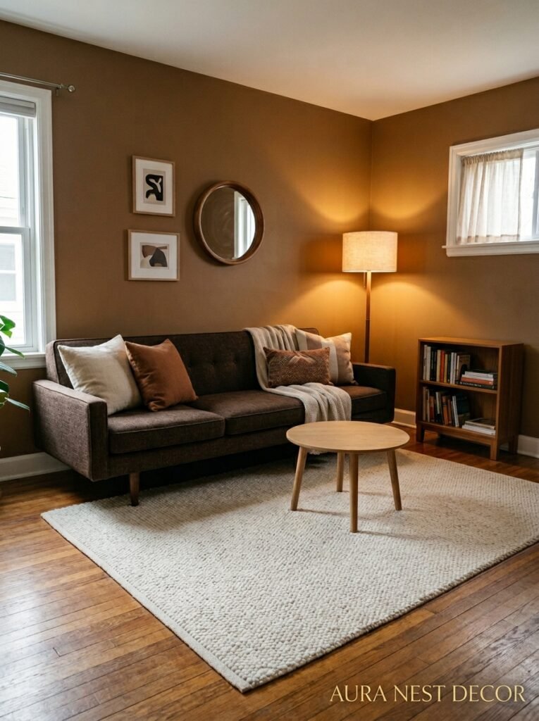
Everyone assumes dark and small equals catastrophic. But I’ve been in tiny brown rooms that feel incredible — cozy in the best sense, like a brilliant little pocket of warmth in the middle of a city flat. And I’ve been in large beige rooms that felt cavernous and cold. Size is less about the square footage than you think.
What makes a small brown room feel intentional rather than cramped: keeping the palette TIGHT. One or two tones of brown, one texture accent, one plant, done. The mistake is adding too much to compensate for the size — too many objects, too many pillows, too many competing colors. That’s what makes a small space feel chaotic. With brown, let the depth of the color do the atmosphere-building. Trust it.
Keep one wall light or reflective if you’re anxious about it. Even just the wall opposite the main window in a warm white tone gives enough breathing room. The room will feel considered rather than closed in.
—
10. The Flooring Situation: What to Do When Your Floors and Your Brown Vision Don’t Match
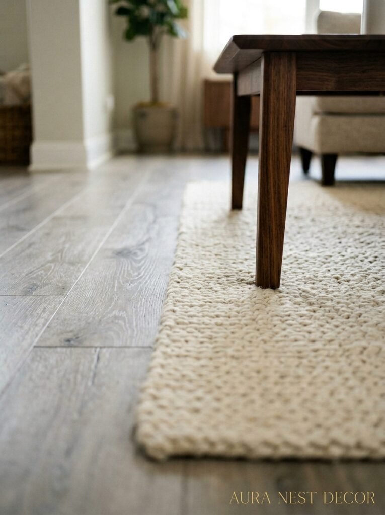
Cold gray tile floors. Pale laminate. Dark wood that clashes. Whatever the builder put in. So many people have beautiful ideas for their brown living room and then look down at the floor and feel stuck.
Rugs. Seriously. A large rug — larger than you think you need — in a warm tone completely changes the relationship between your floor and everything else in the room. You want it big enough that your sofa’s front legs AT MINIMUM are sitting on it. (The sofa floating off the edge of a small rug is a very common mistake that makes even expensive rooms look unfinished.)
For brown-palette rooms: a cream or oatmeal rug adds lightness without breaking the warmth. A rust or terracotta patterned rug ties in the accent colors beautifully. And if you really want to go for it, a dark brown or black rug with a geometric pattern grounds the whole room in a way that looks very intentional. Very editorial, actually.
—
11. Plants That Look Genuinely Extraordinary in Brown Living Rooms
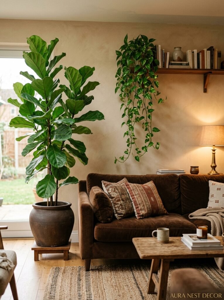
Not all plants photograph the same way against brown tones, and if you’re going to the effort of styling a space, you want ones that actually show up.
The absolute best: fiddle-leaf fig. I know, I know, everyone has one. But there’s a reason — those big, flat, deep green leaves against a warm brown wall look genuinely exceptional. The contrast is almost architectural. If you want something less expected: rubber plant (the dark burgundy kind, Ficus elastica ‘Burgundy’). Against brown it looks almost sculptural, like an artwork. Or a snake plant in a terracotta pot. Simple, striking, impossible to get wrong.
What doesn’t work as well: pale, delicate plants with lots of thin stems. They get visually lost against warm brown backgrounds. You want bold shapes, thick leaves, presence. The plant should feel like it belongs in the room, not like it got placed there as an afterthought.
—
12. One Brown Room Element That Costs Almost Nothing and Changes Everything
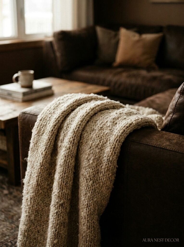
Candlelight. Or the approximation of it — warm LED candles, a cluster of pillar candles on a tray, whatever your household allows. But specifically: candles placed LOW. On the coffee table, on the floor, on a low shelf. Not up high.
Brown rooms at evening with candles at floor-and-table level become completely different spaces. The warmth of the light picks up the warm tones in the room — in the wood grain, in the leather, in the painted walls — and suddenly everything glows. Not in a scented-candle-Instagram-cliché way. In a genuinely beautiful, atmospheric, THIS is why I decorated this room way.
It’s the thing that people overlook because it’s temporary, it’s not furniture, it’s not an investment. But it’s often the final thing that makes a styled room actually feel LIVED IN. Alive. Which is what brown rooms do better than any other color palette — when they’re done right, they feel like someone actually LIVES there. Happily. Which honestly might be the whole point.
—
❓ FAQ
Q: Is brown too dark for a small living room? A: Not necessarily — the key is choosing the right shade and layering warm light at multiple levels. Mid-tone browns with warm undertones can actually make a small room feel intentionally cozy rather than cramped, especially when you use a light-colored rug and keep the overall palette tight.
Q: What colors go best with a brown sofa? A: Warm creams, sage green with yellow undertones, rust orange, and forest green all work beautifully. The main rule is to keep everything around it in warm tones — cool whites or gray-based neutrals will make a brown sofa look heavy and slightly off.
Q: Can I mix different shades of brown in the same room? A: Yes, and it actually tends to look more considered than using a single flat brown tone. The trick is varying the texture as much as the shade — a dark walnut coffee table next to a caramel sofa next to a honey-toned wooden shelf works because each piece has a different texture and finish, not just a different color.
—
💭 Final Thoughts
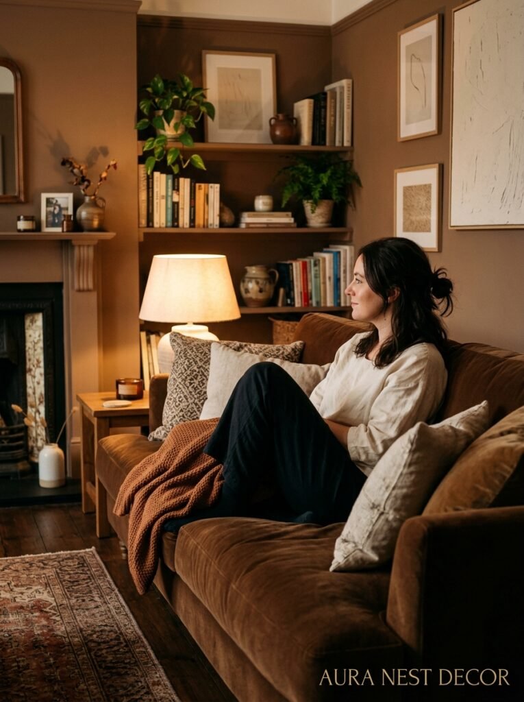
Brown living rooms reward the people who trust their instincts and stop waiting for the “right moment” to commit. It’s forgiving in ways that stark white never is — dust doesn’t show, scuffs disappear, it looks better with age. Which is kind of the whole philosophy behind it, isn’t it? Things that get more beautiful the more they’re lived in. What would your living room feel like if you finally gave yourself permission to go warm?