The Room Divider Glow-Up: 12 Ideas That Actually Make Your Living Room Feel Bigger (Not Boxier)
You know that feeling when a room just… doesn’t work, but you can’t figure out why? It’s open but somehow cramped. Spacious but weirdly undefined. A divider, done right, fixes all of that — and it doesn’t have to look like you borrowed a folding screen from a 1994 hotel lobby.
—
1. The Bookshelf That Does Way More Than Hold Books
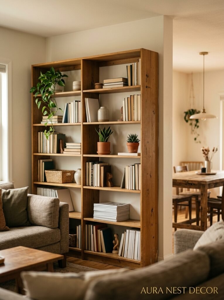
This is probably the most underused trick in home design, and I’m convinced that’s because people think “bookshelf divider” and immediately picture something from a college dorm. But hear me out.
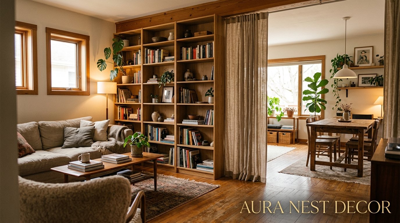
A double-sided, open-backed bookshelf — something like the KALLAX if you’re on a budget, or one of those beautiful solid oak pieces if you’re splurging — doesn’t just split a room. It creates two distinct zones while letting light move through freely. And that’s the whole secret. The light stays. The openness stays. But suddenly your living room has a “lounge end” and a “reading nook end” or whatever you want to call it.
What you put ON the shelves matters enormously, by the way. Don’t stuff every single square. Leave some breathing room — a plant here, a single ceramic vase there, a stack of books on its side rather than standing up. The negative space is doing just as much work as the objects. Style it from BOTH sides, because you’ll see both sides. That’s the part most people forget until they’ve already arranged everything and realize the back of the shelf looks like a junk drawer.
“A bookshelf divider isn’t furniture — it’s architecture you can style.”
2. Curtains Hung From the Ceiling and Why It Makes No Sense Until You Try It
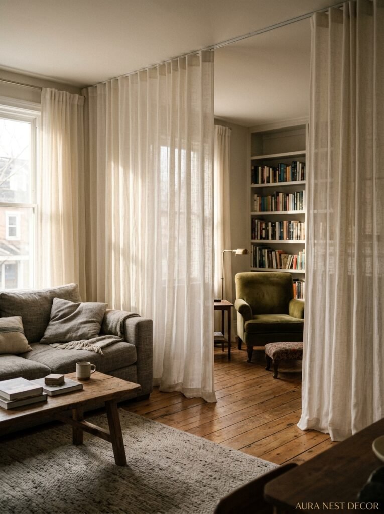
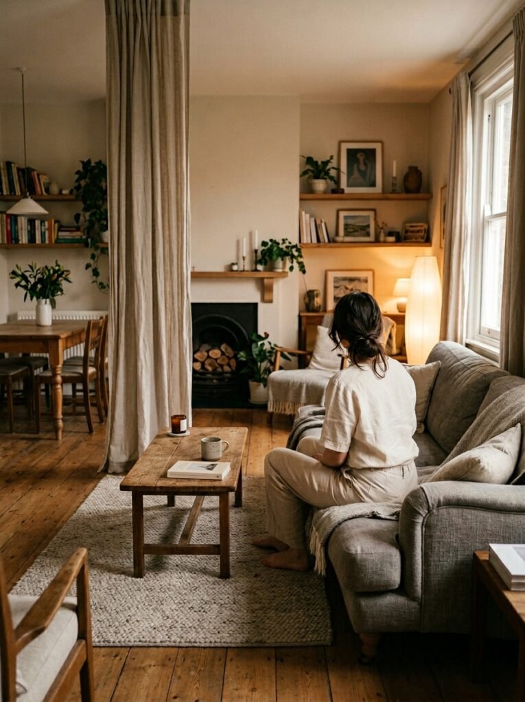
Okay, I know. Curtains as a room divider sounds chaotic. But I’ve seen this done so beautifully in open-plan living rooms, especially in older UK terraced houses where the front room and dining area bleed into each other.
Here’s the thing about ceiling-hung curtain dividers: they draw the eye UP. Which makes a room feel taller. And because curtains are soft, they absorb sound in a way that hard dividers just don’t. Pull them open and it’s one big room. Pull them closed and you’ve got two entirely different moods happening simultaneously.
Linen works best for this, honestly. Unlined, slightly wrinkled linen in an off-white or warm oatmeal color. It lets a glow of light through when closed — so the room behind it doesn’t go completely dark — and it photographs beautifully for that exact reason. Heavy velvet does the opposite of everything you want: it blocks light, it sags, and it makes the space feel strangely theatrical.
The rod situation is worth thinking about too. You want a ceiling-mounted track, not a tension rod. Tension rods droop over time and the whole effect collapses, sometimes literally. A sleek ceiling track mounted in a straight line looks architectural and intentional. That’s the word you’re going for with ALL of this — intentional.
3. The Half-Wall Trick That Interior Designers Charge a Lot to Suggest
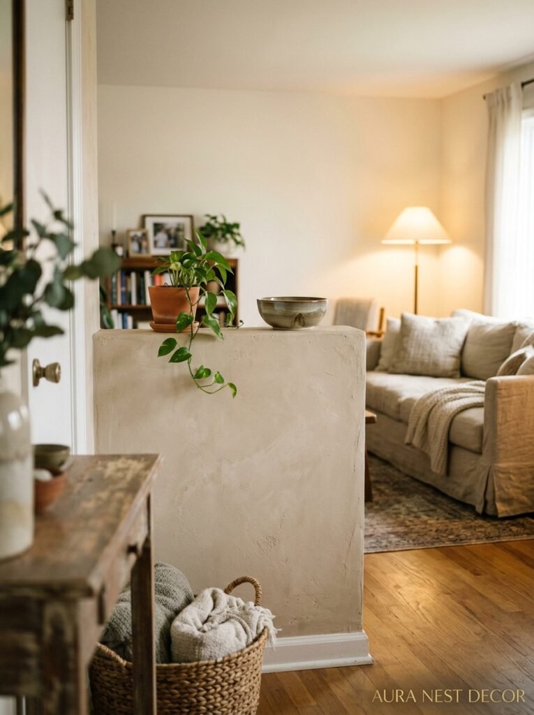
So a half-wall — sometimes called a pony wall, which is the most delightful term in construction — is exactly what it sounds like. A wall that goes up partway and stops. Usually around counter height, somewhere between 36 and 42 inches.
In living rooms, this tends to work best when you’re separating a home office corner from the rest of the living space, or carving out a reading area in what’s otherwise a wide-open room. The wall defines the boundary clearly. But because it stops before the ceiling, it doesn’t cut off airflow or light.
And here’s the part that people don’t always think about: the top of that half-wall is a surface. A shelf. A ledge. You can build a little built-in planter on it, lay some books on their sides, run a string of Edison bulb lights along the edge. I’ve seen someone rest a long, narrow piece of live-edge wood on top of a white painted pony wall in their living room and it looked like something from a high-end renovation magazine. It cost maybe $60 worth of lumber.
The US and UK approaches to this kind of DIY differ a bit — in the UK you’re probably dealing with older plasterwork and more cautious building regs, so always check what’s behind a wall before you go adding to it. In the US, particularly in newer builds with that open-plan layout, this kind of addition is usually pretty straightforward.
4. Plants As a Living Wall (and No, It’s Not as High-Maintenance as You Think)
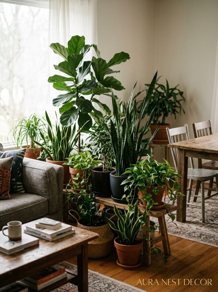
Not gonna lie, when I first started seeing these “plant dividers” all over Pinterest I assumed they were just aspirational content. Like, beautiful, but absolutely not achievable by anyone with a real life.
I was wrong.
The key is not trying to do the full jungle wall in one go. Start with tall floor plants — a fiddle leaf fig, a monstera, a few tall snake plants — placed in a loose, staggered line. They don’t have to touch. They don’t have to be the same height. In fact, they shouldn’t be the same height. A varied line of greenery with different leaf textures creates a visual boundary that feels ALIVE in a way no furniture divider ever can.
And the maintenance is less terrifying than you’d think if you choose your plants deliberately. Monsteras are forgiving. Snake plants practically thrive on neglect. ZZ plants can survive conditions I genuinely wouldn’t recommend to most houseplants.
If you do want to go further — a freestanding plant shelf, a series of hanging planters at descending heights — that’s when it starts to look genuinely impressive. But even just three large floor plants in a loose diagonal line will define a zone. I’ve done this myself, and guests almost always comment on it before they notice any other intentional design choice in the room.
“A row of tall plants doesn’t divide a room — it invites you to walk through something beautiful.”
5. Sliding Barn Doors Without the “Fake Farmhouse” Problem
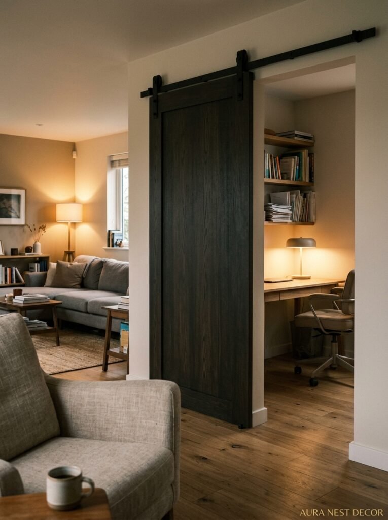
Barn doors have had a complicated few years in interior design. They got very popular, then very mocked, and now we’re somewhere in the middle where they actually make sense again IF you approach them with some self-awareness.
The issue isn’t barn doors themselves. The problem is when they’re put on a very modern, sleek apartment and styled with shiplap and mason jars. The context mismatch is what looks wrong.
But in the right space — a UK period property with some character already, an older American craftsman home, even a modern open-plan with warm wood tones — a sliding door on a black metal track is genuinely one of the most functional and beautiful room dividers you can install. It slides out of the way completely. It doesn’t swing into your space. It goes fully flat against the wall.
Go for solid wood if your budget allows, or a frosted glass panel if you want to keep some light moving. The frosted glass option is especially good for separating a home office from a living room — you get privacy without total visual disconnection. And yes, you can see a shadow through it when someone’s on the other side, but honestly? That’s kind of nice. It doesn’t feel isolating.
6. The Floating Shelf Wall You Can Build in an Afternoon
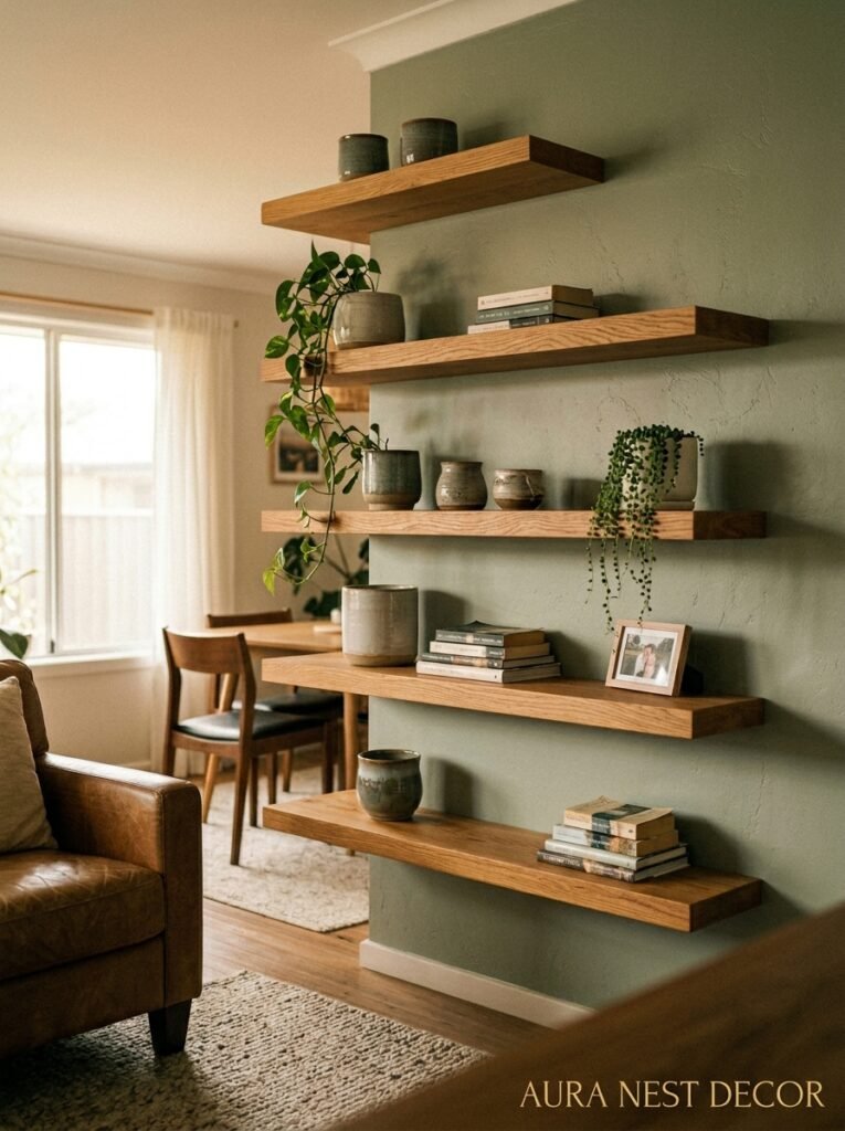
This one’s slightly unconventional and I love it for that reason.
Instead of a solid divider, you use floating shelves — multiple rows of them, staggered and layered — to create the SUGGESTION of a wall. Not an actual wall. It’s more like a visual break, a moment of texture and interest in the middle of the room, with gaps that let light and air pass through.
This works especially well in smaller living rooms where a solid divider would make the whole space feel chopped up and claustrophobic. The floating shelf wall gives you the psychological boundary without the physical heaviness. Your brain reads it as a division even though technically you could walk right through the gaps.
Style-wise, this is where you can go to town. Mix your objects — some tall candles, some small framed prints leaning casually rather than hanging formally, trailing plants that spill off the edges. Keep the color palette tight. Two or three tones max, otherwise it reads as visual noise rather than intentional design.
7. Floor-to-Ceiling Rope or Wooden Bead Curtains (Yes, Really. Stay With Me.)
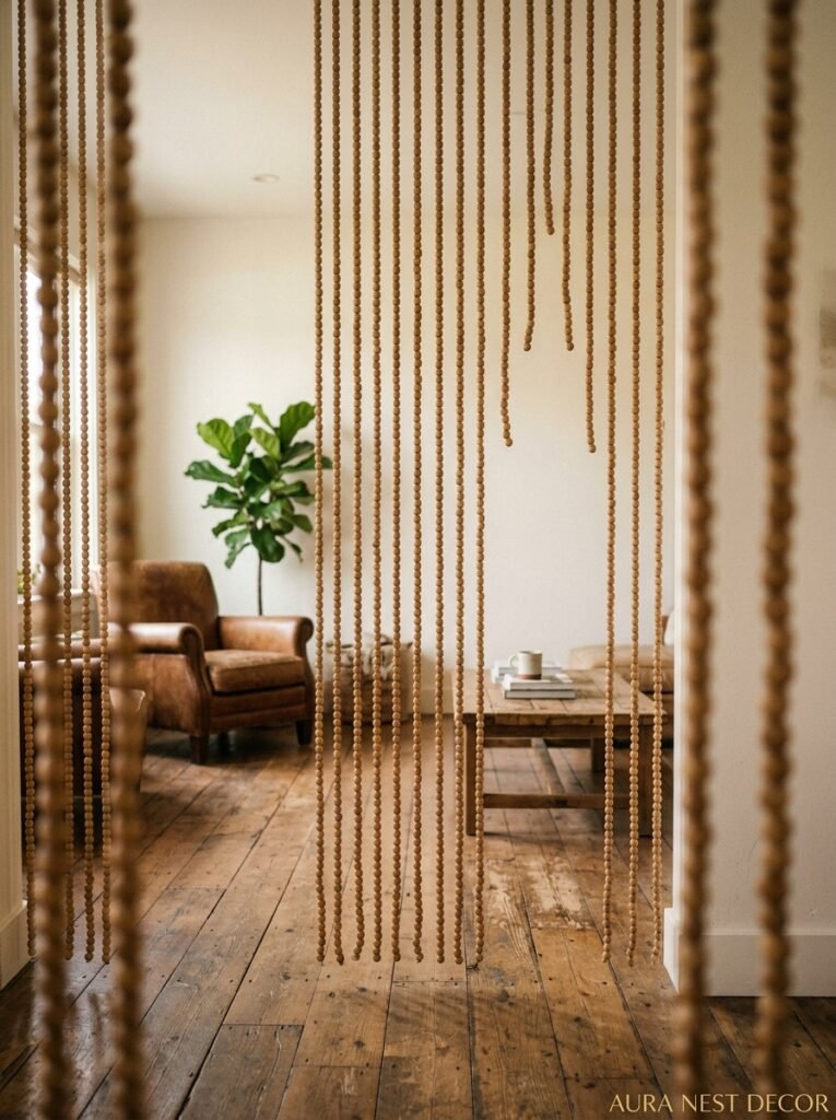
Before you click away — I’m not talking about the hippie beaded curtains from the 70s. I’m talking about the modern, architectural version.
Thick natural rope hung in vertical lengths from a ceiling-mounted dowel. Or wooden beads — larger ones, 1 to 2 inches in diameter, in natural oak or walnut tones — hung with enough weight that they fall straight and still. Done right, this type of divider looks almost Japanese-minimalist. Done wrong, it looks like a craft project.
The difference is proportion and weight. The strands should hang CLOSE together — close enough that it creates a real visual plane when you look at it straight on, but loose enough to walk through. Spacing them too far apart makes it look accidental. Too close and it becomes a wall, which defeats the purpose.
What I love about this option is that it moves. There’s something about a divider that gently shifts when you walk past it — the small sound of beads clicking or rope swaying just slightly — that adds a sensory dimension to a room that no solid wall can match. It’s probably not practical for every home. But for the right space, and the right person, it’s stunning.
“The best room dividers don’t just define space — they make you feel the space differently.”
8. A Console Table Turned Backward (The Low-Key Clever Option)
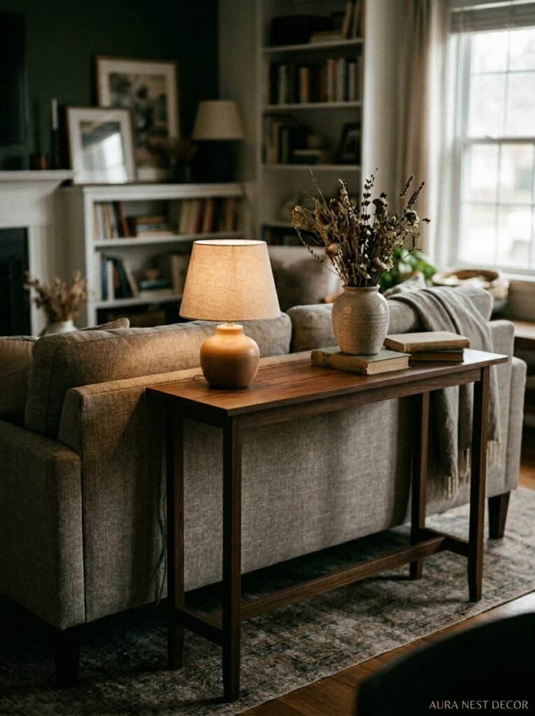
This is less of a “statement divider” and more of a quiet design move that works really well in smaller homes — particularly UK flats and terraced houses where you’re working with a single combined living and dining space.
Place a console table — a narrow one, maybe 12 to 14 inches deep — with its back facing the living area and its front facing the dining zone. Then style the back of it, not just the front. A line of small framed pictures, a trailing plant, a row of candles. Treat that table as a piece that has two faces, because in this placement, it does.
This creates a visual break without any structural commitment. You can move it. You can change your mind. And the styling on top of it does a lot of the work — a long trailing pothos, a couple of taller items at varying heights, and suddenly you have something that reads as intentional and considered even though you spent maybe twenty minutes putting it together.
It’s not dramatic. But not every room needs drama. Sometimes a room just needs a reason.
9. Steel and Glass Frames: The Industrial Look That Works in Period Homes
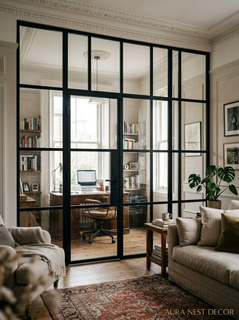
This is one I genuinely didn’t expect to love as much as I do.
The Crittal-style steel frame — those black metal grid windows and doors you associate with factories and loft conversions — has found its way into living room dividers in the most genuinely interesting way. A floor-to-ceiling steel frame with clear or frosted glass panels, used as a room divider, looks INCREDIBLE in older homes. A Victorian townhouse. A Georgian terrace. Places where you’d expect something ornate but instead you get something industrial and the contrast just works.
In the US, this same aesthetic shows up in converted warehouse apartments and older brownstones, and it fits there too. The key is that the steel frame needs to be slim. Chunky frames look cheap and heavy. A slim profile — 1 inch or thinner — reads as refined, almost like a drawing in the air.
It’s not a budget option, I’ll be upfront about that. But it’s also probably the most permanent and impressive divider on this list.
10. Macramé Panels for the Bohemian-Adjacent Living Room
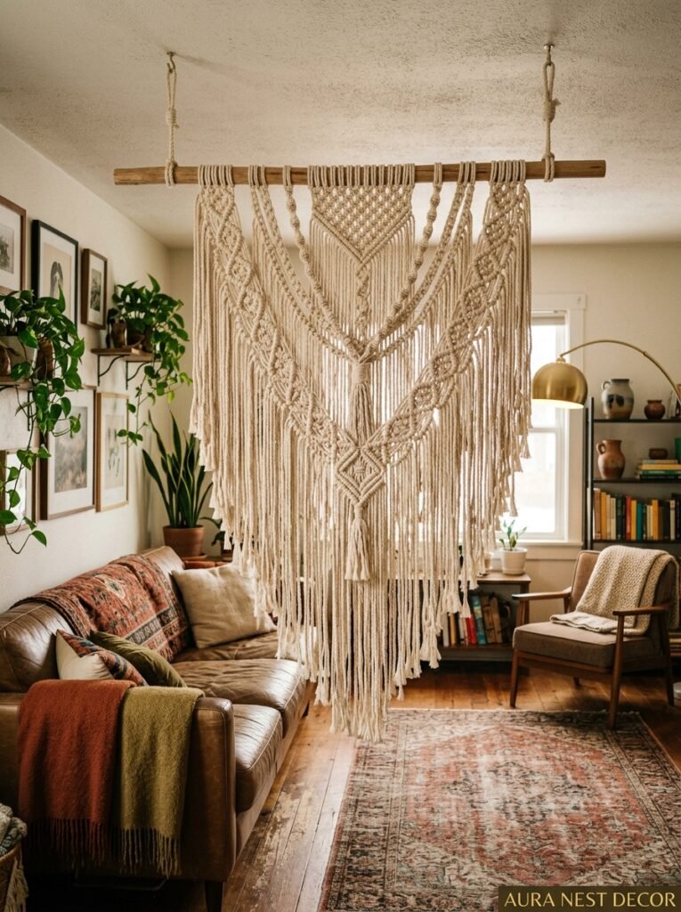
I know macramé went through its Instagram era and you might have some complicated feelings about it. Fair enough. But for a specific type of living room — warm tones, layered textures, a mix of old furniture and new pieces — a large macramé panel hung in a doorway or from a ceiling beam works beautifully.
The critical thing is scale. A small macramé piece looks like a craft fair purchase. A LARGE one — I mean really large, six feet tall and three or four feet wide — has actual presence. It stops being “cute decor” and starts being architectural.
Natural cotton cord in an off-white or undyed cream reads as warm without trying too hard. And because macramé is see-through at varying degrees depending on the pattern, it creates that same light-filtering quality I mentioned with the linen curtains — your eye senses a boundary, but the space doesn’t close off.
11. The Sofa Itself Is the Divider (Furniture Layout as Architecture)
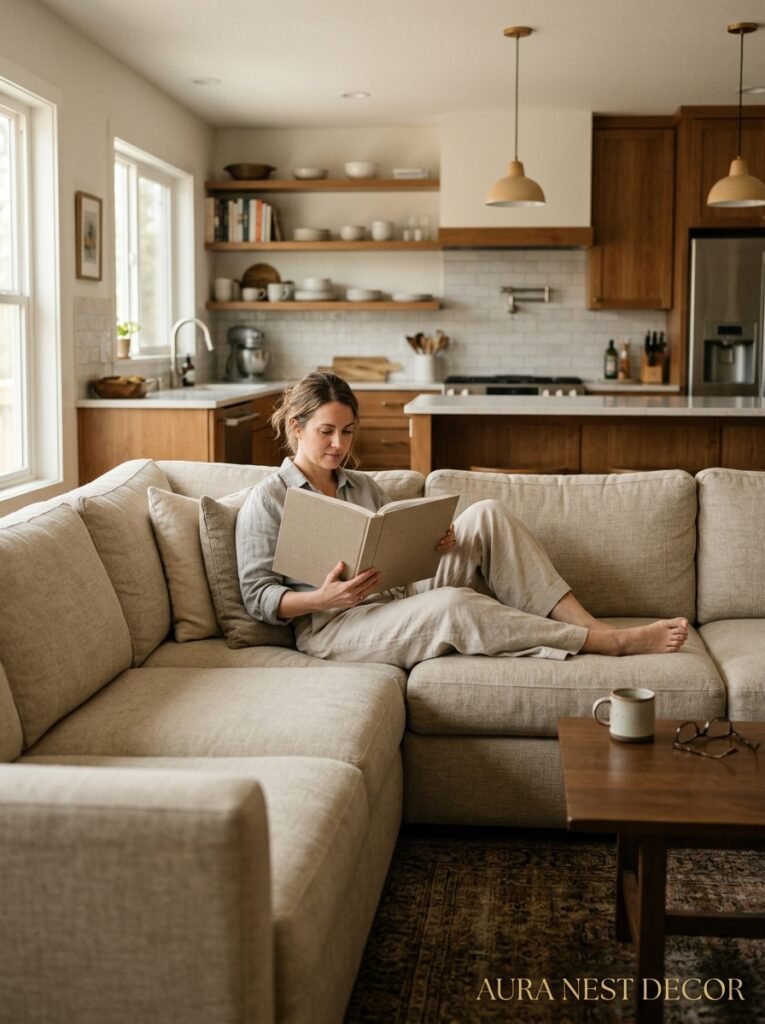
This one’s free, and it might genuinely change how you think about your living room.
In many open-plan homes — and this is especially true in newer American builds where the kitchen flows into the living area with no actual walls — the back of the sofa defines the room boundary. Most people push their sofa against the wall or close to it. But float it. Pull it away. Put the back of the sofa where the “edge” of the living room zone should be.
Then, on the “outside” of that sofa back — the side that faces the kitchen or dining area — put a narrow console table or a row of plants. Suddenly the sofa is doing double duty as a room boundary. It’s a design move, not just furniture placement.
This works because it creates a psychological sense of entering a defined space when you walk toward the seating area. It’s subtle. Guests often can’t articulate what feels different and considered about your layout, but they feel it.
12. Woven Room Screens: The Option That’s Been There All Along
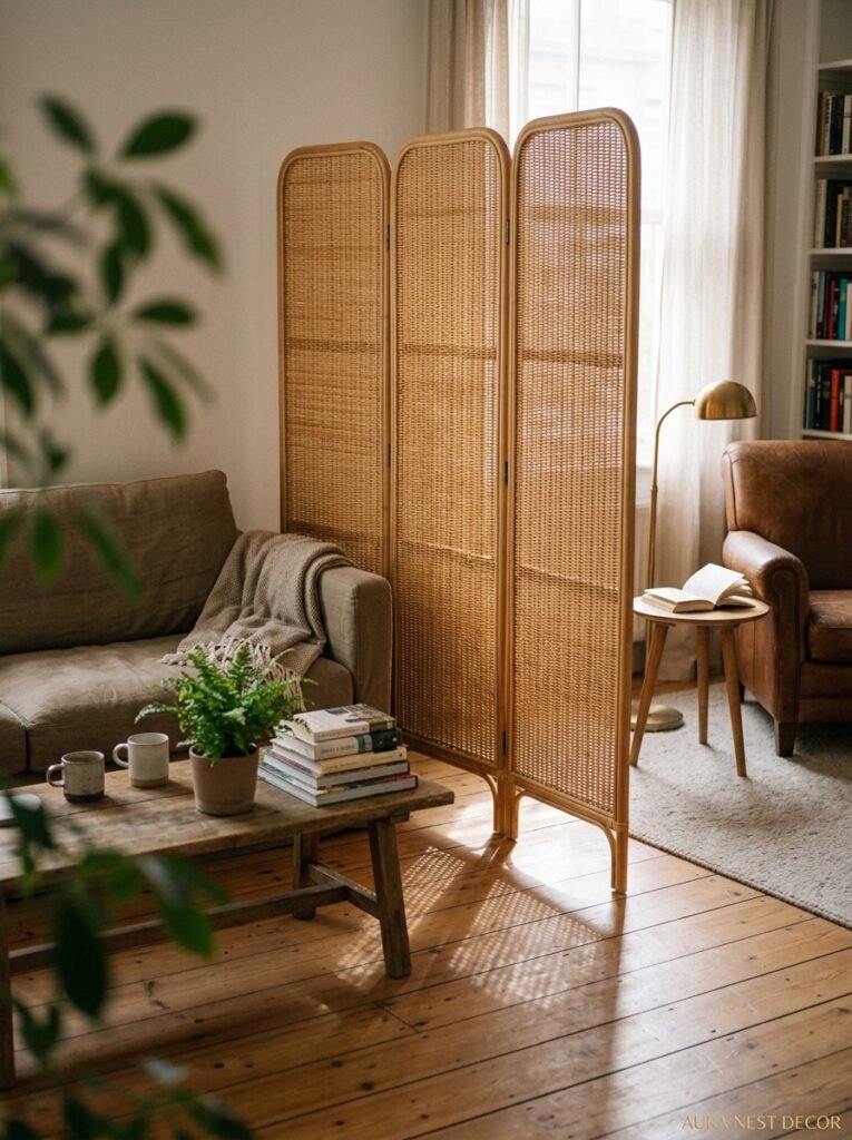
The folding screen gets a bad reputation, and I think that’s mostly because cheap versions of it are very, very cheap-looking. Flimsy hinges, thin panels, fabric that’s already wrinkling before you’ve finished setting it up.
But a genuinely well-made room screen — solid wooden frame, woven rattan or cane panels, three or four sections — is a different object entirely. It has weight. It stands on its own without wobbling. And the cane or rattan panels cast the most beautiful shadow patterns when light hits them at an angle, which is a detail that sounds small but genuinely transforms how a room feels in the late afternoon.
The other thing a screen does that most dividers can’t: it’s moveable. You can reposition it, rotate it, fold it away entirely if you’re hosting and need the space. That flexibility has real value, especially in UK homes where rooms tend to serve multiple functions out of necessity.
—
❓ FAQ
Q: What’s the best room divider for a small living room that won’t make it feel cramped? A: Floating shelves arranged in a staggered pattern, or a curtain hung from the ceiling, are your best options. Both create a visual break without adding physical bulk, and both let light pass through, which keeps the room feeling open.
Q: Do I need planning permission to add a room divider in the UK? A: For freestanding or non-structural options — curtains, shelves, plants, screens — no planning permission is needed. If you’re adding a half-wall or a steel frame structure that involves fixing to the floor or ceiling, it’s worth checking with your local council or a builder, especially in a rented property.
Q: How do I make a room divider look intentional rather than like I’m just hiding something? A: Style it from both sides, choose materials that match the rest of your room’s tones, and leave negative space. A divider that’s over-stuffed or under-considered reads as an afterthought. One that has breathing room and a clear visual logic reads as a design decision.
—
💭 Final Thoughts

The right divider doesn’t just solve a layout problem — it gives a room a story. A reason for each corner to exist. And the really interesting thing is that once you start thinking about your living room this way, as a collection of defined zones rather than one big undifferentiated space, you start to see the potential in every awkward corner and odd-shaped wall.
What would you zone, if you could zone anything?