
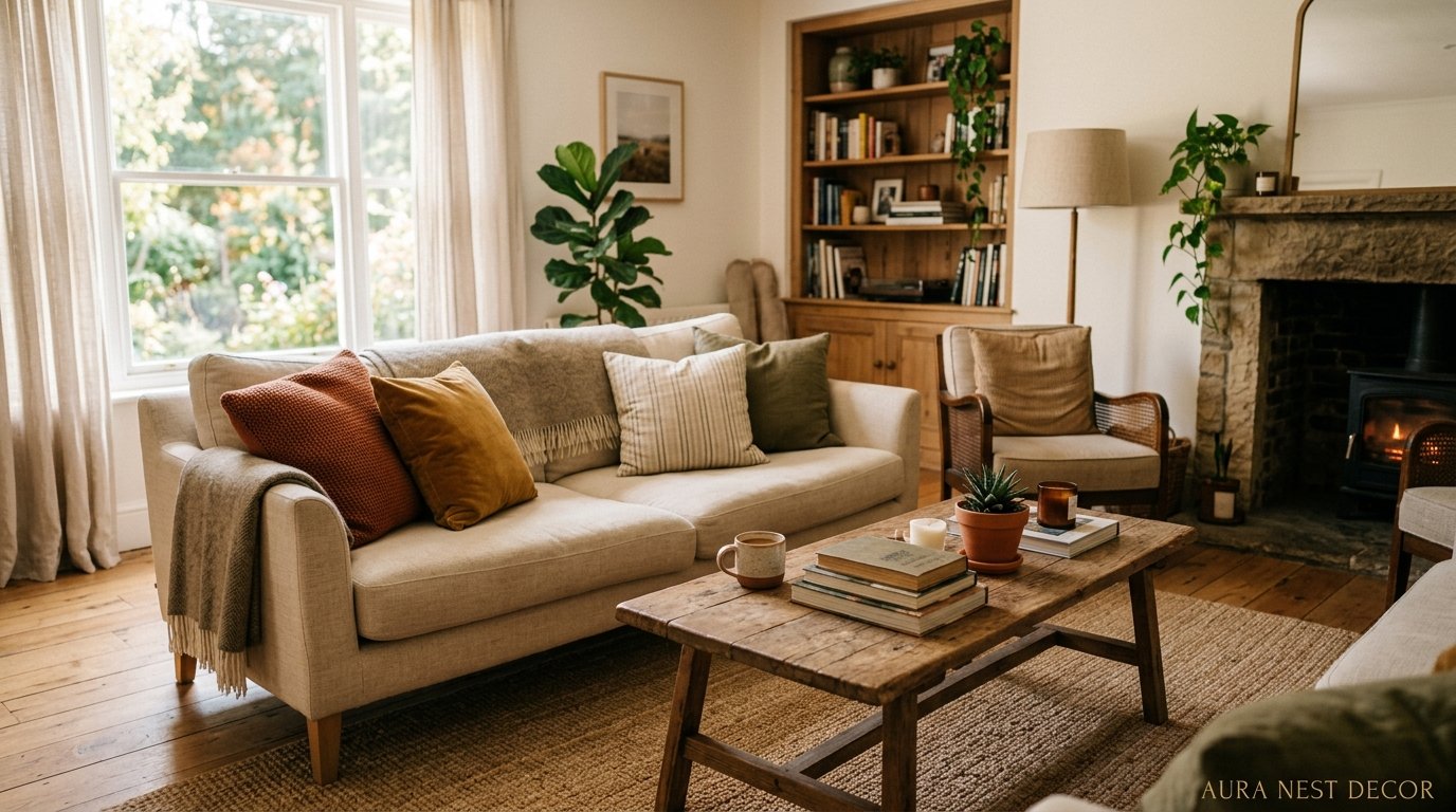
The Living Room Rules I Broke (And Why My Space Finally Feels Like Mine)
There’s a moment — you’ve rearranged the furniture three times, scrolled Pinterest until your thumb hurts, bought the throw pillow that was supposed to fix everything — and your living room still feels like it belongs to someone else. Someone beige. Someone who bought everything in one afternoon from a catalogue. I’ve been there. This is what I actually learned.
—
1. The Sofa Color Decision That Interior Designers Don’t Want You to Rush

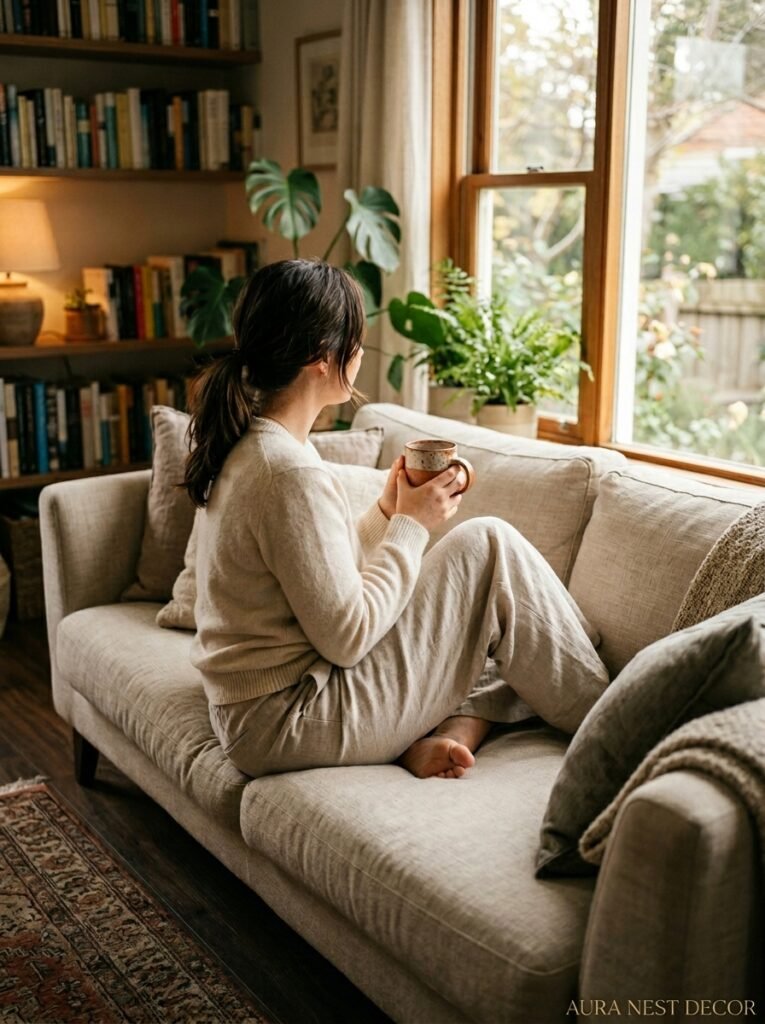
Everyone says start with the sofa. Big investment, anchor piece, blah blah blah. And yes, that’s true. But the part nobody tells you? The color choice isn’t really about the sofa at all. It’s about what you want the room to FEEL like at 9pm on a Tuesday when you’re exhausted and just need it to wrap around you.
I spent two months convinced I wanted a light grey sectional. Practical. Timeless. Safe. And honestly? Safe was the problem. The moment I sat on a deep sage green sofa in a little furniture shop I’d never been into before, something clicked. It didn’t match anything I owned. That was the point.
The thing with sofa colors is that the “safe” choices — your creams, your mid-greys, your caramel tans — photograph beautifully but they don’t always live beautifully. Real life has red wine. It has kids and dogs and that one friend who sits down holding a takeaway container. A medium-to-dark sofa in a richly saturated tone can handle real life AND look stunning. The sage, the forest green, the ink blue, the cognac leather — these aren’t risky anymore. They’re the rooms that stop your scroll.
Don’t rush it. Sit with paint swatches next to fabric samples. Look at them in your actual lamp light, not store light, not noon sunlight. See how they change. That’s the real test.
“The room you love at 9pm on a Tuesday is more important than the room that photographs well at noon.”
2. Why “Too Much Furniture” Might Actually Be Your Problem
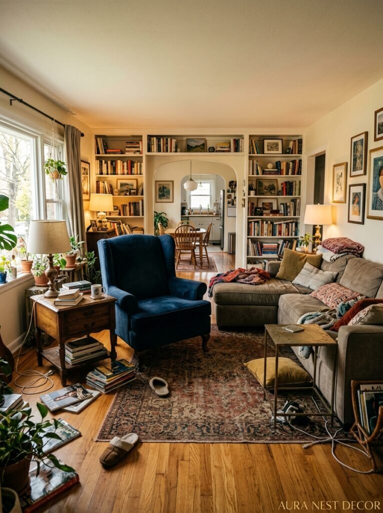
British living rooms especially — and I say this with love — tend to get overstuffed. Every surface gets something. Every corner gets a piece. Every wall gets attention. American rooms do it differently but still do it: the full sectional, the coffee table, the side table, the console table, the armchairs, the ottoman. It’s a lot. It’s a LOT.
Negative space isn’t empty. That’s the thing people get backwards. A corner with nothing in it creates breathing room that makes everything around it look more deliberate. A wall with just one piece of art — properly sized, properly hung — reads as confident, not sparse.
The test I use: stand at the entrance to your living room and notice where your eye goes first. If it goes everywhere at once, that’s the problem. A well-designed room leads your eye on a little journey. It goes to the focal point, moves around, settles. If your eye is jumping all over the place trying to process too much, your brain reads that as chaos even if you don’t consciously notice it.
Try removing one piece. Just one. A side table, a floor lamp, a chair that’s mostly decorative. Live without it for a week. I guarantee you’ll feel the room relax.
3. The Lighting Layer That Everyone Forgets Until It’s Too Late
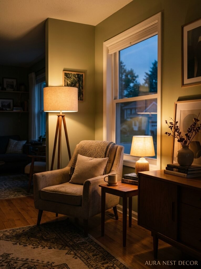
Overhead lighting is a trap. There, I said it. That single ceiling fixture or recessed lighting situation your home came with — it’s fine for finding things you dropped, it’s terrible for making a room feel good. The amber glow of a table lamp at 7pm on a winter evening is doing more for your living room than any piece of furniture you’ve bought.
The three-layer approach is real and it works: ambient (your overhead or ceiling situation), task (a reading lamp, something directional), and accent (candles, LED strips behind a TV unit, picture lights above art). Most rooms only have ambient. That’s why they feel flat.
But here’s what I’d add to that standard advice — height matters enormously. A lamp on a low console table throws light differently than a tall arc floor lamp. Candlelight at coffee table level creates something that ceiling lighting physically cannot. You want pools of light at different heights, not one blanket of brightness from above. Think about how restaurants you love are lit. They’re not blasting fluorescent overhead light. There’s a reason.
Side note — dimmers. If you don’t have them, get the smart bulbs with an app. Game changer, non-negotiable, I don’t make the rules.
4. The Color on Your Walls Is Doing More Than You Think
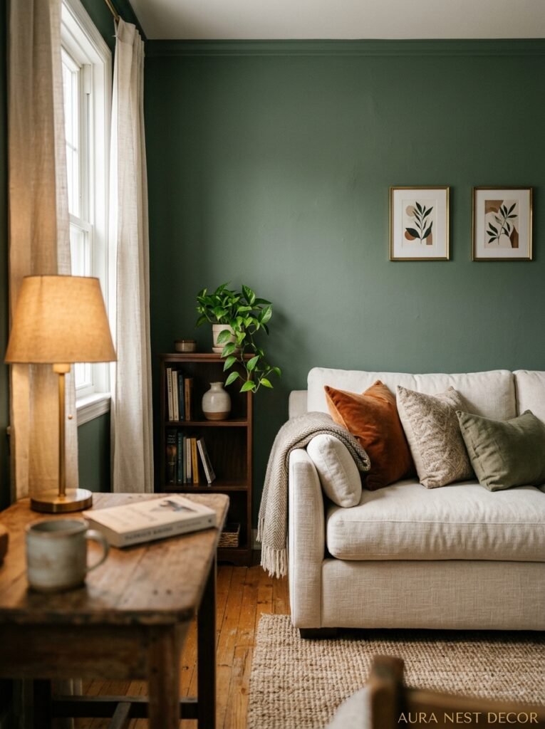
Paint is not a background decision. I know people treat it that way — “just pick something neutral and let the furniture do the talking.” But the wall color is in 90% of your room’s visual field. It IS the talking. It sets the emotional register before anything else even registers.
Right now — and I’ve been watching this across both American and UK design spaces — the move away from grey is real and it’s not coming back. Warm whites are in (not stark white, not cool white — WARM white, with just a whisper of cream or stone). Earthy tones are in. Deep colors on a single wall or in a smaller room are very much in. The kind of muted, sophisticated palette that reads like a linen fabric swatch — dusty rose, soft terracotta, faded sage — these are everywhere and they’re everywhere for a reason. They work.
What doesn’t work is choosing your wall color from a tiny paint chip under fluorescent store lighting. Get the sample pot. Paint a piece of card or lining paper at least A3 size. Move it around the room at different times of day. Morning light and evening lamplight will show you completely different colors from the same sample. Don’t skip this step. I’ve re-painted a room because I skipped this step. Once. Never again.
“Paint color isn’t the background. It’s the emotional register the whole room operates in.”
5. The Coffee Table Styling Rule That Actually Makes Sense
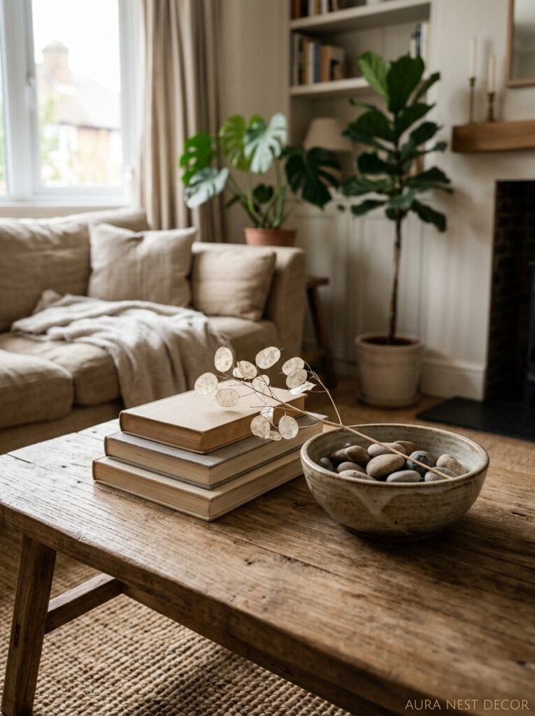
Coffee table styling is one of those things that sounds fiddly and unnecessary until you nail it once and realize how much it anchors the whole seating area. But most advice about it is too prescriptive — “odd numbers of objects,” “vary your heights,” “add a tray” — and people end up with a coffee table that looks styled rather than lived-in.
Here’s what I think works better: pick one thing that means something. A book you actually read. A candle you actually burn. An object you brought back from somewhere. Then add one thing that’s purely visual — a small piece of pottery, a little sculpture, something with interesting texture. Then leave it mostly alone.
The tray trick is genuinely useful, not because it looks good (though it does) but because it contains the visual noise. If everything on the coffee table lives inside a tray or on a small riser, your eye reads it as intentional rather than accumulated. British homes are great at this, actually — there’s a certain casual-elegant approach to surface styling that feels collected over time rather than purchased in one go.
Candles, by the way. Always. A coffee table without a candle (lit or unlit) is a coffee table that’s trying too hard to be minimal.
6. The Rug Size Mistake That’s Making Your Room Look Smaller
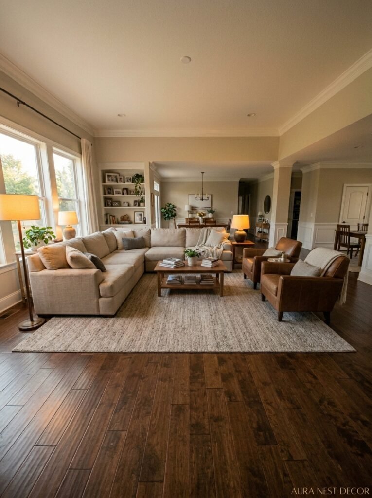
Too small. Almost always, the rug is too small. This is the single most common living room mistake and I’m convinced it’s because the right-sized rug looks enormous in the shop and people panic. But here’s the thing — a rug that only fits under the coffee table and doesn’t reach your sofa isn’t grounding anything. It’s floating.
The front legs of your sofa and all your seating should sit on the rug. At minimum, the front two legs of each piece. Ideally, the whole sofa if the room allows. This connects all the furniture into one unified seating area and makes the whole space feel larger, not smaller, which is the counterintuitive part.
In a smaller British terraced house sitting room, you might not have room for the rug to go wall-to-wall-ish, and that’s okay. But even then — go bigger than you think. A 6×9 in a room that could take an 8×10 is always going to feel off. Measure your space, mark it out with painter’s tape, see how a larger rug would actually sit. It’ll convince you faster than anything I can write here.
And the material — don’t buy a rug you’re scared of. A beautiful wool rug or a jute-wool blend will wear better than a precious silk one you’re always worried about, and it’ll feel better underfoot, which matters more than people admit.
7. What Your Living Room Is Actually Missing (And It’s Not More Stuff)
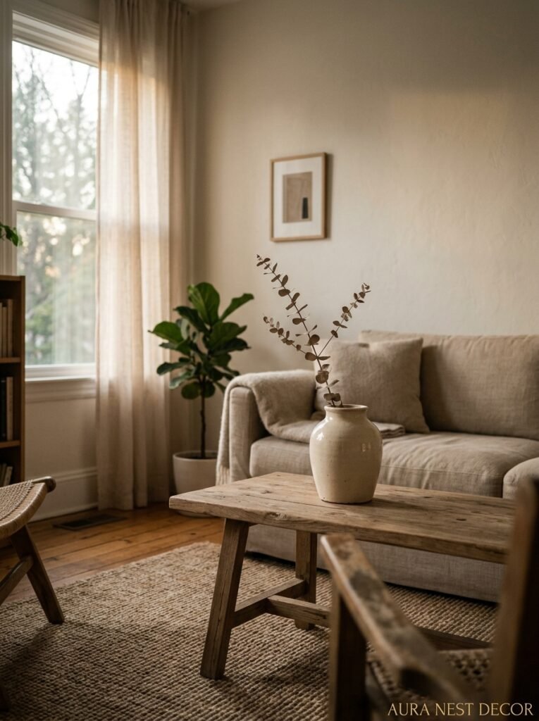
Plants. I know, I know, you’ve heard this before. But not as a decor tip — as an atmosphere tip. There’s something about living things in a room that no amount of styling can replicate. A fiddle leaf fig in a corner. A trailing pothos on a high shelf. Something in a terracotta pot on the window ledge. Real, growing, needing-water things.
British homes are getting better at this — the houseplant obsession that really took hold a few years back hasn’t gone away. American homes too. But the mistake is buying small plants and dotting them around, which just reads as a collection of small plants. Go big with at least one. A tall snake plant in the corner, a large monstera in a statement pot, something that actually registers when you walk in the room.
The other thing — and this one’s less obvious — is SMELL. Your living room has a smell. You can’t detect it because you live there, but it does. A candle you burn regularly, a diffuser, even just fresh flowers sometimes — this is part of the design. It’s part of how the room feels. Guests notice. Guests always notice.
“A room can be perfectly styled and still feel cold. Living things — plants, candlelight, the smell of something warm — that’s what fixes it.”
8. The Focal Point Problem Most Rooms Get Wrong
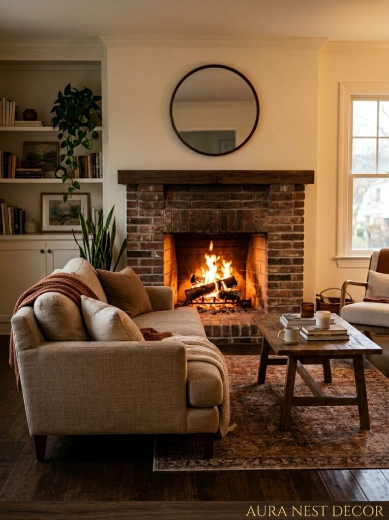
Every living room needs a focal point. And for about 80% of rooms, that focal point is currently a TV, which is fine — the TV isn’t going anywhere — but it’s worth thinking about whether the TV is really where you want the room’s visual energy centered when it’s off.
The fireplace is the obvious answer in a lot of older British homes and some American ones too. If you have one, use it. Style the mantle. Don’t put the TV above it (I know. I know some of you are going to do it anyway. But the angle for your neck is genuinely terrible).
If you don’t have a fireplace, think about creating a different focal point. A gallery wall that’s actually cohesive and considered. A large, properly-scaled piece of art. A statement bookcase styled like a piece of furniture. A dramatic window treatment that draws the eye. Something that gives the room a destination.
The rooms that feel most designed — the ones that stop you scrolling — usually have a clear answer to “what am I supposed to look at when I walk in here?”
9. The Bookshelf Styling Approach That Stopped My Eye Twitching
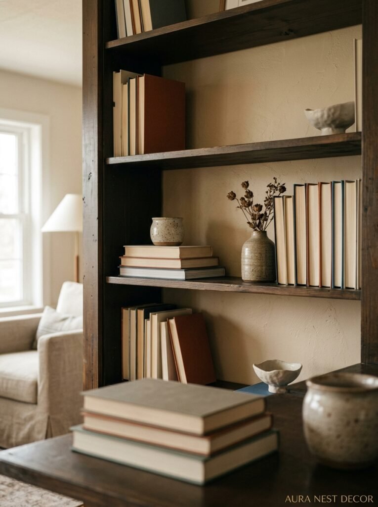
Full shelves of books, packed tight, every color represented — that’s a library and it’s wonderful in the right house. But if you want your shelves to read as designed rather than accumulated, you’ve got to mix in objects, and you’ve got to leave some breathing room.
The approach I’ve landed on: books in small clusters of three to five (spines facing out, or some turned backwards in a section for texture), then a small object or stack, then a plant or trailing vine, then another cluster of books. Not every shelf the same. Some shelves might be mostly objects. One shelf might be books only. The irregularity is what makes it look intentional rather than random.
Color-organizing books is gorgeous and I don’t think it’s as precious or impractical as people make out. You do lose the ability to find things quickly but honestly, do you need your cookbooks on the living room shelf? Probably not.
10. Mixing Old and New — The British Approach Americans Should Steal
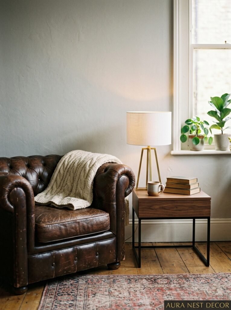
There’s something that British interiors do really well — particularly in older homes — and it’s mixing genuinely old things with brand new things without either looking out of place. An antique side table with a modern lamp on it. Victorian cornicing with a very contemporary sofa. A inherited oil painting above a sleek media unit.
Americans tend to either go full modern-new or full “vintage aesthetic” as a curated look, but the British version of this is less intentional and more accumulated and it WORKS. It works because real homes accumulate things over time and the best-looking rooms reflect that. Nothing looks bought-all-at-once. Everything has a slightly different origin story.
So if you’re styling a living room from scratch — and this is genuinely the best advice I can give — go into secondhand shops, estate sales, car boot sales, whatever’s near you, and find a few things that feel old and real. A wooden bowl. A ceramic lamp base. A worn leather stool. Mix them in with your new things. The whole room shifts.
11. The One Thing Worth Spending More On Than You Think
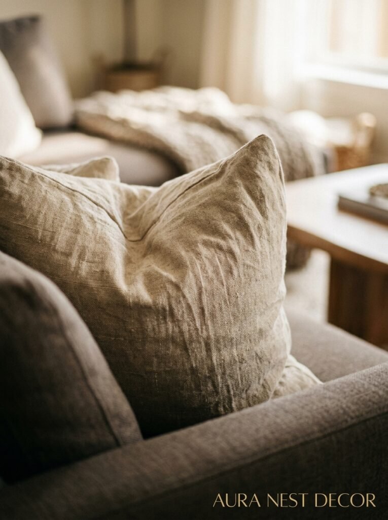
Curtains. Full-length, properly hung curtains that puddle slightly or break cleanly at the floor. Not the £15 tab-top panel sets. Not the ones that stop at the windowsill or hang at actual window height. Proper curtains, hung from a rod close to the ceiling, falling to just above or just at the floor.
This changes rooms. Dramatically. It adds height, it adds softness, it makes the window look larger and the room more finished than almost any other single investment you can make. I’ve seen rooms transformed by replacing short, cheap curtains with long, good ones. It’s not subtle.
The fabric matters. A heavy linen, a velvet, a textured weave — these hold their shape and move beautifully. A thin polyester panel does neither of those things. If budget is a concern, IKEA’s SANELA velvet panels are genuinely good and they’re not embarrassing to admit to.
Hang them high. Hang them wide (beyond the actual window frame on each side). Let them breathe. That’s it. That’s the whole secret.
12. The Final Step People Always Skip Before Calling a Room “Done”
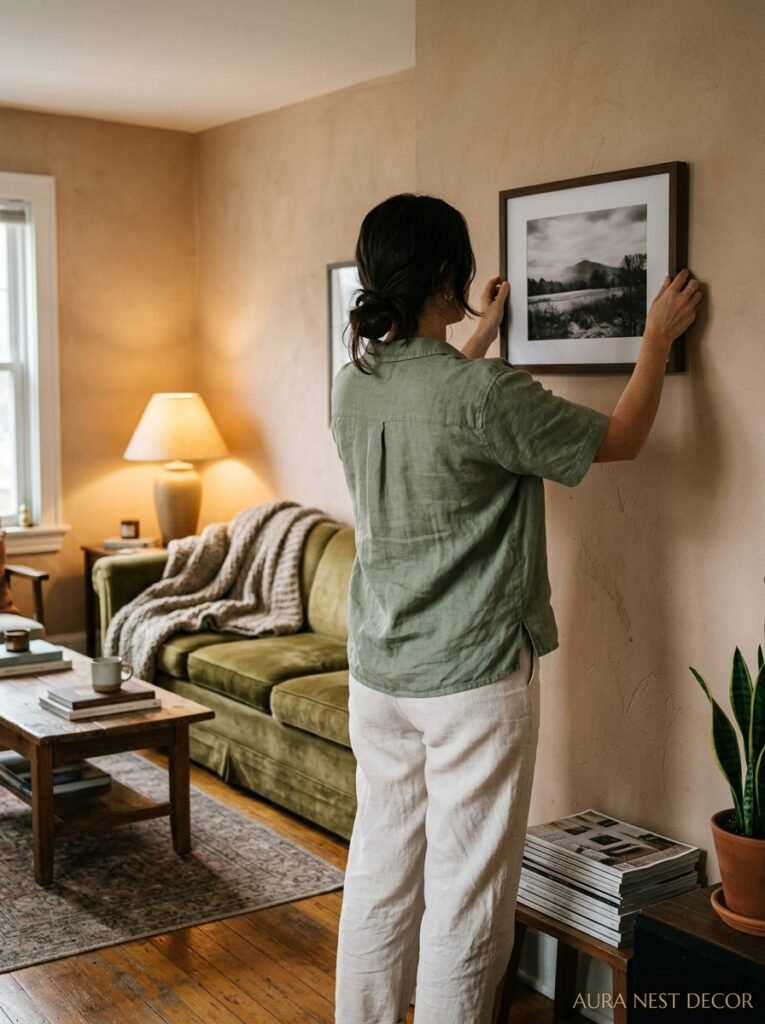
Edit. You have to edit. When a room feels almost right but not quite, the instinct is to add something — another cushion, another plant, another piece of art. But almost always, the answer is subtraction.
Walk out of the room. Walk back in as if you’re seeing it for the first time. What hits you first? Is it something you love, or is it visual noise? Is there something that’s taking up space without earning it? A piece that’s fine but not RIGHT?
The rooms that feel intentional and designed aren’t the ones with the most or the best things in them. They’re the rooms where everything that’s there deserves to be there, and everything that’s left out has been left out consciously.
This is honestly the hardest part because it requires you to look at your own space critically after you’ve become blind to it. Ask a friend. Take a photo — because a photograph sees the room differently than your eye does in person and the camera is ruthless and honest. Look at the photo. What bothers you? Start there.
—
❓ FAQ
Q: How do I make a small living room feel bigger without knocking down walls? A: Honestly, it’s mostly about rug size, light, and not overcrowding. Go bigger on the rug than feels right, use mirrors strategically on dark or dead walls, keep the color palette cohesive and not too busy, and remove any furniture that isn’t genuinely earning its place. Less is almost always more in a small room.
Q: Is it okay to mix different wood tones in a living room? A: Not only okay — it’s actually better. Perfectly matched wood tones look catalogue-staged and a bit sterile. The trick is to make sure the tones have something in common (both warm, or both cool and grey-toned) and that you’re not accidentally mixing just two competing tones. Three or more different woods tends to read as intentional. Two reads as almost-matched.
Q: What’s the best way to style a living room if I’m renting and can’t paint or make big changes? A: Curtains (hung from tension rods or removable hooks), rugs, cushions, and lighting make an enormous difference without touching the walls. A large piece of removable wallpaper or a fabric wall hanging can add character without damage. And plants — really, genuinely, a lot of plants — make a rented room feel like yours faster than almost anything else.
—
💭 Final Thoughts

The living room you actually want is probably just a few edits away from the one you already have. Not a full renovation. Not a budget you don’t have. A couple of brave decisions, one or two things removed, the lighting sorted, and something on those shelves that means something to you.
What’s the one thing in your living room you’ve always wanted to change but kept talking yourself out of?




