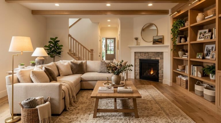
Why Midcentury Modern Living Rooms Still Feel More Alive Than Anything Being Built Right Now
There’s something almost unfair about a design style from the 1950s making your current living room look like an afterthought. But here we are. Scroll through any interiors account right now and it’s all warm wood, clean lines, and that one incredible low-slung sofa that makes you want to rearrange everything you own.
—
1. The Low Furniture Rule That Changes Everything About a Room
Okay so this is the thing nobody tells you when you start going down the midcentury rabbit hole. It’s not really about the furniture style — it’s about the HEIGHT of it. MCM sofas sit low. Tables sit low. Even the lighting often hangs lower than you’d expect. And the effect is that your ceiling suddenly feels taller, your room feels more spacious, and weirdly, more deliberate.
I moved into a pretty standard 1970s semi (UK readers, you know the one — bay window, slightly awkward living room shape) and the first thing I did was swap out my boxy IKEA sofa for a low three-seater in mustard boucle. The room felt like a different planet. Same walls. Same floor. Completely different vibe.
The psychology of it makes sense once you think about it — when furniture doesn’t compete with the upper half of the room, your eye has space to breathe. You’re not looking at bulk, you’re looking at AIR. And air, in a small British or American living room, is everything.
Don’t underestimate this. If you take nothing else from this piece, take the low furniture rule. Start there.
“Lower furniture doesn’t just change how a room looks — it changes how it feels to be inside it.”
—
2. The Walnut Wood Moment That’s Been Going On Since 2019 and Shows No Signs of Stopping
I’m not tired of it. I know some people are. But walnut wood — that warm, dark, reddish-brown grain — is doing something in midcentury rooms that lighter woods just can’t. It’s grounding. It makes a pale linen sofa look intentional instead of cheap. It makes a white wall feel warm instead of clinical.
The reason it works so well in MCM interiors specifically is that it’s inherently a bit formal, but not in a stuffy way. More like… dressed up but comfortable. Like someone who shows up to a dinner party in a nice blazer but immediately takes their shoes off at the door. That energy. That’s walnut.
In terms of sourcing — if you’re in the US, there are some genuinely great pieces on Etsy from small woodworkers doing solid walnut coffee tables and sideboards that look like they cost three times as much as they do. In the UK, keep an eye on places like Heal’s, Ercol (obviously), or honestly just a good charity furniture shop if you’re lucky. Old G-Plan pieces in walnut turn up for almost nothing sometimes, and they’re the real deal.
The thing is, you don’t need walnut everywhere. One or two pieces anchor the whole room.
—
3. How to Mix Eras Without It Looking Like a Jumble Sale
This is the actual skill. Not buying midcentury pieces — that’s easy. It’s knowing how to live in the room and not have it feel like a museum.
The trick is that MCM plays beautifully with one unexpected texture or era if you’re deliberate about it. A lot of the best rooms I’ve seen on Pinterest have one piece that shouldn’t work — a chunky hand-thrown ceramic lamp, a really shaggy modern rug, some abstract art that’s clearly not from 1962 — and it’s THAT piece that makes everything else feel curated instead of cosplay.
What doesn’t work is mixing in pieces that are too traditional or too contemporary without a clear logic. A tufted velvet Victorian sofa next to a credenza is a hard no. So is ultra-minimalist Scandi floating shelving next to a warm, busy MCM gallery wall. There’s a visual grammar here and once you learn it you’ll start seeing it everywhere.
Side note — if you’re in a Victorian terrace or a period home, don’t be scared of MCM. The contrast works. It’s the unexpected pairing that makes both things more interesting.
—
4. The Color Story Behind Every Great Midcentury Room
Here’s something I didn’t know until I started paying close attention: midcentury modern color palettes are almost NEVER fully saturated. They’re always a little muted. A little dusty. Mustard isn’t quite yellow. Teal isn’t quite blue. Olive isn’t quite green. They’re all just slightly off, and that’s exactly why they work together.
This is probably the most reproducible trick in the whole aesthetic. If you’re trying to build a MCM-feeling room but something looks off — it’s probably because your colors are too bright. Too clean. Swap your throw pillows for dusty versions of the same hues and suddenly it’ll click.
In terms of actual colors — terracotta and warm cream is doing a lot of work right now. Burnt orange against walnut is classic for a reason. And that very particular shade of sage green that leans grey rather than mint? That’s the one. That green. You know it when you see it.
“Midcentury color isn’t bold. It’s considered. There’s a difference.”
—
5. The Lamp Situation Is More Important Than You’ve Been Told
I said what I said. Lamps do more for a midcentury living room than almost any piece of furniture. And specifically — the SHAPE of the lamp matters as much as the light it produces.
Sputnik chandeliers. Arched floor lamps. Tripod floor lamps in brass or black. These aren’t decorative accessories, they’re structural elements of the aesthetic. The arc lamp especially — the one that swoops over a sofa or reading chair — it’s doing architectural work in the room. It defines a zone. It creates that amber, intimate feeling at eye level rather than flooding the whole room from above.
And overhead lighting in a midcentury room is almost always wrong. Or maybe not wrong, but incomplete. You want warm pools of light at different heights, not one glaring ceiling fixture washing everything out. This is the most common mistake I see in “MCM-inspired” rooms — they’ve got the furniture right but they’re lit like an office and the whole mood collapses.
Invest in lamps. Dimmable bulbs. And if you can, lower your overhead lighting’s brightness to basically nothing in the evenings.
—
6. The Sofa That’s Worth Saving Up For
There’s one specific sofa silhouette that defines midcentury living rooms and I think it’s worth talking about honestly rather than just saying “get a low sofa.” What you’re looking for is something with tapered wooden legs, clean cushion lines, low back, and arms that don’t roll over but instead sit flat or at a slight angle. That’s the profile. Everything else — fabric, color, size — is secondary.
In the US, Article does a version that’s genuinely good for the price. So does Apt2B. In the UK, Made.com used to be the go-to before the whole collapse situation, but La Redoute has been quietly killing it with MCM-adjacent pieces recently. Or honestly, second-hand. Seriously. A vintage MCM sofa that’s been reupholstered in fresh fabric is better than almost anything you’ll buy new, and often cheaper.
The thing I’d caution against is chasing perfection here. I’ve seen stunning midcentury rooms built around a $400 sofa with the right legs, a good throw blanket, and two excellent cushions. The details carry it. It’s not all about the sofa itself.
—
7. What People Get Wrong About Midcentury Rugs
They either skip the rug entirely — which leaves the whole room feeling cold and unmoored — or they go too busy, too geometric, too obviously “vintage.” And both choices hurt.
The rugs that work best in MCM living rooms are either simple wool in a single warm tone (oatmeal, rust, soft gold) or low-pile geometric patterns that aren’t trying too hard. The pattern should read from across the room as texture, not as design statement. If you see the rug before you see the furniture, it’s probably the wrong rug.
Size also matters more than people realize. Too small a rug makes the furniture float awkwardly. The front legs of your sofa and chairs should sit ON the rug. Not near it. On it. That rule changed everything about how my living room felt, I’m not kidding — I kept the same rug but got a slightly larger one and suddenly the seating area felt like a real room instead of furniture just sort of… existing near each other.
“A rug that’s too small is almost worse than no rug at all.”
—
8. The Gallery Wall Argument (And Why MCM Actually Gives You Permission to Go for It)
There’s this idea that midcentury modern is spare and minimal, and therefore gallery walls are somehow against the rules. But honestly? That’s not accurate. MCM interiors from the actual era — the real ones, the original ones — were often full of stuff. Art, ceramics, books, plants. They just had a visual logic.
What MCM gives you is a framework, not a restriction. And within that framework, a gallery wall of abstract art — think black and white sketches, a few geometric prints, maybe a small oil painting in earth tones — can look incredibly at home.
The key is scale and framing consistency. Thin brass frames. Or simple wooden frames in the same tone. Mix the art but keep the containers consistent and it’ll read as intentional rather than chaotic.
This is one of those things where going a little bigger, a little bolder than you think is right often works. Trust yourself.
—
9. Plants: Not Optional, Not an Afterthought
I don’t know how to say this gently so I’ll just say it — if you want a midcentury living room that actually FEELS like something, you need plants. Not a single succulent on a shelf. A real plant. Something with presence.
Fiddle leaf figs are obvious but they work. Bird of paradise plants work even better in a MCM room because their paddle-shaped leaves echo the organic shapes in MCM furniture design. A monstera in a ceramic pot on a plant stand at sofa-height brings the outdoors in at exactly the right level. Big, leafy, a little dramatic.
The connection between midcentury design and the natural world was intentional from the start — the whole movement was about bringing life inside, blurring the lines between indoor and outdoor. So the plants aren’t decor, they’re part of the design logic.
Even if you kill every plant you’ve ever owned (I’ve been there), try a pothos or a ZZ plant. Basically unkillable. Put it in a good ceramic pot. Watch it transform a corner.
—
10. The Credenza/Sideboard Situation (or: Why Every MCM Room Needs One Long Low Thing)
This might be the piece I’d buy before anything else, including a sofa. A long, low credenza — ideally in walnut, ideally on tapered legs — does something structurally important in a living room. It gives the room a horizontal anchor. It creates a surface for styling. It houses the inevitable chaos of modern life (routers, cables, remotes, candles you never burn). And it photographs beautifully for Pinterest, but that’s not really the point.
The styling on top of a credenza is its own art. A mix of heights helps — a table lamp at one end, a small stack of art books, one or two ceramics, maybe a trailing plant. The rule is odd numbers when it comes to grouped objects. And leave some breathing room. Don’t fill every inch.
In the UK, eBay and Vinterior are genuinely brilliant for vintage sideboards. In the US, Chairish or a good estate sale. You can often find incredible original pieces for less than you’d expect, and the quality of mid-century furniture construction is genuinely hard to match with new pieces.
—
11. Textiles Are Where MCM Gets to Be Warm and Human
This is the section where I push back a little against the idea of midcentury modern as a cold, hard-edged aesthetic — because it doesn’t have to be. At all.
The textiles — cushions, throws, curtains — are where you get to bring warmth in. Boucle in cream or mustard. Chunky woven throws in warm grey or rust. Curtains in a slightly sheer linen that filters afternoon light into something golden and soft. These pieces aren’t in conflict with the clean lines of MCM furniture; they’re the counterpoint that makes those lines feel livable.
Velvet cushions in teal or olive green on a walnut-legged sofa with clean arms? Incredible. It shouldn’t work but it really, really does. The contrast of the soft against the structured is exactly the push-pull that makes a room interesting to be in for more than five minutes.
Don’t go matchy-matchy. Please. A sofa in grey doesn’t need grey cushions. It needs something unexpected in a tone that’s from the same dusty family but clearly different.
—
12. The Small Details That Separate a Pinterest Board From an Actual Room
Here’s the thing about beautiful midcentury rooms you see online — they almost always have a few very specific details that you barely notice consciously but that make the whole thing feel real and considered. And most of them cost almost nothing.
A small ceramic ashtray or bowl on the coffee table, even if you don’t smoke. A stack of three books without their dust jackets (take the jackets off — the cloth bindings underneath are usually gorgeous). Exposed corners of the credenza deliberately not filled with anything. A single piece of pottery that’s slightly imperfect, slightly handmade-looking.
These aren’t decorating tricks, they’re the evidence of a person who actually lives in and thinks about a space. Rooms that look like they were styled in ten minutes (even when they weren’t) almost always have this quality — a little restraint, a few meaningful objects, some deliberate empty space. That’s the real MCM philosophy if you distill it down to almost nothing. Less stuff, but the right stuff.
—
❓ FAQ
Q: Can midcentury modern work in a small living room? A: Honestly, it works BETTER in a small room than most styles. The low furniture creates an illusion of height, the clean lines don’t add visual clutter, and the emphasis on a few key pieces means you’re not trying to fit too much in. A small room with one good sofa, a credenza, a lamp, and the right rug can look more intentional than a large room crammed with stuff.
Q: Is midcentury modern expensive to do properly? A: It can be, but it genuinely doesn’t have to be. The vintage market — eBay, Vinterior, Facebook Marketplace, estate sales — is full of original MCM pieces at reasonable prices. The key is buying fewer, better things rather than filling a room quickly. One real walnut credenza will do more than five cheap trend pieces ever will.
Q: What’s the difference between midcentury modern and Scandi style? A: They share DNA — both love clean lines, natural wood, and functional design — but MCM is warmer, earthier, and more decorative. Scandi leans white, cooler, and more spare. MCM embraces color (that dusty mustard, that teal, that burnt orange) and more organic shapes. You can mix them, carefully, but they’re distinct moods.
—
💭 Final Thoughts
Midcentury modern keeps coming back because it figured something out that a lot of design trends haven’t: that a room should feel good to actually be in, not just good to look at. That’s not nothing. It’s the whole thing.
If you’re starting from scratch, start with one piece that excites you — the lamp, the credenza, the sofa — and let the room build around it rather than trying to create the whole thing at once. The rooms that feel most alive usually grew slowly, with decisions made over time.
What’s the one piece in your current living room that already has that MCM energy without you even trying?