

Why a Navy Blue Sofa Might Be the Smartest Thing You Put in Your Living Room
My friend called me panicking last spring. She’d ordered a navy sofa on a whim — seen it on Pinterest at 11pm, clicked buy before she could talk herself out of it — and now it was arriving Thursday and she had no idea what to do with the rest of her room.
Honestly? It turned out great. Better than great.

—
1. The Reason Navy Blue Works When Other “Bold” Colors Don’t
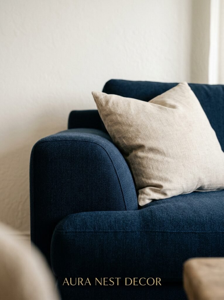
Navy isn’t really a bold color. That’s the secret. It reads as a neutral to your brain — dark enough to anchor a room, but not screaming for attention the way terracotta or forest green can. You can put almost anything next to it and it doesn’t fight back.
Which sounds boring when I type it out, but it’s the opposite of boring in practice. What it means is that your navy sofa becomes the settled, permanent thing in the room and everything else gets to be interesting around it. Cushions, rugs, art, lamps — they can all play because the sofa isn’t competing.
There’s a reason designers keep reaching for it. Not because it’s safe. Because it’s SMART.
“Navy gives a room the thing a lot of color can’t — a foundation that doesn’t get tired.”
It ages well, too. A terracotta sofa might feel very 2023 in five years. A navy sofa in 2030 is just going to look like a navy sofa. Timeless is maybe an overused word but I can’t think of a better one here.
—
2. The Wall Color That’s Actually Going to Make Your Navy Sofa Look Incredible
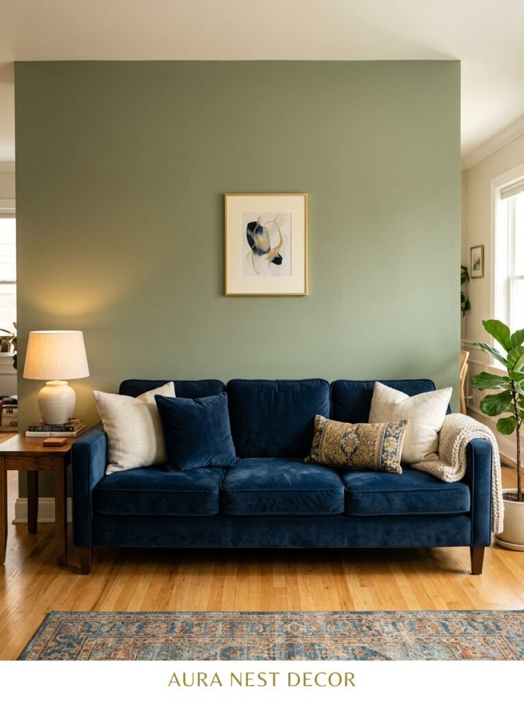
White. Obviously white. But hear me out, because not all white is doing the same thing.
Cool stark white — think gallery walls, the kind that feels almost blue-grey — makes navy feel crisp and modern. It’s very editorial. A little bit fashion-forward. If your room has good light and you want the sofa to feel like a deliberate statement, this works.
But warm white? Creamy, slightly yellow-tinted, the kind that feels like old plaster in a Cotswolds cottage? That’s where navy becomes something else entirely. Warmer. More layered. Less “showroom” and more “someone actually lives and reads here.”
I lean toward the warm white personally, but it depends on your light. North-facing rooms in the UK especially — cool white can make them feel a bit grey and clinical. Go warm. Trust me on this one.
And if you’re feeling brave: deep muted sage on the walls with a navy sofa is having a serious moment and I can see why. It shouldn’t work but it absolutely does.
—
3. The Rug That Makes the Whole Room Feel Like It Was Planned
People agonize over cushions and forget about the rug. Don’t do this.
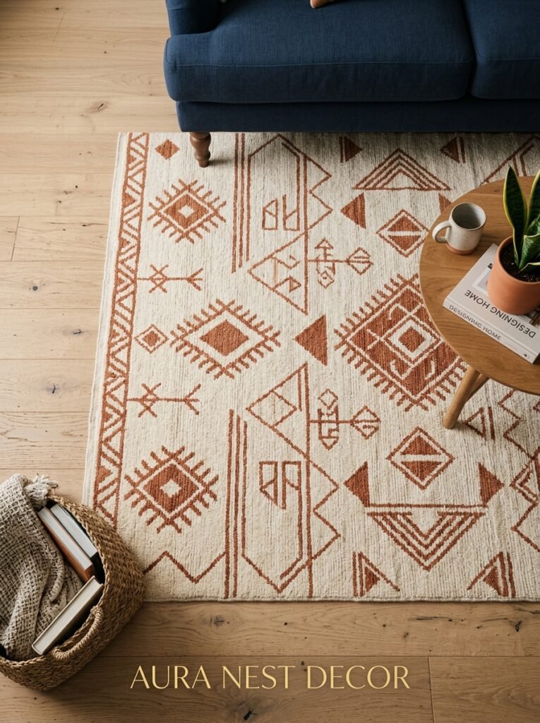
The rug is what makes a navy sofa feel intentional rather than dropped-in. And the pattern matters more than the color for this piece. A plain navy rug under a navy sofa? Too flat. Too much of one thing going on down there. What you want is some movement.
Persian or Turkish-style rugs in deep reds, golds, and terracotta work shockingly well. The contrast sounds chaotic but plays as rich and considered. A lot of the best-looking navy sofa rooms I’ve seen have a vintage-style rug doing exactly this — pulling warm tones into the room so the sofa doesn’t feel cold.
Neutral isn’t wrong either. A jute or sisal rug gives you texture without color competition, keeps things grounded. Good choice if your room has a lot going on already.
What you’re trying to avoid: a thin, too-small rug that sits awkwardly under the front legs only. If you can’t go big, go textured and borderless. Size it properly — the sofa should sit on it or just behind its edge, not floating six inches away from it.
—
4. The Throw Pillow Color Combo Showing Up on Every Good Pinterest Board Right Now

Okay so I’ve looked at a lot of these. A LOT. And the combinations that keep appearing on the boards with serious engagement — not just nice photography but actual saves and repins — cluster around a few unexpected pairings.
Rust and cream is the big one. Rust cushions on a navy sofa is one of those things that photographs like a fever dream and looks even better in person. The warmth of the rust just cuts right through the cool depth of the navy.
Dusty pink is another. Not hot pink, not blush — the kind of pink that’s almost grey, almost mauve. It sits beautifully against navy without looking precious or overly feminine. More understated than it sounds.
“If you’ve been staring at grey cushions for three years wondering why your sofa doesn’t look like it does online — it’s the cushions. Change them.”
And then there’s mustard yellow, which I know some people find loud, but on navy it’s genuinely stunning. Especially in smaller doses — one mustard cushion, a mustard throw folded over the arm, not a full mustard assault.
Vary the sizes. Mix textures. One velvet, one linen, one knit. That’s what makes it feel lived-in rather than staged.
—
5. What Happens When You Put Brass and Gold Next to Navy

Magic. That’s what happens.
Brass hardware, gold frames, amber glass — all of it reads as luxurious against navy in a way it doesn’t against grey or beige. The contrast is sharper. More deliberate. Navy makes gold glow in a way that a lighter sofa just can’t set up.
Side table with brass legs. Floor lamp with a gold base. Framed prints in thin gold frames. A brass pot for the plant in the corner. None of this has to be expensive — IKEA and Amazon do perfectly decent brass-finish pieces — but the effect reads as much higher-end than it costs.
The thing to watch is balance. Too much gold and it tips into dated-feeling. You want the gold to be scattered, not concentrated. A piece here, a piece there, never more than four or five items in the whole room.
—
6. The Wood Tone That Goes With Navy (and the One That Doesn’t)
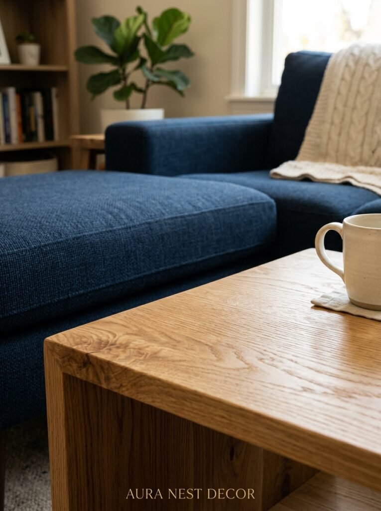
Warm, medium-toned wood. Think walnut, warm oak, American cherry. That’s your friend.
The slightly orange warmth in those tones softens the navy and keeps the room from feeling like a study or a corporate waiting area. Coffee table in walnut, bookshelves in warm oak — it creates this really nice contrast that feels both cozy and considered.
Light Scandi-style birch or ash wood can work, but it takes more care. The room needs warmth from elsewhere — chunky knit throws, amber lighting, warm-toned art — to stop it feeling a bit stark.
Dark wood is the one I’d steer away from. Mahogany or very dark espresso with navy makes everything feel heavy. Formal in a slightly oppressive way. Unless you’re going for a very specific Victorian-library aesthetic, in which case, lean into it completely.
—
7. Small Living Room? Here’s the Rule That Actually Changes Everything

Don’t go light to compensate.
I know every design rule says small rooms need pale colors, light furniture, mirrors to “open up the space.” And yes, those things help. But a navy sofa in a small room doesn’t have to make it smaller. What it does is make the sofa disappear against itself in this interesting way — the eye doesn’t keep tripping over the biggest piece of furniture when it’s dark and settled.
The trick is keeping everything AROUND it lighter. Light walls. Light rug. Sheer curtains if you can manage it. Let the navy be the one dark anchor and give everything else air and space.
“A navy sofa in a small room isn’t the problem. It’s everything you put next to it that decides whether the room breathes.”
Legs on the sofa help too, by the way — if you’re buying and haven’t committed yet. A sofa with visible legs rather than a floor-grazing base lets light pass underneath and makes the whole thing feel less like it’s planted in the floor.
—
8. The Plant That Belongs in a Navy Sofa Living Room

Not every plant works with every room, honestly. And this is one of those cases where the pairing matters more than people think.
Large-leafed plants are the move here. Fiddle leaf fig, monstera, bird of paradise. The structural drama of big tropical leaves against the deep blue is something else — it photographs beautifully and it reads well in person. There’s a contrast between the organic green and the cool navy that just feels right.
Side note — if you’re in the UK and struggling with light for a fiddle leaf, a cast iron plant or a large snake plant gives you similar architectural shapes without needing a south-facing window.
White-flowering plants in simple ceramic pots add this tiny pop of freshness that navy desperately needs in some rooms. Orchids, in particular. Sounds fussy. Isn’t.
—
9. Lighting for a Navy Sofa Room That Isn’t Just “Add a Floor Lamp”
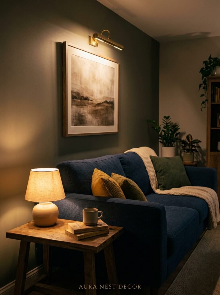
Overhead lighting is working against you in a navy sofa room. That flat, top-down light flattens the sofa’s color and makes the whole room feel dull.
What you want is layered, warm light at different heights. A table lamp on each side of the sofa. A floor lamp in the corner throwing light upward. Candles on the coffee table — I know it’s a fire hazard conversation but honestly the flicker is doing a LOT of work in the evenings.
Amber or warm-white bulbs only. Edison-style visible filament bulbs are great if you can get them in a shape that fits your lamp. The amber glow they throw at 7pm against a navy sofa in a cream room is genuinely the aesthetic people are chasing on Pinterest and it’s not that hard to achieve.
If your main light source is a central ceiling fixture, get a lamp dimmer. Even just dimming it down and relying more on table lamps changes the whole room.
—
10. Art That Belongs on the Wall Behind a Navy Sofa

Landscape prints with sky and water elements. Obviously — navy calls to them.
But also: abstract prints with warm tones (oranges, ochres, terracotta), because the contrast with the sofa does the same thing as those rust cushions. Warm against cool. It creates depth.
Big single piece works better than a gallery wall in most navy sofa situations, I think. Gallery walls are lovely but they can make a navy sofa room feel busy and a bit breathless. One large print or painting with breathing room around it feels more confident.
Black and white photography is clean and graphic against navy. Simple and really effective if you like a quieter, more minimal look.
What I’d skip: blue art above a navy sofa. Too much of one thing in the same area. Let the wall art and the sofa be different from each other.
—
11. The Texture Trick That Makes Navy Velvet vs. Navy Linen Feel Like Different Rooms
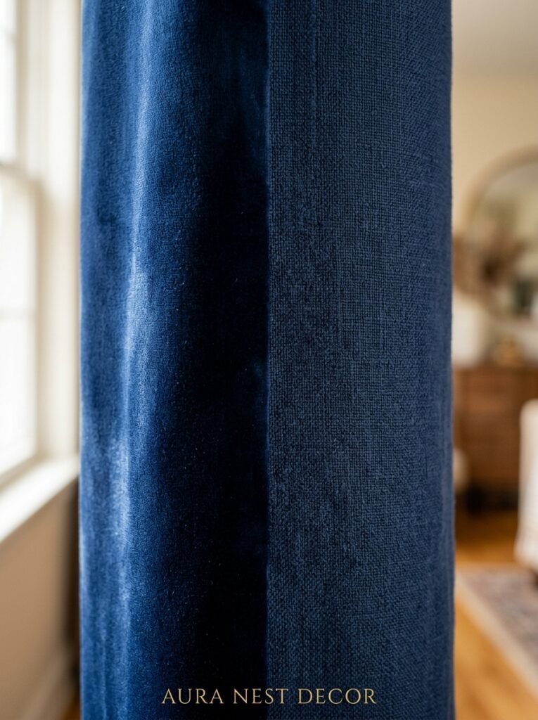
Because they genuinely are different rooms.
Navy velvet is rich, a little formal, very evening. It photographs in this lush, deep way — the pile catches the light and gives you that color shift from near-navy to almost-black depending on the angle. It’s the sofa for the room where you want people to feel like they’ve walked into somewhere special.
Navy linen is the opposite energy. Casual, breathable, everyday. A little bit beach house even in a landlocked suburb. It doesn’t hold on to dust as visibly as you’d think and it softens naturally over time in a way that looks good rather than worn.
There’s also navy boucle, which is having A moment and honestly deserves it — the texture is extraordinary in person, and the slight variation in the weave stops the color from feeling flat.
Choose based on how you actually live. Velvet and a dog that sheds? Linen and boucle exist for a reason.
—
12. The Full Room Look That’s Everywhere on UK Pinterest Right Now
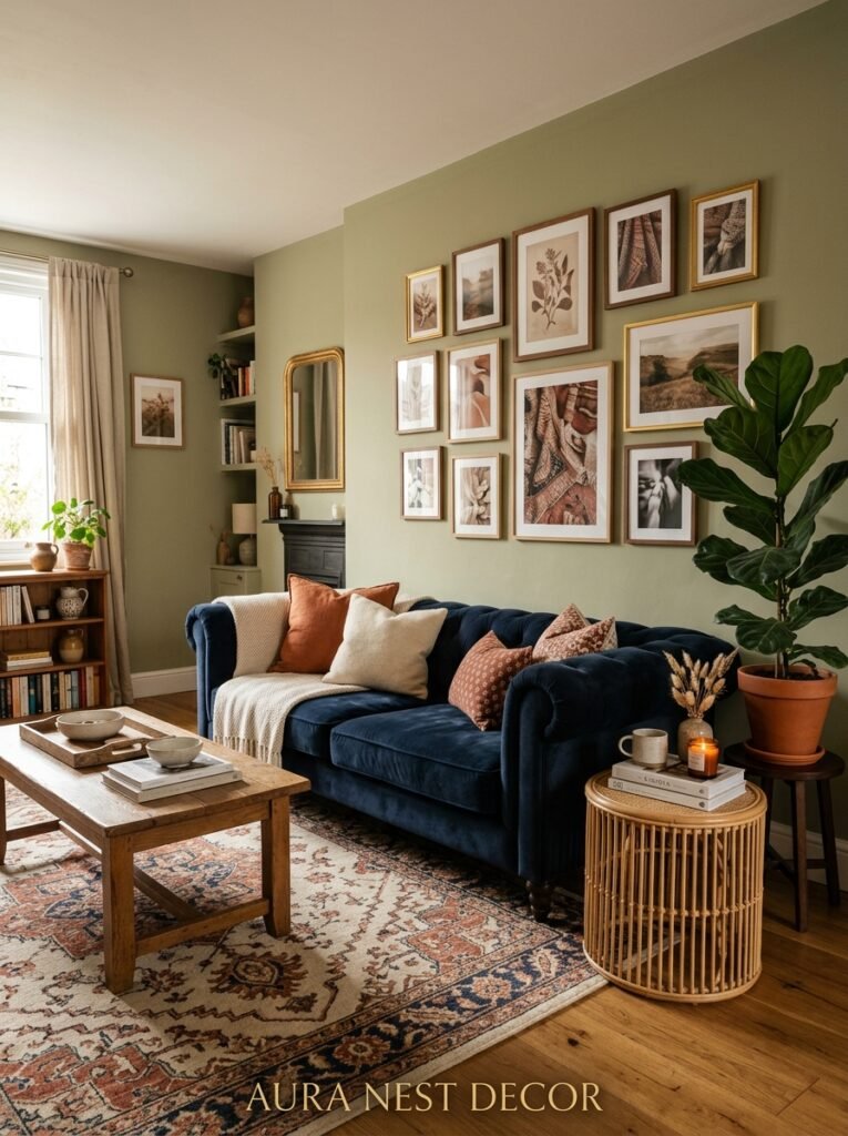
Cream walls. Warm oak floor. Navy velvet sofa. A patterned vintage-style rug in deep reds and gold. Brass floor lamp. Lots of books — on shelves, in stacks. A large fiddle leaf in the corner. Linen curtains in a slightly creamy off-white. And at least one chunky knit throw draped over the arm of the sofa looking like it happened naturally, even though someone 100% positioned it.
This room exists everywhere right now and there’s a reason. It’s the answer to years of grey and white minimalism. It feels warm, it feels layered, it feels like something.
You don’t have to copy it exactly. But if you’re building a navy sofa room from scratch and you have no idea where to start, start there. Swap in what you already own. Adjust for your light. Add whatever makes it yours.
The navy holds it all together regardless.
—
❓ FAQ
Q: Will a navy sofa make my living room look dark and gloomy? A: Not if the rest of the room is working properly. Light walls, warm lighting, and the right rug make all the difference. Navy absorbs light rather than reflecting it, which is why the things around it matter so much — keep them light and airy and the sofa becomes a rich anchor rather than a black hole.
Q: What colors should you NOT put with a navy sofa? A: Cool grey is the big one — it flattens everything and makes the room feel a bit lifeless and corporate. Very dark brown wood is tough too. And honestly, navy-on-navy in the same area (like navy art above a navy sofa) tends to just swallow itself. You want contrast somewhere near the sofa to help the eye read depth and detail.
Q: Is a navy sofa a good idea if I have young kids or pets? A: Better than a light sofa, actually. Navy hides a lot. Dark stains, dirt, general chaos — a navy linen or a tightly woven navy fabric is surprisingly forgiving. Velvet is slightly harder to maintain with pets because of the pile, but even that spot-cleans well. It’s one of the practical arguments for going dark that nobody talks about enough.
—
💭 Final Thoughts

A navy sofa isn’t a commitment to a certain style. It’s more like a decision to build from something solid — something that won’t date, won’t fight with whatever you put next to it, and won’t look tired in three years when trends have moved on. The rooms that get it right aren’t the ones with the most money spent. They’re the ones where someone took the navy seriously and built around it with intention.
What’s one thing in your current living room that a navy sofa would immediately make look better?




