
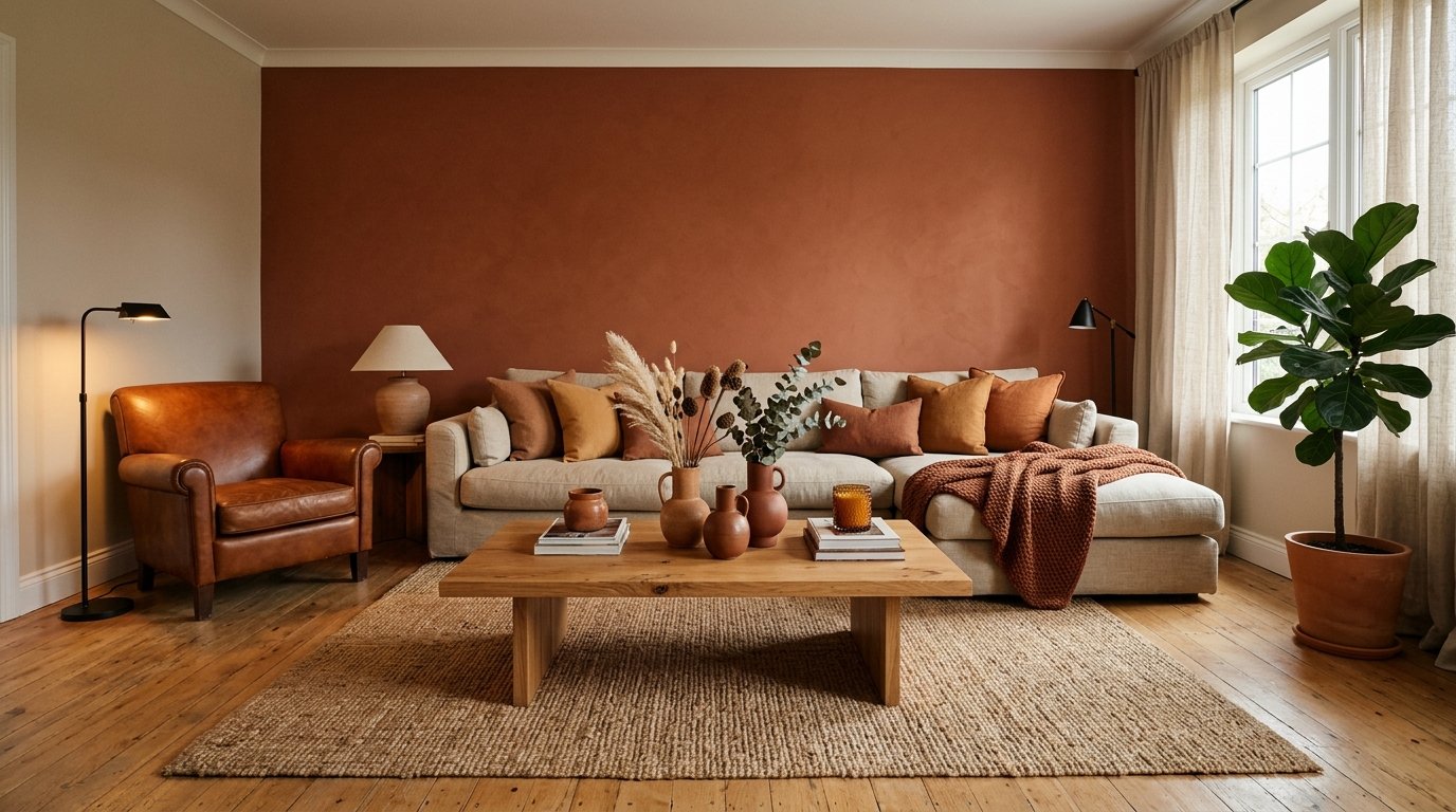
The Color Your Living Room Has Been Waiting For (And Why You’ve Been Scared to Use It)
My friend texted me a photo of her living room last month. White walls, beige sofa, light gray rug. And her message just said: “why does this feel so sad?”
It wasn’t sad because of bad furniture. It was sad because it had no color in it. None. And she’s not alone — honestly, I think half the living rooms in both the US and the UK right now are having the exact same quiet crisis.
—
1. The “Safe” Color Trap and How Millions of Us Fell Into It
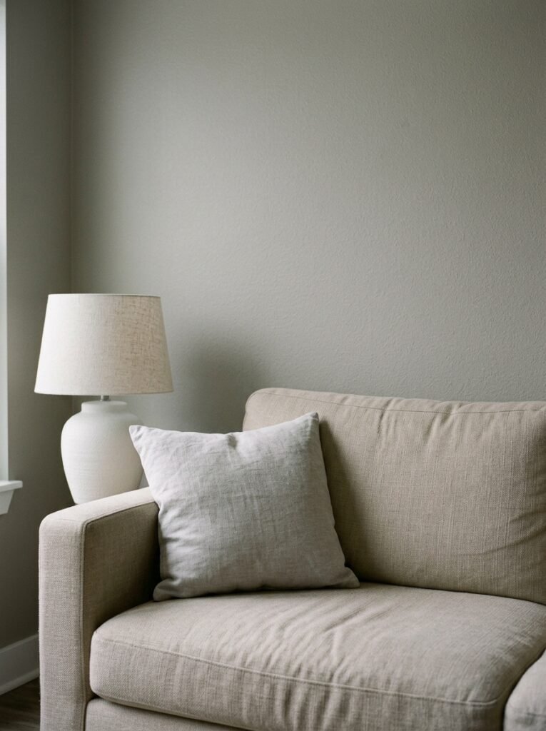
It started with the minimalism wave. Then the Scandinavian aesthetic took over. Then we all got very obsessed with being “timeless,” which somehow translated into being beige. Greige. Off-white. Linen. Cloud. “Warm white.” These are all just different ways of saying we’re afraid.
And I get it. Color feels like a commitment. If you paint a wall green and hate it, that’s a whole weekend you’re not getting back. But here’s what nobody tells you — neutrals are just as permanent a choice, they just feel safer because everyone else is doing it. A wall covered in “Swiss Coffee” can be just as wrong for a space as a wall covered in the wrong shade of teal.
The problem isn’t that neutrals are bad. Some rooms genuinely need them. But when you’re choosing beige because you’re scared of everything else, the room knows. Rooms absorb timidity. They reflect it back at you every single evening when you sit down on that sofa and feel absolutely nothing.
“Rooms absorb timidity. They reflect it back at you every single evening when you sit down and feel absolutely nothing.”
—
2. The Color That Keeps Showing Up in Every Beautiful Living Room Right Now
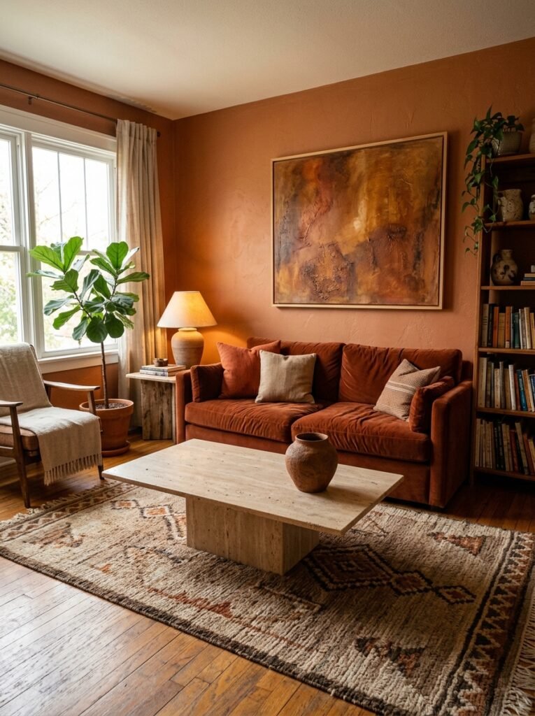
Okay so here’s what I’ve been noticing. Across every mood board, every saved pin, every “living room inspo” post I’ve seen over the past year or so — there’s a color that just keeps appearing. Not always front and center. Sometimes it’s a wall. Sometimes it’s showing up in a velvet sofa. Sometimes it’s just the curtains and suddenly the whole room makes sense.
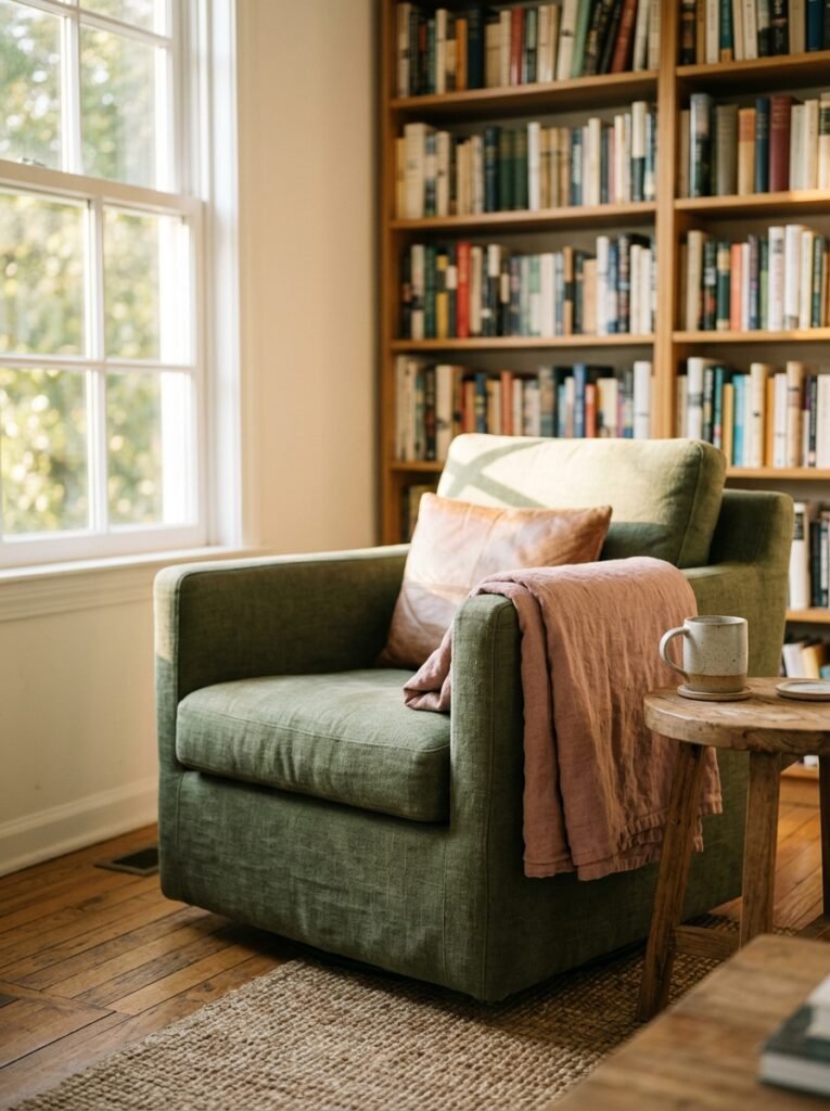
That color? A deep, dusty, slightly-grayed green. Something between sage and forest. Not quite olive, not quite moss. The kind of green that looks like it’s been in a very old library for a hundred years and it’s completely fine with that.
It works in Brooklyn apartments with exposed brick. It works in Cotswolds cottages with low ceilings. It works in modern semis in Manchester and Victorian terraces in South London. I don’t fully understand why it’s this universally flattering but it genuinely is.
The reason, I think, is that this particular green sits right at the intersection of nature and sophistication. It doesn’t scream. It doesn’t try. It just makes everything around it look considered and intentional, including the stuff that isn’t.
—
3. But Don’t Stop There — the Unexpected Partner Colors That Change Everything
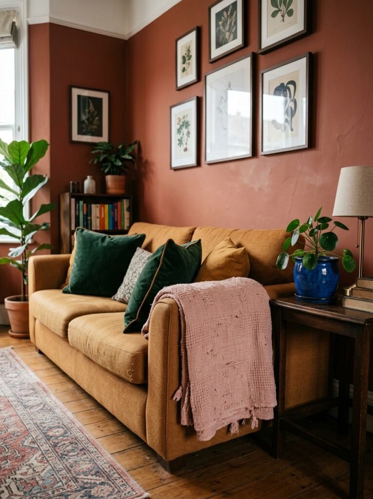
This is where most people stop. They pick the green, paint the wall, and then put all their existing furniture back in front of it and wonder why it still doesn’t feel right.
Color doesn’t work alone. It needs a conversation partner.
For that deep dusty green? The combination that’s making me a little obsessed right now is warm terracotta alongside it. Not orange-orange. The burnished, slightly muted, almost-clay kind of terracotta. Add a lamp in that color, or a few ceramics, and suddenly the green looks intentional rather than random. They do something to each other that neither color does on its own.
Brass is the other piece. Warm metal finishes — the slightly aged, not too shiny kind — with this green is a combination that’s been around for decades and it refuses to feel dated. There’s a reason for that. It just works at a chemical level somehow, or maybe a psychological one. Either way, I’m not questioning it.
—
4. The One Color Rule That Makes Any Living Room Feel Designed on Purpose
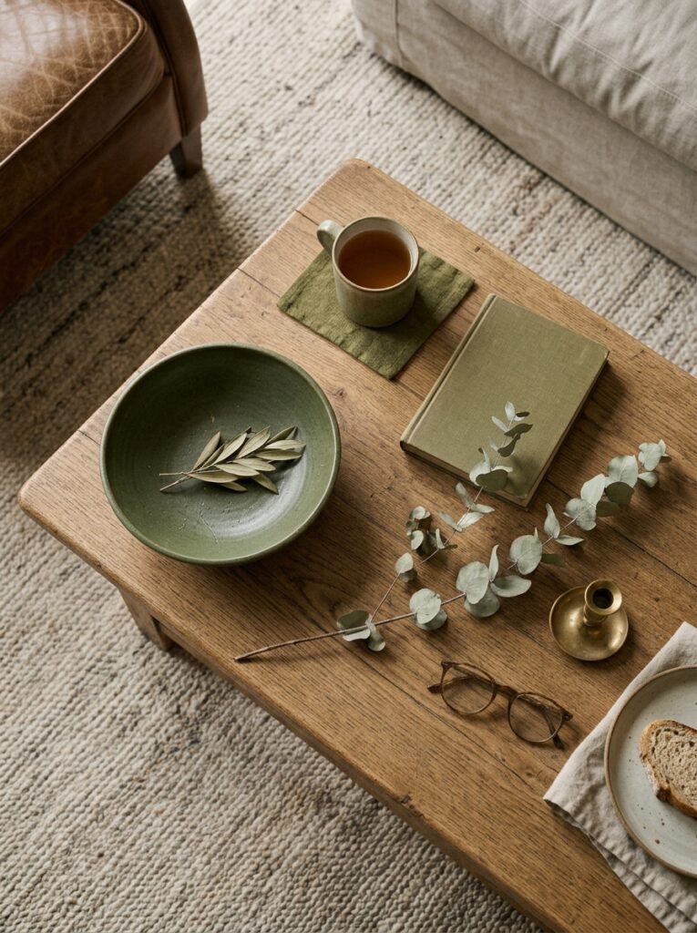
Here’s the thing I wish someone had told me years ago. You don’t need more colors — you need one color repeated at least three times in different forms.
Pick your color. Maybe it’s that green. Maybe it’s a warm, dusty blue — the kind that looks almost gray in low light but goes undeniably blue when the afternoon sun hits it. Maybe it’s a deep, reddish burgundy that you’ve always loved but never been brave enough to try. Doesn’t matter. Pick one.
Then put it in three places that aren’t all next to each other. A wall on one side of the room. A throw or cushion on the opposite sofa. A vase or a print near the window. Now your eye has something to travel between. The room feels like it was thought about. Like someone made a decision. That feeling? That’s what people mean when they say a room “looks designed.”
It’s not complicated. It’s almost too simple. But the repetition is the whole thing — without it, a single colored item just looks like an accident.
—
5. Why Dark Colors in Small Living Rooms Are Misunderstood (Completely)
I will die on this hill.
Everyone in every home magazine, every paint company website, every well-meaning mother-in-law has told you the same thing: small rooms need light colors to feel bigger. And that’s true. That is technically, factually correct.
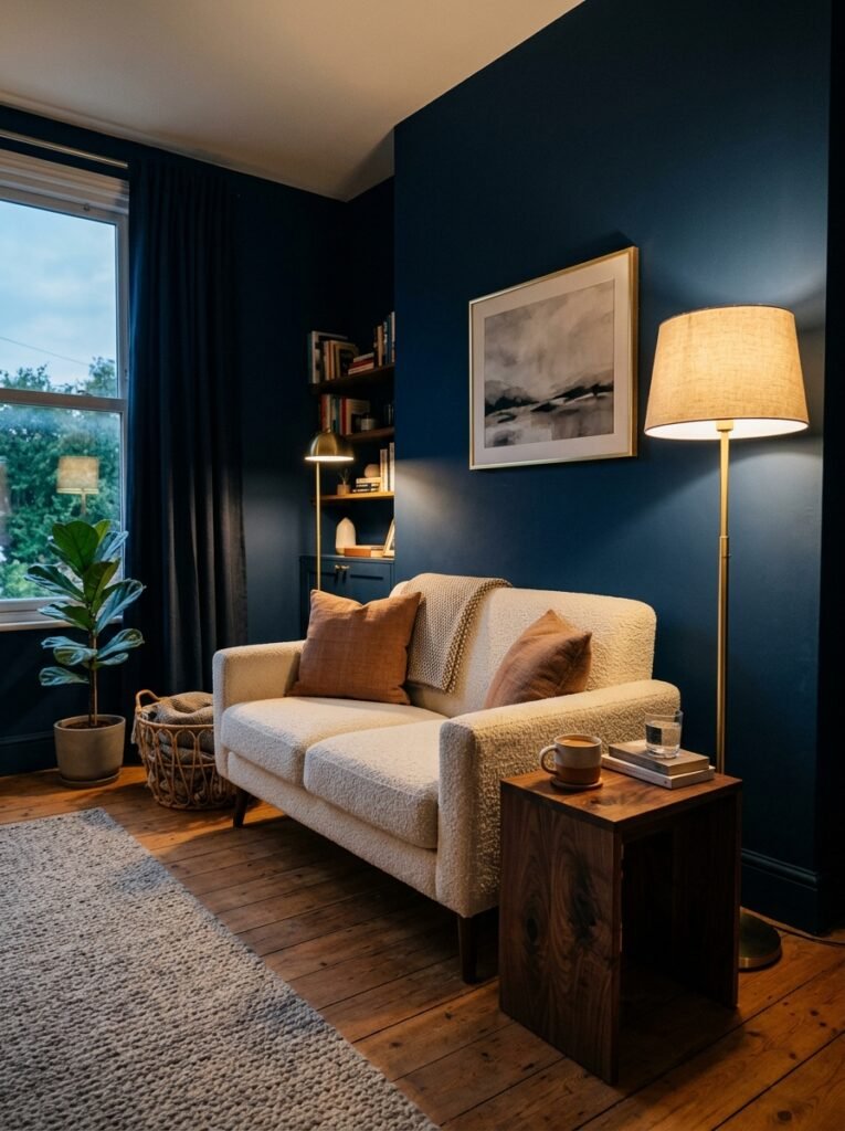
But here’s what they don’t mention. A small room that feels bigger can still feel like a waiting room at the dentist’s office. Size isn’t everything. Sometimes a small room painted in a deep, confident color doesn’t feel small — it feels COZY. Intentional. Like a place you’d actually want to stay.
There’s a difference between a room that reads as “cramped” and a room that reads as “intimate.” Dark paint creates intimacy. The amber glow of an Edison bulb at 7pm against a dark navy or charcoal wall, with good curtains pooling slightly on the floor — that’s not a room that looks small. That’s a room that looks like it belongs in a novel.
“There’s a difference between a room that reads as cramped and a room that reads as intimate. Dark paint creates intimacy.”
So if you have a small living room and you’ve been told you HAVE to go light — you don’t. You have options. Just choose a dark color with warmth in it, not a cold one, and keep the ceiling lighter than the walls.
—
6. The Color Combination Almost Nobody Tries (But Should)
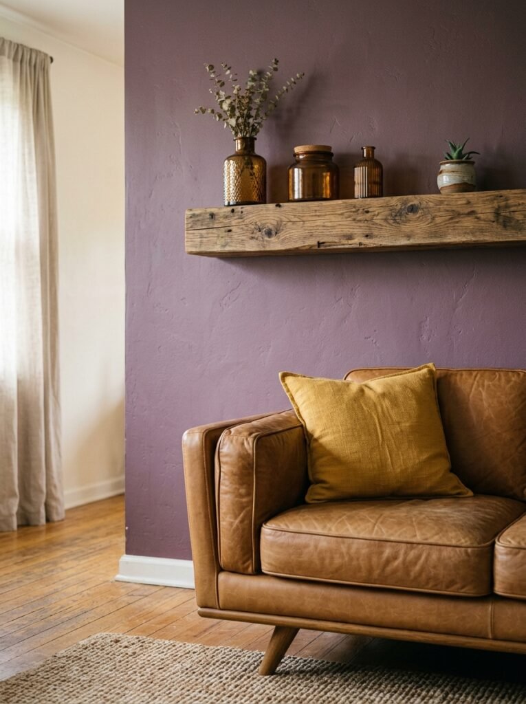
Dusty pink and warm chocolate brown. I know. Stay with me.
Not baby pink. Not millennial pink. Dusty, slightly grown-up, almost vintage pink — the shade you’d find in an old botanical illustration. Paired with a deep warm brown that verges on dark caramel. Together they’re grounded and soft at the same time.
This combination reads completely differently depending on what else you put in the room. Keep the textiles simple and it feels calm and sophisticated, maybe a little Mediterranean. Add some patterned cushions and a worn-looking rug and it feels cozy and collected, like the room of someone who’s traveled a lot and kept things from different places. Add plants — and I mean actually add plants, not one small pothos on a shelf — and it goes somewhere almost tropical but still warm.
It’s a more personal choice than the green. But that’s what makes it interesting.
—
7. How Undertones Are Quietly Ruining Your Color Choices
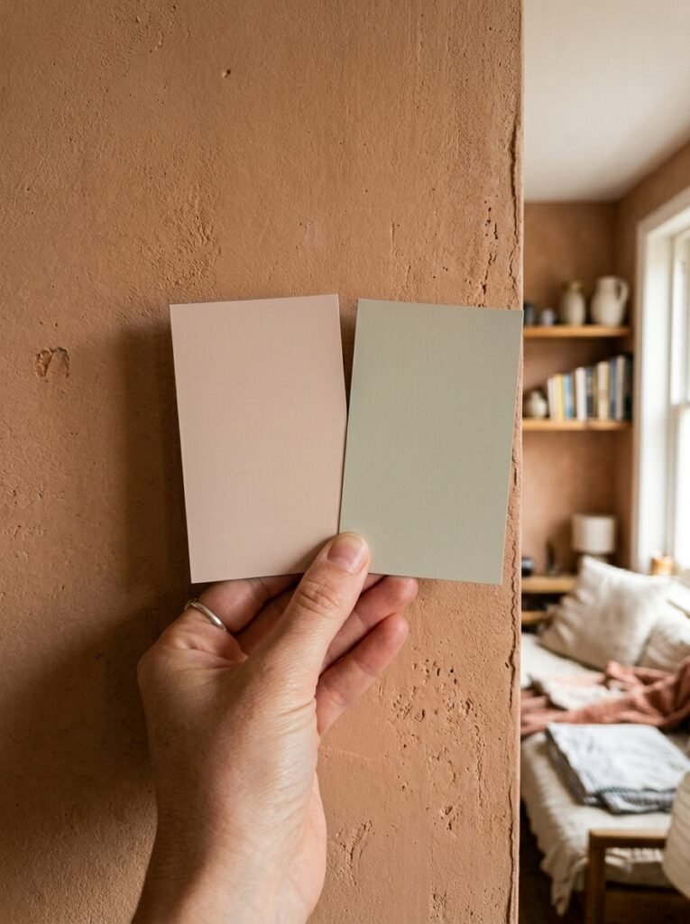
This one’s a bit nerdy but it matters SO much.
Every paint color has an undertone — a subtle secondary color hiding inside it. That warm white you love on the swatch? It might have a yellow undertone that looks beautiful in daylight and turns slightly sickly under your warm LED bulbs at night. That blue you’re considering might have a green undertone that clashes with your existing flooring in a way you can’t quite put your finger on.
The rule I use: hold the paint swatch against something that’s already in the room and won’t change. The floor, usually, or a sofa you’re not replacing. Watch how the undertones interact. Do they fight? Do they pull in opposite directions and make both look slightly off? If yes — that’s your answer. Different color.
And test the swatch at different times of day. Morning light and evening light are completely different conditions. A color that looks perfect at noon can look completely wrong by 9pm and vice versa. This sounds tedious but it will genuinely save you a lot of paint and a lot of weekends.
—
8. The Forgotten Color That Makes Every Other Color in the Room Look Better
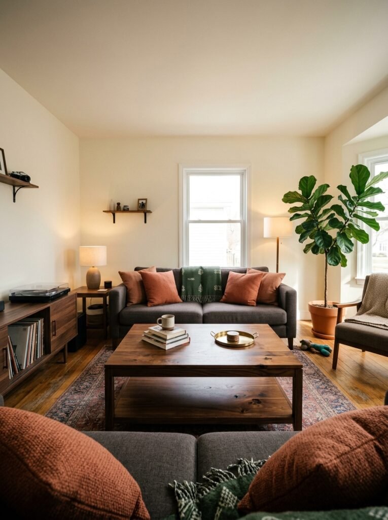
Warm white. Not cool white. Not bright white. Not stark gallery white. WARM white.
I know I spent the first section complaining about playing it safe. But there’s a difference between using warm white as your primary color because you’re scared of commitment and using warm white as a supporting player that lets everything else breathe.
Warm white on a ceiling in a room with colored walls doesn’t feel safe — it feels right. Warm white woodwork against a dark, dramatic wall color is the combination that makes the whole thing feel finished rather than overwhelming. It’s the editing choice. The quiet decision that makes the bold one land properly.
Think of warm white the way you’d think of good lighting — you don’t really notice it when it’s right, but you definitely notice when it’s wrong.
—
9. What Pinterest’s Most-Saved Living Rooms All Have in Common
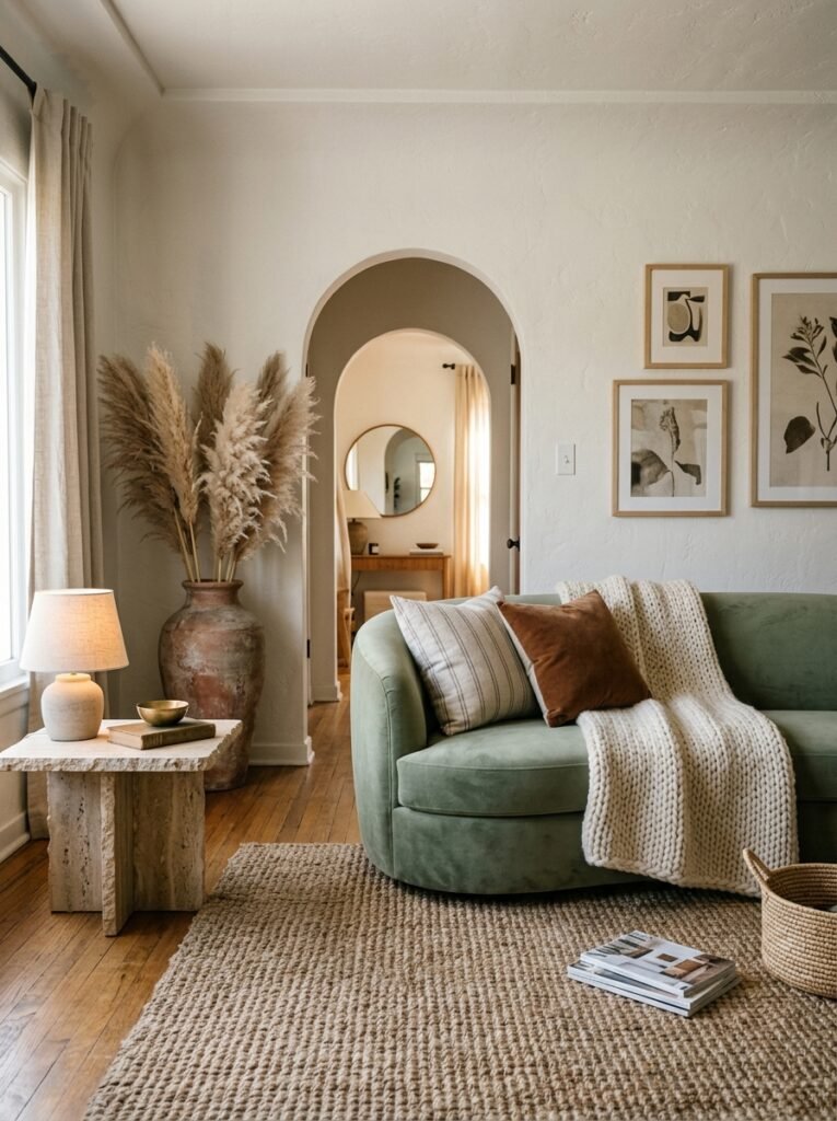
I’ve looked at a probably unreasonable number of pinned living rooms over the past few years, and the ones that get saved over and over — the ones that stop the scroll — aren’t the ones with the most expensive furniture.
They have texture. Multiple types of it, all in the same frame. A chunky knit throw next to a smooth leather cushion. A rough linen curtain against a polished wall. A woven jute rug under a velvet sofa. The color might be interesting or it might be neutral, but the texture is always there, always doing work.
They have ONE weird thing. One choice that doesn’t make obvious sense — a vintage wooden crate used as a side table, a single antique mirror in an otherwise very modern room, one plant that’s almost TOO big for the corner. This is the thing that makes a room feel lived-in and personal rather than styled to within an inch of its life.
And they have LIGHT. Not overhead lighting working alone. A floor lamp in the corner, a table lamp at a lower height, maybe candles on the coffee table in the evening. Layers of light at different heights. This is free to do if you already have the lamps — it’s just a matter of turning the overhead off and seeing what the room becomes.
“The most-saved rooms on Pinterest aren’t the most expensive ones. They’re the ones with texture, one weird choice, and layered light.”
—
10. The Colors Interior Designers Keep Pushing That I’m Actually Skeptical Of
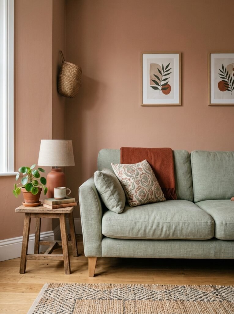
This might get me in trouble. But.
Greige — that gray-beige hybrid — has been heavily pushed as the “perfect neutral” for about a decade now. And it works beautifully in some rooms. But I’ve seen it go very, very wrong when the room doesn’t have enough natural light. In low-light conditions, greige can go muddy and slightly depressing in a way that’s hard to identify if you’ve been looking at it slowly over time. Step away from a greige room for two weeks and come back. Sometimes you’ll see it fresh and think: this is fine. Sometimes you’ll immediately go order paint samples.
Millennial pink had its moment and it’s not fully gone but it’s — fading, let’s say. If you love it, genuinely, that’s a separate thing. Personal love for a color is always worth something. But if you’re picking it because it felt safe and current, it might not feel either of those things in eighteen months.
—
11. The Small Color Details That Do More Than You’d Think
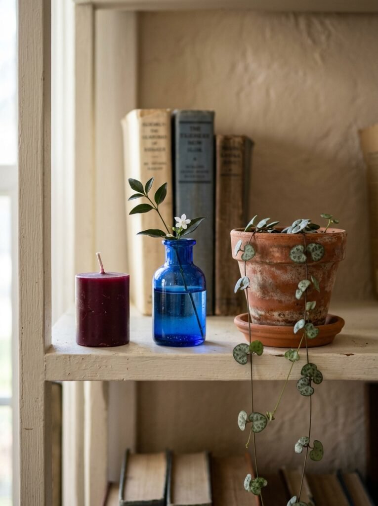
The insides of bookshelves. Seriously. Painting just the back panel of a bookcase in a color — deep green, deep blue, a dusty rose — while keeping the outside neutral is one of those small choices that makes a room feel like it was done by someone who knows things.
The color of a lampshade. A cream or off-white shade throws warm, diffused light that works with almost any wall color. A darker shade creates a more dramatic, directional glow. These are free or very cheap to change and yet most people never think about it.
Door frames and architrave. In the UK especially, painting these in a slightly different finish or tone from the walls — not contrasting dramatically but just slightly richer, slightly more saturated — is something that reads as polished and deliberate without being obvious.
Little things. They compound.
—
12. What “Your Color” Actually Means and How to Find It
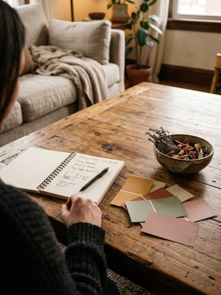
I’ve given you a lot of options and directions and opinions. But the most useful thing I can say is this: your living room’s right color is the one you’re drawn to before you start worrying about whether it’s a good idea.
Pull your Pinterest boards up and look at what colors you’ve actually saved — not what you think you should save, not what looks impressive. The colors you keep coming back to, the rooms that make you exhale a little when you look at them. That’s data. That’s yours.
Color choice in a home isn’t a test you can fail. There’s no wrong answer that can’t be painted over. And a room that takes a risk and doesn’t quite nail it is still infinitely more interesting than a room that plays it completely safe and succeeds perfectly.
Pick something you actually love. Try it on one wall first, if that helps. Live with it for a week. And then decide.
—
❓ FAQ
Q: How do I know if a bold wall color will work with my existing furniture? A: Look at the undertones first. Hold a large paint swatch against your sofa or rug in the actual room, at multiple times of day, and watch how they interact. If the colors seem to fight each other or both look slightly off, the undertones are clashing. If they settle comfortably next to each other, you’re probably fine. A large peel-and-stick paint sample is even better for testing than a small swatch.
Q: Is it okay to use dark colors in a living room that doesn’t get much natural light? A: It genuinely depends on the feeling you want. If you want the room to feel larger and brighter, dark colors will work against you. But if you’re okay with — or actively want — a cozy, intimate atmosphere, dark colors with warm undertones (think deep green, warm navy, dark terracotta) can actually look better in low-light rooms than cold neutrals, which tend to go flat and slightly gray without sunlight to activate them.
Q: How many colors should I actually use in one living room? A: Most well-designed rooms work with three to four colors total — a dominant color for the walls or large surfaces, a secondary color for major furniture or textiles, an accent color that appears in smaller quantities throughout, and a neutral (usually warm white or natural wood tones) that ties it together. Going beyond four tends to get busy unless you really know what you’re doing with it.
—
💭 Final Thoughts
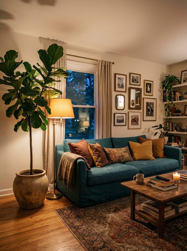
Color is one of the cheapest things you can change in a room and one of the most impactful. It’s almost unfair how much difference it makes. And yet so many of us live for years in rooms that feel a little flat, a little uncommitted, a little like we haven’t quite moved in yet.
You deserve a living room that feels like something when you walk into it. Not neutral. Not inoffensive. Something.
So — what’s the color you’ve been too scared to try?