
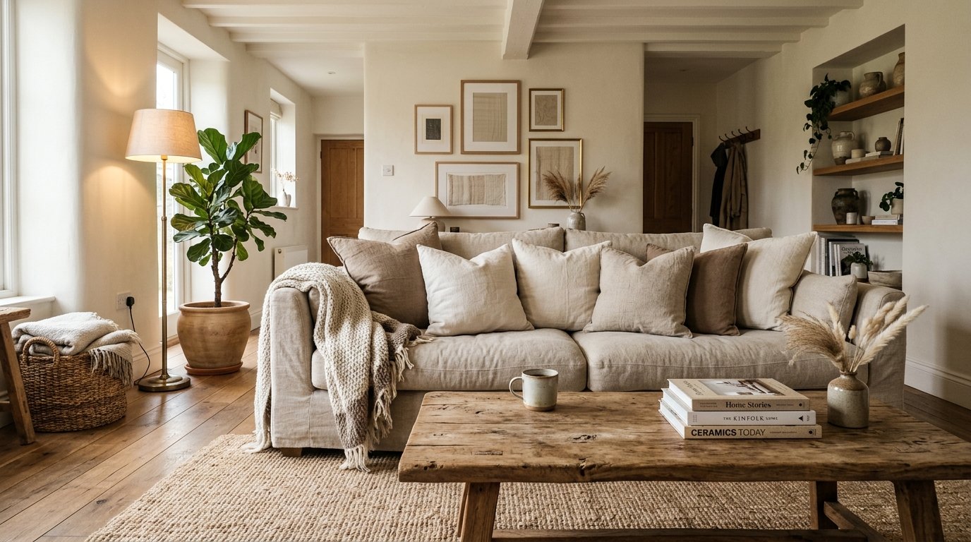
Why Every Living Room I Fall For Right Now Has Almost No Color At All
My neighbor asked me last month why my sitting room felt so calm. She walked in, stopped, and just went “oh.” Couldn’t quite explain it. Neither could I, actually — not right away.
—
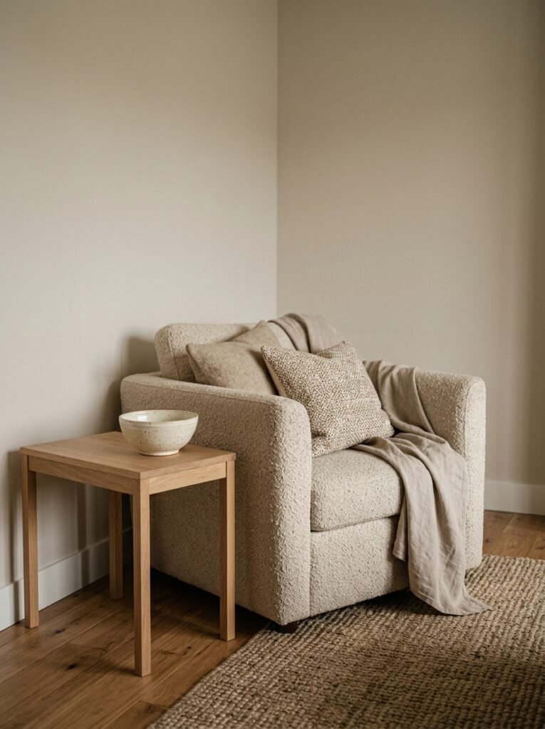
1. The Beige Comeback That Isn’t Really About Beige
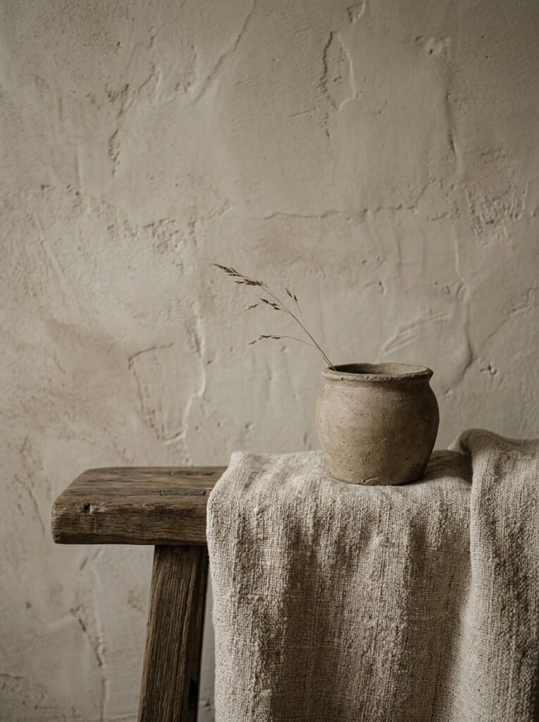
Let’s be clear: neutrals are not beige. Or — okay, sometimes they’re beige. But the neutrals dominating every living room I can’t stop pinning right now aren’t the flat, boring beige of the nineties. They’re warmer. More alive. They shift depending on the light.
There’s a specific shade that shows up over and over in beautiful rooms — it’s somewhere between warm linen and pale clay. In the morning it looks almost white. By evening, under a warm lamp, it turns almost golden. And that’s the thing about neutrals done right. They’re not one color. They’re several colors that happen quietly throughout the day.
I used to think neutral living rooms were a safe choice, the kind of decor people chose when they couldn’t commit to a vision. I was so wrong about that. Pulling off a neutral space takes more restraint, more texture, more intentionality than slapping a jewel-toned accent wall in a room ever would. Anyone can make bold color look interesting. Making nothing look like something? That takes actual skill.
—
2. The Texture Rule That Makes Neutral Rooms Feel Rich Instead of Empty
Here’s the thing nobody tells you when you start pulling a neutral room together: without texture, you’ve just got an empty beige box. And that is genuinely awful.
Texture is the secret. It’s doing all the heavy lifting that color would normally do.
“In a neutral room, texture isn’t decorative — it’s structural. Take it away and the whole thing collapses.”
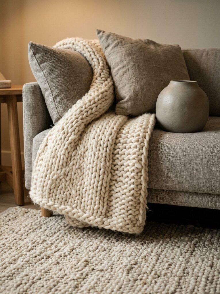
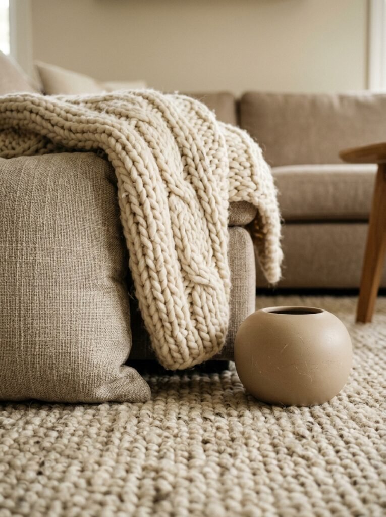
A chunky woven throw on the arm of a linen sofa. A rough-edged wooden coffee table next to a smooth plaster wall. A nubby bouclé pillow next to a silky cushion cover. These contrasts are what your eye actually lands on when you walk into a room that makes you exhale. You’re not consciously thinking “oh, what a lovely mix of tactile surfaces.” You’re just feeling it. That quiet richness.
The mistake I see a lot — and I’ve made it myself — is picking neutral things that are all the same texture. Smooth walls, smooth cushions, smooth table. Everything has the same visual weight. It reads as flat. Almost clinical. And not in a cool, minimal way. In a dentist’s waiting room kind of way.
So if you’re starting over or refreshing what you’ve got: add something rough, something soft, something matte, and something that catches light. Not all at once in a panicked pile. Thoughtfully. One or two pieces at a time until you feel it shift.
—
3. The Color That Keeps Showing Up in Every Beautiful Neutral Room Right Now
Warm white and linen are the backbone. But there’s a third shade I can’t escape right now, and I think it’s the reason so many neutral rooms feel unexpectedly sophisticated rather than just… plain.
It’s a muted, dusty sage. Almost grey-green. Barely there.
It shows up as a single throw pillow. A slightly olive-toned linen curtain. Sometimes a single ceramic vase, squat and artisan-looking, sitting on a wooden shelf. And because it’s so desaturated — so far from what you’d call an actual green — it reads almost as a neutral itself. But it adds something. Depth. The tiniest hint of nature.
The British interiors I’m obsessed with right now do this particularly well. There’s a restraint to it. One muted color note, placed once or twice, then left alone. No matching accessories. No coordinated cushion set. Just one quiet moment of color that makes everything around it feel more intentional by contrast.
—
4. Why Your Sofa’s Fabric Matters More Than Its Shape
I’ve changed my mind on this completely and I’d argue about it with anyone.
Everyone obsesses over sofa silhouette — curved back, track arm, English roll arm, mid-century legs. And yes, shape matters. But I’m convinced the fabric is doing at least sixty percent of the work in a neutral living room.
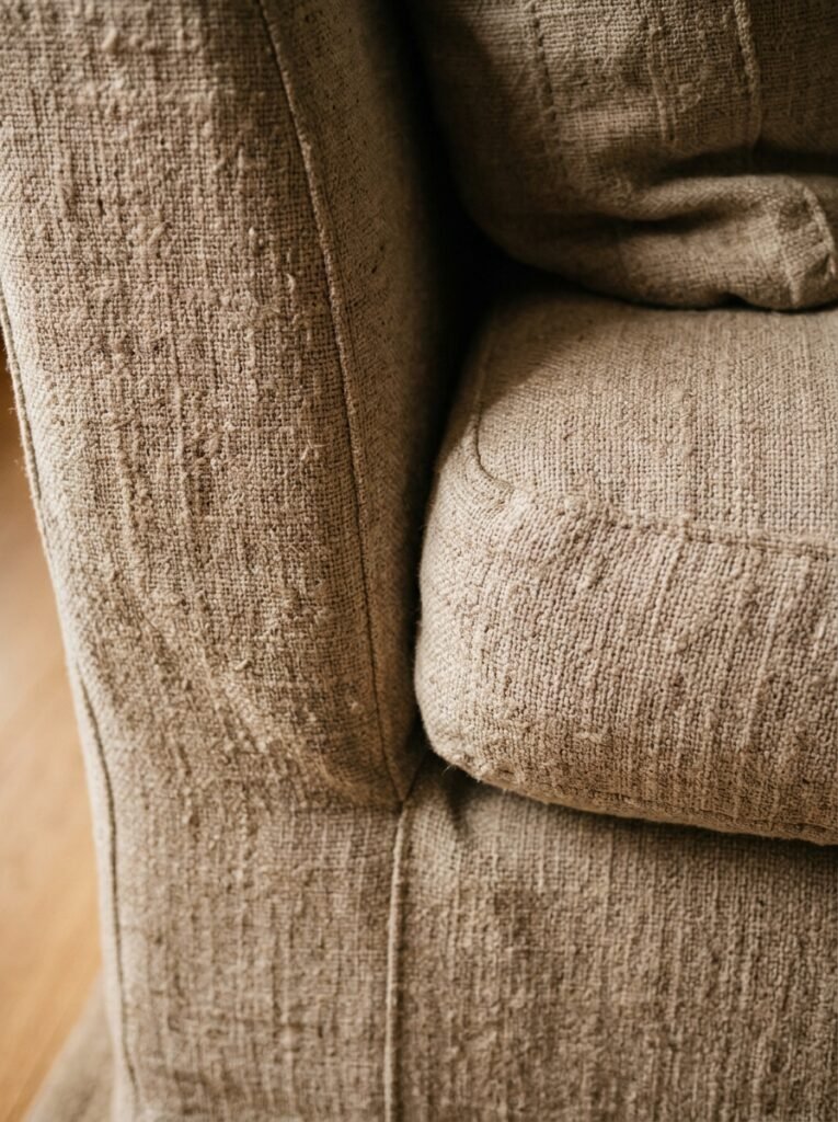
A linen sofa is warm and lived-in from day one. It creases in a way that looks curated rather than messy. A boucle sofa brings all that texture conversation we just had. Velvet in a soft warm grey? Honestly luxurious in a way that photographs don’t quite capture — you have to sit in front of it at 6pm when the light’s going golden to understand.
What doesn’t work: most polyester-heavy blends, no matter how beautifully they’re marketed. They look great in a showroom under controlled lighting. In a real room, on a real afternoon, they flatten and reflect light in a way that just looks cheap. Not worth it. Save longer if you have to.
—
5. The Lamp Situation That Changes a Neutral Room Completely
Nobody’s talking about this enough. Or maybe I’m just saying it too often to the wrong people. Either way.
Overhead lighting is a neutral room’s worst enemy.
Under overhead light, your beautiful warm linen walls look flat and institutional. That carefully chosen warm plaster paint shade you agonized over looks grey. Everything loses its depth. And the layered textures you worked so hard on? Gone. Just a washed-out, evenly lit room that could be anyone’s room.
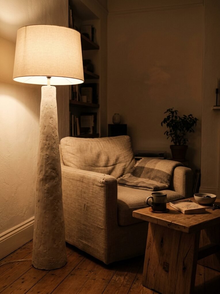
“Turn off the overhead light. Add a floor lamp in the corner, a table lamp at sitting-eye level, and a small warm lamp on the farthest surface. Then look at your room. THAT’S the room.”
It’s the amber glow of an incandescent-style bulb at 7pm that does something almost inexplicable to a neutral space. Suddenly the shadows between textures appear. The linen sofa goes warm. The white plaster wall shows its actual tone. The whole room becomes dimensional.
Three lamps of different heights, all warm-toned bulbs, no overhead. That’s it. That’s the entire lamp strategy. I promise you it works.
—
6. Curtains That Are Doing Surprisingly Heavy Lifting
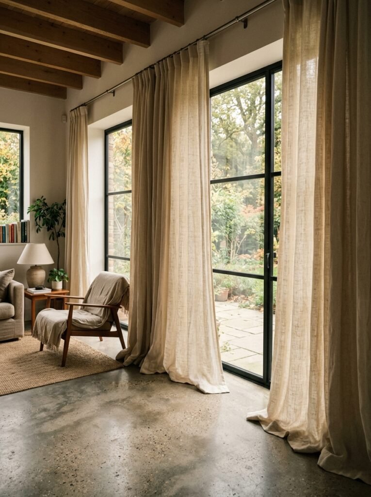
My curtains are floor-length, linen, and the same shade as the wall behind them. People ask about them constantly.
The reason they work — the reason they make the room feel taller, softer, more curated — is because they don’t stop the eye. When curtains blend into the wall color rather than contrasting against it, the room reads as one flowing surface instead of a series of visual breaks. It’s a very old decorating trick. It works every single time.
Hang them high. Like, higher than you think. As close to the ceiling as possible, even if the actual window is much lower. The curtain rod sits up high, the fabric falls from there, and suddenly you have genuinely high ceilings whether the ceiling is actually high or not.
Heavy, lined curtains are worth every extra penny, by the way. They hang differently. They pool properly. Thin unlined panels always look a little bit like they’re trying.
—
7. The One Rule That Makes a Small Neutral Living Room Feel Like a Considered Choice
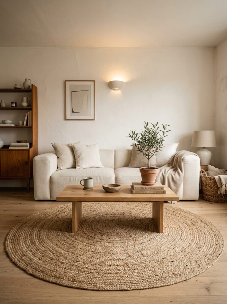
Small rooms are where neutral design either totally redeems itself or falls apart spectacularly.
The rule: everything touching the floor needs to earn its place.
In a small room with a neutral palette, clutter doesn’t just look messy — it looks chaotic, because there’s nothing visually bold to compete with or contain it. A single wooden side table, one rug, four legs of a sofa. That’s your floor story. Keep it clean.
The rug is doing more than you might realize. A woven jute rug or a low-pile wool rug in a warm neutral grounds the whole seating area. It signals: this is deliberate. This is a room, not just furniture placed in a space. And in a small living room especially, that signal matters enormously.
Side note — round coffee tables in small rooms. I know they’re everywhere right now and there’s a good reason. Rounded shapes don’t create visual corners in tight spaces the way rectangular furniture does. The room breathes better. It’s a small thing that makes a genuinely noticeable difference.
—
8. Why Every Good Neutral Room Has at Least One Imperfect Thing in It
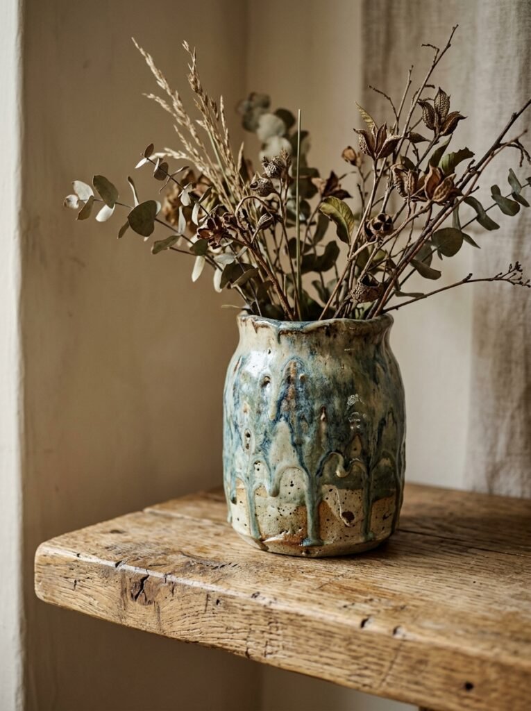
I used to try to make rooms too perfect. Everything curated, nothing random, no visual surprises. And honestly? Those rooms felt staged. Not lived in. Like a hotel lobby but smaller.
The imperfect thing is important. It’s the detail that makes the room feel like a real person lives there.
A slightly irregular ceramic bowl on the coffee table, handmade and just slightly uneven. A vintage wooden frame, slightly different in tone to everything else, propped on a shelf rather than hung formally. Even a single stack of actual books you’ve actually read, not matching spines, not color-coordinated, just honest.
These moments of imperfection don’t undermine the room. They authenticate it. They’re the thing that makes someone walk in and feel comfortable rather than intimidated. You want people to sit down, not stand awkwardly near the door trying not to touch anything.
—
9. The Art Problem Nobody Warned You About
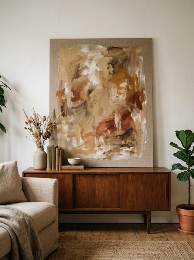
Choosing art for a neutral room is harder than it sounds. Too much color and you’ve accidentally created a focal point you can’t control. Too neutral and it disappears entirely. Either one can throw off the whole careful balance you’ve built.
“The art that works hardest in a neutral room is the kind where you’re not entirely sure what you’re looking at — but you want to keep looking.”
Abstract works, particularly in muted earth tones or soft monochromes, tend to work beautifully. A large-scale piece in chalky charcoal and cream. Something with organic, uneven shapes. Sketchy line drawings. Anything that has texture or visible mark-making — you can feel the hand of the person who made it.
Avoid very commercial-looking prints that are clearly styled “to match” a neutral room. You can always tell. They look like filler. And in a room where everything is already quiet, filler is immediately obvious.
—
10. The Styling Shelf Moment That Pulls the Whole Room Together
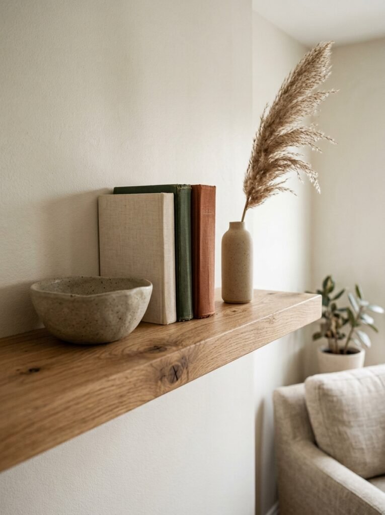
If you’ve got a shelf, a console table, or an alcove anywhere in your living room — this is where the whole neutral story either comes together or unravels.
My approach: odd numbers, varying heights, and at least one thing that looks like it shouldn’t be there.
Three objects: something tall and architectural (a clean vase, a tapered candlestick), something low and organic (a small bowl, a smooth stone, a low stack of books), and something that’s just slightly unexpected — a bit of dried botanicals, a small framed sketch leaning casually. Not hung. Leaning.
Then leave space. Actual empty space. Unoccupied shelf space in a neutral room isn’t emptiness — it’s breathing room. It makes the objects you’ve chosen look chosen rather than accumulated.
—
11. The Specific Kind of Green That Belongs in a Neutral Living Room
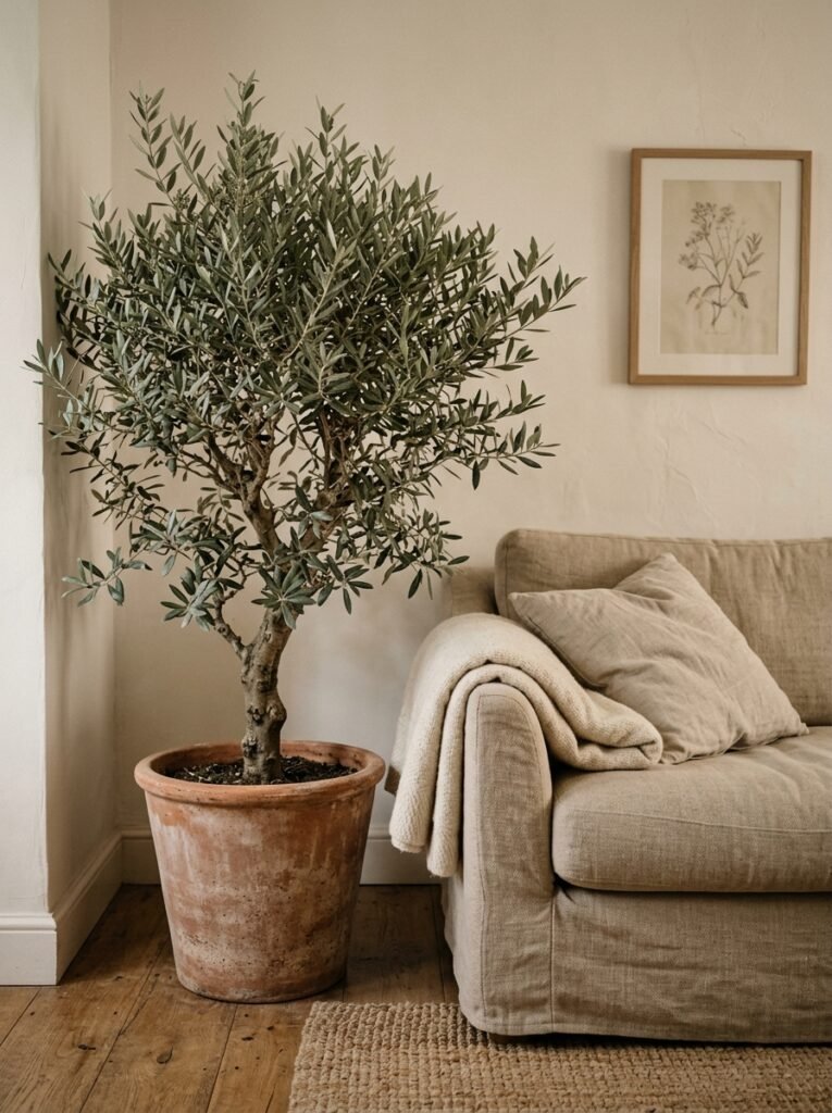
I’m going to make a case for plants here that goes slightly beyond the obvious.
Not all plants read the same way in a neutral room. Big, glossy tropical leaves can feel tropical — which is lovely but might not be the mood you’re going for. Very structured, architectural plants can feel almost clinical. What works, I think, in a room that’s going for warmth and softness and that particular cozy-but-intentional feeling?
Softer plants. More organic shapes. Trailing stems. Something with small leaves and a slightly undisciplined growth habit that makes it look like it just grew there rather than being placed. A soft pothos spilling over a shelf edge. A eucalyptus stem in a simple vase — not perfectly arranged, just dropped in. An olive branch if you can get one.
It’s the difference between decoration and something that’s actually alive. And a neutral room needs something alive in it. Without that breath of green, even the most beautifully styled neutral space can feel a little inert.
—
12. The Part of the Room Everyone Forgets Until It’s Too Late
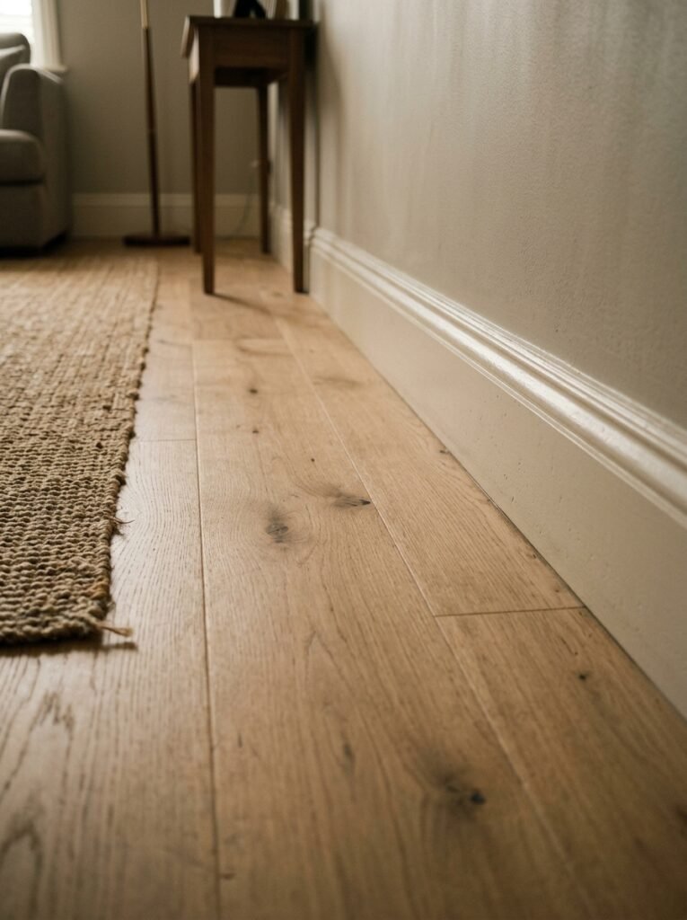
The ceiling.
I know. Bear with me.
In a neutral living room, the ceiling is the fifth wall and most people just slap brilliant white on it and move on. Which is fine! But if your walls are warm — a linen white, a soft clay, anything with warmth in it — brilliant white on the ceiling will read as cold and slightly blue by comparison. The ceiling will visually drop. The room will feel lower than it actually is.
Tinting your ceiling paint to an even lighter version of your wall color — or mixing a tiny bit of warmth into a white — is one of those changes that you don’t consciously notice but absolutely feel. The room suddenly feels enclosed in a good way. Cohesive. Like everything belongs to the same world.
It’s a small thing. Nobody talks about it. It costs almost nothing to do if you’re already painting. And it’s one of those decisions you make, step back, and think — oh. That’s the thing that was missing.
—
❓ FAQ
Q: Do neutral living rooms look boring in real life? A: Only if the texture and layering aren’t there. A neutral room that’s been styled with varied textures, warm lighting, and a few organic elements tends to feel MORE interesting in real life than online — it’s calmer to be in, and there’s always something small to notice. The boring neutral rooms are the ones where everything has the same finish and no warmth.
Q: How do I add personality to a neutral living room without ruining the palette? A: Through scale, age, and imperfection rather than color. An oversized vintage wooden mirror. A genuinely old rug with faded pattern in dusty tones. A piece of art that’s clearly handmade. Personality doesn’t require color — it requires things that have a story.
Q: What’s the biggest mistake people make with neutral living rooms? A: Going too cool. There’s a version of neutral that tips into grey-white, cold, slightly sterile territory — and it photographs beautifully but feels awful to actually sit in. The rooms that feel best in person have warmth in the undertones. Think sand, linen, clay, oat — never stark cool grey unless it’s very intentionally balanced with warm materials.
—
💭 Final Thoughts
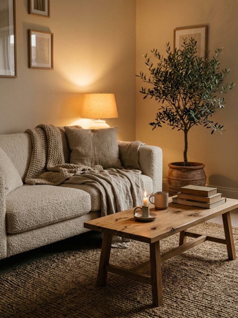
There’s something I didn’t expect about neutral rooms: they make you notice other things. The quality of light at different times of day. The sound of rain on a window. The texture of the blanket you reach for. You stop looking AT the room and start living in it.
Maybe that’s the whole point.
What’s the one neutral room moment — a lamp, a fabric, a single piece of furniture — that finally made your space feel like yours?