
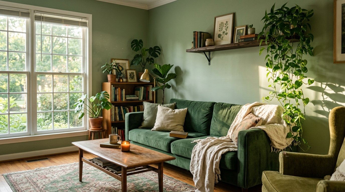
Green Living Rooms That Don’t Look Like a Plant Nursery (Unless You Want That)
My friend called me last week and said, “I want green walls but I’m scared.” And honestly? Same. For years I was convinced green was the riskiest color you could put in a living room. One wrong move and you’re living inside a waiting room from 1994. But then I started actually looking — really looking — at what people were doing with green right now, and I couldn’t stop.
—
1. The Shade That’s Quietly Taking Over Every Living Room Worth Pinning
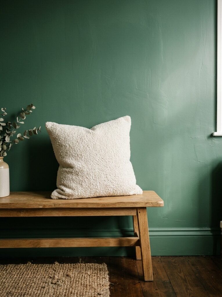
It’s not emerald. It’s not sage. It’s something in between — a dusty, slightly grey-green that reads differently depending on what time of day you look at it. In morning light it’s almost neutral. By the time evening hits and you’ve got one warm lamp switched on, it turns this deep, almost mossy colour that makes the whole room feel like it’s been there forever.
Designers are calling it “aged botanical.” I’ve also seen “dried herb” thrown around. Whatever you call it, it’s the shade showing up in the background of basically every living room photo that makes you stop mid-scroll. It’s not trying to be the star. It lets everything else — the textiles, the wood, the light — do the talking.
And that’s kind of the whole point.
“The best green wall doesn’t announce itself. It just makes every other thing in the room look better.”
If you’re starting from scratch, this is where I’d start. Not with a dramatic dark forest green (though more on that later, because I actually love those too) — but with a shade that gives you room to breathe, room to change things up, room to not be totally committed every time you walk in.
—
2. Why Dark Green Rooms Feel Expensive When Everything Else Feels Flat
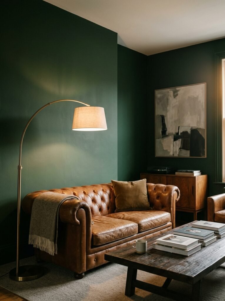
Okay so here’s the thing nobody tells you about dark green — it does the heavy lifting. You can have genuinely cheap furniture and dark green walls and the room will still feel considered. There’s something about deep, saturated colour that signals intention. Like someone made a decision, you know?
Hunter green. Bottle green. That rich, almost black-green that shows up in old English country homes and somehow still looks completely current. These shades absorb light in a way that creates this enveloping, cinema-lobby-at-8pm feeling, and I find it incredibly hard to leave a room that feels like that.
The key is contrast. Dark green walls need something pale and tactile to push against — a cream linen sofa, a whitewashed stone fireplace, a big jute rug. Without that contrast the room starts to feel like a cave. With it? It feels like a retreat.
—
3. Sage Green Isn’t Boring, You’re Just Using It Wrong
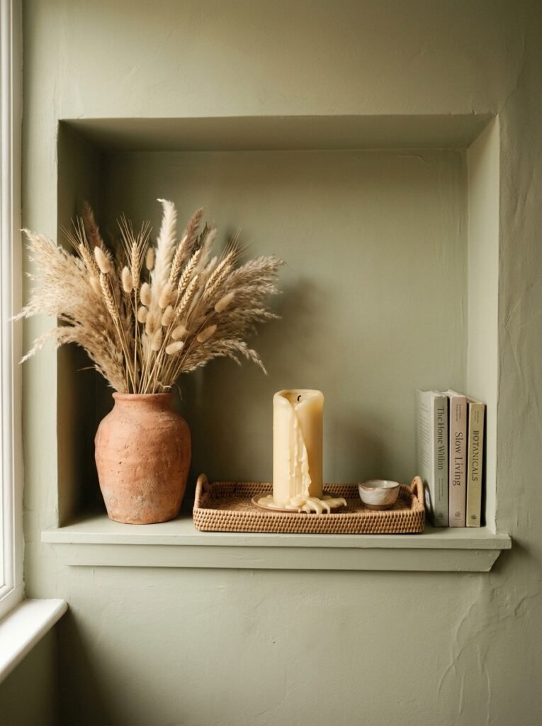
Can we talk about the sage green backlash? I get it. It was EVERYWHERE for a while. Every rental flat, every new build show home, every Instagram grid from 2021. But here’s the thing — the problem was never sage green itself. It was sage green furniture combined with sage green walls combined with sage green accessories, and absolutely no tension anywhere in the room.
Sage is a background colour. It wants contrast, it wants warmth, it wants something unexpected near it. A worn leather armchair in cognac. A deep indigo throw. An abstract painting with a lot of terracotta in it. Give sage green something to react against and suddenly it doesn’t look like a chain hotel anymore.
It looks calm, yes. But in a specific, interesting way.
—
4. The One Green That Works in North-Facing Rooms (Most Greens Do Not)
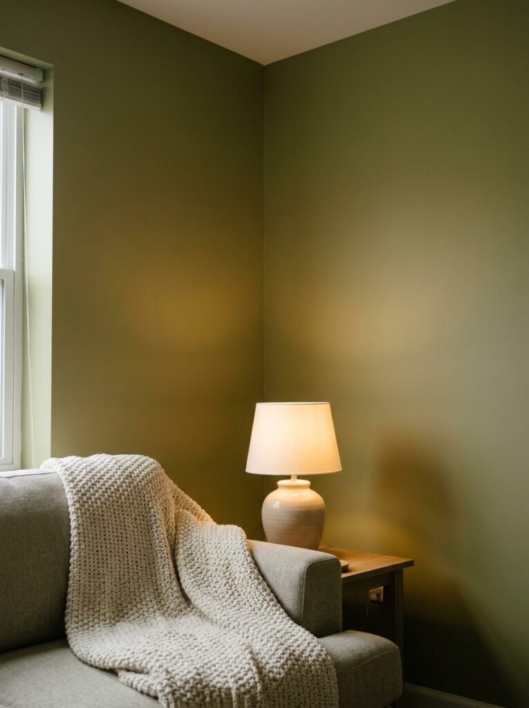
North-facing rooms are brutal. The light is flat, there’s very little of it, and certain colours that look beautiful in the shop turn grey and sad the second you get them home. Most greens will do exactly this to you in a north-facing space. They turn dull. They go slightly yellow or cold depending on the undertone and the whole thing feels like a mistake.
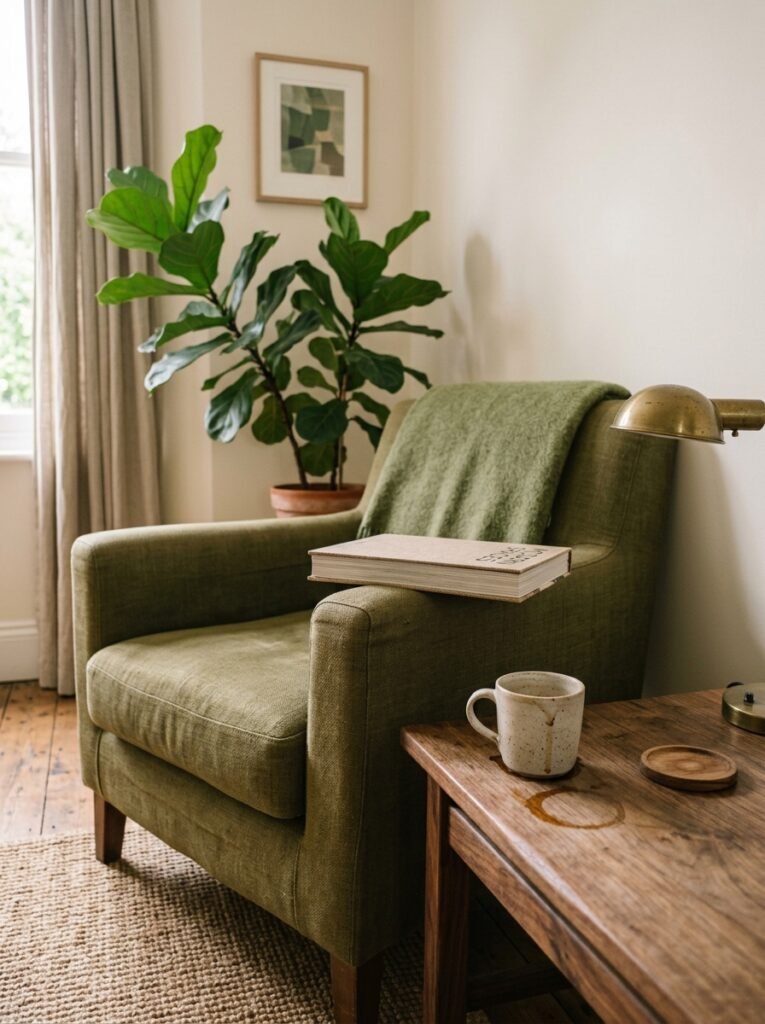
The exception: warm, yellow-based greens. Think olive. Think avocado (not the trendy kind — the deep, dusty, almost-brown kind). Think the colour of a bay leaf in your kitchen window. These shades carry enough warmth in their undertones to hold up even when the natural light is doing absolutely nothing for them.
“Olive green in a north-facing room doesn’t fight the light. It just doesn’t need it.”
I genuinely think olive is one of the most underrated colours in the entire home decor conversation. It’s earthy without being brown, green without being fresh and springy, and it’s been used in Italian country interiors for centuries, which isn’t a bad reference point.
—
5. What to Put on the Floor When Your Walls Are Green
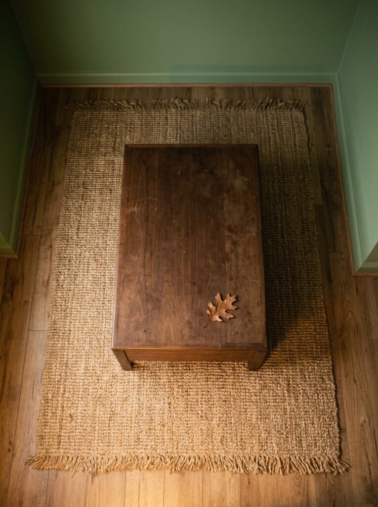
This is where people get stuck. The walls are great, and then they stare at the floor and go completely blank. Here’s how I think about it.
If your green is cool-toned (sage, grey-green, muted botanical shades), you’ve got two moves: warm wood floors with a reddish undertone to create contrast, or a pale stone or concrete finish to keep things minimal and architectural. Both work. The wood is cosier, the stone is sleeker. Pick based on the rest of your life.
If your green is warm-toned (olive, golden green, dried herb), lean into it. A honeyed oak floor, a terracotta tile, even a dark walnut if you want drama. Warm calls to warm and the whole room starts to feel cohesive without feeling matchy.
Rugs: a natural woven texture in a neutral keeps the green feeling grounded. A patterned vintage rug with a little red or burnt orange in it? Even better. Unexpected but surprisingly right.
—
6. The Colour That Sits Next to Green and Makes the Whole Room Sing
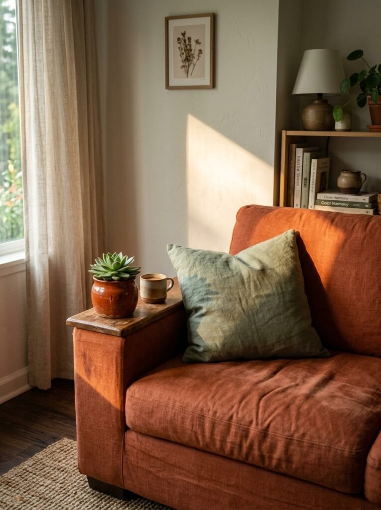
Terracotta. I said it. Not because it’s trendy (though it is, fine) but because it’s been paired with green since people were painting pottery in ancient Greece and there’s a reason it’s never gone away — it works on a level that goes beyond fashion.
It’s the colour combination of the natural world. Green leaves, terracotta earth. Your brain already finds it harmonious before you’ve even consciously registered it. So when you’ve got green walls and a terracotta pot, or a terracotta cushion on your green velvet sofa, or a burnt orange painting on your forest green wall, something just settles in the room.
Dusty pink works too, by the way. Specifically the old-rose, slightly faded kind — not bubblegum, not blush, but the pink you find on the walls of old Italian villas. It sits next to green in a way that feels genuinely romantic without feeling fussy.
—
7. Going Green in a Small Living Room Without Making It Feel Smaller
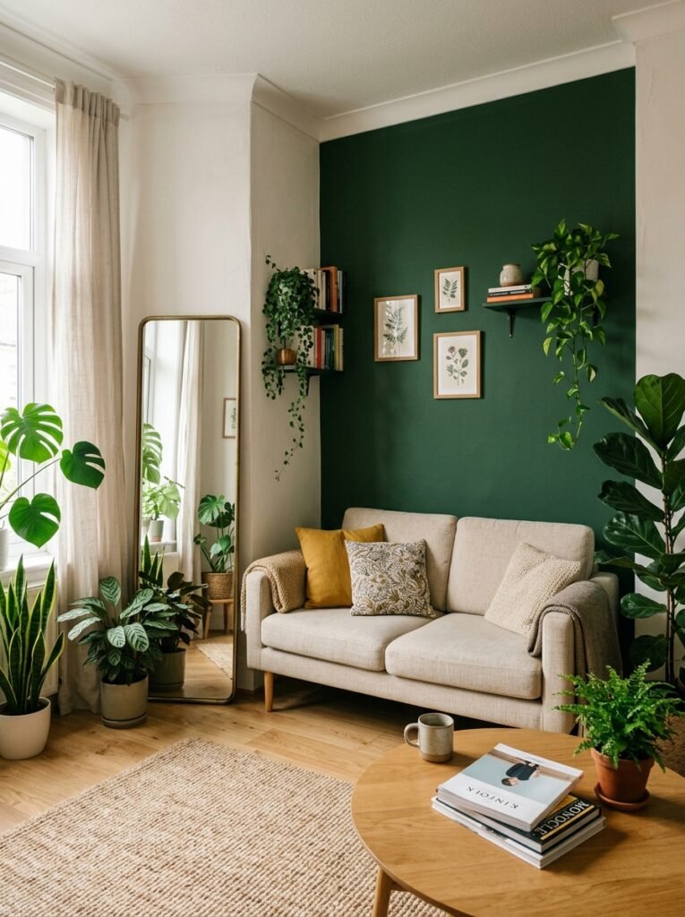
The instinct is always to go light in a small room. Which is fine! Absolutely valid. But there’s another approach that doesn’t get enough attention: commit to the darkness, embrace the cosiness, and stop fighting the smallness.
A small living room painted in deep green and filled with warm light and interesting textures doesn’t read as “cramped.” It reads as intimate. Those are different things. Cramped is when the room feels accidental and unfinished. Intimate is when it feels like someone designed it to feel exactly that enclosed and warm.
The trick — and this is the part that actually matters — is lighting. You cannot paint a small room dark and light it with a single overhead bulb. You need layers: a table lamp in one corner, maybe a floor lamp, maybe a few candles if you want to go full atmospheric. Multiple light sources at different heights stop the dark walls from closing in and start making them feel intentional instead.
—
8. Green Doesn’t Have to Mean the Walls (A Case for the Sofa)
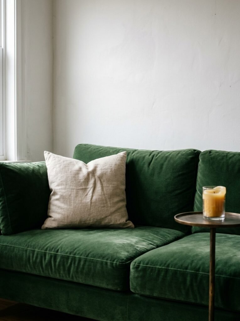
What if you just… don’t want to paint? What if you rent, or you’re not ready, or you tried a tester pot and hated it in the light of your actual room? Green still works. It just lives in the furniture instead.
A green sofa is the statement version. It commands the room in a way a green cushion never will, and I kind of love how bold it feels. But here’s the thing — a green sofa on a neutral background (white, cream, warm grey) gives you something a green wall doesn’t. You can change the cushions and the rug and the accessories and completely shift the whole mood of the room without touching a paintbrush.
For British homeowners especially — where renting is incredibly common and landlords have opinions — this is a seriously practical option. A deep green velvet sofa against white walls and a natural wood floor is an extraordinarily good-looking room. And it moves with you.
“A green sofa on a neutral background might be the best of both worlds — commitment with a built-in escape route.”
—
9. The Unexpected Ceiling Idea That Changes Everything
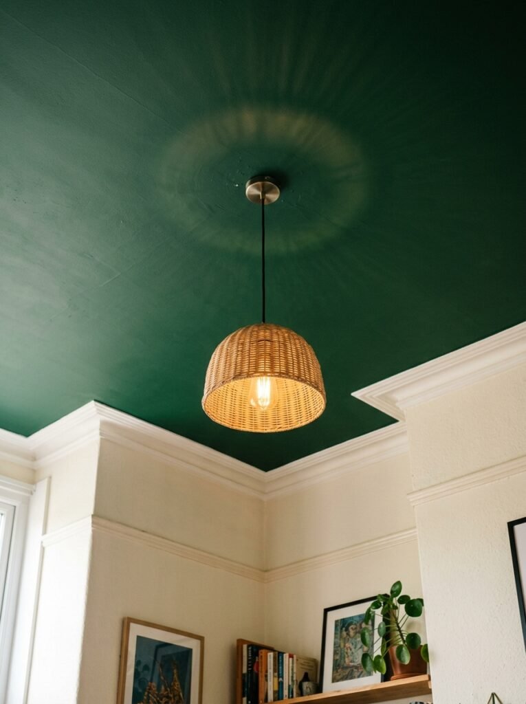
Have you considered a green ceiling? I know. Hear me out.
In a room with white or cream walls, a painted ceiling in a muted, dusty green does something almost architectural. It lowers the room visually (in a cosy way, not a claustrophobic way) and draws your eye upward, which is the opposite of what you’d expect. It also gives you colour without committing to four green walls, which some people find overwhelming.
It’s a very old technique — painted ceilings have been a thing in grand European interiors for centuries — but in a modern context with simple furniture and unfussy styling it reads as pleasantly offbeat. Not trendy-for-five-minutes. Just genuinely interesting.
The shade I’d go for on a ceiling: something lighter than you think. The ceiling colour always reads darker once it’s up there, and you don’t want it feeling oppressive.
—
10. Greenery vs. Green Paint — Why You Probably Need Both
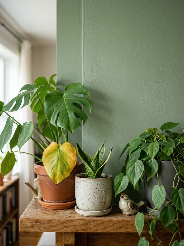
Real plants — and I cannot emphasise this enough — do not look the same as green walls. They’re different greens, different textures, different ways of introducing colour into a space. So if anyone’s told you “just get some plants instead of painting” as a way to bring green into your living room, that’s not quite the right advice. Plants and painted green aren’t interchangeable.
What they ARE is layered. Green walls with plants in front of them creates this depth where you can’t quite tell where the room ends and the greenery begins, and it looks genuinely stunning. The paint gives you a backdrop that makes the plants pop rather than disappear against a pale wall.
That said — plants with no painted green work. Green walls with no plants work. It’s just that together they’re doing something different. More layered, slightly wild, like a room that grew rather than a room that was styled.
—
11. The Living Room Colour Combination That’s Quietly Replacing All-Grey Interiors
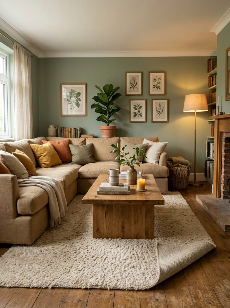
Grey has had its decade. It’s not going anywhere completely — it’s too useful for that — but the rooms that are getting saved and pinned and re-pinned right now are not grey rooms. They’re green rooms. And specifically they’re green-with-warm-neutrals rooms.
Green walls with warm white trim. Green accents against raw linen and undyed cotton. Deep green with natural wood and brass hardware. These combinations have a warmth that grey-based rooms rarely achieve, because green sits closer to nature on an instinctive level and most of us respond to that without quite knowing why.
The warm neutral is doing a lot of work here, though. If you put cool-toned white trim around a warm green wall the room fights itself. You want creamy, warm-white trim — the kind that almost looks slightly yellow next to a pure white — because it ties back into the warmth of the green instead of cutting against it.
—
12. Starting Small So You Don’t Regret a Single Wall
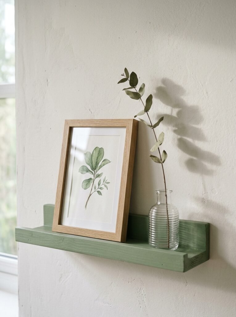
Not ready to commit to the whole room? Good. That’s actually the smart move. Because green — more than almost any other colour — is sensitive to context. The green you fall in love with in the paint deck will look completely different in your specific room with your specific windows and your specific furniture, and the only way to know is to test it.
Paint at least two large test patches (genuinely big ones — the small A4-sized ones lie to you) on different walls and live with them for a full week. Look at them in morning light, afternoon light, lamplight, grey overcast British midday light if applicable. Take photos at different times. Change what’s near the patch — a dark cushion versus a light one makes a genuinely huge difference to how the wall colour reads.
Then, if you’re still nervous? One wall. Just one. A green alcove, or the wall behind your sofa. You’d be surprised how much one green wall can shift a room without locking you into anything. And once you see it? Nine times out of ten, you want more.
—
❓ FAQ
Q: What shade of green works best in a living room with limited natural light? A: Warm, yellow-based greens tend to hold up best in low-light rooms — think olive, golden sage, or deep avocado tones. Cool greys-greens can turn flat and a bit murky when there’s not much natural light to bring them alive. Always test a large swatch in your actual room before committing.
Q: Can green work in a living room that already has a lot of wood furniture? A: It can, and actually it often looks brilliant. The key is picking a green that doesn’t fight the wood’s undertone — warm olive or earthy bottle green tends to sit beautifully next to medium and dark wood tones. Lighter, cool-toned greens can feel a little disconnected from warm wood, so it depends on whether you want harmony or contrast.
Q: How do I make green feel modern rather than outdated? A: Keep the styling unfussy. Green can tip into a sort of dated country-house look when there’s too much pattern, too many accessories, or very traditional furniture shapes. A more contemporary take usually means cleaner lines, a mix of textures rather than prints, and one or two unexpected elements — a modern artwork, an industrial-style lamp — that stop the room feeling like it’s cosplaying a specific era.
—
💭 Final Thoughts
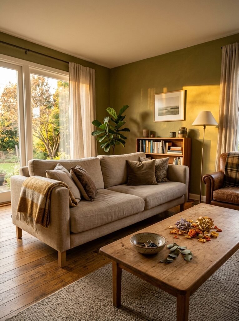
Green is one of those colours that rewards a little courage. Not a lot — just enough to put the test patch on the wall and sit with it for a few days. The rooms I keep coming back to, the ones I’ve saved a hundred times and keep thinking about, almost all have green in them somewhere. It’s not a coincidence.
The question I always come back to: what does it feel like at 9pm on a weekday evening when you’re tired and you just want to be in a room that feels good? For a lot of people, the answer turns out to be green.
What colour are you living with right now — and does it actually make you feel anything?