
The Living Room Look Everyone’s Saving Right Now (And How to Actually Get It at Home)
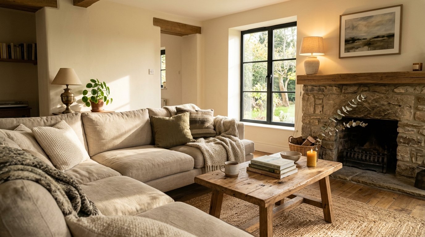
A friend sent me a photo last week. Just a living room. No caption, no explanation — just the image, and I knew immediately why she sent it. Warm, layered, completely unhurried. The kind of room that makes you want to cancel your plans.
That’s the look I want to talk about today.
—
1. Why This Particular Aesthetic Has Such a Grip on People Right Now
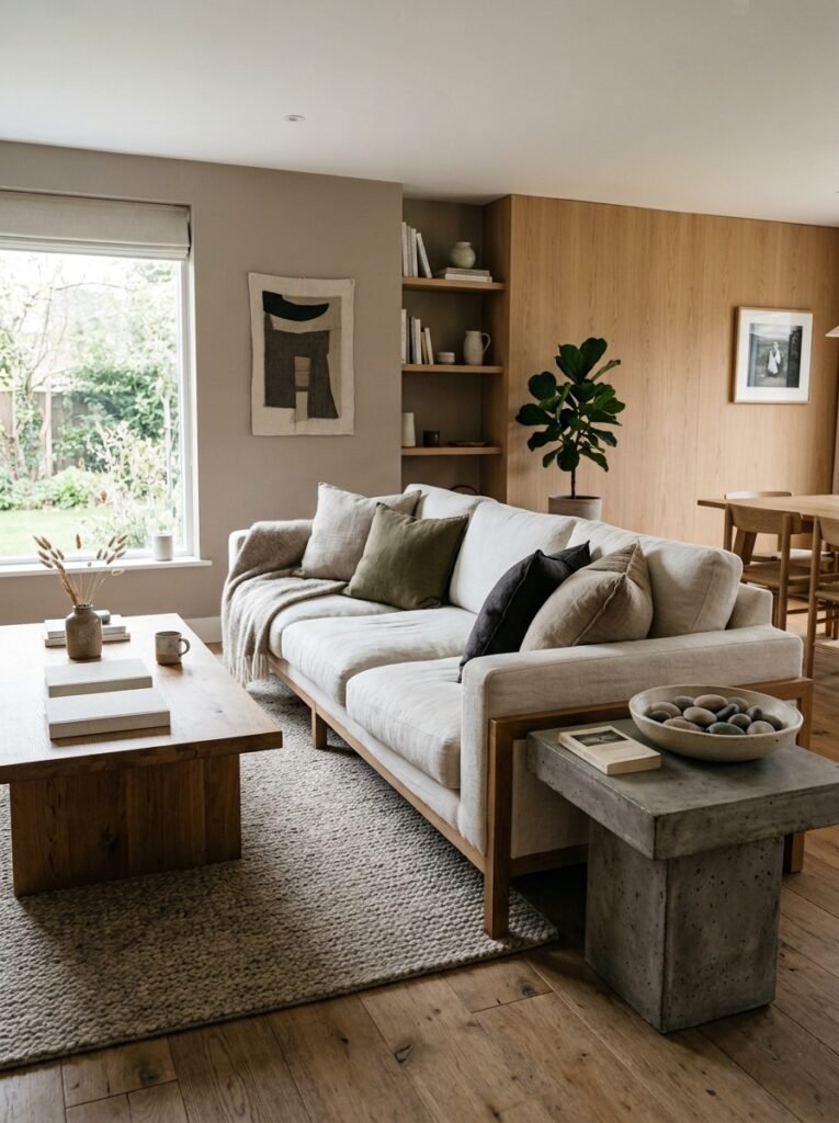
It’s not minimalism. And it’s definitely not maximalism. It sits somewhere in between — which is honestly the harder thing to pull off.
What makes this style so compelling is that it feels chosen. Not decorated in a weekend, not pulled from one catalogue page, but built slowly by someone who actually lives there. Sofas that look broken-in without being shabby. Rugs with enough pattern to anchor a room but not so much that they’re the whole conversation. Wood tones that look like they’ve been around. You get the idea.
The thing that keeps pulling people back to this look is warmth. And I don’t mean warm colors specifically — I mean the feeling of warmth. There’s a texture-to-surface ratio happening in these rooms that just works. More textile than hard surface. More curves than right angles. More lamplight than overhead lighting.
Not gonna lie, I spent about four years thinking I could recreate this with flat-pack furniture and a nice throw blanket. I couldn’t.
—
2. The Sofa Is Doing More Work Than You Think
Most of us pick a sofa based on size and color. That’s the wrong order of operations, honestly.
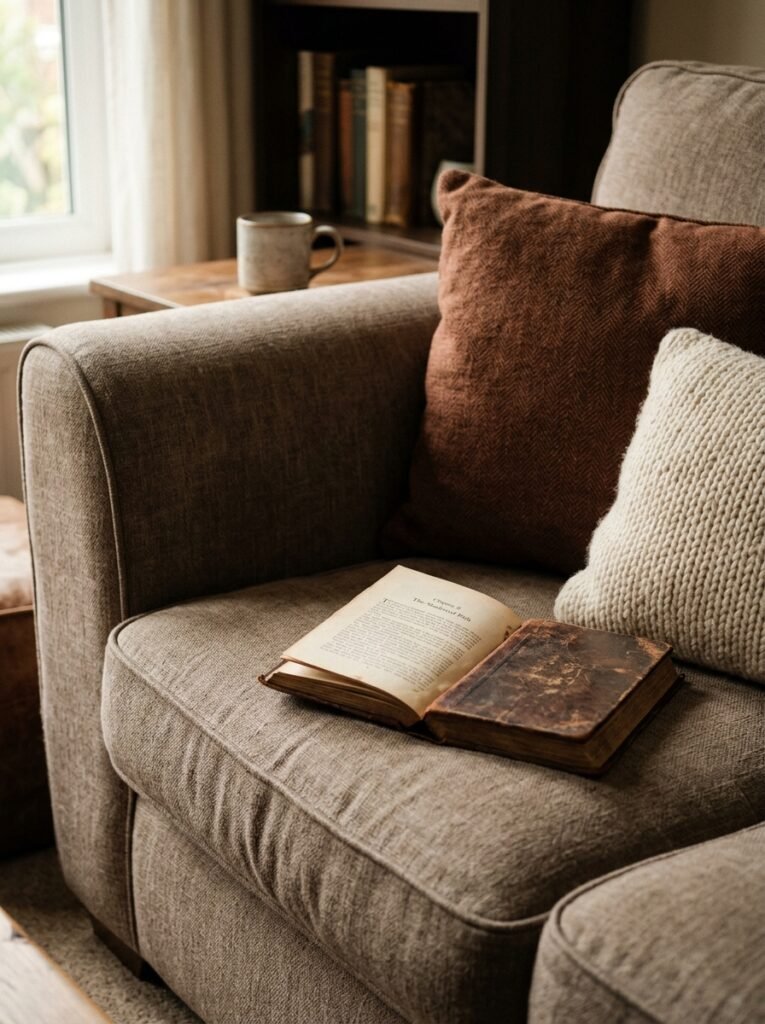
The sofas that anchor this look tend to share a few quiet qualities — deep seats, slightly rolled or curved arms, upholstery that has some visible weight to it. Bouclé, performance velvet, linen-blend fabrics. None of them are trying too hard. They all look like they’d hold their shape after a Sunday morning of just… being on them with a book and too much coffee.
“The right sofa doesn’t announce itself. It just makes everyone in the room relax without knowing why.”
Color-wise? Creams and warm whites are everywhere in this look, but so are deep dusty greens and clay tones. What they share is a muted quality — nothing saturated, nothing that shouts. If your sofa color is the loudest thing in the room, it’s probably fighting the rest of the space.
If you’re starting fresh, go deeper than you think you want on the seat depth. You’ll never regret it. If you’re keeping what you have, the cushions you layer on top can quietly shift the whole register.
—
3. The Color That Keeps Showing Up in Every Beautiful Living Room Right Now
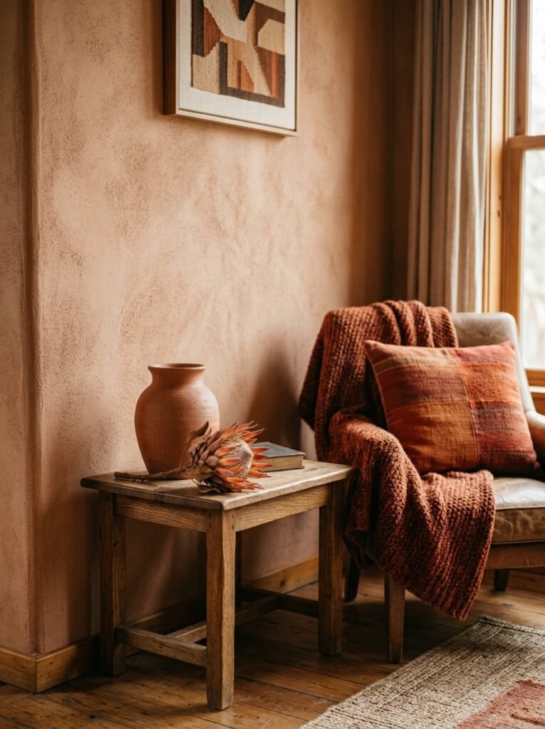
Warm white. Greige. Dusty sage. Terracotta.
But here’s the one that’s everywhere and nobody’s tired of yet: a kind of faded olive green. It’s not quite sage, not quite army, not quite khaki. It’s the color of an old linen jacket left in a sunny room for a decade. It works on walls, it works on velvet accent chairs, it works on ceramic vessels.
Why this color? I think because it reads as neutral but it’s actually doing so much. It makes wood tones look more golden. It makes cream upholstery look richer. It doesn’t compete with natural light — it just kind of absorbs it.
If you’re in the UK and living with a lot of grey northern light, this tone is your friend. It adds warmth where the light isn’t giving you any. In sunnier American rooms, it grounds spaces that might otherwise feel washed out.
Try it on a single wall first if you’re nervous. Or a lampshade. Or a chunky knit cushion cover. You’ll see it immediately.
—
4. Rugs: The One Thing Most Rooms Get Wrong
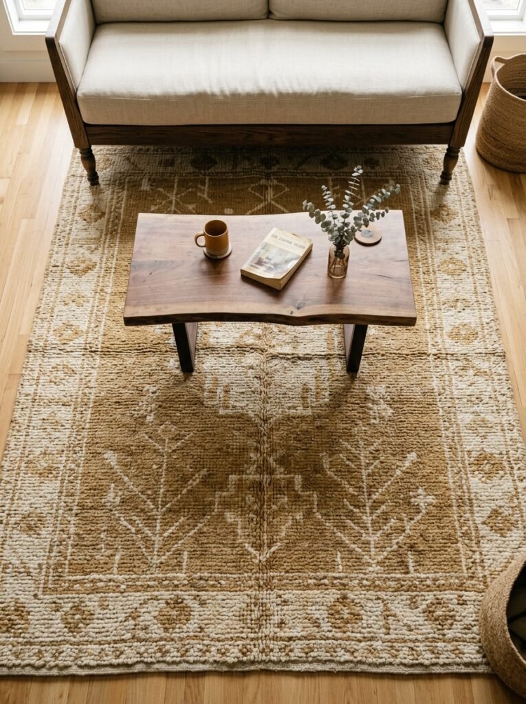
Too small. I’m just going to say it. Most living room rugs are too small.
A rug that only fits under the coffee table isn’t anchoring anything — it’s just floating in the middle of the room looking confused. The furniture legs need to be ON the rug, or at least the front legs do. That’s what makes a room feel like a room and not a furniture showroom floor.
In this particular aesthetic, rugs are usually one of these three things:
- A large, low-pile wool rug in a warm neutral — ivory, camel, soft grey-taupe
- A vintage-style Persian or Oushak-esque pattern, muted and a bit worn-looking
- A chunky natural fibre — jute, sisal, seagrass — sometimes layered under a smaller patterned rug
That layered look (jute underneath, smaller vintage rug on top) has been everywhere for a while now and it still works. It adds depth without adding clutter, which is the goal most of the time.
—
5. What Lighting Actually Does to a Room at Different Times of Day
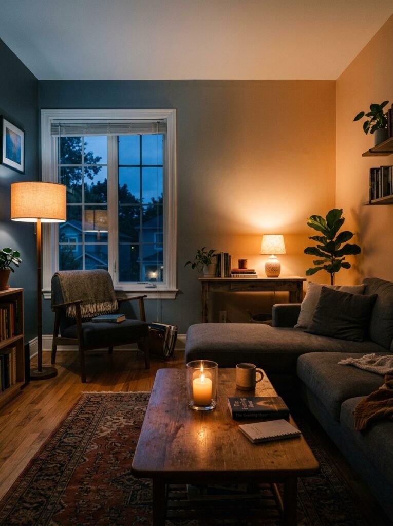
This section exists because lighting is the one thing people consistently underbudget for, and it changes EVERYTHING.
At midday with good natural light, a room can handle harder surfaces and cooler tones. But at 6pm in November? That’s when your lighting plan either saves you or exposes you.
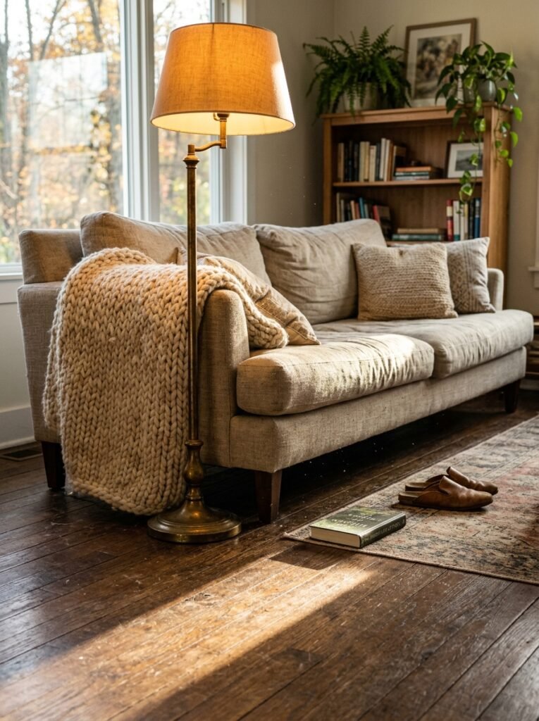
The look we’re talking about relies heavily on layered light sources at different heights. A floor lamp in a corner. A table lamp on a console or side table. Maybe a pendant or two if the ceiling allows it. The overhead light is on a dimmer and used sparingly, or not at all in the evenings.
“Turn off your overhead light for one week and see what you actually need. Most rooms need a lot less than you think — and a lot more warmth than you’re giving them.”
Bulb temperature matters enormously. Anything above 3000K starts to feel clinical. For this look, you want 2200–2700K — that amber-leaning warmth that makes skin look good and makes rooms feel like places people want to stay.
Linen and paper lampshades filter light softly. Metal shades direct it. Know which one your room needs before you buy anything.
—
6. The Case for One Piece of Old Furniture in an Otherwise New Room
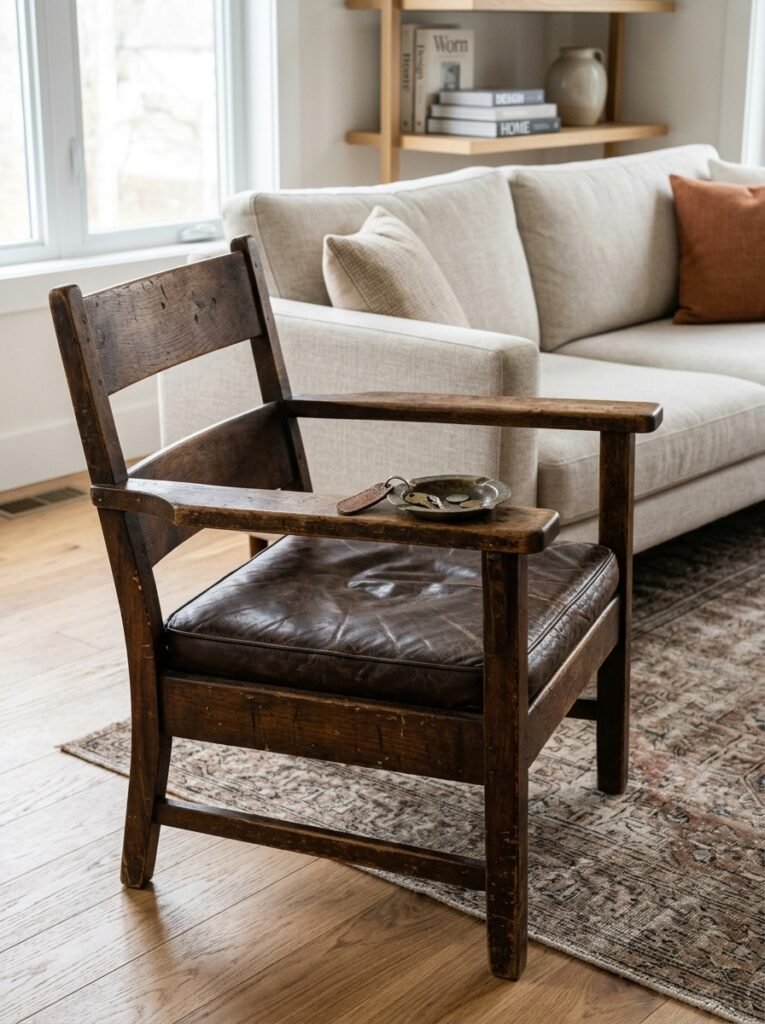
Every beautiful room has at least one thing that looks like it has a past.
An antique side table with a slightly cloudy mirror top. A stack of genuinely old hardback books on a shelf. A wooden chest used as a coffee table that could be from literally any decade and you can’t tell. These pieces are doing something the new furniture simply can’t — they’re adding time to the room.
Interior designers talk about this constantly, but the short version is: rooms that feel curated have something with age in them. It doesn’t have to be expensive. Markets, charity shops, estate sales, Facebook Marketplace — old things are everywhere if you’re looking.
In British homes especially, this is already a cultural habit. There’s often a grandmother’s sideboard or a set of old botanical prints that just… live there. That instinct is correct. Lean into it.
In American interiors, the tendency is to match and coordinate more heavily. But one odd piece that doesn’t perfectly match? It makes the whole room feel real.
—
7. How Shelving Becomes a Room’s Personality Statement
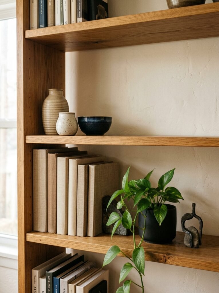
Not just what’s on the shelves — HOW it’s on the shelves.
Here’s something worth noticing: the rooms that look the best don’t have perfectly styled, symmetrical shelves. They have shelves where books are stacked both vertically and horizontally. Where a ceramic vase sits in front of a row of books. Where there’s an odd object that you can’t quite identify from across the room but you want to.
The trick — if there is one — is to leave space. Not everything needs to be filled. Visual breathing room makes each object read better.
A few things that photograph well and add character: small sculptural ceramics, vintage glassware, plants in simple terracotta pots, a framed photograph or small painting propped (not hung), a candle that’s actually been burned. That last one matters. A pristine white candle in a pristine holder looks like a shop. A melted, used candle looks like someone lives there.
—
8. The Throw Pillow Situation, Settled Once and For All
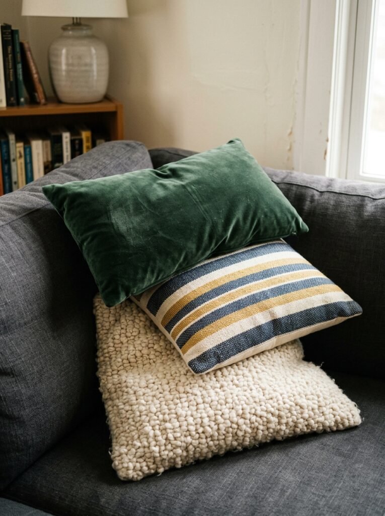
Right. This is where opinions get strong.
Fewer than you think you need. That’s the rule.
Three to five pillows on a standard sofa. Two to three on a smaller one. And they don’t all need to match — but they do need to get along. Different textures work better than different colors in this aesthetic. A boucle, a linen, a woven cotton — all in a close palette — looks intentional. Five different colors trying to “coordinate” looks like you couldn’t commit.
“The pillow that pulls it all together is usually the one that’s the simplest. Plain. Textured. Just sitting there being confident.”
And please, overstuffed pillows. Not the flat, sad ones that collapse immediately. The pillow should hold its shape AND give a little — like a good handshake, if that makes any sense.
Side note — feather/down inserts almost always look better than polyester fills. Worth the extra cost.
—
9. Why the Coffee Table Isn’t Just a Surface
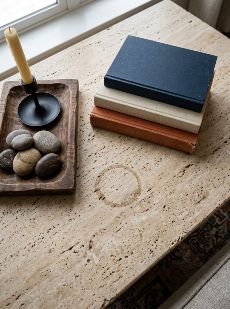
The coffee table is the handshake of the living room. First visual impression, middle of the space, everyone’s eyes land on it.
In this look, coffee tables tend to be lower than standard, often in raw or lightly finished wood, rattan, stone, or a combination. They’re not glass. Glass coffee tables feel like a completely different design language — great if that’s your thing, but it doesn’t belong in this one.
What’s ON the table matters too. A tray helps group small objects so they read as one thing rather than scattered clutter. A large art book (actually interesting, not just for show). A small ceramic bowl for remotes that you’re not quite ready to hide completely. A single candle. Maybe a plant or a trailing stem in a simple vessel.
Don’t overdo it. The table needs room to be a table. People need somewhere to put their tea.
—
10. The One Rule That Makes Any Window Feel Like a Design Decision
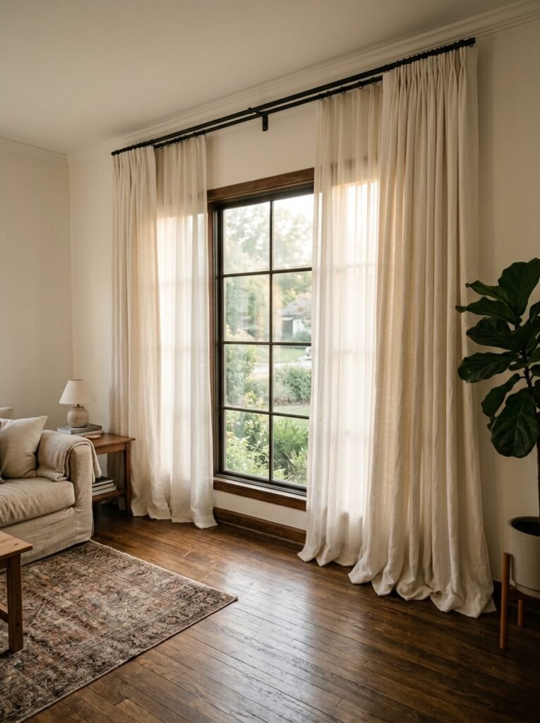
Stop centering curtains on the window frame.
Mount the rod higher than the window — closer to the ceiling. And wider than the window on both sides. This is the thing. It’s so simple and it changes the entire proportion of the room. The window looks taller, the room looks bigger, and the curtain panels have somewhere to stack without blocking any light when open.
For this aesthetic, curtain fabric tends to be linen or linen-look — unlined or lightly lined so light filters through rather than being blocked completely. Off-white, ecru, warm stone. They don’t need to be long, but they should touch the floor. Pooling slightly is even better if your floors are nice.
In British older homes where window placement is sometimes a bit chaotic, this technique is genuinely life-changing. Or at least room-changing, which right now feels like the same thing.
—
11. Plants That Actually Belong in This Kind of Room
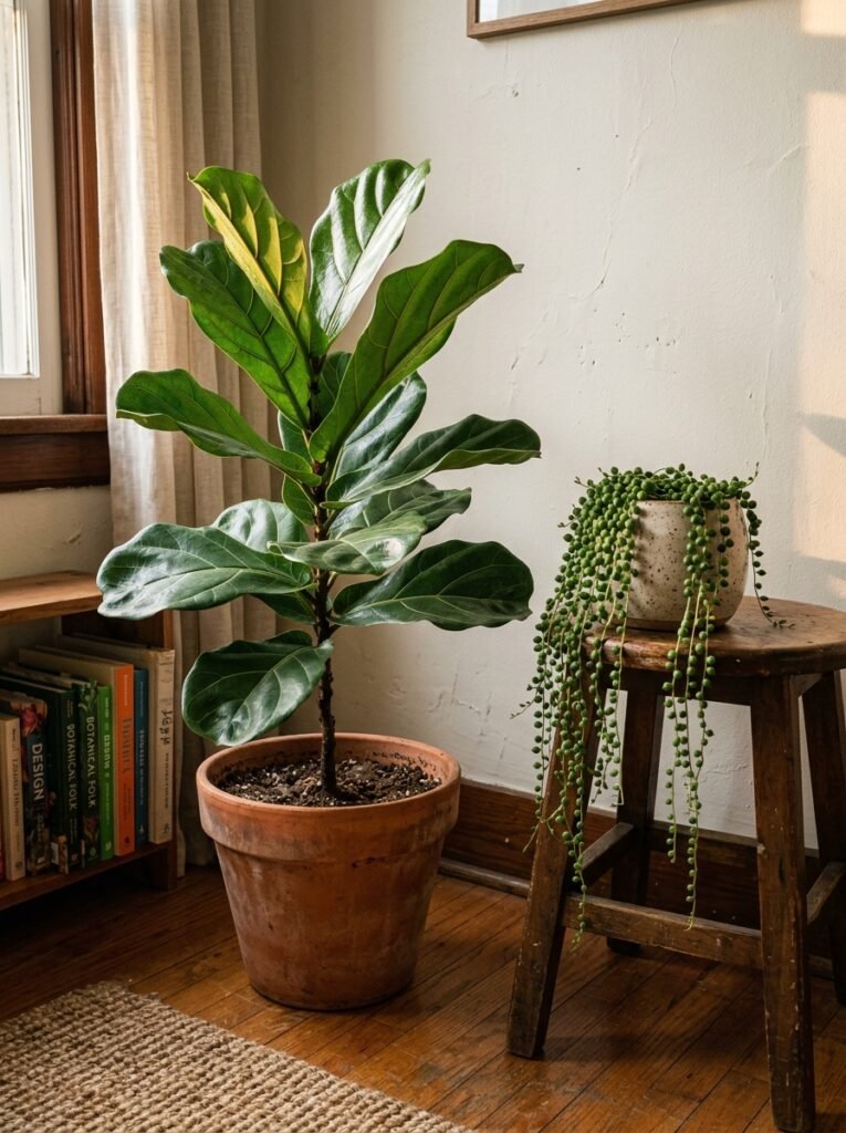
I’m not here to tell you to get a fiddle leaf fig. You’ve heard that.
What’s working in these rooms — visually, I mean — is a mix of scales. One large plant that commands space (a tall olive tree, a big monstera, a branching fig). A few medium ones in terracotta. And then tiny trailing things on shelves or in small propagation vases on the windowsill.
The terracotta thing is real. Simple terracotta pots, some aged slightly, look better in this aesthetic than nearly any other vessel. They connect to the earthiness of the whole look — the warm tones, the natural materials, the slightly undone quality that makes these rooms feel lived-in rather than staged.
Dried botanicals work here too, by the way. A bundle of dried pampas or eucalyptus in a tall narrow vase. A wreath of dried botanicals on an unexpected wall. It adds texture without needing any maintenance, which — honestly? That’s a selling point.
—
12. The Last 10 Percent That Most Rooms Never Get To
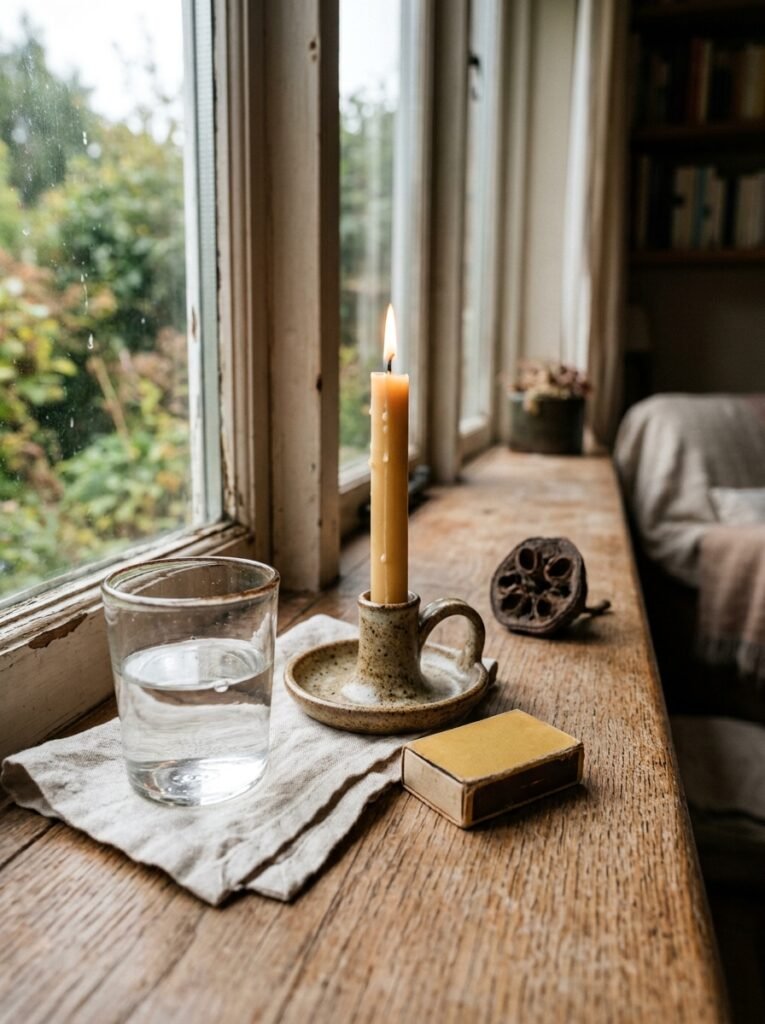
Most living rooms are 90% there and then they stop.
The last 10 percent is the stuff that doesn’t have a category. It’s the worn leather tray that holds a candle and a matchbox. The stack of actual books you’ve actually read that happen to have beautiful spines. The blanket folded at one end of the sofa — not artfully draped, just folded, like someone just sat there. The framed thing on the wall that you love for a reason you can’t explain.
That 10 percent is the part that can’t be purchased in one go. It accumulates. It comes from living with a space and noticing what’s missing.
And that’s the real difference between a room that looks designed and a room that looks lived in and loved. It’s not a budget difference. It’s a patience difference. The rooms that pull at people — the ones that get saved thousands of times — aren’t finished. They’re just at a really good moment.
Maybe that’s what makes them so appealing. They feel like they’re still happening.
—
❓ FAQ
Q: How do I make my living room look expensive without spending a lot? A: Focus on textiles first — they give the most visual return per pound or dollar. A good-quality throw, a few well-stuffed pillow covers, and linen curtains hung high and wide will do more than most furniture upgrades. Also, edit ruthlessly. A room with fewer, better things reads as more considered.
Q: What’s the best way to layer a living room that feels cohesive? A: Pick a tonal family — warm neutrals, cool muted tones, whatever — and stay within it, but vary the textures dramatically. Same palette, wildly different surfaces. That contrast is what creates depth without chaos.
Q: My living room gets very little natural light. How do I make it feel warm and inviting? A: Warm bulb temperatures (2200–2700K) are your biggest tool — swap every bulb if you have to. Then layer your light sources so nothing is coming from one place overhead. Mirrors positioned to catch whatever light exists help a lot. And lean warmer with your color palette than you think you need to; cool tones in a dark room feel cold, while warm tones in a dark room feel cozy.
—
💭 Final Thoughts
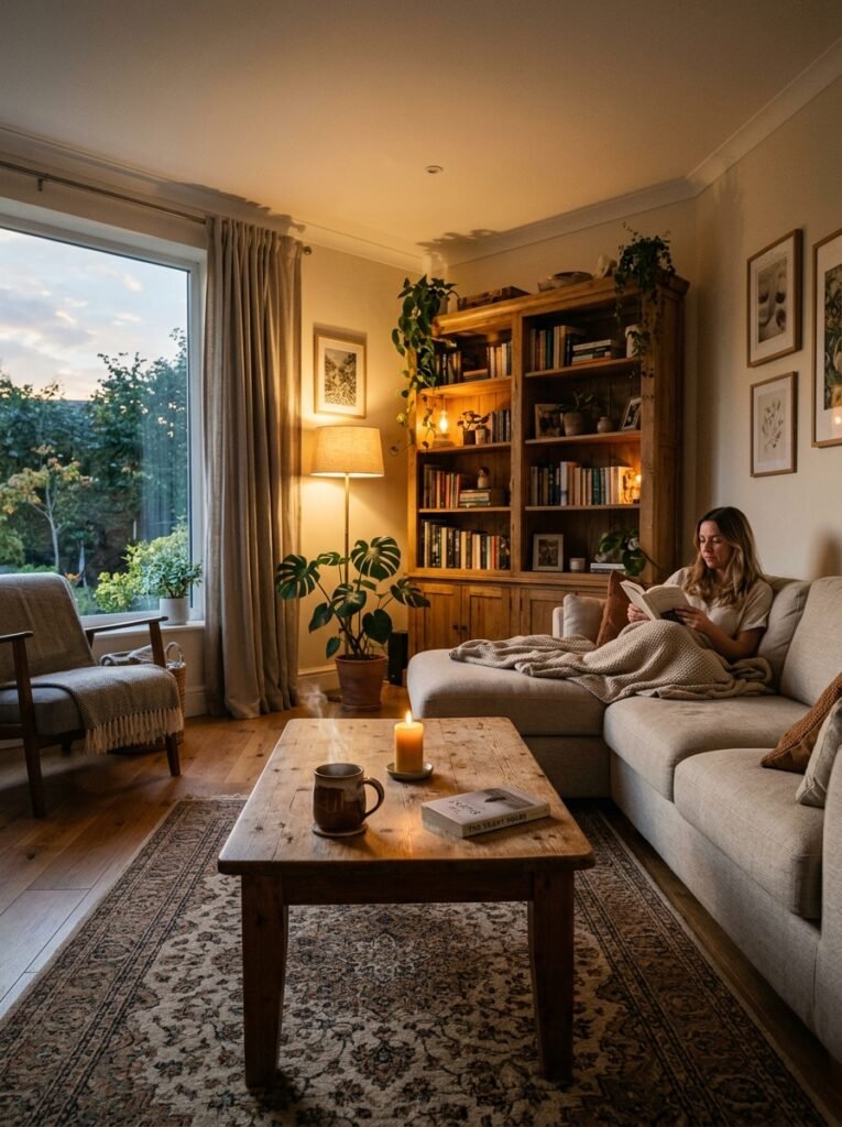
You don’t need to start over. Most people have more to work with than they think — they just haven’t looked at it in the right order yet. Start with the light. Then the big surfaces. Then the small things that make it feel like yours.
The rooms that stay with you aren’t perfect. They’re just honest. What would your living room look like if it was completely, unapologetically honest about who you are?