
Dark Feminine Bedroom Wall Art: How to Make Your Walls Feel Like a Mood, Not Just a Room
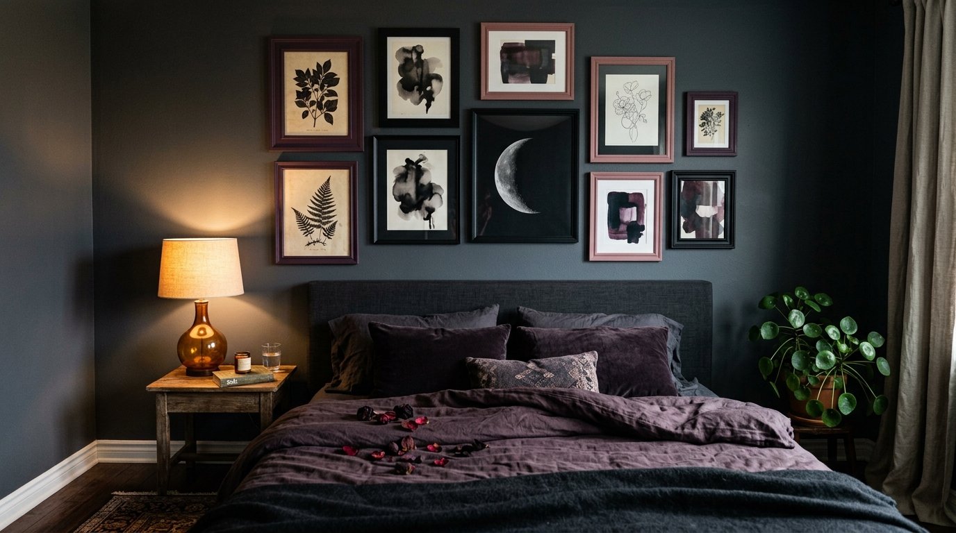
My friend stood in the doorway of my bedroom and said, “It feels like a forest at midnight in here.” I’d been staring at it for so long I’d stopped seeing it. But she was right. That’s exactly what I’d been going for.
—
1. Why “Dark Feminine” Hits Different Than Just “Dark Decor”
Let’s get something straight. Dark decor is a black accent wall and some moody candles. Dark feminine is something else entirely.
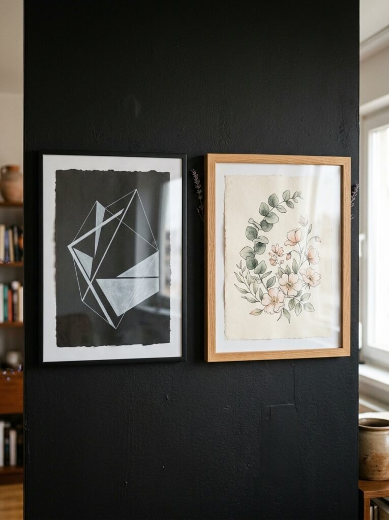
It’s the difference between a room that looks dramatic and a room that feels like it belongs to someone. The wall art is where that distinction lives. A deep burgundy botanical print isn’t just dark — it’s lush, layered, specific. A black and white portrait isn’t just moody — it’s got presence. That’s what we’re actually chasing here.
Dark feminine aesthetics pull from gothic romance, Art Nouveau, Victorian botanical illustration, surrealism, cottagecore’s shadowy cousin. And the wall art does most of the heavy lifting. Get the walls right and the rest of the room falls into place around it. Get them wrong and even the most perfect velvet duvet looks a bit lost.
So yeah. This isn’t just about hanging something dark on the wall. It’s about choosing art that has a specific kind of emotional weight.
“The right piece of art doesn’t complete a dark feminine bedroom — it starts one.”
—
2. The Color Palette That’s Quietly Taking Over Every Beautiful Bedroom Right Now
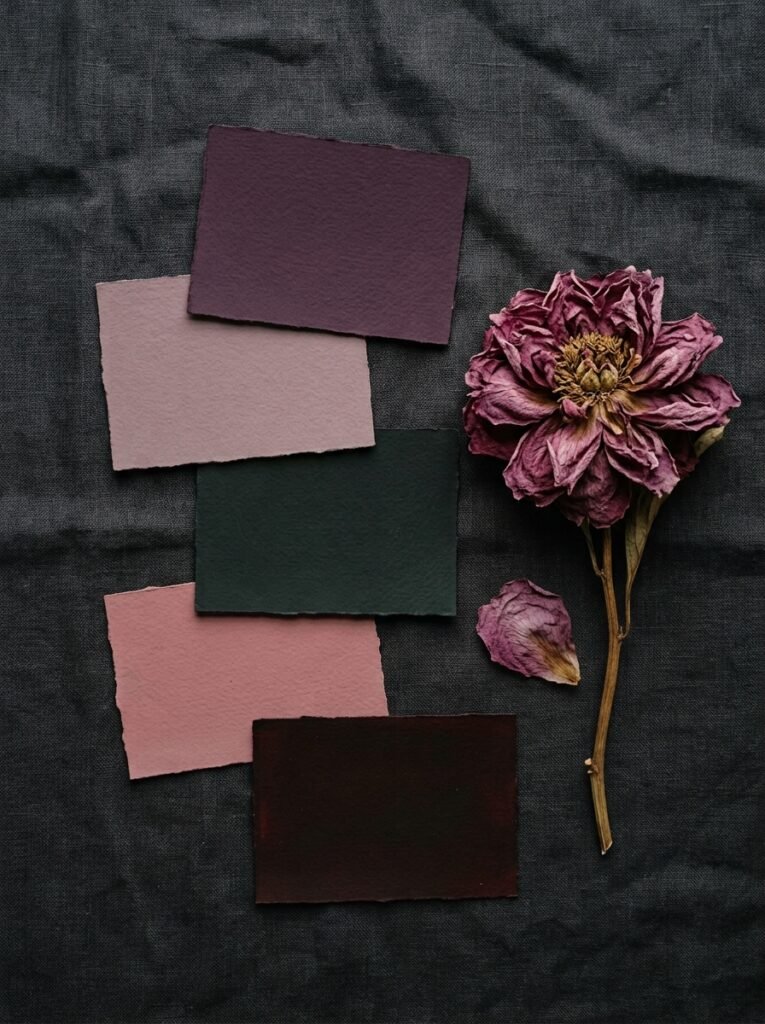
Deep plum. Oxblood. Forest green that’s almost black. Antique gold that’s more tarnished than shiny.
These are the tones showing up everywhere and honestly, I get it. They’re warm enough to not feel cold and dark enough to feel like something. If you’re choosing wall art, lean into prints and canvases that live in this palette rather than ones that simply sit against it.
A large-scale botanical print in deep inky greens with cream highlights will do more for a dark feminine bedroom than a black-and-grey piece. Because the green is alive, even in its darkest form. Same goes for deep floral watercolours with a lot of shadow in them — the kind where you’re not quite sure where the petals end and the background begins.
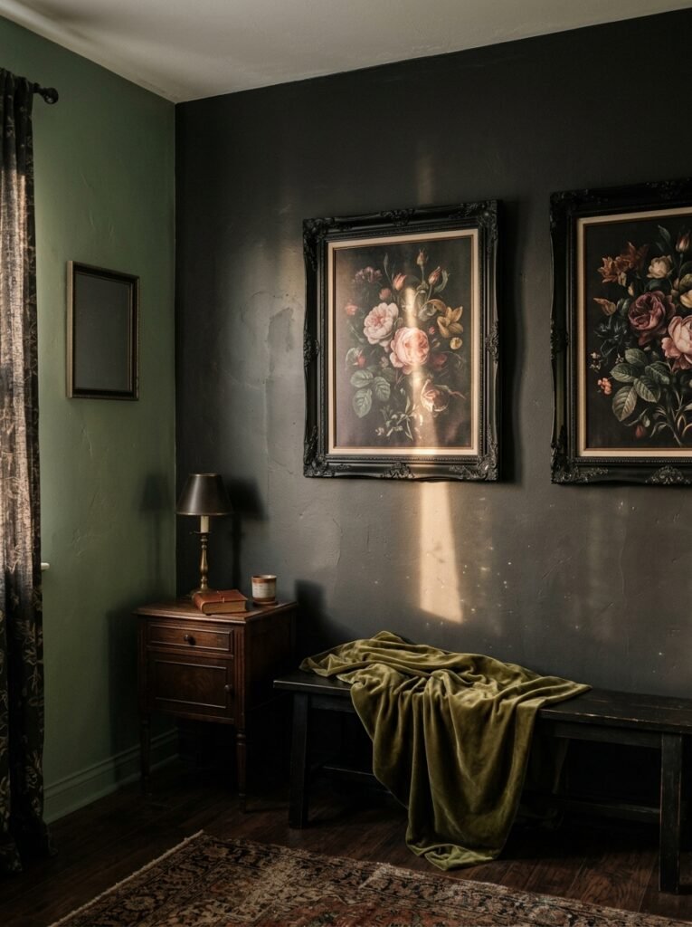
Here’s the thing people don’t always say: the FRAME matters as much as the print. An ornate aged gold frame changes a print completely. That same print in a flat black frame reads totally differently — sharper, more modern, less romantic. For dark feminine walls, lean toward tarnished gold, dark walnut, or black frames with detail rather than plain ones.
—
3. Botanical Prints That Feel Haunted (in the Best Way)
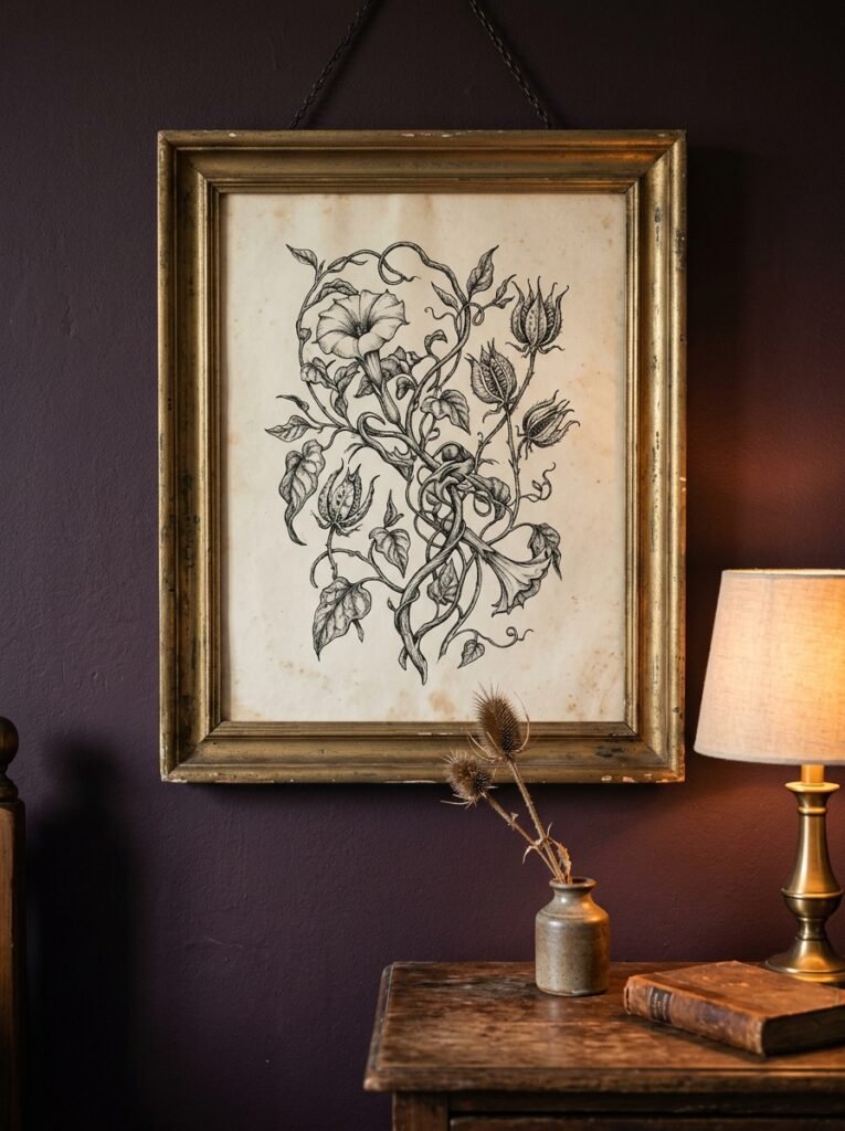
There’s botanical illustration and then there’s gothic botanical illustration. I’m obsessed with the second kind.
Classic botanical drawings — the scientific ones with their clean lines and Latin labels — are beautiful. But for a dark feminine bedroom, you want the versions that feel a little less cheerful about it. Roses with visible thorns. Nightshade. Poppies. Moon flowers. Ferns that curl at the edges.
The key is finding prints where the background isn’t white. Off-black, deep forest, dark navy — these grounds change the whole character of the piece. A poppy on white paper is pretty. The same poppy on near-black paper feels like it knows something.
You can find these on print-on-demand sites and independent illustrators on marketplaces, and they’re genuinely affordable. I’d rather have three small gothic botanical prints in matching frames than one large beige abstract any day. Which is probably a personality thing, but still.
—
4. The Case for Figurative Art (Even If You’ve Never Been a “Portraits on the Wall” Person)
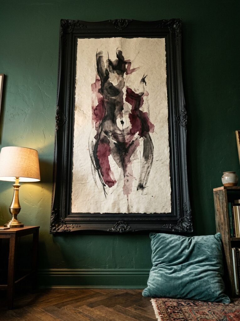
I wasn’t. And then I was.
There’s a specific kind of feminine figurative art — think Pre-Raphaelite influence, Art Nouveau maidens, ethereal portraits with dark backgrounds — that works SO well in this space. Not because it’s fashionable. Because it gives the room a sense of personhood. Like the room belongs to someone with a history.
A woman with dark flowing hair against a shadowed background. A figure half-turned toward a window. Hands holding flowers that are clearly past their peak. This kind of art doesn’t just decorate — it tells a story. And in a bedroom, that matters more than in any other room.
Side note — the Pre-Raphaelites were genuinely onto something and I’ll die on that hill.
If portraits feel too intense, consider close-up figurative details. Hands. A neck with a piece of jewellery. The curve of a shoulder. These feel intimate without being confrontational, which is honestly the sweet spot for a bedroom.
“You don’t have to like ‘portraits’ in the traditional sense to fall in love with figurative art that has a dark feminine energy to it.”
—
5. Moon Art: Not Cheesy If You Do It Right
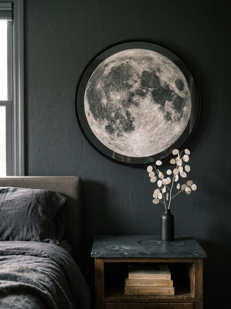
Moon art has a reputation problem. There’s a lot of it out there that’s, let’s be honest, a bit much. Neon crescent moon signs, mass-produced “she’s magic” prints — that’s not what we’re doing here.
But moon art done well? It’s perfect for this aesthetic.
What works: a large-scale moon illustration in soft graphite tones, a realistic photograph of a full moon in a dark sky, a vintage-style moon phase print with proper detail and aged coloring. The kind of thing you’d find in an old astronomer’s study or tucked into a Victorian naturalist’s collection.
What doesn’t work: anything with affirmations printed over it, anything that glows, anything in millennial pink.
Scale up. A small moon print on a large wall just looks shy. Go big, frame it properly, hang it where it gets decent light.
—
6. How to Actually Arrange Multiple Pieces Without It Looking Like a Car Boot Sale
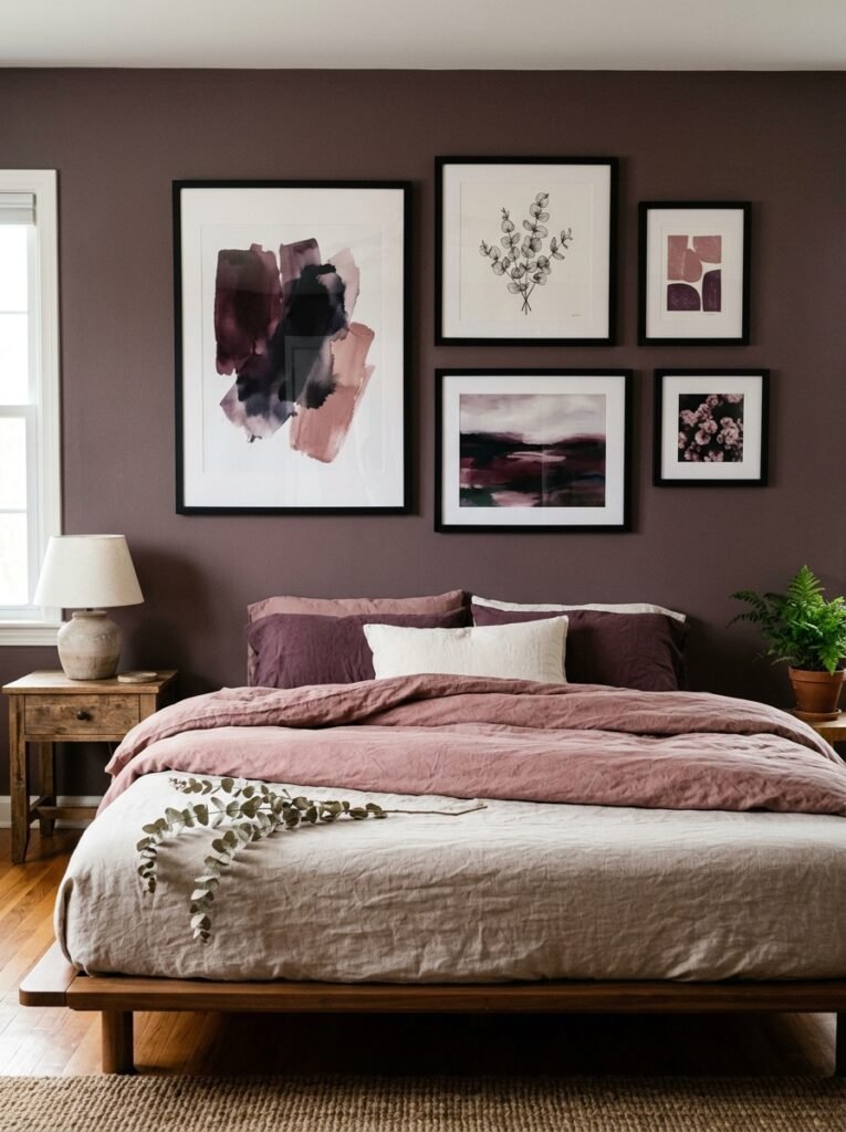
Gallery walls get messy fast. Dark feminine gallery walls have an added challenge because the art tends to be rich and detailed, and too much richness in one place becomes noise.
Here’s what actually works:
- Stick to a strict frame family. Two at most — maybe an ornate gold and a plain dark wood. Don’t introduce a third.
- Vary the SIZES wildly. One large anchor piece, a couple of mediums, one or two small. Not four mediums. That’s a grid, not a gallery wall.
- Leave breathing room. Dark art on dark walls needs space between frames or everything bleeds together.
- Odd numbers. Three pieces works. Five works. Four always looks like you couldn’t decide.
But honestly, the single-large-piece approach is underrated. One enormous framed print centered above the bed, done right, is more powerful than a whole gallery wall. It takes confidence, but it pays off.
—
7. The Textures That Make Framed Art Look Like It Was Always Meant to Be There
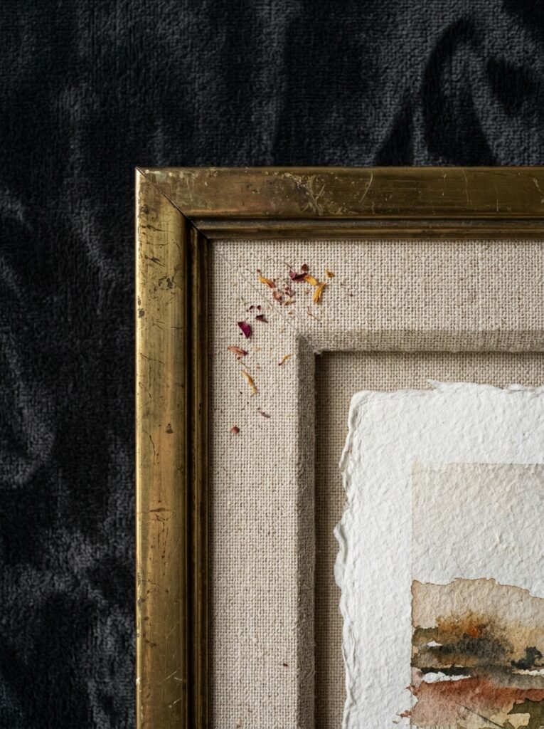
Art doesn’t exist in isolation on a wall. It exists with everything around it.
For dark feminine bedrooms, the art lands better when the surrounding textures are soft and layered — velvet, linen, knitted throws. Hard minimal surfaces fight against this kind of art. But a wall with a textured plaster finish or dark painted surface, with a bed below it dressed in rich fabrics? The art sinks into that environment and looks inevitable.
Also: lighting. Not overhead. Never overhead if you can avoid it. A picture light above the frame, or a warm lamp nearby, changes everything. The amber glow of an Edison bulb at 7pm falling across a botanical print is one of the better small pleasures in life, not gonna lie.
—
8. The Print Format That Most People Don’t Consider (But Should)
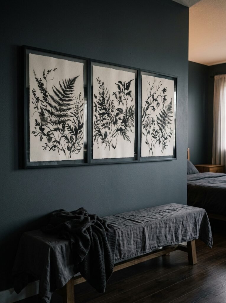
Canvas gets all the attention. Prints under glass get the respectability points. But there are other options worth considering.
Unframed art prints pinned directly to the wall with proper display mounts have a raw, studio-feel that can actually work brilliantly in a dark feminine space. It feels intentional if you do it right — like the art is so good it doesn’t need a frame to justify itself.
Fabric wall hangings are having a moment too. A large woven piece in deep tones — burgundy, forest, near-black — adds dimension that flat canvas can’t. The texture catches the light differently at different times of day.
And stretched velvet-backed prints. Yes, they exist. Not the tacky kind — the kind where the image is printed on a velvet or velour-adjacent surface that gives it a soft, almost felt-like texture. They look incredible in candlelight. They’re harder to find but absolutely worth it.
“Sometimes the most interesting choice isn’t the art itself — it’s what you put it on.”
—
9. Dark Feminine Art That Works in a Small Bedroom Without Eating It Alive
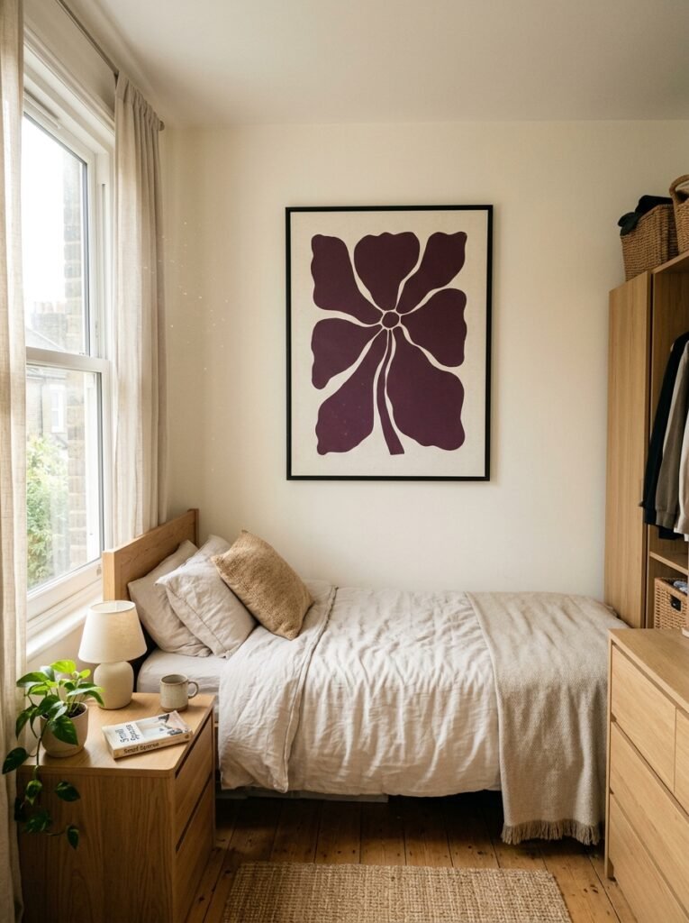
Small rooms and dark art have a complicated relationship. Here’s the thing though: the problem usually isn’t the darkness of the art, it’s the scale.
One large-scale dark botanical print in a small bedroom can make the room feel bigger, honestly. Because it gives the eye something to travel to, and then the space around it feels like breathing room. It’s three small dark prints crowded together that makes a small room feel claustrophobic.
In a small UK bedroom especially — those Victorian terrace bedrooms that are basically a bed and a window and not much else — one well-chosen piece above the bed, properly scaled, is the move. Nothing below the headboard. Nothing flanking the window. Just that one piece doing its thing.
American homes sometimes have more wall space to play with, and if you do, still resist the urge to fill all of it. Dark feminine is about intention. Not saturation.
—
10. The Color That Changes Meaning Depending on What’s Around It
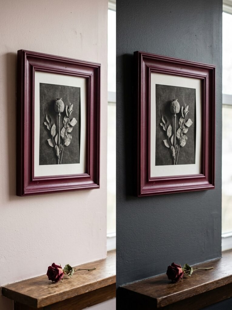
Black art on a white wall is dramatic. Black art on a dark green wall is sophisticated. Black art on a burgundy wall almost disappears and becomes textural.
This isn’t obvious until you’ve lived with it. The same framed print that looked striking in the shop looks completely different once it’s home on your specific wall.
If you’re going with a dark wall color — which I’d encourage because it makes everything richer — consider the art tones carefully. High contrast works (cream botanical on dark wall). Tonal layering works (deep blue art on deep navy). What doesn’t work is mid-tone art on a mid-tone wall in the same family. It all just… flattens.
Or maybe that’s just my experience. Your room might prove me completely wrong. Worth testing with a good print before committing to anything expensive.
—
11. The One Thing That Makes Dark Feminine Art Feel Personal Instead of Pinterest-Perfect
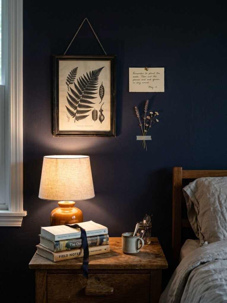
It’s having at least one piece that you can’t easily explain.
Not something obscure for the sake of it. But something that isn’t immediately categorizable — a piece of art that somebody picks up and has to ask about. Maybe it’s a surrealist print you found from a small independent illustrator. Maybe it’s a vintage French lithograph from a market. Maybe it’s something you printed yourself from a public domain archive of Victorian scientific illustrations.
The rooms that feel most specifically “someone lives here and is interesting” aren’t the ones with the most consistent aesthetic. They’re the ones with one unexpected piece that makes you stop.
Every other piece can be curated and cohesive and perfectly dark-feminine. But leave room for that one thing that’s just yours. It’s the difference between a beautiful room and a room that belongs to a person.
—
12. When to Stop (Because Over-Styled Kills the Vibe Completely)
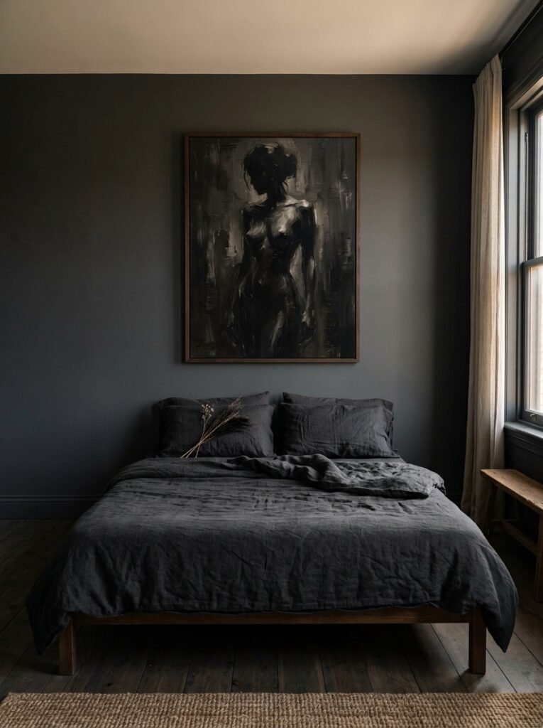
This is the section nobody wants to hear.
Dark feminine bedrooms don’t need a lot. They need the right things. And the right number of things is usually fewer than you think.
If every wall has something on it, nothing stands out. If the art is competing with fairy lights, a gallery shelf, two different tapestries, and a collection of dried flowers in every corner — the art loses. The whole aesthetic loses. It starts looking like a mood board instead of a room someone actually sleeps in.
Pick your walls. One feature wall. Maybe a smaller secondary piece elsewhere. Decide what your ANCHOR piece is and let everything else support it, not rival it. Then stop. Sit with it for a while before adding anything else.
I know, I know. It’s hard. There’s always one more print. But the restraint is the point.
—
❓ FAQ
Q: What wall colors work best behind dark feminine bedroom art? A: Deep, saturated colors tend to make this kind of art sing — think dark forest green, charcoal, deep plum, or a very dark navy. That said, off-white or warm cream walls work too if you go for high-contrast art with dark tones. The main thing to avoid is bright white, which can make rich, moody art look a bit harsh rather than romantic.
Q: How do I find affordable dark feminine art prints that don’t look cheap? A: Print-on-demand platforms, independent illustrators on digital marketplaces, and public domain archives (a lot of Victorian and Art Nouveau work is free or very low cost) are brilliant sources. What elevates a budget print is almost always the frame — a good quality frame with a mount makes a £10 digital print look like a gallery piece. Don’t skip the mat board.
Q: Is dark feminine wall art too intense for a small bedroom? A: Usually not, as long as you get the scale right. One well-scaled piece on the main wall actually draws the eye and makes the room feel larger, not smaller. The mistake is hanging several small dark pieces together — that’s when a small room starts to feel heavy. Go singular and intentional over multiple smaller pieces whenever space is limited.
—
💭 Final Thoughts
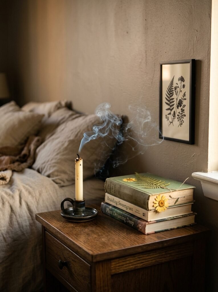
A bedroom wall should feel like it was chosen, not curated. Not assembled. There’s a difference, and dark feminine art lives right in that space — it’s personal, it’s atmospheric, it’s got edges. The best dark feminine bedrooms I’ve ever walked into weren’t the most polished ones. They were the ones that felt like nobody else could have made them quite that way.
So what’s the one piece you keep coming back to — the one you haven’t bought yet because you’re not quite sure it’s “right”?
Maybe that’s exactly the one you need.