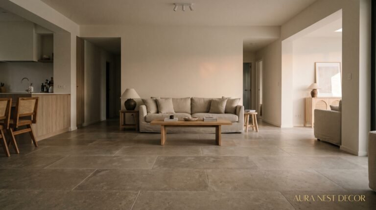
Farmhouse Curtains That Actually Make Your Living Room Look Pulled Together (Not Like a Barn)
There’s a version of farmhouse style that looks incredible and a version that looks like someone just moved in and never finished unpacking. The difference, nine times out of ten, is the curtains. Get them right and the whole room settles. Get them wrong and nothing — not the shiplap, not the linen throw, not the cute little pitcher of dried pampas — can save you.
—
1. Why Farmhouse Curtains Hit Different When the Fabric Is Wrong
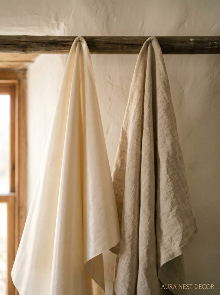
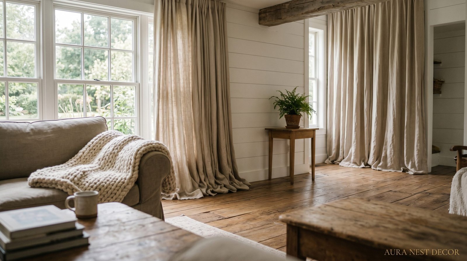
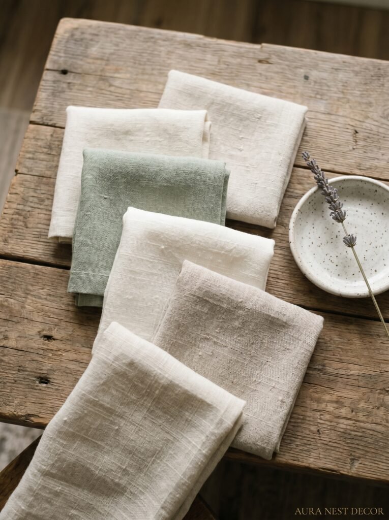
Let’s start here because nobody talks about this enough. The fabric is doing 80% of the work. You can find the most perfect cream curtain panel in the world and if it’s polyester, it’s going to hang stiff and shiny and completely ruin the vibe you’re going for. Farmhouse living rooms live or die by texture — and the textures that work are the ones that look like they’ve existed for a while. Linen. Cotton canvas. Burlap-blend. Even a subtle woven texture in a neutral cotton can work beautifully.
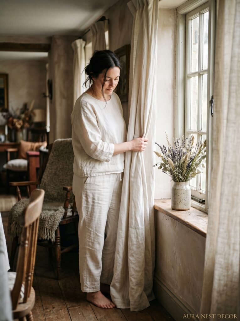
Linen is honestly the one I’d push hardest. It wrinkles, which sounds like a problem, but that slight crumple is exactly what makes it feel authentic. You’re not going for hotel-pressed perfection here. You’re going for the kind of room that looks like someone lives in it and actually loves it. Linen in natural, undyed tones picks up the light differently throughout the day — dusty and warm in the morning, almost golden when the sun cuts through the windows in the late afternoon.
The mistake most people make is going straight to the curtain section and grabbing whatever’s labeled “neutral.” Neutral in polyester and neutral in linen are completely different things. One says IKEA staging, the other says collected-over-years home. Trust me on this one.
“The right fabric doesn’t just hang in the room — it breathes with it.”
2. The Color That Keeps Showing Up in Every Beautiful Farmhouse Living Room Right Now
Off-white. Not white. Not cream either, exactly — something in between. If you’re looking at paint swatches for reference, think Benjamin Moore’s White Dove or Sherwin-Williams Alabaster but in fabric form. That very slightly warm, very slightly muted tone that doesn’t compete with anything in the room.
Here’s why this matters: pure white curtains in a farmhouse space read as modern and clinical. They push the eye away instead of pulling it in. But that soft, worn-in off-white? It layers with everything. Wood tones, cotton throws, rattan baskets, black iron hardware — it just… works.
For UK readers who are working with rooms that get less natural light (which, honestly, is most of us most of the year), I’d lean slightly warmer rather than cooler. A linen that has any grey undertone will feel a bit flat and sad on a dark November afternoon. Go warmer, even if it feels like a lot when you’re looking at a small sample in a shop.
And if you want something with a bit more presence — a gentle stripe in an oatmeal and warm white is so good right now. Ticking stripe. Classic, farmhouse, works in literally any room. I’ve never met a ticking stripe curtain I didn’t like, honestly.
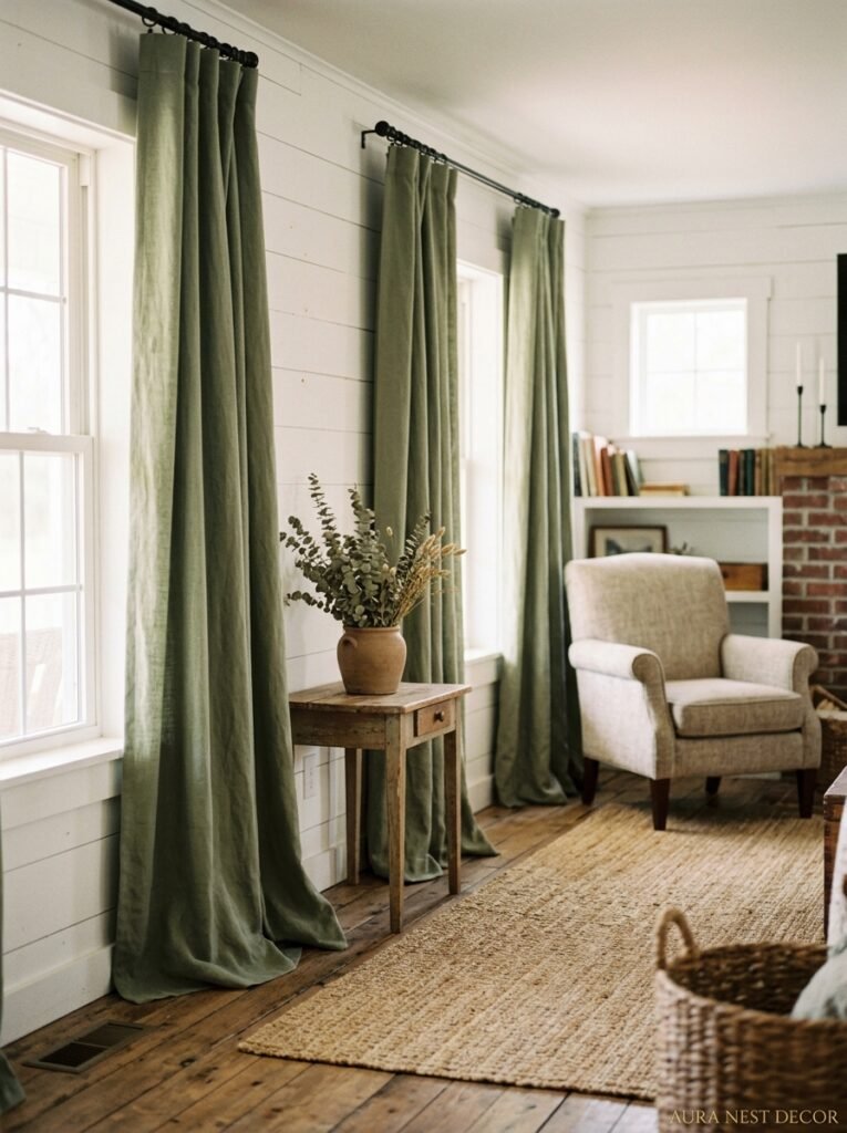
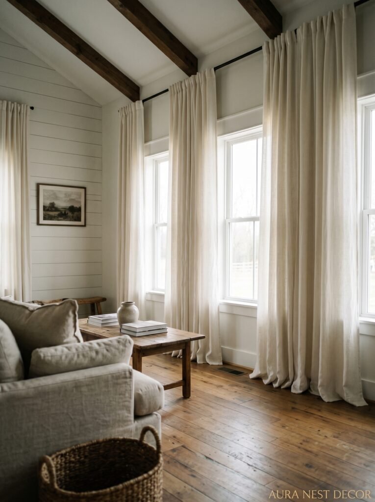
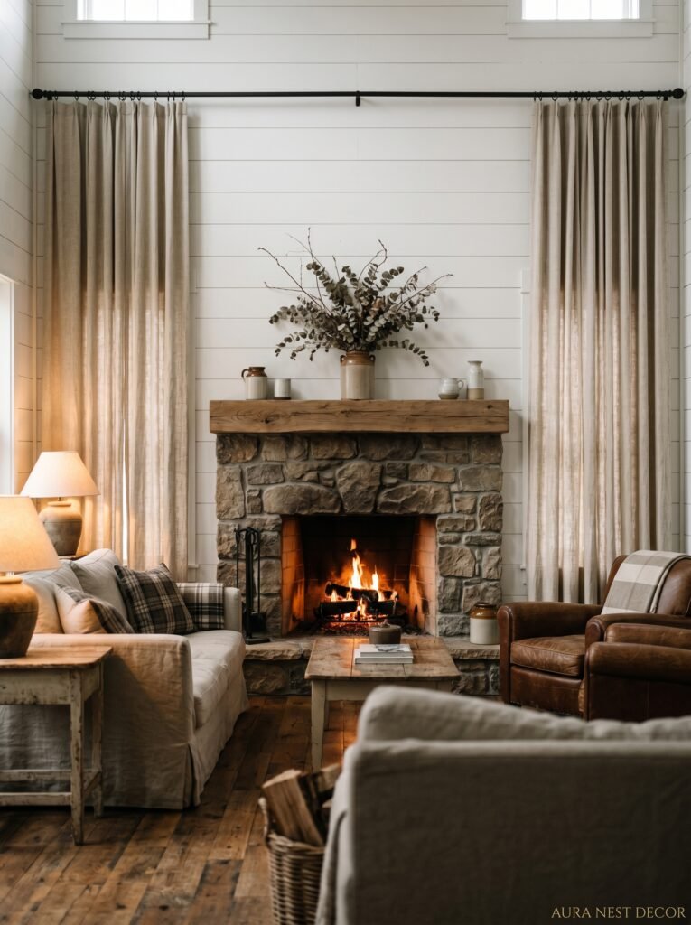
3. Floor-to-Ceiling or Nothing — Here’s Why This Rule Actually Holds Up
This is the one rule I repeat to everyone. Hang them high, let them touch the floor. That’s it. That’s the whole section, kind of.
But I’ll expand because the “why” matters. When you hang curtains from the actual curtain rod above the window — not from 12 inches higher — you cut the room off visually. The window looks shorter. The ceiling feels lower. The whole room shrinks. But when you push that rod up toward the ceiling and let the panels fall all the way to the floor, something clicks. The room feels taller, the windows feel enormous, and the curtains stop being window coverings and start being an architectural feature.
In farmhouse style specifically, this elongating effect is everything. Most farmhouse interiors are working with traditional proportions — not huge open-plan spaces. So you need every visual trick to make the room feel generous and unhurried. Curtains puddling on the floor, just slightly? Even better. That gentle puddle at the base (about an inch to two inches of extra fabric) looks intentional and a little romantic, not sloppy.
The exception is if you have small children or dogs. In which case, puddle at your own risk. But aesthetically? Breathtaking.
4. The Curtain Rod That Keeps Getting Overlooked (And It’s Changing Everything)
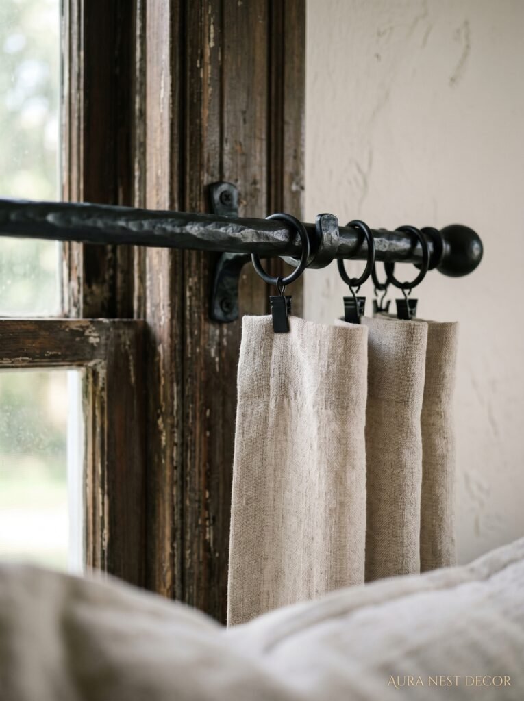
Black matte iron. That’s it. That’s the answer.
I don’t know why people still buy the cheap brushed nickel rods when black iron exists, but here we are. A matte black curtain rod does something almost structural to a farmhouse living room — it gives the eye a place to land at the top of the window, it ties in with any other metal accents in the space (light fixtures, door hardware, cabinet pulls), and it feels deliberate. Considered. Like someone thought about it.
Wooden curtain rods are also genuinely beautiful in this style. A chunky round rod in a natural wood with simple ring clips — so good. That combination of the organic wood rod and the linen panels with ring clips hanging slightly unevenly? It’s that effortlessly collected feeling that’s really hard to buy and really easy to accidentally achieve when you just commit to natural materials.
The clip rings, by the way, are not just aesthetic. They make the panels way easier to pull and actually hang better on linen than standard rod pocket because the linen doesn’t have to be forced over the rod and bunch up at the top. Practical AND pretty. Rare combination.
“The hardware isn’t an afterthought — it’s the punctuation mark at the top of the whole sentence.”
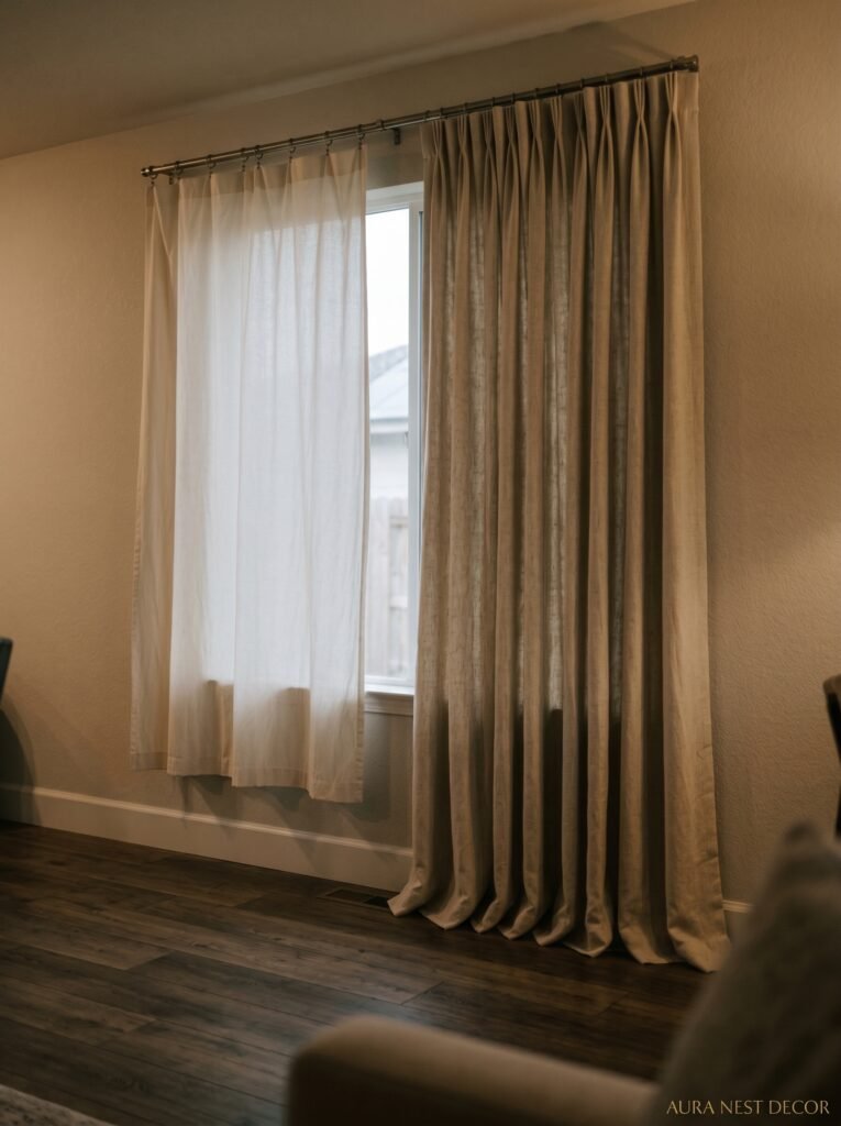
5. What Happens When You Layer Sheers Behind Your Main Panels (This Is the Secret)
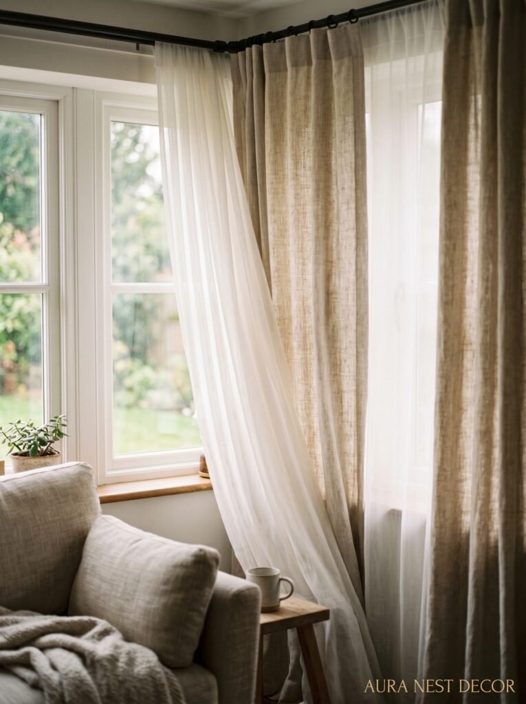
Okay, so. Not everyone does this and I genuinely don’t understand why because the effect is so good it almost feels like cheating. Hang a sheer — a very simple, almost transparent natural linen sheer — behind your main curtain panels. What you get is this gorgeous layered look where the sheers diffuse the light and give you privacy without losing the glow, and then the heavier main panels frame the outside and add the structure.
During the day, you can pull your main panels back and the sheers do the heavy lifting. The room fills with this soft, diffused light instead of harsh direct sun. Everything looks prettier in diffused light — your furniture, your plants, your face in the mirror. Genuinely.
At night, you close both layers and the room feels genuinely cosy — not just “I turned on a lamp” cosy but the kind of enveloping warmth that makes you not want to leave the sofa. That’s the goal, right?
For the sheers, go very plain. No pattern, no fringe, no embroidery. The plainer the better. You want them to be almost invisible until you notice the effect they’re creating, and then you can’t unsee it.
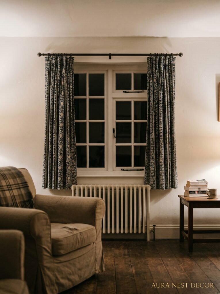
6. The One Pattern That Works (And the Three That Don’t)
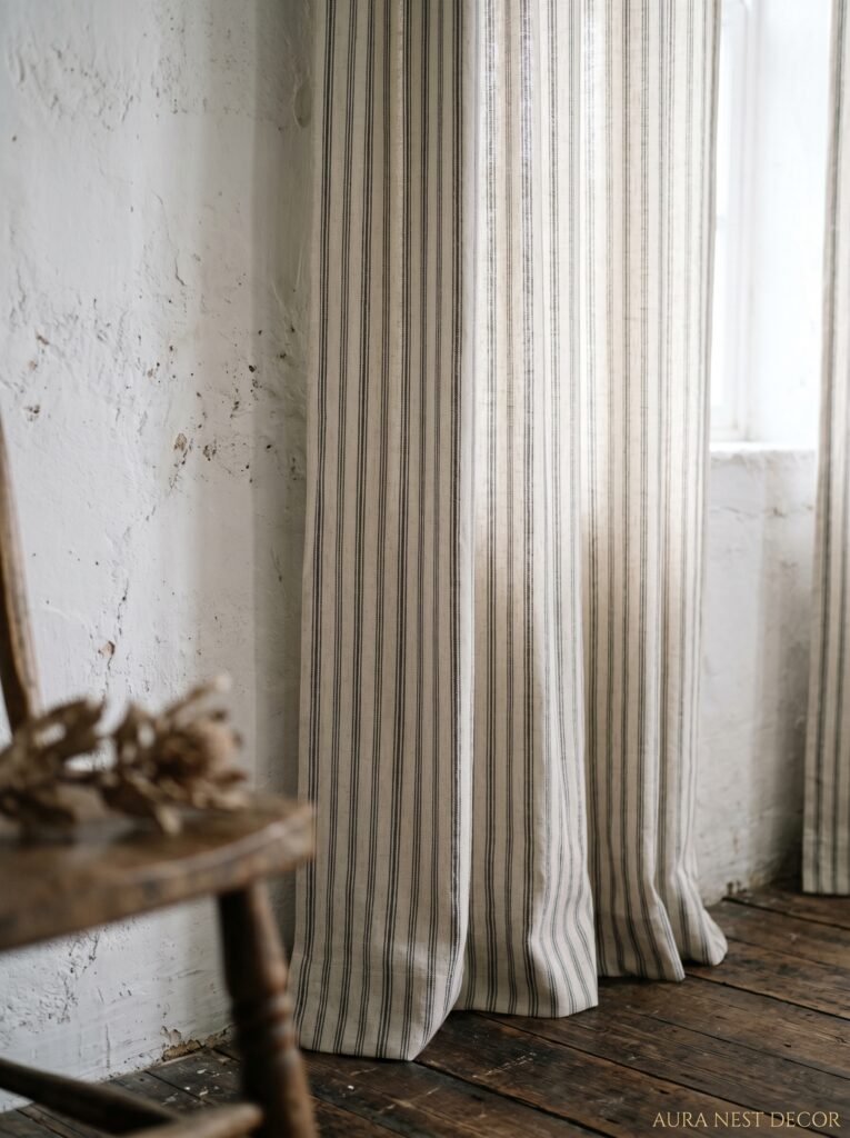
Ticking stripe: yes. Already mentioned it, I stand by it.
Buffalo check: in very small doses, in a SMALL living room, maybe. But in most living rooms it can feel like you’re living inside a tablecloth. Proceed with caution.
Floral: only if it’s very faded, very old-looking, and you’ve confidently committed to a more cottagecore version of farmhouse. If you have any doubt, skip it.
Plain solid: almost always the better choice than a pattern, especially if your room has other pattern moments — a rug, a pillow, a piece of art.
Gingham: no. I know. It’s sweet. It’s farm-adjacent. But in a living room it just reads as too casual, too country kitchen, and not in the good way. Dining room? Spare bedroom? Sure. Living room? Let it go.
The thing about pattern in farmhouse curtains is that the goal is usually for the curtains to be PART of the room, not the STATEMENT of the room. Unless you’re doing something really considered and intentional with a faded floral that has a story behind it, plain or very subtle stripe is almost always going to serve you better.
7. How Length, Width, and Fullness Are Making Your Curtains Look Cheap
Width is the thing nobody warns you about. You buy a 54-inch wide curtain panel and hang it in a window that’s 40 inches wide and think, great, that’s wider than the window, I’m done. But gathered up onto a rod, that 54-inch panel barely creates any fullness. It sits there looking thin and a little pathetic and kind of sad.
The rule is: you want your curtain panels to be at LEAST 2x the width of the window when they’re hanging closed. For a really full, luxurious look — which is exactly what you want in farmhouse style — 2.5x is better. That means if your window is 40 inches wide, you want 80 to 100 inches of total curtain panel width. Two panels of 50 inches each. That’s the fullness that makes curtains look expensive and intentional instead of like something you bought at a superstore and hung the same afternoon.
“Skimpy curtains are a quiet disaster. You don’t notice them until you see a room where it’s been done right.”
Length: floor-length, as we established. If you’re buying ready-made, 96 inches is usually a safe bet for standard ceiling heights. 108 inches if your ceilings are higher or you want any puddling effect at the base.
8. The Styling Move That Makes Farmhouse Curtains Look Less Staged
Tie-backs. But not the fussy, curtain-shop kind. A strip of jute rope, a leather strap, even a simple iron hook mounted to the wall beside the window. Something that holds the panel back loosely — casually — so it drapes rather than parts like a stage curtain.
There’s something about the asymmetry of one curtain loosely pulled back while the other hangs straight that feels a bit lived-in and unlabored. Like you just sort of moved it out of the way and happened to look beautiful doing it. When both curtains are identical and perfectly symmetrical on either side, it can start feeling a little formal and stiff — which is the opposite of what farmhouse is going for.
Side note — if you go the jute rope route, make sure the rope is thick enough to look intentional. Thin twine looks like you ran out of proper tie-backs, thick jute rope looks like a design choice. There’s a difference.
9. What UK Homes Get Wrong (And Americans Sometimes Do Too, To Be Fair)
In UK living rooms, the proportions are often different. Sash windows, bay windows, smaller overall room footprints. And I see a lot of people making curtain choices based on American farmhouse Pinterest content without adjusting for the space they’re actually working with.
In a bay window especially — which is SO common in UK terraced houses and Victorian semis — curtains can get complicated. The instinct is to put a separate rod in each section of the bay, which usually looks disjointed and busy. What works better, and looks dramatically more considered, is a curved curtain track that follows the shape of the bay with a single run of curtains. It treats the bay as one beautiful feature rather than three awkward little windows.
For sash windows, hang the rod HIGH above the window frame — there’s often beautiful original plaster coving up there that you want to play into, not cover. Let the panels frame the window without covering any more of it than necessary, because the window IS the feature in a lot of older UK homes.
10. The Exact Moment Your Living Room Goes From “Trying” to “Arrived”

It’s when the curtains stop being about the windows and start being about the room. That’s the shift. And it happens when every element — the fabric, the rod, the length, the fullness, the tie-back, the color — is working together instead of each one just being individually “fine.”
You can feel it when you walk in. The room has a kind of settled quality. Nothing is shouting. Everything belongs. The curtains aren’t doing a separate thing in the corner — they’re part of the whole room’s story, framing the light, adding warmth, giving the walls a reason to feel cosy instead of empty.
That’s the goal. Not “nice curtains.” Not “curtains that go.” That feeling when the whole room exhales.
11. Curtain Styling for Fireplace Walls — The Placement Rule That Actually Matters
This one trips people up. If you’ve got a fireplace on the same wall as, or close to, a window — and this happens constantly in UK Victorian houses and a lot of American colonial-style homes — the curtain placement gets really important really fast.
The temptation is to hang the curtains close to the window to avoid crowding the fireplace. Do the opposite. Extend the curtain rod as wide as possible, covering more wall on either side. This makes the window area feel bigger and more generous, and — crucially — it frames the window and the fireplace together as a single composed wall rather than two awkward separate things competing for attention.
Think of it like staging a photograph. You want a frame around the interesting bits. Wide curtains on a long rod create that frame. They pull everything together instead of letting things drift apart.
12. The Shopping Shortcut That Actually Delivers (No, Really)
Ready-made curtains get a bad reputation in design circles but honestly? There are some genuinely good options if you know where to look. The issue isn’t ready-made vs. custom — the issue is fabric and fullness, which we’ve already covered.
For US readers: Pottery Barn’s linen curtains have been a reliable option for years. H&M Home has good affordable linen panels. Anthropologie has some lovely options when they’re on sale. Target’s Threshold range occasionally delivers something genuinely good.
For UK readers: John Lewis does solid linen options. Dunelm, honestly, is underrated — especially their natural linen range. IKEA’s LISELOTT and AINA curtains in linen are a great base that can look really expensive when hung correctly with good hardware.
The trick with any ready-made curtain is buying MORE than you think you need. Get the wider panels, hang them high, and suddenly a £25-a-panel curtain from Dunelm looks like something you had made.
—
❓ FAQ
Q: What’s the best curtain length for farmhouse style — floor length or window length? A: Floor length, always. Window-length curtains in a farmhouse living room tend to look unfinished and a bit awkward. Hang them from as close to the ceiling as possible and let them reach the floor — it makes the whole room feel taller and more considered.
Q: Can I use white curtains in a farmhouse living room or is off-white better? A: Off-white almost always wins. Pure white can feel stark and modern, especially in natural light, and it tends to compete with other elements in the room rather than blending with them. That warm, slightly muted off-white or natural linen tone just sits more comfortably in a farmhouse palette — especially in UK homes with variable light.
Q: How do I stop linen curtains from looking too wrinkled and messy? A: A light steam is all you need — don’t iron them flat. The gentle wrinkle in linen is part of what makes it look authentic rather than synthetic. Hang them slightly damp if you can, smooth them into place by hand, and let gravity do the rest. A completely flat, crease-free linen panel actually looks LESS natural and less expensive than one with a little life in it.
—
💭 Final Thoughts

Getting farmhouse curtains right doesn’t take a huge budget or a designer’s eye — it just takes a few decisions made with intention rather than habit. The fabric matters. The height matters. The fullness matters. When all of those things come together, the curtains stop being curtains and start being part of the reason the room feels the way it does. And isn’t that exactly what we’re all going for — a room that feels like something, not just looks like something? What would change in your living room if you started from the windows first?