
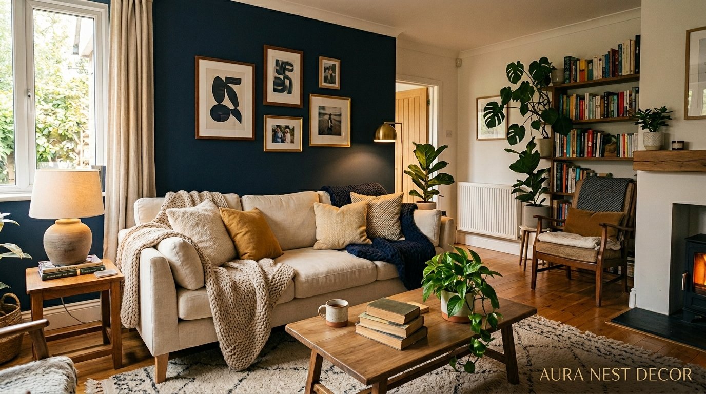
The Blue Living Room Trend That’s Making Everyone Finally Love Being Home Again
There’s something happening with blue right now. Not the cold, clinical blue of a 2009 feature wall — something richer, deeper, more like the color of a storm rolling in over the sea at 4pm in November. People are wrapping their living rooms in it and not looking back.
—
1. Why Blue Feels So Different in a Living Room Than Anywhere Else in the House
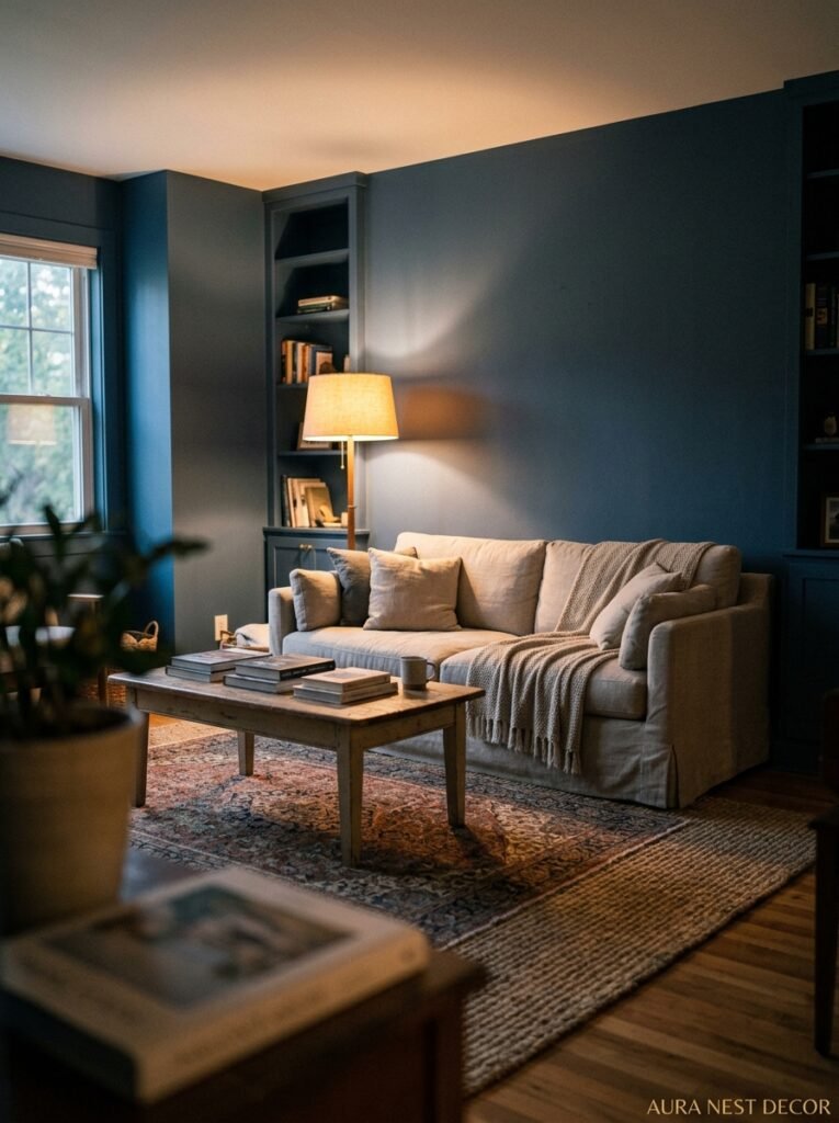
Blue in a bedroom makes sense to everyone. It’s calm, it’s restful, fine. But a blue living room? That’s where people pause. That’s where it gets interesting.
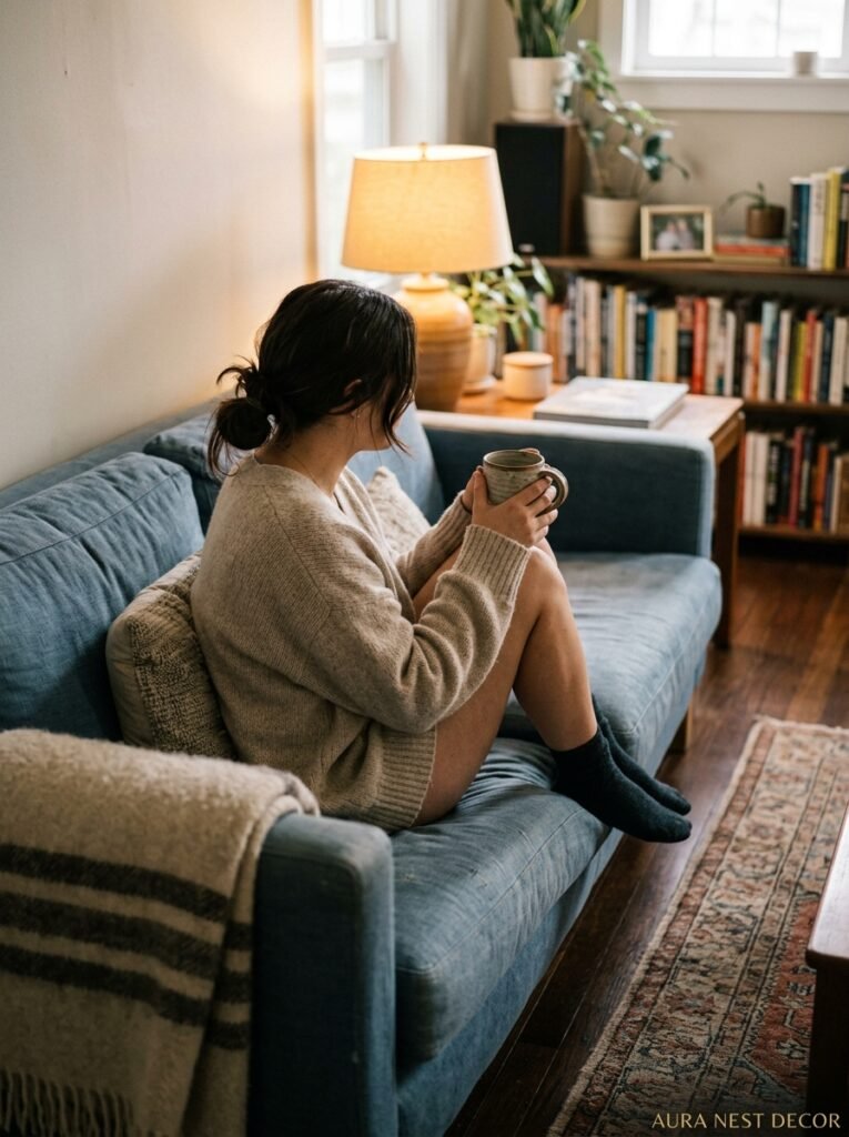
Here’s the thing about living rooms — they’re the room that does the most work. It’s where you crash at 9pm with a blanket, where guests come in and immediately form an opinion, where Sunday mornings happen and somehow stretch into Sunday afternoons. So the color you choose isn’t just decorative. It sets a tone for every single one of those moments.
Blue — and I mean a GOOD blue, not a powder blue with beige furniture — can make a living room feel anchored in a way that white walls never quite manage. There’s a weight to it. A sense that the room has a personality. I’ve been in beautifully decorated all-white living rooms that still felt like the owners hadn’t actually moved in. And I’ve been in tiny, slightly imperfect rooms painted in deep navy where I genuinely didn’t want to leave.
It’s the difference between a room that looks nice and a room that actually feels like somewhere.
“A blue living room doesn’t ask you to admire it. It asks you to sit down and stay awhile.”
The right shade of blue absorbs light instead of bouncing it around nervously. It makes your sofa look more intentional, your lamp feel warmer, your bookshelves look like they were styled by someone who actually reads. And that’s before you’ve changed a single piece of furniture.
—
2. The Specific Shade That’s Showing Up Everywhere Right Now (and Why It Works)
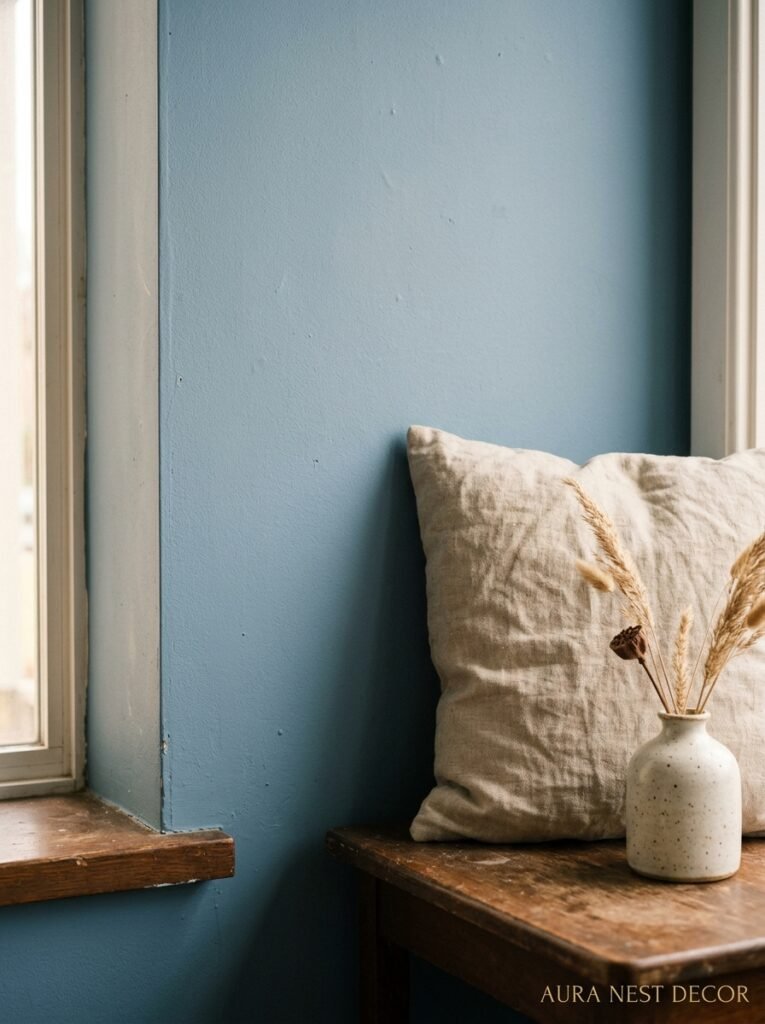
Not navy. Not sky. Not denim. The shade I keep seeing — in design accounts, in the Pinterest saves flooding my feed, in real homes I’ve been invited into — is something closer to a dark slate blue with just a hint of green in it.
Think Farrow & Ball’s Hague Blue, or if you’re in the US, Benjamin Moore’s Van Deusen Blue. It’s sophisticated without being stuffy. It reads differently depending on the light — almost grey on a cloudy afternoon, genuinely dramatic at night with a lamp on.
This isn’t a trendy blue. It’s more like the blue your grandmother’s friend had in her sitting room in the seventies that you thought was weird then and now realize was completely perfect. Or maybe that’s just me. Anyway, the point is it has history to it.
Lighter versions of this same blue-green slate are working beautifully too, especially for smaller living rooms or rooms with limited natural light. Something like Railings by Farrow & Ball’s softer cousins, or Clare Paint’s Petal for a dustier take. These are blues that don’t fight with you. They settle in.
—
3. The One Paint Trick That Makes a Cozy Blue Room Feel Bigger, Not Smaller
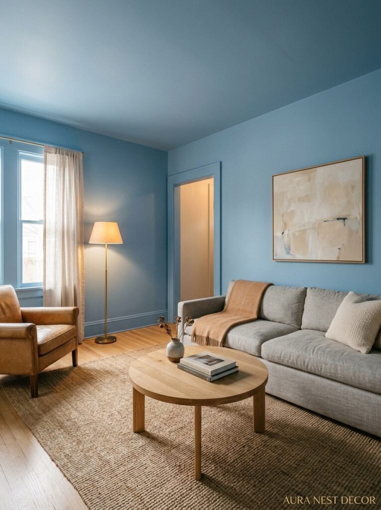
Everyone’s first worry is that a dark blue room will feel small. And I get it, I do. But there’s a rule that basically solves this entirely, and once you know it you can’t unsee it.
Paint the ceiling. Not white. The SAME color, or a shade lighter.
I know. Stay with me.
When the ceiling matches or closely echoes the walls, the eye doesn’t read the room as a box anymore. It reads it as an envelope — a continuous space that wraps around you rather than pressing in. The edges disappear. The room somehow feels less defined and therefore less limited.
This is why those dark-painted Victorian living rooms in London townhouses don’t feel oppressive — the color flows up and over and the room becomes more like a mood than a measurement. I’ve seen this work in small terraced houses in Manchester and in compact New York apartments alike. Scale isn’t really the issue. Contrast is.
Side note — if you’re renting and can’t paint, dark blue removable wallpaper (yes, it’s good now, the old stuff was terrible) does the same job on a feature wall. Not the same, but close enough.
—
4. Furniture Colors That Genuinely Work Against a Deep Blue Wall (This List Will Surprise You)

Here’s where most people go wrong. They paint the walls blue and then panic and put in all-white or all-beige furniture because they’re afraid of it. And the result is a room that feels like a fight.
Natural linen works. Cream works better than white — white fights, cream cooperates. Terracotta is extraordinary against blue, genuinely one of the best pairings in design history and I’ll argue with anyone about that. Burnt sienna cushions, a warm clay vase, even a terracotta-colored rug will make a blue room feel like it was planned by someone who knows what they’re doing.
“Terracotta against deep blue is the color pairing that designers use when they want the room to feel emotionally intelligent.”
Warm wood tones — oak, walnut, anything golden rather than grey — are essential. You need that warmth somewhere in the room or it tips from cozy into cold. A worn leather sofa in cognac or caramel brown is maybe the single best piece of furniture you can put in a blue living room. Better than velvet, even. Which is saying something because I love velvet.
Green works too, weirdly. Olive or forest green cushions or a plant in a warm terracotta pot — it ties into the natural world in a way that feels very current without feeling like it’s trying.
—
5. Lighting: The Thing That Will Either Save or Ruin Your Blue Room
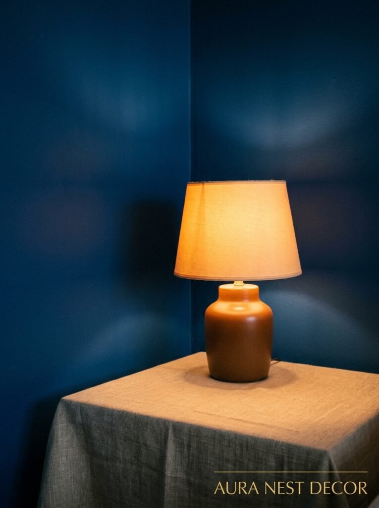
Blue rooms are UNFORGIVING of bad lighting. This is the thing nobody tells you when you’re standing in the paint aisle.
Cool, overhead fluorescent or LED light will turn a beautiful deep blue into something flat and vaguely sad. You’ll come home, flick the light on, and wonder why the room doesn’t look like it did in the inspiration photo. This is why.
What you need is warmth. Specifically, bulbs in the 2700K range — that’s the amber glow that reads like candlelight rather than office lighting. Edison bulbs, warm-toned filament lights, any lamp that throws gold rather than white. Table lamps placed low in the room are better than overhead lighting almost always, but in a blue room they’re essential.
If you can only do one thing to a blue living room, light it warmly. That’s it. The rest is detail.
Candles help more than they should logically help. I don’t fully understand the science of it but three candles lit in a deep-blue living room on a Tuesday evening in October creates something close to magic. The flickering against the wall color, the way it shifts between grey-blue and something almost green — it’s genuinely good.
—
6. The Textile Layer That Makes It Actually Cozy (Not Just Pretty)
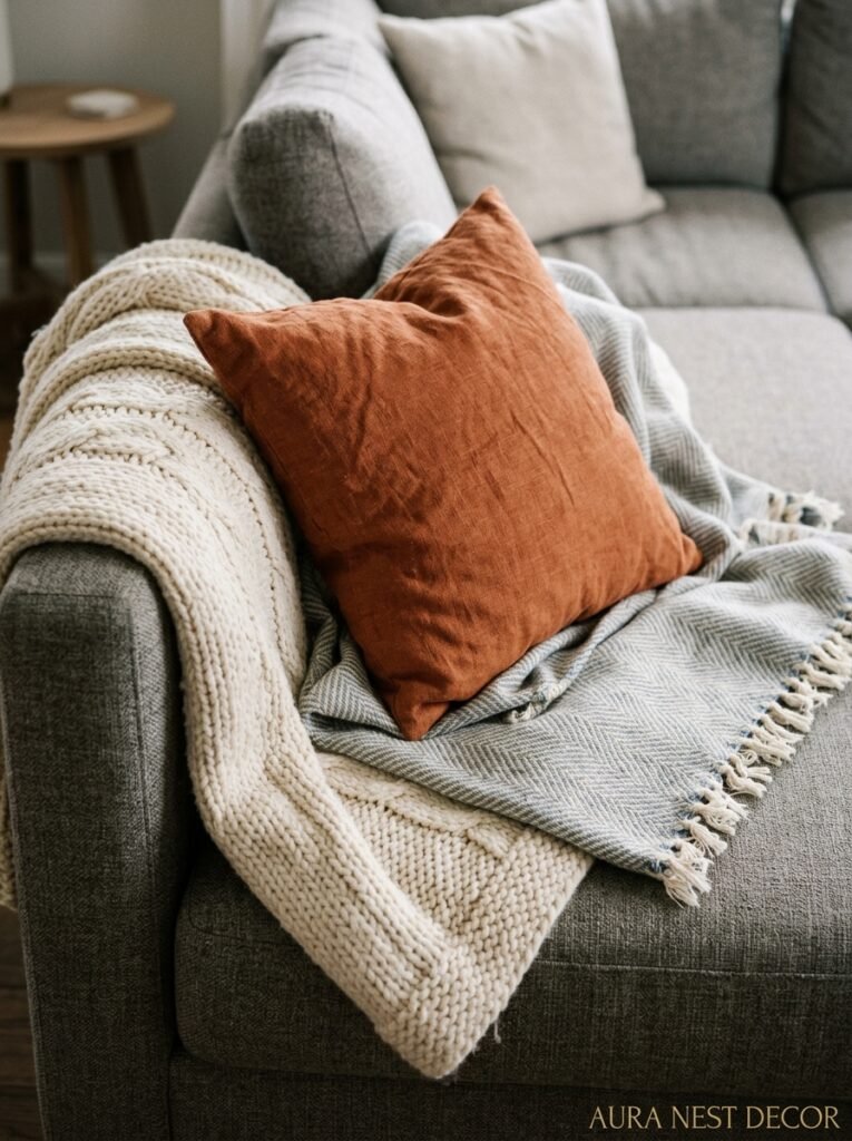
A blue living room without the right textiles is just a room. The textiles are where the cozy actually lives.
Chunky knit throws in cream or oatmeal draped over the sofa arm. Not folded neatly — thrown, like someone left it there because they were using it. Pillows in varying textures rather than matching ones. Velvet and linen next to each other. A slight chaos to it. Rooms that look like a catalog are not cozy, they’re just clean.
Rugs deserve their own conversation. A faded Persian-style rug with blues AND terracotta AND cream in it is probably the single most powerful thing you can add to a blue living room because it grounds it and introduces every color you want in the room at once. It doesn’t have to be expensive. Wayfair, IKEA’s Persisk range, or a charity shop find — it’s the pattern and the fading that matter, not the price.
And curtains. Long curtains, please. Floor to ceiling if you can manage it. Linen in natural, cream, or even a dusty blush. Hung above the window frame to make the ceiling feel higher. This is a trick designers use constantly and it works EVERY time.
—
7. Small Blue Living Room Ideas That Don’t Feel Like Compromises
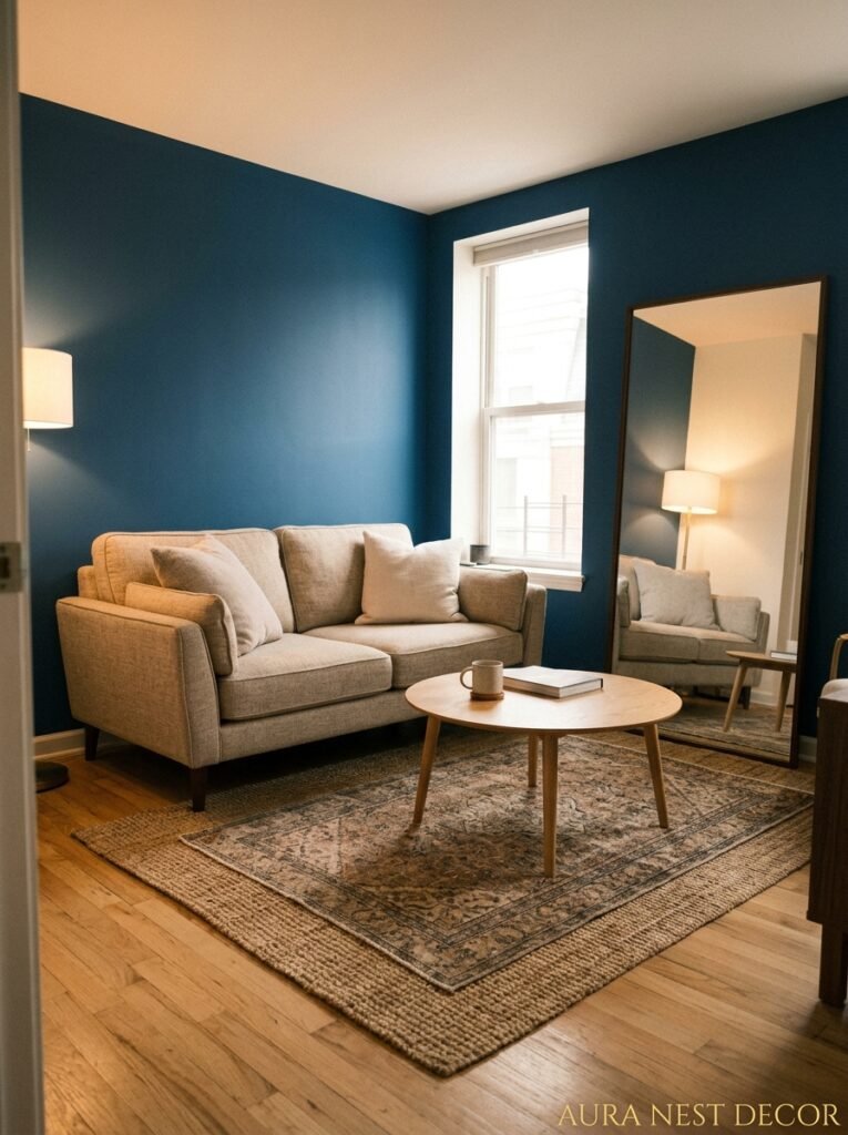
Small living rooms have a different energy problem than large ones. They don’t feel cold — they feel cluttered. And clutter in a dark room is genuinely bad.
But here’s the thing: a small room in a lighter version of that blue-slate shade, with intentional furniture (less of it, not smaller versions of it), with warm lighting and one really good rug — that room can feel more intentional than a large living room in beige.
The key in small rooms is vertical. Draw the eye UP. Tall curtains, a piece of art hung slightly higher than feels natural, a tall lamp, a few shelves. The room doesn’t get bigger but your perception of it does.
“Small rooms don’t need less furniture. They need more intention behind every single piece.”
Mirror placement matters enormously. One good mirror — not a gallery wall of three small ones, just one — on the wall opposite or adjacent to a window will pull light through the room in a way that opens it up without making it feel like a hotel corridor. Round mirrors work especially well in blue rooms. Something about the shape softens the whole thing.
—
8. The Art and Gallery Wall Approach That Doesn’t Look Chaotic
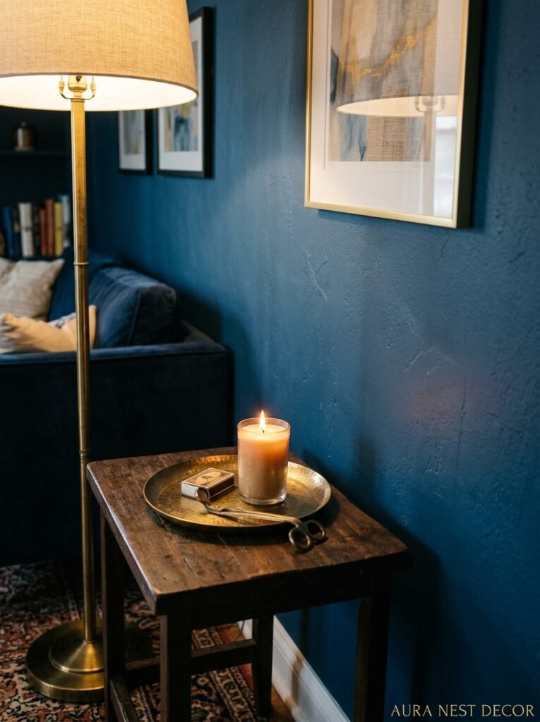
Blue walls are GREAT for art. They make almost everything look better — better hung, better chosen, more deliberate. White walls sometimes show art off. Blue walls make art feel at home.
Single large pieces work brilliantly. A big painting or print, something warm-toned or abstract, hung on a deep blue wall with some breathing space around it. Don’t be afraid of the empty space. That space is doing work.
Gallery walls can work but they need a unifying element. In a blue room I’d go for wooden frames — natural, warm-toned, varying widths. Mix photographs with prints with maybe one small mirror. The warmth of the wood against the blue connects it. Metal frames can work but they push the room colder, so only if you’re going for a more contemporary feel.
Botanical prints are extremely good in blue rooms. Don’t know why, something to do with bringing in the outside, but a few framed botanical illustrations — the old-fashioned kind with white backgrounds — against a deep blue wall look like they were always supposed to be there.
—
9. The Surprising Power of Brass in a Blue Living Room
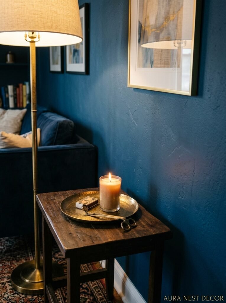
I keep coming back to brass. Every single time I’m putting together a blue room concept, brass hardware ends up in it. Not gold. Brass — that slightly tarnished, antique warmth that reads old and expensive even when it isn’t.
A brass lamp base. Brass picture frames around one or two prints. A brass-legged coffee table. Brass handles on a built-in cabinet. You don’t need all of these — you need two or three, placed thoughtfully.
The pairing of deep blue and aged brass is one of those combinations that transcends trend. It’s been working in British country houses for centuries and it’s working in LA apartment on Instagram right now. That’s the sign of a real pairing rather than a fad.
Honestly, just replace your existing lamp with one that has a brass base. Do it before you change anything else. The difference it makes to a blue room is almost unfair.
—
10. How to Do This on an Actual Budget Without It Looking Cheap
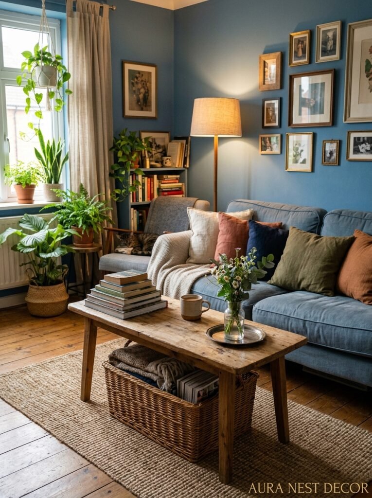
Real talk: most of the inspo images you’re saving right now were shot in rooms with budgets that don’t bear thinking about. But the PRINCIPLES translate completely to normal budgets. You just have to know where to actually spend.
Spend on: paint (good paint matters, the cheaper stuff covers badly and you’ll end up applying three coats anyway, so buy decent), a rug (this is the most impactful single purchase), and lighting (the right bulb costs about $3 and changes everything, a decent lamp costs $30-60 and can come from IKEA or TJ Maxx).
Save on: cushion covers (buy the inserts from IKEA and the covers from smaller shops or even Etsy), art (print it at home or find prints for under $15 and frame them simply), and accessory items like vases and decorative objects which look fine from HomeGoods, Dunelm, or a car boot sale.
The expensive things in beautiful rooms are usually the paint, the rug, and the structural pieces. Everything else is more about editing than spending.
—
11. The Cozy Evening Ritual That Makes a Blue Living Room Worth Every Bit of Effort
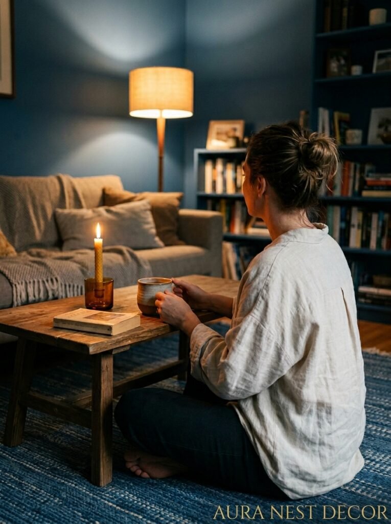
Okay, slight tangent but hear me out.
A blue living room changes the way you use a room in the evenings. This sounds ridiculous but it’s true. There’s something about the color — combined with the warm lighting, the textiles — that makes sitting down and actually being in the room feel like the obvious choice rather than drifting to your phone in a beige corridor.
I’ve heard this from people again and again. You do the room, you light the candles, you switch off the overhead light, and suddenly you’re actually reading the book you bought six months ago. You’re actually having the conversation. You’re actually just sitting there, not doing anything, and not feeling like you should be doing something else.
The room does that. The color does that.
I don’t have a scientific explanation. I just know it’s real.
—
12. The Blue Living Room Mistakes I See Constantly (And How to Sidestep Them)
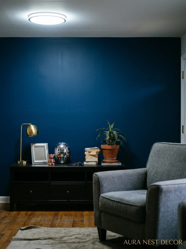
Too much blue. This sounds obvious but it catches people out. Blue walls with a blue sofa and blue cushions and blue art — it’s overwhelming. The warmth has to come from somewhere. At least one major piece of furniture needs to be warm-toned.
Starting with a feature wall and calling it done. A single blue wall in a white room isn’t a blue living room and it rarely looks intentional. Commit. Go three walls minimum, or just go all four. Half measures tend to look like the owner got nervous and stopped.
Choosing the wrong finish. Blue walls in a living room should be matte. Always matte. Eggshell and satin finishes on walls can look fine in other rooms but on dark blue they look plastic and flat and they’ll catch every mark.
Skipping the warm white or cream trim. Dark walls with dark trim can look fantastic in the right hands but it’s harder to pull off. Keep your trim and architraves warm white. It gives the room definition and stops it reading as a cave.
And please — don’t let anyone talk you out of it because it’s “too dramatic.” The whole point is that it’s dramatic. That’s the good part.
—
❓ FAQ
Q: Will a dark blue living room make my space feel smaller? A: Only if you fight it with the wrong lighting and furniture. Warm bulbs, a few well-placed lamps, a light-toned rug, and curtains hung high will actually make the room feel more expansive — the color wraps around you instead of closing in. The trick is committing to the warmth.
Q: What’s the best blue paint for a north-facing living room in the UK? A: North-facing rooms get cool, grey light, so you want a blue with warmth in its undertones — something with a slight green or teal lean rather than a stark navy. Farrow & Ball’s Hague Blue, Dulux’s Sapphire Salute, or Little Greene’s Mizzle are all worth testing. Always do large swatches and look at them in the evening light, not just midday.
Q: Can I have a blue living room if I’m renting and can’t paint? A: Yes, genuinely. Dark blue removable wallpaper has come a long way — Chasing Paper and Tempaper both do good options. Alternatively, a large dark blue area rug, heavy dark curtains, and blue-toned art can create a lot of the same effect without touching the walls. It won’t be identical but it’ll get you most of the way there.
—
💭 Final Thoughts
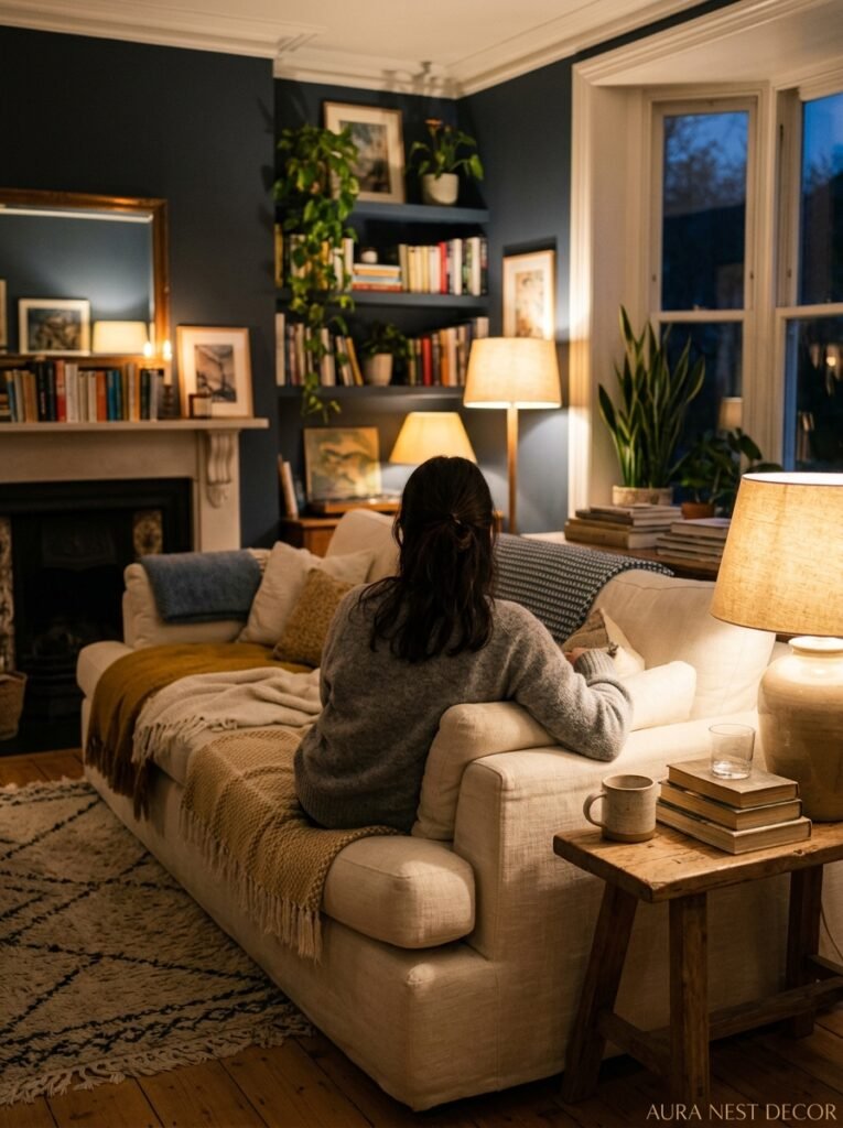
Blue living rooms aren’t for everyone. But for the people they ARE for — the ones who want to come home and actually feel something — they’re hard to beat. There’s a reason this keeps showing up in design accounts, in saved pins, in conversations about the rooms people love most. It’s not a trend that’s about to peak and disappear. It’s something older than that.
The question worth sitting with is: what do you actually want your living room to feel like at 8pm on a Wednesday night when the week has been a lot?




