
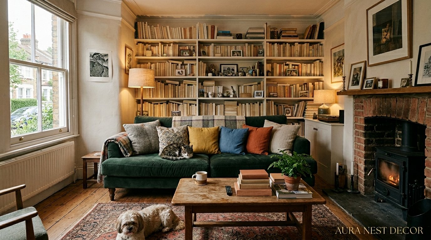
The Living Room Rules Everyone’s Breaking Right Now (And Why Your Space Finally Feels Off)
You walk in, look around, and something just… doesn’t sit right. Everything’s technically fine. Sofa’s nice. Paint color’s fine. But it feels like a waiting room. A very expensive waiting room. Here’s what’s actually going on.
—
1. The Sofa Placement Mistake That’s Making Your Room Feel Like a Hallway
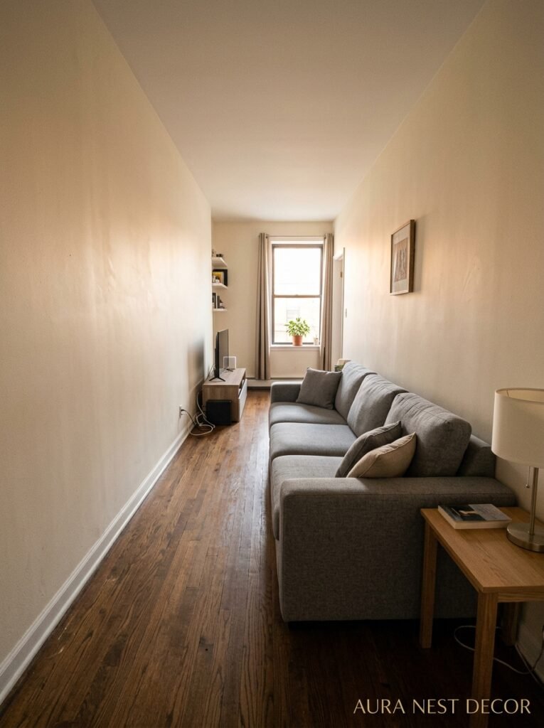
Almost everyone does this. You get a sofa, you push it against the wall, and you think — great, more floor space. Done. Except it’s not done, it’s just sad. Floating furniture, meaning pulling your sofa away from the wall by even eight or ten inches, is the single fastest way to make a living room feel like someone ACTUALLY lives there instead of just passing through.
I know it feels counterintuitive. The room looks smaller on paper. But here’s the thing — rooms don’t feel bigger when there’s more empty floor showing. They feel bigger when there’s visual weight distributed in a way that makes sense. A sofa pressed against a wall creates this long, flat line that the eye just… travels down and off. There’s no anchor. No reason to stop.
Pull it out. Even a little. Then angle a couple of chairs toward it. Suddenly you’ve got a conversation area instead of a furniture display. The rug (assuming there is one — more on that later) should anchor all the pieces together, front legs on at minimum.
This is the thing no one tells you in the furniture showroom.
“The room doesn’t need more space. It needs the space it already has to mean something.”
2. Why the Most Interesting Living Rooms Always Have One Thing That Doesn’t Match
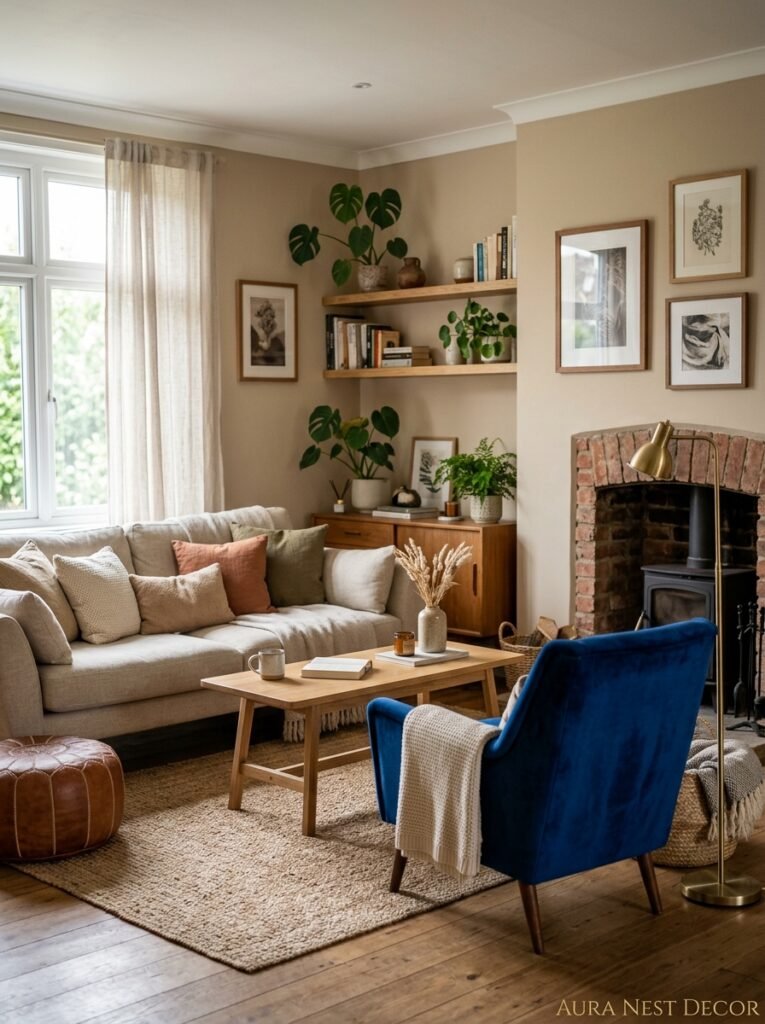
There’s this Pinterest aesthetic trap where everything coordinates a little TOO well. Same wood tones, same metal finishes, same visual temperature across every single surface. And the result is technically pretty. But it’s also sort of lifeless, if I’m honest. Like a hotel lobby styled by an algorithm.
The rooms that stop you mid-scroll — the ones you save and come back to — almost always have one thing that’s slightly wrong. A battered vintage leather chair in an otherwise clean modern room. A wildly oversized lamp. A dark, moody painting on an otherwise pale wall. Something that shouldn’t work, but does.
This isn’t accidental. The designers who do this on purpose call it “tension.” I just call it personality. Your living room is allowed to have a past. It’s allowed to have things in it that you loved before you had a “color scheme.” The chunky ceramic vase your friend brought back from Portugal doesn’t need to match your cushions. It needs to be YOURS.
So if you’ve been holding back from adding something because it doesn’t quite go — that’s probably exactly the thing the room needs.
3. The Color That Keeps Showing Up in Every Beautiful Living Room Right Now
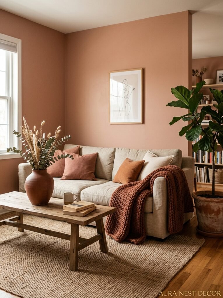
Okay so warm whites are obviously still everywhere, but the color I keep seeing absolutely EVERYWHERE right now — in UK period homes and American craftsman bungalows equally — is a sort of greyed-out sage. Not the bright mint-sage that was huge a couple of years ago. Deeper than that. Closer to lichen. Almost like the color of an old book spine.
It works because it reads as neutral in most lighting but it’s not actually neutral. It has presence. It shifts. In morning light it goes almost grey-green, and in the evening with warm lamp light it goes earthy and rich. It’s doing something, just quietly.
If you’re not ready to paint a whole room (and honestly, fair enough), this color works beautifully in large-format art, in a velvet accent chair, or even just in a chunky throw. The key is depth — you want a version that has some grey in it, maybe some brown. Avoid anything that veers too yellow-green or it’ll read as avocado kitchen, which is a whole different energy.
Farrow & Ball’s “Mizzle” is close to what I mean. Benjamin Moore “Aganthus Green” too, if you’re stateside. Side note — I spent an embarrassing amount of time last year just… looking at paint chips. Anyway.
4. Lighting Is the Thing You Keep Getting Almost Right
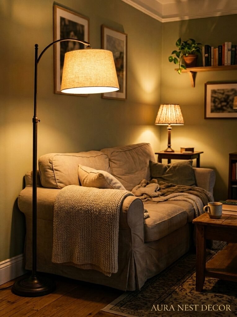
Here’s a confession. I’ve rearranged the same living room four times. Different rugs, different gallery walls, different cushion combinations. And it kept feeling not quite right. Then I changed one lamp — switched from a white shade to an amber-tinted one — and it was suddenly a completely different room. Same everything. Different light.
Overhead lighting is the enemy of a cozy living room. I don’t care if it’s a beautiful pendant or a recessed can or even a chandelier — overhead light flattens everything. It removes shadow. Shadow is what makes rooms feel dimensional, inhabited, interesting.
The goal is multiple light sources at varying heights. A floor lamp. A table lamp on the opposite side. Maybe something small on a bookshelf or a sideboard. None of them should be too bright. You want pools of light, not a floodlit stage.
Edison bulbs at around 2200K color temperature. Or warm LED equivalents if you’re trying to save on your electricity bill (which, given recent energy prices in the UK especially, you probably are, no judgment). The light should feel like late afternoon in autumn. That’s the benchmark.
“You’re not decorating a room. You’re setting a scene, and light is the whole script.”
5. The One Rule That Makes Any Awkward British Living Room Feel Intentional
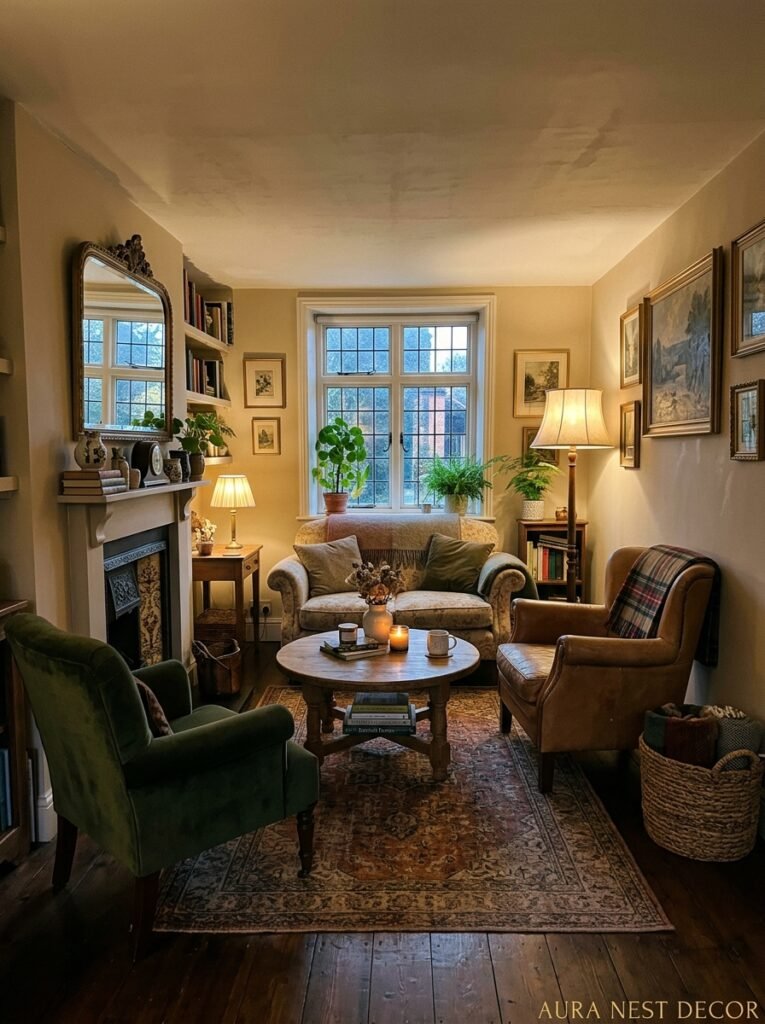
A lot of older UK homes have WEIRD living rooms. I mean that affectionately. Victorian terraces with bay windows that eat into the floor plan. Thirties semis with fireplaces that aren’t centered on any wall. Edwardian rooms with picture rails and coving but also, somehow, a 1970s gas fire that no one’s replaced yet.
The temptation is to fight these quirks. To try to make the room feel more symmetrical, more “normal.” Don’t. Because you will lose. The room has been there longer than you have.
Instead, lean INTO the weirdness. The off-center fireplace? Make it the focal point anyway and let everything else be deliberately asymmetrical around it. The bay window? Put a reading nook in it — a low bench with cushions, a small side table, a lamp. Make it feel like a room within the room. That’s not a design problem, that’s a feature. Those rooms are gorgeous when you stop trying to correct them and start trying to celebrate them.
The rule is: pick the thing that’s strange and COMMIT to it. Own it completely. That’s what makes a room feel like it has a story.
6. What Your Rug Is Telling People About You (And It’s Not Good)
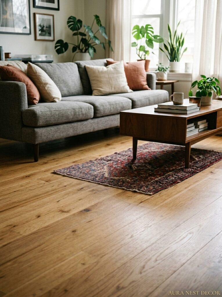
Too small. That’s it, that’s the issue. In nine out of ten living rooms, the rug is too small. It’s sitting in the middle of the room like a little mat, with the sofa legs completely off it, and it’s making the seating area look like furniture that got arranged around a floor stain.
The rug should be big enough that at least the front legs of every piece of upholstered furniture are on it. Ideally all legs, but front legs is the minimum for a cohesive look. For a standard living room, that usually means you need at least an 8×10 foot rug, often a 9×12. Most people buy a 5×7 because it’s cheaper. And then the room looks like it’s missing something and they can never figure out what.
There’s a budget trick, though. Layering rugs is genuinely not just a trend, it’s a solution. A large natural fiber rug — jute, sisal, seagrass — underneath a smaller, more interesting patterned rug gives you the scale you need without the price tag of one giant statement piece. It also adds texture, which living rooms almost always need more of.
A flat, matchy, single-rug living room has no soul. Texture is the soul.
7. The Gallery Wall Approach That Doesn’t Look Like You Followed a YouTube Tutorial
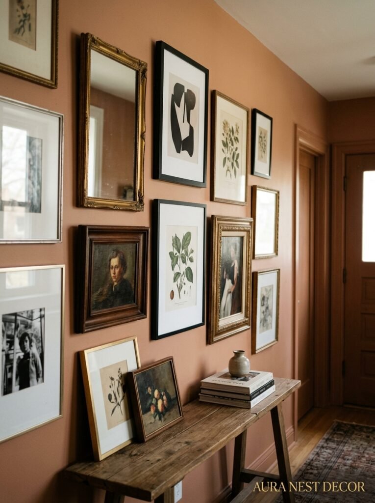
Every gallery wall I’ve ever put together that looked good had at least one piece that wasn’t a print or a photo. A small mirror. A piece of woven wall art. A tiny shelf with one object on it. Something three-dimensional that breaks the flat plane of all those frames.
And the frames themselves — they shouldn’t all match. I know. It FEELS like they should. Matching frames feels orderly and deliberate and designed. But what it actually looks like is a set, not a collection. Mix thin metal frames with chunky wooden ones. Let some frames be white and some be natural and one be dark. Let the sizes be genuinely different, not graduated in a way that feels planned.
The thing is, a gallery wall should look like it happened over time. Like each piece was added because you loved it, not because it fit the grid. If it looks like you ordered everything at once from the same website (even if you did, no shame), it loses that lived-in quality that makes it feel personal.
Oh — and leave more space between the frames than you think you should. The instinct is to cluster them close, but breathing room makes each piece feel more intentional.
“A gallery wall isn’t a project. It’s evidence that you’ve been paying attention to beauty for a long time.”
8. The Bookshelf Styling Secret That Interior Designers Won’t Just SAY Out Loud
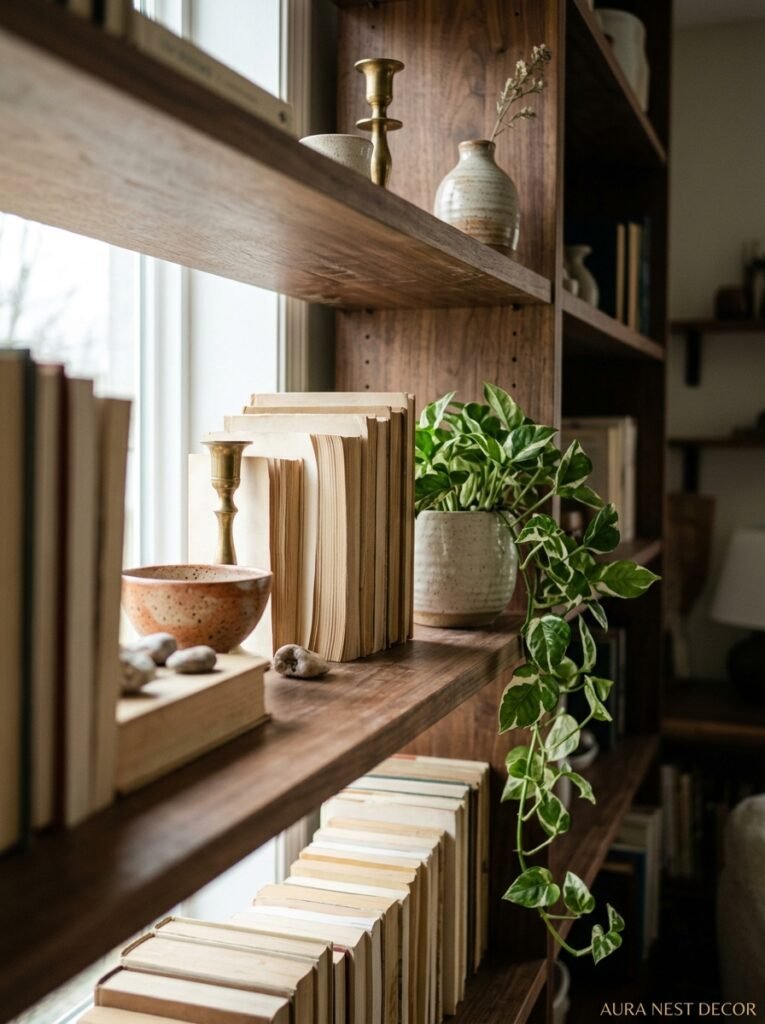
The reason most people’s bookshelves look cluttered isn’t because they have too many books. It’s because everything is the same HEIGHT. All upright books, spine facing out, lined up perfectly — it looks like a library catalog. Which is fine if you want your living room to feel like a library. But if you want it to feel like a home, you need variation.
Lay some books flat and stack them. Use those stacks as platforms for objects. A small plant on top of three horizontally stacked books. A candle. A ceramic piece you love. Every few upright books, lay some flat. Break the line. Let things breathe.
Also — face some books backwards. The pages facing out instead of the spines. It sounds odd but it creates this soft, tonal, textured look that photographs beautifully and actually makes the colorful spines that ARE showing pop more. You can group the backward-facing ones or scatter them randomly. Both work.
The shelf doesn’t have to be perfect. It has to look lived in, edited, and slightly imperfect in an intentional way. That’s the goal.
9. Why American Living Rooms Feel Bigger Than They Are (And the Simple Thing British Homes Are Missing)
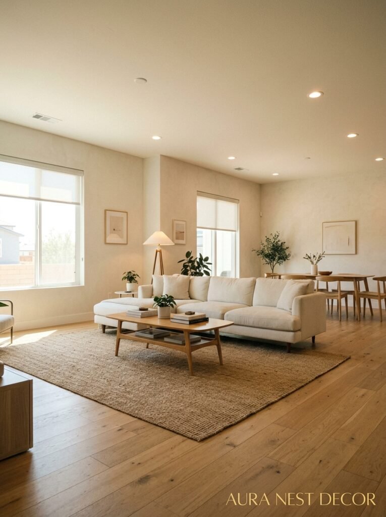
Curtains. Hung HIGH and hung WIDE. This is the thing.
American interior design tends to default to curtains hung close to the ceiling, extending well beyond the window frame on each side. British homes often have curtains hung just above the window, only as wide as the window itself. And the difference in how big the room feels is genuinely dramatic.
Hanging curtains high (ideally within 4-6 inches of the ceiling, or even right at the ceiling) draws the eye up and makes ceilings feel taller. Hanging them wide (extending 8-12 inches beyond the window frame on each side) makes the window look larger and lets in maximum light when they’re open. Both things together can make a small-ish British sitting room feel almost airy.
The curtains themselves should be floor length. Not hovering awkwardly above the floor, not just grazing it — actually resting on it, or slightly pooling. Pooling curtains feel incredibly luxurious in person. And linen curtains, specifically? They hang beautifully, they soften the light in a way that polyester just doesn’t, and they get better looking as they wrinkle and relax over time.
10. The Coffee Table That’s Actually Ruining Your Living Room
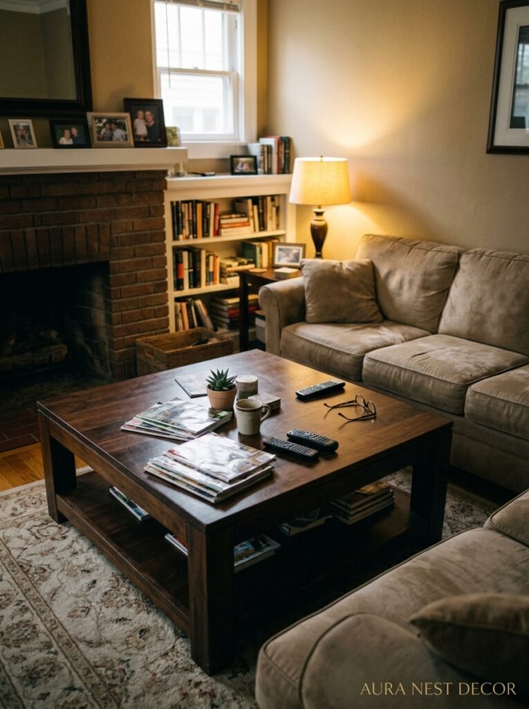
Glass coffee tables. I know. I’m sorry. But a glass coffee table in a living room that has ANY other visual complexity — a patterned rug, interesting furniture, art on the walls — just adds noise. You see through it to the rug pattern, which creates a weird layered visual effect that makes the room feel busier and somehow cheaper, even if the table itself was expensive.
What actually works: wood (especially if it’s got some character — knots, grain, imperfection), stone, rattan, or a solid upholstered ottoman with a tray on top. The ottoman option in particular is incredibly practical, works in small spaces, and adds softness to a room that often has a lot of hard surfaces already.
If you LOVE your glass coffee table, keep it. But style it with intention. A substantial object — a stack of large books, a sculptural bowl, something with real visual weight — so there’s something to look at on the surface, drawing the eye away from the see-through complication underneath.
11. The Exact Ratio of Cushions That Doesn’t Look Ridiculous
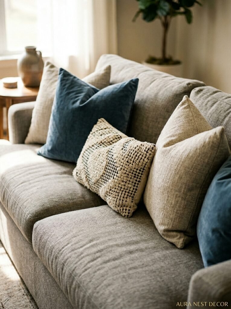
There’s a thing people do where they fill every sofa surface with decorative cushions and then there’s nowhere to actually sit. Too many. Four cushions on a two-seat sofa, six on a three-seater — that’s where I’d draw the line. Any more and you’ve got a display bed, not a sofa.
Mix sizes. One or two larger square cushions (about 22-24 inches) as the back layer, one or two standard rectangles in front, maybe one lumbar cushion if you like the look. That’s enough. They don’t all need to match — they need to feel coordinated, which is different. Same color family, different textures, maybe one pattern that picks up a color from the room.
And please — firm cushions. Cushions that hold their shape. The little thin flat ones that came in a pack of four from a discount shop? They’re not doing what you think they’re doing.
12. The Small Change That Made My Living Room Feel Like a Completely Different House
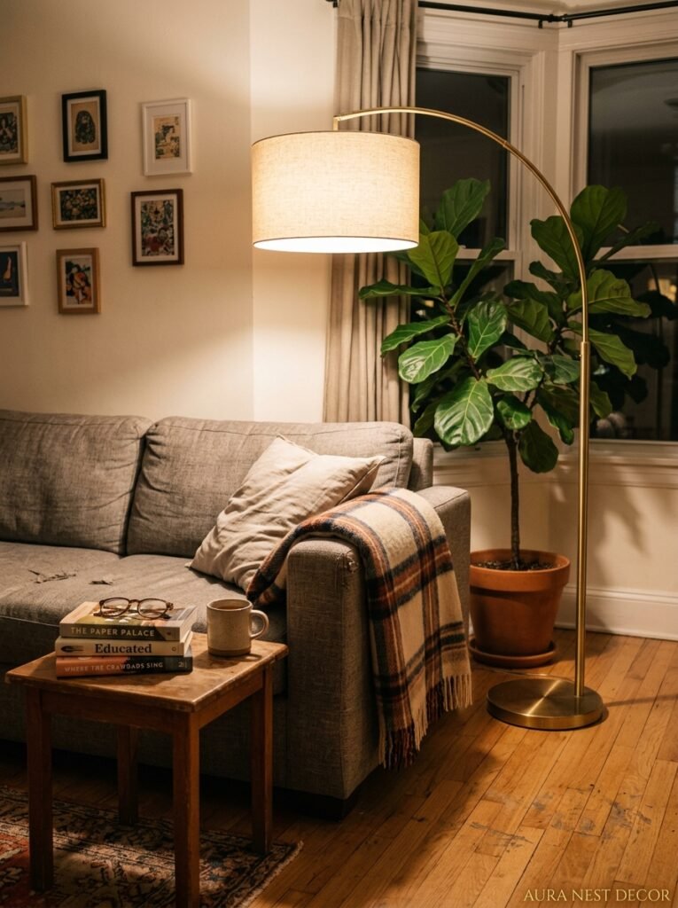
I moved the plants. That’s it.
I’d had a big fiddle leaf fig in the corner and some small succulents on the windowsill and it looked fine, perfectly fine. Then I moved the fig to a spot right next to the sofa — close, like almost within arm’s reach — and brought in a trailing pothos on a high shelf so it drapes down the wall. And something completely shifted.
Having plants close to where you sit changes the texture of the room in a way that’s hard to explain until you’ve experienced it. You’re not looking at a plant across the room. You’re sitting next to it. In it, kind of. It makes the whole space feel organic rather than staged.
If you’re plant-phobic (or just plant-unlucky, I see you), high-quality faux trailing plants placed in real terracotta pots can honestly get you most of the way there for the trailing wall look. Don’t put them up close though — the illusion doesn’t survive scrutiny. Distance. The floor plants, though? Get real ones. The size and presence of a large real plant simply can’t be faked convincingly.
—
❓ FAQ
Q: How do I make a small living room feel bigger without knocking down walls? A: The most effective things are: curtains hung close to the ceiling and wide past the window frame, a large enough rug to ground the furniture, and keeping the floor as clear as possible. Mirrors help too, but only if placed where they reflect something worth reflecting — a window or a lamp, not a blank wall.
Q: What’s the biggest living room decorating mistake people actually make? A: Buying everything at once from the same collection. A living room should look like it evolved over time, and when every piece matches perfectly it reads as a showroom, not a home. Buy intentionally but slowly, and let things mix.
Q: Can I mix warm and cool tones in a living room? A: Yes, and honestly the rooms that do this carefully feel much richer than ones that stick rigidly to one temperature. Warm wood tones with cooler greens or blues can be stunning. The key is keeping your lighting warm — cool overhead light on a “warm” room will make everything look wrong regardless of what you’ve decorated with.
—
💭 Final Thoughts
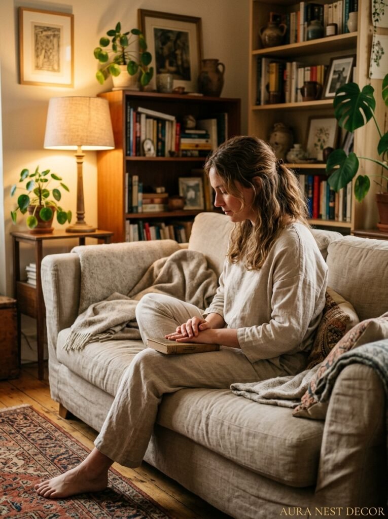
A living room isn’t finished when everything matches. It’s finished when it feels like you. That particular combination of the things you’ve collected, the light you love, the slightly-wrong thing that somehow works perfectly — that’s what makes a room feel like home rather than a catalogue page.
What’s the one thing in your living room right now that you’ve been meaning to change for months?




