The TV Stand Ideas That Actually Make Your Living Room Look Like You Tried (In the Best Way)
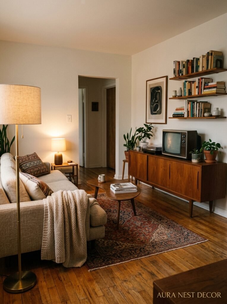
You know that weird moment when you realize the TV stand is the first thing people see when they walk into your living room — and yours is just… there? Not ugly, not beautiful. Just there. That’s the thing nobody talks about: a forgettable TV stand is almost worse than a bad one.
—
1. Why Most TV Stands Make a Room Feel Unfinished (And It’s Not the Stand’s Fault)
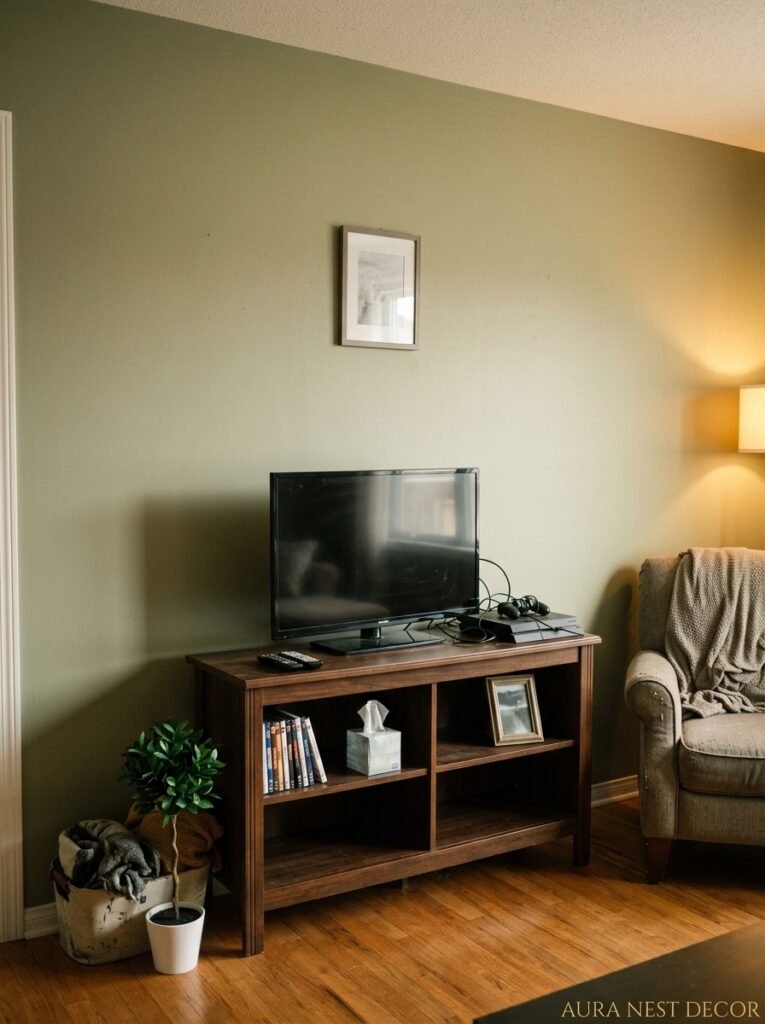
Here’s something I didn’t understand for years. The TV stand isn’t the problem. The problem is that we pick the stand first and style the room around it — or worse, we never style around it at all. The stand just sits there, holding the TV, maybe with a cable box shoved in a cubby, and that’s it. Done. Functional. Deeply uninspiring.
The issue is context. A TV stand that doesn’t connect visually to anything else in the room will always look like an afterthought, even if it cost a fortune. I’ve seen beautiful mid-century walnut consoles sitting in rooms that made them look like they came from a flat-pack sale. And I’ve seen a plain IKEA unit that looked genuinely intentional because someone styled the wall behind it with purpose.
So before we get into specific ideas, this is the mindset shift: your TV stand isn’t furniture. It’s the anchor of a vignette. Everything around it — the wall, the floor, the styling on top, the storage inside — is part of that picture. Once you see it that way, the whole room starts making more sense.
And honestly? It’s kind of exciting once it clicks.
—
2. The Low-Profile Look That’s All Over Pinterest Right Now (And Why It Works)
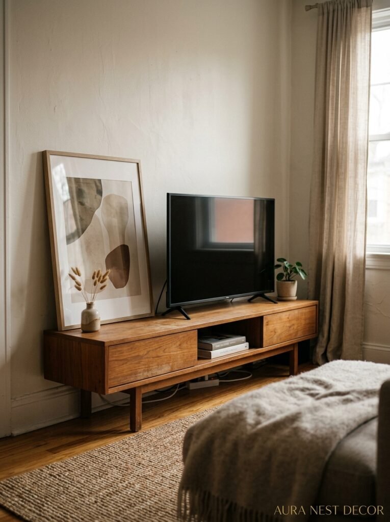
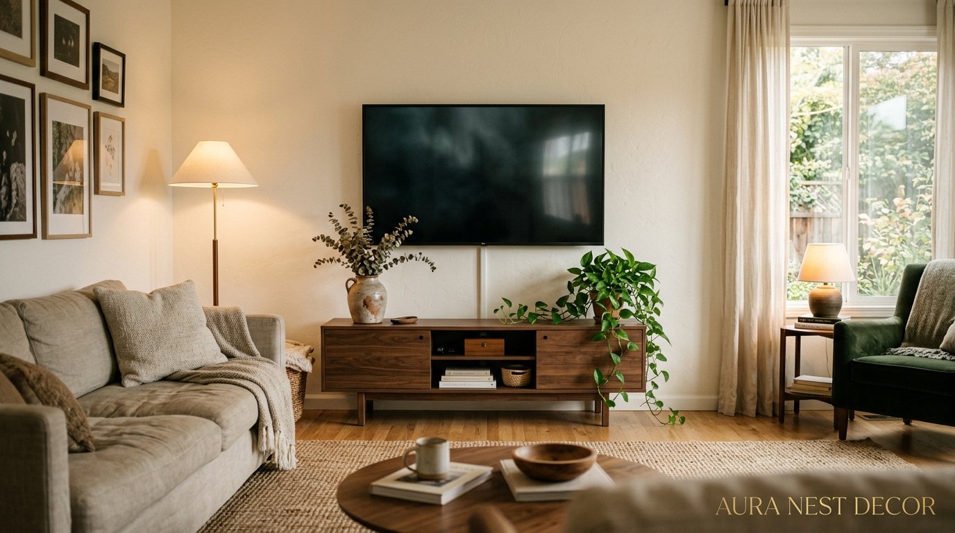
Low-slung TV consoles. They’re everywhere and I’m not bored of them yet, not even a little. The kind that sit maybe 18-20 inches off the ground, with tapered legs, long horizontal lines, and just enough storage to feel organized without looking like a filing cabinet.
Why do they work so well? Because they make the ceiling feel higher. Your eye travels along that low horizontal line and then has nowhere to go but up. In a smaller living room or a room with average ceiling height, this is genuinely useful. It’s not a trick exactly, more like working with the geometry you already have.
The finishes that are showing up most right now: matte walnut, limewashed wood in pale grey-green, and matte black with brass hardware. That last one is doing a lot of heavy lifting on Pinterest at the moment. Black unit, warm brass handles, something lush and green on top — a trailing pothos or a little olive tree in a terracotta pot. It shouldn’t work as well as it does.
In the UK especially, I’m seeing a lot of these in Victorian terraces where someone’s been brave enough to keep the original fireplace AND add a low console for the TV nearby. The contrast between old and new in that situation is just really lovely.
—
3. The Floating TV Unit: Commitment-Phobe or Genius Design Move?
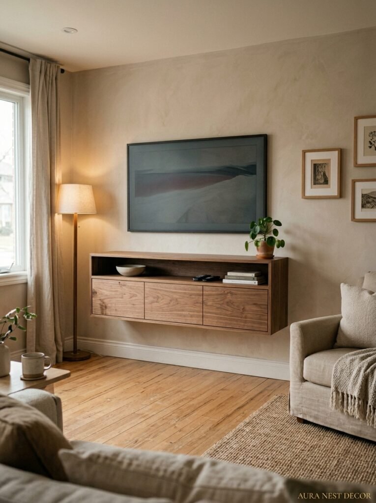
I used to think floating TV units were a bit try-hard. Like, you’re just avoiding having legs because it looks modern, right? And then I lived with one for six months and fully changed my mind.
Here’s what nobody tells you about a wall-mounted console: the floor space underneath it is EVERYTHING. Even in a large living room, visual floor space matters enormously. When you can see the floor beneath your TV unit, the room breathes differently. It just does. And practically speaking — easier to vacuum, obviously. Not nothing.
The sweet spot for mounting height is roughly 8 to 10 inches off the floor. High enough to feel intentional, low enough to still read as a low-profile console. Too high and it looks like a shelf that got lost on the way to another room.
The styling move that makes floating units look expensive: run a length of LED strip lighting underneath, so there’s a warm wash of light on the floor below. It’s subtle in daylight. At night, when you’ve got a film on and the main lights are down, it’s the difference between a nice room and a room that feels designed. And before you ask — no, it doesn’t look tacky if you keep the color temperature warm. Cool white LED strips underneath a TV unit do look tacky. Warm amber ones don’t. That’s just the rule.
“Visual floor space is free design — and we give it away every time we plant a piece of furniture without thinking.”
—
4. The Entertainment Unit That Replaced an Entire Wall (No, Seriously)
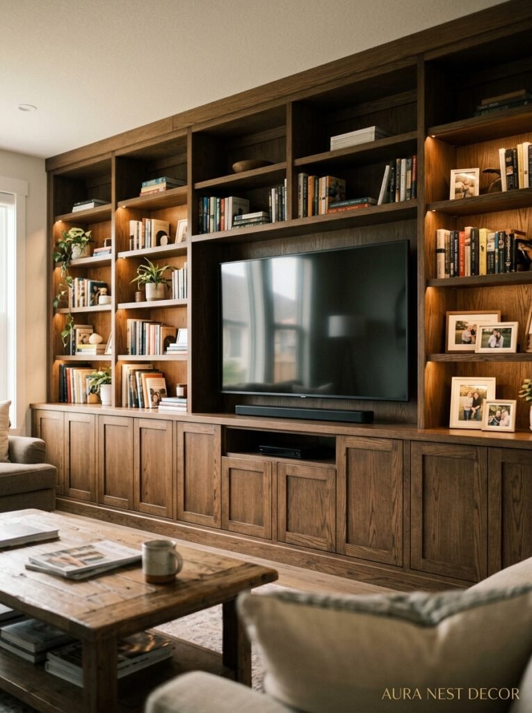
Full wall entertainment units are having a massive moment and I have complicated feelings about them. Let me explain.
On one hand: a built-in or built-in-LOOKING unit that runs the full width of a wall is genuinely one of the most impactful things you can do in a living room. It creates that “we live here, we made this ours” feeling that no amount of throw pillows achieves. When it’s done right — open shelving mixed with closed storage, some negative space left intentionally empty, maybe a little interior lighting in one section — it looks incredible.
On the other hand, when it’s done wrong, it looks like a hotel lobby from 2009. The difference is usually in what you put on the shelves. Books are great. Real books, not just displayed spines. Actual art objects, things that mean something. A lamp on one of the lower shelves. Plants. The trap is treating the open sections like display cases and filling them too symmetrically — one object on the left, matching object on the right, everything spaced evenly. It looks staged in a cold way.
Asymmetry is your friend here. An odd number of objects. A stack of books next to something tall. Empty space next to something with visual weight. And please — don’t fill every single cubby.
—
5. When a Vintage Sideboard Does the Job Better Than Any Actual TV Stand

This is my personal favorite and I’ll defend it. Taking a vintage credenza or sideboard — something with proper joinery, dovetail drawers, solid wood — and using it as your TV console. It’s not a new idea but it keeps being the right answer.
Why? A few reasons. The scale is usually perfect. Sideboards tend to be around 60 to 70 inches wide and 28 to 30 inches tall, which works for most TVs and most rooms. The storage is good — deep drawers for remotes and cables, sometimes a central cupboard section for the cable box and router. And the proportions are right because they were designed to be looked at, not just used.
Good hunting grounds in the US: Facebook Marketplace (the vintage furniture market on there is genuinely underrated), estate sales, and any second-hand furniture shop in a slightly older part of town. In the UK, I’d say Vinterior, eBay, and basically any charity shop in a wealthy suburb — you’d be amazed.
The styling rule with vintage sideboards: don’t overthink the top. One plant. One lamp if you want it. Maybe a small object with some meaning. That’s it. The piece itself is doing the work.
—
6. The Cable Chaos Problem (And the One Approach That Actually Solves It)
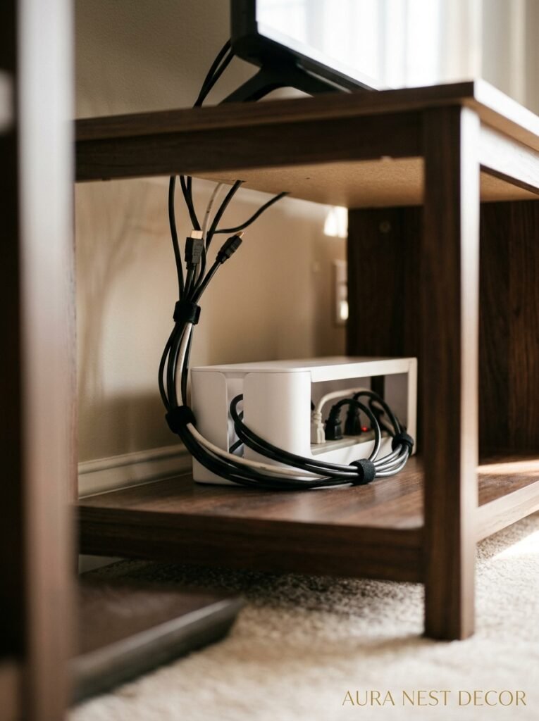
Nobody wants to talk about this but cable management is the thing that makes or breaks a TV setup. You can have the most beautiful stand in the world and three visible cables running down the wall will ruin it entirely.
The options, roughly ranked by how well they actually work. Cord covers — the kind you paint to match the wall — are fine and surprisingly invisible once they’re up. Cable raceways in a matching color to your skirting board look almost built-in. Routing cables through the wall is the best option aesthetically but obviously involves a bit more effort and might not be viable in a rented home.
For UK readers especially: if you’re renting, the peel-and-stick cord covers are your friend. They come off cleanly (mostly) and make an enormous difference. For US homeowners, it might genuinely be worth getting an electrician to add an outlet behind the TV and running cables through the wall. The difference is dramatic. Not expensive dramatically, just visually dramatic in the best way.
Side note — the router. The router is the enemy of every beautiful TV setup. It’s always the wrong color, it always has blinking lights, it always looks like it belongs in an IT cupboard. Put it inside a closed-door section of your TV unit if at all possible. If not, there are actual router covers available now that look like small decorative boxes. That’s a thing. We live in good times.
—
7. The Rule About TV Height That Interior Designers Keep Saying (And They’re Right)
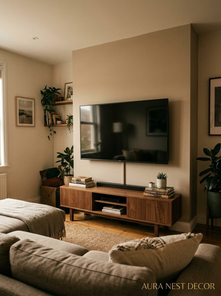
The TV should be at eye level when you’re seated. Not when you’re standing. Not “roughly” at eye level. Actually at eye level when you’re sitting on your sofa in your normal watching position.
Most people mount their TVs too high. Way too high. The neck strain is real, and beyond the physical discomfort, a high-mounted TV makes the whole room feel off somehow, like everything is oriented toward a point too far up the wall. It’s not comfortable to look at.
The standard guideline is the center of the screen at about 42 to 48 inches from the floor, depending on your sofa height and personal preference. If you’re using a TV stand rather than wall-mounting, this matters for stand height too. A stand that puts the bottom of the TV at around 24 to 30 inches usually gets you close.
“We spend hundreds on the perfect TV and then hang it at the wrong height and wonder why watching films never quite feels cinematic.”
This one adjustment — getting the height right — changes the feel of the whole room more than almost any other single thing. I mean it.
—
8. How to Style the Top of Your TV Stand Without It Looking Like a Gift Shop
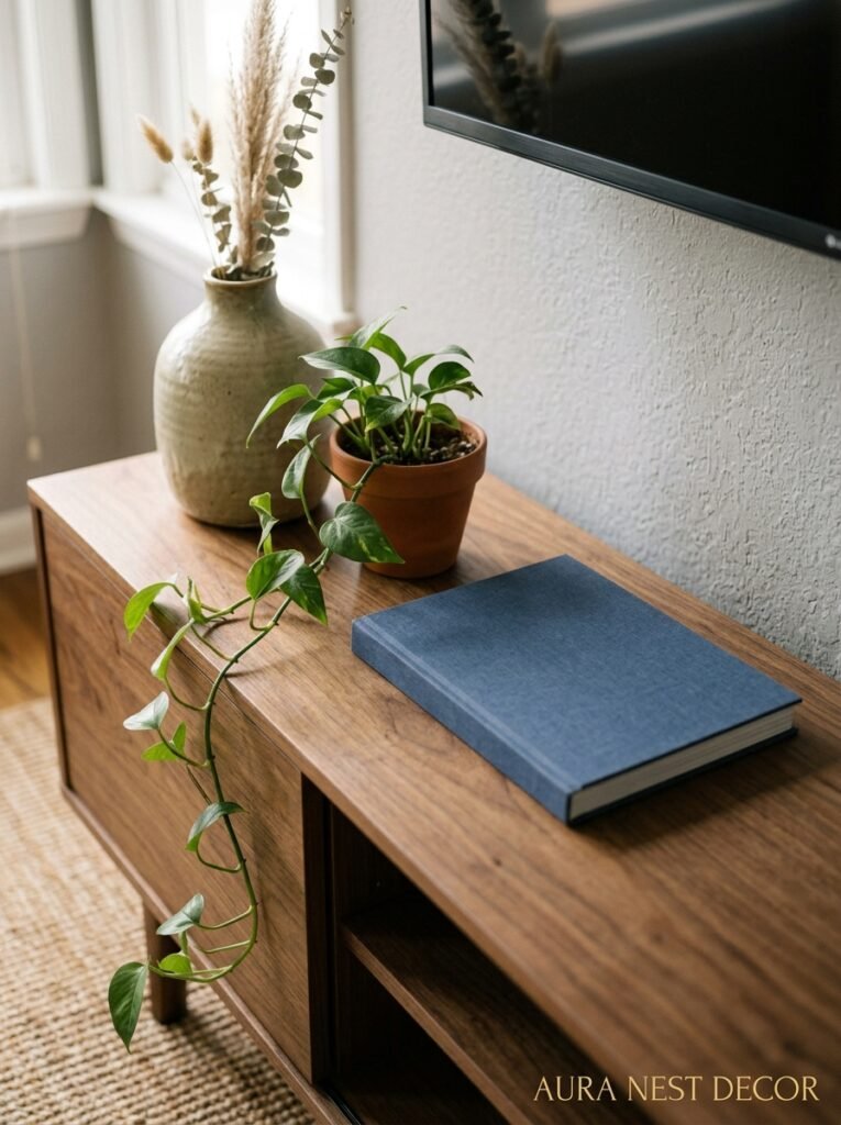
This is where so many people trip up and honestly, it’s because there’s too much advice out there. “Add a plant! And a candle! And a decorative tray! And some books!” And then someone does all of that and their TV stand looks like a surface you’re supposed to buy things off.
Here’s the actual approach. Start with nothing. Literally clear the whole thing off and look at it. Then add one thing — the most interesting thing you own that’s the right scale. Live with that for a day. Then decide if it needs anything else.
Usually? Two things is plenty. Sometimes one is exactly right. The instinct to fill is the thing to fight. Empty space on a TV console doesn’t look empty, it looks confident. It says “I made a choice.”
Plants work especially well here because they introduce organic shapes against what’s usually a very rectilinear piece of furniture. A fiddle-leaf fig in the corner next to the TV stand. A trailing plant on one end. Something in a pot that looks like it grew there. That works. A row of matching candles in graduated heights does not work (sorry).
—
9. The Style That’s Replacing “Grey and White Minimalism” in Living Rooms Right Now
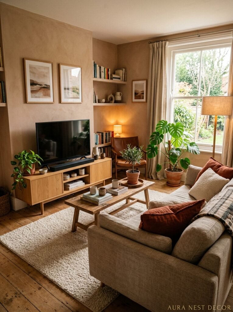
Warm maximalism. That’s what I’m calling it. Not full-on eclectic chaos — more like: warm wood, lots of texture, soft organic shapes, a bit of collected-over-time energy. The opposite of the grey Scandi living room that dominated the last decade.
TV stands that fit this direction: rattan or cane-front consoles, natural oak with visible grain, painted furniture in deep earthy tones (terracotta, warm tobacco brown, dusty sage), anything that looks like it might have a story. The styling around them is richer too — more plants, more books, warmer lighting.
This works in US homes that already lean toward a collected, layered look and in UK homes where there’s already interesting original architecture to lean into. Old houses love warm maximalism. New builds can do it too but you have to bring the texture yourself because the rooms don’t have it built in.
What’s fading: the all-grey living room, the very stark white-and-black contrast approach, anything that feels like a show home. People want their rooms to look LIVED IN again. That’s the shift.
—
10. Small Living Room? The TV Stand Setup That Makes the Most of a Tight Space
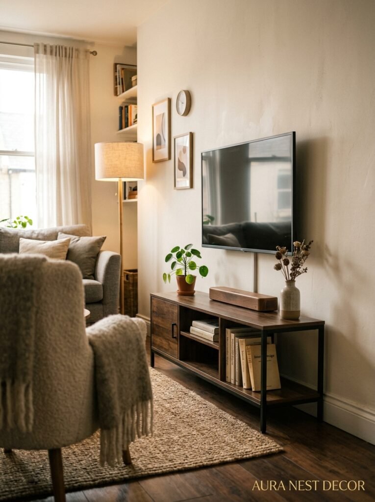
Small rooms need clever, not small furniture. That’s the bit that feels counterintuitive. Putting a tiny TV stand in a small room often makes it feel smaller because the proportions feel tentative. A properly scaled piece — even in a small room — grounds the space.
What actually helps in a tight room: the floating unit (floor space, remember), a console with legs rather than a solid base (again, visual floor space), keeping the TV at the right height so the eye doesn’t have to travel awkwardly, and avoiding anything that creates visual clutter on the surface.
Corner TV stands are worth mentioning here. They used to look a bit dated but the newer designs — low, angled, with clean lines — work surprisingly well in small rooms where you don’t have a clear feature wall. The corner placement actually creates a natural anchor for the seating without eating into the main floor area. Worth considering before you dismiss them.
—
11. The TV Stand Idea Nobody Talks About: Treating It Like a Piece of Art
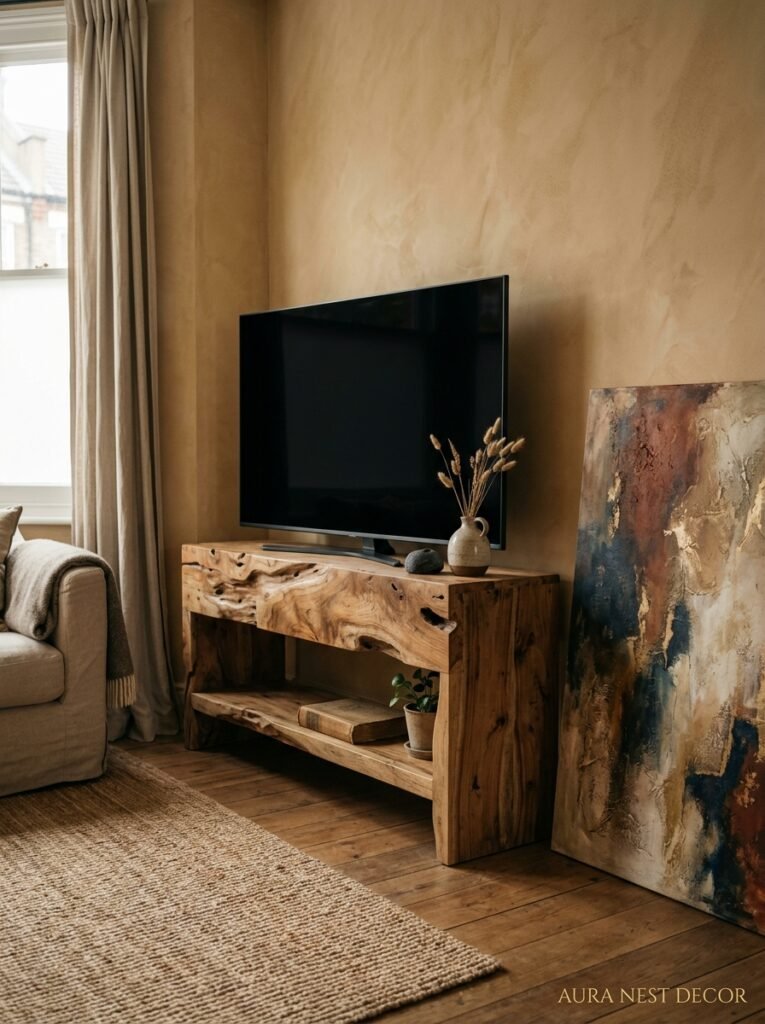
This one’s a shift in thinking more than a specific style recommendation. What if the TV stand was the focal point on PURPOSE? Not competing with the TV but genuinely beautiful on its own terms, something you’d look at even if there wasn’t a screen above it.
That means: investing in quality and interesting design rather than just function. A hand-crafted wooden console with joinery details you can actually see. A painted piece in a color that’s genuinely bold. Something vintage with real character. A unit with integrated lighting that looks architectural.
When the stand is genuinely beautiful, the TV above it stops feeling like an eyesore and starts feeling like a frame — or you stop noticing it as much, which is almost the same thing. The room feels intentional because something in it was chosen with real care.
It doesn’t have to be expensive to achieve this, by the way. One really well-chosen second-hand piece will do more for a room than three pieces of cautious, safe furniture.
“The rooms that stop you mid-scroll aren’t full of expensive things — they’re full of things that were chosen like they mattered.”
—
12. The One Styling Mistake That Makes Even Expensive TV Stands Look Bad
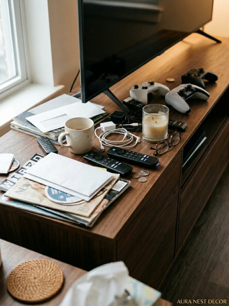
Putting the TV stand against a bare, unaddressed wall. That’s it. That’s the mistake.
Even the most beautiful console can’t carry a whole wall by itself. The TV is already a large dark rectangle — it needs context, visual weight distribution, something else happening on that wall to keep the eye interested. Without it, the stand and TV just sit there looking like they’re waiting for something.
What that “something else” looks like depends entirely on your space and style. A gallery wall that wraps around the TV on both sides. A large piece of art flanking the TV. A painted accent wall or textured wallpaper behind the unit. Sconces on either side at a slightly lower height than the TV. Shelving or built-ins that make the stand feel like part of a larger composition.
The thing they all have in common: they make the TV wall feel considered. Like you looked at it and made decisions. That’s really all anyone’s trying to achieve, isn’t it — a room that looks like someone cared enough to think about it.
—
❓ FAQ
Q: How wide should a TV stand be compared to the TV? A: Generally, you want the stand to be wider than the TV — a few inches on each side at minimum, though many designers recommend the stand be roughly two-thirds to the full width of whatever wall it’s on. A TV that overhangs its stand looks precarious. One that sits comfortably on a wider surface looks much more intentional.
Q: Can I use a TV stand if my TV is wall-mounted? A: Absolutely — a console or credenza placed below a wall-mounted TV looks great and adds useful storage. The TV being on the wall doesn’t mean you can’t have furniture beneath it. Just make sure the console isn’t so tall that it pushes the TV too high.
Q: What’s the best TV stand for a small living room? A: A floating or wall-mounted console is usually the best choice because it keeps visual floor space clear. If you need a freestanding option, look for something with legs rather than a solid base, and keep the top styling minimal so it doesn’t compete with the room’s other elements.
—
💭 Final Thoughts
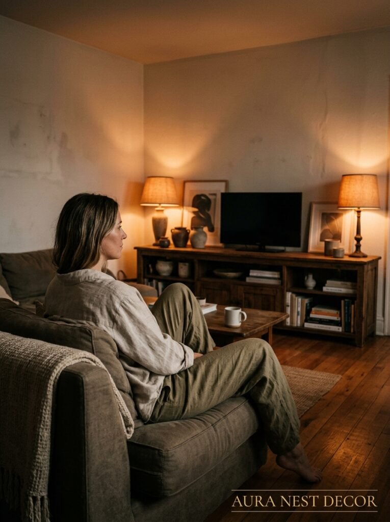
The TV stand is one of those pieces that can quietly hold an entire room together — or just as quietly undermine it. Getting it right isn’t about spending more or following a specific trend; it’s about making a deliberate choice and then committing to it with the styling around it. Your living room will tell you when it’s finally settled.
What’s the one change you’ve been putting off that you know would make the biggest difference?