
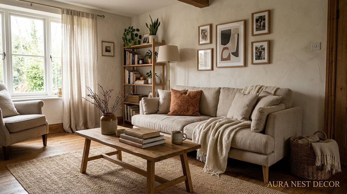
The Neutral Living Room That Doesn’t Look Beige and Boring (Here’s How They Pull It Off)
You’ve seen it on Pinterest a hundred times — that living room that somehow manages to be entirely cream and tan and white and yet absolutely does NOT look like a waiting room. How are they doing that? Because your neutral living room attempt ended up looking… flat. And a little sad. Let’s fix that.
—
1. The Reason Your Neutral Room Feels Empty (and It’s Not the Colors)
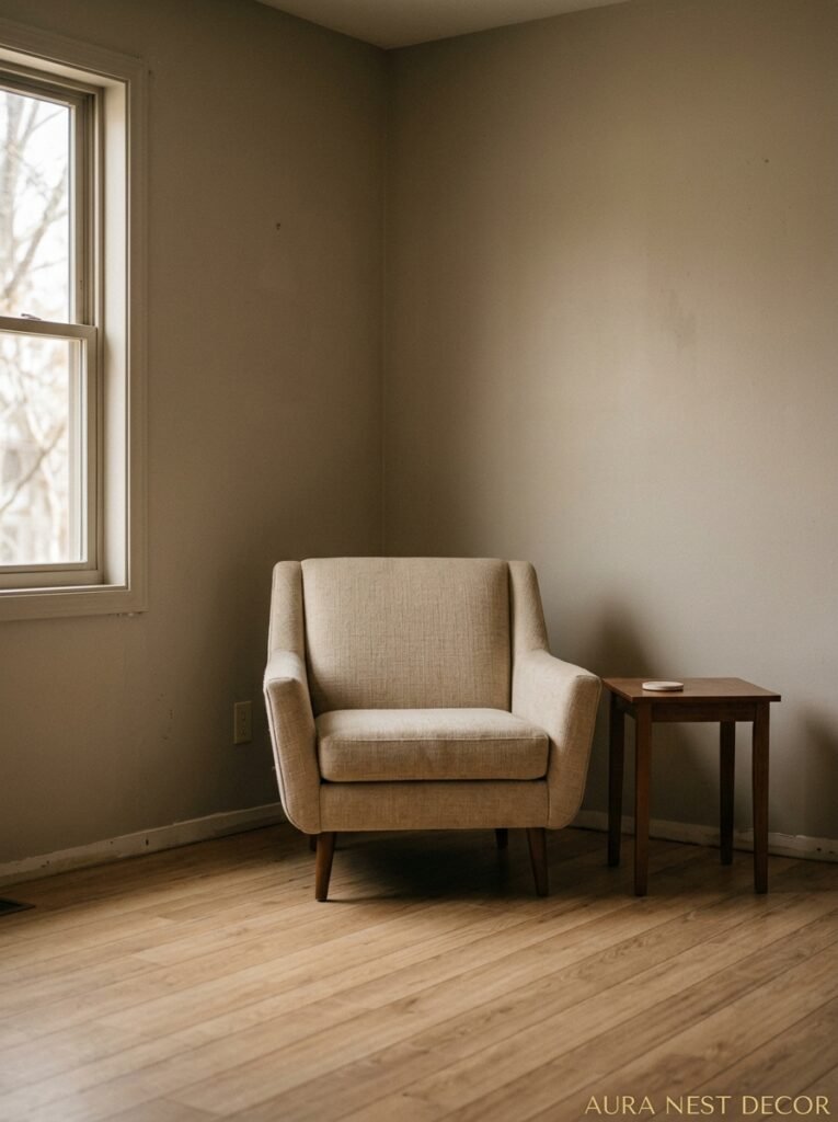
Here’s the thing nobody tells you upfront: neutral isn’t a color choice. It’s a texture strategy.
When a room is all one color family, the eye needs something ELSE to land on. Not another color — texture. The difference between a neutral room that looks like an expensive hotel suite and one that looks like an unfinished rental is almost entirely about surface variety. A chunky linen throw next to a smooth ceramic lamp next to a raw wood coffee table next to a velvet cushion — your eye moves around the room, finds little surprises, and the whole thing just feels… alive.
I made this mistake for years, not gonna lie. I kept buying things in the right shades but somehow my living room still looked dull. Turns out everything I owned had basically the same finish — slightly matte, slightly smooth. Nothing rough. Nothing shiny. Nothing woven. The second I added a jute rug and a single high-gloss vase, the whole room woke up like it had been waiting for permission.
So before you repaint or buy new furniture, walk around your current space and just touch things. Genuinely touch the surfaces. If everything feels roughly the same under your hand, that’s your problem. That’s where to start.
“Neutral isn’t about restraint — it’s about knowing exactly where the interest lives.”
2. The Warm Neutrals vs. Cool Neutrals Thing Actually Matters More Than You Think
Right. So this is where it gets a little technical but bear with me because once you understand this you’ll never look at a paint chip the same way again.
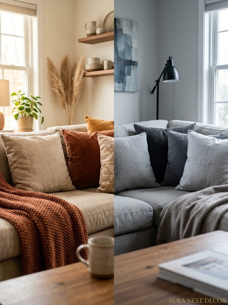
Warm neutrals — your creams, your oatmeal tones, your soft taupes — lean yellow or red underneath. Cool neutrals — your stone grays, your greiges, your soft whites — lean blue or green. And here’s what nobody tells you when you’re standing in front of a wall of Farrow & Ball cards having a mild breakdown: you can mix warm and cool neutrals in the same room. You just can’t mix them randomly.
The trick is to anchor the room in one direction — let’s say warm — and then let cool neutrals do the supporting work. So your walls are warm linen, your sofa is a cooler gray, your rug pulls them together. Or you flip it. Cool walls, warm textiles. What you DON’T want is a warm cream sofa sitting against a cool greige wall with a cold-toned rug. Everything starts competing for dominance and the room looks somehow both busy and bland at the same time, which is a very specific kind of decorating failure.
In the UK, Farrow & Ball’s Elephant’s Breath (yes, that’s a real color, and yes, it’s stunning) reads warm in some lights and cool in others, which honestly makes it magic for this reason. In the US, Benjamin Moore’s White Dove does something similar — soft, flexible, non-committal in the best way. Both work brilliantly as wall colors that let your furniture be the thing with personality.
3. The Sofa You Choose Is Basically the Whole Conversation
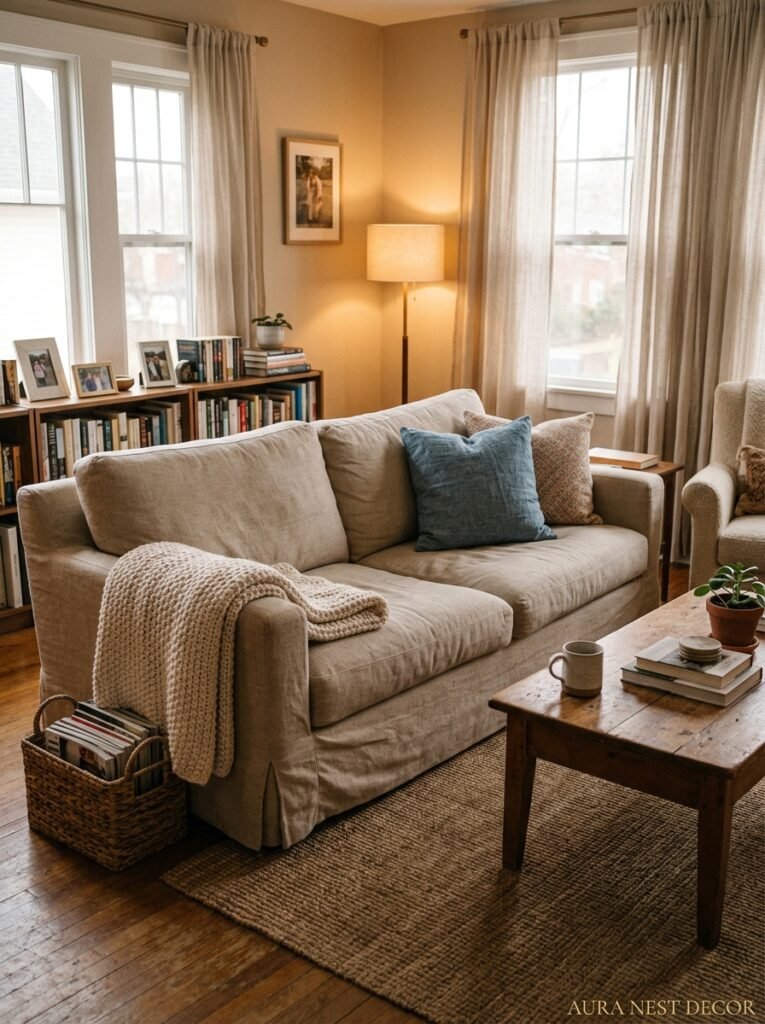
Everything else can be right and the wrong sofa will sink the room. That’s just the truth.
For a neutral living room, a boucle sofa in off-white or oatmeal is having a genuine moment right now — and I don’t say that lightly because I’m usually suspicious of anything trending. But boucle earns it. The loopy, textured weave catches light differently at different times of day. At noon it looks almost crisp and graphic. In the evening with a lamp on, it goes all soft and cozy and you just want to sit in it forever. It’s one of those materials that earns its place in a neutral scheme by doing texture AND color simultaneously.
That said, boucle isn’t the only answer. A stone-colored linen sofa is more timeless, easier to style, and won’t date itself in three years. A greige velvet is slightly more formal but absolutely gorgeous if your room gets good evening light. Side note — if you’re in the UK and considering a velvet sofa, just know that British afternoon light can make certain velvets look almost purple in winter. Test your fabric in your actual room light before you commit.
What I’d avoid? An overly structured, very square sofa in bright white. It fights the whole softness that makes neutral rooms feel good to be in. You want the furniture to look like it might let you fall asleep on it.
4. The Color That Keeps Showing Up in Every Beautiful Neutral Room Right Now
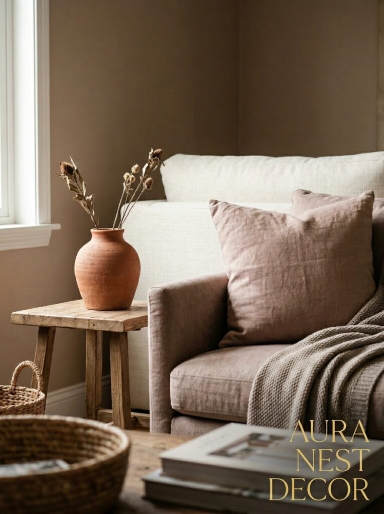
It’s not white. It’s not gray. It’s not even that millennial greige everyone overused between 2015 and 2020.
It’s warm clay. Sometimes called terracotta-lite — so not the full rusty terracotta that was everywhere a couple years ago, but a softer, more pinkish version of it. Think the color of a really good café au lait, or a dusty salmon before it gets too pink. And the reason it’s showing up in neutral rooms specifically is that it adds warmth without adding COLOR in an obvious way. From across the room it reads as a neutral. Up close it’s clearly doing something beautiful.
You’ll see it in throw pillows, mostly. A single clay-colored pillow on a cream sofa. Or it shows up in ceramics — a matte vase in that dusty pinkish tone sitting on a shelf of white and wood. Sometimes it’s the art. But it keeps appearing, quietly, in rooms that look effortless and considered at the same time.
Try it even if you’re nervous about it. A $15 throw pillow in warm clay is the lowest-commitment test and it will very likely make your existing neutrals look like they’ve been professionally styled. Or maybe it won’t work in your particular room — honestly it depends on your light, which is always the wildcard in decorating.
“One warm clay pillow on a cream sofa and the whole room suddenly looks like someone who actually has taste lives there.”
5. Why the Rug Is Making or Breaking the Whole Scheme
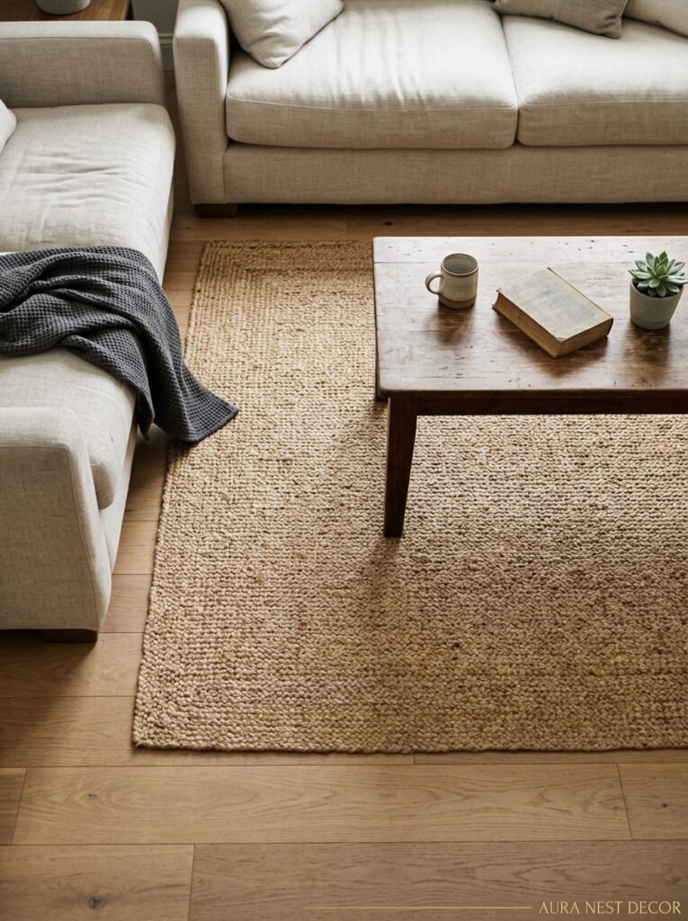
The rug is the room. I say this slightly dramatically but I mean it.
In a neutral living room, the rug is doing something that no other piece can do — it’s unifying every other element by putting them all on the same visual foundation. A rug that’s too small makes your furniture look like it’s floating in space, slightly unmoored. A rug with too much pattern suddenly becomes the most important thing in the room and everything else has to answer to it. But a rug that’s right in scale and right in tone? It just quietly makes everything look deliberate.
For neutral rooms specifically, I’d push you toward texture over pattern. A flatweave in oatmeal. A chunky wool loop pile in cream. A proper natural fiber jute if your room gets enough light (jute can look gloomy in dark rooms, so fair warning). The thing about a textured neutral rug is that it carries the room’s main job — which is creating a sense of warmth and ease — without creating a whole new visual conversation you then have to manage.
Size is non-negotiable. In the US, go up to at least 8×10 for an average living room, ideally 9×12. In the UK, your rooms might be slightly smaller but the principle holds — all four sofa legs on the rug, or at minimum the front two. The moment you see a rug that’s too small under a sofa you can’t unsee it. Trust me on this one.
6. The One Rule That Makes a Tiny Neutral Room Feel Intentional
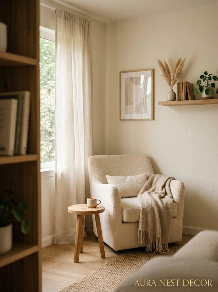
Keep the bottom half of the room lighter than the top half. Or do the opposite on purpose.
Okay that sounds contradictory, let me explain. The reason small neutral rooms sometimes look cramped is that all the visual weight lands at eye level and below — dark sofa, patterned rug, chunky coffee table — and the walls and ceiling feel like they’re closing in to meet it. If you keep your lower furniture lighter — pale sofa, light rug, natural wood tones — and let the walls be the thing with depth (a darker linen shade, a warm stone paint), the room suddenly feels taller and more deliberate. Your eye gets pulled UP, which is the only direction you have to gain space.
The opposite trick also works, actually, which is why I said it. Some designers go intentionally dark and moody on a small room — deep clay walls, low lighting, dark velvet — and rather than feeling small, it feels cozy and cavernous in the best way. Like a really good wine bar. That approach takes confidence and commitment though. There’s no half-doing it.
For most people? Go light below, give the walls depth. It’s the safer bet and it works almost every time.
7. What Happens When Neutrals Are Used for Every Single Piece of Furniture
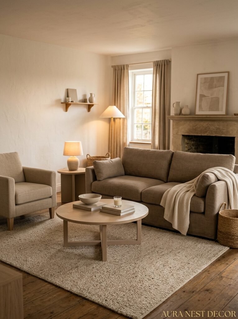
Nothing. That’s what happens. Nothing interesting at all.
If your sofa is cream, your armchair is white, your side table is light oak, your coffee table is white marble — congratulations, you’ve made a room that looks like a showroom but has no soul. The problem with matching-everything-to-the-neutral-scheme is that there’s no anchor. Nothing for the eye to rest on. Everything becomes equally important, which means nothing is.
This is where the “one rule-breaker” philosophy comes in. You need ONE piece that breaks slightly. Not a bright accent color if you really don’t want it — it doesn’t have to be bold. Maybe it’s a dark espresso-toned side table. Or a black iron floor lamp. Or a single piece of dark art. Something that creates a moment of contrast within the neutrals. The rest of the room suddenly makes sense around that piece. It becomes the visual anchor everything else references.
Honestly? A dark lamp base does more work than most people realize. It’s such a small thing but in a room full of soft pale tones, one tall lamp in matte black or dark bronze becomes a punctuation mark. The room needs punctuation.
“A room full of beautiful nothing is still nothing. Give it one dark anchor and it becomes somewhere you actually want to be.”
8. The Lighting Temperature That Makes Neutral Rooms Look Like Pinterest Photos
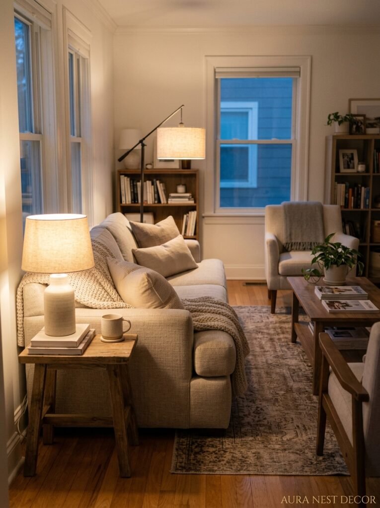
2700K. Write it down.
That’s the color temperature of warm white light — the kind that makes cream walls glow slightly amber in the evening and makes linen look like it costs twice what it did. Most overhead lights in standard homes are 4000K or above, which is a cleaner, cooler light, and it’s fine for kitchens or bathrooms but it absolutely kills a neutral living room. Everything looks slightly clinical. Your cream sofa starts to look almost grey. The warmth you built with your palette just… disappears under cold light.
Swap your bulbs. Seriously, it takes twenty minutes and costs almost nothing and the difference is completely startling. 2700K warm LED bulbs in every lamp. A dimmer switch if you can swing it, even just on one overhead light. And if you’re layering your lighting properly — which you should be — table lamps, floor lamps, maybe a candle or two for actual evenings — at 2700K it all wraps together into that amber glow that makes people walk into your living room and go “oh, this is so nice” before they can even identify what they’re responding to.
They’re responding to the light. It’s almost always the light.
9. Plants That Actually Work in a Neutral Scheme (and the Ones That Fight It)
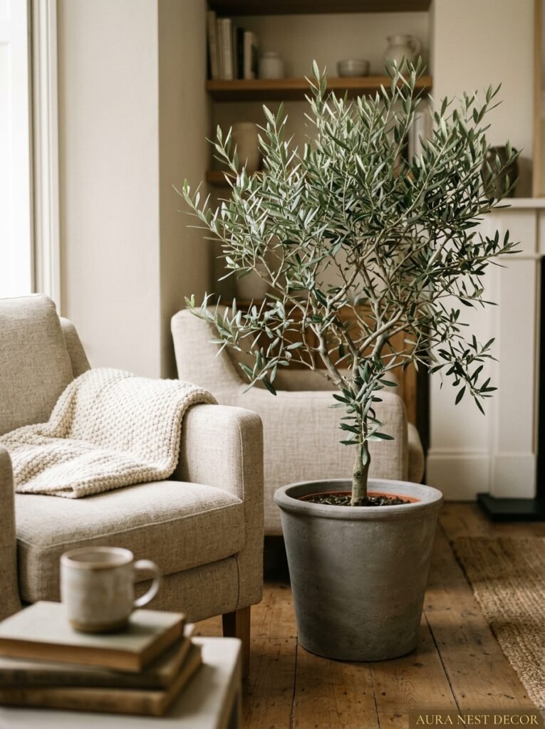
Not all green works. This is a thing people don’t talk about enough.
Bright, glossy tropical green — your big-leaf monsteras, your glossy pothos — they look stunning in bold, colorful interiors. In a pale, quiet neutral room they can actually look slightly jarring. The green is too saturated, too present. It becomes the main event when you don’t necessarily want a plant to be the main event.
What works beautifully in neutral rooms is muted green. Sage. Eucalyptus gray-green. Dusty dried botanicals. The faded silvery green of an olive branch. These tones sit within the neutral palette rather than shouting over it. A dried pampas grass arrangement in a cream ceramic vase. A small potted olive tree in the corner of a room. A trailing string of pearls in a matte white pot. These things add life without disrupting the whole careful balance you’ve built.
If you LOVE your monstera — keep it, I’m not saying throw away your plant — but maybe place it somewhere it has its own moment rather than competing with the rest of the room.
10. The Art That Neutral Rooms Almost Always Get Wrong
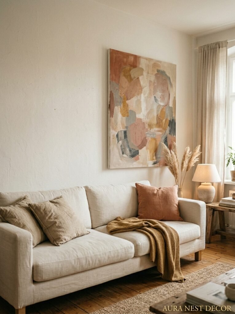
Either no art, or art that matches the palette so completely it disappears.
Both are mistakes. No art makes a neutral room look temporary, like you just moved in or you’re afraid to commit. And art that’s all cream and white and tan — look, I get the impulse, it feels cohesive — but it just blends into the wall and serves no purpose. Art is supposed to create a moment. A pause. An excuse to stop and look.
In a neutral room, art works best when it has at least ONE element of contrast. A simple sketch with a dark frame. An abstract print that’s mostly neutral but has one stroke of warm rust or deep navy. A black and white photograph with strong graphic shapes. You’re not disrupting the neutrals — you’re giving them a reason to exist, a visual counterpoint that makes the softness around it feel intentional rather than accidental.
Frame choice matters too, actually. Thin black metal frames or dark natural wood frames will do more for a neutral room than chunky white or light-wood frames, which just disappear. Sometimes the frame is doing more work than the art itself.
11. The Shelf Styling Principle That Interior Designers Use and Never Explain
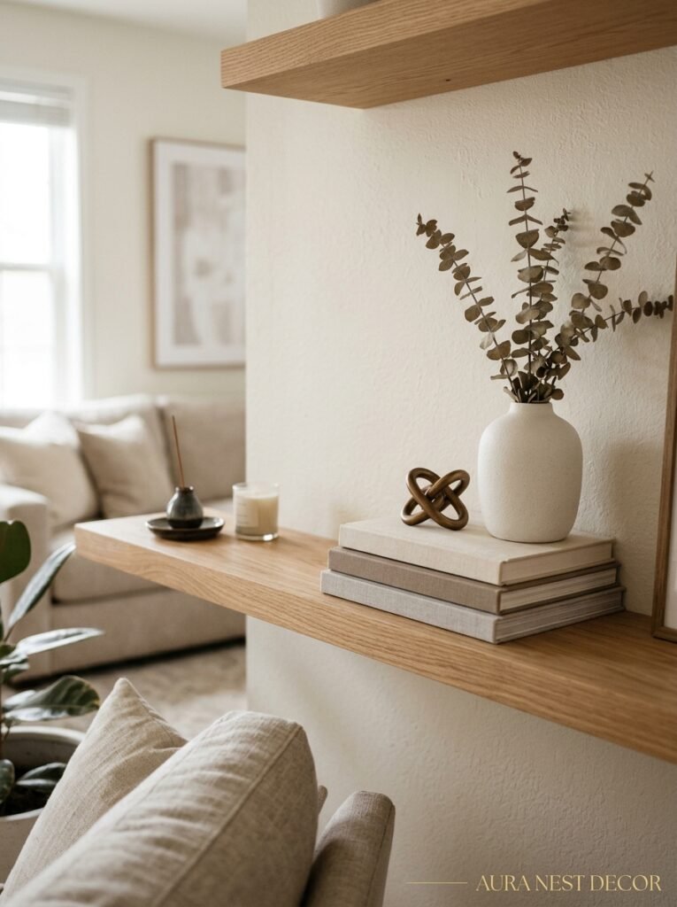
Odd numbers and empty space. That’s the whole secret.
I know “style in odd numbers” gets said constantly and it sounds like Pinterest filler advice, but there’s a real reason it works — your eye doesn’t know where to rest with an even group, so it just slides off. With three or five objects, it finds a natural landing place, moves around, finds another. The arrangement feels resolved without looking rigid.
But the empty space part is the bit people miss. You’re allowed — encouraged — to leave gaps on shelves. Deliberate emptiness in a neutral room reads as confidence. It says “I chose exactly what’s here and I don’t feel the need to fill every inch.” A shelf that’s one-third empty with three considered objects looks more expensive than a shelf packed with things, even beautiful things.
The objects themselves for a neutral room? Vary the heights dramatically. Mix matte and shiny finishes. Include at least one natural material — a piece of coral, a chunk of stone, a small wooden bowl. And keep the color range tight: whites, creams, warm woods, one or two clay or dusty tones. That’s enough. That’s actually more than enough.
12. The Final Layer That Makes a Neutral Room Feel Actually Lived-In
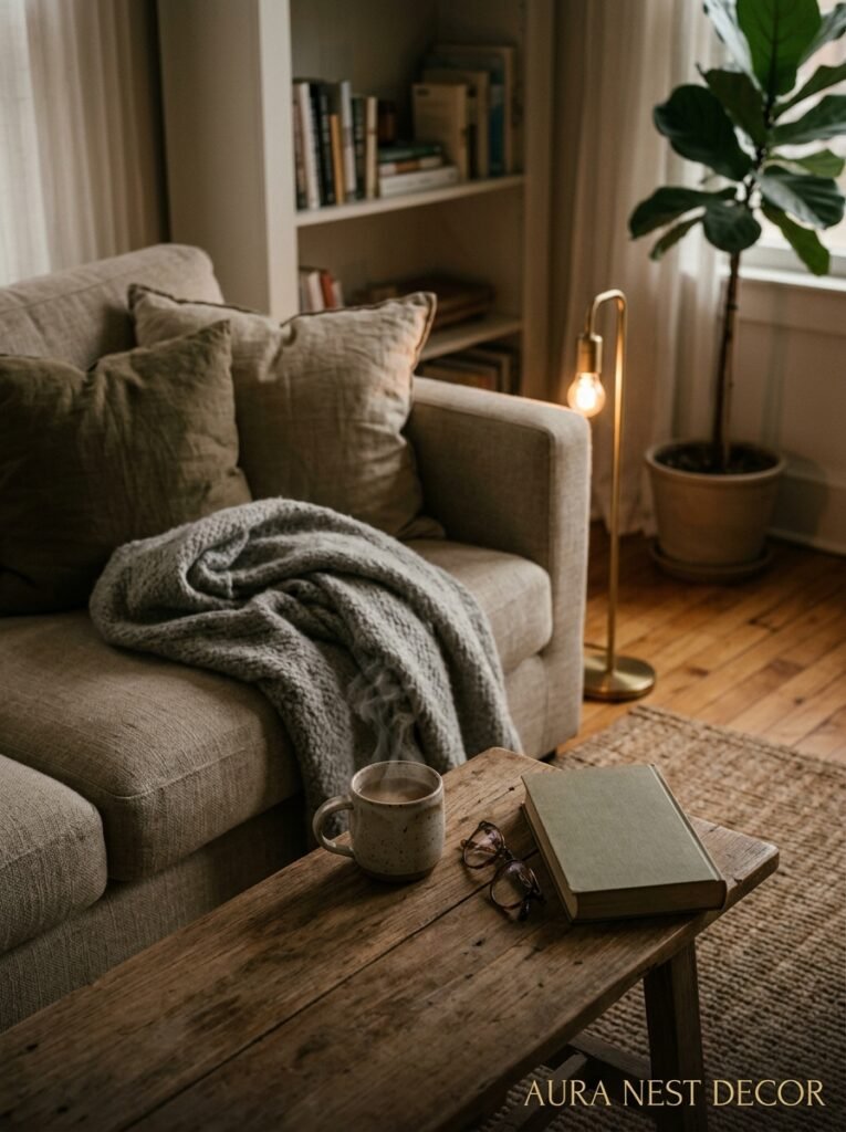
Books. A real blanket, not a decorative one. A candle that’s been actually burned.
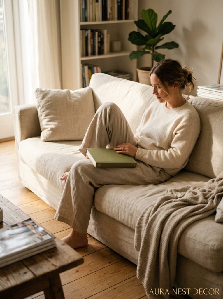
This is the part that can’t really be styled into existence, which is mildly annoying when you’ve worked this hard on everything else. The rooms on Pinterest that look genuinely inviting rather than showroom-stiff almost always have evidence of a human being using the space. A stack of actual books you’re actually reading. A ceramic mug that got left on the coffee table and just happened to look good there. A throw that’s been pulled off the basket and is sort of half-on-the-sofa in a way that no one arranged.
You can fake this, obviously — and there’s no shame in that. Leave the throw slightly messy on purpose. Put out a candle that you burn regularly so the wick is dark and the wax is slightly sunken. Stack books spine-out on the coffee table, not the designer way with all the spines hidden, but actually the way a person reads books. The goal is for your neutral living room to look like the beautiful home of someone who actually lives there. Not a magazine. Not a Pinterest board.
Someone’s home. Yours.
—
❓ FAQ
Q: Can you have a neutral living room that still feels warm and not cold or sterile? A: Yes, absolutely — and warmth in a neutral room comes almost entirely from two things: the undertones you choose (go warm, lean into creams and oatmeals rather than stark whites and blue-grays) and your lighting temperature (2700K warm bulbs, lamps at multiple levels). Get those two things right and a neutral room will feel incredibly cozy.
Q: What’s the best neutral paint color for a living room that works in both UK and US homes? A: It depends on your light, which is the honest answer. For UK homes with lower natural light, Farrow & Ball’s Elephant’s Breath or Ammonite tend to work beautifully — they’re complex enough to look interesting in grey light. For US homes with more consistent sun, Benjamin Moore’s White Dove or Pale Oak are reliable, flexible choices that read warm without going too yellow.
Q: How do you add personality to a neutral living room without using color? A: Texture and contrast. A mix of materials — rough jute against smooth linen, matte ceramics against a glossy lamp base — does more for personality than any color accent. Add one piece that creates visual contrast (a dark frame, a black lamp, a piece of graphic art) and you’ve got a room with character that still sits fully within a neutral palette.
—
💭 Final Thoughts
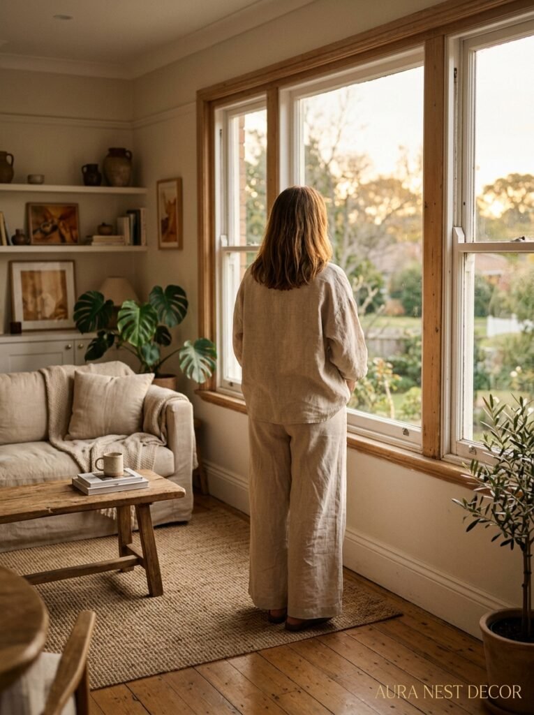
A neutral living room done well isn’t about playing it safe — if anything, it takes more confidence than a bold one, because there’s nowhere to hide. Every choice shows. But that’s exactly what makes it so satisfying when it comes together: the layered textures, the warm light, the careful balance of soft tones that somehow feel full and interesting and completely, completely yours.
Have you found the one thing that finally made your neutral room click?




