
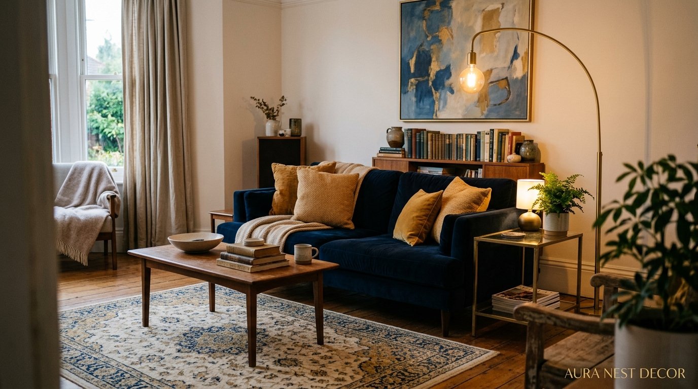
Why Blue and Gold Is the Living Room Combination That Actually Gets Better Every Year
You know that feeling when you walk into a room and everything just clicks? That’s blue and gold. Not trendy-of-the-moment blue and gold, but the kind that’s been in palaces and beach cottages and Georgian townhouses for centuries, and somehow keeps finding its way back into the rooms people are most proud of.

—
1. The Shade of Blue That’s Doing All the Heavy Lifting Right Now
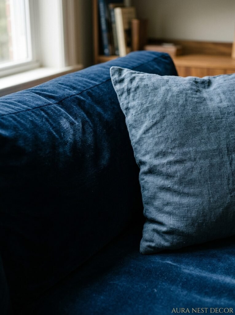
Not all blues are created equal, and honestly this is where most people go wrong. They pick a blue that’s too flat, too corporate, too “feature wall from 2012,” and then wonder why the gold accents look cheap next to it.
The blues that work right now — the ones showing up in every beautiful living room I keep bookmarking — are the ones with some depth to them. Prussian blue. Inky navy with a slight teal pull. Dusty slate that can’t quite decide if it’s blue or grey. The kind of blue that looks one shade at noon and completely different when the lamp goes on at 6pm. That shift is the whole point.
What you want is a blue with enough pigment that the gold has something to push against. A watery pale blue next to gold just looks washed out. The gold overwhelms it. But a deep, moody blue? That’s when gold suddenly looks rich instead of gaudy.
Side note — if you’re in the UK, check out Farrow & Ball’s Hague Blue or Little Greene’s Juniper Ash. In the US, Benjamin Moore’s Van Deusen Blue keeps coming up and I completely understand why. These aren’t trendy picks, they’re just good.
“Pick a blue that changes in the light. That’s the one worth committing to.”
2. Why Gold Keeps Coming Back (and It’s Not Nostalgia)
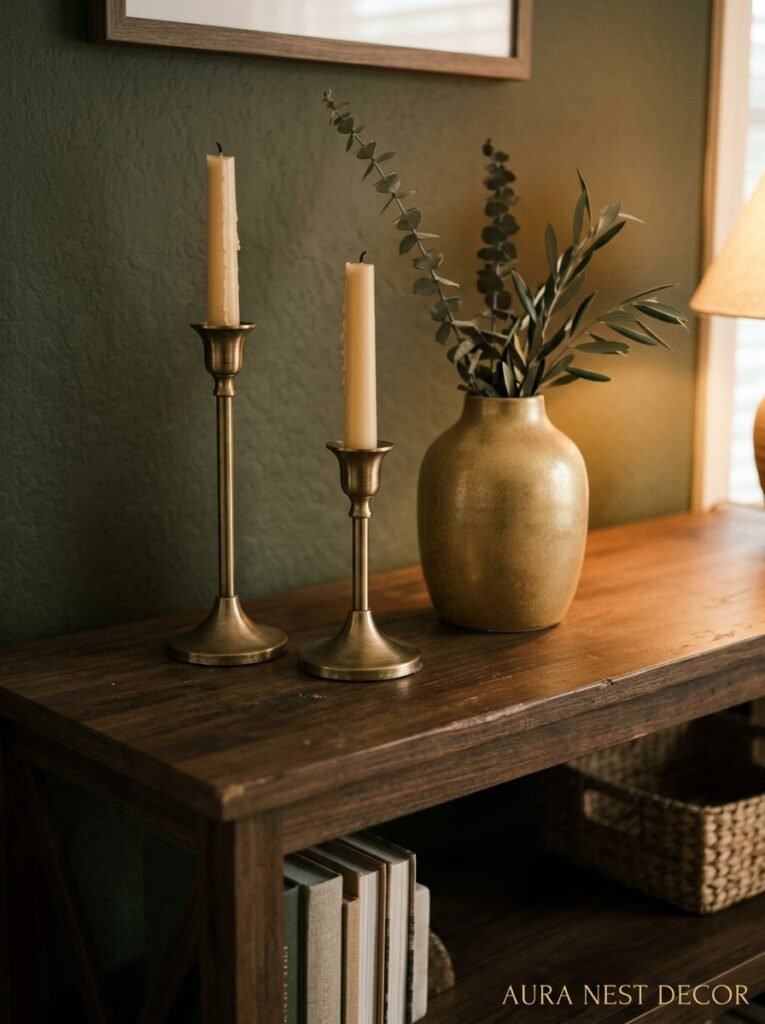
People have been dismissing gold in home decor for years. “Too glam.” “Feels dated.” “Gives me flashback to my grandmother’s house.” And then they come home to a room with a single brass lamp and a gold-framed mirror and they can’t stop looking at it. Every time.
Gold works because it’s warm. That sounds obvious but it actually matters — a lot. Blue runs cold by nature, even the warmer navy tones have a coolness to them. Gold pulls the temperature back up. It keeps the room from feeling like a beautiful but slightly austere library. Not that austere libraries aren’t great, but most people want to actually sit in their living room and feel comfortable.
There’s also the quality thing. Gold finishes — especially brushed brass, antique gold, unlacquered brass — catch light in a way that nothing else does. Even a small amount of it in a room reads as intentional. A single gold picture frame on a navy wall says “I thought about this room” in a way that ten other accessories can’t.
The finish matters, though. Shiny gold in the wrong context reads cheap. Brushed or antique finishes read expensive. If you’re not sure which you have, hold it next to candlelight. If it glows, you’re fine.
3. The One Piece of Furniture That Changes Everything
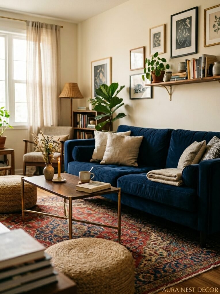
There is a sofa situation happening right now and it involves velvet and I am HERE for it.
A navy velvet sofa on a light background with gold-finish side tables and lamp bases. OR a cream or off-white sofa in a navy-painted room with a gold-framed art collection above it. Both work. Both are brilliant in completely different ways. The question is just which version of “blue and gold living room” you’re actually building.
Velvet in navy or cobalt or even a dusty cadet blue holds color differently than linen or cotton — it shifts depending on how the light hits the pile and that creates this incredible depth that photographs beautifully (and feels even better in person). If you can afford one good piece of velvet furniture, the sofa is where to put it.
But if velvet isn’t your thing, or the sofa you love is a neutral, don’t panic. A blue and gold room doesn’t require one anchor piece in blue. You can build the blue through walls, rugs, cushions, curtains, and let the gold be the through-line instead. More on that in a bit.
4. How to Use Gold Without Making It Look Like a Hotel Lobby
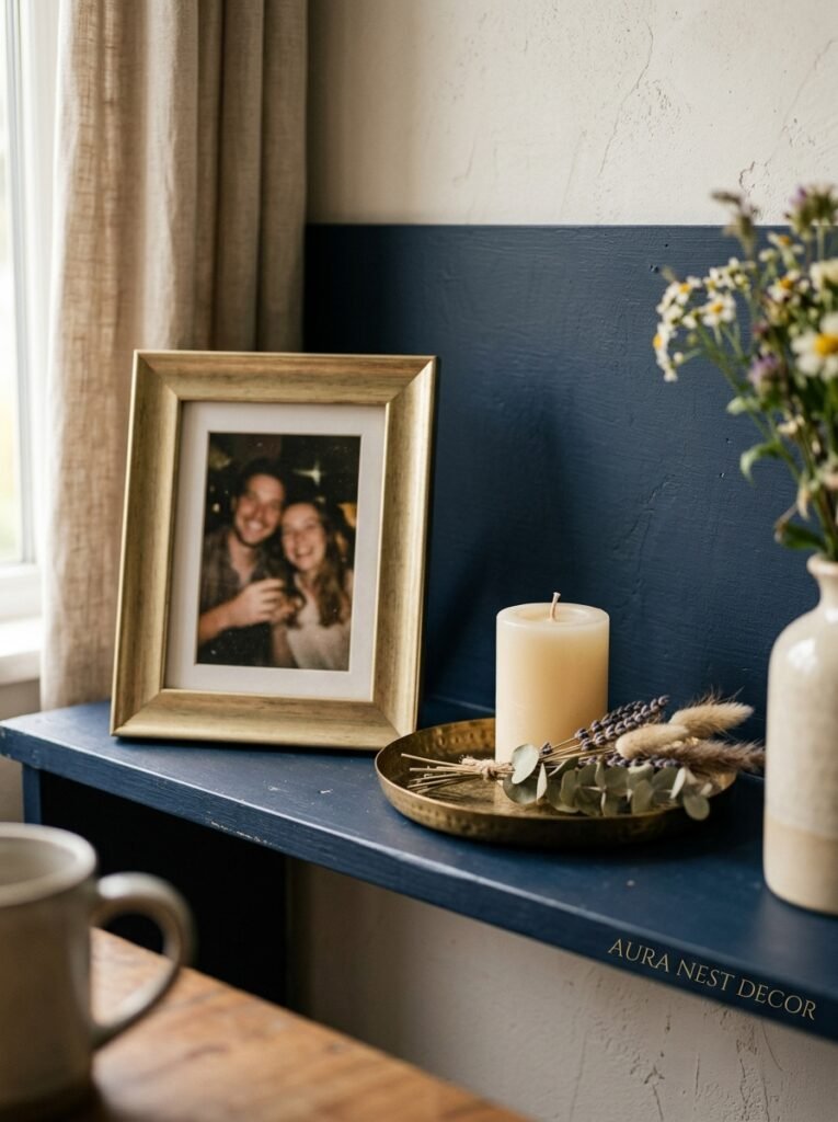
This is the fear, right? You don’t want your living room to look like a four-star hotel that peaked in 2005. The difference between “opulent” and “overdone” in a blue and gold scheme is mostly about distribution and finish consistency.
Here’s what I mean. If all your gold is the same finish — say, all brushed brass — the room will read as curated, like you made real choices. But if you’ve got shiny gold candlesticks next to a brushed brass lamp next to an antique gold mirror, the eye doesn’t know where to go. It just reads as “a lot.”
Pick one dominant gold finish and let 80% of your metallics be that. The other 20% can vary. That ratio gives you visual consistency without making it look like you bought everything from the same catalogue page.
Also — and this is the thing people underestimate — you don’t need a lot of gold for it to work. A pair of brass picture frames. A lamp base. A few drawer handles on a painted chest. The room doesn’t need to be swimming in it. Gold is loud, even when it’s quiet. A little genuinely goes a long way.
“More gold than you think you need is always less than it looks. Start smaller and see.”
5. The Floor Situation: Rugs That Tie It All Together Without Being Obvious About It
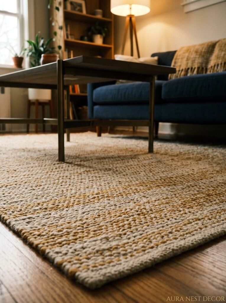
The rug is honestly one of the most underrated decisions in a blue and gold living room, and people either overthink it or completely phone it in with a plain grey rectangle.
If your room is heavy on the navy — dark walls, navy sofa — your rug is probably the place to bring in warmth. A Persian or Turkish-style rug with golden amber and rust tones on a cream ground? Perfect. It bridges the blue and gold without literally having to contain both colors explicitly. The warm tones do the work.
If your room is more blue-as-accent (cushions, curtains, art) on a neutral base, you can go bolder with the rug. A rug with a genuine deep indigo or sapphire in it, with cream or ivory patterns, can be the piece that grounds everything. Something geometric, or a classic medallion pattern in blue and cream with gold detailing.
What doesn’t work: a bright white rug (too stark, fights everything), a plain solid rug in either blue or gold (just looks like you couldn’t decide), or a very grey, very contemporary rug that has no warmth in it at all. The rug needs to be in conversation with the room, not just sitting there being practical.
6. Walls: Paint, Wallpaper, or Just the Power of Knowing When to Stop
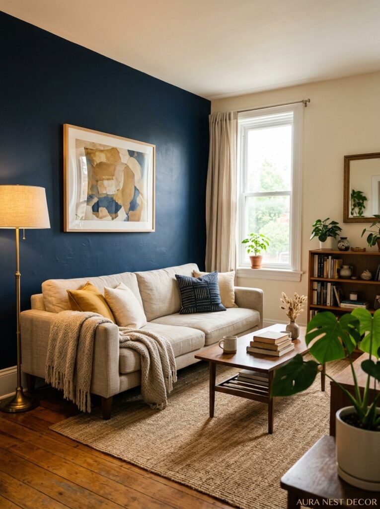
The most dramatic blue and gold living rooms I’ve ever seen have had wallpaper. I’m going to put that out there upfront because wallpaper is the fastest way to create a room with real personality and people are still scared of it for some reason.
A navy or deep blue botanical wallpaper with cream and gold detailing on one wall — just one — will do more for a living room than almost any other single decision. In the UK, Cole & Son’s botanical prints in teal and indigo with cream ground are extraordinary. In the US, Rifle Paper Co. and Spoonflower have options that don’t require remortgaging your house.
But paint can absolutely get you there too, especially if you go full commitment. Four walls in a deep Prussian blue feels enveloping in a way that one feature wall never does. One feature wall in navy when the other three are magnolia says “I wasn’t sure I wanted to do this,” and that energy comes through in the room. Either go all in with the paint or save the drama for the wallpaper.
Light colours on ceilings matter here, by the way. Dark walls with a dark ceiling can feel oppressive unless you have really high ceilings. A soft warm white or a very pale cream on the ceiling keeps the room from feeling like it’s closing in.
7. The Curtain Question (and Why Everyone Underestimates It)
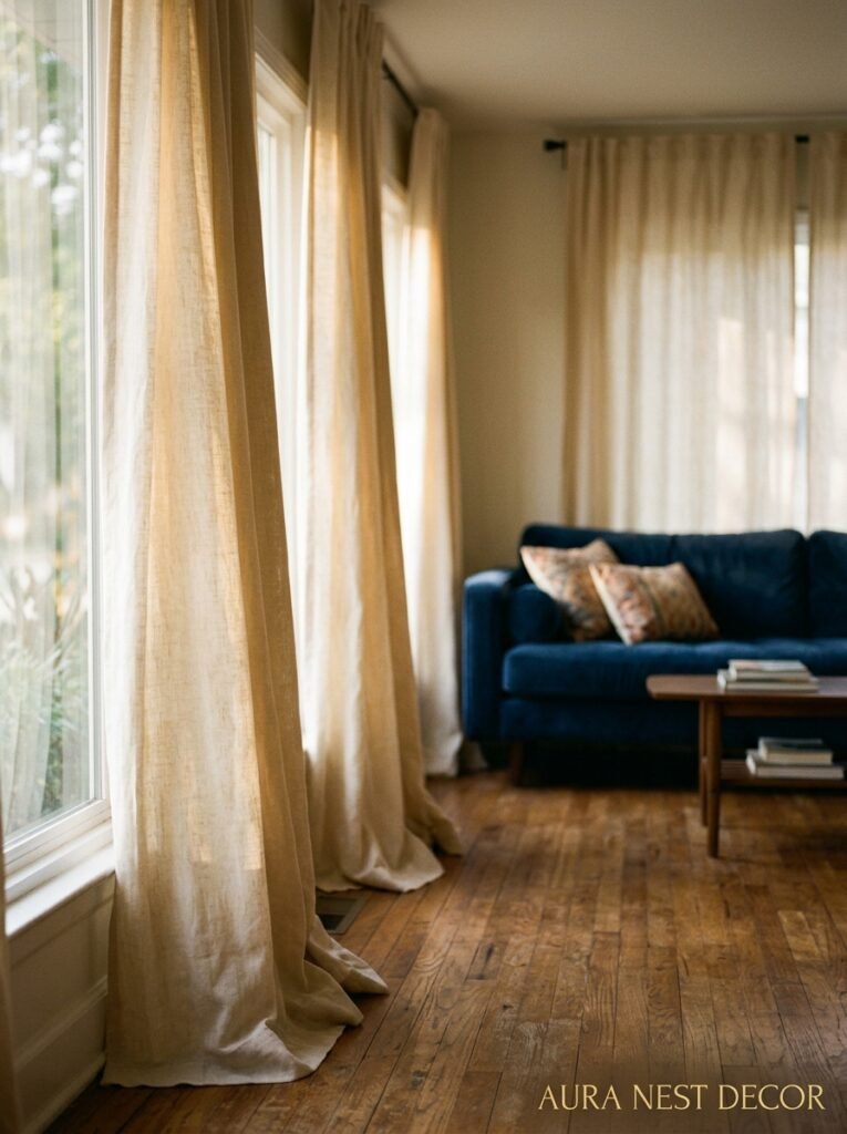
Curtains in a blue and gold room are where you can either play it safe or make a real statement. And I’ll be honest — the statement is usually the right call.
Long, floor-to-ceiling curtains in a deep blue velvet or linen look extraordinary in these rooms. Hung high (close to the ceiling, not just above the window frame — this is the rule everyone knows and half the people ignore) and wide, they make the windows look enormous and the ceilings look taller. That’s doing two things at once.
If the room is already very blue — dark walls, navy sofa — you might want curtains in a warm cream or natural linen to give the eye somewhere to rest. Brass curtain rods in that case are non-negotiable. They’re the thing that ties it back to the gold without being heavy-handed about it.
Patterned curtains can work brilliantly too — a classic ikat in blue and ivory, or even a subtle gold botanical print on a dark ground. But they need to be the statement piece, not competing with already-bold wallpaper or a very patterned rug. Pick your one big thing and let the other elements support it.
“Curtains hung from the ceiling, not from above the window. This is not a negotiable.”
8. Art on a Navy Wall: What Actually Looks Good Up There
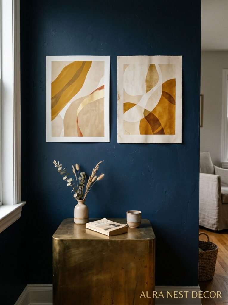
This could be its own article, genuinely. But the short version is: gold frames, always. Ornate vintage gold frames from a junk shop or antique market, all slightly mismatched, create a gallery wall on navy that looks like it took years to build even if you pulled it together in a weekend.
The art itself doesn’t have to be blue and gold. In fact, a collection of warm, richly coloured prints — botanical illustrations, abstract warm-toned art, old maps with aged cream backgrounds — will often look MORE striking on navy than art in matching colours would. The contrast is the point.
What doesn’t work as well: bright white frames on navy (too high contrast, slightly cold), black frames (they disappear), very modern minimalist prints that feel out of tone with the richness of the room.
If you’re on a budget — and who isn’t — high-quality printed art from Etsy sellers or even scanned antique botanical plates printed large and framed is a totally legitimate approach. Nobody can tell. Nobody needs to know.
9. Cushions: The Fast Way to Test If the Balance Is Right
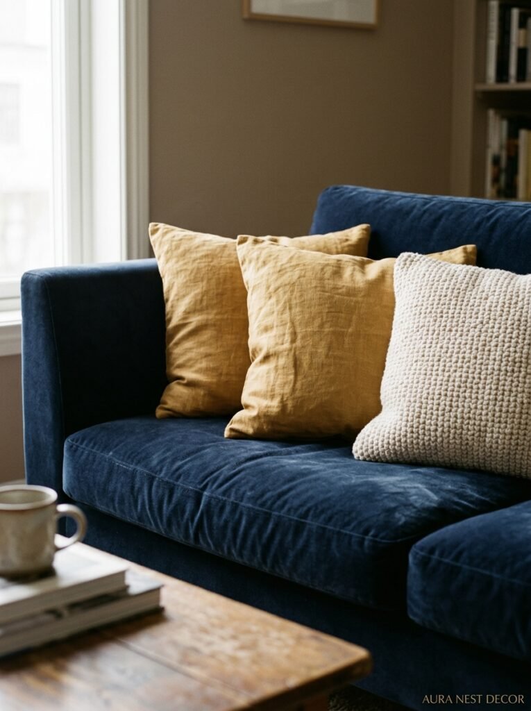
This is genuinely underrated as a room-testing tool. Before you commit to paint colours, sofas, curtains — do it with cushions first. A navy sofa with various blue and gold cushions will tell you immediately how much blue you can handle, what gold finish feels right in your specific light, and whether you prefer warm or cool blue tones.
The mix that tends to work best in blue and gold rooms: a couple of deeply saturated blue cushions in velvet or textured fabric, one or two with gold embroidery or detail on a cream or neutral ground, and maybe one in a warm amber or terracotta that isn’t explicitly gold but reads warm alongside it. That last one is the secret weapon.
Cushion arrangements should look a bit casual, by the way. Perfectly symmetrical cushion placement looks incredibly staged. A slightly odd number, different sizes, one a bit knocked over — it makes a room look lived in rather than showroom-cold.
10. The Coffee Table Situation: Glass, Wood, or Something Entirely Else
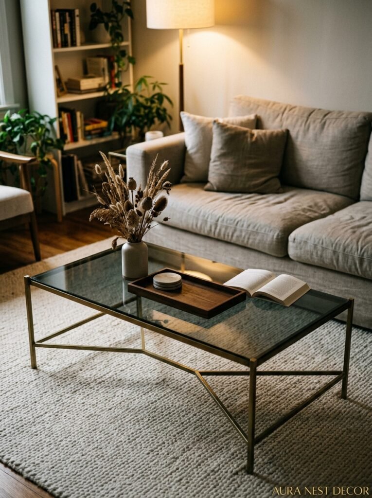
In a room with a lot going on — which blue and gold rooms often are — the coffee table is a chance to breathe. A simple travertine or marble coffee table in cream/warm white is one of the best things you can put in a saturated blue room. It stops the eye, creates visual rest, and the warmth of the stone complements the gold without competing.
Brass or gold-finish coffee tables can work, but they’re HIGH commitment. If it’s the right shape and the right finish, it’s incredible. If it’s even slightly wrong — too shiny, too ornate, wrong scale — it’s the thing that makes the whole room feel overdone.
Dark wood is also genuinely beautiful in these rooms. A rich walnut or mahogany tone against navy is warm and grounding without being precious. It gives the room a bit of British library energy, which honestly isn’t the worst thing.
Glass is a miss, in my opinion. It looks great in photographs and slightly lifeless in person, and it does nothing to add warmth or interest to a room that’s already working hard on richness.
11. The Small Stuff That Adds Up to the Whole Feeling
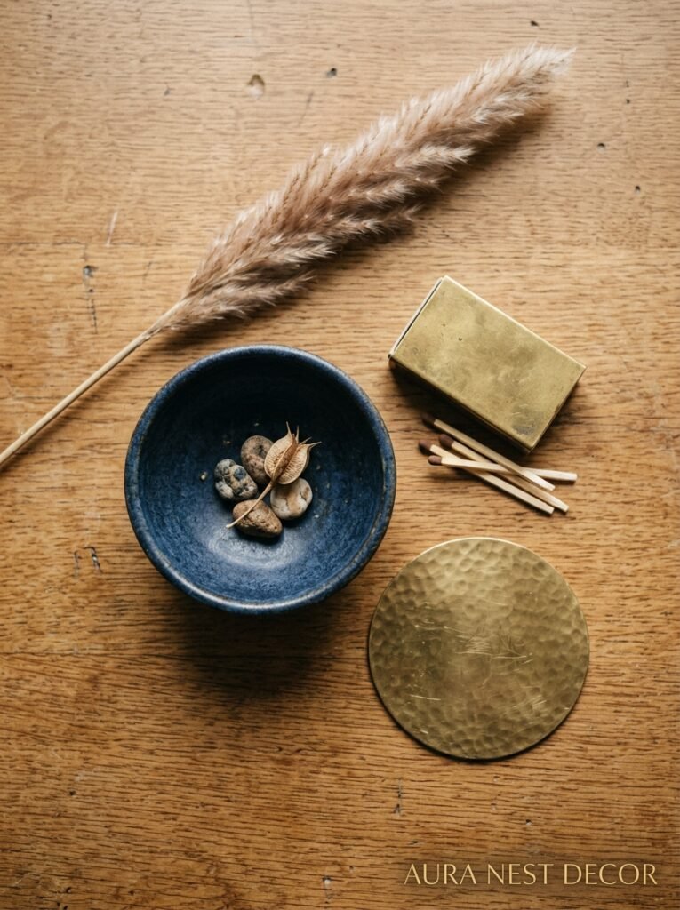
Candleholders. Side tables. Door handles if you’re really committed. Bookends. A single brass tray on the coffee table with a few things sitting in it — a candle, a small plant, a stack of books.
These tiny decisions are where the room either feels intentional or kind of random. And the thing is, none of them are expensive. A £12 brass candleholder from a homeware store, a vintage ceramic vase in teal blue from a charity shop, a set of navy bookends — these are the finishing details that make a room look like you spent five times more than you did.
Plants, by the way. Don’t skip the plants. A tall, architectural plant — a fiddle-leaf fig, a snake plant, something with bold dark-green leaves — against a navy wall looks extraordinary. The deep green against navy with gold accents is this rich, jewel-box combination that photographs insanely well.
12. Lighting: The Thing That Makes Blue and Gold Go From Good to Incredible
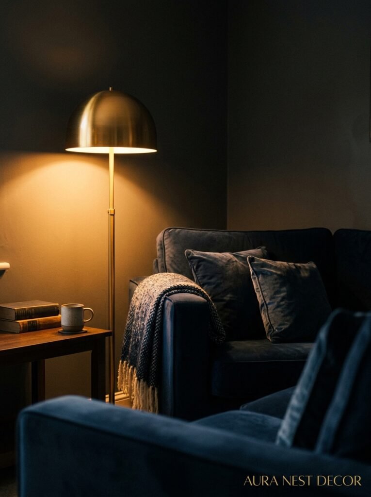
I saved this for last because I genuinely think it’s the most important factor that nobody talks about enough.
Blue and gold rooms need warm light. Not bright white LED light that makes every blue look slightly purple and every gold look slightly yellow. Warm, amber-toned bulbs — around 2700K if you’re choosing — that make the blue deepen and the gold glow.
A single overhead light in a room like this is a crime. You want layered lighting: a floor lamp in the corner (brass base, please), table lamps on side tables, maybe a pendant over the coffee table or seating area if the architecture supports it. Candlelight if you’re feeling extra. The more sources of warm light in different parts of the room, the more alive the whole colour scheme feels at night.
This is the thing that makes people walk into a blue and gold living room in the evening and audibly go “oh, wow.” Not the sofa, not the wallpaper, not the perfectly curated gallery wall. The light. Always the light.
—
❓ FAQ
Q: Can blue and gold work in a small living room, or is it too much? A: It can absolutely work — but scale matters more in a small room. Instead of dark walls and heavy furniture, try a single navy accent wall, gold-frame mirrors (which open the space up), and cream or white as your dominant base. The richness comes through without making the room feel smaller than it already is.
Q: What metals work alongside gold/brass in a blue and gold room? A: Brushed brass is the main event, but a little warm bronze works beautifully alongside it. Silver and chrome are a harder mix — they cool everything down and can fight with the warmth the gold is providing. If you want to mix metals, stick to the warm family.
Q: Is this colour scheme more traditional or can it work in a modern home? A: Both, genuinely. In a Victorian terrace or Georgian flat it leans classical and rich. In a clean-lined modern space with minimal furniture it goes more contemporary glam. The key is the shade of blue and the gold finish — matte and dusty reads modern, ornate and glossy reads traditional. You choose the version that fits the bones of your room.
—
💭 Final Thoughts
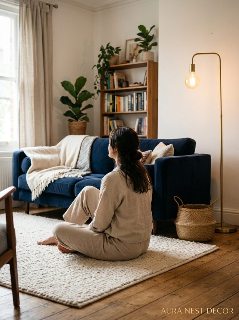
A blue and gold living room is one of those schemes that people think they understand from a mood board and then completely fall in love with in real life. It’s warmer than it looks on screen. More comfortable. More adaptable. You can build it slowly over months with second-hand finds and a single tin of really good paint, or you can go all in at once — either way, it rewards the commitment.
The question is always: which blue is yours?




