
The Grandmillennial Living Room Trend That’s Making Every Minimalist Question Everything
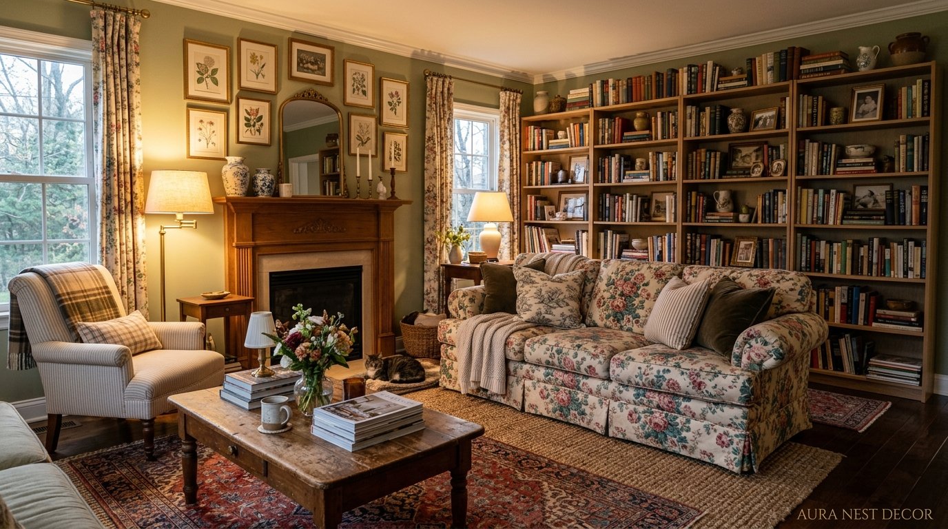
You walk into someone’s house and there are framed botanical prints, a tufted sofa in a color that should feel dated but absolutely doesn’t, and a lampshade with a fringe on it. And somehow? It looks incredible. That’s the grandmillennial living room — and it’s been quietly taking over Pinterest boards and Instagram saves for a reason people are only just starting to articulate.
—
1. Why This Trend Feels Like a Deep Exhale After Years of Cold, Clean Rooms
Let’s be real. A lot of us spent the better part of a decade trying to make our living rooms look like Scandinavian hotel lobbies. White walls. Flat cushions. A single abstract print with maybe five brushstrokes on it. And there was a moment — somewhere around the third grey linen sofa we’d pinned — where it started to feel a little… empty? Not calming. Just empty.
Grandmillennial style is the correction to that. The overcorrection, even, and I mean that as a complete compliment. It’s rooted in the aesthetic of your grandmother’s front room — the one that actually had STUFF in it, that felt like someone lived there, that had a story in every corner — but filtered through the eye of someone in their thirties who’s on TikTok and also knows what a mood board is.
The word “grandmillennial” was actually coined by House Beautiful back in 2019, and it picked up steam because it named something people were already feeling. A hunger for warmth. For pattern. For rooms that didn’t require a staging crew to look good.
It’s not nostalgia for its own sake. It’s nostalgia with intention. There’s a difference, and it shows.
“It’s the first decorating trend in years that actually rewards you for keeping the things you love.”
2. The Sofa Color That Keeps Showing Up and Why It’s Not What You’d Expect
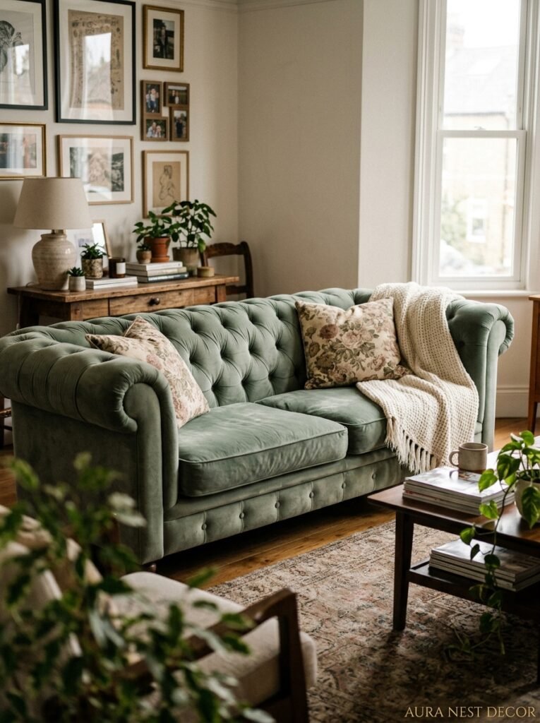
Here’s where it gets interesting. Grandmillennial living rooms don’t default to beige or cream the way you might assume. The sofas trending right now — the ones getting saved fifty thousand times on Pinterest — are dusty rose. Sage green. Deep burgundy. A very specific shade of teal that sits somewhere between the ocean and a vintage library.
These aren’t bold colors in the way an interior design magazine might call something “bold.” They’re muted. A little worn-in feeling even when they’re brand new. They have what I’d describe as a quality of having already been loved, which sounds odd but makes complete sense once you see it in person.
In the US, the crushed velvet tufted sofa is having a major moment — particularly in jewel tones. In the UK, the preference seems to lean slightly more toward upholstered linen or a worn leather chesterfield (always a chesterfield, honestly). But both aesthetics share that same underlying quality: the sofa looks like someone’s grandmother picked it out in 1962 and it’s been in the family since. That’s the WHOLE point.
Pair it with mismatched throw cushions. Not intentionally mismatched in a curated, “effortless” way — genuinely mismatched, because you found one at an antiques market and one came from your mum’s spare room. That’s what makes it feel real instead of styled.
3. Florals in Every Direction and How to Stop Them Looking Like a Country Inn
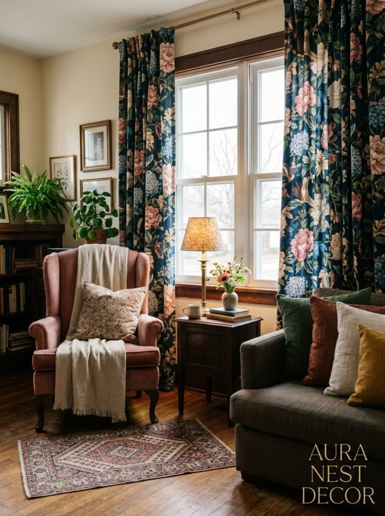
Floral prints are central to grandmillennial style, but there’s a version of this that works beautifully and a version that makes your living room look like a B&B in the English countryside that hasn’t updated since 1994. The difference is actually pretty simple once you see it.
The rooms that get it right are mixing scale. One large-scale floral — maybe a vintage-style curtain fabric with big cabbage roses on it — against smaller, tighter patterns elsewhere. A geometric cushion. A thin stripe. Something that gives the eye somewhere to rest between the florals.
The rooms that go wrong are matching everything. Matching floral curtains to a floral sofa to a floral rug to floral cushions. That’s not grandmillennial — that’s just a lot of flowers, and it creates a visual noise that’s genuinely exhausting to sit in.
Side note: some of the best grandmillennial floral moments come from vintage fabric sourced on Etsy or at estate sales. You don’t need to buy new. Actually, the older the fabric, the better — the colors will have that softened, slightly faded quality that no modern print can fully replicate.
4. The Lamp Situation: Why This Trend Lives or Dies by Its Lighting
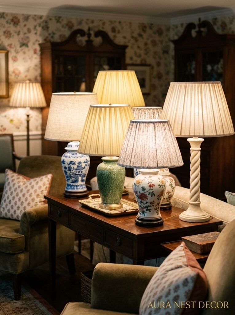
Okay, this is maybe my strongest opinion on grandmillennial decorating. The lighting is EVERYTHING. Get the lighting wrong and the whole room looks chaotic. Get it right and the whole thing coheres in a way that feels almost magical at dusk.
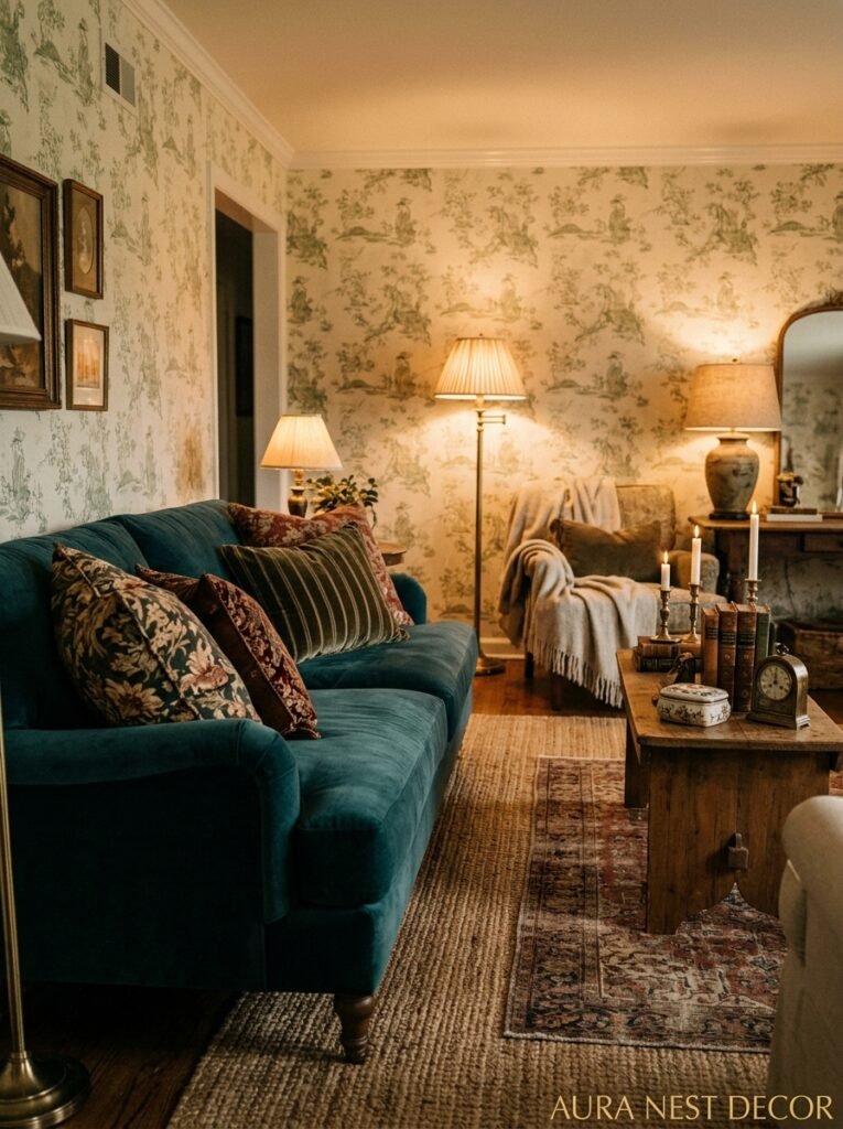
You’re looking for: table lamps with pleated or ruched fabric shades. Floor lamps with a slight curve to the neck. Fringed lampshades, if you’re brave enough (and you should be). Candlesticks. The occasional wall sconce if your space allows it.
You’re NOT looking for: LED strip lights, pendant bulbs hanging without a shade, recessed lighting as your primary source, anything that points straight down. Grandmillennial rooms glow. They don’t beam.
The amber glow of an Edison bulb at 7pm in a room like this is genuinely one of the most calming things you can come home to. And I don’t say that lightly — I’ve lived in my share of harshly lit rooms and the difference that warm, layered light makes to how you feel in a space is significant. Not just aesthetic. Actually physical.
In terms of bulb temperature, you want 2200K-2700K. That’s the warm, golden range. Anything over 3000K starts creeping into office territory, and that’s not what we’re doing here.
“Grandmillennial lighting doesn’t illuminate a room. It wraps it.”
5. Gallery Walls That Feel Collected, Not Assembled
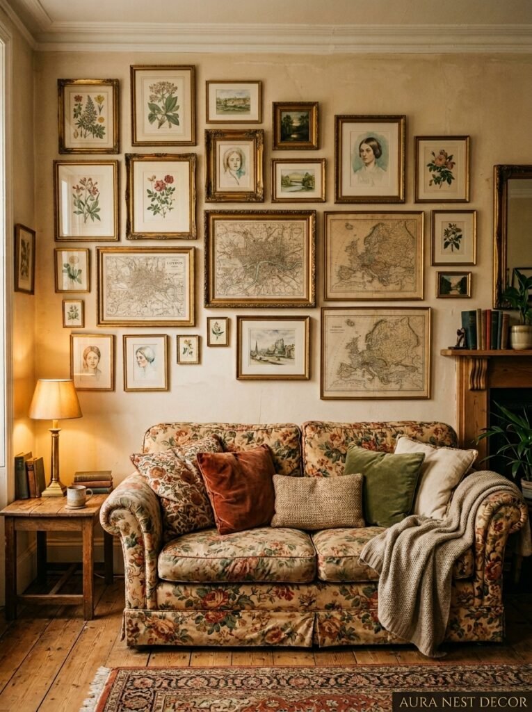
There’s a version of a gallery wall that looks like someone measured everything with a ruler and used identical IKEA frames. That’s fine! But it’s not this.
Grandmillennial gallery walls are maximalist without being overwhelming. They mix frame styles — gilded baroque frames next to simple dark wood next to a clip frame with no mount — and they mix content without a rigid theme. Botanical illustrations. A watercolor portrait. A piece of embroidery or needlepoint in a frame (huge in this aesthetic). An old map. A black and white family photo. A postcard someone sent in 1987.
The “rule” — if there is one — is that every piece should have a reason for being there. Not a design reason. A PERSONAL reason. This is not about curation. It’s about accumulation with love.
In the UK especially, there’s a tradition of keeping inherited art on the walls, which slots perfectly into this look. Portraits of people you can’t quite identify. Landscape paintings from deceased relatives. Don’t hide those. That’s the whole point of them.
American grandmillennial rooms tend to lean into the botanical and natural history print side of things — framed pressed flowers, Audubon bird prints, shell illustrations. Both approaches are completely right, and mixing them is even better.
6. The Bookshelf Moment That Grandmillennial Rooms Do Better Than Anyone
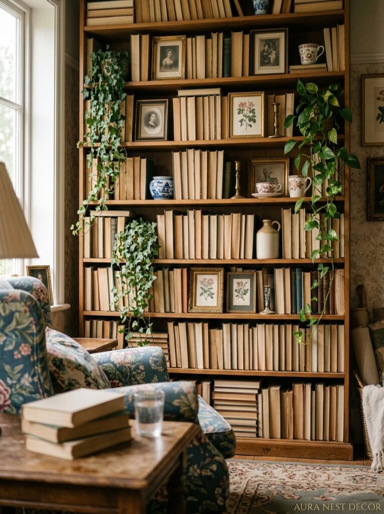
I have to talk about the books. Because grandmillennial style doesn’t do the thing where you turn all your spines around to make the shelves look clean and color-coordinated. (That trend. I can’t.)
The books are present. Stacked horizontally in places. Organized loosely by size or color in some sections, completely ignored in others. And interspersed throughout: objects. A small ceramic figurine. A brass candlestick. A geode. A stack of vintage hardbacks with beautiful cloth covers. A plant in a terracotta pot.
The grandmillennial bookshelf looks like it took years to build — because ideally, it did. But if you’re starting fresh, the trick is not to buy everything at once. Pick up books at charity shops and library sales. Grab objects one at a time. The bookshelf should look like evidence of a life, not a purchase made in a single afternoon.
Or maybe it’s the opposite, honestly — maybe the point is just that it looks genuinely loved. Whether that took two years or two weeks probably matters less than how intentional each piece feels when you put it up there.
7. Chintz, Toile, and the Patterns That Were Banned From Cool Rooms for 20 Years
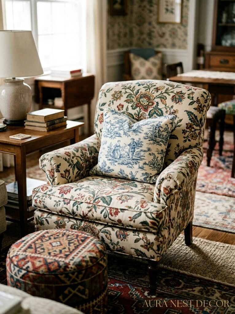
Chintz! Toile! Two words that got absolutely exiled from mainstream interior design somewhere around 2005 and are now having the most spectacular comeback.
Chintz is that glazed cotton fabric with large, slightly shiny floral prints. Very English country house. Very Laura Ashley. Very much something your auntie had on her dining chairs and you thought was incredibly uncool until about three years ago. Now? There are interior designers specifically sourcing vintage chintz fabric to reupholster furniture and it’s selling out.
Toile de Jouy is the French one — those narrative scenes printed in a single color on cream or white, showing pastoral countryside life or little vignettes of people doing things in what looks like the 1700s. A toile cushion, a toile curtain, even just a toile notebook placed visibly on a side table is a full grandmillennial moment.
The combination of either of these patterns with a solid, slightly saturated color — say, toile curtains against a deep green wall — is one of those combinations that looks absolutely considered without you having to work very hard to achieve it.
“The patterns your grandmother called ‘classic’ and your 25-year-old self called ‘dated’ are now just called correct.”
8. Houseplants in the Grandmillennial Room: Not the Ones You’re Thinking Of
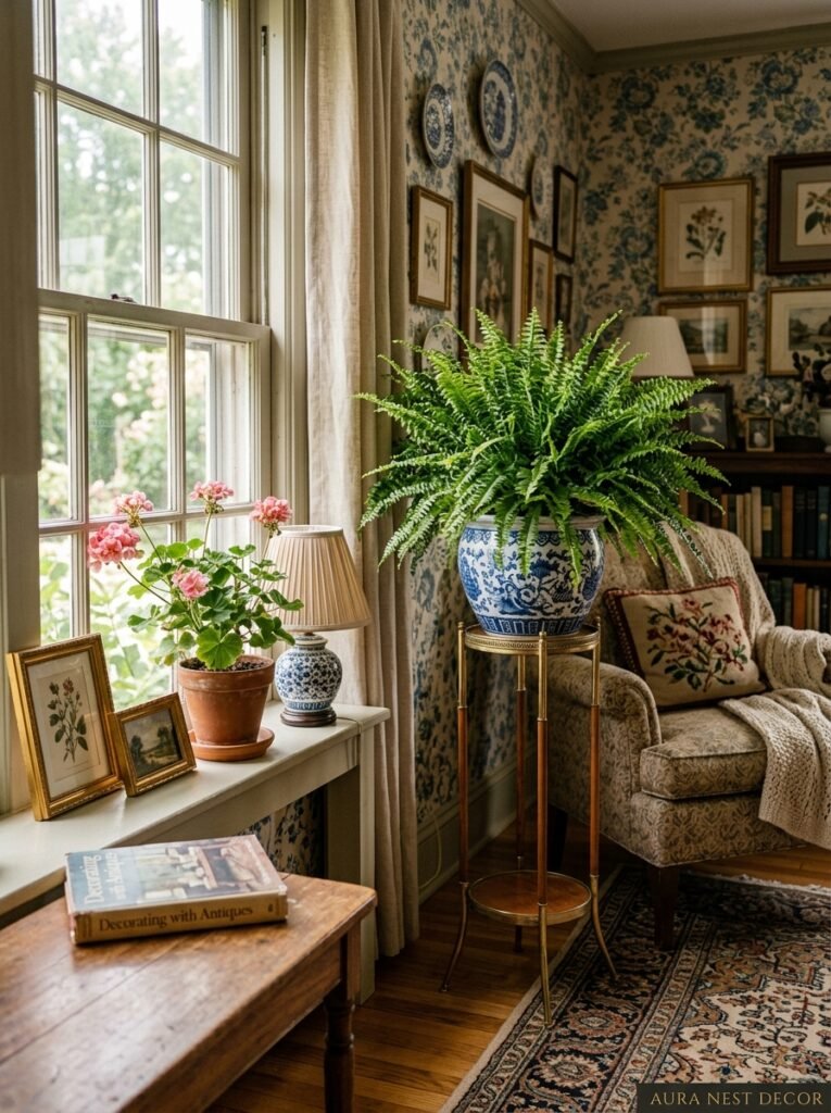
Here’s where I’ll probably be slightly controversial. The standard millennial houseplant lineup — the monstera, the fiddle leaf fig, the trailing pothos — those aren’t quite right for this aesthetic. Not WRONG, but not really it.
Grandmillennial plants are a bit more specific. African violets. Ferns. A peace lily. A Boston fern on a plant stand. Begonias with their blowsy, slightly overdone flowers. Geraniums on a windowsill if you’re lucky enough to have good light.
And the pots matter enormously. No plain white plastic nursery pots. No minimalist matte ceramic. You want: hand-painted pots, vintage porcelain cache-pots, wicker plant stands, terracotta with a worn patina. The plant and the container are both part of the look, and they should both feel like they’ve been around a while.
A big jardiniére — that tall, pedestal-style plant stand that was massive in Victorian parlors — is coming back in a serious way. If you find one at an antiques fair, you buy it immediately. No hesitation.
9. The Side Table That’s Doing the Most Work in the Room
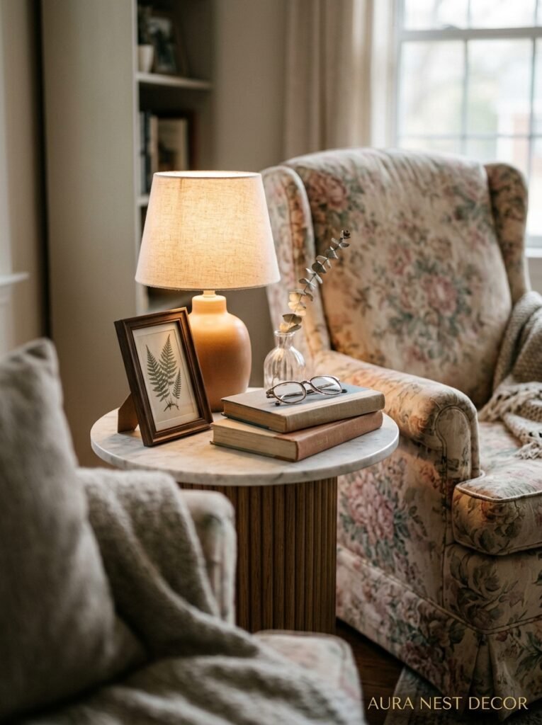
In a minimalist room, side tables are basically invisible. Just a surface to put your cup on. In a grandmillennial room, the side table is a whole scene.
You want: a round table with a tablecloth that touches the floor. Or a small painted wooden table with slightly curved legs. Or a wicker side table with a glass top. Something that has personality rather than just function.
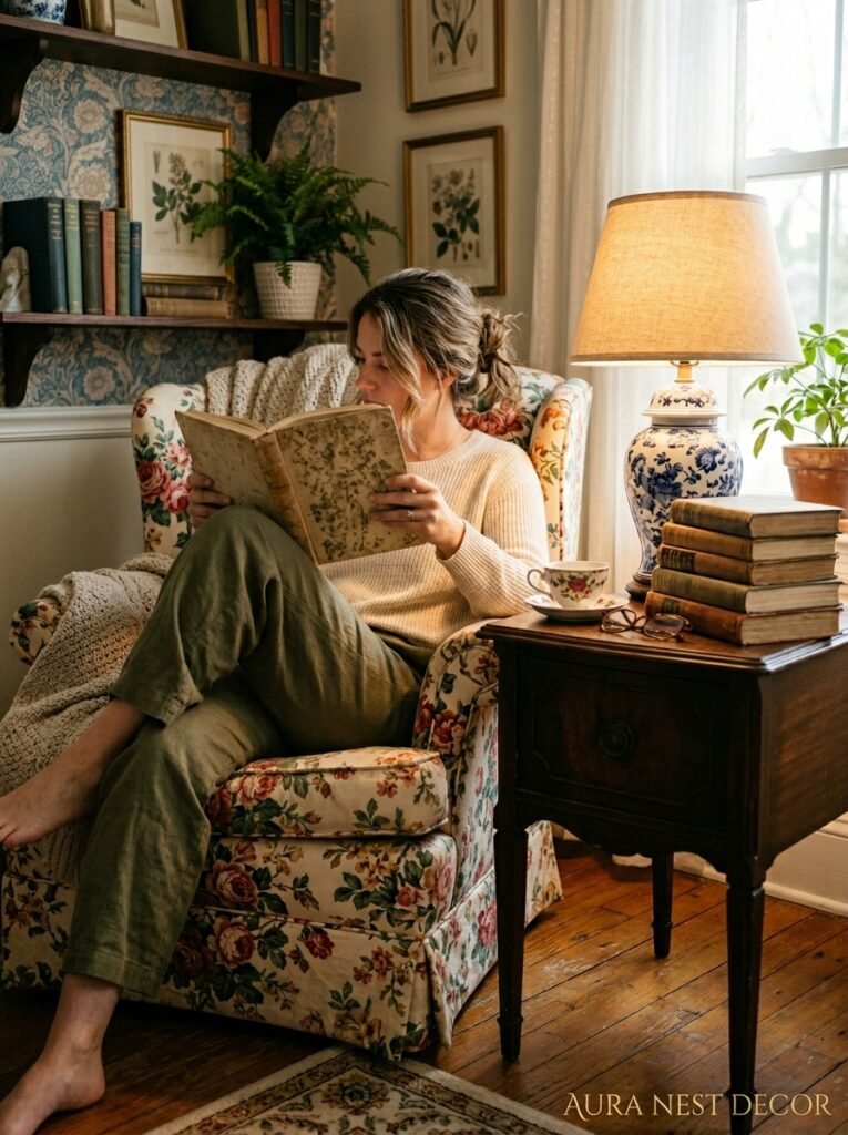
And then you dress it. A lamp (already discussed — make it warm). A small stack of books. A vase with fresh or dried flowers. A coaster that’s actually beautiful — brass, or embroidered, or vintage tile. Maybe a small dish for rings or earrings because you take them off when you sit down to read. The surface tells a story about who you are and what you do in this room.
This is something grandmillennial rooms do that minimal rooms just can’t: they make you feel like a person lives there. Not a concept. A person.
10. Curtains Long Enough to Pool on the Floor — And Why You Should Do It
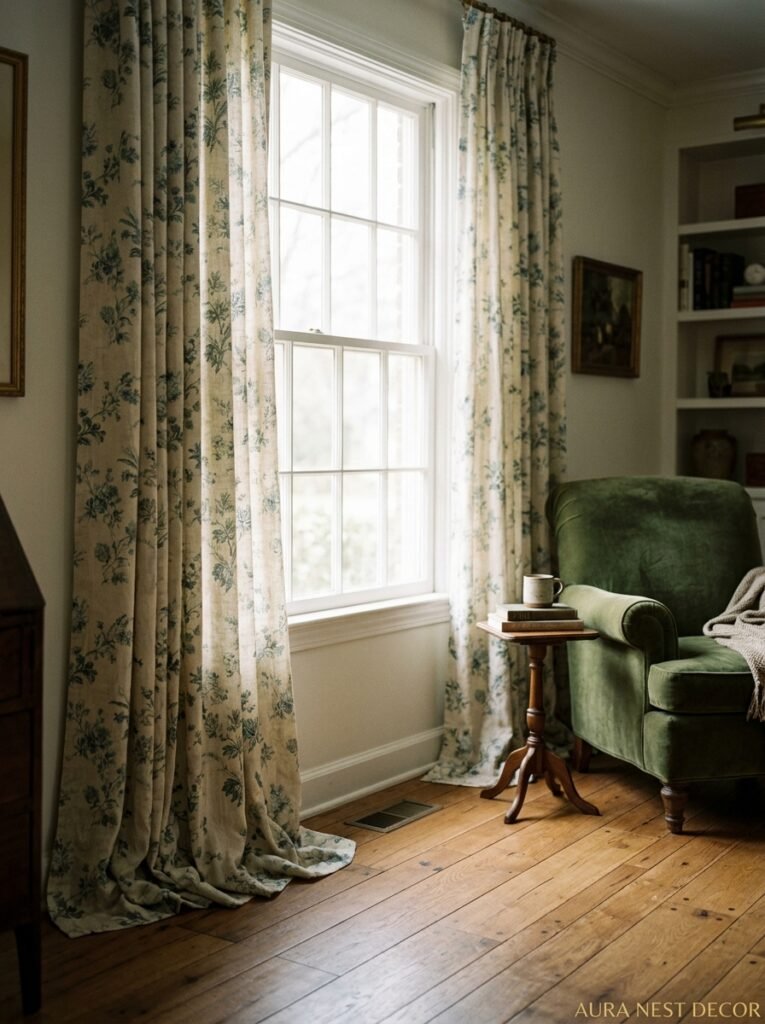
Most people hem their curtains to exactly the right length, or a centimeter or two above the floor, because it’s practical and it looks tidy. Grandmillennial rooms don’t do that.
The curtains pool. They hit the floor and keep going — six inches, sometimes more. And it looks INCREDIBLY lush. The fabric gathers slightly at the base and there’s something about it that looks both maximalist and somehow very old-money elegant at the same time.
In terms of fabric: velvet for a very dramatic, cocooning effect. Heavy linen in a natural or printed color for something softer. Chintz if you’re going all-in. Even a slightly sheer fabric in an ivory or blush can work if the pattern is right.
The curtain rod matters too. Decorative finials. Brass or aged gold hardware. Not the plain chrome rails from a home improvement store, please, I am begging you.
11. The Color Palette That’s Sitting Underneath All of This
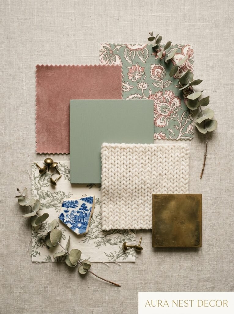
Walls in grandmillennial rooms aren’t always white. That’s a key thing to understand. Actually, a lot of the most beautiful examples of this style feature walls in deep, saturated colors: forest green, terracotta, dusty mauve, a warm navy that’s almost indigo. Or a very specific kind of off-white that leans cream or yellow rather than cool grey.
The color on the walls does something important: it makes the room feel contained. Intimate. Like you’re inside the room rather than just in it. Which sounds like an odd distinction but it’s a real one. When you sit in a deep-green room at night with warm lamps lit, there’s a quality to it that bright white walls genuinely cannot recreate.
In the US right now, terracotta walls with white painted woodwork are everywhere in grandmillennial interiors. In the UK, a particular dark dusty sage — think Farrow & Ball’s Mizzle or something adjacent — seems to be the choice. Both are right. Both are warm. Both disappear into themselves in the best possible way after dark.
12. The Things Grandmillennial Style Keeps That Other Trends Throw Away
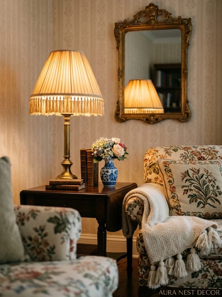
And here’s the thing — maybe the most important thing — about why this trend has lasted longer than anyone predicted. It’s about keeping. Not upgrading. Not replacing. Not starting over.
The grandmother’s clock that’s been in your family for three generations? That goes on the mantelpiece. The imperfect vintage mirror with a slightly foxed surface? That goes on the wall. The mismatched set of china your parents got as a wedding gift in 1978? That goes on display, not in a box.
Grandmillennial living rooms are full of things with histories. That’s what gives them their quality — that sense of walking into a room and knowing it didn’t get assembled from a single shopping trip. It took time and affection. It kept the things that meant something.
And in a world that’s very focused on newness, on fresh starts, on decluttering and minimizing — there’s something almost radical about that. About saying: no, actually, I want to keep this. It matters. It stays.
—
❓ FAQ
Q: How do I make a grandmillennial room look intentional and not just cluttered? A: The difference is usually editing — choosing things you genuinely love rather than just more things. Every object in a grandmillennial room should earn its place, either through beauty or meaning. When something doesn’t have either of those qualities, it creates clutter rather than character.
Q: Can grandmillennial style work in a small living room? A: Absolutely, and it can actually be better in small spaces because the warmth and layering makes the room feel cozy rather than cramped. Focus on one or two statement pieces — a great lamp, a small gallery wall, a beautiful side table — and build from there rather than trying to do everything at once.
Q: Where do you actually find grandmillennial pieces without spending a fortune? A: Estate sales, charity shops (UK) and thrift stores (US), Etsy vintage sellers, Facebook Marketplace, and eBay are genuinely the best sources. The pieces that look most authentic in this style are usually the ones that have actually been around for decades. New high-street versions exist but they rarely have the same quality of patina and detail.
—
💭 Final Thoughts
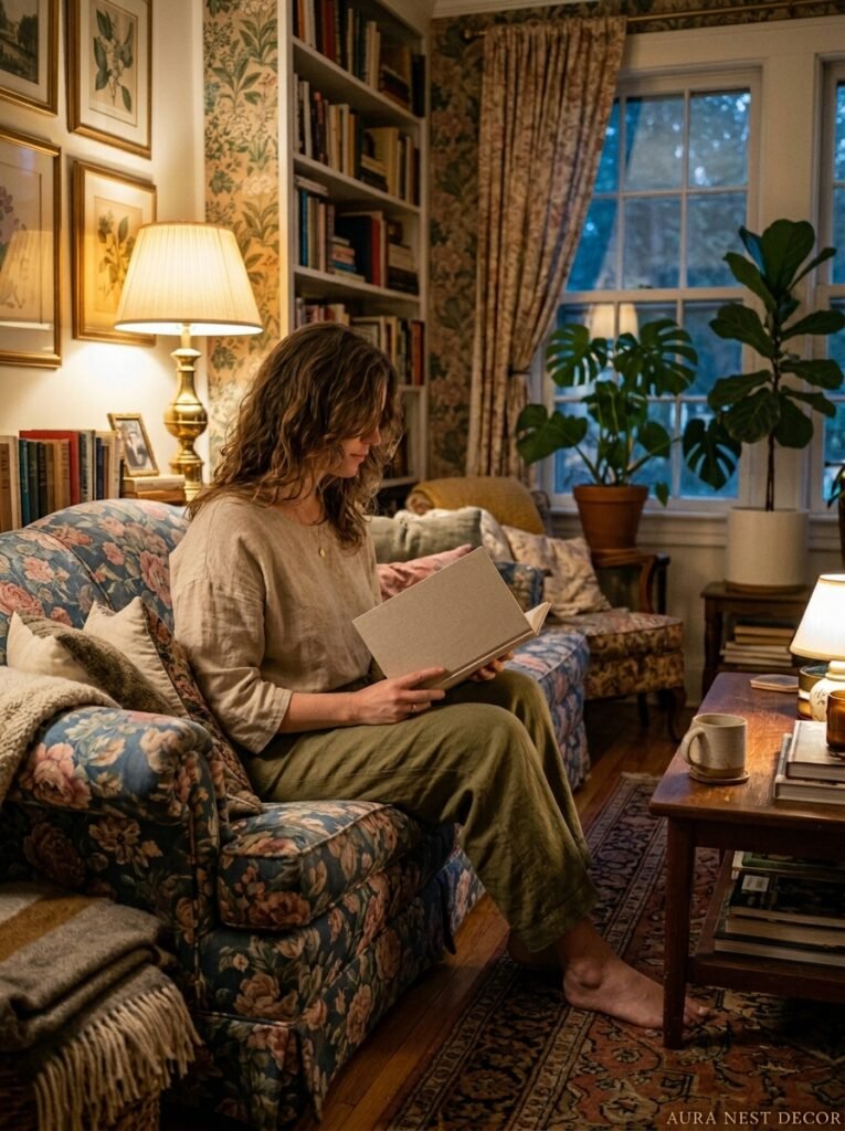
The grandmillennial living room isn’t really about aesthetics in the end. Or it is, but that’s not where it starts. It starts with a resistance to the idea that a beautiful home has to be a spare one — that comfort is somehow less sophisticated than restraint. The rooms that feel the best to be in, historically, have always been the ones full of things that mattered. So the question isn’t really whether grandmillennial style will last. It’s whether you’re ready to stop apologizing for the things you’ve kept.




