
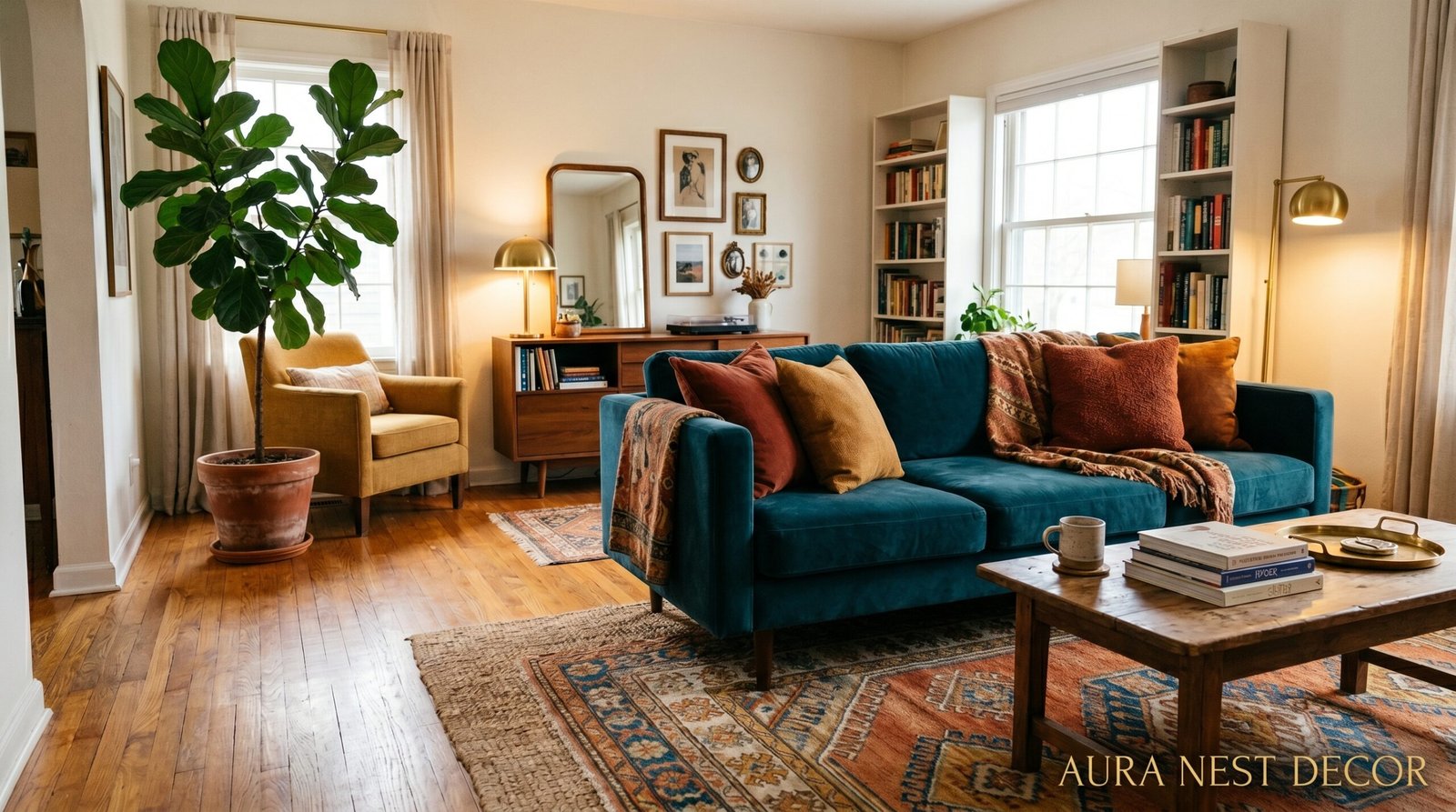
Your Living Room Doesn’t Have to Be Beige: How to Use Color Like You Actually Mean It
You opened Pinterest, scrolled past seventeen greige sofas, and thought — there has to be more than this. There is. Color isn’t risky. Playing it safe for the tenth year in a row is.
—
1. The Color That’s Quietly Taking Over Every Living Room Worth Pinning Right Now
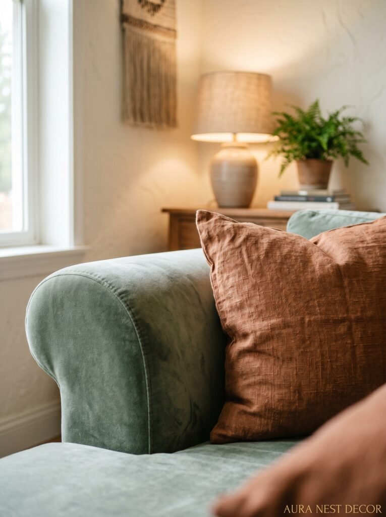
Okay so it’s not one color exactly. But if you’ve been on Pinterest in the last six months, you’ve noticed something: deep, moody jewel tones are EVERYWHERE. We’re talking cobalt blue, forest green, that specific shade of rust that looks expensive without trying. Not pastel. Not washed out. Rich.
And here’s the thing — these colors don’t make a room feel smaller the way everyone’s been telling you for years. That’s sort of an old wives’ tale, honestly. A deep navy wall in a small living room can actually make it feel like a jewel box. Like it was designed with intention rather than decorated in a panic. The difference is confidence in the execution.
What’s driving this trend? I think people are genuinely tired. Tired of the safe, the beige, the “goes with everything” philosophy that somehow ends up going with nothing. There’s a collective exhale happening in interior design right now, and color is the breath.
Start noticing it. Deep terracotta paired with warm whites. Emerald green with unlacquered brass. Cobalt and cream. These combinations keep showing up because they WORK, and once you start seeing them, you can’t unsee them.
“A beige room doesn’t feel calm. It feels like a decision you were afraid to make.”
—
2. Why Your “Neutral” Foundation Might Actually Be Killing Your Color Plans
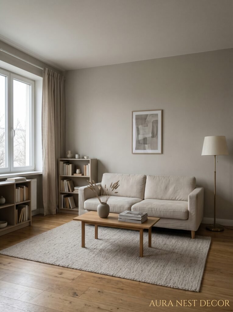
Before you pick a single paint color or throw pillow, you need to look at what you’re working with. And I mean really look. Because a lot of people try to add color to a room and wonder why it feels off — and the answer is usually the undertones in their “neutral” base.
That greige sofa you bought because it “goes with everything”? It’s got pink undertones. So when you bring in terracotta accessories, suddenly everything feels weirdly peachy and you can’t figure out why. Or your “warm white” walls are actually pulling yellow, which is going to fight tooth and nail with any cool-toned blue you try to introduce.
Here’s what to do. Take photos. Not to post, just to study. Your eyes adjust to your room constantly, so photographs let you actually SEE the undertones you’ve been ignoring. Hold paint swatches against your largest pieces of furniture, not against a wall by itself. That’s how you figure out if your foundation is actually helping you or working against you.
If your neutral base has warm undertones, lean into warm colors — rust, amber, terracotta, olive green. If it reads cool, you’ve got a green light for teal, cobalt, soft lilac, sage. Don’t fight the undertones. Go with them and then push it further than you think you should.
—
3. The One Piece of Furniture That Will Make or Break Your Color Story
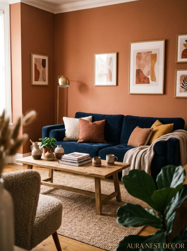
It’s the sofa. I know, obvious, but hear me out because most people think about this backward.
Most people pick a sofa first and then try to build color around it. That’s fine if you choose wisely. But here’s what actually works better: decide your color direction FIRST and THEN choose a sofa that plays a role in that story — not a neutral that sits there asking nothing of anyone.
A mustard yellow sofa against a white wall isn’t a risk. It’s a statement piece that defines the whole room. A deep plum velvet sofa is the color story. A sage green sofa with natural wood legs and cream walls? That’s a complete room in three pieces.
The sofa doesn’t have to BE the loudest color. But it can’t be a beige placeholder that you “plan to accessorize around.” That plan never works as well as you hope. Side note — velvet genuinely photographs better than any other fabric, which is something Pinterest has been quietly proving for about eight years. Velvet in any jewel tone = immediate impact.
If you’re renting or genuinely can’t commit to a colored sofa yet, invest in a quality slipcover in a deep natural linen and let your walls or rugs carry the color. That’s a real solution, not a compromise.
—
4. Two Colors You’re Probably Underestimating (and One Everyone’s Finally Getting Right)
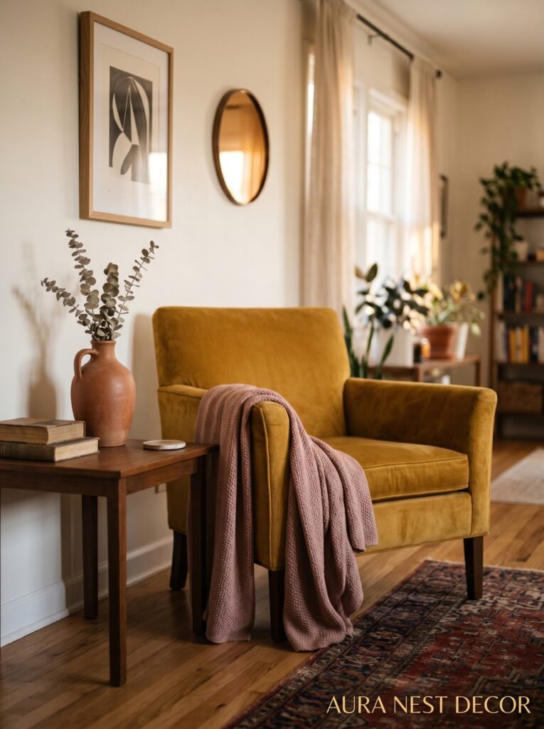
First: olive green. Not sage, not forest — olive. That specific murky, complex yellow-green that looks like something from an old Italian fresco. People keep sleeping on it and I genuinely don’t understand why. It works with practically everything. Warm wood tones, burnt orange, cream, even a soft dusty pink. It’s the most quietly sophisticated color in the spectrum and it doesn’t get nearly enough credit.
Second: rust. Real rust, not “burnt sienna” or the orange-adjacent shades that look trendy for six months and then date horribly. Rust is the color of old clay pots, of autumn leaves after they’ve been on the ground for a week. It’s warm without being aggressive, and it layers beautifully with blues and greens in a way that feels both earthy and unexpected.
And the one everyone’s FINALLY getting right? Terracotta. For a while, everyone was doing terracotta wrong — too orange, too flat. But the newer interpretations, the ones showing up in the really beautiful rooms, are more complex. Dusty, slightly muted, like the color has aged a little. Pair it with a creamy off-white and some plants and a woven rug and I promise you’ll be obsessed.
“The colors people call ‘risky’ are usually just the ones that require a little conviction.”
—
5. The Accent Wall Debate: Is It Still Embarrassing or Has It Come Back Around?
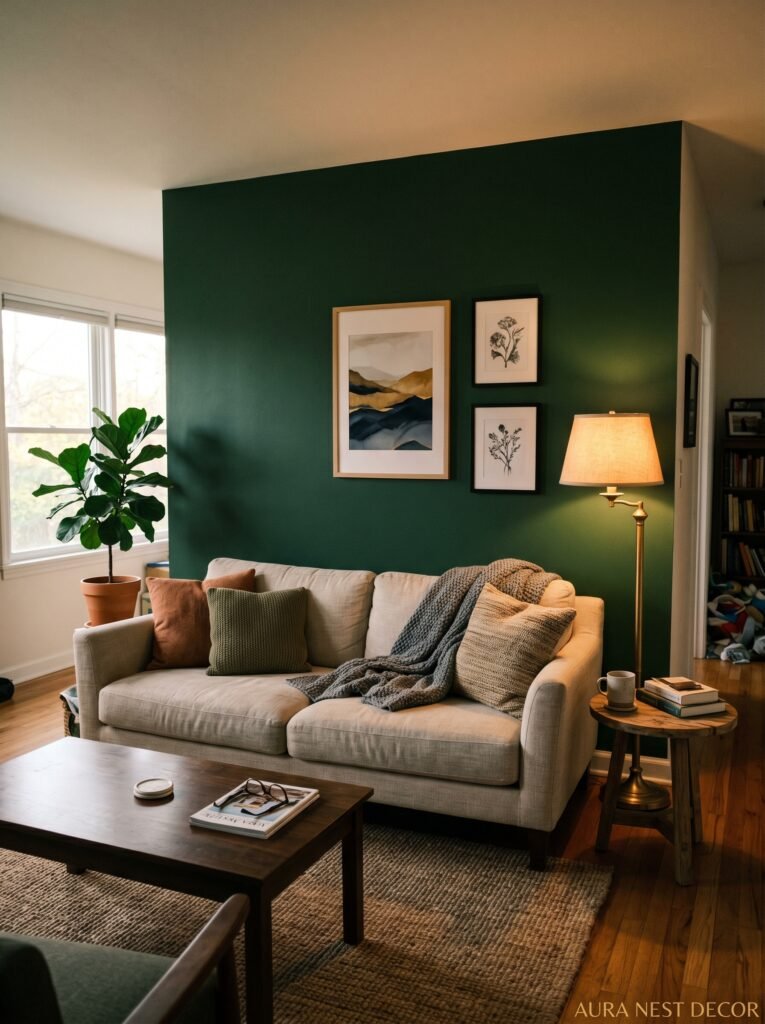
Okay so there was definitely a period — probably 2015 to 2020 — where the accent wall became the interior design equivalent of a skinny tie. Overdone, a bit sad, a signal that someone had watched exactly one episode of a home makeover show.
But I think they’re back. And I think the reason is that people are now doing them with more confidence and less hedging. The old accent wall was often a single, half-committed wall in a slightly darker version of the existing color, which — yes, that’s embarrassing. But a deep, dramatic color on one wall in a room that otherwise breathes? That’s different.
The current version tends to be: one deeply saturated wall (navy, forest green, inky black even), paired with everything else in warm neutrals or natural textures. The wall does the work. The rest of the room doesn’t compete.
Where it still goes wrong is when people choose the wrong wall. You almost always want the wall your eye goes to FIRST when entering the room — usually the one farthest from the door, or the one framing your fireplace or main seating area. Not a side wall, not a corner. The wall that anchors the room.
Don’t let the accent wall be a compromise. If you’re going to do it, COMMIT.
—
6. What British Living Rooms Do With Color That Americans Should Probably Steal
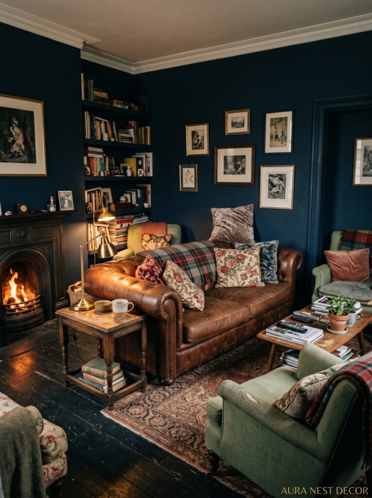
Not gonna lie, British interior design has been quietly more adventurous with color for years and the American aesthetic is only just catching up. There’s a reason brands like Farrow & Ball have such devoted followings — those colors are COMPLEX. They’re not flat. They shift in different light, they have histories baked into them.
British living rooms have traditionally embraced what I’d call “lived-in layering” — mixing an old inherited sofa in one pattern with new cushions in a clashing color, adding a rug that technically shouldn’t go, and somehow it all reads as deeply intentional. That’s a skill. And it’s one Americans tend to shy away from because we’re more conditioned to “match everything.”
The other thing British design does brilliantly: dark, dramatic rooms with warm lighting. A sitting room painted in Railings (that’s a Farrow & Ball deep charcoal-green) with an antique mirror, a velvet sofa, some mismatched table lamps — it’s moody without feeling depressing. The key is always the warmth of the light. Overhead lighting with bright bulbs ruins the effect. Lamps only. Multiple.
Adopt that layered, slightly imperfect, mix-of-old-and-new approach and your room will immediately feel more considered.
—
7. How to Use Pattern Without Making Your Living Room Look Completely Unhinged
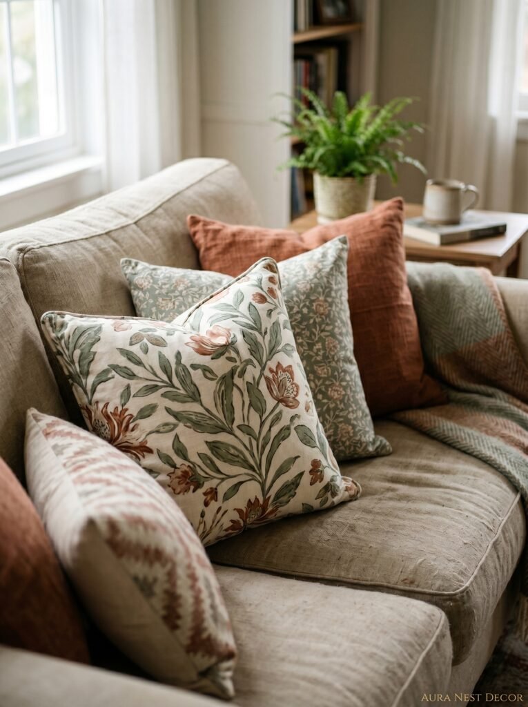
Pattern mixing is where people either get it SO right or SO catastrophically wrong. And the difference is usually scale.
The rule — and it’s actually a helpful one — is to mix scales. One large-scale pattern, one medium, one small. But not just any three patterns: they need to share at least one color. That’s the connective tissue. The shared color is what makes a clashing combination feel curated rather than chaotic.
Example: a large-scale botanical print curtain in deep green and cream, a medium-scale geometric throw pillow in green and terracotta, and a small ditsy floral cushion in cream and rust. Three totally different patterns. Different vibes, almost. But the green ties the curtain to the geometric, the cream to the floral, and suddenly it all holds together.
Stripes count as a pattern. Plaid counts. Texture counts — a chunky boucle next to a smooth velvet is a pattern conversation even without a print. Don’t just think in terms of printed fabric. Think about the visual rhythm of every surface in the room.
And honestly? Sometimes you can just break the rules. Sometimes you put two patterns together that “shouldn’t” work and they do because the colors are right. Trust your eye more than you think you should.
“Pattern mixing isn’t about following rules. It’s about having one thing that connects everything — and then being brave.”
—
8. The Rug You Choose Is Actually Doing Most of the Color Work
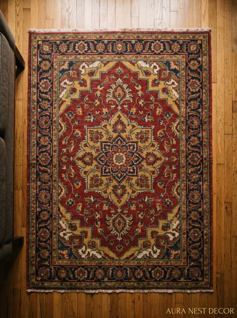
The rug is the unsung hero. I’d argue it’s the single most important color decision in a living room and most people treat it like an afterthought.
Here’s why it matters so much: the rug is the only piece that sits underneath every other piece. It’s in visual dialogue with the sofa, the coffee table, the curtains, the walls. It touches everything. So if your rug is wrong — in color, scale, or texture — you’ll feel it in the whole room and probably won’t be able to identify why.
Size matters enormously. In a standard living room, your rug should be large enough that at least the front legs of every sofa and chair sit ON the rug. A tiny rug floating in the middle of the seating area looks like someone ordered a bath mat by accident.
For color: your rug can either be the anchor of your color story or the bridge between two colors you want to use. A Turkish or Persian-style rug in faded reds and blues can let you use both navy AND rust in the same room without either one fighting the other. The rug does the diplomatic work.
Natural fiber rugs — jute, sisal, seagrass — are beautiful but they don’t DO the color work. They’re neutral. Great for a colorful room that needs some breathing room underfoot, but don’t rely on them to add life.
—
9. The Lighting Trick That Makes Every Color Look Exactly Right
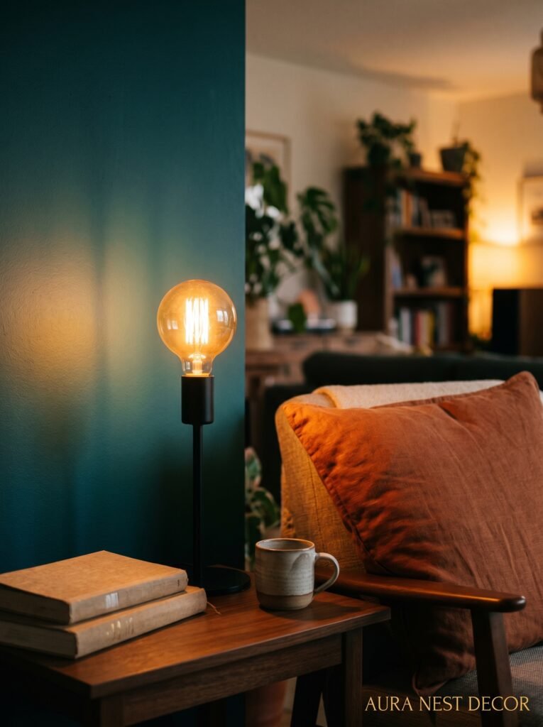
Color doesn’t exist in a vacuum. It exists in light. And if you’re choosing paint colors under overhead fluorescent-adjacent lighting and wondering why they look wrong once they’re on the wall, this is your answer.
Natural light changes throughout the day and so does your paint color. A dusty pink that looks perfect at noon can look straight-up lavender at 6pm and almost beige at 10am. This isn’t a flaw — it’s kind of the magic of a complex paint color. But you need to LIVE with a sample for several days before you commit, at different times of day, in different weather.
For artificial light: warm bulbs (around 2700K color temperature) make warm colors glow. They make cool colors feel muddy. If you’ve got a blue or green room, you want slightly cooler bulbs — not harsh, but not too amber either. Around 3000K.
And please, multiple light sources at varying heights. A floor lamp in the corner, a table lamp on an end table, maybe some candles on the coffee table in winter. The room should feel lit from WITHIN, not from above. Overhead lighting as a supplement only. This single change does more for a colorful room than almost any other.
—
10. Plants Are Not Just for Instagrammers — They’re Actually Color
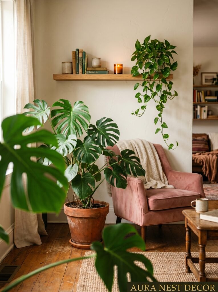
I want to push back on the idea that plants are just a nice add-on. In a colorful living room, greenery is a color decision. It’s a specific green — not sage, not olive, not forest — that exists in relationship to everything else.
A large fiddle leaf fig next to a terracotta wall is a piece of color composition. A trailing pothos on a high shelf in a navy room adds movement and a color that no paint or fabric quite replicates. The specific, slightly yellow-green of a monstera leaf next to a deep mustard sofa is honestly one of the most satisfying color pairings I’ve ever seen.
And they add scale. A large plant does the same spatial work as a floor lamp — it fills vertical space, creates layers, gives the eye somewhere to travel that isn’t furniture. Don’t underestimate that.
If you can’t keep plants alive (no judgment, truly), quality faux has gotten genuinely good. The silk ones still look terrible. But there are realistic faux varieties now that photograph beautifully and add the same color dimension without the watering schedule.
—
11. The Colors That Always Age Badly and Why You’re Still Tempted by Them
Not every color is timeless. Some are trend colors dressed up as classics, and knowing the difference will save you from repainting in three years.
Anything too saturated and bright without complexity tends to date fast. Think: pure primary colors used without any texture or layering. A pure cobalt blue that has no variation, no depth — it reads flat and trendy in a way that ages visibly. The answer isn’t to avoid blue, it’s to choose a COMPLEX blue. One that looks different in different lights. Indigo over cobalt. Teal over turquoise.
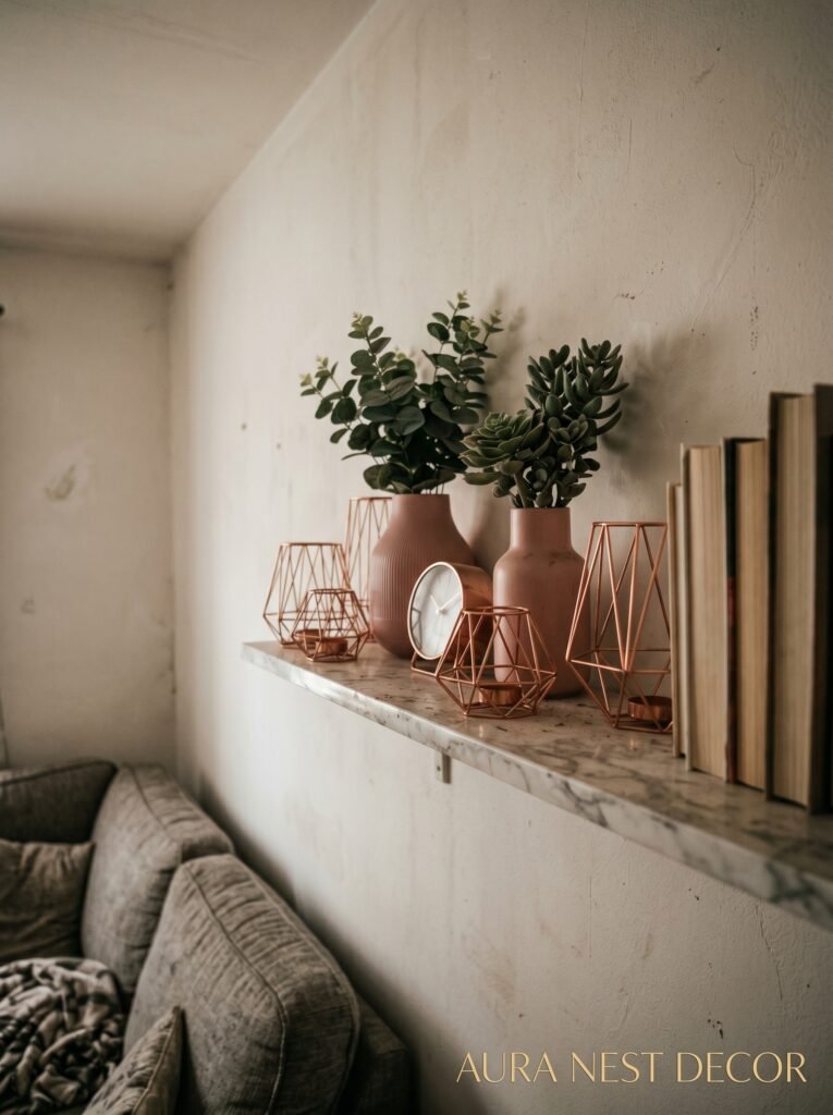
The “millennial pink” problem: that very specific dusty blush became SO recognizable as a 2016-2019 trend that it now immediately signals its era. Blush still works beautifully but you need a version that’s warmer, slightly peachier, less Instagram-grid-specific. The color itself isn’t the problem; that particular iteration of it is.
Greige, used everywhere and without contrast, is aging out as a look. It’ll come back eventually — everything does — but right now it reads as a lack of decision rather than a neutral palette.
The test: does the color feel like it belongs to a specific moment in culture? If yes, proceed with caution.
—
12. Starting Small Isn’t Cowardice — Here’s How to Do It Without It Looking Half-Finished
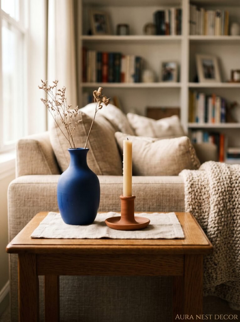
Maybe you’re not ready to paint the walls. Fine. Really. You can introduce color meaningfully without touching a wall, and if you do it right, nobody’s going to walk into your living room and think “she’s not ready for color.”
Cushions are the obvious entry point but most people underbuy. Four cushions in a bold color is a statement. Two is an accident. Buy more than you think you need in your chosen color and vary the textures — velvet next to linen next to something woven.
Curtains are massively underused as a color vehicle. Floor-to-ceiling curtains in a rich, saturated color change the entire feel of a room without affecting a single wall. Velvet curtains in deep green or rust or navy in a white room? Stunning. And completely reversible.
A colored lamp. A set of vases. A painted side table. Art with a strong color story. These are all legitimate ways to build confidence in a color before you fully commit — but the key is to build enough of them that it reads as intentional layering, not tentative decoration.
One bold accessory floating in a sea of beige still looks tentative. A whole STORY in your chosen colors — even if nothing is painted — looks like you know exactly what you’re doing.
—
❓ FAQ
Q: How do I know if a paint color will work in my living room before I commit? A: Get a large sample pot and paint at least a 12×12 inch swatch directly on your wall — not on paper or card. Live with it for a few days and look at it at different times of day, especially morning light and evening lamplight. Most paint mistakes happen because people judge colors in store lighting or on a tiny chip.
Q: Can I use multiple colors in my living room without it looking like a kindergarten? A: Yes, but anchor everything with one dominant color that takes up the most space, then bring in one or two others as accents. Make sure there’s visual breathing room — some neutral texture, some natural wood, some emptiness. A colorful room needs quiet moments in it or it becomes exhausting.
Q: What’s the best way to add color if I’m renting and can’t paint? A: Curtains, rugs, large artwork, and cushions are your best friends. A big, colorful rug and floor-to-ceiling curtains in a rich tone can completely shift a room’s mood. Some landlords also allow removable wallpaper — the peel-and-stick kind has gotten much better, especially for a single feature wall.
—
💭 Final Thoughts
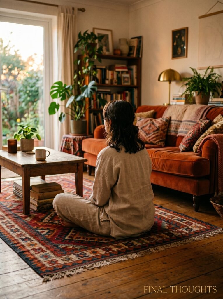
Color is, at its core, a form of courage. Not grand, life-changing courage — just the small, daily kind that says I know what I like and I’m going to live in it. The rooms that stop you mid-scroll on Pinterest aren’t the ones that played it safe. They’re the ones where someone made a decision and meant it.
Your living room should feel like yours. Not like a showroom, not like a neutral background for other people to feel comfortable in. Yours.
So — what color have you always loved but been too afraid to use?




