
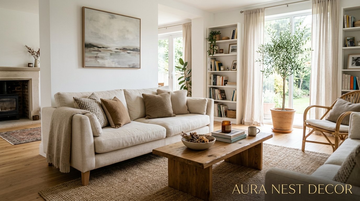
Why White Walls Are Having the Biggest Comeback of the Decade (And How to Make Yours Look Incredible)
You painted them greige. Or sage. Or that muddy taupe color everyone swore was “the new neutral.” And now you’re staring at your living room thinking, what if I’d just gone white? Same. I’ve been there, and honestly, so has basically everyone I know who’s done a full repaint in the last three years.
White walls are back. Not in a quiet way, either.
—
1. The Shade of White That’s Actually Flattering (And It’s Not What You Think)

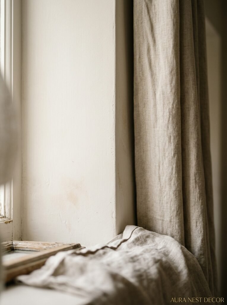
Here’s the thing nobody tells you when you’re standing in front of forty-seven white paint chips at the hardware store: most of them are wrong. Not wrong in an absolute sense, just wrong for what people think they’re getting.
Bright white — like pure, cool, high-gloss white — reads completely differently depending on your light source. North-facing rooms in the UK? That cool white will look almost grey by 3pm in November. It’s not the crisp, airy look you pinned. It’s a dentist’s waiting room.
What actually works — what photographs beautifully AND looks good in real life — tends to sit just one or two shades off pure white. Think Farrow & Ball’s All White, or Benjamin Moore’s Chantilly Lace for US homeowners who want something clean but alive. Swiss Coffee if you want the very faintest warmth without crossing into cream territory.
And honestly? The finish matters as much as the colour. I’d go matte or flat every single time for walls. Eggshell on trim if you want that subtle contrast without anything feeling shiny. Gloss is for doors and that’s it.
“The most beautiful white rooms don’t use the whitest paint.”
Test your shortlist on three different walls in the same room and live with them for a week. Photograph them at 8am, noon, and 8pm. The differences will genuinely surprise you.
—
2. The Lighting Rule Every White-Walled Room Lives or Dies By
White amplifies everything. Every shadow, every warm pool of light, every cold fluorescent flicker from the kitchen — all of it. So if you’ve got flat overhead lighting and nothing else, white walls are going to feel brutal.
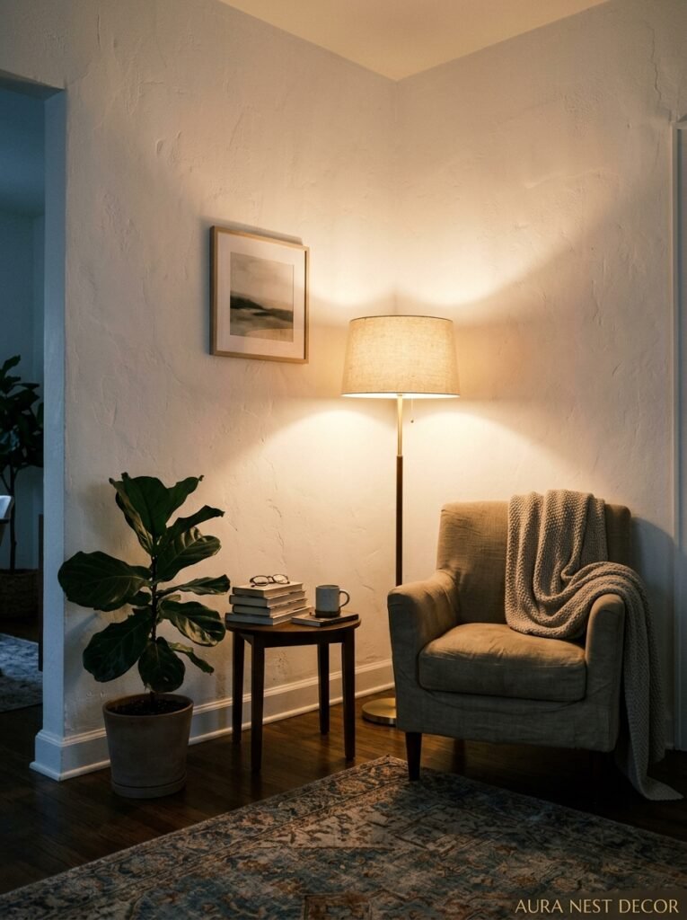
The rooms that make people stop scrolling aren’t lit from above. They’re lit from the sides. Floor lamps in corners, table lamps on side tables that are maybe a little too low (this is actually ideal, the light throws differently), sconces if you’re willing to do a tiny bit of electrical work.
The amber glow of an Edison bulb at 7pm against a white wall is genuinely one of the most beautiful domestic moments I can think of. It’s warm, it’s layered, the shadows are soft. That’s the look everyone’s chasing. And it’s not about the white paint — it’s about the bulbs.
LED warm white, around 2700K, is what you want. Anything cooler and your beautiful warm white walls turn grey and cold and your room suddenly looks like a studio flat that hasn’t been finished yet.
Side note — if you’re in a flat or apartment with textured ceilings, the right lighting will also mean those textures just disappear into shadow. Genuinely life-changing.
—
3. The Furniture Colours That Hit Different Against White
Okay, this is where it gets fun. Because white walls are essentially a blank canvas — everyone knows that — but how you respond to that canvas is where people go totally wrong.
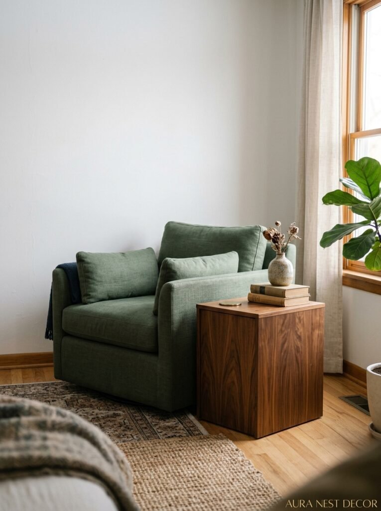
The obvious choice is natural wood. And yes, it works, it always works, warm oak or walnut against white is a forever combination. But if everyone’s doing the same thing, your room starts to look like a catalogue page rather than a home.
The combination I keep coming back to is white walls with something genuinely dark. Deep navy, forest green, even black furniture. It sounds heavy but it’s not — the white holds all that visual weight easily. A black coffee table against white walls in a room with good natural light looks SO intentional. Expensive, almost.
Rust and terracotta work brilliantly too. Something about those burnt, earthy tones against a clean white reads incredibly warm without any of the beige-ness that a cream wall would bring.
What doesn’t work as well as people expect: all-grey furniture against white walls. The whole room goes cold and flat. Add a warm element somewhere — a throw, a lamp, a rug — or the whole thing looks unfinished.
—
4. How Texture Saves a White Room From Looking Like a Hospital
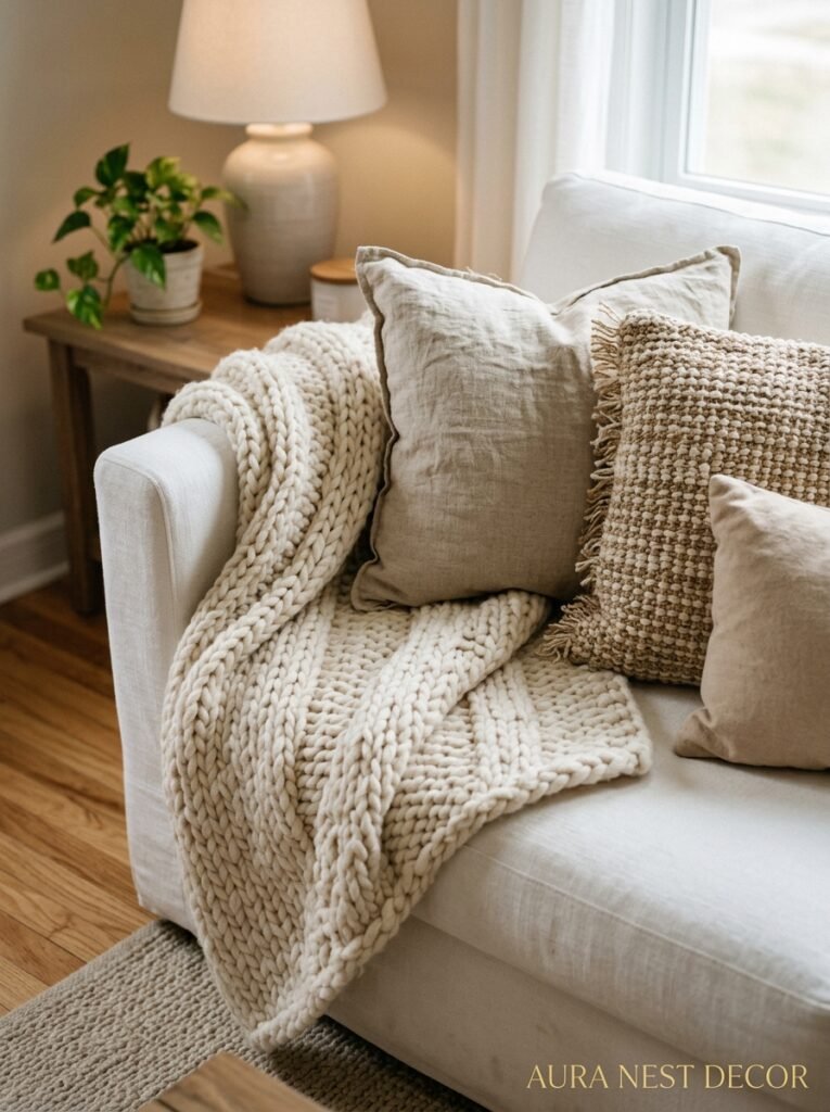
This is the one. This is the secret.
Without texture, a white room is sterile. WITH texture, it’s stunning. The difference between a white living room that looks clinical and one that looks like something from a boutique hotel in the Cotswolds — it’s almost entirely texture.
Linen cushions. A chunky knit throw that’s been used a thousand times. Rattan or seagrass furniture, even just in accessories. A jute rug instead of a flat-weave synthetic. Plaster effects on a feature wall. Wood panelling, even just on the lower third of the wall.
Even art contributes texture — a rough canvas painting reads completely differently from a smooth print. One adds warmth to a white room, the other sort of… floats.
My honest opinion? At least four different textures in every white living room. Not just different patterns — different actual surface qualities. Something rough, something soft, something natural, something matte and solid. You don’t have to shop for them all at once. You just have to know what you’re reaching for.
“White walls aren’t minimalist. They’re a texture competition in disguise.”
—
5. The Art That Actually Works (And Why Gallery Walls Are Getting Complicated)
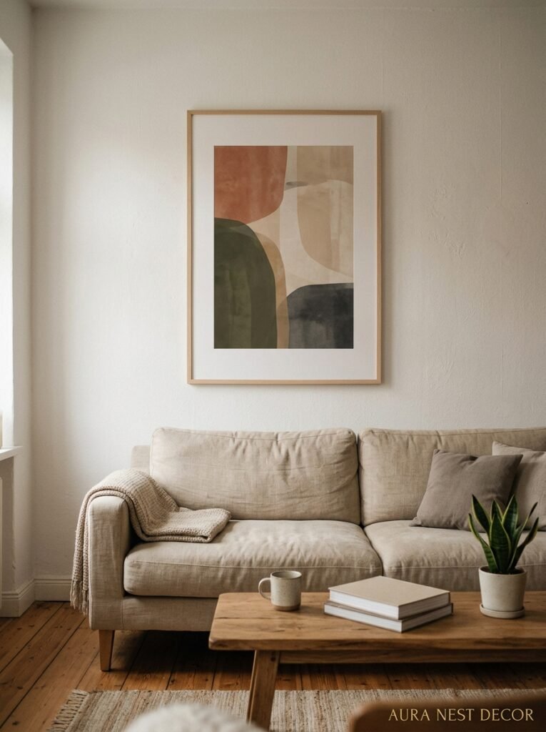
Gallery walls on white — look, I know, they’re everywhere, they’re beautiful when they’re done well, and I’m not anti gallery wall. But I think the default assumption that white walls automatically need a gallery wall is where people lose the plot.
One large piece. One. Especially in a smaller British terraced house living room where the walls just don’t have the space for a sprawling arrangement. A single oversized piece of art on a white wall, hung maybe an inch or two lower than feels natural, makes a completely different statement.
And the art itself — white rooms can handle a lot. Abstract colour, black and white photography, something graphic and bold. What doesn’t land is very small, very fussy, decorative prints. They get lost. On a white wall, art needs to be confident.
If you ARE doing a gallery wall, mix the frame finishes. All matching frames on a white wall looks corporate somehow, or maybe like a hotel corridor. Mix dark wood, black metal, natural wood, and the whole thing looks more collected and personal. Like you found these things gradually, because you did.
—
6. Why Your Skirting Boards Are More Important Than You’ve Been Told
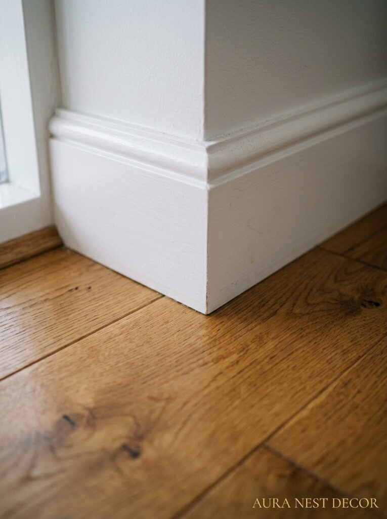
This one’s particularly relevant for UK readers because our skirting boards are doing serious work in most older houses and flats.
Painting your skirting boards the same white as your walls versus a slightly brighter or crisper white — completely different room. The contrast (even subtle) defines the edges of the space, makes the ceilings feel higher, gives the room architecture. If everything’s the same white, the room can feel a bit flat and endless in a way that isn’t cosy, it’s just directionless.
And grubby skirting boards on white walls are IMMEDIATELY visible. This is the trade-off you’re signing up for. My routine is a quick wipe with a magic eraser every month, and a proper repaint of just the skirting every couple of years. Worth it.
Also — and I feel strongly about this — don’t paint over interesting architectural details to make them disappear. If you’ve got coving, picture rails, original plaster ceiling roses? Paint them the same white, yes, but photograph those details. They’re what makes a white room in a Victorian terrace feel completely different from a white room in a new build.
—
7. Styling Shelves Against White So They Don’t Look Like a Staged Show Home
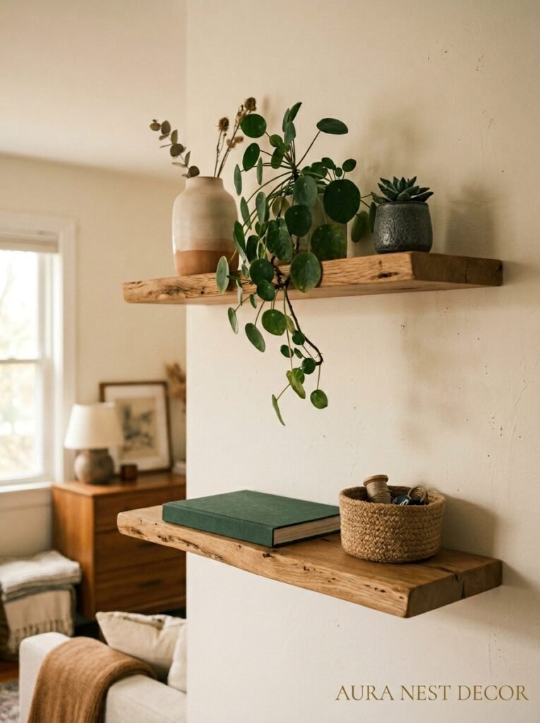
Shelves on white walls can go two ways. Either they look incredibly curated and beautiful, or they look like you moved in two weeks ago and haven’t unpacked. The line between those two things is thinner than you’d think.
Books facing outward or spine-out (the hidden covers trend — I’ve gone back and forth on this, I’ve landed on: some of each). A plant, ideally at different heights. Something personal — not generic decor, but an actual object that means something to you. A small ceramic you found at a market, a photo in a simple frame, a candle that’s been used.
Even numbers of objects tend to look more designed. Odd numbers look more collected. Both work, they just create different energy.
Don’t fill every inch. The white wall showing behind and between shelf items is part of the composition. It breathes.
“The white space on your shelves IS the styling. Don’t fill it in.”
—
8. The One Plant That Changes Everything in a White Living Room
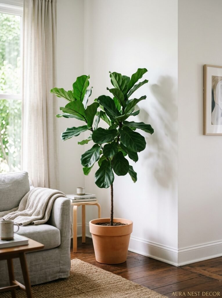
I’ll be specific: trailing plants. Not just any trailing — I mean something with actual leaf presence. Pothos, heartleaf philodendron, devil’s ivy. Something that’s going to spill off a high shelf or drape from a hanging planter and create a flowing green line against all that white.
It does something structural to the room that a regular potted plant in a corner just doesn’t. The eye follows the trail of leaves and suddenly the room has height and movement. It’s not expensive. It’s not complicated. A mature pothos from a garden centre is maybe £8, $12, and it will cascade a foot further every season.
The container matters as much as the plant against white. White pot on a white wall — lost. A terracotta, a dark stoneware, a woven basket — suddenly you’ve got contrast and texture in one object.
—
9. What Nobody Admits About White Walls in a House With Kids
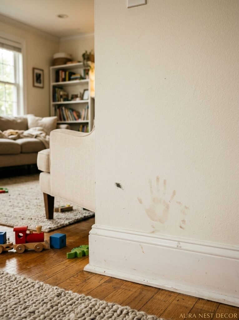
They show EVERYTHING. Let’s just say that. Handprints, scuff marks, mystery smears at knee height, the occasional crayon. I’m not going to pretend this isn’t a real consideration because it absolutely is.
But here’s what I’ve found: a good quality paint in a washable finish (look for specifically “washable white” or “scrubbable” on the tin) changes the equation. Farrow & Ball’s Modern Emulsion and Benjamin Moore’s Aura both wash really well. Not perfectly, but well enough that a damp cloth handles most incidents.
The alternative — painting in a colour you hate — isn’t actually solving the problem. Kids mark every colour of wall. At least with white you can touch up convincingly, and a fresh coat over a small section blends much better than it does with strong colours.
Also, the more lived-in a white room feels from intentional styling, the less obvious the everyday marks are. A little wear is part of it.
—
10. How US and UK Rooms Approach White Differently (And What Both Get Right)
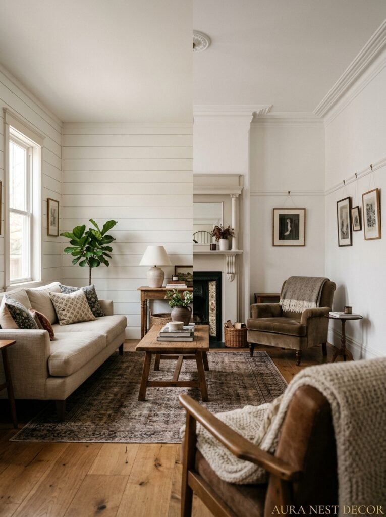
Not gonna lie, I’ve spent a lot of time looking at American and British living rooms side by side, and there are real differences in how the same “white walls” idea gets executed.
American white living rooms tend to go bigger, bolder — larger scale furniture, higher ceilings used aggressively with taller bookshelves and artwork, more architectural millwork like built-ins and crown moulding all painted out in the same white. The effect is grand. It’s airy in a wide-open way.
British white living rooms work with tighter spaces and lean INTO the cosiness that white can actually create. Lower ceilings, original period features, smaller windows — it all reads differently, and somehow the warmth is higher because the room is more intimate. A white living room in a Victorian end-of-terrace with a log burner is a completely different vibe to a white living room in a Denver new build. Both are beautiful, for entirely different reasons.
The lesson from American rooms: don’t be afraid of going big with one piece of furniture or art. The lesson from British rooms: your architectural quirks are features. Work with them.
—
11. The Rug That Anchors It All (And Why Pattern Is Your Best Friend Here)
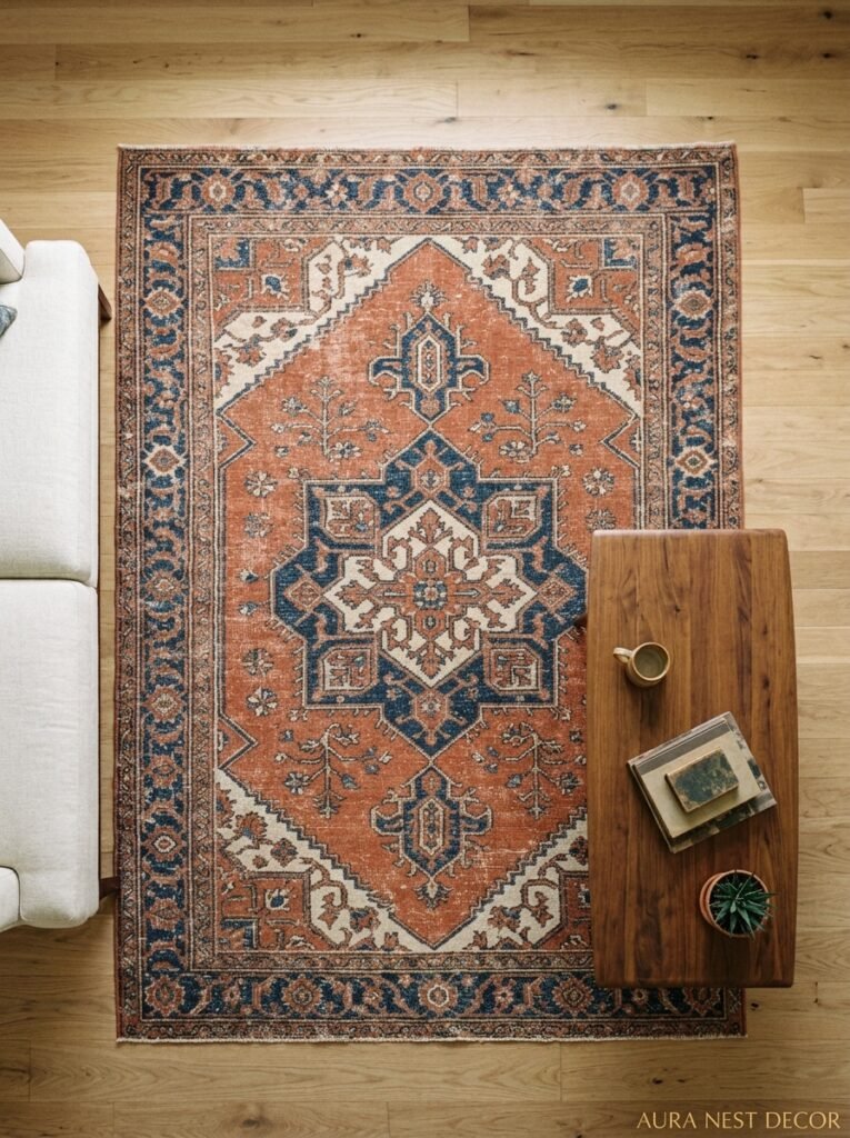
White walls need something on the floor that commits. A small, pale, inoffensive rug does nothing — it just sort of… sits there. What white rooms actually need underfoot is something with personality.
A Persian or Moroccan-style rug with rich jewel tones looks incredible against white. The white essentially puts the rug on a pedestal. It becomes the focal point of the floor in a way it simply wouldn’t be against a dark or patterned wall.
Go larger than you think you need. The standard mistake in every living room regardless of wall colour is a rug that’s too small. All furniture legs (or at least the front two) should sit on it. If your sofa is against the wall, the rug should still extend well beyond it.
And don’t be afraid of colour in that rug. Deep red, navy, even something with black in it. White walls absorb the boldness and the room stays balanced.
—
12. The Room That’s Changed How I Think About White Walls Entirely
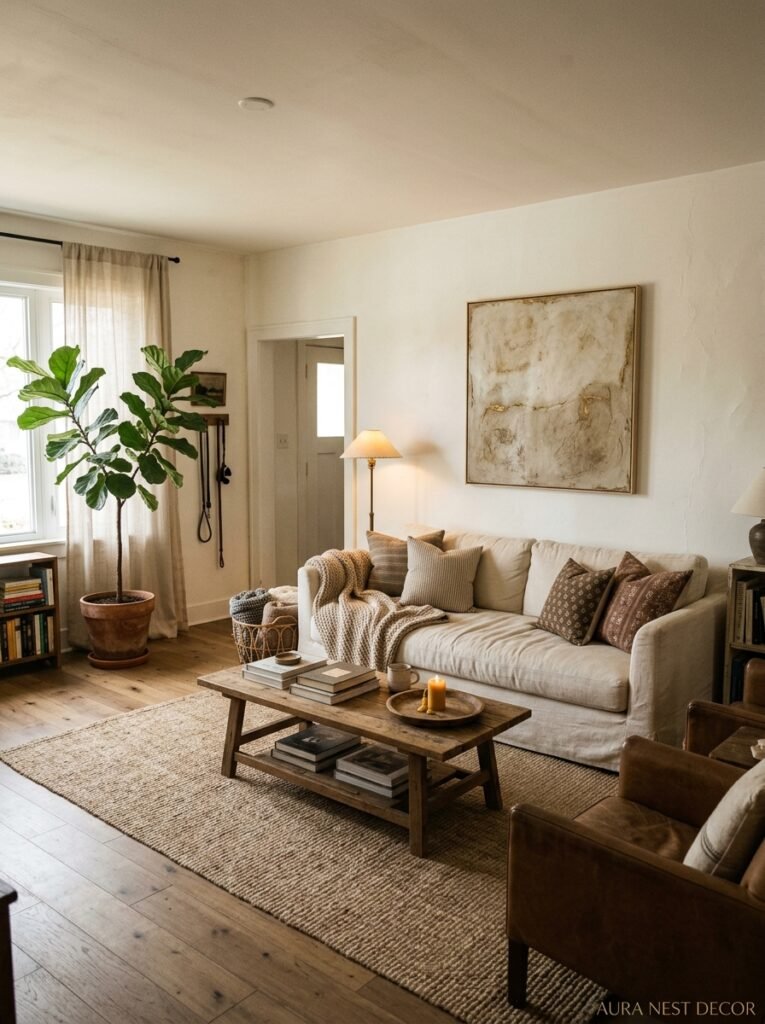
I saw a living room — I think I spotted it first on Pinterest, then tracked it down to an interiors account — that had pure white walls, a single massive black-framed window, raw linen curtains pooling on the floor, and basically nothing else except a worn leather sofa and a concrete coffee table.
No gallery wall. No shelf styling. No plants. Just the quality of light coming through linen at about 4pm.
And it was the most beautiful room I’d seen in months.
I think about it because it made me realise that white walls done right are actually about restraint. Not emptiness, not minimalism for minimalism’s sake, but the confidence to stop before you’ve filled every corner. To let the light do work. To believe that the room is enough.
That’s the hardest thing to pull off, and honestly, the most worth it.
—
❓ FAQ
Q: Will white walls make my living room look bigger? A: Yes, but only if the lighting is right. White walls reflect light and blur the edges of a space, which does create the illusion of more room — but if your lighting is flat or cool, they can just as easily make the space feel clinical and small. Warm bulbs and layered light sources are non-negotiable.
Q: How often do you have to repaint white walls compared to coloured ones? A: Honestly, about the same — but the touch-ups are easier. White paint in a good brand matches itself better than coloured paint does, so small patches blend well. A full repaint every four to five years is typical for a busy living room.
Q: Is off-white or pure white better for a living room? A: For most rooms, off-white wins. Pure bright white tends to look harsh unless you have truly exceptional natural light — and in most UK homes especially, that light just isn’t there. Something with the faintest warm undertone keeps the room feeling alive rather than washed out.
—
💭 Final Thoughts
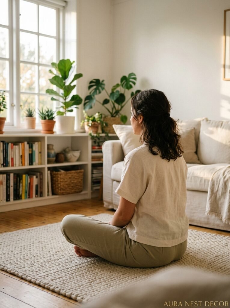
White walls aren’t a safe choice. Done carelessly, they’re cold and flat and forgettable. Done well, they’re the most generous thing you can do for a living room — they make everything you love about your home look better, and they grow with you as your taste changes.
The things you’ve gathered, the light you’ve cultivated, the textures you’ve chosen — white walls just hold all of it more quietly than any other colour could.
What’s one thing in your living room that you think would actually look incredible against white?




