
The Living Room Color Palette Rules Everyone Keeps Breaking (And Why the Rebels Were Right)
You know that moment when you walk into someone’s house and the living room just feels right — before you’ve even sat down, before you’ve had a drink, before you’ve thought about it consciously? That’s color doing its thing. And here’s what nobody tells you: it’s almost never the color you’d guess.
—
1. Why “Safe” Neutral Rooms Feel So Exhausting to Actually Live In
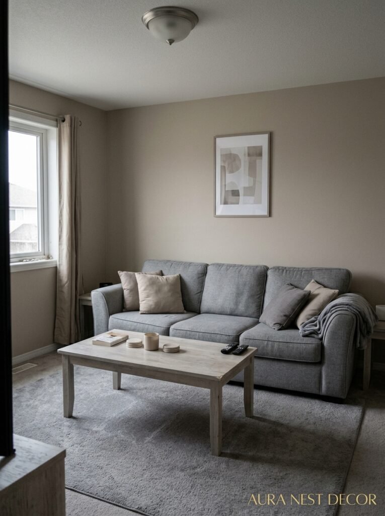
Greige. You’ve heard it. You’ve probably saved seventeen pins of it. And I’m not here to trash it — there are greige rooms I’d happily move into tomorrow. But here’s the thing nobody says out loud: a lot of neutral living rooms feel less “timeless” and more “waiting room.” The color’s fine. The problem is there’s no decision in it. No risk. When a room is all the same temperature and undertone and value, your eye has nothing to catch on. Nothing to rest against. You end up with a space that photographs beautifully and feels vaguely anxious to sit in.
I’ve talked to so many homeowners — American and British both — who spent months choosing the “right” neutral and then couldn’t figure out why the room felt empty. They’d add throw pillows. A rug. Another throw pillow. And it still wasn’t working. Because the fix isn’t more stuff. It’s contrast. It’s one color that actually commits.
The rooms I can’t stop thinking about? They always have one shade that shouldn’t work on paper. A deep forest green on a single wall. A terracotta rug that clashes with absolutely everything in theory. One saturated color that makes every neutral around it wake up and become something.
That’s the rule safe rooms break by accident. Color doesn’t just decorate. It activates.
“A room without a single brave color isn’t neutral. It’s just unfinished.”
—
2. The Undertone Trap That’s Making Your Walls Fight Each Other
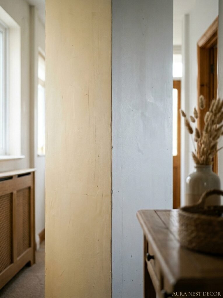
Okay so this is the one that trips people up constantly. You’ve chosen a “warm white” for your walls and a “light grey” for your trim and a “warm beige” for your sofa and somehow the whole room looks like it’s arguing with itself. What happened?
Undertones. They’re sneaky and they’re REAL and paint companies do not make this easy on purpose, I’m convinced.
Every color has a base — usually red, yellow, blue, or green hiding underneath the main shade. Your “warm white” might have a yellow-pink undertone. Your “light grey” might pull slightly blue. Put them next to each other and your eye registers a subtle wrongness without being able to name it. You just know something’s off.
The fix is deceptively simple. Pull undertones in the same direction. If your sofa is warm, your walls should be warm. If you go cool, commit to cool. Side note — this doesn’t mean everything has to match. It means they need to agree on their temperature. You can mix warm cream walls with a warm navy blue and it’ll feel considered. Mix warm cream walls with a cold blue-grey sofa and it’ll feel like two rooms that wandered into each other.
The easiest trick? Take a paint chip home and hold it against your sofa fabric in natural daylight. Not showroom lighting. Natural light. Wait ten seconds. Your gut will tell you.
—
3. The Color That Keeps Showing Up in Every Beautiful Living Room Right Now
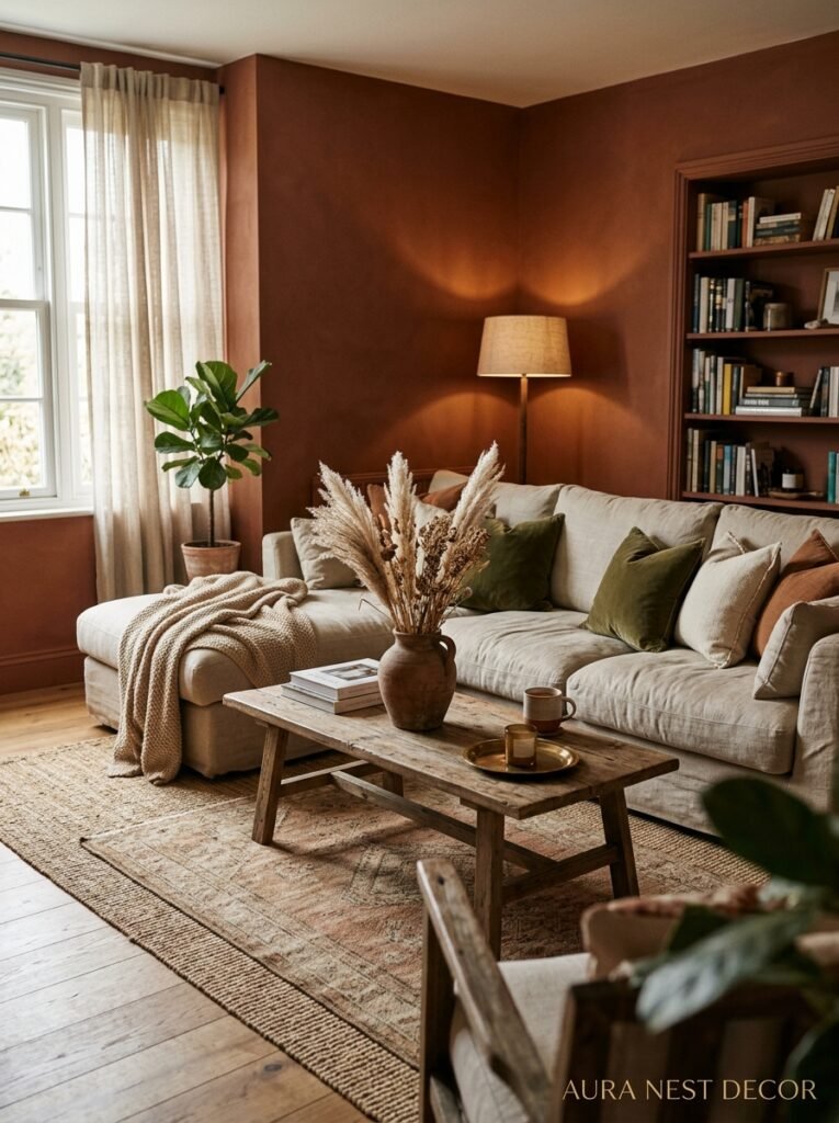
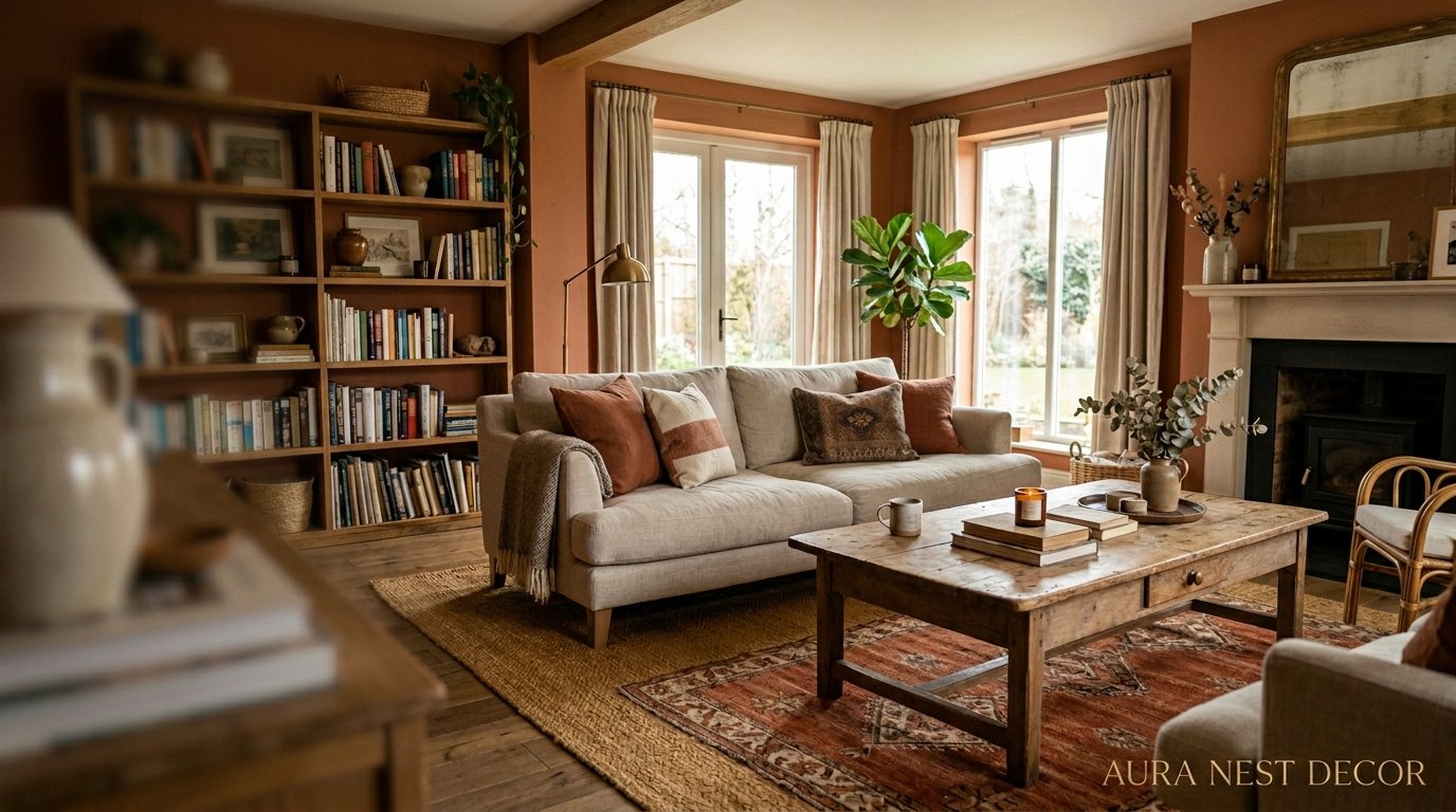
I’ve been noticing it for about two years and it’s not going anywhere. Warm terracotta-adjacent tones — not the orange-red terracotta of the 2019 Instagram wave, something more muted than that. More dusty. Almost like old dried flowers mixed with clay. In the US it tends to show up as an accent wall or a large rug. In British homes I see it more in curtains, in painted furniture, in a single armchair that suddenly makes everything else feel expensive.
Why does it work? Because it’s warm without being aggressive. It references earth and pottery and things that have been worn in slowly over time. It sits next to almost every other warm neutral without competing. It makes skin tones look beautiful, which matters more than we admit — your living room is where people actually SIT and you see their faces against your walls.
The specific shade I’d point to: think less “pumpkin spice” and more “the inside of an old Spanish farmhouse at 4pm.” That warm dusk terracotta that’s basically red but never quite gets there. Farrow & Ball’s Dead Salmon is in this family (yes, the name is terrible, yes, the color is incredible). Benjamin Moore’s Moroccan Spice is another one. Both are brilliant in north-facing rooms where you want to fight back against grey English or Pacific Northwest light.
—
4. What Your Floor Color Is Actually Doing to Every Shade You Choose
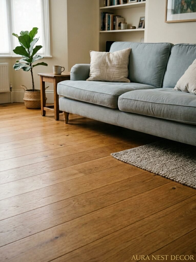
Here’s the thing people forget completely: your floor is a COLOR. It’s the biggest single surface in the room and it’s setting the undertone for everything above it. A golden honey oak floor is warming every single shade in that space. A cool grey slate tile is cooling everything down. And if you’re working against your floor instead of with it, you’re making your palette job about three times harder.
Dark espresso floors? They’re dramatic and gorgeous and they want rich, deep wall colors to match that energy — think inky teal, dusty plum, off-white with a pink undertone. They’ll eat pale grey alive.
Light blond wood floors, which you see a lot in Scandinavian-inspired UK homes right now, want cool whites, sage greens, soft dusty blues. They can handle terracotta if the terracotta leans pink rather than orange. They hate warm cream because the two warm yellows start competing.
The best thing you can do before picking a wall color? Stand in your living room and look DOWN. What temperature are you already working with? Work with it, not against it.
“Your floor is your palette’s foundation. Ignore it and you’re decorating on quicksand.”
—
5. The Two-Color Rule That Stops a Room From Looking Chaotic
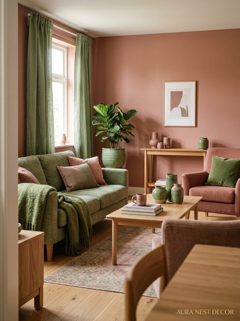
Not one color. Not a million colors. Two colors with a clear relationship. That’s it. That’s the thing.
I know that sounds reductive but stay with me. When a room has a clear primary color and a clear secondary color — and those two colors have a defined relationship (complementary, analogous, light and dark versions of each other) — your eye knows exactly what to do. It relaxes. It can wander around the space and feel like everything was intentional.
Here’s how it plays out in practice: say your primary color is a warm off-white on the walls and your secondary color is a deep dusty olive. Now every purchase you make — cushions, throws, lamps, frames — gets run through that filter. Does it belong in the off-white camp or the olive camp? Warm wood? Off-white. Linen? Off-white. Dark vase? Olive. Sheepskin? Off-white. It becomes fast and easy and the room looks pulled together because it IS pulled together.
Or: soft blue-grey walls as primary, warm brass and caramel as secondary. Every choice becomes obvious. The eye has a story to follow.
The chaos in most living rooms doesn’t come from too much color. It comes from too many colors that don’t have a relationship. Three different blues that don’t know each other. Warm wood AND cool chrome AND black AND rattan. Nobody talked to anybody.
—
6. Why British Living Rooms Handle Dark Walls Better Than Almost Anyone
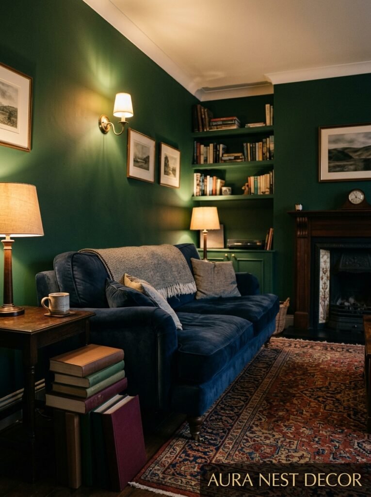
Okay this is a genuine observation, not just flattery. British interiors — specifically the ones in Georgian terraces and Victorian semis and those lovely old stone farmhouses — have something specific going on with dark walls that American rooms often miss. The architecture is doing half the work.
High ceilings. Original coving and cornicing. Deep skirting boards. Window proportions that were designed before electricity, meaning the light comes in at specific angles with specific drama. When you paint those walls a dark racing green or a near-black navy or a deep tobacco brown, the room doesn’t shrink. It becomes theatrical. The white cornicing pops forward. The light puddles in corners in a way that feels genuinely beautiful.
American rooms — especially newer construction with eight-foot ceilings and no architectural detail — can pull off dark walls too, but the technique is different. You need MORE light sources and they need to be lower. Wall sconces, floor lamps, table lamps. Never just recessed overhead lighting with dark walls because you’ll end up in a cave.
The British trick is basically: let the darkness be dramatic, then fight it with original architectural lightness. The American trick is: let the darkness be cozy, then fight it with layered warm light.
Both work. They just need to work differently.
—
7. The Color Combinations That Look Beautiful in a Magazine and Awful on Your Actual Walls
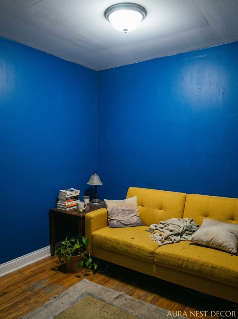
You saved the pin. You ordered the paint. You rolled it on. And now you’re standing in your living room wondering why your room looks nothing like the photo.
Nearly always, the reason is scale and light.
Magazine photos are shot in specific light, styled to an inch of their life, and often those gorgeous contrasting colors are in a room with HUGE square footage where the proportions just work differently. That moody charcoal wall with the bright coral sofa? Stunning at 400 square feet, claustrophobic at 220. That all-white room with the perfect terracotta rug? Works facing south. Feels cold and grey facing north.
Here’s the honest version of the combinations I’d be cautious with in real everyday rooms: stark white walls with cold grey furniture (it’ll read clinical unless you’re very deliberate), black walls with black furniture (don’t, unless your lighting budget is significant), bright yellow walls with anything (yellow changes so aggressively in different lights, it’s genuinely unpredictable).
The combinations I keep coming back to as genuinely livable? Warm white walls with warm wood and one deep accent color. Dusty sage green walls with cream and aged brass. Off-white with navy and natural linen. These work because they’re temperature-consistent and they photograph AND live well.
“A color that looks perfect at 2pm might look wrong at 7pm. Test your palette in every light you live in.”
—
8. The Secret Life of Ceiling Color and Why You’re Ignoring Yours

The fifth wall. People say it like a cute little tip and then never actually do it and their room keeps feeling slightly… unresolved. Ceilings matter MORE than most people realize and not just because a colored ceiling looks dramatic on Pinterest.
A ceiling painted slightly warmer than your walls will push color DOWN into the room — it makes the whole space feel more contained, more like a room you’re inside rather than a room you’re walking through. A stark white ceiling against warm walls creates a separation your eye registers as slightly jarring. Nothing wrong with white ceilings. But “brilliant white” ceiling paint against anything warm tends to make the ceiling look like it belongs to a different house.
An easy fix: take your wall paint color and add one cup of white to it. Paint the ceiling that. It’ll read as white but it’ll agree with your walls. I started doing this after seeing it in a National Trust property in the Cotswolds and I haven’t gone back.
If you want to be actually bold — and you should consider it — paint the ceiling your darkest accent color. Navy ceiling, white walls, warm wood. It works. It makes the room feel like the most comfortable place on earth.
—
9. How to Use Black Without Making the Room Look Like a Mistake
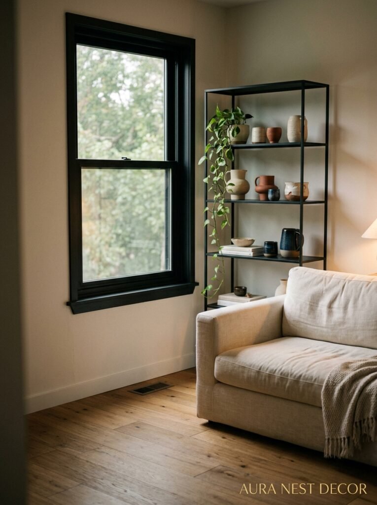
Black is not a neutral. I know everyone says it is. It’s not. It’s a STATEMENT and you have to treat it like one.
But black done right? It’s the difference between a room that’s nice and a room you remember. It creates depth. It makes every other color in the room more saturated. It draws the eye intentionally. The trick is using it as an anchor, not a covering.
A black side table next to a cream sofa. Black window frames (very on-trend in the UK right now, especially in Victorian homes getting new windows). Black picture frames creating a gallery wall. A single black lamp. A black fireplace surround. Black pulls on kitchen cabinets that open into the living space.
None of these are overwhelming. All of them add what designers call “grounding” — basically a reason for the eye to stop, to have a reference point.
Where black goes wrong is in accidental accumulation. You get a black sofa AND black shelving AND black frames AND black rug AND suddenly the room is 60% black and it’s not cozy anymore. It’s just heavy. Keep black to no more than about 15% of your room’s visual surface and use it intentionally. Choose its placement.
—
10. The One Color That Works in Every Single Living Room, Full Stop

I’m going to say it. Warm cream.
Not white. Not beige. WARM CREAM. The color of the inside of a good vanilla pod, the color of old parchment left in the sun, the color of unpressed linen. It’s not a cop-out. It’s genuinely the most workable, most beautiful, most forgiving non-color in any palette.
Why? Because it agrees with every undertone if you pick the right version of it. Because it makes rooms feel lived-in without looking dirty. Because it doesn’t bounce around the room the way stark white does — in morning light, in evening light, it stays warm and honest. Because it makes actual colors sing next to it.
The mistake people make with cream is choosing one that’s too yellow (starts looking dated, cheese-adjacent) or too pink (reads as skin-tone, which is genuinely unsettling). Go for one that leans subtly warm but stays mostly neutral. Benjamin Moore’s White Dove. Farrow & Ball’s Pointing. Dulux Warm White. These are the dependable ones.
And then put something interesting against it. Because that’s the point of a great neutral. Not to be the story — to be the thing that makes the story possible.
—
11. The Room Styling Move That Makes Any Palette Look Intentional
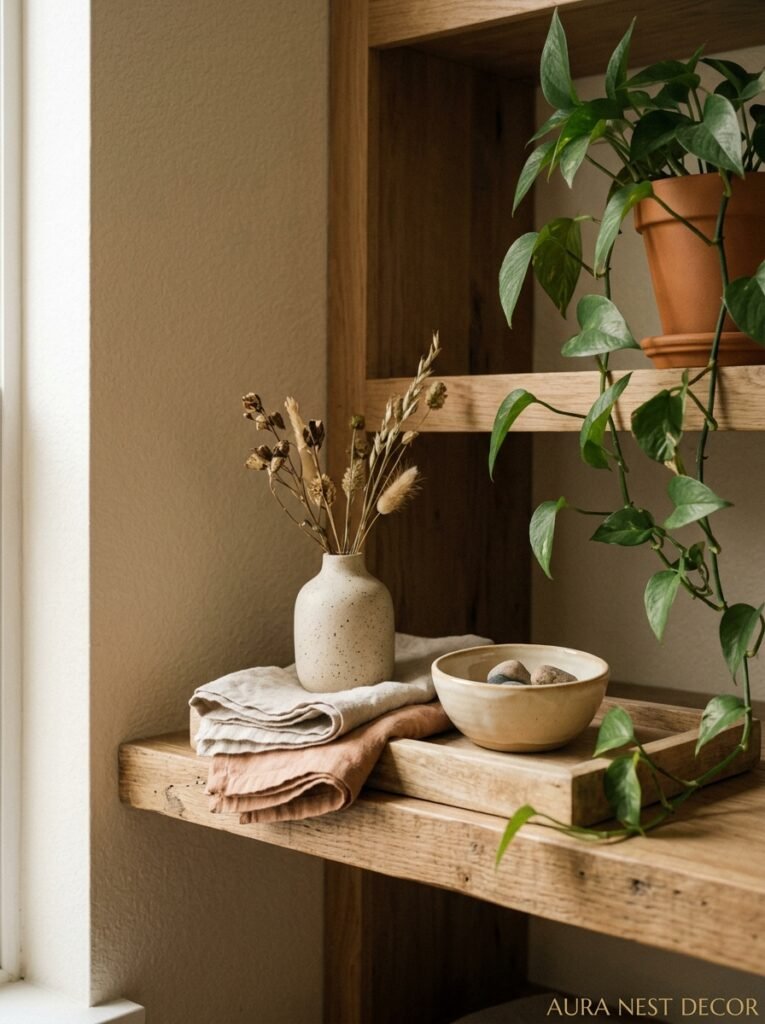
You could have the most thoughtful color palette in the world and it’ll still fall flat if your light sources are wrong. This is genuinely the most underrated thing in home styling and I’m a little obsessed with it.
Here’s what actually matters: LAYERED light at different heights creates color in itself. An Edison-style bulb in a warm amber shade at lamp height transforms what’s on the walls, what’s on your sofa, what’s in a vase on the shelf. It adds warmth even to cool palettes. It softens even to neutral palettes. It’s not just about seeing — it’s about how the room FEELS at 8pm when you’re actually in it.
Switch your overhead light off for a week. Just try it. Use table lamps, floor lamps, candlelight if you’re into that. The color of your room will shift completely. Things that looked flat will develop depth. Things that looked mismatched will suddenly agree with each other. Lighting is color. It really is.
—
12. The Real Reason Some Living Rooms Always Look Better Than Yours (And It’s Not the Budget)
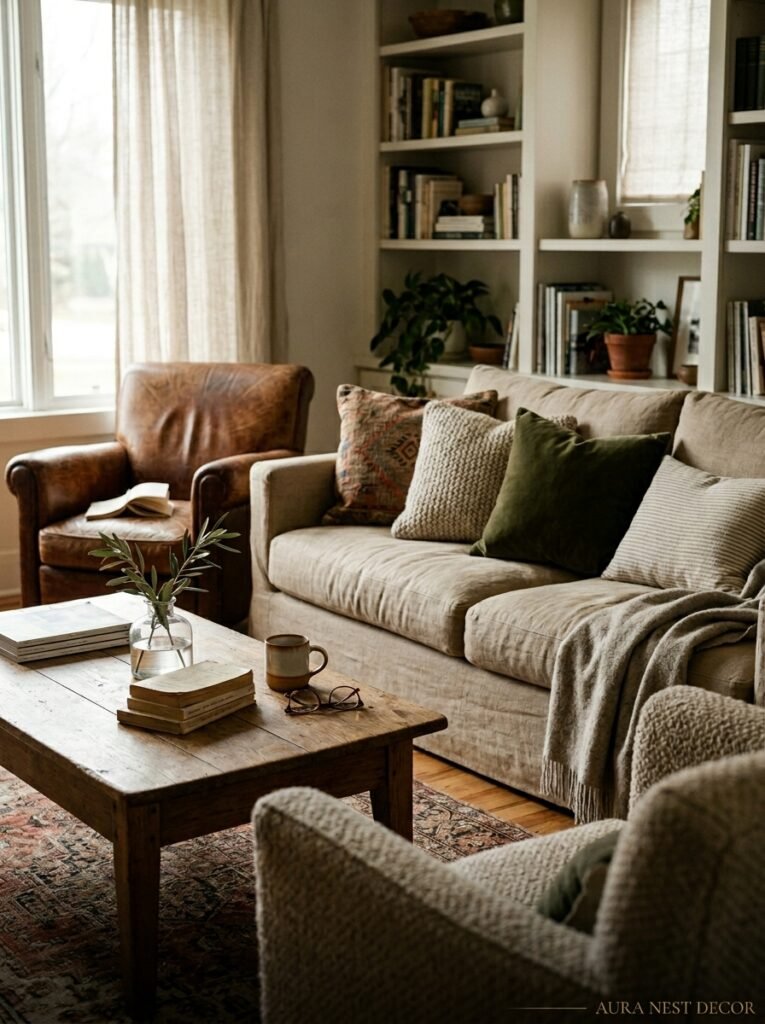
It’s restraint. Honest to god, that’s it. The rooms that stay with you — the ones on Pinterest with fifty thousand saves, the ones in the houses you never forget visiting — they’re almost always rooms where someone made fewer decisions, not more.
Fewer colors. Fewer patterns fighting each other. Fewer “accent” pieces all shouting for attention. One great rug instead of two okay ones. One large piece of art instead of a gallery wall where nothing gets looked at because everything is talking at once.
The homes with the biggest budgets aren’t always the most beautiful. Sometimes they’re just the loudest. The homes that feel genuinely beautiful are the ones where someone trusted the palette they chose and didn’t keep second-guessing it with additions. Where the color does the work and everything else just supports it.
Pick your palette. Commit to it. Edit ruthlessly. Let there be some empty space.
Your living room isn’t a collection. It’s a feeling.
—
❓ FAQ
Q: How many colors should a living room color palette have? A: Realistically? Three to five works best. One or two neutrals (walls, large sofa), one or two accent colors, and one “grounding” element like black, dark wood, or deep navy. More than five and you’re usually working too hard.
Q: Does it matter which direction my living room faces when choosing colors? A: It really does. North-facing rooms get cooler, flatter light — they need warm colors to compensate (terracotta, warm cream, ochre, warm greens). South-facing rooms get warm golden light all day and can handle cooler, bolder colors without feeling cold. East-facing rooms are lovely in the morning but cool by afternoon. West-facing rooms save their best light for evening.
Q: Can I use dark colors in a small living room? A: Yes, and I’d argue you should consider it. Dark colors in small rooms don’t shrink them — they make the edges feel less obvious. A small room painted in a deep, warm shade feels more intentional than the same room painted pale grey and still feeling small but also sad. The key is lighting: you need more lamps, lower down, warmer bulbs.
—
💭 Final Thoughts

The living room is the room that tells people who you are before you’ve said a word. Color is how you do that. And the most interesting rooms I’ve ever been in weren’t the most expensive or the most perfectly curated — they were the ones where someone made a brave choice and trusted it.
So maybe the question isn’t “what color is safe?” Maybe it’s — what color do you keep coming back to, saving pins of, dreaming about, and then talking yourself out of?
What if that’s exactly the one to use?




