
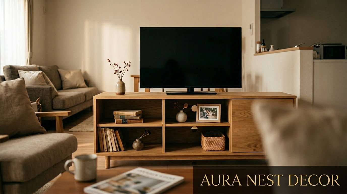
The TV Cabinet Makeover That Made Me Stop Apologizing for My Living Room
You know that feeling when you’ve had a piece of furniture for years and you’ve just… stopped seeing it? That was me and my TV cabinet. Chunky, beige-adjacent, crammed with remotes and old gaming controllers nobody had touched since 2019. Then I actually looked at it and thought — this is the first thing people see when they walk into my living room. That can’t be right.
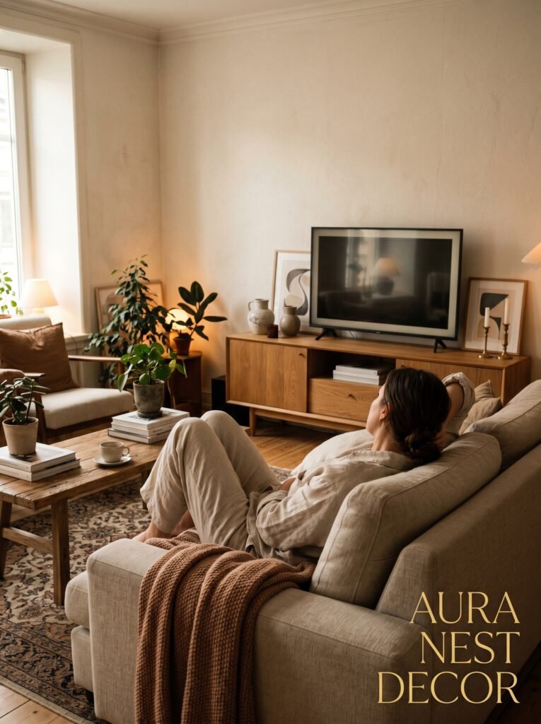
—
1. Why Your TV Cabinet Is Secretly Running the Whole Room (And You’ve Been Ignoring It)
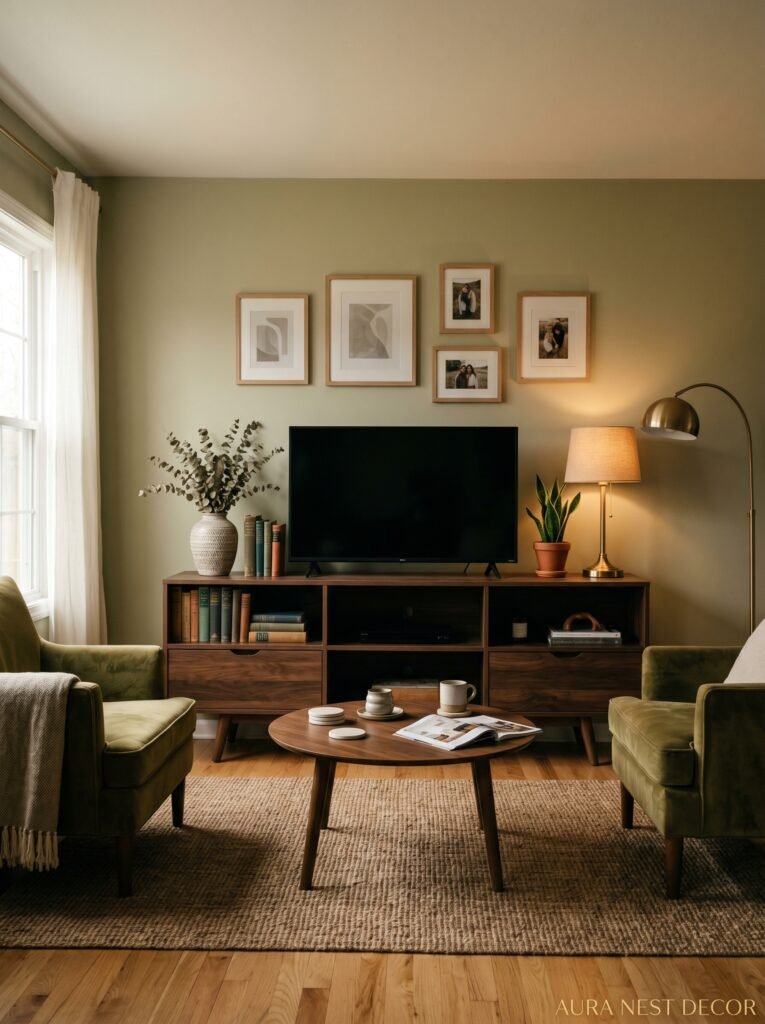
Here’s the thing nobody really says out loud: your TV cabinet is probably the most looked-at piece of furniture in your entire home. Think about it. Everyone who sits in your living room — guests, family, whoever — spends the majority of their time facing that wall. And the cabinet underneath (or around) the screen is what their eyes land on when there’s nothing good on Netflix.
It’s the anchor. The visual center of gravity for the whole space.
And yet most of us treat it like an afterthought. We buy it to store stuff. We dump things in it because it has doors. We stop thinking about whether it’s actually beautiful or whether it’s doing anything for the room.
I did this for three years. THREE years of a cabinet that was fine. Functional. Invisible in the worst possible way.
The rooms that stop people mid-scroll on Pinterest? Those rooms have a TV wall that’s been THOUGHT about. The cabinet isn’t just holding the television up — it’s part of a whole story the room is telling. Once you start seeing it that way, you genuinely can’t unsee it.
“The TV cabinet isn’t just where you store the remote. It’s the visual anchor of your entire living room, and you’ve probably been ignoring it for years.”
—
2. The Low-Profile Look That’s Showing Up in Every Room Right Now (And Why It Works)
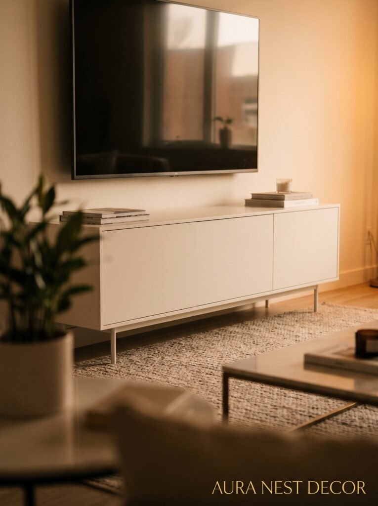
Low-profile TV cabinets. They’re everywhere and I kind of love that.
We’re talking about those long, flat units that sit close to the ground — somewhere between a sideboard and a media console, usually no taller than about 18 to 24 inches. Legs that lift the whole thing off the floor slightly, which sounds like a small detail but it COMPLETELY changes how heavy the piece feels in the room.
Why does it work? Honestly, I think it’s because it keeps your eye level lower. The TV ends up at a more natural viewing height, which is better ergonomically anyway — you’re not craning your neck up like you’re at the cinema. And all that visual weight gets pulled down toward the ground, which somehow makes the ceiling feel higher.
It also just looks more considered? Like you went to an actual furniture shop and thought about proportions rather than buying whatever was available in the right width.
These units look gorgeous in walnut or oak veneer, but I’ve also seen people pull them off brilliantly in painted MDF if the hardware is right. The color of the handles does more work than you’d expect — brass pulls on a matte black cabinet is a completely different vibe from matte black pulls on the same piece. Same cabinet, totally different personality.
—
3. The Floating Shelf Situation: When It’s Stunning and When It’s a Mistake
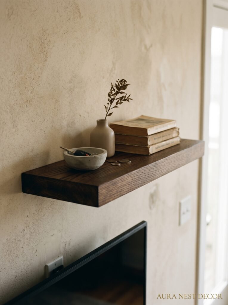
Floating media shelves — those wall-mounted units where the cabinet seems to hover mid-air — are genuinely stunning when they’re done right. But I’ve seen them done very, very wrong, and I want to save you from that.
Done right: the shelf is positioned at a deliberate height, there’s genuine negative space below it, and the wall mounting is clean enough that it actually looks intentional. Maybe there’s a simple LED strip tucked behind it for that soft backlight glow. Maybe there’s a bit of wall art above and below. The whole composition feels balanced.
Done wrong: it’s the same shelf, but it’s mounted at a slightly weird height (not quite low enough to be a statement, not quite high enough to feel normal), the cables are drooping down the wall behind it, and the stuff on and in it is just sort of… stuffed in there randomly.
The cables are the thing that kills floating units. If you can’t get the cables properly managed — either run through the wall or at least bundled tightly and painted to match — don’t do the floating shelf. Go for a floor-standing unit instead. There’s no shame in that, I promise. A well-styled floor unit will look better than a floating shelf with sad dangling cables every single time.
—
4. How Many Doors Is Too Many Doors (A Question I Wish Someone Had Asked Me Earlier)
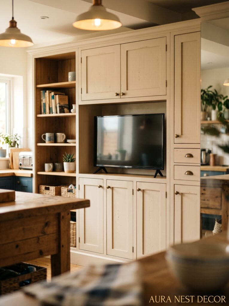
This sounds ridiculous but I spent a genuinely embarrassing amount of time thinking about this when I was choosing my current unit.
The case for doors: they hide the chaos. If your collection of things includes gaming gear, router equipment, old DVDs you’re emotionally attached to, and seventeen remote controls, doors are your best friend. Close them. Never speak of what’s inside.
The case for open shelving: it forces you to actually curate what goes on display. Which, if you’re a decor person, is kind of fun? It means your books, your objects, your plants — they’re all part of the display. Everything has to earn its place.
What actually works for most people is a mix. The lower section has cupboards for the chaos. The upper section, or the open side panels, have shelving for the stuff you’re actually proud of. This is the configuration I’d recommend to almost anyone who isn’t a complete minimalist.
And if you ARE a complete minimalist — honestly, just get one sleek unit with push-to-open doors and no visible hardware at all. Handleless cabinets look unbelievably clean. Sort of intimidatingly clean. In a good way.
“One sleek cabinet with push-to-open doors and zero clutter visible will always, always beat a beautiful unit that’s been stuffed to capacity.”
—
5. The Exact Styling Formula That Makes TV Cabinets Look Like They’re from a Magazine
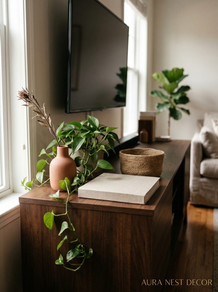
Okay. So you’ve got your cabinet. Now what?
The styling is where most people lose their nerve and end up with a shelf full of random objects that don’t talk to each other. I’ve been there. I had a succulent, a candle I’d never lit, three books spine-out, and a little statue from a holiday we took years ago. It was a graveyard of intentions.
What actually works — and I say this after probably too many hours looking at interior photos — is thinking in three layers. Things that are tall (a lamp, a tall vase, a piece of art leaning against the wall). Things that are medium height (a stack of coffee table books, a plant, a small sculpture). And things that are low (a tray, a small candle, a flat decorative dish).
You don’t need all of these. But you need at least two of the three heights or everything looks flat.
Color matters too. Try to limit yourself to two or three tones across everything on the cabinet. If your objects are all different colors it just reads as clutter, even if each item is beautiful on its own. Neutrals with one accent color — say, everything in cream and natural wood tones with ONE thing that’s terracotta or deep green — tends to work really well.
Side note — don’t forget the TV itself. A matte black TV on a light wood cabinet disappears beautifully. A silver-framed screen on a dark unit creates contrast. Think about whether your television is adding to the styling or fighting it.
—
6. The Color That Keeps Showing Up in Every Beautiful TV Wall Right Now
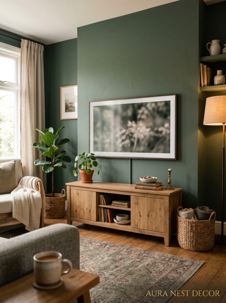
Warm whites. Natural teak. But honestly? Dark forest green is having a real MOMENT.
I’ve seen it used as a painted feature wall behind the TV — not the whole room, just that wall — and it makes the screen look almost intentional. Like the darkness of the TV blends into the darkness of the wall and the whole thing becomes a piece of the room rather than a screen bolted to a wall.
Smoked oak cabinets against deep green walls. Rattan-fronted cupboard doors. Brass handles. It’s a look that’s simultaneously very 2024 and somehow also feels like it’s been in a countryside house forever.
In the US I’m seeing a lot of aged bronze and warm greige combinations — that specific beige that has more brown in it than pink. In the UK there seems to be more willingness to go darker, go richer, use actual color. Both approaches work. But if you’ve been playing it safe with grey and white for the last five years, maybe this is the sign to try something warmer.
—
7. Small Living Room? This Changes Everything About What Cabinet to Buy
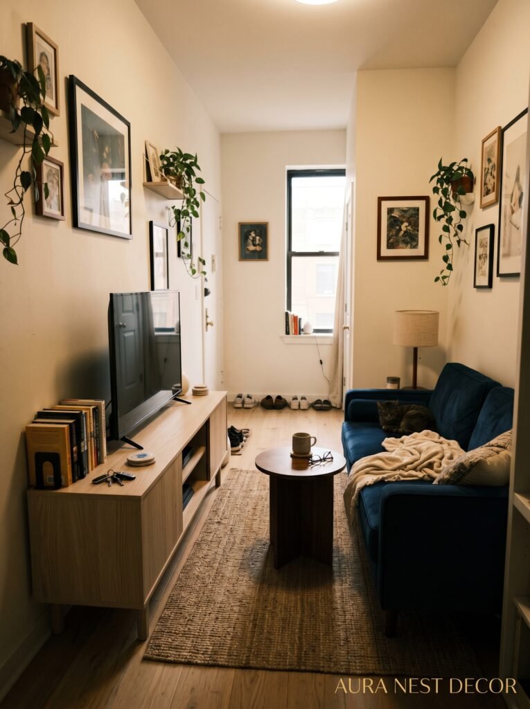
Small rooms have completely different rules. The instinct is always to buy small furniture, but that’s often the wrong call.
One bigger piece done well reads as intentional. Six small pieces crammed in looks chaotic. If you’ve got a small room, I’d honestly rather you buy one long, low media unit that spans most of the wall than a narrow little cabinet that leaves awkward space on either side.
The wall-spanning unit also gives you the illusion of a wider room. Your eye travels along the length of it. That’s a good thing.
Legs are non-negotiable in small spaces. Furniture that sits directly on the floor without any gap underneath makes a room feel heavier, more cluttered. Anything on legs — even stubby little 2-inch wooden legs — lets light pass underneath and instantly feels more airy.
And please, please keep the top of the cabinet relatively clear if your room is small. The more surfaces you pile things on, the smaller the space feels. One lamp. Maybe a plant. That’s it. Less is doing more work than you realize.
“In a small room, one long, low cabinet that spans the wall will always look more intentional than a narrow unit floating in the middle of nowhere.”
—
8. The Cabinet Hack People With Beautiful Homes Are Already Using
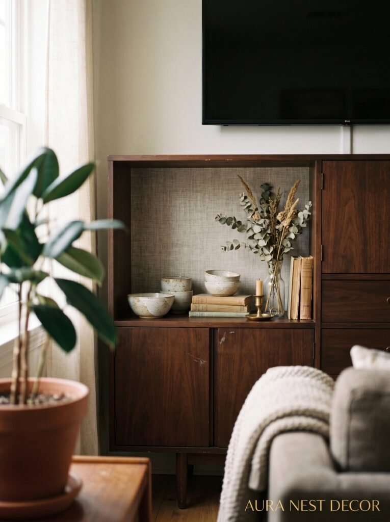
IKEA hacking. Yes, I’m going there. Don’t roll your eyes.
The IKEA KALLAX and BESTA units have been getting dressed up and transformed by people for years, and some of the results are genuinely indistinguishable from expensive custom furniture. New doors from companies like Superfront (UK-based, ships to the US) or Semihandmade (US-based) replace the standard IKEA fronts with something that looks completely bespoke.
Pair new fronts with brass or matte black hardware, paint the carcass a different color if needed, add some plinth legs, and you’ve got a media unit that looks like it cost three or four times what it actually did.
I’m not saying this is for everyone. Some people want the real thing, and that’s completely valid. But if you’re working with a tight budget and you’ve got a free weekend and some patience, this approach produces results that are actually shocking.
The key is the hardware. Cheap handles will give away the whole thing. Spend what you save on the unit itself and put it toward handles and legs that feel solid and look expensive.
—
9. Cord Management: The Unsexy Thing That Makes or Breaks the Whole Look
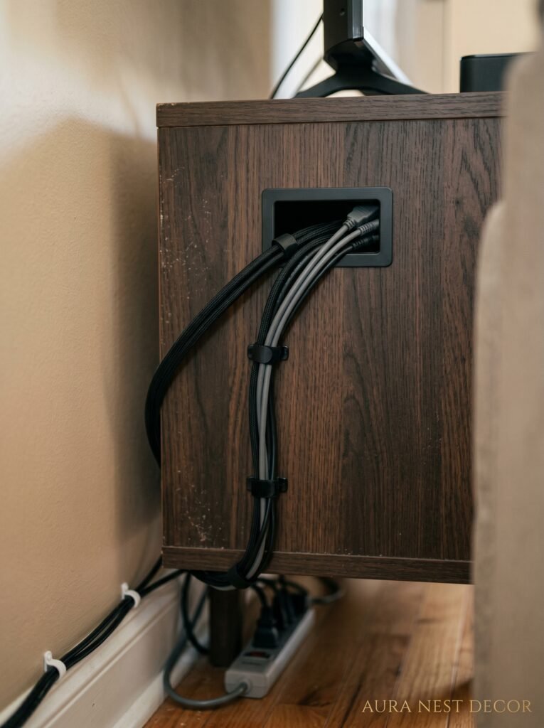
Nobody wants to write about this. Nobody wants to READ about this. But I’m doing it anyway because I’ve seen too many beautiful TV setups ruined by a waterfall of cables.
The quickest fix is a cable box — a simple decorative box that sits on or near the unit and swallows up your power strip and the cable chaos. They come in bamboo, rattan, leather, fabric. You can get one that blends into your cabinet styling. It’s not a perfect solution but it’s a five-minute one.
The better solution is cable channels — those plastic or metal conduits that you stick to the wall and run cables through. They come in white or black and if you position them carefully (behind the unit, behind the TV stand, along the skirting board) they become almost invisible.
The BEST solution, if you’re already making changes, is to have an electrician add a wall socket directly behind where your TV sits, and run the cables through the wall cavity. Clean wall. No cables. That’s it. Takes half a day, costs a reasonable amount, and the result looks like your TV is floating in a magazine photo.
—
10. The One Thing Stylists Always Do That Nobody Talks About
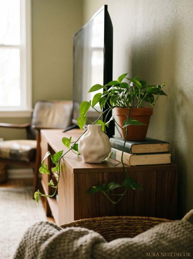
They use the cabinet’s top surface as part of a WIDER wall composition.
It’s not just about what’s on the cabinet. It’s about what’s on the wall above it, to the sides of it, around it. The cabinet becomes the base of a whole gallery situation — art leaning against the wall, a framed print hung above the television, a simple shelf installed to the left with a trailing plant hanging down.
The TV doesn’t have to be the focal point of the wall. It can be part of a composition where it’s just… one element. A dark-framed screen on a wall with some dark-framed artwork actually reads as intentional and cohesive rather than “big TV taking over the room.”
Think of the whole wall as the design project. The cabinet is the foundation. Everything else builds up from it.
—
11. What British Homes Get Right That American Homes Are Starting to Copy
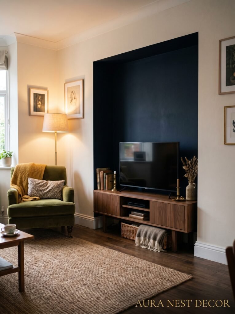
Built-ins. Alcove units. The deep-rooted British obsession with making furniture look like it was always part of the house.
In the UK, particularly in Victorian and Edwardian terraced houses, the alcoves on either side of the chimney breast are almost always fitted with shelving or cabinets. It looks considered and architectural because it IS. The furniture becomes part of the room’s bones.
American homes don’t always have those natural alcoves, but the principle is getting borrowed — people are adding built-in media walls, floor-to-ceiling units, even just a simple run of cabinets with a header panel above that makes the whole thing look like it was always there.
It’s a bigger project. It costs more. But if you’re in a house you plan to stay in, it adds something you genuinely can’t fake with freestanding furniture: the sense that the room was designed, not decorated.
—
12. The Last Thing to Decide (And Why Most People Get It Wrong)
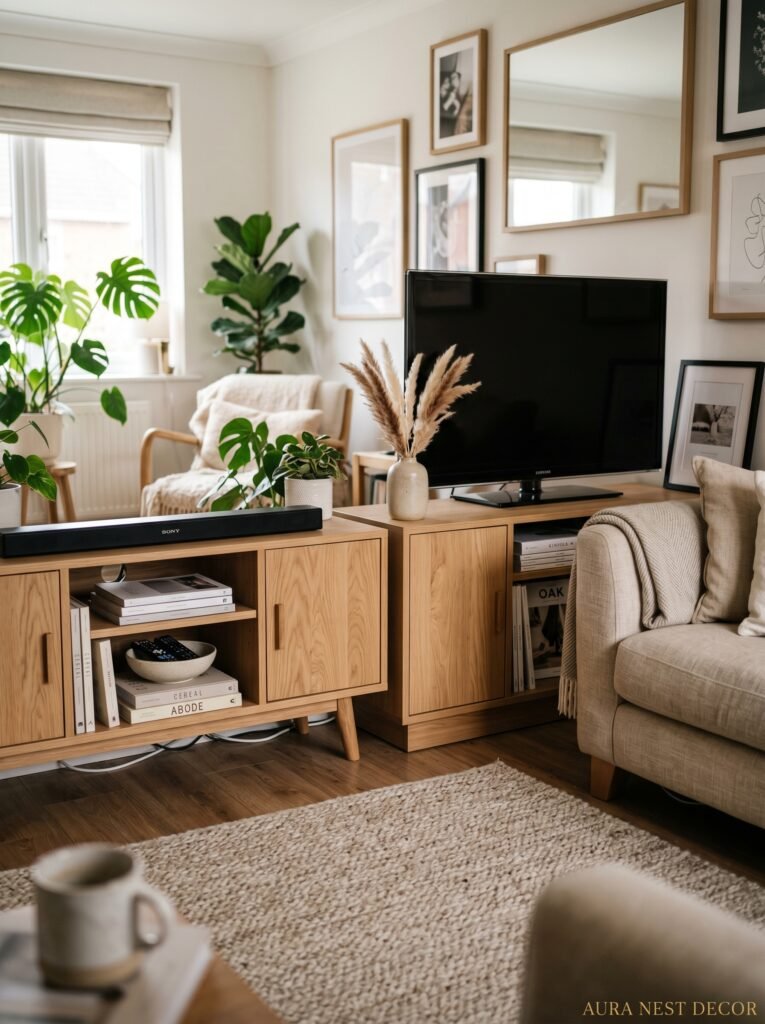
The TV mounting height. It’s always too high. ALWAYS.
I know why people do it. You want to see it from across the room. You want it above the cabinet, with space for everything else. But the human eye when you’re sitting down on a sofa doesn’t naturally want to look up at a 45-degree angle for ninety minutes.
The center of your TV screen should sit roughly at seated eye level, or just slightly above. For most people on a standard sofa, that’s about 42 to 48 inches from the floor to the center of the screen.
If your cabinet is lower than that and you’re wall-mounting above it, measure before you drill. Please. Because a TV mounted eight inches too high will bother you every time you watch it, and it’ll look off in photos forever. Get it right the first time.
—
❓ FAQ
Q: What’s the best TV cabinet size for a small living room? A: Honestly, go longer and lower rather than taller and narrower. A unit that spans more of the wall (even in a small room) reads as intentional and anchors the space better than a small cabinet floating in the middle. Look for something with legs to keep the room feeling light.
Q: Should the TV cabinet match the rest of my furniture? A: It doesn’t have to match exactly, but it should feel like it belongs to the same family. Wood tones that are in a similar warmth range, or pieces that share a hardware finish, will look cohesive without being matchy-matchy. Mixing a walnut cabinet with a lighter oak side table is completely fine if they’re both warm-toned.
Q: How do I style a TV cabinet without it looking cluttered? A: Limit your color palette across everything on the surface to two or three tones. Use varying heights — something tall, something medium, something low. And edit ruthlessly. If something doesn’t add to the overall composition, it shouldn’t be there. A few well-chosen objects will always look better than a full shelf of things you’re not sure about.
—
💭 Final Thoughts

Your TV cabinet might be the piece of furniture you’ve thought least about and looked at most. That imbalance is worth fixing. And the good news is it doesn’t take a full renovation or an enormous budget — sometimes it’s just a decision. A different unit. New handles. A cleared-off top surface and one plant. The rooms we love most are usually the ones where someone made a decision rather than settling for whatever was already there. What would you change about your TV wall first?




