
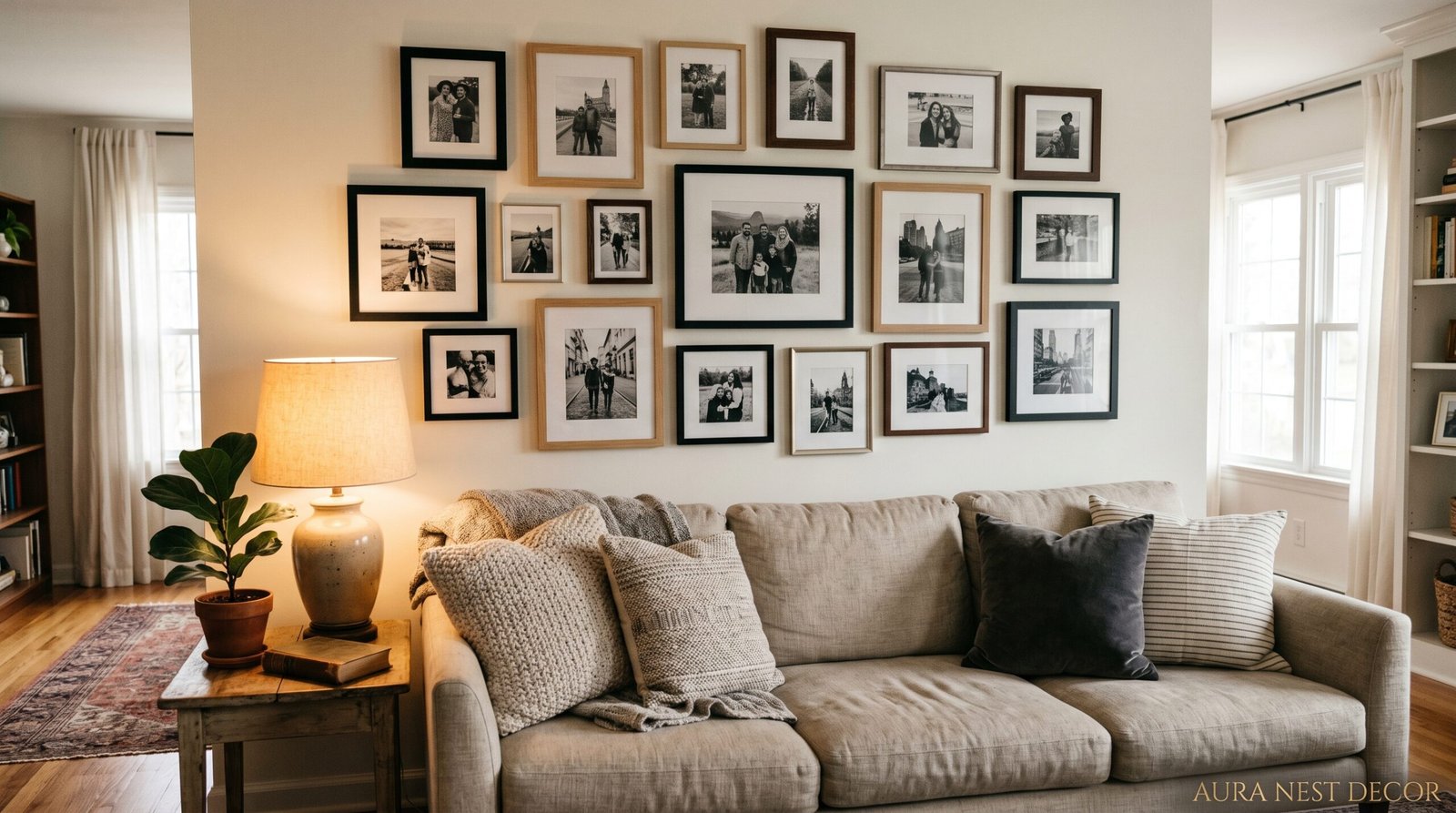
The Photo Wall That Made My Living Room Finally Feel Like Mine
You know that feeling when you walk into someone’s house and their living room just hits different? It’s not always the furniture or the paint color. A lot of the time, it’s the wall. That one gallery wall that’s clearly theirs — chaotic or curated, black-and-white or wildly colorful — and it stops you mid-conversation.
—
1. Why Most Photo Walls Feel Soulless (And How Yours Won’t)
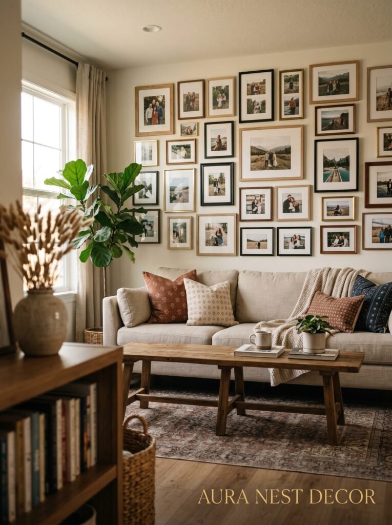
Here’s the thing nobody says out loud: most gallery walls look like a Pinterest board someone printed out. Every frame the same size. Same matte finish. Same four-inch gap between every single one. And they’re fine. Totally fine. But they don’t feel like anyone actually LIVES there.
The ones that work — the ones you remember — they’ve got friction. A frame that’s slightly too big. A snapshot next to something more formal. A postcard someone brought back from Portugal jammed between a wedding photo and a watercolor print. That’s what makes it feel lived in. Not messy — just real.
Before you buy a single frame, ask yourself one honest question: is this wall going to tell someone something true about you, or is it going to look like you spent a Sunday afternoon on Amazon? Because both outcomes are possible and only one of them is worth the effort.
The good news is that the difference between a flat, forgettable gallery wall and one that actually makes people stop and look isn’t really about money or taste. It’s mostly about intention. And being willing to mix things up a bit.
—
2. The “Anchor Piece” Rule That Changes Everything
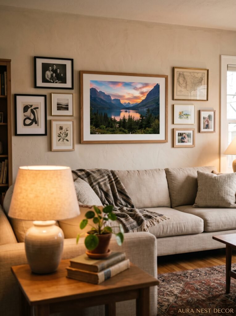
Every great photo wall has an anchor. One piece that everything else orbits around.
It could be a large format print — 20×24 or bigger — of a photo that actually means something to you. Or a vintage mirror you found at a car boot sale. Or a canvas that’s been with you since your first apartment. The size doesn’t have to be massive, but the visual weight does have to be significant. Think of it like the host at a dinner party. Everyone else arranges themselves around it.
This is where a lot of people go wrong, and I’ve done this myself. They try to build a gallery wall as if every piece is equal. Same sizes, same spacing, same importance. It ends up looking like a spreadsheet on a wall. The anchor piece gives your eye somewhere to land first, and then it can wander. Without it, there’s no journey — just a bunch of frames happening at the same time.
If you don’t have an obvious anchor piece, don’t panic. A large black frame with a simple, high-contrast image works almost every time. Or go the opposite direction — a lightweight, ornate gilded frame around something unexpected. The contrast does the anchoring for you.
—
3. The Color Move Most People Are Too Scared to Try
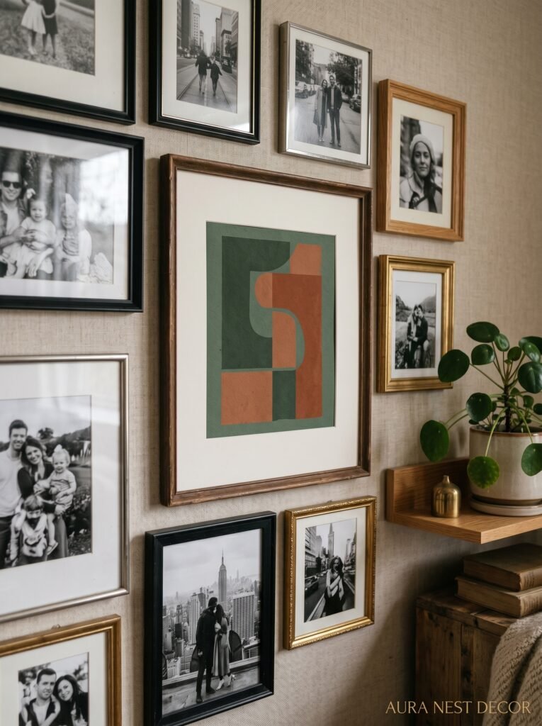
Black and white. Yes, I know — boring, obvious, done to death. But hear me out, because there’s a version of this that isn’t any of those things.
The move isn’t going fully monochrome. The move is mixing black-and-white photos with ONE color. Not two, not a spectrum. One.
I’ve seen this done with deep terracotta and it looked extraordinary. All the family photos in black and white, and then one or two prints in this warm, dusty red-orange scattered through the arrangement. Your brain reads it as cohesive because the photos are unified, but your eye gets pulled around by those pops of color. It shouldn’t work as well as it does.
In the UK especially, this pairs brilliantly with the kind of slightly moody, slightly gray walls that come with Victorian and Edwardian homes. That one warm color becomes the whole personality of the room. And in American homes where everything’s a bit brighter and more open-plan, it keeps a gallery wall from disappearing into the rest of the decor.
The color doesn’t even have to be a print. A single painted frame. A dried flower arrangement mounted in a way that sits inside the wall composition. A pressed botanical in an olive-green mat. That’s your one color. That’s enough.
—
4. Arranging Without Measuring (Yes, Really)
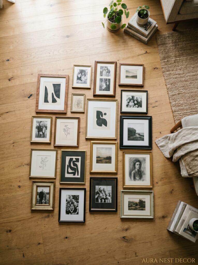
People over-think the layout. Dramatically.
“The arrangement doesn’t need to be perfect. It needs to feel like you.”
Here’s how I actually do it, and it’s embarrassingly low-tech. Trace every frame onto brown kraft paper or old newspaper. Cut out the shapes. Use painter’s tape to stick them on the wall. Now you can move things around, step back, squint, hate it, rearrange it — without making 47 holes in your plaster.
Start with your anchor piece roughly where you want it. Then cluster two or three pieces close to it — closer than feels natural. Like, actually close. Six inches max. Then let the arrangement breathe outward from there, with a couple of pieces drifting further out, maybe lower than the others. That drift is what gives a gallery wall its organic quality.
The thing about spacing: tight clusters with a bit of negative space around the OUTSIDE of the whole arrangement looks much more intentional than evenly spaced frames across the whole wall. It’s the difference between a constellation and a grid.
Also — and this is a firm opinion — if you can see the builder’s white wall through your arrangement, you’re probably fine. If you can see it between every single frame? Loosen up. You’re not hanging a calendar.
—
5. The One Frame Type That’s Underrated Everywhere
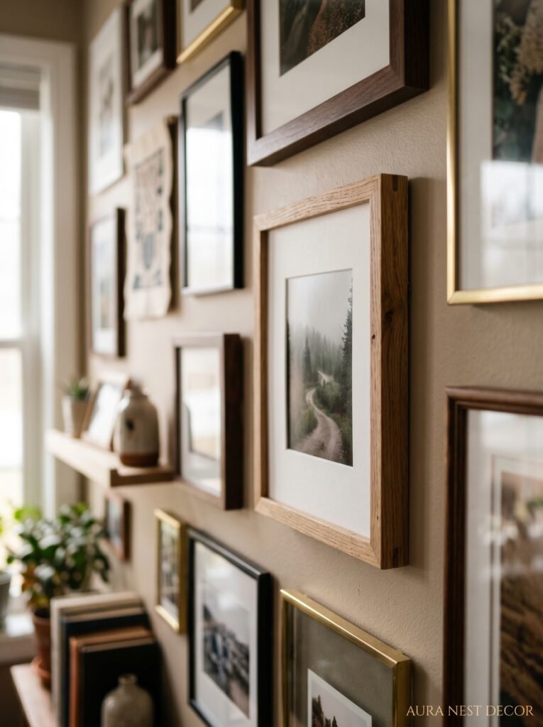
Clip frames. Or ledge display — which is basically the same energy.
Nobody talks about clip frames (those minimal frameless ones where the glass is just attached with small clips at the corners) and I have no idea why. They’re light, they’re cheap, they come in basically every size, and they disappear. Your photo is just floating on the wall. It creates this really airy, studio-ish quality that you’d pay a lot more to get with expensive minimalist frames.
Same goes for photo ledges. The long, shallow shelves — IKEA’s Mosslanda is the obvious one and honestly it’s an obvious one for a reason. You can lean frames of all different heights, layer things slightly, swap photos out without tools. If you’ve got kids and you want to rotate their drawings in with family photos, ledges are the only sensible choice. The wall stays alive because you’re actually changing it.
A combination wall works too — some hung frames, some ledge-display, maybe one larger canvas. That layering of display methods adds depth in a way that’s subtle but you’d notice it missing.
—
6. Why Black Frames Aren’t as Safe as You Think
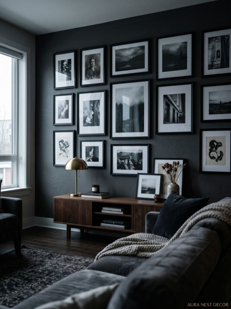
Black frames have become the “beige” of gallery walls. Everywhere, on everything, in every home. And they’re not wrong — they’re graphic, they work with almost any color scheme, they’re clean.
But they’re also kind of a wall whisper at this point. They say: I watched the same reels as everyone else.
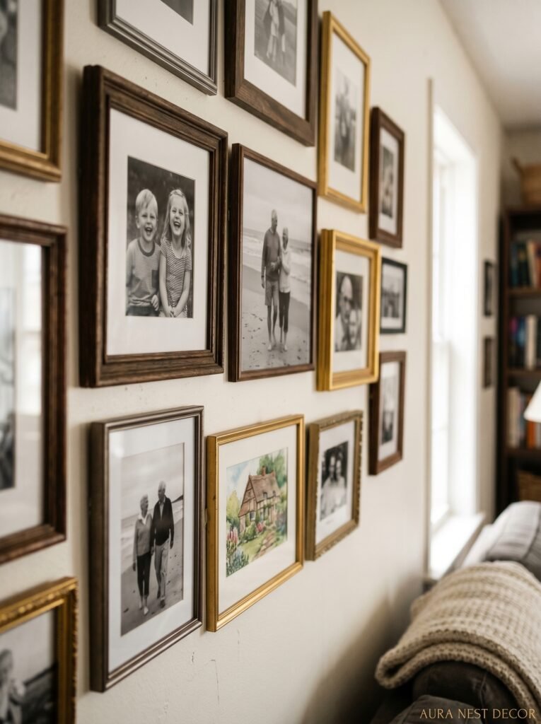
If you want your wall to feel distinctive right now, I’d push you toward dark wood — not honey oak, not light maple, but walnut or dark walnut finish. It’s warm where black is cold. It reads as expensive even when it isn’t. And against a white or off-white wall it has this richness that a black frame just doesn’t.
Or — here’s the one that surprises people — raw wood frames. Unfinished, natural, slightly rough. They look brilliant in cottages, in older British homes, in any space with exposed brick or original features. They also look weirdly good in really modern spaces because of the contrast. The opposite is true: painted frames in unexpected colors (sage green, dusty pink, deep navy) can pull a whole room’s palette together. It feels like the wall was designed, not just populated with pictures.
—
7. The Photo You’re Definitely Overlooking
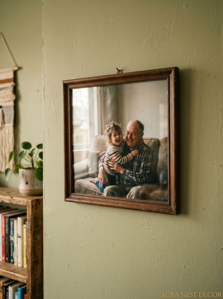
Not gonna lie, this one took me a while to come around to.
Your phone photos. The casual ones, the blurry ones, the ones that are technically bad photos but capture something REAL.
The photo of your dog mid-zoomies, all blur and chaos and pure happiness. The one of your kids at the kitchen table at 8am on a Saturday, completely unposed. The holiday photo taken by accident that somehow captured exactly the right moment. Those.
Get them printed. Not on glossy photo paper from a chain chemist — on matte fine art paper from a proper print lab. Mpix in the US is great, Loxley Colour if you’re in the UK. The print quality takes a mediocre photo and makes it feel considered. It doesn’t have to be sharp to be beautiful. Sometimes the softness is the whole point.
“The casual shot from your camera roll can be more beautiful on a wall than anything you deliberately composed.”
The best gallery walls I’ve ever seen — the ones that make me properly stop and look — have at least three or four of these. Real life mixed in with the more intentional photos. It makes the whole wall feel less curated and more inhabited.
—
8. Living Room Specific: Don’t Fight the Sofa
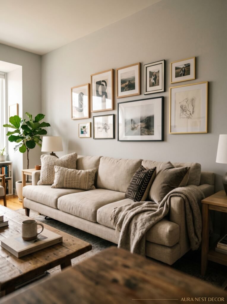
The sofa is your ally. Most people hang things too high and create this visual gap between where you’re sitting and where the art starts, and the whole room looks like it doesn’t quite fit together.
The general rule — which I think should be applied more aggressively than people usually apply it — is that the center of your gallery wall should sit around 57 to 60 inches from the floor. That’s eye level for most people standing. But in a living room above a sofa, you can actually go a few inches lower, around 54 to 57 inches to the center, because people are experiencing that wall primarily while seated.
And group the frames a bit lower than you think you should. If the bottom of your arrangement is floating a foot and a half above the sofa back, that’s the problem. Six to eight inches above the back of the sofa gives you a relationship between the seating and the wall. The whole room reads as more settled.
Fireplace walls are a different situation, and honestly a better one. The fireplace gives you a natural center point, a natural height reference. Work outward from the mantel symmetrically or asymmetrically — asymmetrical is harder but better when it works. Don’t cover the chimney breast entirely. Leave the wall breathing around the edges of the arrangement.
—
9. Mixing Photography With Objects (This Is Where It Gets Good)
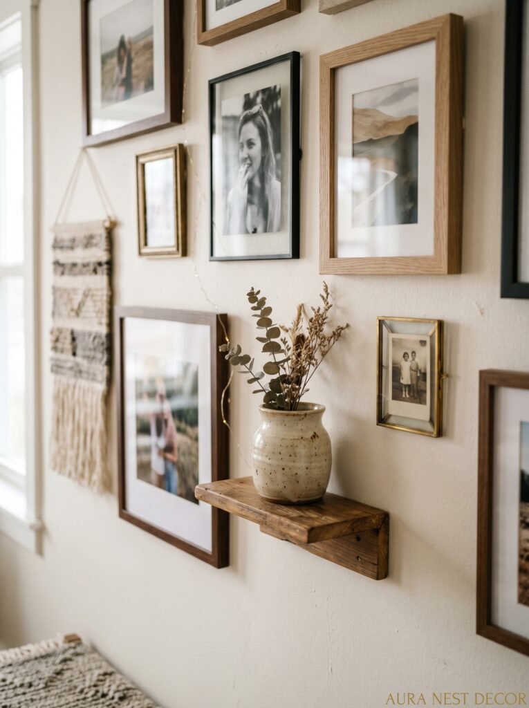
This is the upgrade that separates a photo wall from an actual feature wall.
Hang things that aren’t frames. Small wall-mounted plants, specifically air plants or a mounted tillandsia — they don’t need soil, they don’t need a pot, they just sit in a little wall-mount and look wildly good. A small woven wall hanging tucked into the lower right corner of your arrangement. A vintage clock that doesn’t work (honestly, decorative clocks are underrated — you’re not looking to tell the time on a gallery wall).
Small shelves that stick out of the arrangement, holding a candle or a small succulent, are my personal weakness. They add dimension. Everything else is flat against the wall; suddenly there’s a three-dimensional element and the whole thing gets interesting. Depth, literally, where before there was none.
In British homes especially, I’ve seen people incorporate original architectural features beautifully — a little corbel shelf, an old door knob mounted as a coat hook that ends up being part of the arrangement, even a framed section of original Victorian tile. You’re telling the story of the house alongside the story of the people who live in it. That’s good.
—
10. The Thing to Do Before You Buy Anything
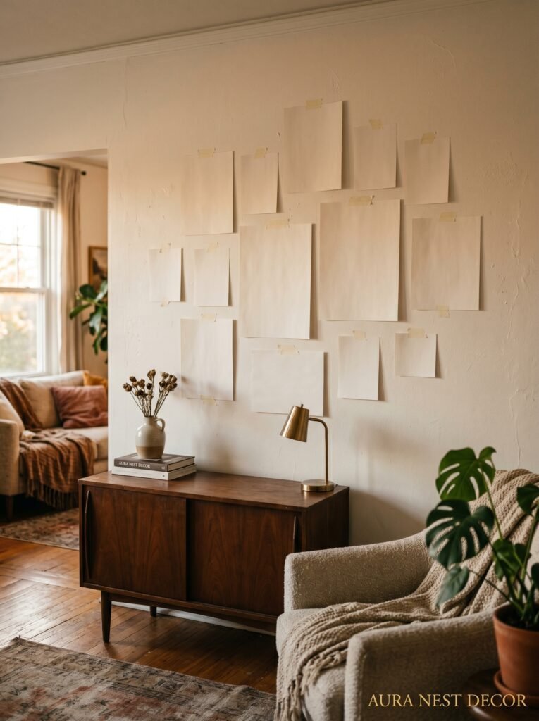
Edit your photos first.
Seriously, before you print anything or buy a frame, sit with your photo library and choose. Don’t let yourself have more than 15 to 20 for an average wall (12 is probably better). The constraint forces you to pick the ones that actually matter, the ones you want to look at every single day for the next five years. Because you will be looking at them every day. You’ll stop noticing them eventually, the way you stop noticing the smell of your own home, but subconsciously they’ll still be there, still doing something to how you feel in the room.
So edit hard. Take out anything that’s there because someone else is in it who you feel obligated to display. Take out anything that’s technically a good photo but doesn’t actually move you. Keep the ones where you can feel exactly what the day was like just by looking.
A tight, meaningful collection on a wall beats a comprehensive archive every single time.
—
11. The Fastest Way to Make a Gallery Wall Look Finished
Unify the mats.
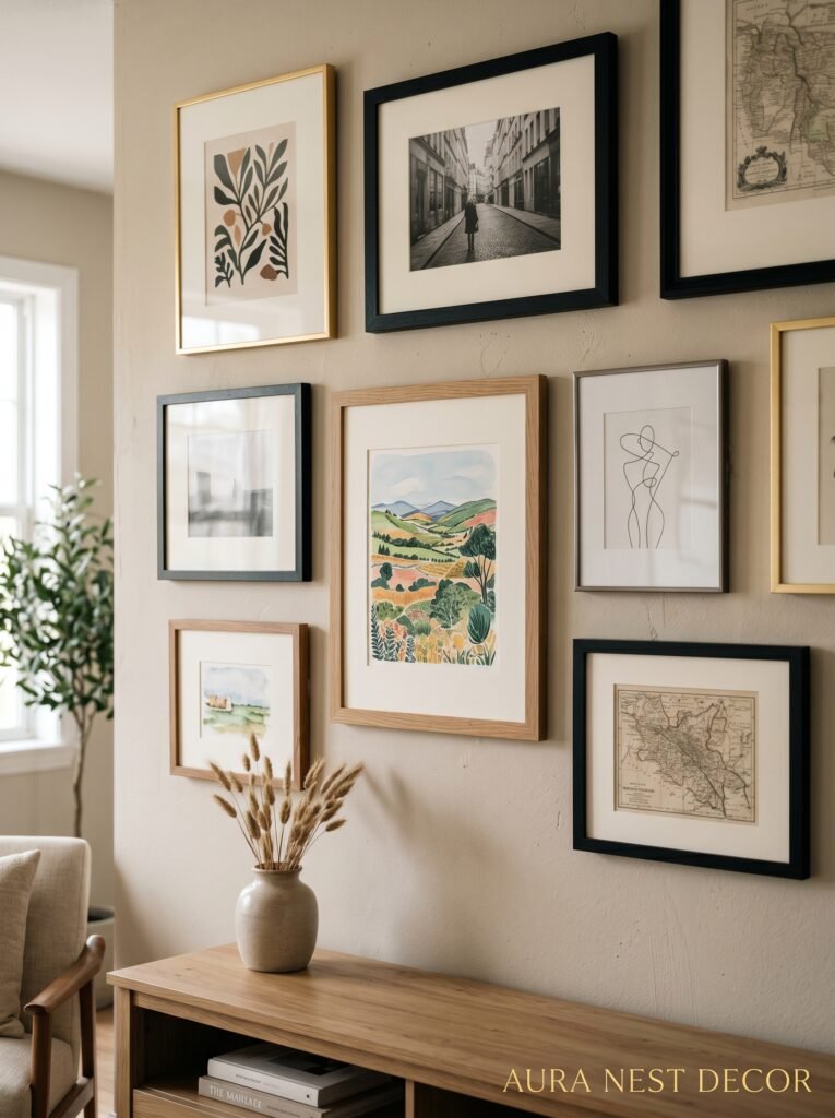
If you’ve got mismatched frames — different colors, different depths, different styles — matching the mats (the border inside the frame, around the photo) will do more to make the whole thing look intentional than almost anything else. White mats, or off-white mats, everywhere. Suddenly the frames are secondary. The eye reads the whole thing as a coherent collection.
Side note — if you’re using clip frames or frameless options, just make sure your prints all have a consistent white or cream border from the print lab. Same effect, no mats needed.
—
12. One Mistake Worth Making (And One Worth Avoiding)
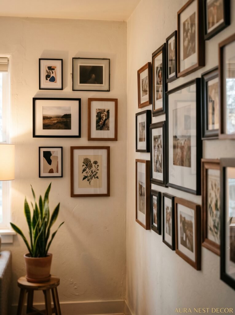
Make this mistake: start before you’re ready. Put something up. Make the first hole. Because a photo wall that lives in your head while you “wait until you have all the pieces” doesn’t actually exist. It NEVER exists. The best gallery walls I know are ones that grew over months and years, pieces added and swapped out, nothing permanent.
Don’t make this mistake: centering everything on the wall. A centered, symmetric gallery wall in the middle of a wall can look impressive, sure. But an off-center arrangement — hugging one end of the wall, or anchored to a corner — looks intentional and confident in a way that centered arrangements rarely do. Off-center says: I know what I’m doing. Centered says: I looked at guidelines.
“Put something up. Make the first hole. The wall that lives only in your head never actually exists.”
Be willing to let it be imperfect for a while. The imperfection is how it gets good.
—
❓ FAQ
Q: How many photos should be on a living room gallery wall? A: There’s no perfect number, but somewhere between 8 and 15 works for most living room walls. Fewer than 8 can feel sparse unless the pieces are large and intentional; more than 20 starts to feel chaotic in a way that’s hard to manage. Start smaller than you think you need and add from there.
Q: Should I use the same frame color for all photos on a gallery wall? A: Honestly, not necessarily. Matching frame colors creates cohesion, but a thoughtful mix of two or three complementary frame styles can look even better. The key is giving yourself a rule — same mat, same color family, same finish — so the mixing feels deliberate rather than random.
Q: What’s the best way to hang a gallery wall without destroying the walls? A: For lighter frames, Command Picture Hanging Strips are genuinely reliable and won’t damage plaster or drywall. For heavier pieces, proper wall anchors in the studs are worth taking the time to find. In UK homes with older lath-and-plaster walls, go carefully — use a proper picture hook and test the plaster first. The kraft paper template method (trace, cut, tape to wall first) saves you from making excess holes while you figure out the layout.
—
💭 Final Thoughts
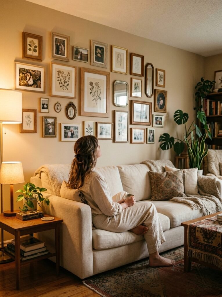
A photo wall isn’t really about the frames or the arrangement or even the photos themselves. It’s about deciding that your life is worth looking at. That the people and places and moments you’ve accumulated deserve a wall in the room where you actually spend your time.
Start messy. Start incomplete. It’ll find its shape.
What’s the one photo you keep looking at on your phone that you’ve never actually printed?




