
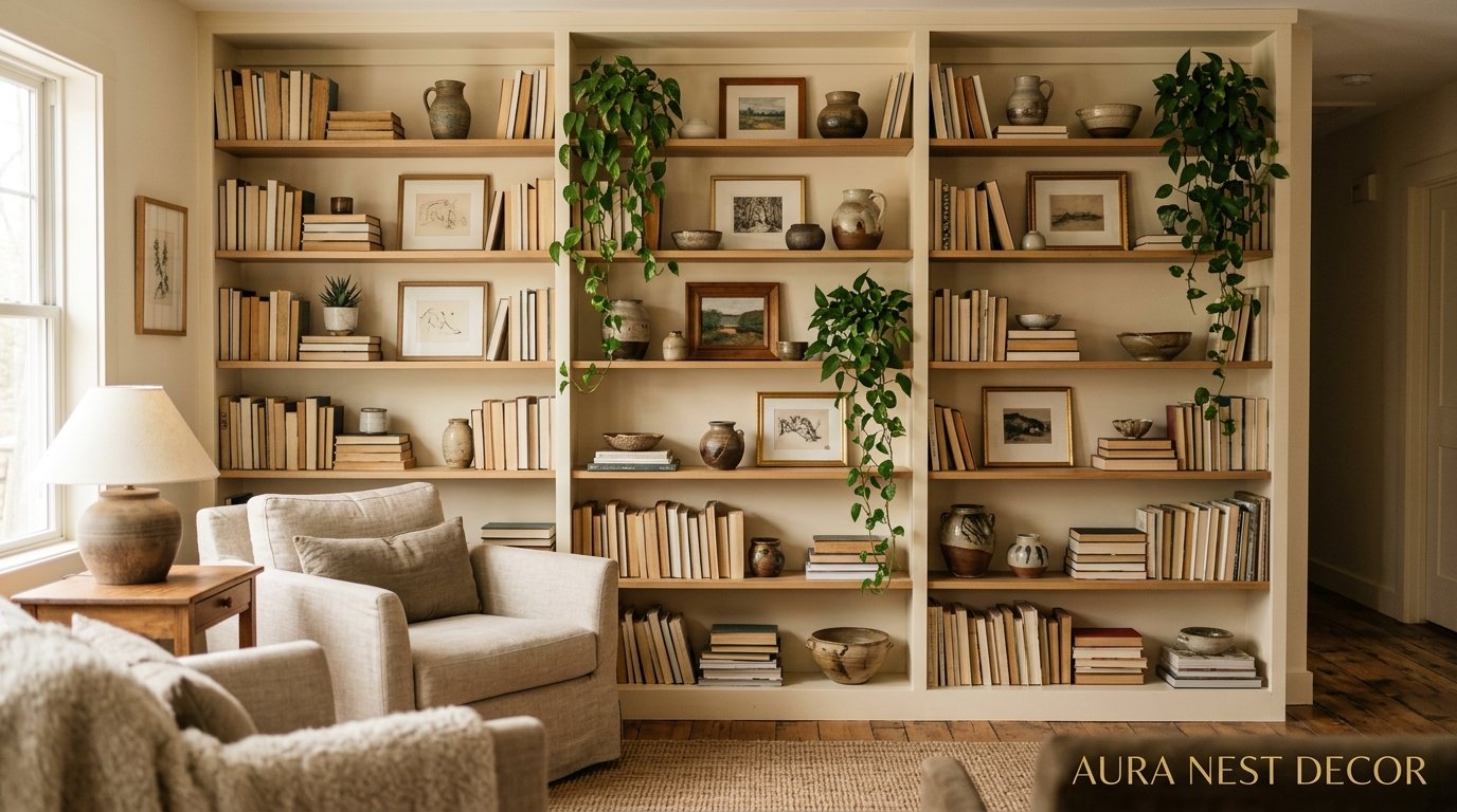
The Shelf Styling Guide That’ll Make You Want to Redo Your Living Room This Weekend
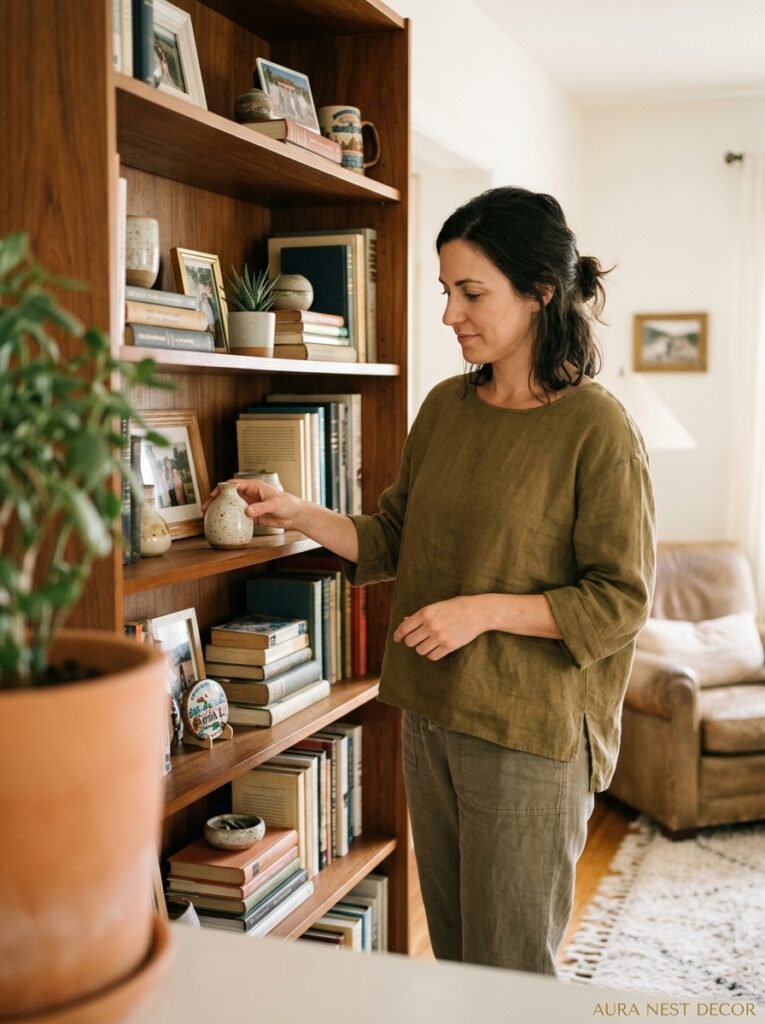
You know that feeling when you walk into someone’s house and their shelves just look right? Not perfectly symmetrical, not curated within an inch of their life — just right. I’ve spent way too long staring at my own shelves wondering what I was missing, and honestly? It was simpler than I thought.
—
1. Why Your Shelves Look “Off” (And It’s Not What You Think)
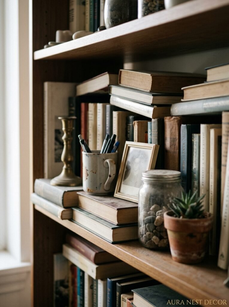
It’s not the stuff. That’s the thing nobody tells you. You could have the most beautiful collection of ceramics and vintage books and trailing ivy and your shelves could still look like a car boot sale gone wrong. And I say that with love because I’ve been there.
The real culprit is almost always height. Everything sitting at the same level creates this flat, monotonous visual plane that your eye just slides right off. Think about it — in nature, nothing lines up. Trees don’t grow at the same height. Flowers don’t either. Your brain is wired to find irregular, layered arrangements interesting, and when everything’s at the same level, something feels subtly wrong even if you can’t put your finger on it.
So before you buy a single new thing, try this: remove everything. Actually, all of it. Now put back only your tallest items first and deliberately make them different heights by stacking books underneath some things. A chunky coffee table book under a ceramic vase changes the whole game. You’re building a skyline, not filling a container.
“You’re not decorating a shelf. You’re building a tiny skyline — and every great skyline has peaks, gaps, and unexpected silhouettes.”
2. The “Odd Number” Rule Is Real but Everyone’s Applying It Wrong
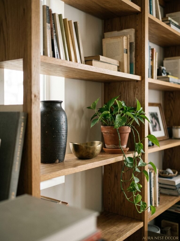
Yes, groupings of three, five, or seven objects look better than even numbers. That part’s true, I’m not disputing it. But most people hear “rule of three” and then line up three identical-height objects in a neat little row and wonder why it looks boring.
The grouping isn’t about the count. It’s about the triangle. When you arrange three objects — a tall vase, a shorter candle, a small dish or stone — you want to imagine a triangle shape rising between them. One item at the top of the triangle, two fanning outward and lower. That visual tension, that slight diagonal pull, is what makes your eye move and stay interested.
And here’s the part people skip: the triangle doesn’t have to be tidy. It should be a little imperfect. Shove things closer on one side than the other. Let one item lean against the back of the shelf. Put a small trailing plant that droops down from one corner so it breaks the geometric rigidity. Messy triangles are better than perfect rows every time, and I will die on that hill.
3. The One Color Trick That Actually Ties a Whole Wall of Shelves Together
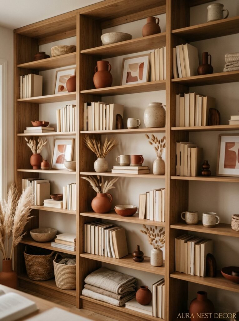
There’s a color that keeps appearing in every beautiful living room shelf I’ve pinned, saved, and screenshot-stalked in the last year. It’s not a trending color — it’s more of an approach. One accent color, repeated quietly across the whole shelf arrangement. Not dominating. Whispering.
So if you have a terracotta pot on the left side of your shelves, there should be a tiny flash of terracotta somewhere on the right — maybe a book spine, maybe a small dried flower bunch. Your eye makes the connection subconsciously and suddenly the shelves feel like a collection instead of a pile.
This is genuinely the fastest fix. You don’t need new stuff. Just move things around until you’ve got that quiet repetition of color across the span. I started doing this with my blue ceramics — a big vase on one side, a small dish on the other — and people started commenting on my shelves within weeks. Same objects, completely different effect.
Side note — warm neutrals like sand, warm white, and a soft rust are the most forgiving colors to repeat. Cool grays are trickier because they can make everything feel a bit clinical.
4. Books Are Not Boring — You’ve Just Been Stacking Them Wrong
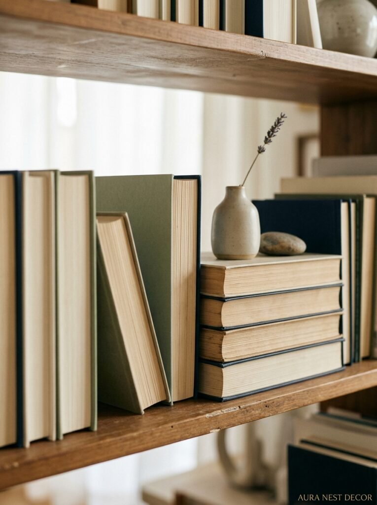
Can we talk about books? Because I feel like the interior design world went through this phase of treating books as vaguely embarrassing, like we should all be replacing them with sculptural objects and linen fabric. And I get it, a full shelf of crammed paperbacks can look chaotic. But books done right are some of the most interesting decor you can have.
First: not all spines facing out. Flip some around so the pages face forward. That soft, creamy white of a book’s pages is one of the most quietly beautiful textures on a shelf, and it works with virtually every color scheme. A row of page-forward books next to a dark-spined collection creates this lovely tonal shift.
Second: don’t shelve them all upright. Stack some horizontally, especially as risers for other objects. A stack of four or five books with a small plant or candle on top is a classic for a reason — it works. The key is varying your stack heights so you’ve got one tall stack, one medium, and don’t create a third because that’s where it starts looking too deliberate.
Third — and this is the one nobody talks about — edit ruthlessly. You don’t need every book on display. Keep the ones with beautiful covers or interesting spines, box up the tatty ones. I know that sounds harsh but a shelf with 20 carefully chosen books will always look better than one with 200 crammed in.
“Keep the beautiful ones. Box up the rest. Your shelves aren’t a library — they’re a love letter to the things that actually matter to you.”
5. Why Empty Space Feels So Scary (And Why You Should Do It Anyway)
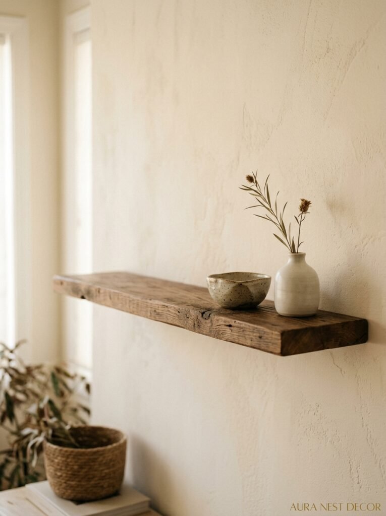
Negative space. Every design resource talks about it and I used to read those articles and nod along and then immediately go home and fill every inch of my shelves again. Because empty space just felt wrong to me. Like I’d forgotten something.
Here’s what shifted my thinking: I started looking at the brands I actually loved — the pottery studios, the small home boutiques, the furniture makers with beautiful Instagram accounts. Their product shots never have cluttered shelves. They always have this gorgeous breathing room around each object, and that space is what makes the object look expensive, considered, intentional.
The thing is, your shelves don’t have to be packed to feel full. They have to feel balanced. One section of a shelf that’s completely empty draws the eye straight to the section that isn’t — and suddenly your favorite ceramic bowl is getting the kind of gallery-wall treatment it deserves. Start by removing one item from each shelf. Just one. Live with it for a few days. I almost guarantee you won’t want to put it back.
6. The Lighting Situation Nobody Talks About Enough
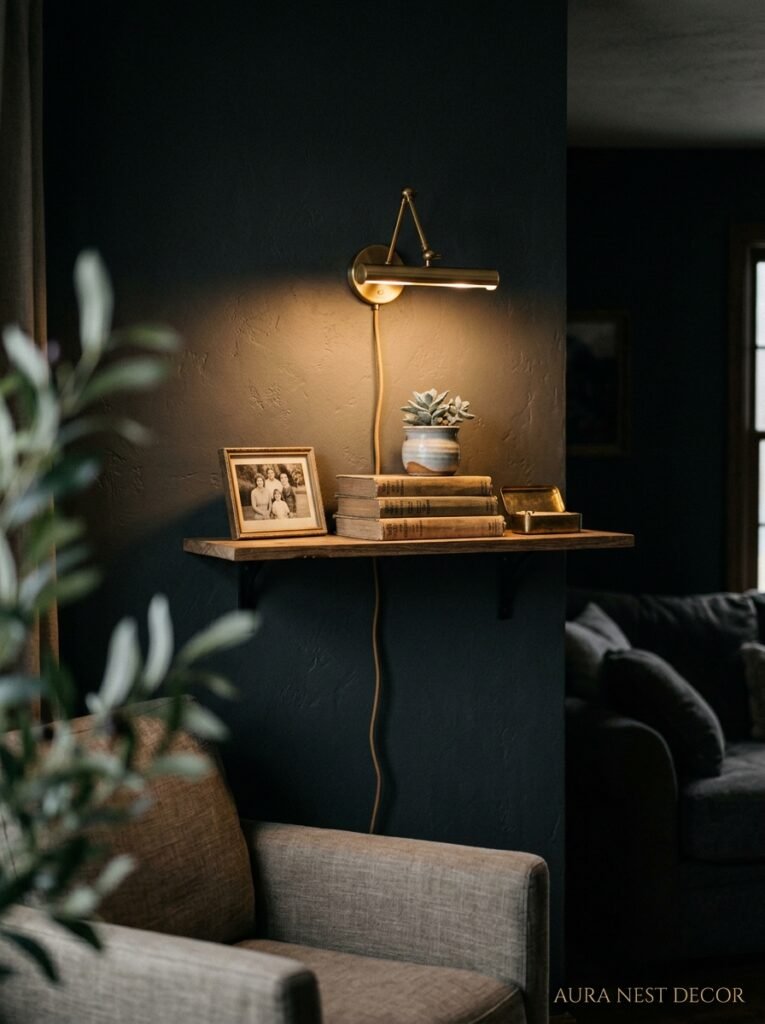
Shelf lighting is doing more work than you realize, or it should be. I’m not talking about overhead room lighting spilling across your shelves — that’s flat and it makes everything look the same. I’m talking about the amber glow of a small LED puck light tucked at the back of a shelf, or a slim strip light running underneath a shelf edge, or even just a small plug-in spotlight aimed at your most interesting corner.
That warm, low light hitting a ceramic object from underneath or behind it creates this gorgeous depth. The shadows become part of the arrangement. And it costs almost nothing — battery-operated puck lights are a few dollars at any hardware store and you don’t need an electrician or any complicated installation.
If you’ve got shelves with something you actually love on them, aim light at it. Pretend it’s in a museum. Because the way something is lit is often the difference between “nice shelf” and “oh wow, what is that piece?”
7. The Plants That Actually Work on Shelves (Versus the Ones That’ll Torture You)
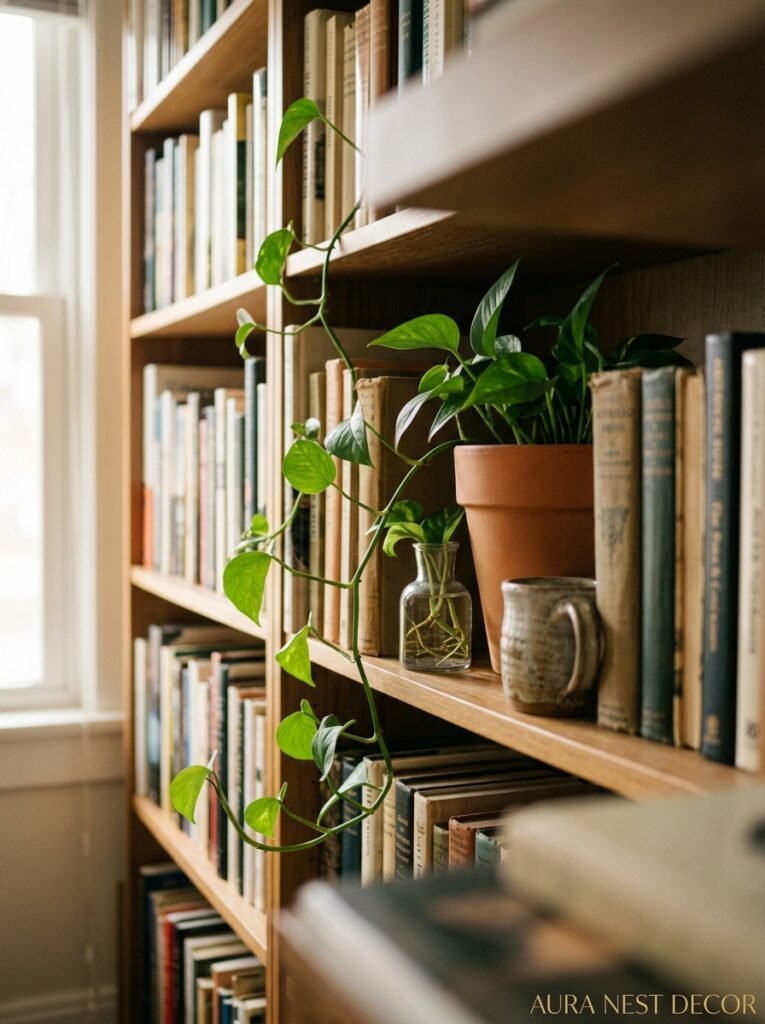
Not all plants are shelf plants. I’ve killed enough to know this.
The ones that WORK: pothos, because they trail beautifully and are basically unkillable; devil’s ivy for the same reason; small succulents if your shelves get decent light; a single dried pampas stem in a thin-necked vase (gorgeous, zero maintenance, trends be damned it still looks good); dried eucalyptus bundles; and those little air plants that just sit in a glass sphere looking effortlessly cool.
The ones that’ll constantly disappoint you on shelves: ferns (they want humidity and will go crispy in your dry living room faster than you can say “misting bottle”), real moss arrangements (beautiful for about four days), and any flowering plant that needs consistent light rotation — you’ll keep forgetting to turn them and they’ll grow toward the window and your arrangement will be weird in a week.
Trailing plants are almost always the right answer. A pothos hanging over the edge of a high shelf with its leaves catching the light — that’s the image you’ve been pinning. It’s also genuinely easy to keep alive, which matters.
“A trailing pothos on a high shelf is doing more decorative work than you’re giving it credit for. It’s the thing that makes everything else look intentional.”
8. Mixing Old and New: The Ratio That Actually Feels Good
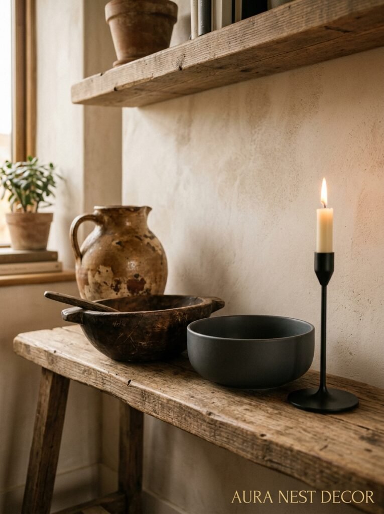
You’d think there’d be some complicated formula here but honestly it’s more of a feeling. The vintage or secondhand pieces ground the arrangement — they give it history, texture, a sense that these things were actually lived with. And the new pieces give it crispness, freshness, intention.
The ratio I keep coming back to: roughly 60% pieces with some age or texture to them, 40% clean and new-looking. That might look like a weathered wooden bowl, a stack of vintage Penguin paperbacks, and an old brass candleholder alongside a brand new concrete vase and some fresh white candles. The contrast between worn and crisp is genuinely pleasing in a way that all-new or all-old isn’t.
Charity shops in the UK are brilliant for this — I’ve found some of my absolute favorite shelf pieces in Oxfam and British Heart Foundation stores for under £3. And in the US, estate sales and thrift stores do the same job beautifully. You’re not looking for anything specific, just things that feel like they have a story. A good shelf has stories.
9. The Frame Rule That Makes Art Look Better Than Anything You Could Buy
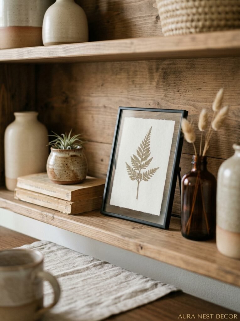
Original art is wonderful and if you can afford it, brilliant. But a framed piece of handwritten text, a beautifully typeset quote, a vintage botanical print, a map of somewhere that means something to you — these things can look every bit as striking when framed properly.
The rule: don’t frame everything in the same frame. A mix of frame finishes — say, brass, black, and natural wood — across a shelf or the wall above it creates visual interest in a way that a “matching set” never does. And slightly mismatched frame sizes? Perfect. The off-kilter combination of an A3 print next to a small square frame next to a tall narrow frame creates that gallery-wall energy that Instagram loves.
Lean frames instead of hanging them where you can. A frame leaning against the back of a shelf looks considered and relaxed in a way a hung frame can’t quite match. It says “I put this here because I love it” rather than “I put this here because it’s the right place for a picture.”
10. What “Cohesive” Actually Means (Because It Doesn’t Mean Matching)
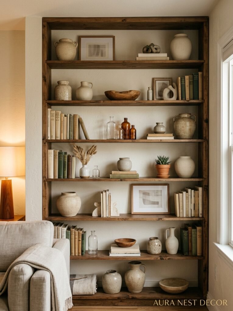
This word gets thrown around a lot and I think it’s scared people into buying everything from the same collection, the same store, the same aesthetic. But cohesive doesn’t mean matching. It means connected.
Your shelves can have a vintage ceramic next to a modern geometric candle holder next to a Seventies-looking abstract print — and they’ll feel cohesive if they share the same general color temperature (warm or cool), a similar sense of scale, and maybe one repeated material (wood, or linen, or matte ceramics). It’s those connective threads that your eye follows, not the sameness.
Think of it like an outfit. A great outfit mixes textures and eras and pieces from different places — but it has a color story and a mood. Your shelves are the same. What’s the mood? Warm and earthy? Clean and Scandi? Maximalist and collected? Pick a mood first, and then anything that fits the mood can come along.
11. The Seasonal Refresh Method That Takes Twenty Minutes
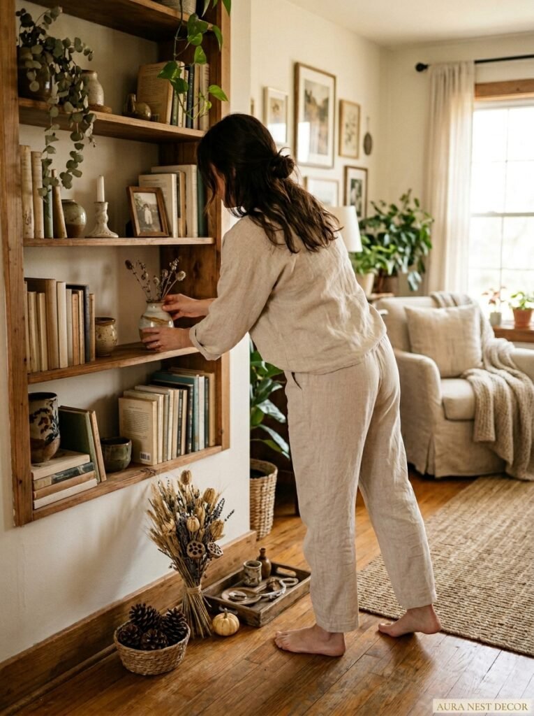
Here’s one of my favorite habits with shelves: I don’t redecorate for seasons in any dramatic way. I just swap out two or three small items and it completely changes the feeling.
Coming into autumn? Replace a lighter, leafy trailing plant with a small vase of dried flowers in rust and amber tones. Add a beeswax pillar candle in a rich honey color. Move a heavier, chunkier ceramic to a more prominent spot. Twenty minutes. Maybe thirty if you’re indecisive like me. And the whole shelf feels like it shifted into the right season.
Coming into spring? Lighter objects forward. A small glass vase with a few fresh stems. A woven rattan piece in place of something heavier. You’re not buying new things most of the time — you’re rotating what you already have.
This is why I keep a small box of “shelf rotation” items in a cupboard: pieces I love but that don’t live on the shelves year-round. They get their moment, then they rest, and when they come back out they look fresh again.
12. The Single Most Overlooked Detail That Expensive-Looking Shelves Always Have
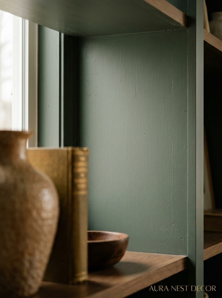
Clean backs. That’s it. That’s the secret.
If you’ve got raw MDF shelving or builder-grade white laminate backing, everything you put on it will look a bit discount — even beautiful objects. Expensive-looking shelves almost always have a treated back: painted in a contrasting color, lined with wallpaper, or even just painted in a deep, moody tone that makes objects pop forward.
Wallpaper-lined shelf backs are genuinely one of the highest-impact, lowest-cost changes you can make. A small piece of floral or geometric wallpaper stuck to the back of a shelf costs almost nothing and suddenly makes every object in front of it look gallery-worthy. Remodelista ran a whole feature on this and I completely agree — it’s the thing most people have never thought to try and the thing they can’t stop talking about once they do it.
Dark paint on shelf backs — forest green, navy, deep terracotta — does the same thing. It creates depth. Objects in front of a dark background have visual weight in a way objects in front of white just don’t.
—
❓ FAQ
Q: How do I stop my shelves from looking cluttered even though I don’t have that much stuff on them? A: It’s almost always a grouping problem rather than a quantity problem. Try consolidating your objects into defined clusters with clear empty space between them, rather than spreading things evenly across the shelf. Clustering creates intention; even spacing creates clutter.
Q: What’s the best way to style built-in alcove shelves in a British living room? A: Treat each shelf as its own composition but make sure there’s one repeated element — color, material, or object type — that runs through all of them to tie the whole alcove together. The mistake most people make is styling each shelf completely differently, so the alcove looks scattered rather than curated.
Q: Can I mix open shelves with closed storage and still make it look intentional? A: Absolutely, and honestly it often looks better. Closed storage below and open shelving above is one of the most practical and visually pleasing combinations you can do, especially in smaller living rooms. The closed section grounds the whole unit and gives you somewhere to hide the stuff that doesn’t photograph well.
—
💭 Final Thoughts
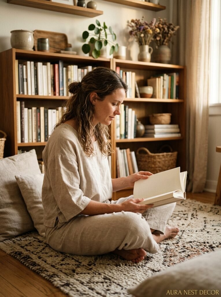
Good shelves aren’t about having the right things. They’re about knowing what to do with what you’ve already got — and being willing to move it around until something clicks. I’ve rearranged the same collection of ceramics probably forty times by now and it still surprises me what a difference a small shift makes.
Start with just one shelf this weekend. Take everything off, put back half, and see how it breathes.
What’s the one thing sitting on your shelves right now that you’ve walked past a hundred times but never actually looked at?




