
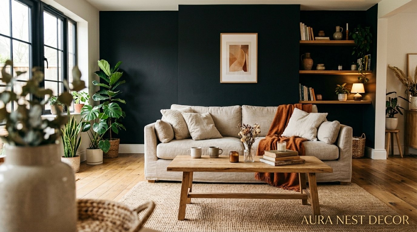
Why a Black Accent Wall Might Be the Best Decision Your Living Room Ever Made
You know that moment when you walk into someone’s home and something stops you cold — in the best way? Nine times out of ten, there’s a black wall involved. Not dark gray. Not charcoal. Black.
—
1. The Fear Is Real — and Also Completely Overblown
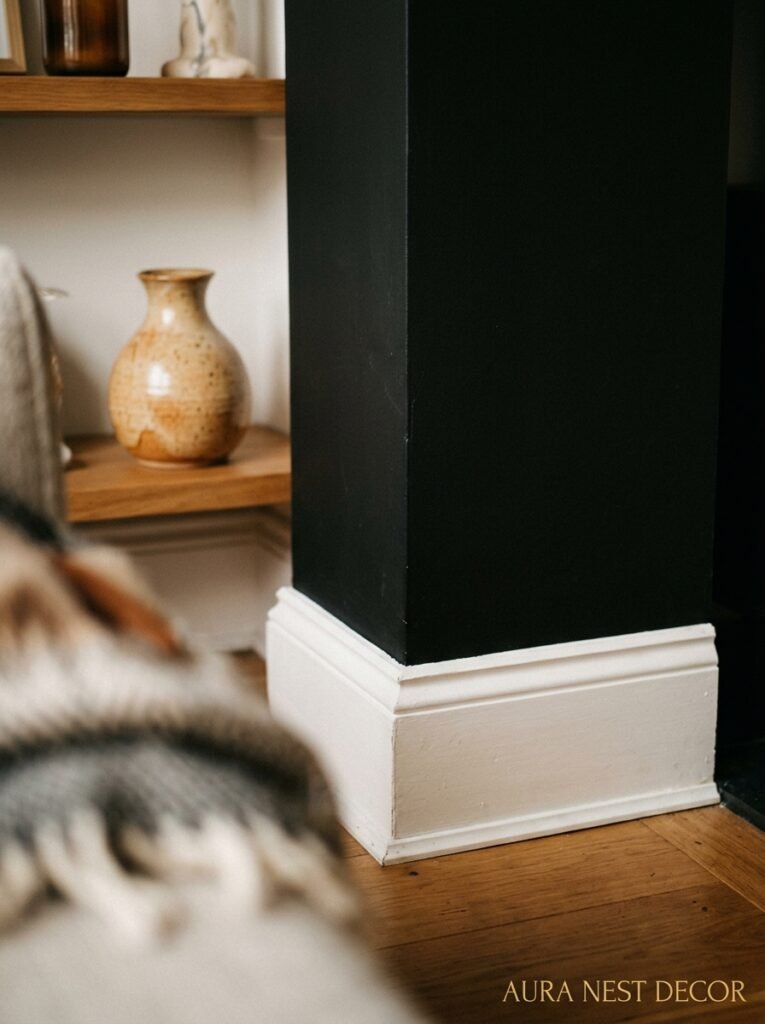
Let’s just address the thing everyone thinks first: won’t it make the room feel like a cave?
Short answer — only if you do nothing else. And honestly, that fear is what’s keeping so many living rooms stuck in the land of greige and faint sage green that looks exactly like everyone else’s Pinterest board from 2021.
Here’s what actually happens when you do it right. The black wall recedes. It makes the furniture in front of it pop like a photograph, gives the room DEPTH that no paint color under Benjamin Moore’s “timeless neutrals” range can touch. I’ve seen tiny British terrace living rooms with one black wall feel dramatically more considered than open-plan spaces painted the most inoffensive warm white money can buy.
The fear comes from imagining the whole room painted black. That’s not what we’re talking about. One wall. The one everyone looks at when they sit down. The one behind the sofa, or the chimney breast, or wherever your eye naturally lands first. That wall, painted black, acts less like a heavy presence and more like a frame. The room becomes a painting. You become the person who lives inside it.
It’s not a bold choice for bold people only. It’s actually a deeply practical design decision disguised as a dramatic one.
“The black wall doesn’t swallow the room. It wakes the room up.”
—
2. The Finish You Choose Changes Absolutely Everything
This is the part most people skip over in their excitement to buy the paint, and it’s the part that makes or breaks the whole thing.
Matte black is moody, soft, almost velvety when the light hits it in the evening. It doesn’t bounce light back at you — it absorbs it, holds it. This finish photographs beautifully and doesn’t show every smudge and scratch the way you’d expect. It’s forgiving. Slightly chalky. The kind of surface that makes a room feel like it belongs in an Italian loft or a very serious design magazine.
Satin black is for living rooms with slightly more light, rooms that need a little more life in them. It has a subtle sheen, not shiny exactly but present. You’ll notice it more in daylight, less at night, and it’s easier to wipe down — which matters if you’ve got kids, dogs, or just a habit of resting your hands on walls, which apparently I do.
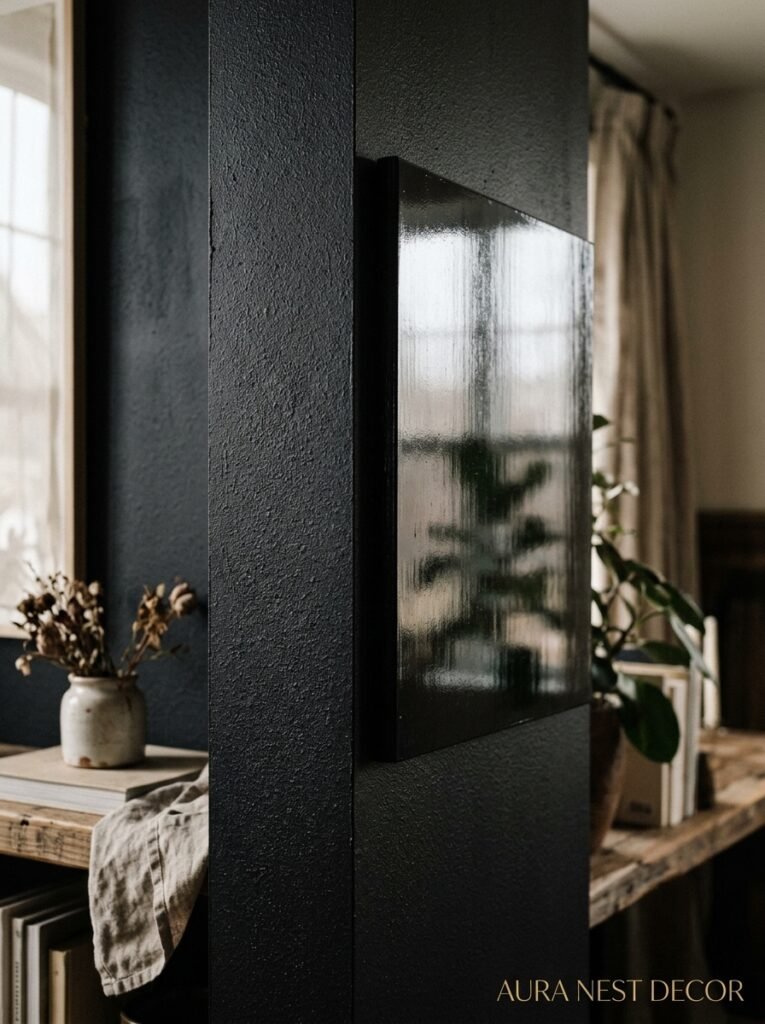
Gloss black? That’s a whole other commitment. It’ll reflect everything in the room back at you, make the wall feel almost lacquered, and it’s genuinely stunning in the right context — think a really high-ceiling Victorian living room with picture rails and original cornicing. But it’s high-maintenance and sort of unforgiving. Scratches show. Marks show. Every fingerprint shows.
Most rooms? Go matte. You won’t regret it.
—
3. The Exact Colors That Come Alive Against Black (And One That Surprisingly Doesn’t)
Cream. Not white, cream. There’s a warmth to it that white just doesn’t carry, and against a black wall, cream furniture or curtains look almost luminous, like candlelight made solid. A cream sofa in front of a black wall is one of those combinations that feels both timeless and completely current, and I don’t say that lightly.
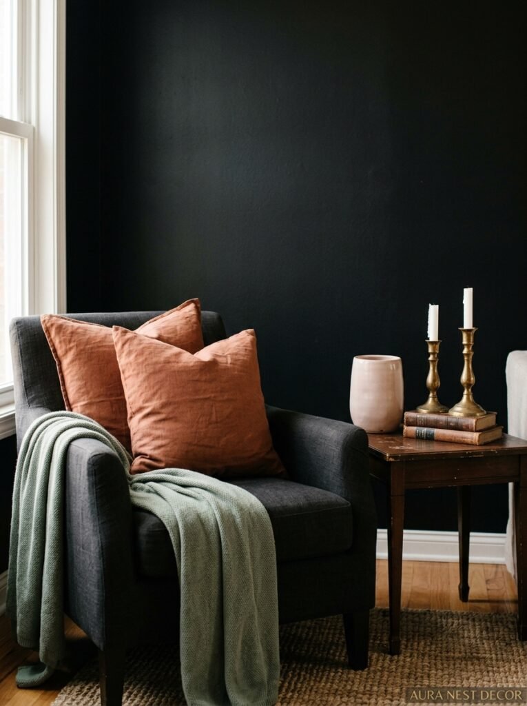
Warm terracotta works. Dusty pinks work. Burnt orange — surprisingly, shockingly works. Brass and gold work in a way that feels earned rather than overdone.
Deep forest green works, but carefully. You need light if you’re going both black AND green, or the room starts to feel less like a moody retreat and more like a Victorian study where bad things happen. Not the vibe. Usually.
The one that doesn’t work as well as people expect? Bright white. It CAN work — very Scandi, very clean — but it tends to make the whole room feel a bit clinical rather than warm. If you’re going white furniture with a black wall, you need texture to save you. Boucle. Linen. Chunky knit throws. Something that says “human lives here” rather than “showroom opens Monday.”
—
4. Lighting Is Doing 40% of the Work Here, No Exaggeration
I cannot stress this enough.
A black accent wall in a poorly lit room is a different experience to a black accent wall with the right lighting. COMPLETELY different. The lighting isn’t an afterthought — it’s genuinely half the magic.
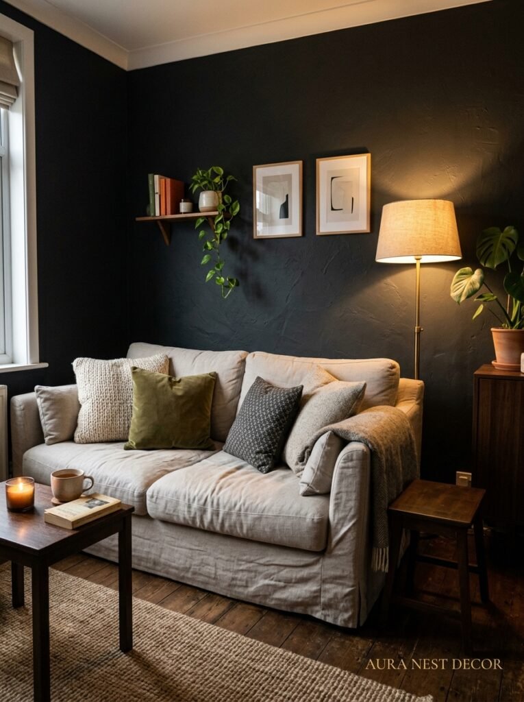
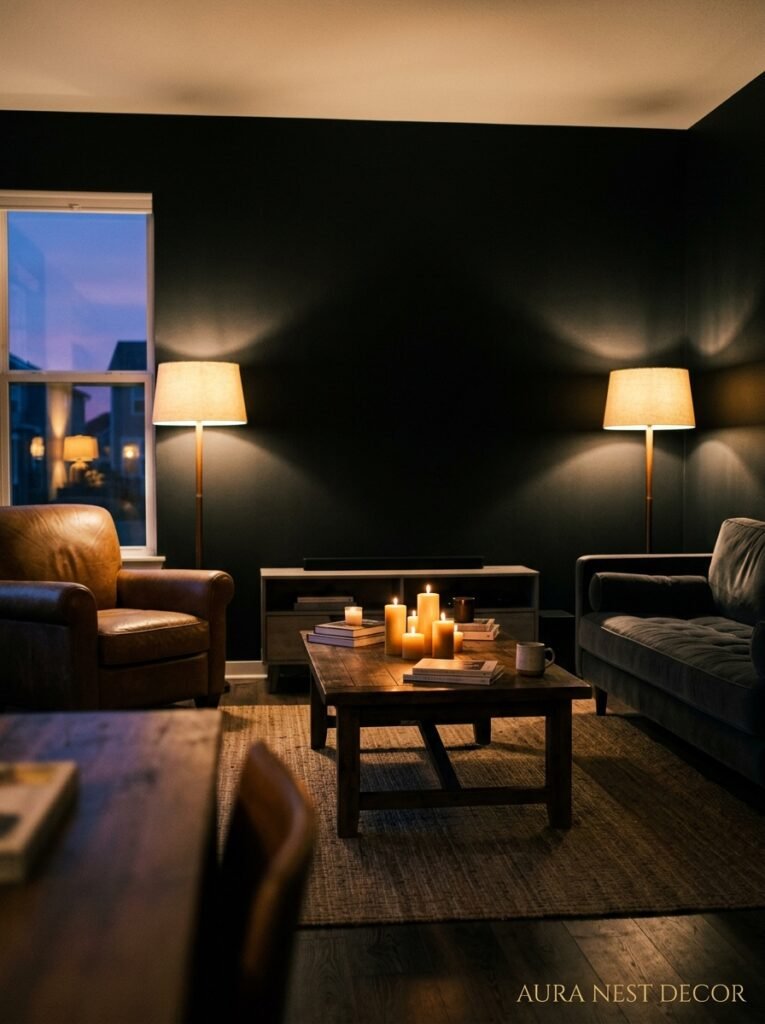
The amber glow of an Edison bulb at 7pm? That’s your best friend. Warm-toned bulbs (2700K-3000K, if you want to be specific about it) make a black wall feel cozy and intentional. Cool white LED bulbs make the same wall feel stark and a little sad, like a rental flat painted black by a previous tenant who was definitely going through something.
Wall sconces either side of a black chimney breast are incredible. They draw the eye, create pools of warm light against that dark surface, and photograph so well it’s almost unfair. If you’re doing a black wall behind a sofa, consider a floor lamp tucked nearby — something with a shade that throws light upward and downward both. The contrast is genuinely gorgeous.
Natural light matters too, obviously. Rooms with south-facing windows (US: rooms that catch afternoon sun) can handle a black wall more easily than north-facing ones. But here’s the thing — north-facing rooms don’t need to avoid it. They just need more layered artificial lighting to compensate. Which, if you do it well, ends up looking MORE interesting than the south-facing room that doesn’t have to try.
“Get the lighting wrong and the wall looks heavy. Get it right and the room looks like it was designed on purpose.”
—
5. The Chimney Breast as a Black Accent Wall — This Is the Sweet Spot
If your living room has a chimney breast, you’ve already won.
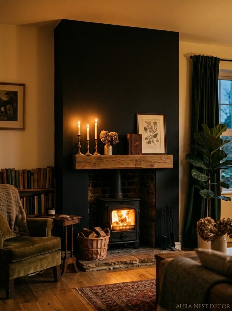
This is the most natural accent wall in any room. It’s already a focal point. The fireplace already draws the eye. Painting it black — just the breast, just that defined architectural feature — is one of those design moves that feels obvious in retrospect but radical before you do it.
It doesn’t even have to be a functioning fireplace. Dead fireplaces with a black chimney breast are actually some of the most interesting interiors going right now, especially when you fill the fireplace opening with candles, stacked logs, or a really good piece of art. The black paint makes the whole architectural moment feel INTENTIONAL. Considered. Like whoever lives here knew what they were doing.
In older British homes especially — Victorian terraces, Edwardian semis — the chimney breast has proportions that almost beg for this treatment. The coving, the picture rails, the original tiles or wooden mantel: all of it looks sharper, more defined, more itself with a black backdrop.
American craftsman houses work brilliantly too, by the way. That combination of wooden built-ins and a black painted fireplace wall? Come on. There’s nothing better.
—
6. Why Your Art Will Suddenly Look Like It Belongs in a Gallery
Hang something on a white wall and it floats there, a bit uncertain, maybe not quite landing the way you hoped.
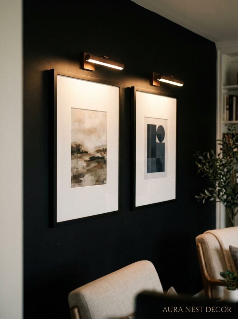
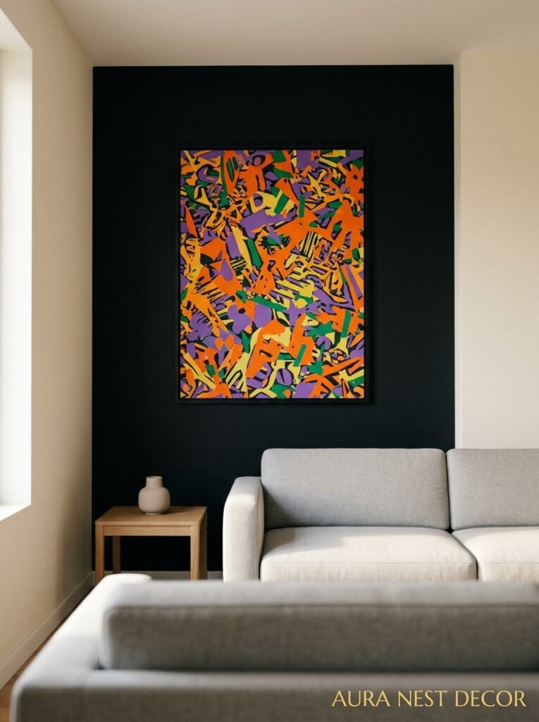
Hang the same piece on a black wall and it commands the room. The contrast forces the eye to really SEE it. Colors in the artwork look more saturated. Frames — especially anything gold, natural wood, or bright white — look sculptural rather than just decorative.
This is why so many actual galleries use dark or black walls, side note. It’s not about drama, it’s about focus. The dark surface tells your brain “look HERE, this matters.” White walls ask you to look everywhere and nowhere at once.
If you’ve been quietly disappointed by how your art looks in your current living room and you can’t figure out why, the wall color might genuinely be the answer. Not the art itself.
Gallery walls especially work beautifully on black accent walls — mixed frames, mixed sizes, the kind of arrangement that would feel chaotic on white somehow feels curatorial and intentional on black. I’m not sure exactly why that is, but it does.
—
7. Textures That Make the Black Wall Feel Like a Design Choice (Not a Mistake)
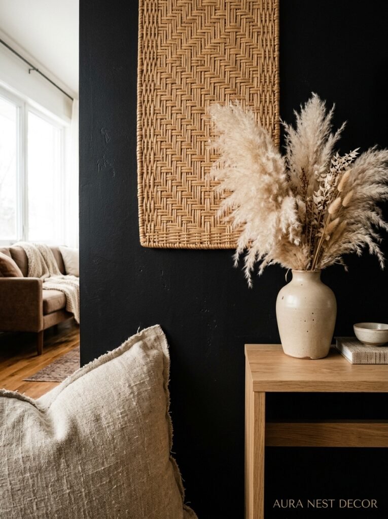
A black wall on its own can look a bit stark if the rest of the room doesn’t meet it with enough texture.
Rough linen curtains in warm oatmeal. A chunky jute rug. A boucle throw draped over a chair arm, slightly disheveled, like someone actually uses it. Wooden furniture — not dark wood, WARM wood, something honey-toned or medium oak — brings a natural contrast that softens the whole thing.
Plants, too. A large leafy plant in front of or near a black wall is almost outrageously beautiful. The green pops in a way it simply doesn’t against lighter walls. A big monstera, a fiddle-leaf fig, or honestly even a very full pothos on a high shelf — anything with leaves, anything living.
The mistake people make is going too matchy-matchy. All black furniture against a black wall disappears into itself. One or two black accents elsewhere in the room — a side table, a lamp base, a picture frame — help the eye travel and feel cohesive. But you don’t want everything to be dark. The contrast is the whole point.
“The black wall is the backdrop. Everything in front of it is the show.”
—
8. Small Living Room? Here’s Why You Shouldn’t Wait Until You Move Somewhere Bigger
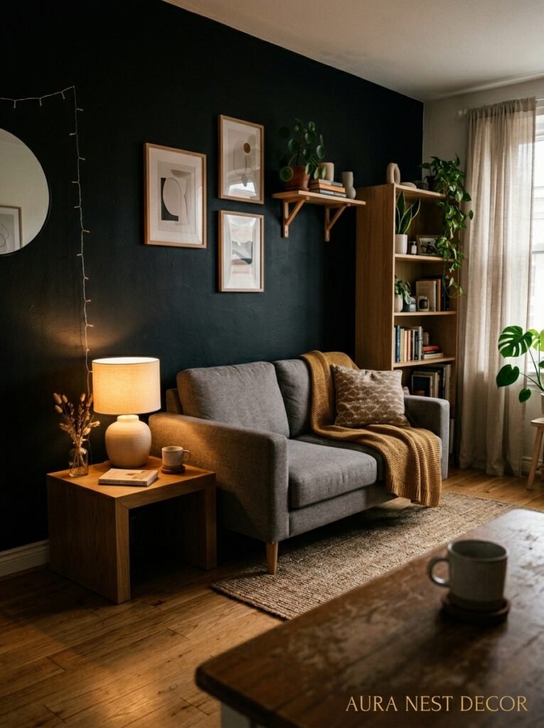
This is the advice most people don’t believe until they try it.
Small rooms are actually great candidates for a black accent wall because the darkening effect on ONE wall creates the illusion of depth — the wall seems to recede rather than advance. It’s counterintuitive but it’s real. A small living room with a black feature wall often feels more deliberate and designed than a larger room painted uniformly in a safe neutral.
The key is keeping the other walls light. Not necessarily white — warm white, soft cream, the palest stone — but significantly lighter than the black. That contrast does the heavy lifting.
In tiny London flats especially (I see so many of these on Pinterest and I always notice which ones look good and which ones don’t), the ones that go for it — the black chimney breast, the art, the warm lighting — consistently outperform the ones playing it safe in the small space department. Playing it safe in a small room just gives you a very average-looking small room. Going bold gives you a small room that feels CHOSEN.
—
9. The Black Wall in a Rented Home — Yes, You Can Still Have This
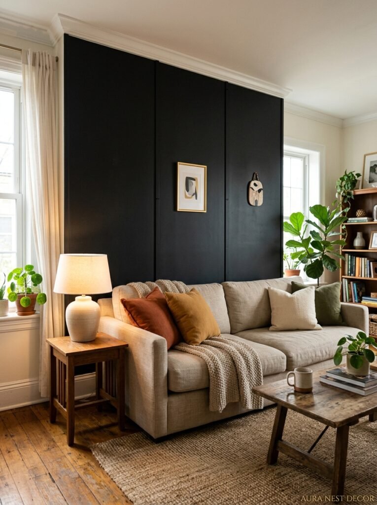
If you rent, you’re not completely locked out of this particular dream, though I won’t pretend it’s as straightforward.
Removable peel-and-stick wallpapers in black (especially matte textured versions) have gotten genuinely impressive. The early versions were terrible — shiny, obvious, peeling at the corners after three weeks. The newer ones, particularly some of the options from specialist wallpaper brands, are much more convincing. You can usually find good options via Pinterest itself, which is a weird thing to say but genuinely true.
Some landlords will allow you to paint if you return the wall to its original color before you leave. It’s always worth asking. The worst they can say is no, and the conversation costs nothing. If you’ve been renting the same place for several years and you’re a good tenant, you’d be surprised.
Dark removable wall panels — thin wooden slats in black, for instance — are another option that’s gotten really popular. They mount without drilling in most cases and they genuinely transform a wall. Not the same as painted black, but the visual weight is similar and the effect is real.
—
10. What NOT to Hang on a Black Accent Wall (Opinions, Firmly Held)
Inspirational quotes in script font. No. Please.
Family photo collages in mismatched frames in every color of the rainbow. They’ll look chaotic rather than personal against that dark backdrop. If you want photos, go uniform — all black frames, or all white, or all natural wood. Same vibe. Same size, ideally.
Extremely pale watercolors will get a bit lost. They need contrast to sing and pale pastels sometimes just disappear against black rather than standing out. This is fixable with good lighting pointed directly at the art, but it’s worth knowing.
And honestly? Resist the urge to hang TOO much. A black wall is strong on its own. Two or three really good pieces, well-placed, will always beat fifteen mediocre ones packed in. The wall is already doing work. Let it.
—
11. The Paints That Actually Look Good (Because Not All Blacks Are the Same)
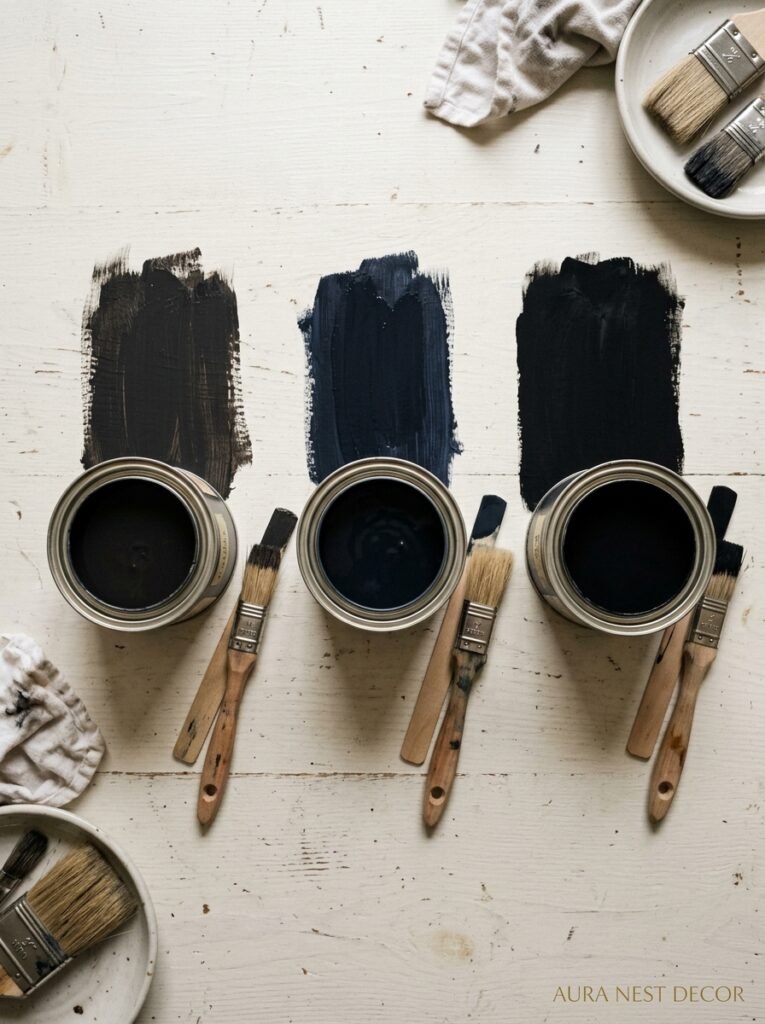
This is something nobody tells you until you’ve bought three sample pots and stared at them drying in confused disappointment.
Black paint varies more than almost any other color. Some dry with undertones — blue-black, brown-black, green-black. Some dry flatter than you expected, some darker. The sample pot is genuinely essential here, not optional.
A few names that come up consistently in design circles and actually deliver: Railings by Farrow & Ball is technically a very dark navy that reads as black in most lights — it’s warmer than true black and it’s gorgeous. Pitch Black by Farrow & Ball is the actual black, cool and definitive. Off-Black, also by F&B, has warm undertones that make it softer. In the US, Benjamin Moore’s Black Ink and Sherwin-Williams Tricorn Black are both well-regarded and more accessible on budget.
Paint your sample on the wall. Leave it for 24 hours. Look at it in morning light, afternoon light, and evening lamplight. You’re not being indecisive, you’re being smart.
—
12. The One Thing That Will Make You Actually Commit to Doing This
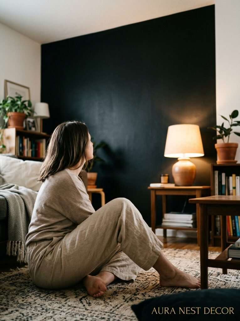
Stop imagining the worst version of it.
Seriously. Every time someone tells me they’re scared to do a black accent wall, they’re picturing a dark, closed-in room with bad lighting and no thoughtfulness to it. That’s not the result of painting a wall black — that’s the result of doing nothing else right. The wall doesn’t create those problems. The wall actually CAN’T create those problems on its own.
What you should be imagining is the specific thing you’ve seen somewhere — a photo on Pinterest, someone’s living room you walked into, a café or hotel lobby that made you catch your breath. Something stopped you. Something felt right. That feeling is information.
A black accent wall, done thoughtfully, with warm lighting and the right textures and a few things you actually love displayed on it — that room exists for you. It’s not a dramatic leap. It’s one wall. One can of paint. One Saturday afternoon.
Most people who do it wish they’d done it sooner. Not many people who do it paint back over it.
—
❓ FAQ
Q: Will a black accent wall make my living room feel smaller? A: Actually, a black wall tends to make a wall recede visually rather than advance, which can create the illusion of more depth in the room. The key is keeping the other walls light and layering in warm lighting — that combination usually makes even smaller rooms feel intentional and interesting rather than cramped.
Q: What sheen or finish is best for a black living room accent wall? A: Matte or flat finish is the most popular choice for living rooms — it’s velvety, it doesn’t highlight imperfections, and it photographs beautifully. Satin is a good option if you want easier cleaning or have a lighter room that needs a bit more reflectivity. Save gloss for very specific architectural applications.
Q: How do I choose between painting the whole chimney breast vs just one flat wall? A: Go with the chimney breast if you have one — it’s already a natural focal point and the defined shape of it makes the black paint feel architectural rather than arbitrary. A flat wall works brilliantly too, especially behind a sofa or TV unit, but make sure it’s the wall your eye naturally goes to first when you walk in the room.
—
💭 Final Thoughts

The thing about a black accent wall is that it asks you to commit. Not to a whole new room, not to a renovation — just to one decision, one afternoon, one wall. And in committing, the room commits back to you. It starts to look like someone chose it.
There’s something quietly satisfying about that.
What’s the one wall in your living room that you keep looking at and wishing felt like more?




