
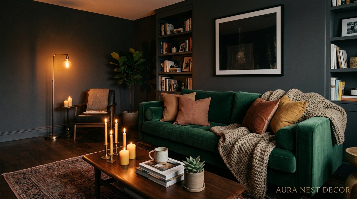
Why Dark and Moody Living Rooms Are Outperforming Every “Light and Bright” Space on Pinterest Right Now
You know that feeling when you walk into a room and something in your chest just… settles? Not a bright white room. A dark one. Deep green walls, low lamplight, the smell of something warm. That’s what we’re chasing.
—
1. The Moment Everyone Stopped Wanting Bright White Walls
It happened gradually, then all at once. For years, every Pinterest board, every Rightmove listing photo, every home staging guru told us the same thing — light walls, open plan, maximize the light. And honestly? It worked. Until it didn’t.
People got tired. Not tired in a dramatic way, more like… quietly over it. Because here’s the thing about a bright white living room: it asks something of you. It wants to look clean. It wants to look curated. It needs afternoon light to do its job, and the second the sun moves behind a cloud — especially in the UK, where that happens approximately every 12 minutes — the whole room just feels cold and a bit sad.
Dark rooms don’t do that. A room painted in deep charcoal or forest green or inky navy actually looks BETTER on a gray Tuesday afternoon. The contrast disappears. The room just becomes itself.
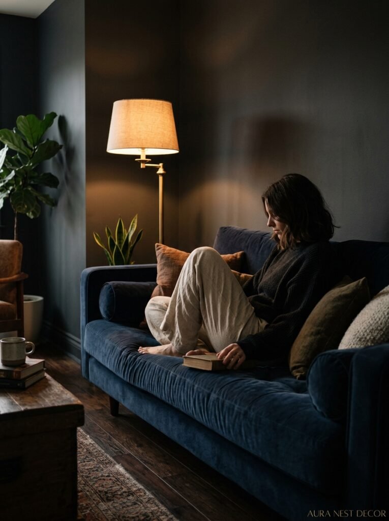
I think that’s why the shift happened. People started nesting properly again, wanting rooms that felt private and sheltered instead of showroom-ready. A moody living room doesn’t perform. It just exists, warmly, and lets you exist in it too.
“A bright white room asks you to perform in it. A dark room lets you just be.”
—
2. The Paint Colors That Actually Work (Not Just the Ones That Look Good in Photos)
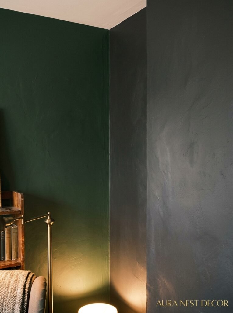
Here’s where I’ll save you some pain. Because there is a significant difference between a dark paint color that photographs beautifully and one that actually lives beautifully.
The ones that work in real life tend to have warmth in them. Not necessarily brown, but warmth. Farrow & Ball’s Hague Blue has that slight green undertone that keeps it from feeling like a basement. Benjamin Moore’s Black Forest is deeper than it sounds but never reads as flat because of the slight olive in it. Sherwin-Williams Urbane Bronze is having an absolute moment and for good reason — it shifts from brown to gray to almost green depending on the light, which means your room never quite looks the same twice.
Colors to approach with caution: anything that reads purely cool and dark. Pure charcoal, pure slate, pure navy with no undertone at all. These can work brilliantly with the right lighting, but in a north-facing room in February, they can tip from moody-beautiful into actually-depressing. There’s a line, and you’ll know when you’ve crossed it because you’ll feel vaguely anxious in your own living room.
Sample on large pieces of card, not tiny swatches. Move them around. Look at them at 7pm under your actual lights. That’s the real test.
—
3. The Light Source Doing More Work Than Your Paint Color
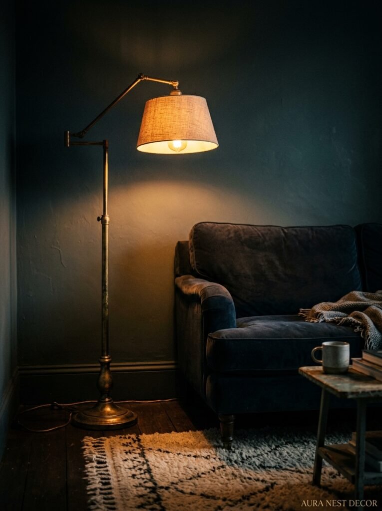
This might be controversial but I genuinely believe lighting matters more than the wall color when you’re going dark. Like, significantly more.
Overhead lighting in a dark room is almost always a mistake. It pushes light straight down, which creates this flat wash over everything and makes dark walls look heavy and suffocating instead of rich and enveloping. Switch it off. Or, if you can’t wire in something different, at least get a dimmer on it and treat it as the thing you use only when you’re searching for something you dropped.
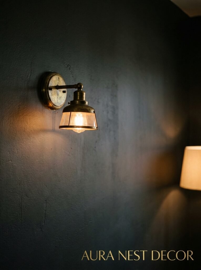
What you want instead is low light. Lots of it, scattered around the room at different heights. Table lamps with warm bulbs (2700K or lower — not daylight bulbs, please, not in a moody room). Floor lamps tucked into corners. Candles, obviously, but also those little rechargeable LED candles if you have kids or pets or both. A lamp on a low side table behind a sofa.
The goal is layers. You want some parts of the room slightly in shadow. That’s not a failure of lighting, that IS the lighting. Dark rooms don’t need to be fully illuminated, they need to be warmly punctuated.
—
4. Why Velvet Is Still the Right Call (and When It Starts Looking Wrong)
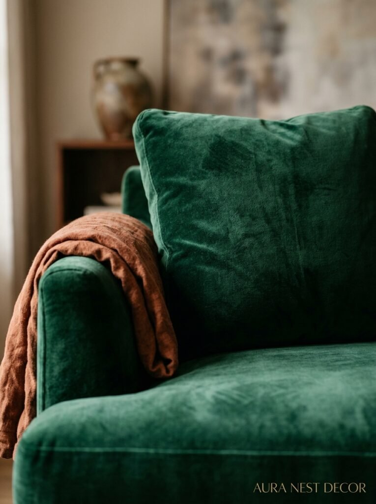
Velvet in a dark living room is one of those combinations that sounds slightly overdone until you’re actually sitting in it, and then it just makes complete sense.
The reason velvet works so well in moody rooms is the way it behaves with light. It absorbs and reflects simultaneously — press the pile one way and it looks almost black, catch it at an angle and it glows. In a room that’s already playing with shadow and lamplight, that quality becomes part of the atmosphere rather than just a furniture choice.
Jewel tones are the obvious move. Emerald, sapphire, deep rust, burgundy. But don’t ignore the more unexpected ones — a dusty mauve velvet sofa against a near-black wall is one of the better things you can do in a living room right now. Or a deep teal against warm charcoal, which sounds like it shouldn’t work and absolutely does.
When does velvet go wrong? When there’s too much of it in too many competing textures. A velvet sofa, velvet cushions, velvet curtains — that’s a lot of the same thing. Break it up with something rough, something natural. A jute rug. A linen throw. Raw wood somewhere. The contrast is what makes the velvet sing rather than smother.
“Velvet in a dark room doesn’t just sit there — it actually moves with the light.”
—
5. The Furniture Mistake That Kills the Mood Immediately
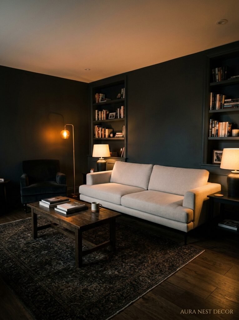
You’ve painted the walls dark. You’ve sorted the lighting. And then you put in a big pale beige sofa and wonder why the room feels wrong.
This is the most common mistake I see and it’s so fixable. Light furniture in a dark room creates a thing designers call “spotlighting” — the eye goes straight to the pale piece and never quite settles. The room looks unfinished. Like the person was going for cozy and got halfway there.
This doesn’t mean everything in the room needs to be dark. It means the largest pieces — sofa, rug, curtains — need to either work WITH the darkness or contrast it very intentionally. A pale sofa can work if the curtains are heavy and the rug is deep and everything around it grounds the room. But you have to commit.
The pieces that consistently work: sofas in charcoal, forest green, rust, dark cognac leather. Rugs in black, warm terracotta, deep burgundy, faded antique tones. Coffee tables in dark wood or matte black metal. Side note — aged brass hardware and legs read BEAUTIFULLY in dark rooms. Don’t overlook that.
—
6. Ceiling and Trim: The Part Everyone Chickens Out On
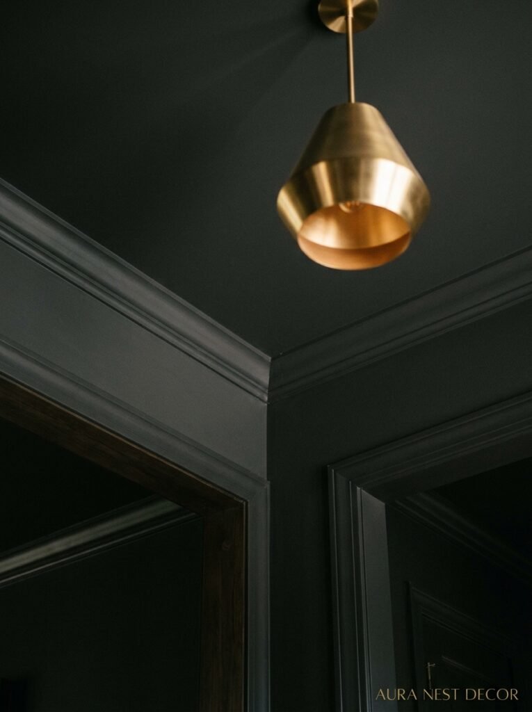
Most people paint the walls dark and leave the ceiling white, and most of the time they wish they hadn’t.
A white ceiling in a dark room draws the eye upward and creates a visual horizon. The room starts to feel like a box with a lid on it rather than an enveloping space. And the trim — those white skirtings and cornices — they pop out of the dark walls in a way that says “I wasn’t totally sure about this” more loudly than anything else in the room.
The move is to take the dark color onto the ceiling too. Or at least go a shade or two lighter on the ceiling with the same undertone. And paint the trim either the same color as the walls or in a slightly deeper shade. Yes, really. When trim disappears into the wall color, something magical happens to the proportions of the room. Everything feels intentional. Considered. Like the room was designed rather than just decorated.
I know it’s scary. It goes against decades of “bright white ceilings make rooms feel larger.” But in a dark room, a dark ceiling makes it feel INTENTIONAL rather than just tall. There’s a difference.
—
7. The Plants That Belong in a Dark Room (Most Don’t Survive It)
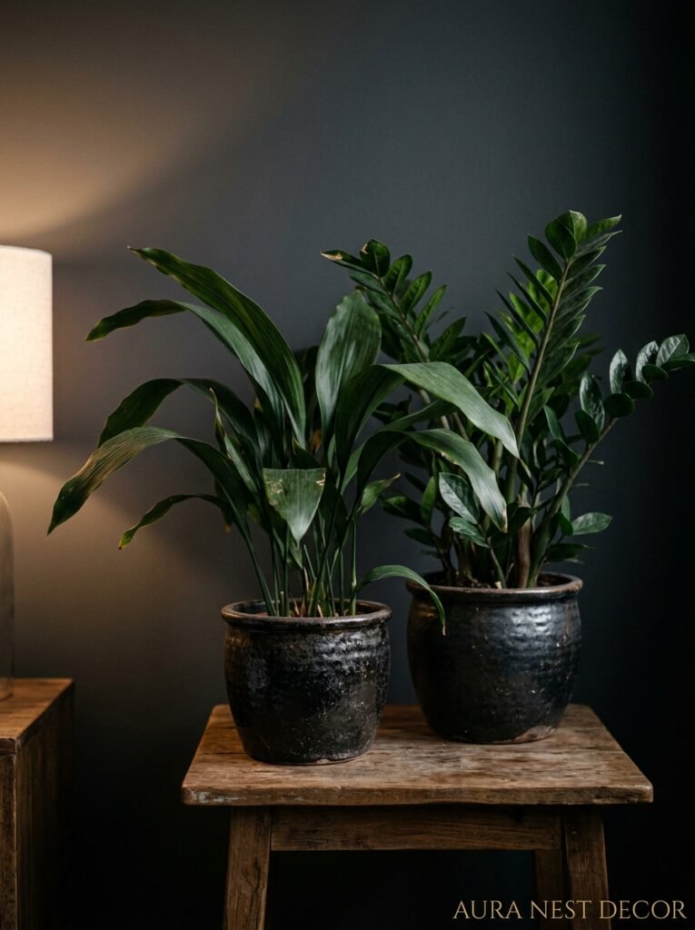
Okay, real talk — not every plant is going to make it in a dark living room, and I’ve killed enough of them to speak from experience.
The temptation is to go big and leafy, because plants add so much life to a moody space. And they do. But you’ve got to choose the right ones or you’re just watching slow plant funerals from your velvet sofa.
The survivors: ZZ plants, which are basically unkillable in low light and have this incredible dark glossy leaf that looks almost sculptural. Cast iron plants — the name is the clue. Snake plants, which everyone already knows about but genuinely thrive in dark rooms and look architectural in a corner. Pothos will trail from a high shelf and live happily in fairly low light, and there’s something about a trailing green plant in a dark room that feels specifically right.
The ones that won’t last: most ferns, anything variegated, most flowering plants, fiddle leaf figs (they want light, a consistent temperature, and apparently emotional support). If you’re attached to a high-light plant, put it near whatever natural light exists and put your low-light plants further in.
“A ZZ plant in a dark corner doesn’t just survive. It thrives, and it looks like it was born for exactly that spot.”
—
8. How to Layer Texture Without Making the Room Look Like a Cave
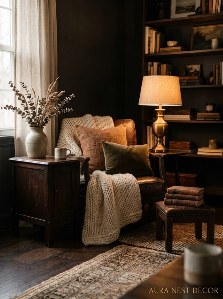
Here’s the thing about dark rooms — texture is doing the heavy lifting that light usually does. In a bright room, light bounces off everything and creates visual interest automatically. In a dark room, you have to BUILD that interest through surface variation.
What does that mean practically? It means mixing materials deliberately. Matte walls with glossy books on shelves. Rough linen cushions against smooth velvet upholstery. A chunky knit throw over the arm of a leather chair. Polished brass next to unfinished wood.
Gallery walls work exceptionally well in dark rooms — and this is where dark spaces actually have an ADVANTAGE over light ones. Artwork pops off a dark wall in a way it simply doesn’t against white. Lean into it. Mix frames — some gold, some dark wood, some black. Mix the art itself. Old prints, mirrors, pressed botanicals, abstract pieces. The wall becomes a collection rather than a display.
Mirrors are non-negotiable. Not to “add light,” which is the usual advice — in a dark room you’re not really chasing more light. Mirrors add depth. They create the impression that the room continues, which keeps the space from ever feeling closed in.
—
9. The Dark Living Room That Works in a Small Space (It’s More Doable Than You Think)
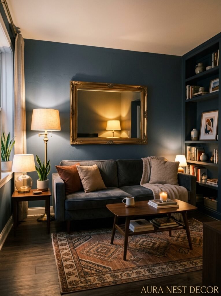
Every article about dark rooms has that one disclaimer buried somewhere: “of course, this works best in larger spaces.” And I want to argue against that quite strongly.
Small dark rooms can be INCREDIBLE. The reason people assume small rooms need to be light is that light walls visually push the walls back, making a space feel larger. True. But there’s another way to make a small room feel good: make it feel complete. Intentional. Cozy on purpose rather than accidentally cramped.
A small living room painted in deep green with low lighting and furniture scaled to the space doesn’t feel like a big room pretending to be something it isn’t. It feels like a jewel box. And that’s so much better.
The rules in a small dark space are slightly different. Keep furniture legs visible — pieces that lift off the floor keep the room from feeling heavy. Use one large rug rather than multiple smaller ones (a rug that ends awkwardly before the walls is worse in a dark room than a light one). And be ruthless about clutter. A dark room with visual clutter tips fast into chaos. A dark room with thoughtful, edited objects feels curated and intentional.
—
10. What Scandi Designers Got Right About Darkness (That We Kept Missing)

Scandinavia has been doing dark interiors for decades, and we kept looking at the photos thinking it was about minimalism and pale wood. But that was never actually it.
What Scandinavian designers understood was that winter isn’t a problem to be solved by making rooms brighter. Trying to fight darkness with bright white walls in a country that gets six hours of sunlight in December is… kind of futile. So instead, they worked WITH the dark. They made interiors that were meant for candlelight, meant for low lamps, meant for sitting close together with heavy blankets.
The hygge concept isn’t really about throws and hot chocolate, or not just about that. It’s about creating spaces that make the dark feel safe rather than bleak. And that’s what a well-done dark living room does in any country. In the UK, where gray skies are a personality, a room that fights the outside light looks sad. A room that embraces it looks brilliant.
—
11. The Color Combinations That’ll Make Your Dark Room Look Designed, Not Just Dark
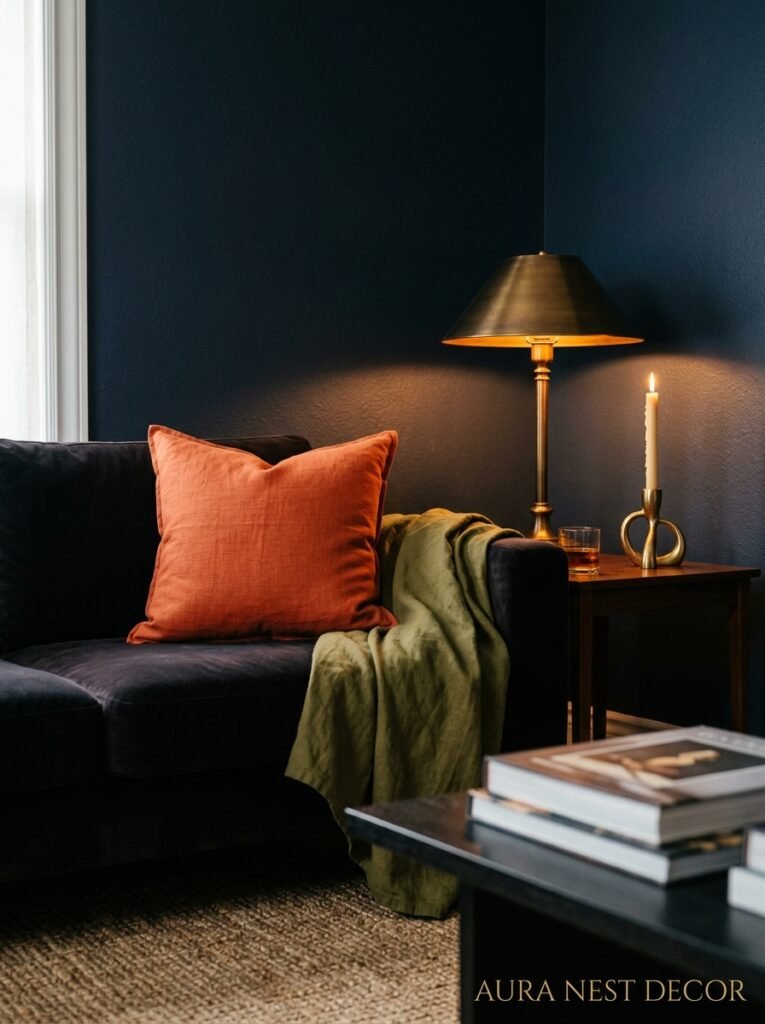
There’s dark, and then there’s dark DONE WELL. The difference usually comes down to the secondary colors in the room.
Forest green walls with warm brass, natural wood, and deep cognac leather. That combination is almost impossible to get wrong. The warmth in the brass and leather stops the green from going cold, and the natural wood grounds everything.
Deep navy with terracotta and off-white linen — not bright white, off-white. This reads coastal-meets-moody and it’s surprisingly fresh. The terracotta warms the navy from going corporate.
Charcoal with blush pink is a combination that sounds like it belongs in 2017 but continues to work because the contrast is so good. The pink keeps charcoal from feeling heavy. Use it in small doses — a single armchair, a couple of cushions.
Dark plum or aubergine with gold and cream is maximalist in the best way. Don’t use it if you’re a minimalist. If you’re not, go for it without apology.
—
12. The One Thing That Makes a Dark Room Feel Neglected vs. Considered
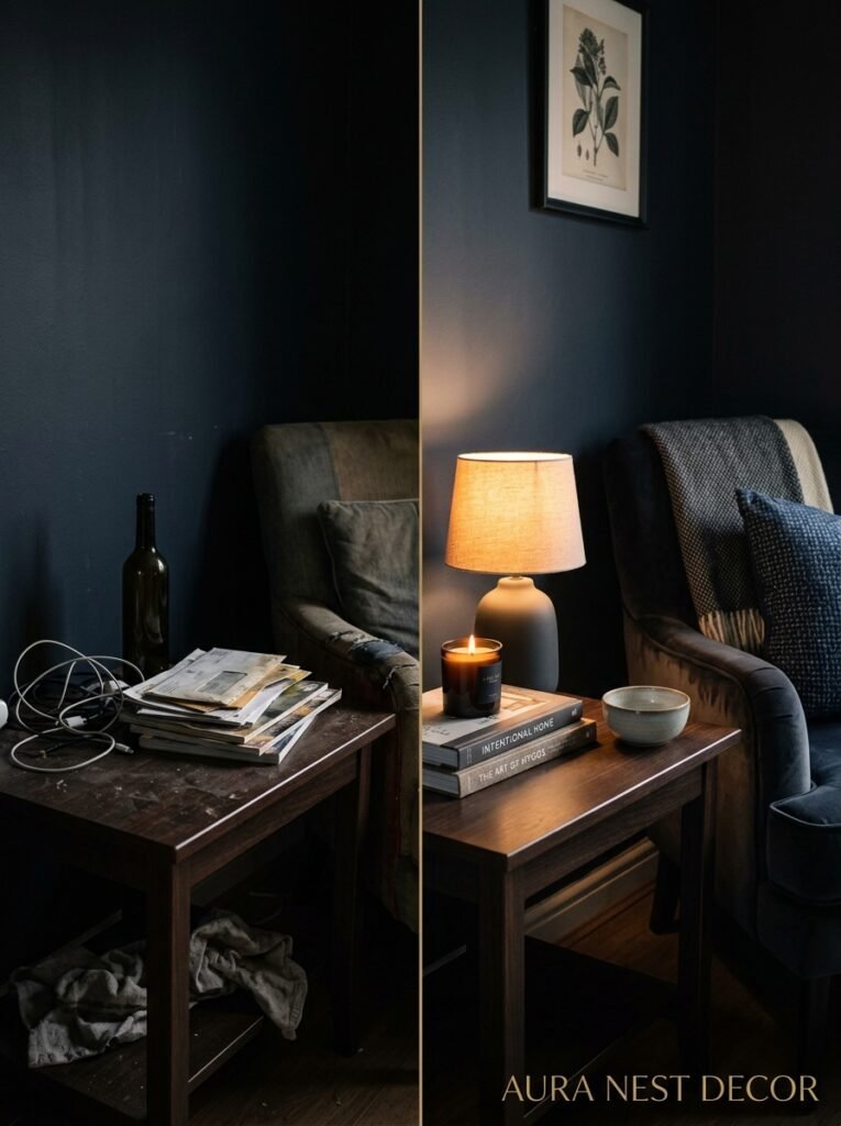
I’ve been in dark living rooms that felt rich and intimate, and dark living rooms that felt neglected. The difference wasn’t the paint color or the furniture. It was the details.
Scent. I know that sounds like a bonus but it’s not. A dark room that smells like nothing feels like a room that hasn’t been used. A dark room with a single candle burning or a diffuser with something woody — cedar, sandalwood, vetiver — feels inhabited. Alive.
The state of the textiles. Dark rooms are unforgiving about worn-out cushions, bobbled throws, tired rugs. In a bright room, you might not notice. In a dark room, with low lamplight picking out every surface, a cushion that’s seen better days reads LOUDLY. Invest in fewer better things rather than more average things.
And honestly — books. Not styled books, just books. Actual books you’ve actually read, stacked and shelved and slightly untidy. Nothing makes a dark living room feel more like a real lived-in home and less like a set. That’s the goal, isn’t it? Not a room that looks good in a photo, but a room that feels good to be in at 9pm on a Wednesday in November.
That’s the whole point.
—
❓ FAQ
Q: Will a dark living room make my home harder to sell? A: It can, but only if it’s done poorly or the buyer has no imagination — which, fair enough, many don’t. The practical answer is that dark rooms photograph beautifully with good lighting, and a well-styled dark room tends to stand out in listings. If you’re selling soon, lean toward the more versatile dark shades like deep green or warm charcoal rather than anything ultra-specific.
Q: Can I do a dark living room if my space doesn’t get much natural light? A: Yes, and this might actually work in your favor. Rooms with little natural light often look their worst when painted pale, because there isn’t enough sun to make the walls glow. A dark color removes the expectation of brightness entirely, and with thoughtful artificial lighting, a low-light room can feel incredibly warm and intentional.
Q: How dark is too dark? A: It’s less about the depth of the color and more about the undertones and the lighting. A near-black green with warm lighting can feel extraordinary. A mid-gray with cool lighting can feel oppressive. Trust your gut — if standing in the room makes you feel vaguely anxious rather than settled, the lighting probably needs work before you blame the paint.
—
💭 Final Thoughts
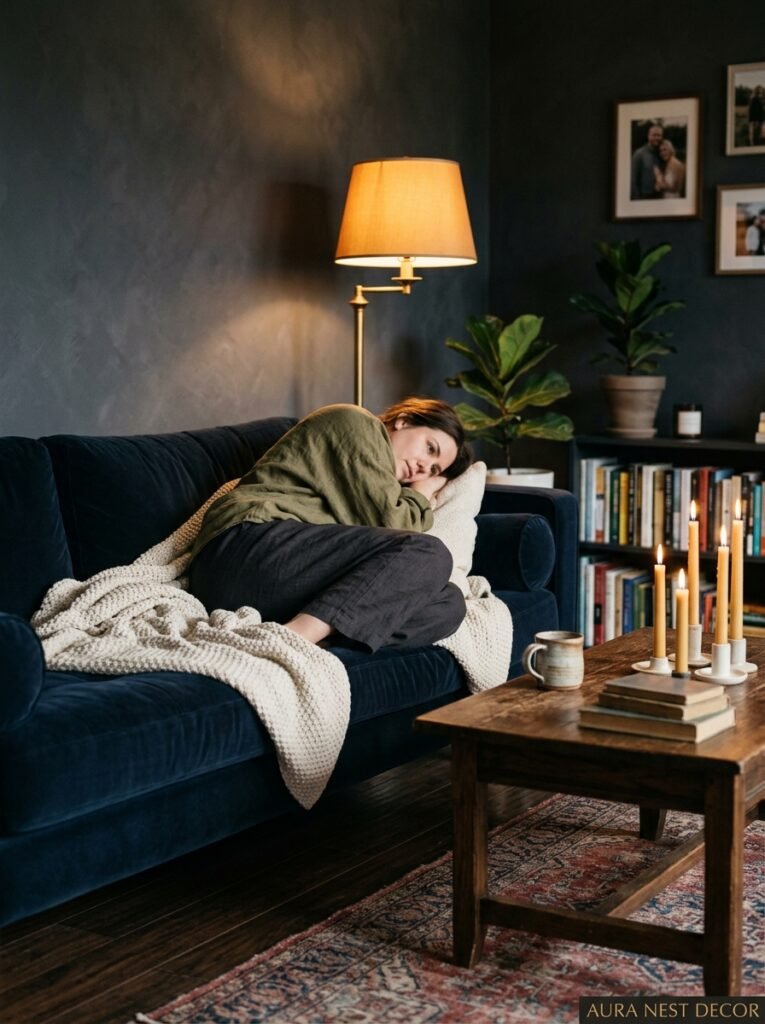
Dark and moody living rooms aren’t a trend that’s going to date the way chevron wallpaper did. They’re a response to something people actually feel — a need for rooms that hold you rather than perform at you. Get the lighting right, commit to the color, don’t chicken out on the ceiling, and the room will do the rest.
Your living room is where you end the day. Shouldn’t it feel like somewhere you actually want to be?




