
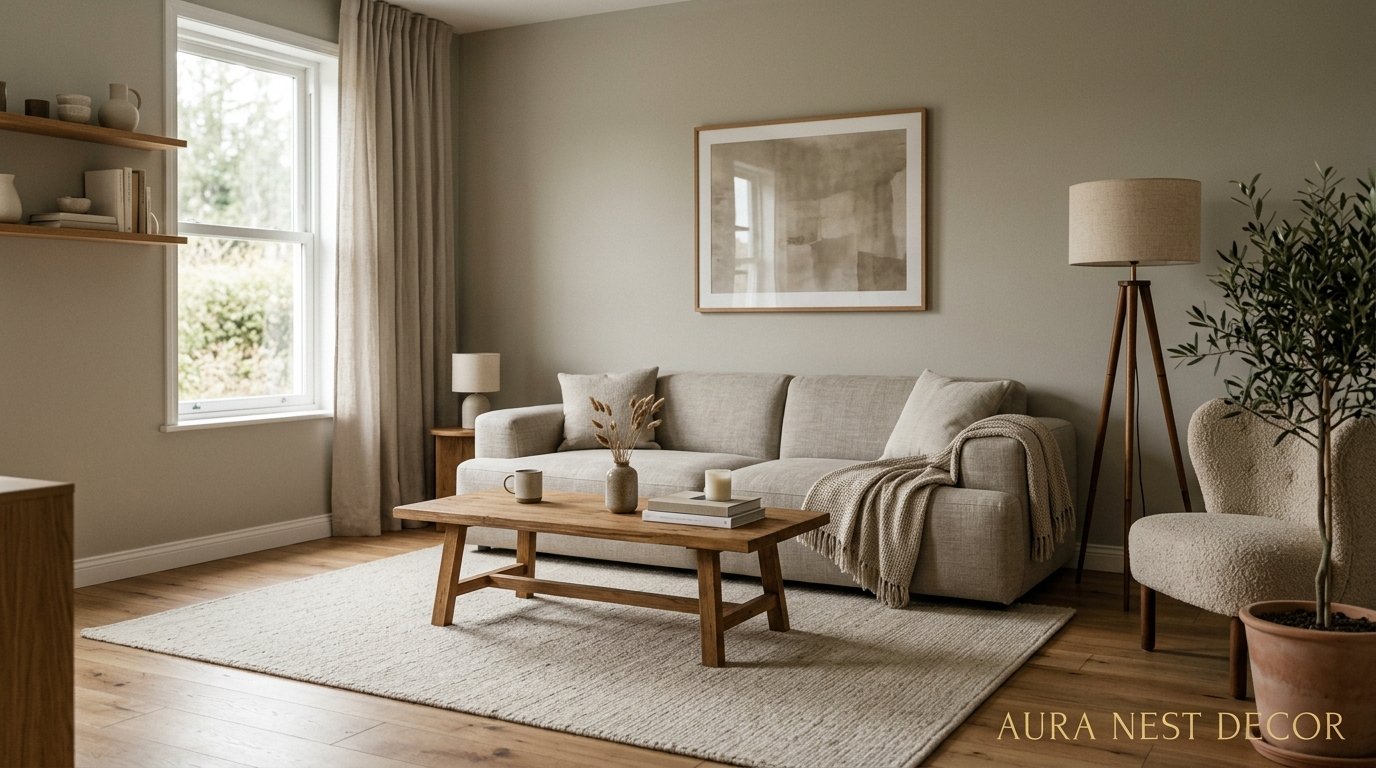
The Living Room That Finally Stopped Trying So Hard (And Looked Better For It)
You walk into a room and just… breathe. Nothing’s competing for your attention. Nothing’s fighting to be noticed. That’s the thing about modern minimalist living rooms that nobody really talks about — it’s not a style, it’s a feeling.
—
1. Why Your Living Room Feels Cluttered Even When It’s “Tidy”
Here’s the thing most people don’t realize: clutter isn’t always physical. You can have a room with twelve throw pillows and zero dishes on the floor and it still FEELS overwhelming. Because visual noise is a thing, and most of us have been sold a version of “cozy” that actually just means “full.”
Modern minimalism isn’t about cold white rooms with one chair and a single sad plant. That’s a caricature. What it actually means is that every object in the space earns its place — and the stuff that doesn’t earn it? Gone. Or at least, somewhere else.
I went through this with my own living room a while back. I had good individual pieces — a nice lamp, a decent sofa, some prints I genuinely loved. But together they were just… noise. The room had no breathing room. No rest for the eye.
The shift happened when I stopped asking “what can I add?” and started asking “what can I take away?” That’s the actual foundation of this whole aesthetic, and it sounds obvious until you try it and realize how deeply uncomfortable subtraction makes most of us. We’re wired to add. Removing things feels like failure, somehow.
It’s not.
“Minimalism isn’t about living with less — it’s about living with only what actually matters in that room.”
2. The One Furniture Rule That Changes Everything About Scale
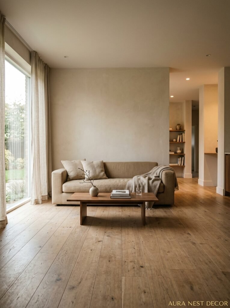
Scale is the word nobody says out loud but everyone can feel. A sofa that’s too big for a room doesn’t just look wrong — it PRESSES on you. Same with a coffee table that’s too small, floating awkwardly in the middle of a large space like it’s apologizing for existing.
Modern minimalist spaces tend to get scale right, and I think that’s actually most of the magic.
So here’s the rule I keep coming back to: pick one large anchor piece per zone and let it be large. Genuinely large. A wide, low sofa. A substantial coffee table. A credenza that actually holds its own against the wall. Then build around it with space, not with other furniture.
Most living rooms in the UK and US are trying to fit three zones into one room — seating, storage, display — and the result is everything competing at the same visual weight. When you commit to one big anchor and strip back the rest, the room suddenly reads as intentional rather than stuffed.
Don’t be scared of the empty corners. Seriously, don’t fill them. An empty corner in a well-considered room isn’t a mistake — it’s a rest stop. Your eye gets to pause there and that pause is what makes the rest of the room feel calm rather than frantic.
3. The Color That Keeps Showing Up in Every Beautiful Minimalist Living Room Right Now

Not white. Well, not JUST white.
The palette that’s everywhere right now is what I’d describe as “warm nothing” — creamy off-whites, soft stone, putty, clay, that specific shade of greige that somehow looks expensive in every single light condition. These colors don’t shout. They don’t even whisper, really. They just exist, and they make everything in the room look better by not competing with any of it.
The key distinction — and this matters a lot — is that warm neutrals and cold neutrals do completely different things to a room. A cool grey-white can feel clinical and flat, especially in British homes that don’t get a huge amount of natural light. But a warm linen tone? It glows. At 11am it looks bright and clean. By 7pm with a lamp on it looks like the inside of a very good candle.
That transformation is the whole game.
If you’re starting from scratch, I’d say pick your wall color last, not first. Get your sofa fabric, your rug, your main textile — then pull the wall color from the lightest tone in that mix. It’s backwards from how most people approach it and it works SO much better.
4. Texture Is Doing All the Heavy Lifting Here (And You Might Be Underusing It)
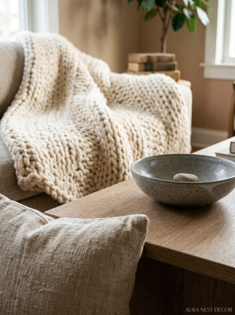
When you strip color and pattern back, texture becomes everything. This is one of those things that’s genuinely hard to photograph, which is maybe why it doesn’t get talked about enough on Pinterest. But walk into a well-executed minimalist room and you’ll feel it before you can name it.
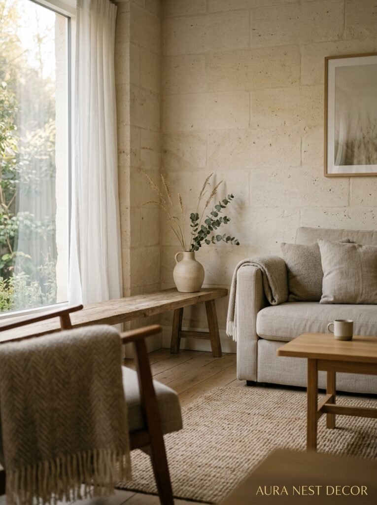
Linen cushions. A chunky knit throw that has actual weight to it. A jute rug with that slightly rough, satisfying feeling underfoot. A matte ceramic vase next to a slightly glossy side table. It’s all quiet, but it’s not flat.
“A neutral room without texture is just a beige box. Texture is what makes restraint feel rich.”
The mix I keep seeing done well: one rough element, one soft element, one hard smooth element — all in the same corner, all in the same color family. A linen cushion, a chunky knit blanket, a stone or concrete side table. The COLORS are basically identical. The textures are miles apart. And that contrast is what makes the whole thing feel curated rather than boring.
Side note — if you’ve been relying on pattern to add interest to a room, texture is the upgrade. Pattern dates. Texture doesn’t.
5. The Lighting Setup Nobody Talks About But Every Good Room Has
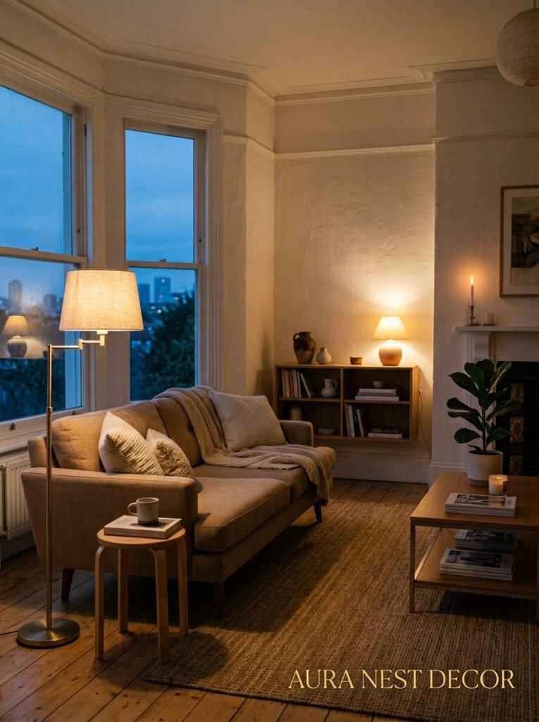
Overhead lighting in living rooms is almost always a mistake. There. I said it.
The ceiling fixture that came with your flat or house — the one in the middle of the room — it’s working against you. Central overhead lighting flattens everything, kills shadows, and makes a room feel like an office waiting area. Or a car park. Neither of which is the vibe.
Modern minimalist spaces rely almost entirely on layered low lighting. Table lamps at sitting height. A floor lamp in a corner. Maybe one piece of directed lighting like a wall-mounted spot aimed at something you love. The amber glow of an Edison bulb at 7pm does more for a room than any furniture choice you’ll make.
In practice, this means you need more lamps than you think. Three is the minimum for most living rooms. Four is better. And they don’t all need to be on — part of the appeal is being able to light different parts of the room for different moods. Two lamps on, one off feels different from one lamp on, two off. You get to decide what the room feels like each evening.
This is genuinely one of the highest-impact, lowest-cost changes you can make, and most people are sitting in overhead light wondering why their lovely minimalist furniture doesn’t look as good as it does in photos.
6. The Art and Display Rule That Keeps Things From Feeling Sterile
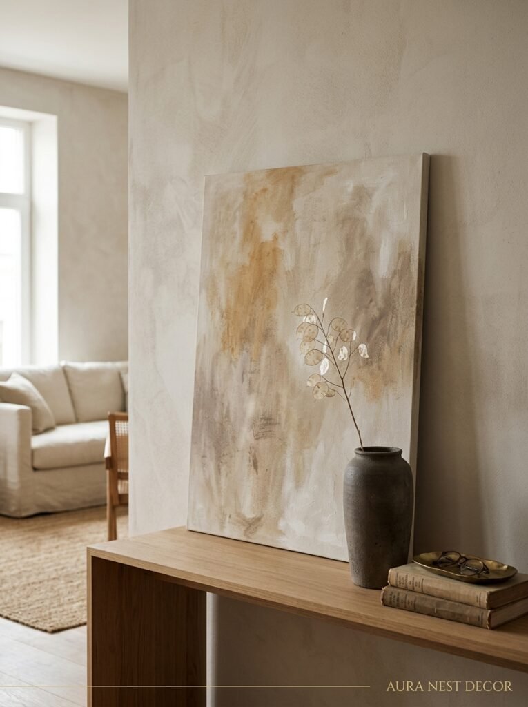
One of the most common complaints about minimalist rooms is that they feel cold. Like a showroom, or worse, like nobody actually lives there. And I get it — I’ve been in spaces like that and they’re not comfortable to be in.
The fix isn’t adding more stuff. It’s being more specific about what’s already there.
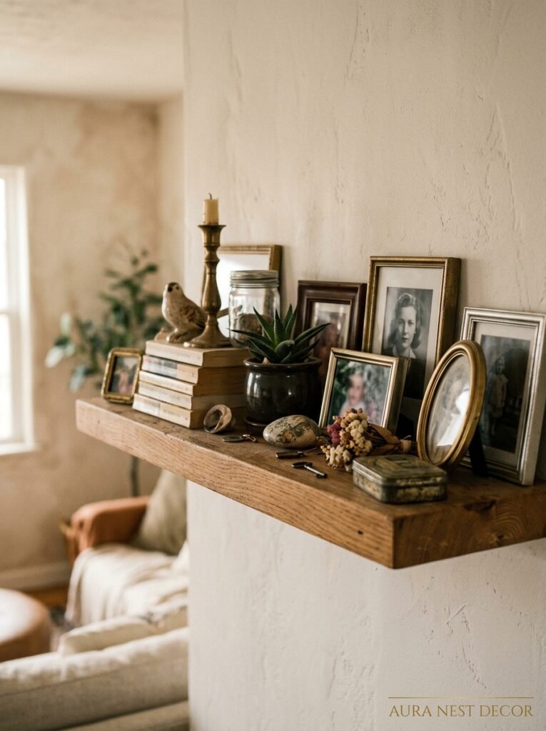
One piece of art hung correctly — actually at eye level, not where the previous owner left a nail — does more than a gallery wall of ten prints. One genuinely beautiful object on a shelf, with space around it, gets noticed. Ten objects on a shelf become wallpaper.
In terms of what to keep on display: the test I use is whether the object tells a story I actually want to tell. Not “is it pretty” (though that helps) but does it mean something? Did you bring it back from somewhere? Did someone you love make it? Is it just objectively interesting to look at?
Because a room with five deeply personal objects feels inhabited and warm in a way that a room with fifty generic “decor items” never will.
7. Why the Sofa Matters More Than Anything Else in the Room
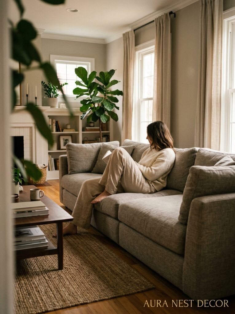
This is not a controversial opinion, but it deserves to be said clearly: the sofa is the room. Everything else is supporting cast.
In a minimalist living room especially, the sofa dominates both physically and visually. There’s less competing with it, so if it’s wrong — in scale, in color, in shape — the whole room is wrong. And if it’s right, honestly, the room is 70% of the way there before you’ve done anything else.
What I’d push people toward: lower profile, clean lines, legs that let you see the floor beneath (this makes the room feel bigger, always). Avoid anything with rolled arms or heavy tufting — that’s a different aesthetic and it fights against the cleaner shapes of modern minimalism. A three-seater in a warm bouclé or a slightly textured linen will serve you better than a flashier option in a material that doesn’t breathe.
“Buy the sofa like you’re buying the room. Because you are.”
Color-wise: I’m team warm grey or a soft natural here. Not white — too precious, too hard to live with if you have humans in your house. Not dark charcoal unless your room gets a huge amount of light. That middle ground of warm stone or oatmeal is where the long-term satisfaction lives.
8. Storage That Doesn’t Look Like Storage (This Is the Secret Nobody Tells You)
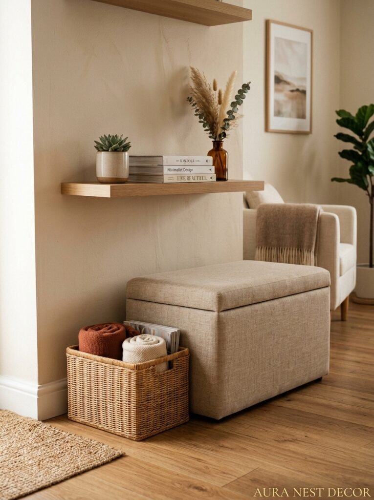
Modern minimalist rooms look effortless because the functional stuff is hidden. Not absent — hidden. There’s a difference.
Built-in shelving with closed lower cabinets. A low sideboard with doors, not an open bookshelf. A sofa with under-seat storage. A coffee table with a drawer. All the visual work of a minimalist room happens above the surface, but below the surface there’s often more storage than you’d find in a more traditional space.
The method I’ve seen work best: dedicate one closed unit per room for all the visual noise — remotes, chargers, kids’ stuff, the three books you’ve been meaning to return, whatever. Keep it closed. When it opens, deal with it, but the default state of that door is shut.
In UK living rooms especially, where space is often tighter, this becomes even more important. You can’t afford to let storage become display. The room’s too small for that tension to resolve happily. Everything gets a home, most homes have doors, and the room stays calm because the visual field isn’t competing with the functional reality of actual life.
9. Plants — How Many Is Actually Right
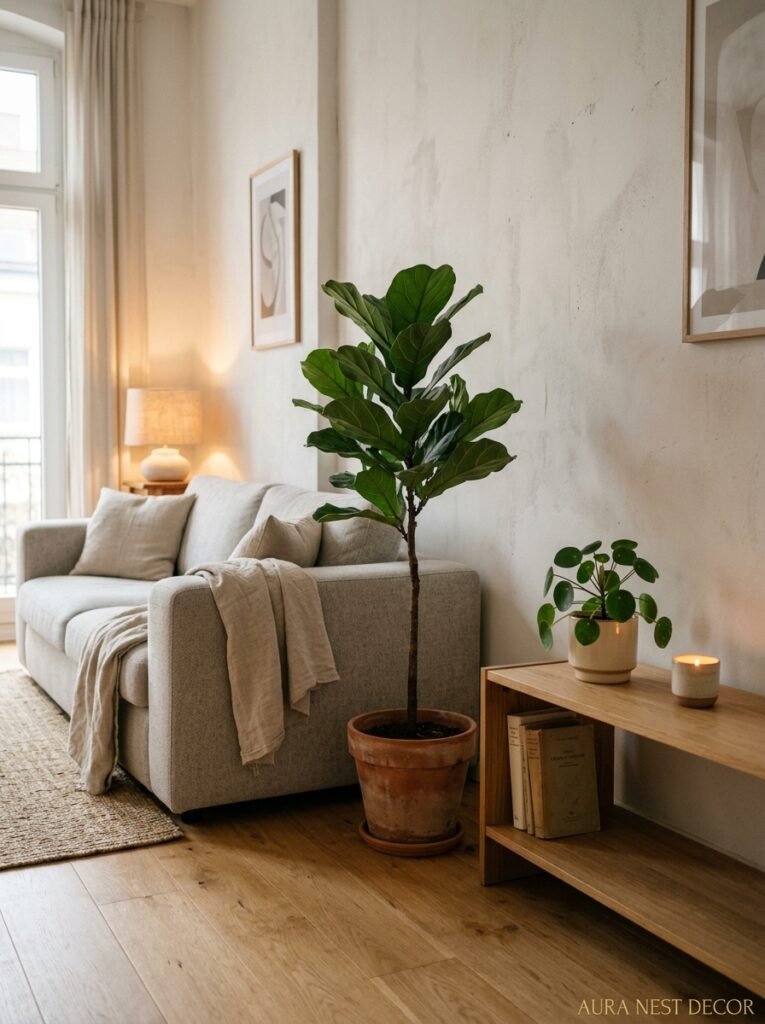
Not a jungle. Not zero. This is a question I get asked genuinely often, and I think the answer most people want is “as many as possible” but the honest answer is more like two or three, placed deliberately.
One large-scale plant — a fiddle leaf fig, a monstera, something with genuine presence — in a corner that needs height. Maybe one smaller trailing plant on a shelf, if you have one that’s not too crowded. That’s kind of it. The plant-as-texture thing only works when there’s space around the plant to appreciate its actual shape.
Too many plants, even beautiful ones, tips a minimalist room back toward busy. You stop seeing the plants individually and start just seeing “plant zone.” Which isn’t the point.
Also — and this is slightly tangential but worth saying — the pot matters as much as the plant. A gorgeous fiddle leaf in a plastic nursery pot looks terrible. A simple, matte ceramic pot in a warm neutral makes the same plant look like it was always supposed to be there.
10. The Rug That Will Make or Break the Whole Floor Plan
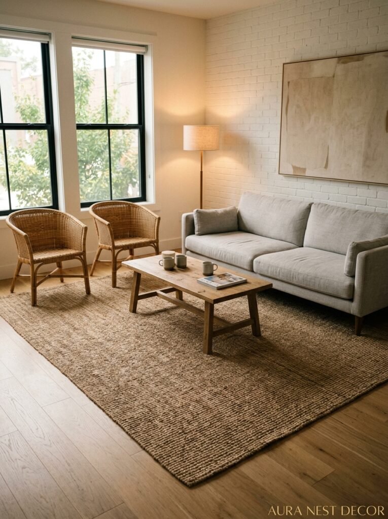
Wrong rug size is probably the single most common mistake in every living room, minimalist or otherwise. Too small, and the furniture floats on a sea of floor with a little rug island in the middle. Odd. Disconnected. Like furniture waiting to be moved somewhere.
In a modern minimalist room, the rug is defining the space. It’s drawing the boundary of the seating zone, and all the furniture should sit either on it or right at its edge. The front legs of the sofa, at minimum, should be on the rug. Ideally, more of it.
Go larger than you think. Genuinely. The most common rug advice I give is to size up one from wherever your gut lands.
Material for minimalist rooms: flat-weave for a cleaner, more graphic look; low-pile wool for warmth without fussiness; jute for that layered, natural thing (though it’s not great in high-traffic zones, it gets a bit grim). Avoid anything with a loud pattern — the rug’s job is to ground the room, not compete with it.
11. The One Thing British Homes Get Right That American Homes Often Don’t
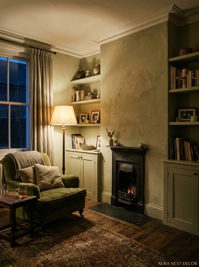
This is a slightly bold thing to say but I’m going to say it: older British homes often have original architectural details — cornicing, picture rails, fireplaces, bay windows — that give a minimalist approach something genuinely beautiful to work with.
The homes that do this best lean into those details rather than trying to modernize them away. A clean, sparse modern room with original 1930s cornicing is more interesting than the same room without it. The contrast between the architectural history and the contemporary restraint of the furniture creates something that’s NEITHER purely historic nor purely contemporary. It’s its own thing.
American homes, especially newer builds, often don’t have that kind of inherent detail to play against. The minimalist rooms that work best there tend to compensate with more considered material choices — the quality of the wood, the thickness of a door frame, the texture of a stone fireplace surround — because those are the things that give the room its character.
Both approaches can work. But they’re different problems, and they need different solutions.
12. The Last Thing to Add Is Actually the First Thing People Try to Add
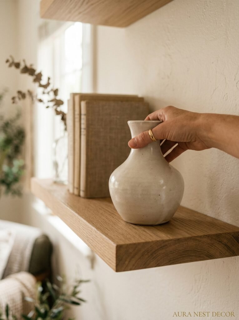
Accessories. The cushions, the candles, the small objects on surfaces.
Most people start here because it’s the easiest and least expensive entry point into decorating. But in a minimalist room, accessories are the LAST thing you add, once everything else is right. Because they’re supposed to finish a room, not furnish it.
If the bones aren’t there — wrong sofa, wrong rug, bad lighting — accessories just add more noise. More things for your eye to trip over without any sense of resolution.
When you do add them: less than you think. Three cushions on a sofa, not seven. Two objects on the coffee table, spaced with intention. One candle, a small plant, or one beautiful book on the side table — not all three. Let there be surface. Surface IS the aesthetic in a minimalist room.
The restraint is the point. And the restraint is genuinely hard to hold to when you’re standing in a home store and everything is beautiful and you want it all. But walk past it. Buy the one thing. Go home. See if the room needed it.
It usually didn’t.
—
❓ FAQ
Q: How do I make a minimalist living room feel warm, not cold? A: Warmth in a minimalist room comes from materials, not quantity. Linen, wool, wood, matte ceramics, warm-toned lighting — those things do the work that lots of objects would otherwise do. If your room feels cold, check your bulb temperature (you want warm white, around 2700K) before you add anything.
Q: Can a minimalist living room work if you have kids or pets? A: Honestly, yes — but you’re solving for “appears minimalist” rather than “is minimalist.” Closed storage becomes your best friend. A washable sofa cover or a slipcover in a natural fabric helps. The goal is that the room resets easily, not that it stays pristine constantly.
Q: What’s the biggest mistake people make when trying minimalist decor? A: Buying new things to look minimalist. Ironic, but common. The first step is always editing what you have — removing, not adding. Most rooms look significantly better with things taken out of them before a single new item is introduced.
—
💭 Final Thoughts
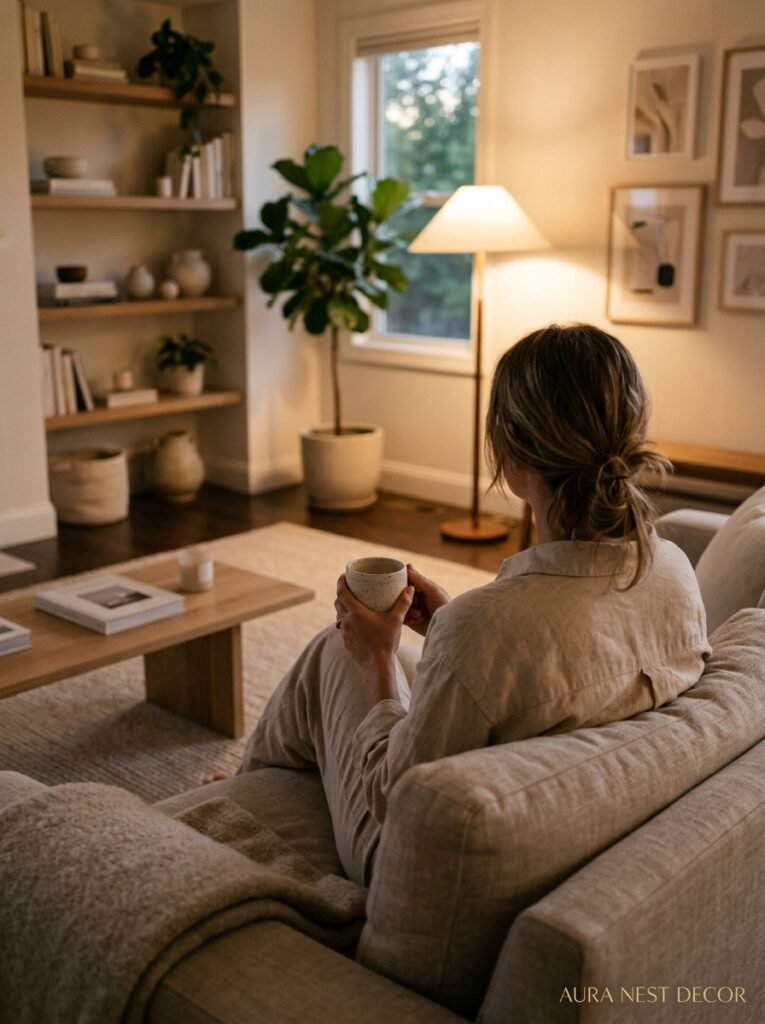
The best minimalist living rooms I’ve ever walked into don’t feel designed. They feel considered — like someone knew exactly what they wanted the room to feel like, and quietly removed everything standing in the way of that feeling. It’s not a trend that’s going to date badly, and it’s not about owning less in some virtue-signaling way. It’s just about being more intentional than the average furniture store wants you to be.
What would your living room feel like if you took one thing out of it today?




