
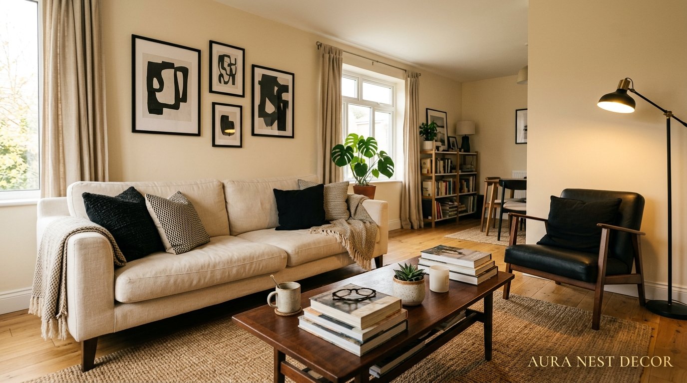
Cream and Black Living Room: The Contrast That Designers Can’t Stop Going Back To
There’s a moment when you walk into a cream and black living room and something just settles. Not dramatic. Not overwhelming. Just — right. And the longer you think about it, the more you realize this combination isn’t trending. It never really left.

—
1. Why This Color Combination Hits Different Than You’d Expect
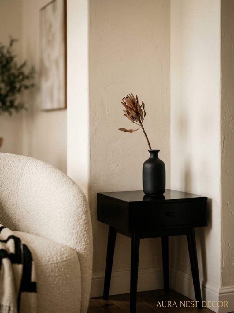
Most people assume cream and black is going to feel cold. Clinical, even. Like a showroom nobody actually lives in. But done right — and there’s definitely a right way — it’s one of the warmest, most inviting rooms you can walk into.
Here’s the thing: cream isn’t white. That sounds obvious but it genuinely changes everything. White has a sharpness to it. Cream absorbs warmth, especially natural light, and it glows in the evening in a way that white walls just don’t. It’s the difference between a room that looks good in photos and a room that makes people want to take their shoes off and stay.
Black does the work that most people are scared to let it do. It grounds the space. It keeps the cream from going soft and forgettable. And when you put them together — against natural linen, warm wood, textured plaster — you get a room that feels considered. Like someone actually thought about it, not just painted everything greige and called it neutral.
I think the reason it works so well is contrast, sure, but more specifically it’s about confidence. Cream and black together don’t apologize for themselves. And rooms that don’t apologize? Those are the ones people can’t stop pinning.
“Cream isn’t white. That distinction changes every single decision you’ll make in this room.”
—
2. The Sofa Question That Trips Everyone Up First
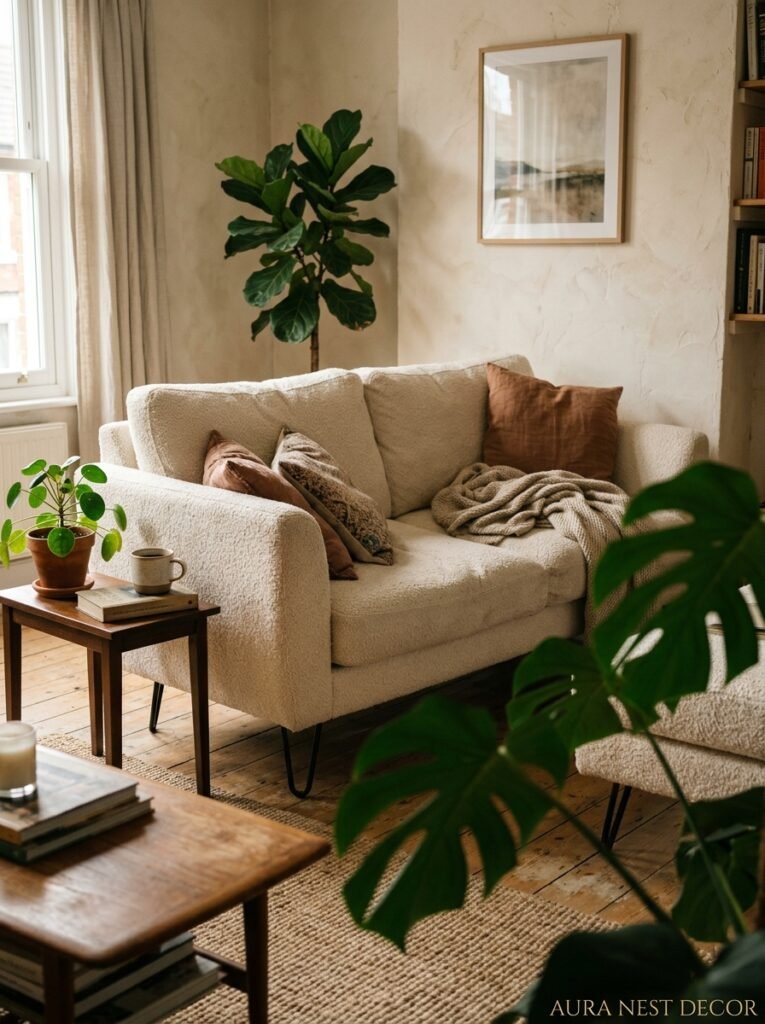
Should the sofa be cream or black? It’s the first question and honestly, it matters more than people think.
A cream sofa is a commitment. Not a scary one, but a real one. It’s going to dictate almost everything else — your cushion choices, your rug, how often you’re reaching for that throw to cover a mysterious armrest smudge. But a cream linen or boucle sofa in a room with black accents is genuinely one of the most beautiful things I’ve ever seen in person. There’s a softness to it that no dark sofa can replicate.
A black sofa goes the other direction. It anchors the room hard. You get more visual weight in the lower half of the space, which can actually make ceilings feel higher by contrast — especially in rooms with cream or off-white walls. A black velvet sofa with cream-painted walls and warm brass fixtures? I mean. Come on.
There’s also the in-between option that a lot of designers default to: a sofa in a third neutral — oatmeal, warm grey, even a mushroom taupe — that lets the cream and black play out across other elements. Honestly, sometimes that’s the move that keeps the room from feeling like it’s trying too hard.
What I’d say is: pick the sofa based on your light, not your mood board. South-facing rooms can handle a black sofa without going dark. North-facing rooms almost always benefit from cream.
—
3. The Color That Keeps Showing Up in Every Beautiful Cream and Black Room Right Now
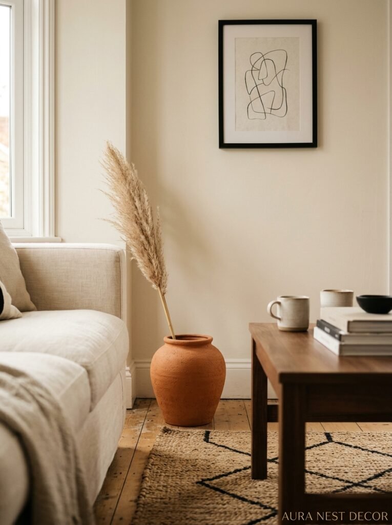
Warm wood. Every single time.
It’s not technically a third color, I know. But the tone of your wood — whether that’s a walnut coffee table, light oak floorboards, or a rattan side table — is doing an enormous amount of work in a cream and black room, and most people underestimate it.
Cool wood tones (think ashy, grey-washed, Scandi birch) push the whole room colder. The cream starts to look pale instead of warm, and the black starts to look harsh. Suddenly you’re in a room that feels very 2016 in a way that’s hard to put your finger on.
But warm, medium wood — walnut especially — pulls the whole thing together. It adds a third dimension, a hint of color that isn’t really a color, and it stops the cream-and-black from reading as graphic or stark. It’s the ingredient that makes the room feel lived in rather than designed.
Side note — if you’ve got an older home with honey-toned hardwood floors that you can’t change, this whole color scheme was practically made for you. Don’t sand them down. Don’t cover them with a pale rug. Let them be warm and work the rest of the room around them.
—
4. Texture Is Doing Most of the Heavy Lifting Here

Say you’ve got cream walls and a black coffee table. On paper that sounds fine. In practice, without texture, it can feel a little flat and a little sad.
Texture is what stops a cream and black room from looking like a mood board that never became a home. Chunky knit throws. Boucle cushions. A jute or sisal rug with a subtle weave. Linen curtains that pool just slightly at the floor. A ceramic vase with an uneven, handmade surface. A plaster lamp base. All of these things catch light differently at different times of day, and that variation is what creates warmth.
The mistake I see most often is people getting the colors right and then filling the room with smooth, shiny surfaces. Lacquered furniture, satin cushions, glossy picture frames. It looks great in a showroom. In a home, in the evening, it looks cold and a bit corporate.
You want the light to move differently across different surfaces. You want something matte next to something that has a slight sheen. You want something rough next to something that’s plush. That variety is what makes a room feel rich — not expensive, necessarily, just rich in the way that real, inhabited spaces feel.
“Texture isn’t a finishing touch. It’s the actual room. Everything else is just color.”
—
5. The One Rule That Makes a Tiny Living Room Feel Intentional, Not Cramped
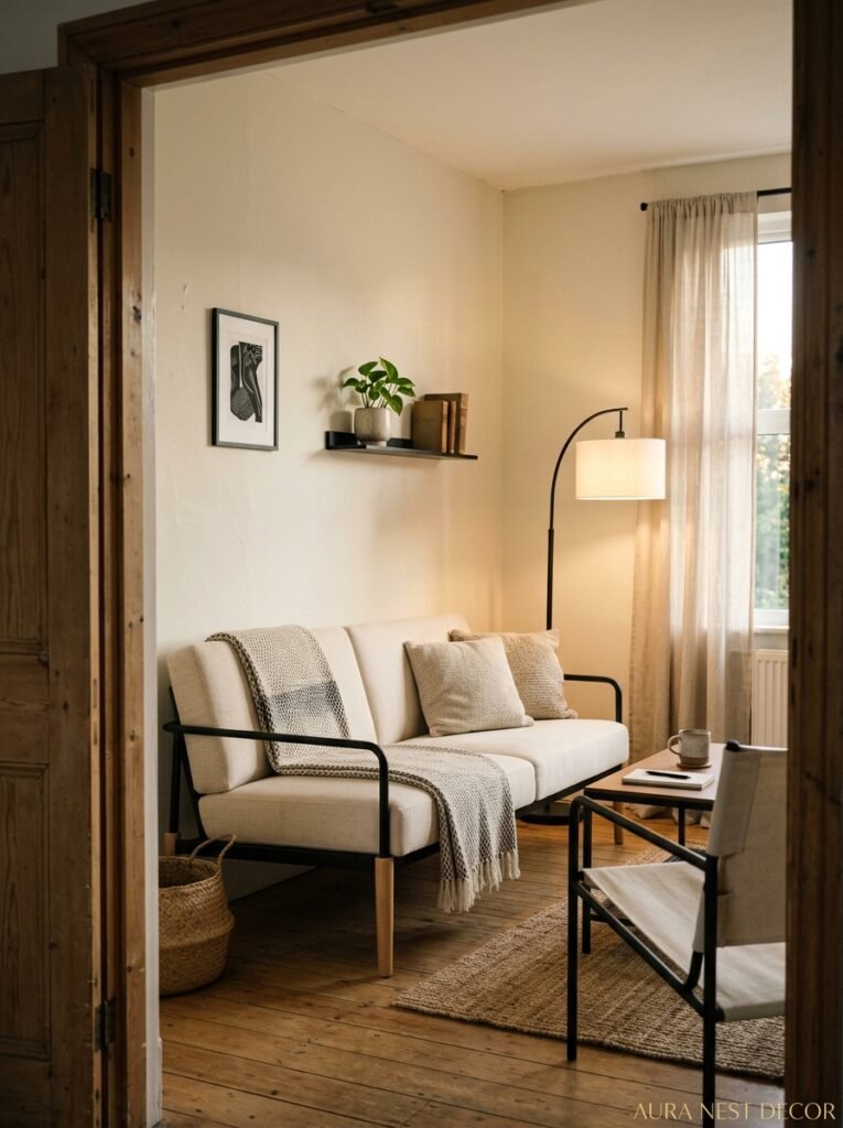
Small room, cream and black — people get nervous. They assume they should stick to all cream and add just tiny touches of black so it doesn’t overwhelm. I’d actually push back on that.
In a small room, being too timid with your contrast creates visual noise without resolution. The room feels like it’s trying to be calm but not quite getting there. Going bolder — more intentional with where the black lands — actually makes the space feel more purposeful.
One approach that works brilliantly in smaller UK terraces or American apartment living rooms: keep walls and large upholstery cream, but let the black go BIG in one concentrated place. A large black-framed mirror, floor to ceiling. A black fireplace surround. A single black shelving unit styled properly. The room reads as deliberate. And deliberate always feels bigger than hesitant.
Scale of pattern matters here too. In a small space, tiny black-and-cream patterns on cushions or rugs tend to vibrate visually and make rooms feel busier. Go for fewer, bigger, cleaner shapes. Less is genuinely more — not as a cliché, but because the eye needs somewhere to rest.
—
6. What British Homes Get Right About This Scheme That American Interiors Often Miss
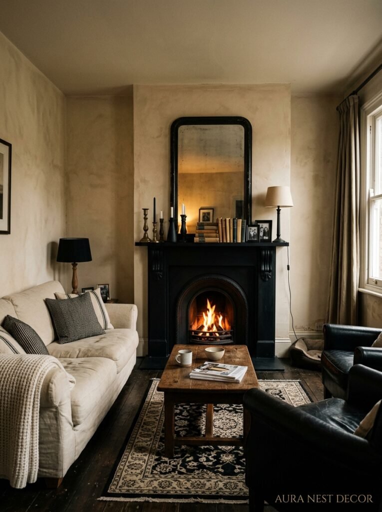
I’m going to generalise here, but bear with me.
British interiors — especially in older Victorian and Edwardian houses — have a natural relationship with cream and black. The original fireplaces are often black cast iron. The original coving and dado rails want to be cream or off-white. The proportions of the rooms, the ceiling heights, the deep skirting boards — they all lean INTO this palette in a way that feels almost architectural.
American interiors tend toward the warmer, the softer, the more informal. And that’s genuinely lovely. But what sometimes happens when Americans do cream and black is it ends up a little glossier than it needs to be. A little more graphic, a little more “magazine page” rather than “real home.”
The British instinct — intentional or not — is to mix in aged pieces. A scuffed leather armchair. An inherited lamp with a slightly yellowed shade. An old chest used as a coffee table. That patina is what keeps cream and black from looking like it’s trying to be a luxury hotel lobby.
So: if you want this palette to feel genuinely warm, age it. On purpose. Mix old and new. Don’t buy matching sets. Let something in the room be a bit battered and loved. That’s where the soul comes in.
—
7. The Lighting Setup That Makes Every Cream and Black Room Look Incredible
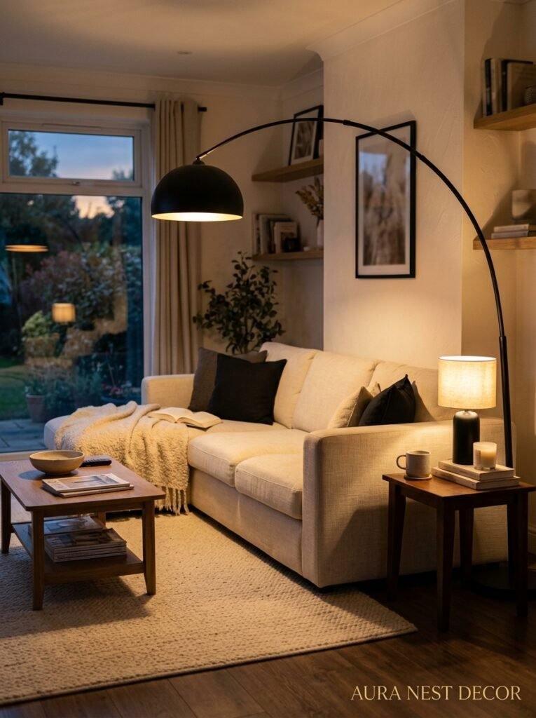
Overhead lighting alone will RUIN this palette. I can’t stress that enough.
A cream and black room under a single overhead ceiling light — especially a cool or neutral white bulb — looks flat, a bit interrogation-room-y, and the cream goes grey. The black goes dull. The whole reason you chose these colors disappears.
What you want instead is layered light at different heights. A floor lamp in the corner with a warm-toned bulb (2700K is the sweet spot, not warm enough to be yellow, not cool enough to be harsh). A table lamp on a side table. Maybe a small accent light behind a plant or inside a bookcase. The amber glow of an Edison bulb at 7pm in a cream and black room is honestly one of the better things in life.
Candles, too. I know it’s obvious, but cream walls by candlelight become something else entirely. It’s not interior design at that point, it’s atmosphere, and there’s a difference.
If you’ve got dimmable switches, use them. Set a daytime level and an evening level and don’t compromise between them. Bright during the day to keep the cream from going murky. Warm and low in the evening to make the whole room feel like it’s wrapping around you.
“Overhead lighting alone will ruin this palette. This is not a drill.”
—
8. The Prints and Artwork That Work — and the Ones That Don’t

Black and white photography. Always. If you’re building a cream and black room and you want artwork that’s a safe bet, black and white photography — whether framed in black frames or simple white matte borders — integrates so naturally it almost feels like cheating.
But here’s what I find more interesting: a cream and black room is an incredible backdrop for bold art. Because the room itself isn’t screaming for attention, a single large artwork in rich color — terracotta, forest green, deep rust — lands HARD and beautifully. It doesn’t fight the palette. It sings against it.
What doesn’t work as well: lots of small, colorful prints scattered around. They create visual chaos against the clean contrast of the room, and none of them get to be seen properly. Better to go fewer, bigger, bolder.
And frames matter enormously in this scheme. Black frames are the obvious choice and they look great. But brass or gold frames against cream walls are genuinely gorgeous — especially in the evening light. Don’t feel locked into black frames just because it’s a black and cream room. The wall color does enough of the work.
—
9. Cushions: The Part Where People Overthink and Undercommit

Oh, cushions. The source of so much internal conflict.
Here’s my actual approach, for what it’s worth: in a cream and black room, I want cushions doing two different jobs at once. Some of them should blend — cream boucle, ivory knit, off-white linen — because they add texture without competing. And one or two should introduce something unexpected. Burnt orange. Sage green. Deep burgundy. Something that connects back to a small accent elsewhere in the room (a plant, an artwork, a bowl on the coffee table) so it doesn’t look random.
The mistake is going all-monochrome with the cushions because it feels “safe.” Safe cushions are how rooms end up on that before-photo. You want one thing that feels slightly brave.
And please — odd numbers. Three or five on a sofa. Not four. Not two. The even numbers feel symmetrical and arranged, and the whole point of this palette is that it feels intentional but not stiff.
—
10. When to Let a Third Color In (And What That Color Should Be)
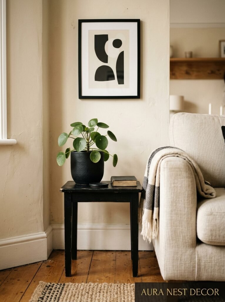
You don’t HAVE to add a third color. This palette genuinely stands alone. But if you want one — and a lot of people do, because a room that’s purely cream and black for a long time can feel a bit hungry for warmth — here’s what plays best.
Warm terracotta or rust. It’s the warmest, most grounding accent you can bring in, and it doesn’t compete with the cream at all. A single terracotta ceramic. A rust-colored throw blanket. A small cluster of amber-toned dried florals.
Sage or olive green. Particularly if you’ve got natural wood in the room, because the green connects to the organic warmth of the wood and makes everything feel more alive. A olive linen cushion. A sage green plant pot. Even a small framed botanical print.
Deep forest green goes darker and more dramatic — especially beautiful in British homes with period features.
What I’d avoid: bright primary colors. They break the mood completely. And anything too pastel — blush, pale lavender — which dilutes the confidence of the contrast rather than adding to it.
—
11. The Coffee Table Setup That Pulls a Cream and Black Room Together
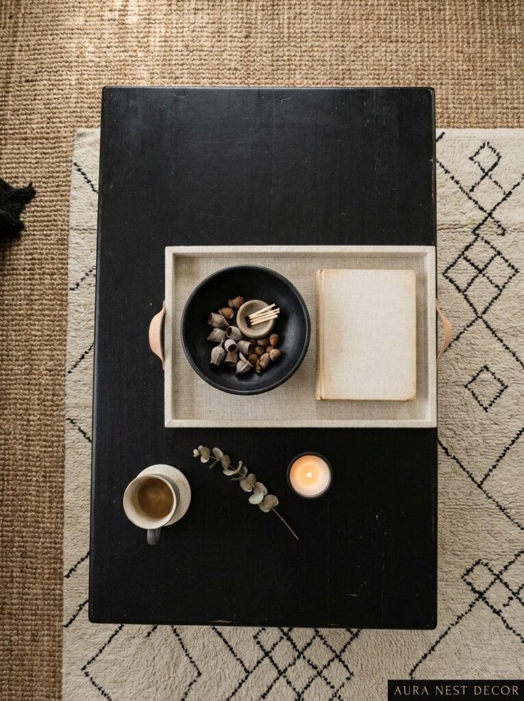
The coffee table is where the whole room proves itself, honestly. It’s the most-photographed surface in any living room and it’s also the place where styling either reinforces or undermines everything you’ve done to the walls and sofa.
In a cream and black room, I’d lean toward a coffee table with some warmth — walnut, mango wood, rattan, cane — rather than a pure black or pure glass option. The glass disappears, which is sometimes fine, but this room benefits from the mid-tone anchoring.
On top: keep it deliberate. A stack of two or three books (not five, not one). A candle — preferably in a vessel that’s either black or warm stone-toned. A small sculptural object. And something organic, even just a single stem in a simple vase. You’re not decorating, you’re arranging. There’s a subtle difference and the eye knows it.
—
12. The Version of This Room That’ll Still Look Good in Ten Years
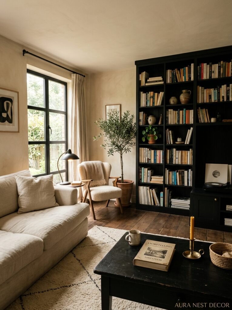
Trends move fast. What I keep coming back to with cream and black is that the bones of this palette — when done in natural materials, with warm tones rather than stark stark contrast — have been around for a very long time. Think Art Deco. Think mid-century British interiors. Think classic American Colonial homes with dark shutters against light exteriors.
The version that dates is the version that goes too graphic. Too matching. Too “Instagram 2024.” Black grid furniture, cream faux-fur cushions, black-and-white geometric rugs, very shiny surfaces.
The version that lasts? Antique-feeling, tactile, slightly imperfect. Cream walls with a subtle warmth, like they might be original lime plaster. Black that’s almost very dark charcoal — not cold, not stark, just deep. Wood that looks like it grew somewhere and was made by a person. Fabrics that would look better after a year of use.
Buy the quality where it shows. Scrimp on the stuff nobody notices. And let the room evolve slowly rather than assembling it all at once — because the rooms that feel truly beautiful almost always look like they were gathered over time.
—
❓ FAQ
Q: Is cream and black too bold for a small living room? A: Not if you’re intentional about where the black lands. In smaller spaces, concentrating dark accents rather than scattering them actually makes the room feel more purposeful and less cramped. The key is giving the eye a place to rest — large areas of cream do that.
Q: What floor colors work best with cream and black? A: Warm medium-toned wood is the most forgiving and beautiful option — walnut, honey oak, even an antique pine. Light grey or cool-toned floors tend to push the palette colder than most people want. Dark floors work brilliantly if your walls and upholstery have enough warmth to balance.
Q: Can I do cream and black in a rental where I can’t paint the walls? A: Yes, actually. If your walls are a basic white or off-white, lean into black furniture and textiles and bring in cream through throws, cushions, and rugs. The contrast still reads. You can also use large framed black-and-white prints to shift the room’s visual identity without touching a wall.
—
💭 Final Thoughts
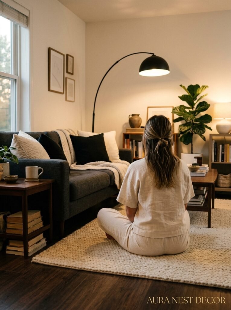
Cream and black is one of those combinations that sounds simple on paper and turns out to be endlessly interesting to live with. The light changes it. The seasons change it. And the longer you sit in a well-done cream and black room, the more you notice things — the way the texture in a cushion catches the lamp, the way the walls glow just differently at dusk.
It’s not a bold choice, exactly. But it’s a confident one. And confidence, in a room, is everything.
What’s the one piece — a sofa, a rug, a single statement light — that you’d build your cream and black room around?




