
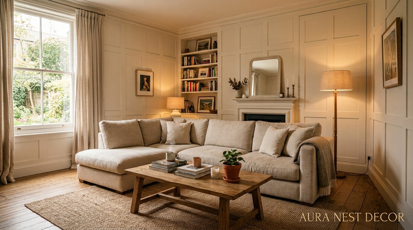
Wall Panelling Is Having a Moment — And Not the One You’d Expect
You’ve seen it everywhere lately. That textured, layered, impossibly cozy look on every Pinterest board and Instagram reel that makes you stop scrolling and save immediately. Wall panelling isn’t new — it’s been around since the 1600s — but what’s happening to it right now in living rooms across the US and UK feels genuinely different. Less stately home, more “I designed this myself and I’m obsessed.”
Here’s everything you need to know to do it right.
—
1. Why Everyone’s Suddenly Obsessed With Panelled Walls Again
It didn’t happen overnight, but it kind of feels like it did.
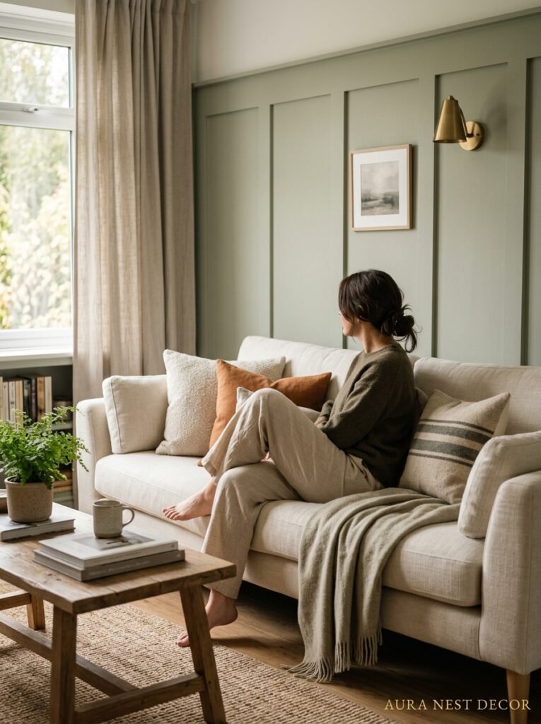
One day you’re looking at flat painted walls and thinking they’re fine. Then you see ONE photo — maybe it’s a British terraced house with sage green shaker panelling and a vintage sofa, or an American craftsman bungalow with dark walnut board and batten — and suddenly your walls feel completely unfinished. Naked, almost.
That’s the thing about wall panelling. It adds what designers call “visual weight,” but honestly that phrase doesn’t do it justice. What it actually does is make a room feel like someone MEANT it. Like the space was considered. Walls aren’t just barriers anymore, they’re architecture.
And the timing makes sense if you think about it. We’ve all been spending more time at home. We want our spaces to feel rich and layered, not just clean and minimal. Flat walls were fine when we barely looked at them. But now? We want texture. We want depth. We want to look at our living room and feel something.
The other reason panelling is everywhere right now is that it’s genuinely achievable as a DIY project. You don’t need a carpenter or a massive budget. And that accessibility, combined with how GOOD it looks in photos, made it basically go viral.
—
2. The Panelling Style That’s Taken Over Pinterest Boards This Year
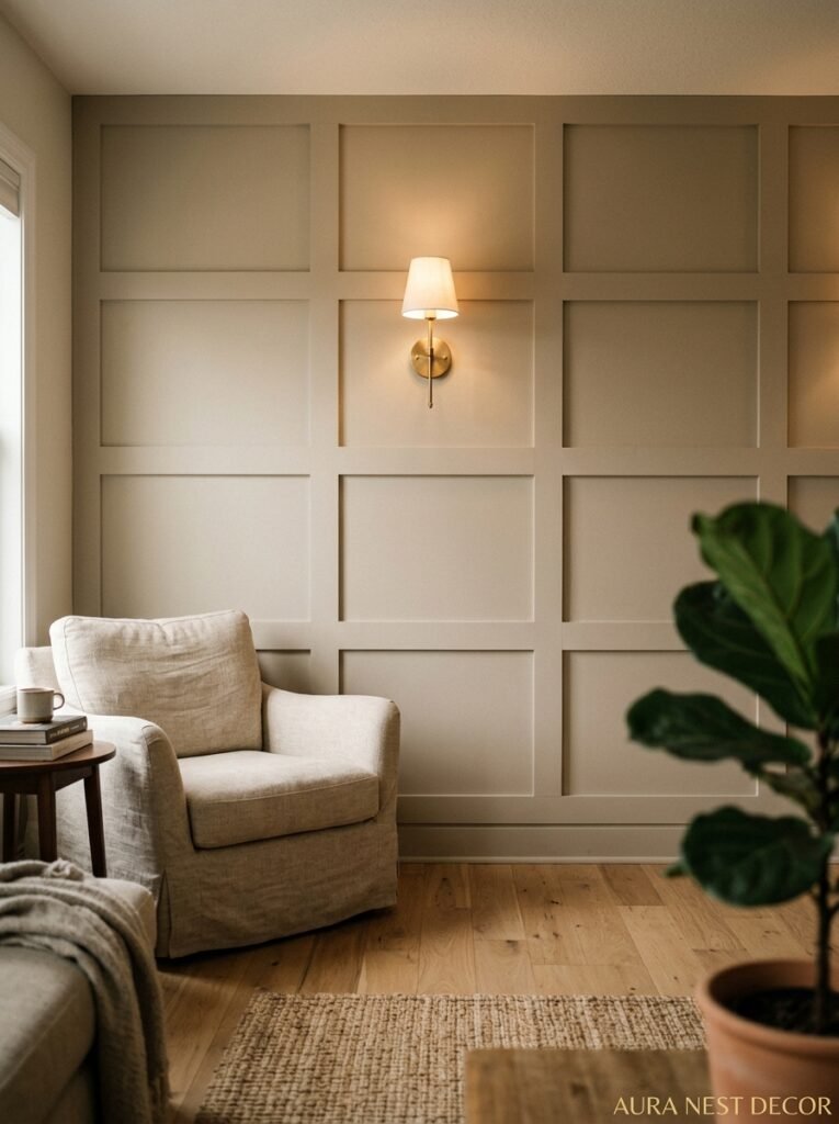
If you’ve been paying attention, one style keeps showing up. Grid panelling. Sometimes called picture frame moulding, sometimes listed under “Hamptons style,” but whatever you call it — those clean rectangular frames applied flat to the wall, painted in a single matte color — it’s everywhere and I honestly can’t argue with why.
It’s forgiving. The frames create structure without demanding precision, and when the whole wall (panels AND wall) gets painted the same color, any slight unevenness basically disappears. Magic, sort of.
But here’s my honest take: grid panelling is also starting to feel a tiny bit safe. The rooms that REALLY stop me mid-scroll right now are the ones doing something slightly unexpected with it — asymmetrical panel sizes, panels that run only three-quarters up the wall and meet a contrasting color or wallpaper above, or grid panelling in a really surprising color. Ochre. Burnt terracotta. That deep inky blue-green that doesn’t have a clean name but you know it when you see it.
So yes to grid panelling. But push it a little. Give it a color it wasn’t expecting.
—
3. Board and Batten in a Living Room — Why It Works When It Shouldn’t
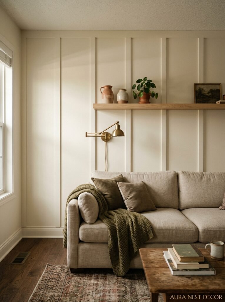
Board and batten feels like it belongs in a farmhouse kitchen or a mudroom. The vertical strips, the chunky battens, the whole utilitarian vibe. But I’ve been pinning living room board and batten for months and I think it might be the most underrated choice right now.
Here’s why it works. Vertical lines make ceilings feel taller — and not just a little, noticeably. In a room where the architecture isn’t doing you any favors, that matters. A lot.
It also has incredible range. Paint it bright white and it reads as crisp and coastal. Paint it a deep charcoal and it’s suddenly moody and dramatic. Leave it in natural wood tones (cedar, especially) and you’ve got something that feels like a really beautiful cabin, in the best way.
The thing nobody tells you about board and batten in a living room is that it changes how you style everything else. You don’t need as much art, because the wall IS the design. Sconces sit differently against it. Even your sofa looks more intentional when it’s against a panelled wall rather than a plain painted one.
Don’t overthink the spacing. Between 12 and 16 inches apart for the battens is the sweet spot for most walls, but go wider if your room has high ceilings and you want it to feel more grand than cozy.
“You don’t need more art. You need the wall itself to be the design.”
—
4. The Color Mistake That Makes Beautiful Panelling Look Cheap
I’ve made this mistake. I’ve seen it in a hundred Pinterest saves and had to look away.
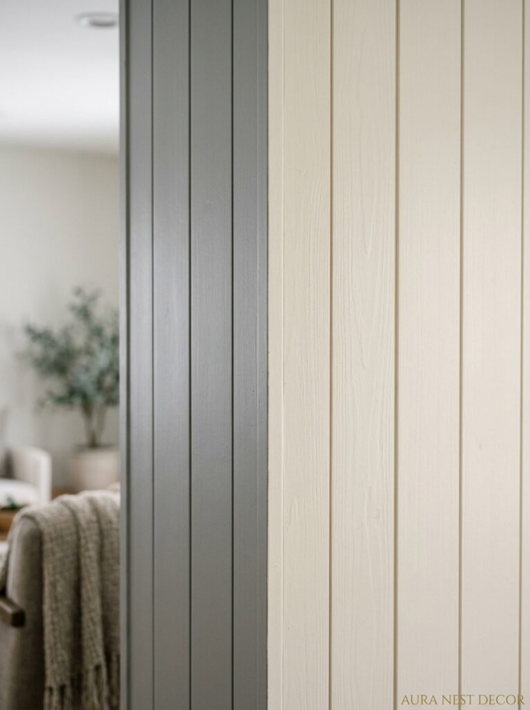
The mistake is painting the panels and the wall two different colors when the panelling isn’t deep enough to justify it. Hear me out. If your panel moulding is thin — like half an inch of raised detail — and you paint the inner panel a different color from the trim, it looks like a coloring book page that someone filled in slightly wrong. The shadow and depth isn’t there, so the contrast just looks flat and a bit sad.
The fix is one of two things. Either use DEEPER moulding (3/4 inch or more raised from the wall surface) so there’s an actual shadow line creating definition. Or paint everything the SAME color. One tone, all over. That monochromatic approach is what makes panelling look genuinely expensive. The texture shows up through light and shadow alone, and it’s actually more impactful than two-toning it.
The rooms that look really stunning usually go all-in on one deep, saturated shade. A warm mushroom. An almost-black navy. A rich terracotta that makes you feel like you’re in a villa somewhere. Same shade on the panelling, the wall, even the ceiling sometimes. Suddenly it’s a whole thing.
—
5. Shaker Panelling and Why British Homes Wear It Better Than Anyone
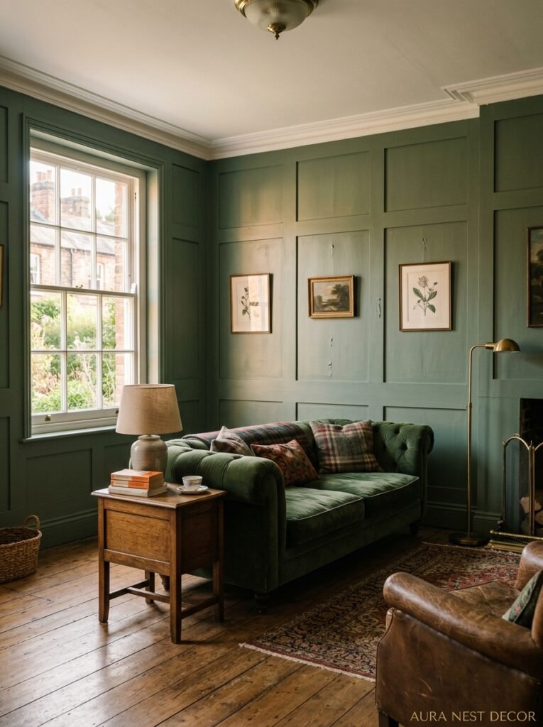
There’s a reason British interiors influencers have dominated the panelling conversation for the last few years. Shaker-style wall panelling — that classic recessed panel with a clean, flat center — looks absolutely at home in a Victorian terrace, an Edwardian semi, or even a newer build with decent ceiling height.
Part of it is just proportions. UK homes often have period features — ceiling roses, picture rails, deep skirting boards — and shaker panelling slots right in alongside those details without fighting them. It feels like it was always there.
American craftsman homes get the same energy, honestly. Those low ceilings, the built-in bookcases, the warmth of the original woodwork — shaker panelling ties it all together.
But can you do it in a more modern space? I think you can, actually. Keep the panel style simple, paint it the same color as the wall (see above), and make sure your furniture is doing the work of grounding it. A clean-lined sofa, some warm textiles, a rug with depth. The panelling adds the architecture. Everything else adds the soul.
—
6. The Living Room Wall You Should Panel First (It’s Not the One You Think)
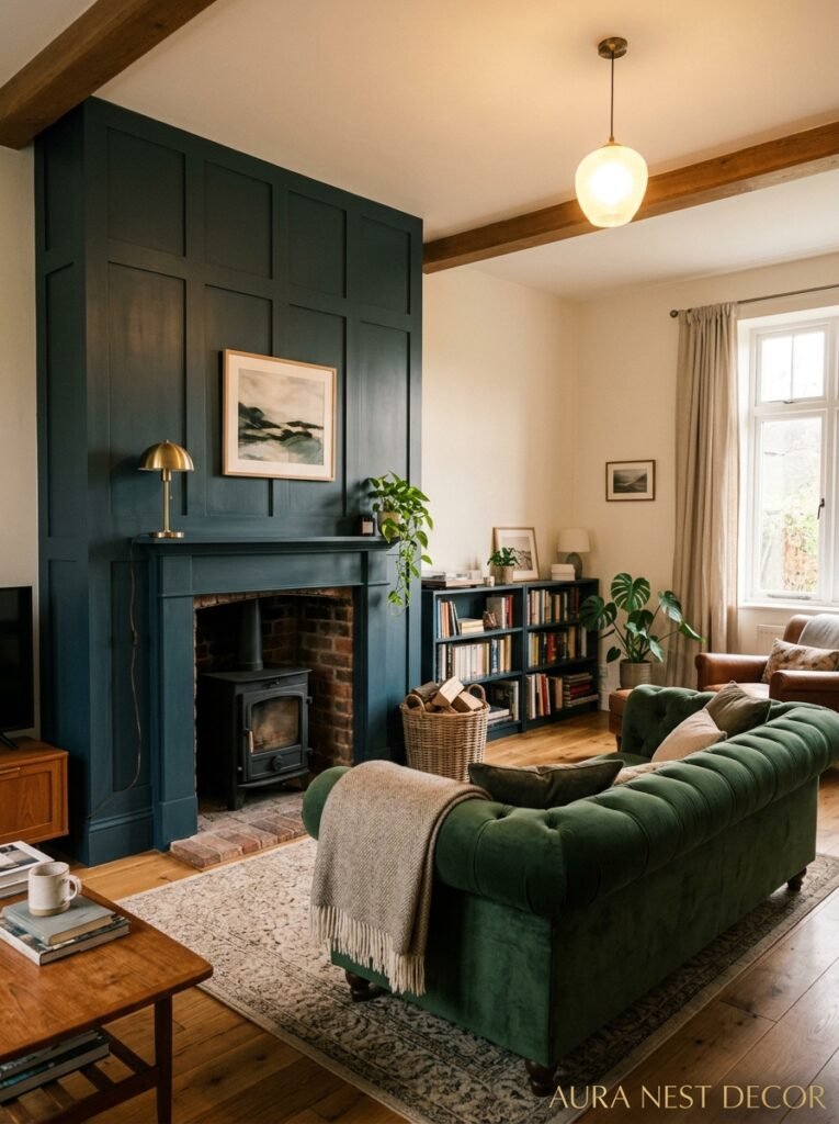
Most people jump straight for the fireplace wall. And I get it — it’s the obvious focal point, it’s what you see when you walk in, it’s the Pinterest-bait shot.
But honestly? I’d start with the wall behind the sofa.
Here’s why. That’s the wall you’re actually LOOKING at all the time. That’s the wall in the background when you video call. That’s what visitors see when they walk in and sit down. It’s working harder than the fireplace wall is, and yet it’s often completely neglected.
A panelled sofa wall — especially with a horizontal wainscoting style that runs to around four feet high, topped with a contrasting paint color or even a bold wallpaper above — changes the whole feeling of being IN the room. Not just looking at it from a doorway.
The fireplace wall is great for drama. But if you want your living room to feel better to actually LIVE in, start behind the sofa. You can always panel the fireplace wall next.
—
7. What Nobody Tells You About the Height of Your Panelling
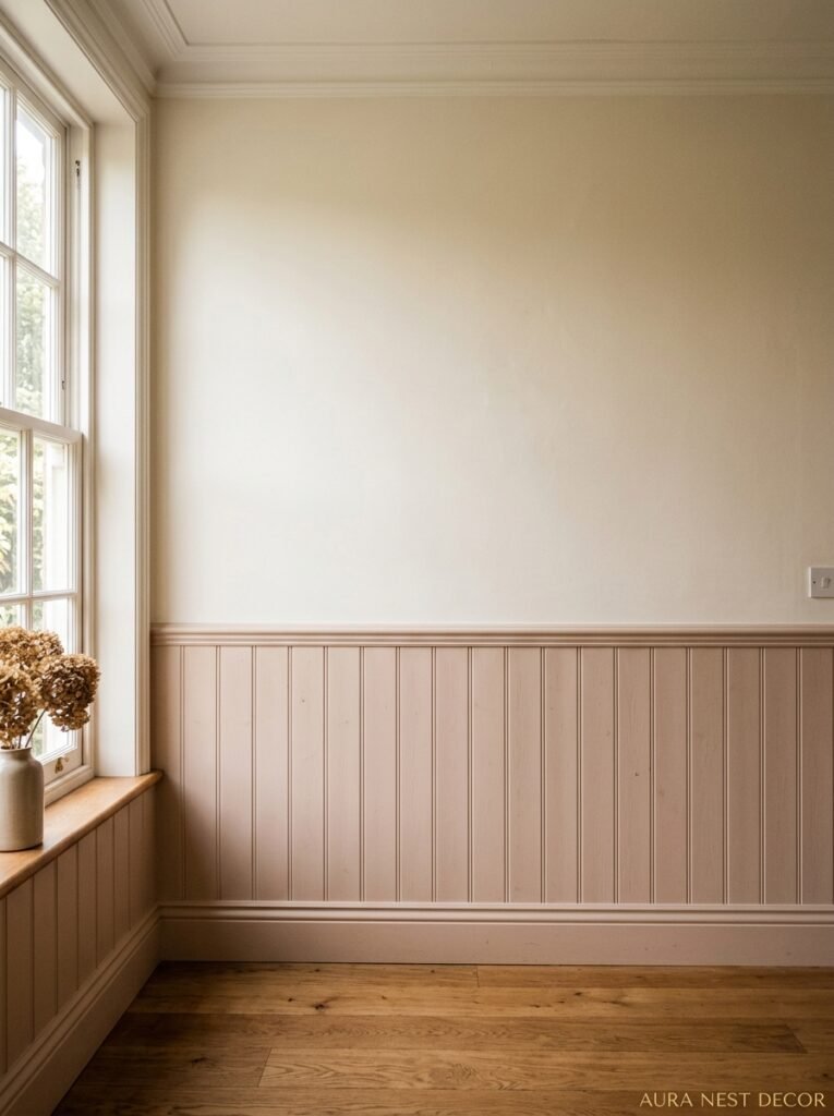
This is the detail that separates a DIY install that looks slightly off from one that looks genuinely considered.
The standard advice is to run wainscoting or lower wall panelling to about one-third of your wall height. Which is roughly 32-36 inches in a standard 9-foot ceiling room. And that’s fine. It’s correct in a technical sense.
But “correct” and “interesting” aren’t the same thing.
Panels that run to around 54-60 inches — so roughly two-thirds of the wall height in most rooms — feel more dramatic, more enveloping, more like the whole room was designed rather than accessorized. It’s the difference between a panel treatment that reads as trim detail and one that reads as architecture.
Go even higher — all the way to the ceiling — and you’ve crossed into full room commitment, which is a different thing entirely and INCREDIBLE when done right. But it needs a big, confident color choice and furniture that can hold its own.
Side note: in rooms with lower ceilings, full-height panels in a light color can actually feel bigger and taller than you’d expect, because the vertical lines have nowhere to stop.
“Panels that stop at chin height don’t just look better — they make the whole room feel designed.”
—
8. The Living Room Colors That Are Genuinely Thriving Under Panelling Right Now
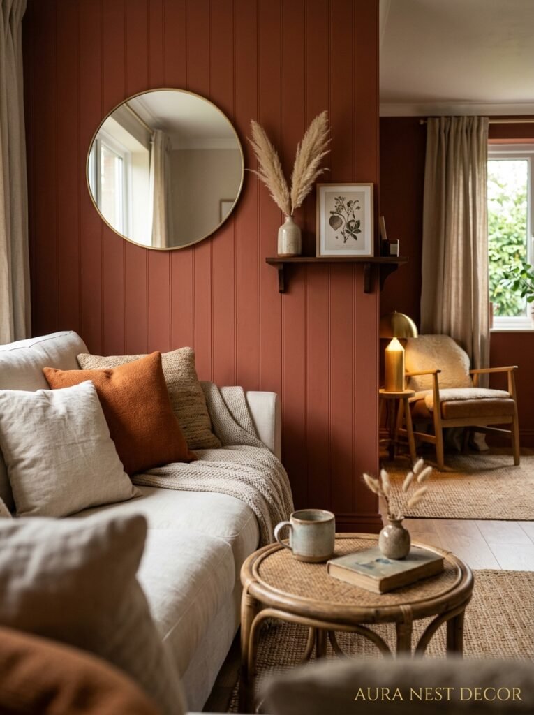
Not gonna lie, I keep a saved folder on my phone specifically for this.
The colors I keep seeing work the hardest under wall panelling right now are warm and dusty rather than cold and crisp. Warm whites — not bright white, never bright white — work on fresh modern installs. But the rooms that make me actually save AND share tend to be in deeper tones.
Dusty sage. Not the bright mint-sage that was everywhere four years ago, but the darker, greyer, almost-olive sage that looks completely different under different light.
Warm terracotta, which I thought had peaked but apparently hasn’t. In a living room with wooden furniture and linen upholstery it still looks incredible. Not trendy, just good.
And deep, warm off-blacks — in the US there’s a massive thing happening right now with charcoal panelling in living rooms, and the UK has been doing it slightly longer with some really extraordinary results in period homes where the dark color makes the white cornicing look practically luminous by contrast.
—
9. The Affordable DIY Panelling Method That Doesn’t Look Cheap
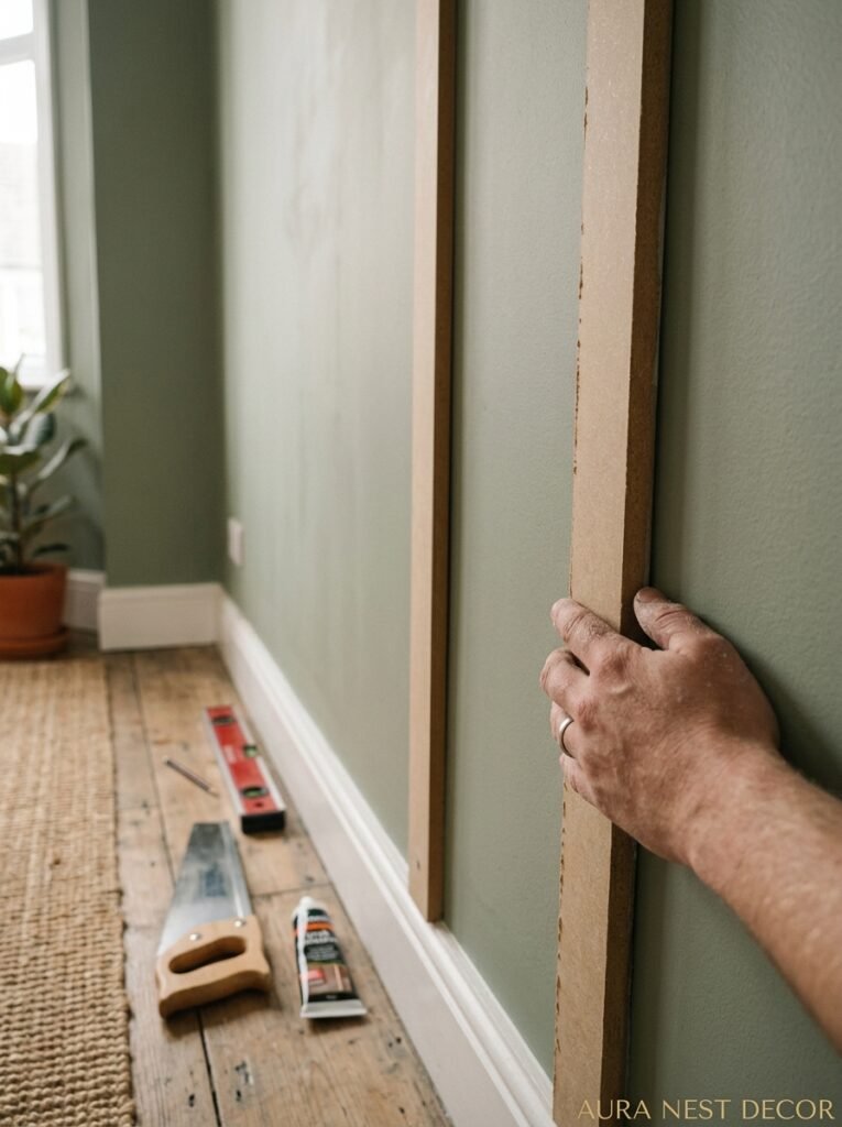
Here’s where I get practical, because some of the most beautiful panelled living rooms I’ve ever seen cost under $200 in materials.
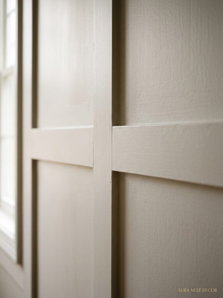
The secret is MDF strips. Thin — around a quarter inch — and cut to your measurements. Applied directly to the wall with construction adhesive and finishing nails, caulked at every seam and corner, then painted over completely. The whole wall gets the same color, panels and background together, and when it dries you genuinely cannot tell it cost $200.
A few things that actually matter if you’re doing this yourself. Level is everything. Get a good spirit level or a laser level if you can borrow one. Because once it’s painted, you can’t un-see a slightly tilted panel, and you WILL see it every single day. Also, prime before the final paint coat even though you want to skip this step. You really can’t. MDF soaks paint unevenly and the priming is what makes it look smooth and solid rather than patchy.
And the cutting. Hire a shop to cut your MDF strips to length if you don’t have a table saw. It’s usually a few dollars per cut and the precision is worth every penny.
—
10. How to Make Panelling Work in a Small Living Room Without Making It Feel Like a Cave
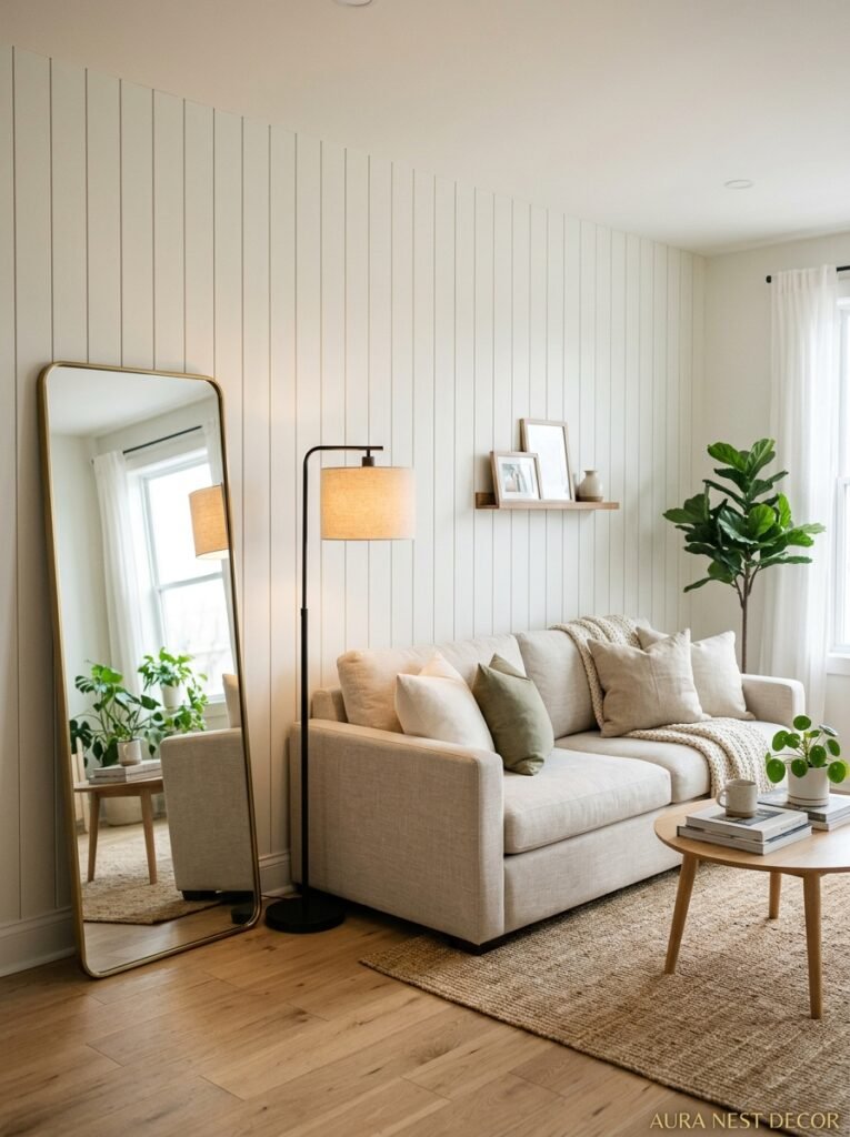
Small rooms get scared off panelling and I think that’s mostly wrong.
The key is direction and color, and honestly both are solvable. Vertical panelling in a lighter shade makes a small room feel taller and airier. Full-height board and batten in warm white on just ONE wall of a small living room gives you the architectural detail without the whole room closing in.
What DOES make small rooms feel like a cave is dark color AND heavy horizontal panelling AND low ceilings all happening at once. That’s too much. Pick one dramatic element and let everything else breathe.
Grid panelling in small living rooms can go either way. If the panels are well-proportioned to the wall size — meaning you don’t have twenty tiny squares crammed in — it reads as intentional and beautiful. But scale it wrong and it looks like a Tudor inn that’s seen better days.
—
11. The Lighting Detail That Makes Panelled Walls Look Incredible After Dark
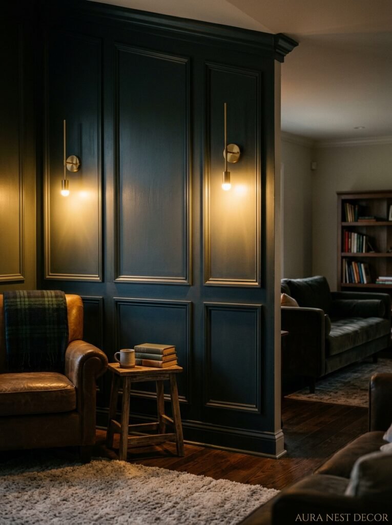
This one’s kind of a secret and it genuinely changes everything.
Wall sconces. Specifically, sconces placed BETWEEN panel sections rather than above them or in the center of them. The light they throw sideways across the panelling creates actual shadows inside the moulding profiles, and those shadows are what make the texture visible and dramatic at night.
Without this kind of cross-lighting, even beautiful, well-made panelling can look flat after dark because overhead light doesn’t rake across the wall the way side-mounted light does. The shadows ARE the panelling, in a way. Without them it’s just paint.
You can do a version of this with picture lights, floor lamps positioned close to the wall and angled slightly, or even chunky candlesticks on a shelf that sits in front of the panel. The goal is light coming from the SIDE, not from above.
“The shadows in your panelling are doing as much work as the panels themselves. Light from the side, always.”
—
12. One Living Room Mistake That Wastes a Perfectly Good Panel Job
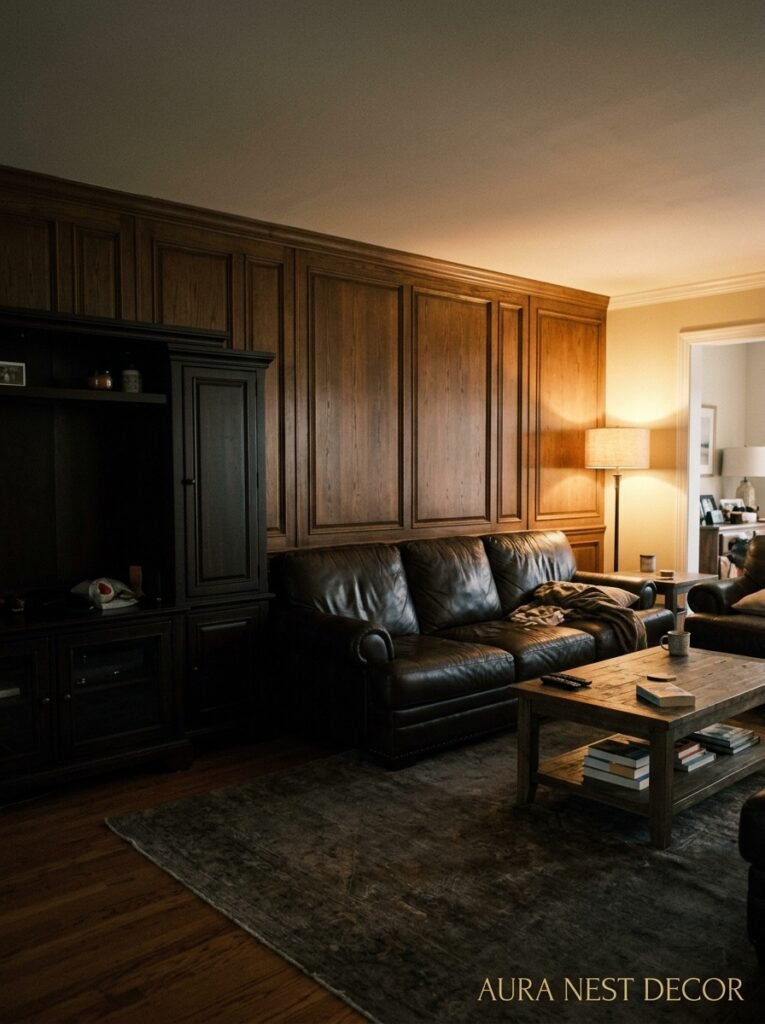
You’ve done the panelling. It looks amazing. And then.
You cover it with too much stuff.
I see this constantly — a beautifully panelled wall absolutely covered in framed prints, gallery walls, oversized clocks, shelving brackets. And it’s not that you CAN’T put anything on a panelled wall, but there’s a real tension between “the wall IS the design” and treating it as a backdrop for everything else you own.
Panelling is architectural detail. It has visual mass. Layering more visual complexity on top of it dilutes what makes it special. One statement piece — a single large mirror, one oversized piece of art, a single beautifully placed sconce — works WITH the panelling. A gallery wall of fifteen prints fights it.
The restraint is hard because we’re all conditioned to fill walls. But the rooms that look genuinely expensive and considered are almost always the ones that know what to leave out.
—
❓ FAQ
Q: Is wall panelling hard to install yourself if you’re not experienced with DIY? A: Honestly, grid-style moulding panelling is one of the more beginner-friendly DIY projects out there, especially if you get your MDF strips pre-cut and use construction adhesive alongside your nails. The hardest part is keeping everything level and taking your time with caulk before painting. Give yourself a weekend, not an afternoon.
Q: Does wall panelling work in rented homes where you can’t make permanent changes? A: There are peel-and-stick panel systems specifically designed for rentals, and while they’re not quite as solid as glued MDF, they’ve gotten genuinely good in the last few years. Some renters also use lightweight foam panelling strips that come off cleanly — worth looking into before you give up on the idea entirely.
Q: What’s the best paint finish for wall panelling in a living room? A: Eggshell or satin. Not flat/matte (it scuffs too easily and panelling gets touched more than a regular wall) and not gloss unless you’re going for a very specific lacquered look. Eggshell in particular has just enough sheen to show the texture beautifully under good lighting without being shiny in a way that highlights every imperfection.
—
💭 Final Thoughts
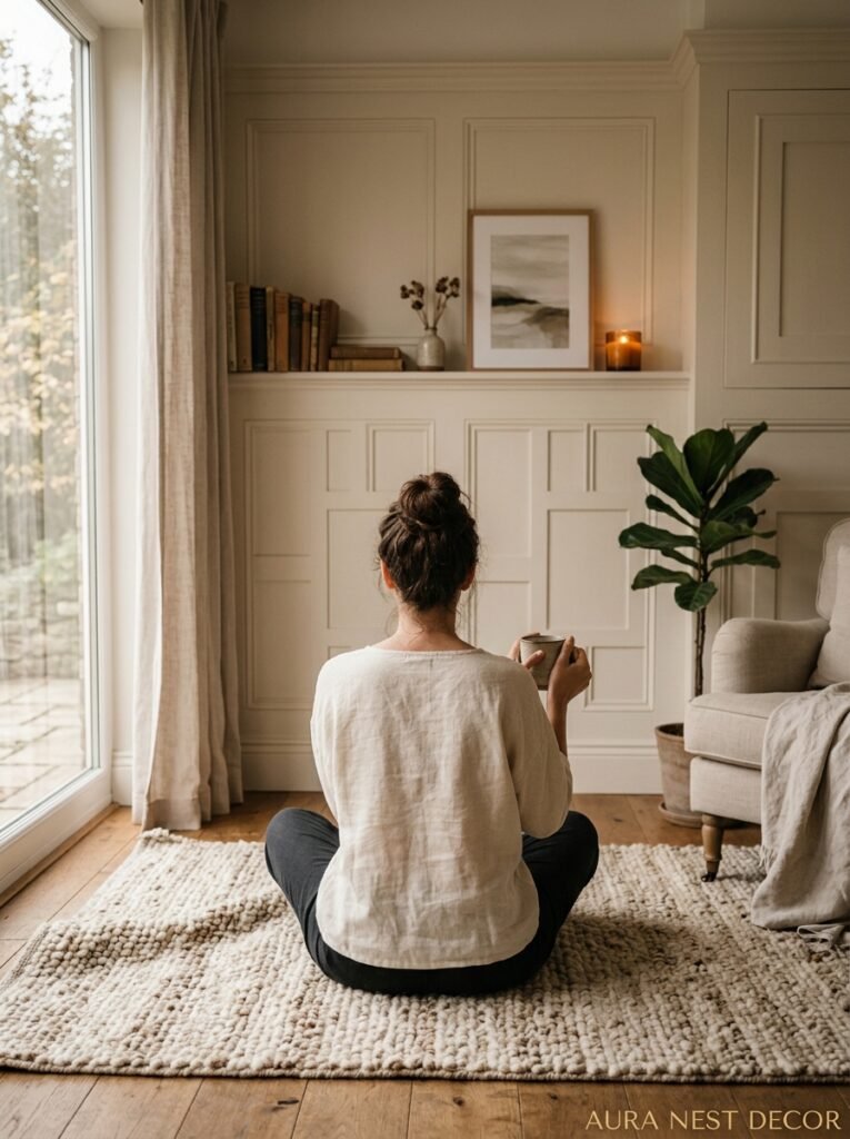
Wall panelling in a living room isn’t a trend you’ll regret in three years. It’s closer to a permanent improvement — the kind that makes you wonder why you waited so long every single time you sit down in the room. The decisions that matter most aren’t which style to choose, but how high to go, which color to commit to, and whether you’re brave enough to let the wall be the main event rather than the background.
So — if you were standing in your living room right now looking at those flat, empty walls, which one would you panel first?




