Why Grey and Beige Together Is the Living Room Combination That Just Won’t Quit
You know that feeling when you walk into a room and something just clicks? That’s greige. Or grey-and-beige, if you want to be precise about it. It’s the combination that’s been showing up on every Pinterest board I’ve scrolled through for the past three years, and honestly? I’m not even a little bit tired of it.
—
1. The Reason This Color Pairing Feels So Expensive (Without Actually Being Expensive)
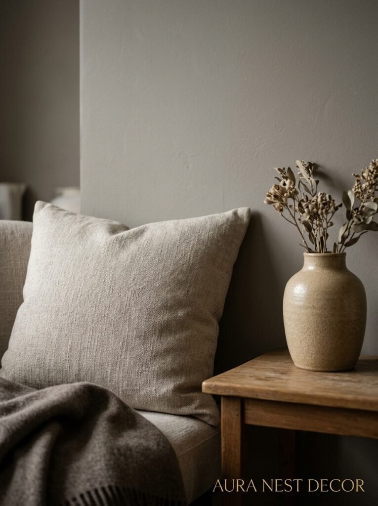
Here’s the thing nobody talks about: grey and beige work together because they’re doing completely opposite emotional jobs in the same room. Grey is cool, composed, a little sophisticated. Beige is warm, soft, the interior design equivalent of a cashmere sweater. And when you layer them together — a warm linen sofa, cool grey walls, a jute rug underneath — your eye doesn’t know what temperature the room is. And that confusion? That’s actually luxury.
It reads the same way expensive neutrals in fashion do. Think of a camel coat with a grey knit underneath. Neither is flashy. Together they look like money.
The trick is the ratio. You don’t want 50/50. You want one to dominate — usually the beige or a warm greige on your largest surfaces — and the grey to come in as an accent, on trim, through cushions, in artwork. When it’s too balanced, it just looks muddy. Sort of safe in a bad way.
I think what draws people to this combination, especially in UK Victorian terraces and American craftsman homes, is that it photographs beautifully in natural light AND in that amber glow of an Edison bulb at 7pm. That’s rare. Most color schemes pick a lane.
“Grey and beige aren’t playing it safe. They’re playing it smart.”
—
2. The Specific Shade of Grey That’s Currently Winning Every Room
Not all greys are created equal. I need to say this loudly because people get this wrong constantly, then wonder why their room looks cold and a little depressing.
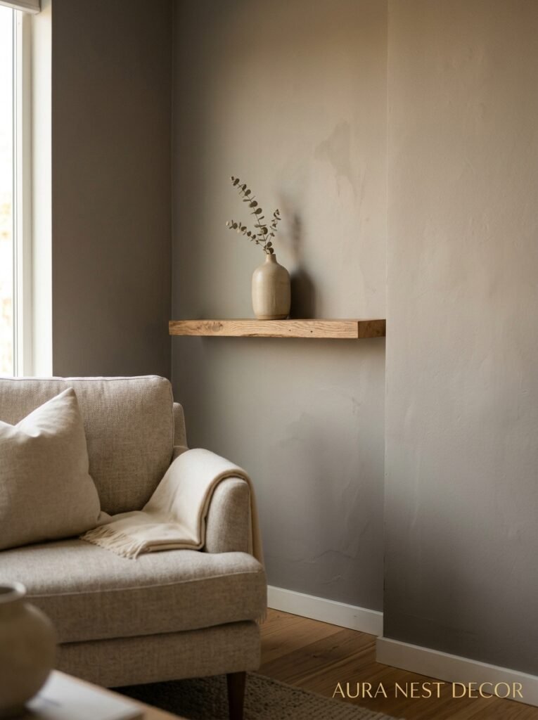
Warm grey. That’s the answer. A grey with a brown or purple undertone, not a blue one.
Farrow & Ball’s Mole’s Breath is having a genuine moment right now. So is Pebble Shore from Dulux. In the US, Sherwin-Williams’ Agreeable Gray is basically a cultural institution at this point — it’s warm grey on the lighter end and it works with almost every beige on the market because it’s already half-beige itself.
What you want to avoid is anything with a blue or green undertone if you’re pairing it with warm beige. That’s where rooms go wrong. The grey goes cold, the beige looks dingy next to it, and suddenly the whole thing feels like a waiting room from 2009.
Test your greys in the actual room. Not from a tiny paint chip. Get a sample pot, paint a big square — at least 12×12 inches — on the actual wall and look at it at different times of day. Morning light will tell you one thing, afternoon another, and lamplight at night might surprise you completely.
Also worth noting: matte finishes make grey feel softer and more intentional. Satin makes it feel a bit corporate. So unless you’re doing trim work, go matte on the walls.
—
3. The Beige That’s Not Your Grandmother’s Beige
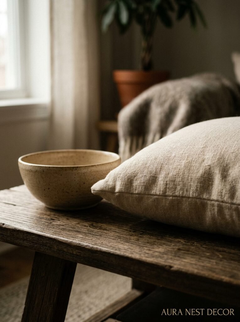
Beige got a bad reputation somewhere in the 90s and it deserves a full rehabilitation. The beiges that work in this pairing aren’t the flat, yellowy, wall-to-wall-carpet-and-MDF beiges of that era. They’re richer. Warmer. Almost tan.
Benjamin Moore’s Pale Oak is extraordinary paired with mid-tone greys — it has this barely-there peachy warmth that makes a room feel glowy. Farrow & Ball’s String is another one that I keep coming back to. It’s not quite cream, not quite beige, sort of lives in the middle in the best possible way.
For UK readers, Little Greene’s Slaked Lime is worth trying on a feature wall if you want something a little more interesting than a straight beige. It photographs warm and feels very current without being trendy in a way that’ll age badly.
The key detail with beige in this pairing is to make sure it has depth. Flat beige is boring. Beige with a bit of shadow and warmth? It’s the background that makes everything else in the room look considered.
And honestly — don’t underestimate your ceilings. A beige ceiling in a room with grey walls does something kind of magical. It makes the walls feel taller, the room feel warmer, and it’s an unexpected detail that people always notice.
—
4. The Sofa Question (Because Everyone Gets Stuck Here)
This is where people spiral. I’ve seen it happen. They’ve got their wall color sorted and then they stare at sofa swatches for three weeks and end up buying something beige-adjacent that disappears into the room.
Don’t let your sofa disappear.
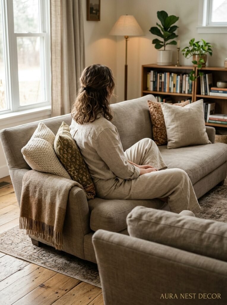
If your walls are grey, your sofa has the chance to bring in warmth. A biscuit-colored linen sofa. A caramel velvet. Even a deep oatmeal textured fabric. Let it be the warm anchor in the room.
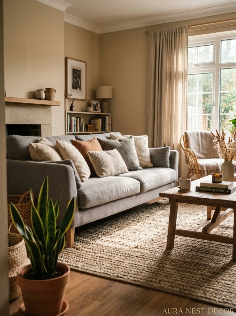
If your walls are beige (or greige), then a mid-tone grey sofa is genuinely stunning. Think charcoal? Maybe not — that can feel heavy. But a cool medium grey sofa against a warm beige wall is a contrast that works because again, it’s doing that temperature tension thing.
What you really want to avoid is a bright white sofa in this kind of room. It’ll read stark and cold and it’ll make your carefully chosen neutrals look grubby in comparison. Not worth it.
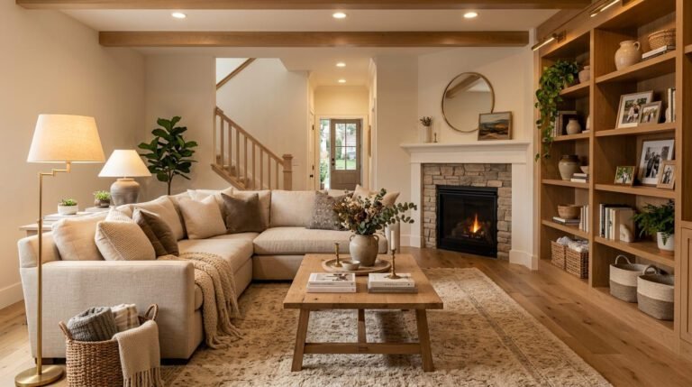
Side note — if you’ve got a corner sofa, the L-shape actually works beautifully in grey-and-beige rooms because it takes up enough visual space to anchor the whole scheme. A small two-seater in the same palette can sometimes look a bit lost.
“Your sofa isn’t just furniture. In a neutral room, it’s the whole personality.”
—
5. Textures That Make or Break the Whole Thing
Here’s the honest truth: a grey and beige room with no texture is just… sad. Really, truly sad. Because you’re working in a palette with almost no contrast, and the contrast has to come from somewhere. And it comes from texture.
Think about this: a flat grey wall, a flat beige sofa, a flat cream rug. Nothing for your eye to catch. Feels like a rental property.
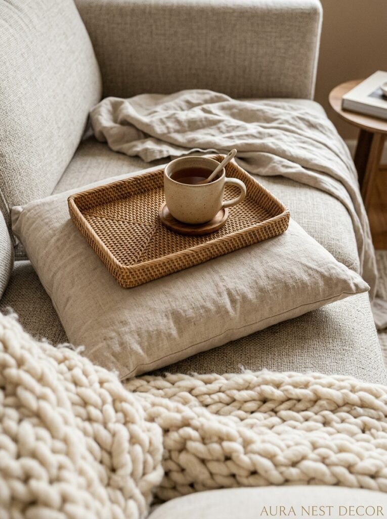
Now add: chunky knit cushions in oat, a jute rug with visible weave, a linen throw draped imperfectly over one arm, a velvet cushion in deep greige, a rattan coffee tray with a candle on it. Now the room has layers. Every time you look at it, you’re catching something new.
The materials that work best in this palette are the ones with natural variation: linen (especially unwashed linen with a slight crumple), jute, rattan, unfinished wood, raw brass, terracotta. These materials all read warm and they all have texture built into them, so they’re doing your work for you.
Velvet is also extraordinary here. A velvet cushion in a warm taupe or dove grey catches light differently depending on the time of day. It basically shifts color with the room’s lighting and it makes everything look more expensive than it is.
—
6. The One Wood Tone You Should Use, and the One You Shouldn’t
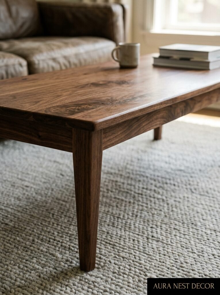
Wood makes or breaks a grey-and-beige room. So let me be clear.
Warm, mid-toned wood. Oak. Walnut on the lighter end. Raw pine if you’re going for a more Scandinavian feel. These all play beautifully with the palette.
What you want to avoid is anything very dark — dark mahogany, dark walnut, ebonized wood — because it creates too sharp a contrast and suddenly the room stops feeling soft and starts feeling divided. And very blonde, almost-white woods can push the room cold if your greys are already on the cooler side.
Honestly, if I had to pick one wood tone for a grey-and-beige living room, it’s medium-warm oak every single time. Coffee table, shelving, a console table. Doesn’t matter. Oak works. Oak is always the answer in this palette.
One more thing: mix your wood finishes slightly. Not wildly — but a coffee table in lighter oak and shelves in a slightly darker tone adds depth. A room where every piece of wood is identical starts to look very showroom-y. And not in a good way.
—
7. Metallics and How to Use Them Without It Looking Like a Hotel Lobby
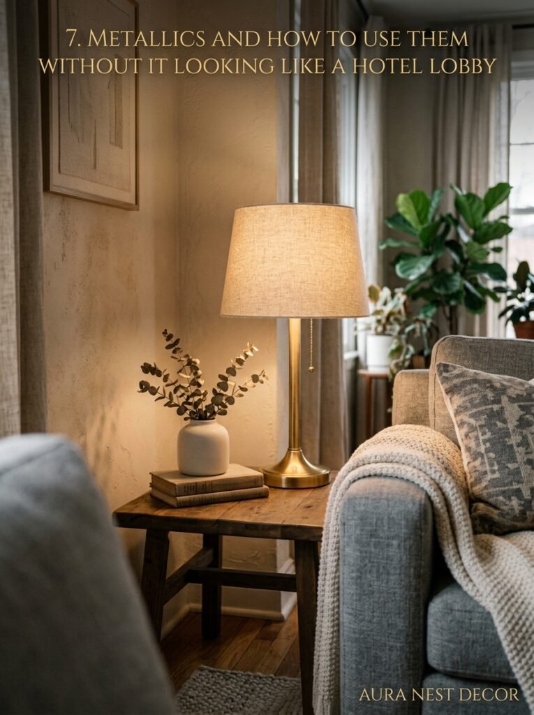
Metallics are essential in a grey-and-beige room. Without them, the palette can start feeling a bit flat and lifeless. But there’s a right way and a very, very wrong way to do this.
Wrong way: cool silver hardware everywhere. Silver picture frames, silver lamp bases, chrome light fittings. In a warm neutral room, cool silver reads as cold and slightly clinical. Everything starts feeling a bit… dental office.
Right way: warm brass. Antique brass, brushed brass, raw unlacquered brass that’ll patina over time. It’s the metallic that genuinely sings against greiges and warm greys because it adds that golden glow without being overwhelming.
But — and this matters — don’t do brass everything. A brass floor lamp, a brass picture frame, brass handles on a drinks cabinet. Then stop. Let it be an accent, not a theme.
Aged bronze works too. And matte black, surprisingly, is incredible as a fourth color in a grey-beige room — it grounds everything and gives the eye a place to rest. Black picture frames, a black side table, black candle holders. A bit of black in a neutral room is like punctuation. It makes the whole thing make sense.
“A bit of black in a neutral room is like punctuation. Everything reads clearer.”
—
8. Rugs: The Decision Most People Make Too Fast and Regret
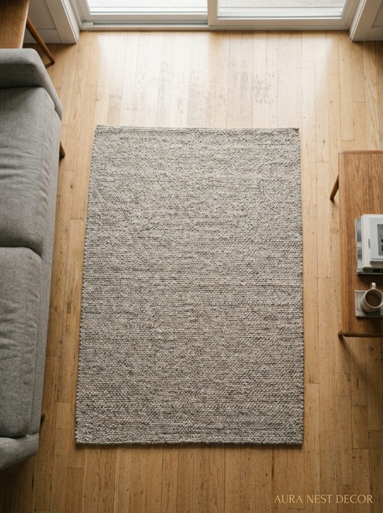
The rug is the foundation. Literally, it’s on the floor holding everything together, and I genuinely believe that more grey-and-beige rooms fail at the rug stage than anywhere else.
Here’s what happens: people pick a rug that’s just another shade of the same neutral family, and the room loses its definition. The sofa floats, the chairs float, nothing feels anchored. A completely tonal rug in a tonal room is risky.
What actually works: a rug with some contrast or pattern. Not bright, graphic pattern — something subtle. A faded Moroccan in oatmeal and faded charcoal. A striped jute in natural and grey. A vintage Persian in dusty pinks and washed greens that pull in new color without screaming about it.
And SIZE. Please get the right size rug. In the US and UK both, I see people get rugs that are too small constantly. Your sofa legs (at least the front ones) should be ON the rug. If your rug is floating in the middle of the room with six inches of floor visible on every side, it’s too small. Too small a rug is the thing that makes a room feel cheap fastest.
—
9. Lighting That Actually Changes How This Palette Feels
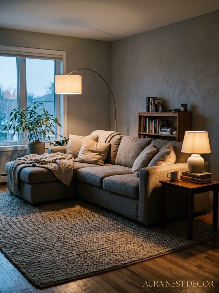
Natural light hits grey and beige completely differently than artificial light does. A grey that looks perfect in morning sun can look flat and greenish under LED strips at night. So lighting isn’t an afterthought — it’s half the design.
For this palette, you want warm white bulbs. 2700K-3000K. Not cool daylight bulbs, which’ll strip all the warmth from your beige and make the greys look cold.
Layer your lighting: a main overhead (but dimmed, not blasting), a floor lamp in one corner, a table lamp on a side table or console, maybe a small lamp on a bookshelf if you’ve got one. The layering creates pools of light that make the room feel alive in the evening.
Candles, too. I know it’s a bit cliché to say it, but a cluster of candles in different heights on a tray does something to a greige-and-grey room at night that no artificial light quite replicates. The flicker, the warmth. It’s the kind of room you actually want to sit in.
—
10. Plants That Work (and Why You Shouldn’t Default to a Fiddle Leaf Fig)
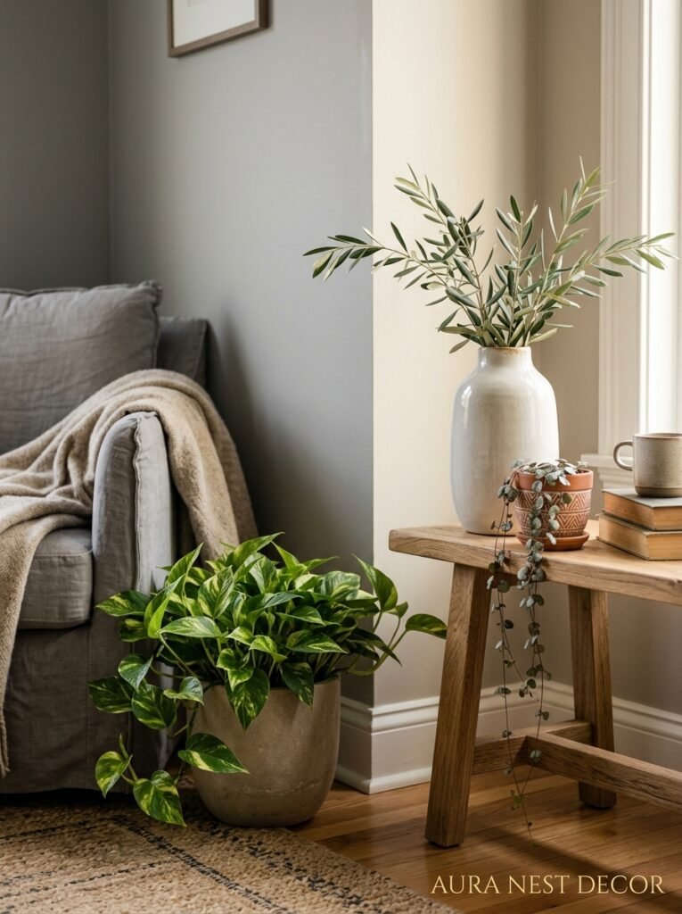
Not all plants work with this palette. There. I said it.
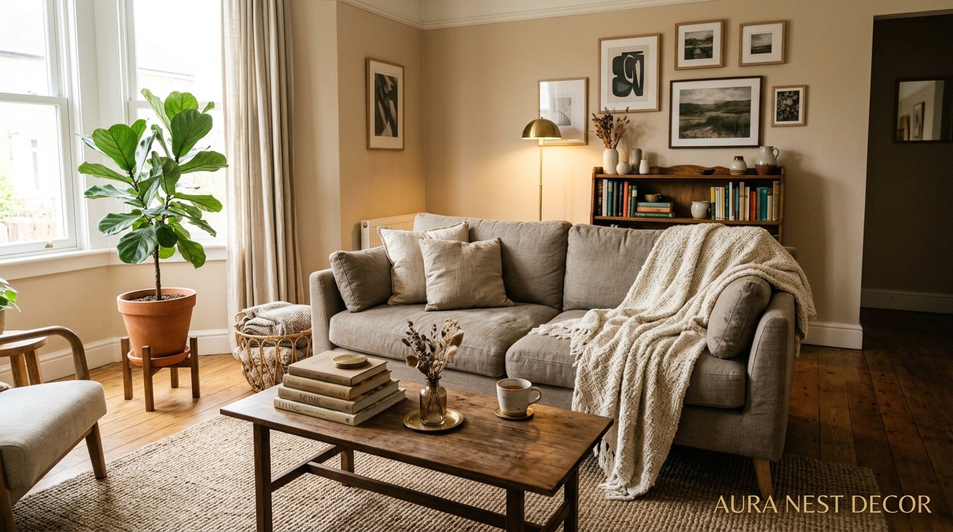
The fiddle leaf fig is everywhere, and it can work, but the very dark green and big graphic leaves can sometimes fight with the softness of a grey-beige room rather than complement it. Depends on the specific room and how much light comes in.
What I keep seeing work beautifully: olive trees (that soft, dusty, silvery-green is made for this palette), dried pampas grass in a tall ceramic vase, eucalyptus — fresh or dried — in something simple. Sage-toned succulents. The muted, dusty, silvery plant tones work with grey and beige in a way that bright tropical green sometimes doesn’t.
Also: terracotta pots are your friend. The warm orange-red of a terracotta pot introduces a new color to the room without jarring because terracotta has enough brown in it to read as a warm neutral. It grounds plant arrangements without feeling like you’ve suddenly added a bold color.
—
11. The Feature Wall Debate — and Where I Actually Land on This
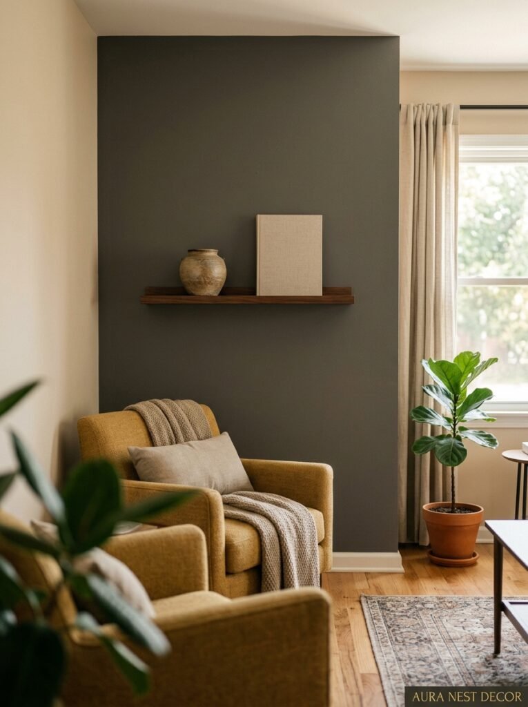
People have STRONG opinions about feature walls. I’m going to give you mine.
In a grey-and-beige living room, a feature wall works when it adds depth — not drama. A single wall in a deeper grey while the others stay in a warm beige or greige. A paneled wall in a putty tone with off-white detail in the grooves. Venetian plaster in a warm clay finish. These add texture and interest without breaking the serenity of the palette.
What doesn’t work: a bright color or busy wallpaper on one wall of an otherwise calm neutral room. It feels like an accident. Like someone changed their mind halfway through.
If you want wallpaper — and I think wallpaper is often the right answer, honestly — go for something subtle. A textured grasscloth in warm beige. A very faint geometric in tone-on-tone grey. Something that reads as texture from across the room and reveals its pattern when you get close. That’s the kind of wallpaper that works in this scheme.
—
12. The Accessories You Actually Need (vs. the Ones That’ll Clutter It Up)
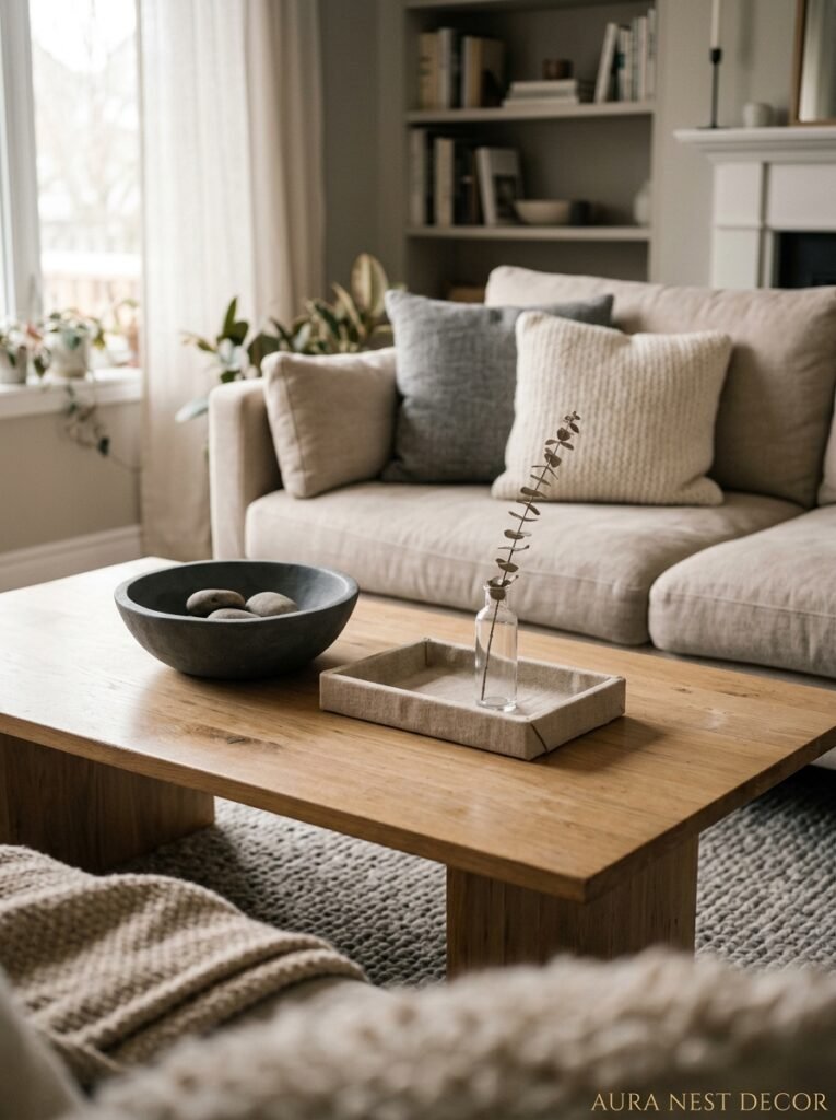
Let me be direct: less is more in a grey-and-beige living room. The palette is doing a lot of work. You don’t need thirty things on every surface.
What the room actually needs: a few considered pieces. A stack of coffee table books with nice spines. A single meaningful piece of art — not a grid of twelve small prints, but one or two larger pieces that the eye can settle on. A tray on the coffee table with two or three objects: a candle, a small ceramic vessel, maybe a piece of driftwood or stone.
Ceramics are especially good in this palette — handmade, slightly irregular ceramics in cream, grey, or a warm speckled glaze. They look like they belong.
And — this is important — don’t match everything. Matching cushions, matching throws, matching lampshades. A room where everything coordinates exactly starts to feel staged rather than lived in. Buy cushions from three different places. Let there be slight variation. That’s what makes a room look styled instead of decorated.
—
❓ FAQ
Q: Is grey and beige too boring for a living room? A: Only if you don’t work the texture and lighting. The palette has almost zero inherent contrast, so you have to build it through material and layer — linen, jute, velvet, brass, wood. Get those right and it’s one of the richest-looking combinations you can do.
Q: What colors can I add to a grey and beige living room without ruining it? A: Dusty pinks, terracotta, muted sage, and warm rust all sit beautifully within this palette. Stick to colors that have some brown or grey mixed into them — so muted rather than primary. Navy can work as a very small accent. Bright colors will fight with the softness of the scheme.
Q: Does grey and beige work in a small living room? A: Yes, actually better than a lot of palettes because it doesn’t close walls in the way dark or bold colors can. Keep your larger surfaces in lighter beige tones, bring grey in through accessories and smaller accents, and make sure your lighting is warm and layered. The room will feel larger, not smaller.
—
💭 Final Thoughts
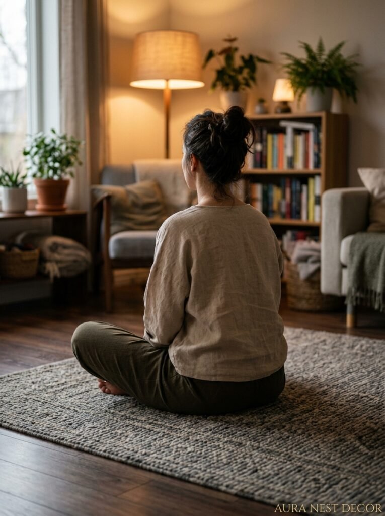
Grey and beige isn’t a compromise. It’s not the choice you make when you can’t decide on a real color. It’s a deliberate decision to make a room that feels calm, considered, and genuinely nice to spend time in — and that’s harder to pull off than it looks.
The rooms that really get it right are the ones where you can’t quite explain why they feel so good. You just know you want to sit down and stay a while.
So what would you keep, and what would you change, if you started your living room over tomorrow?