
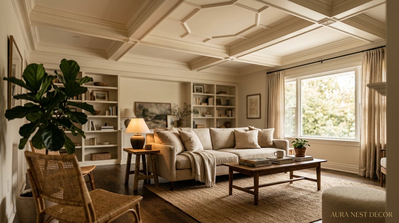
The Part of Your Living Room You’ve Been Completely Ignoring (And Why Designers Are Obsessed With It)
You painted the walls. You found the perfect sofa. You agonized over the rug for three weeks. And then you looked up — and there it was. A blank, flat, slightly boring ceiling doing absolutely nothing for you.
That’s the one. That’s your next project.
—
1. Why the Ceiling Is Actually the First Thing People Notice (They Just Don’t Realize It)
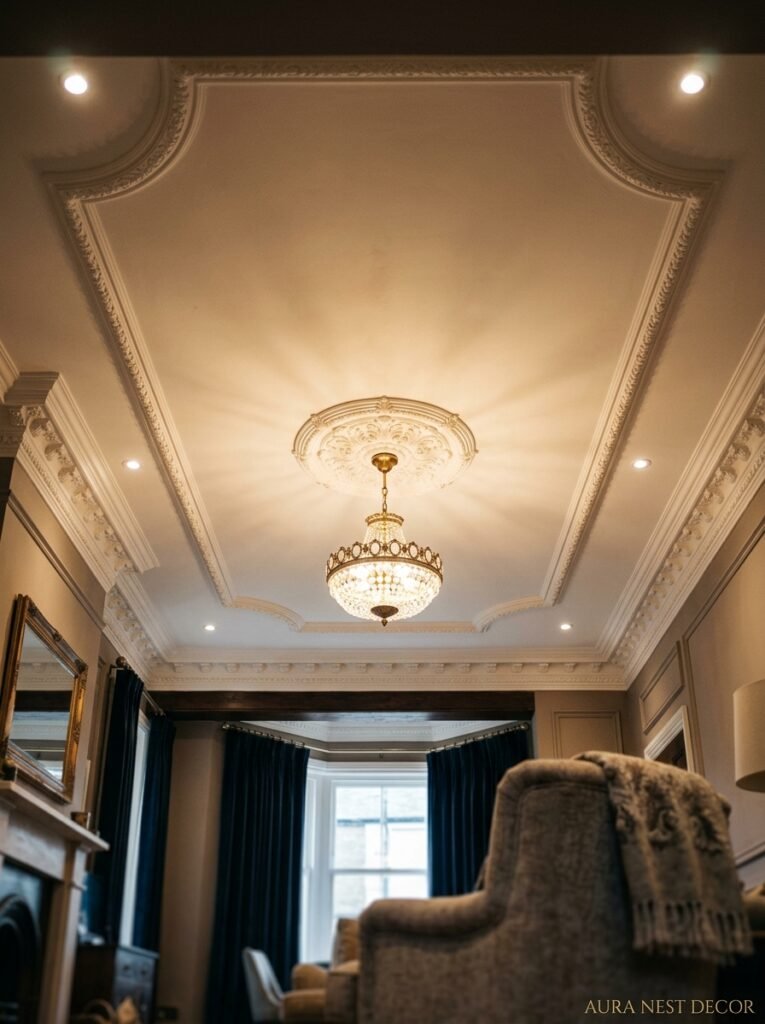
Okay so hear me out. When someone walks into a living room, they don’t consciously think “wow, great ceiling.” But the ceiling is doing enormous work underneath the surface of their awareness. It’s setting the height of the room in their body, not just their eyes. It’s determining whether the space feels expansive or intimate, grand or cozy. A low flat ceiling with no detail says “rental apartment.” A coffered ceiling with warm paint says “someone thought about this room.”
I’ve been in rooms with genuinely stunning furniture — like, proper investment pieces — where everything still felt slightly off. And it was the ceiling every single time. Flat white, no detail, often with a slightly dirty popcorn texture or a single sad ceiling rose that didn’t match anything else. The ceiling was actively working against the room.
Here’s the thing designers know that most homeowners don’t: the ceiling is the one surface no furniture is competing with. It’s pure canvas. And that means whatever you do to it has an outsized impact compared to anything you do at eye level.
So yes. It matters. A lot.
“The ceiling isn’t the fifth wall. It’s the first impression — you just haven’t been looking up.”
—
2. The Color Rule That’ll Make Your Living Room Feel Custom-Built
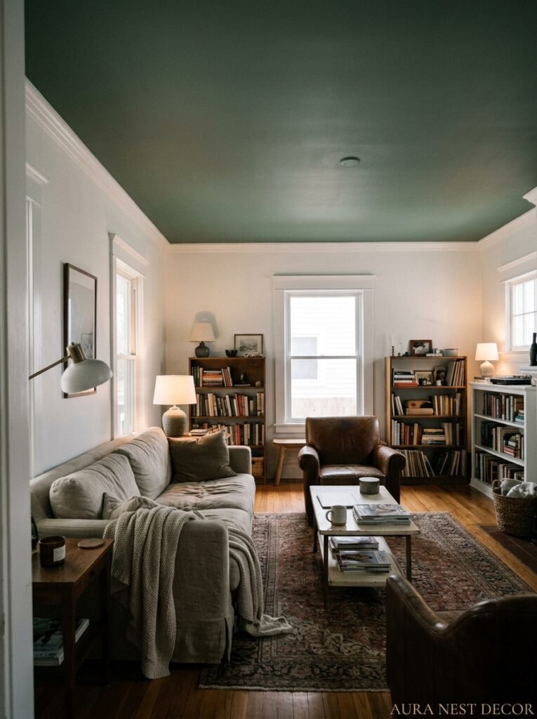
White. Why is it always white? I get it, I do — white feels safe, it feels like it opens things up, it feels like the neutral backdrop. But there’s a version of white that’s doing real work and a version that’s just… not making a decision.
The rule that actually works: paint your ceiling 2-3 shades lighter than your walls, not bright white. If your walls are a moody sage green, try a barely-there celadon on the ceiling. If your walls are warm cream, go for a very soft blush or the palest warm ivory. The ceiling will still feel lighter than the walls — which your brain reads as “airy” — but there’s no jarring break. The room wraps around you instead of stopping at shoulder height.
And then there’s the bold option, which honestly I think more people should try. Deep navy ceilings. Forest green. A saturated terracotta. It sounds like too much and then you see it in person and it’s like — oh. OH. It makes the room feel like somewhere. Not just a room with stuff in it, but an actual place with a mood and an intention.
Flat or matte finish always for ceilings, by the way. Gloss up there catches every imperfection and bounces light in a way that just feels cheap, no matter how expensive the paint was.
—
3. Coffered Ceilings Are Having a Moment and Here’s Why They Actually Work in Normal Houses
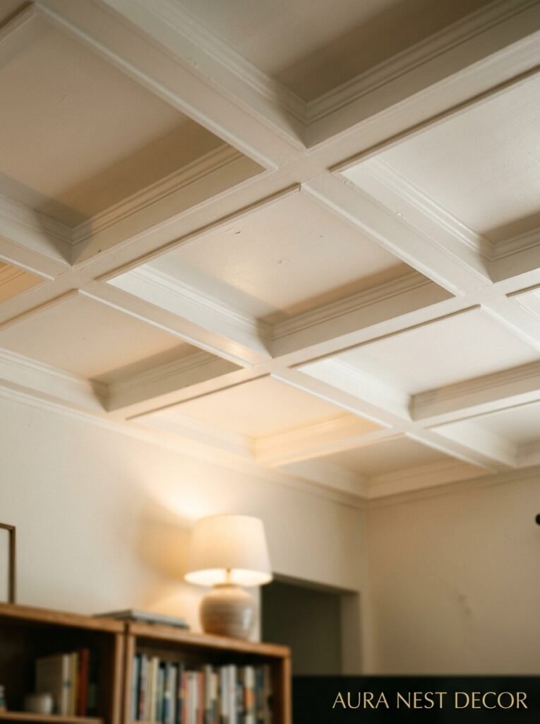
For a long time, coffered ceilings felt like something you’d only see in a Georgian country house or a very serious Manhattan apartment. Heavy, expensive, permanent. Not for regular people with regular budgets and regular builders.
That’s changed. The way people are doing coffers now is lighter, more modern — and honestly more interesting. Narrower beams, painted the same color as the ceiling so the whole thing reads as texture rather than architecture. Or the opposite: painted a contrasting color so each recessed panel becomes a feature in itself.
The practical magic of a coffered ceiling is that it adds depth to a flat surface without actually changing the height of the room. Your eye perceives those recessed panels as shadow and dimension. The room immediately reads as more finished, more considered. More like a room someone designed rather than a room someone moved into.
You can DIY a faux coffered ceiling with MDF strips and a weekend, not gonna lie. It’s not as hard as it looks. The trick is keeping the proportions right — panels that are too small look fussy, too large look unfinished. About 18-24 inches square in a standard room, with 3-4 inch beams, tends to hit the sweet spot.
—
4. The Beam Situation: Exposed Wood vs. Painted vs. Shiplap (They’re Not All the Same)
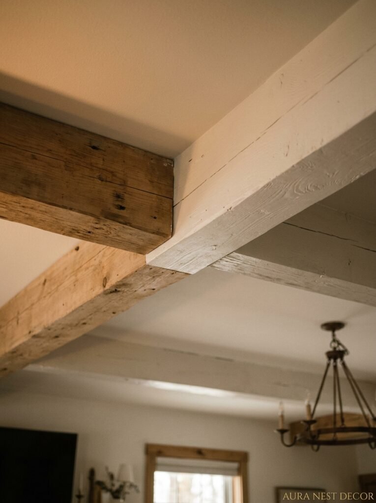
Beams are one of those things that can go very right or very period-drama-wrong depending on how you approach them.
Exposed wood beams — actual structural or decorative timber, raw or lightly oiled — belong in spaces with other natural materials. Stone floors, linen sofas, terracotta pots. They need company or they look like a costume piece stuck onto a normal room. But when they have that company? Genuinely beautiful. There’s something about the amber and honey tones of real oak at ceiling height that makes a room feel grounded and warm in a way nothing else quite does.
Painted beams are a different thing entirely. White beams on a white ceiling can give you the architectural interest without the visual weight. It’s more subtle — you almost don’t notice the beams until you realize the ceiling has depth and you’re not entirely sure why. Works especially well in smaller living rooms where dark wood would feel oppressive.
Shiplap on ceilings is its own conversation. It’s casual in a way that beams aren’t. More Americana, more beach house, more that specific kind of relaxed American living room that British homeowners are sort of obsessed with right now. In wide planks with a matte white paint, a shiplap ceiling can make a standard room feel like a thoughtful renovation rather than a surface you just hadn’t gotten to.
“Stop thinking about what ceiling treatment fits your style. Start thinking about what ceiling treatment creates the mood you want to live inside.”
—
5. Wallpaper on the Ceiling — Yes, Really, and It Works
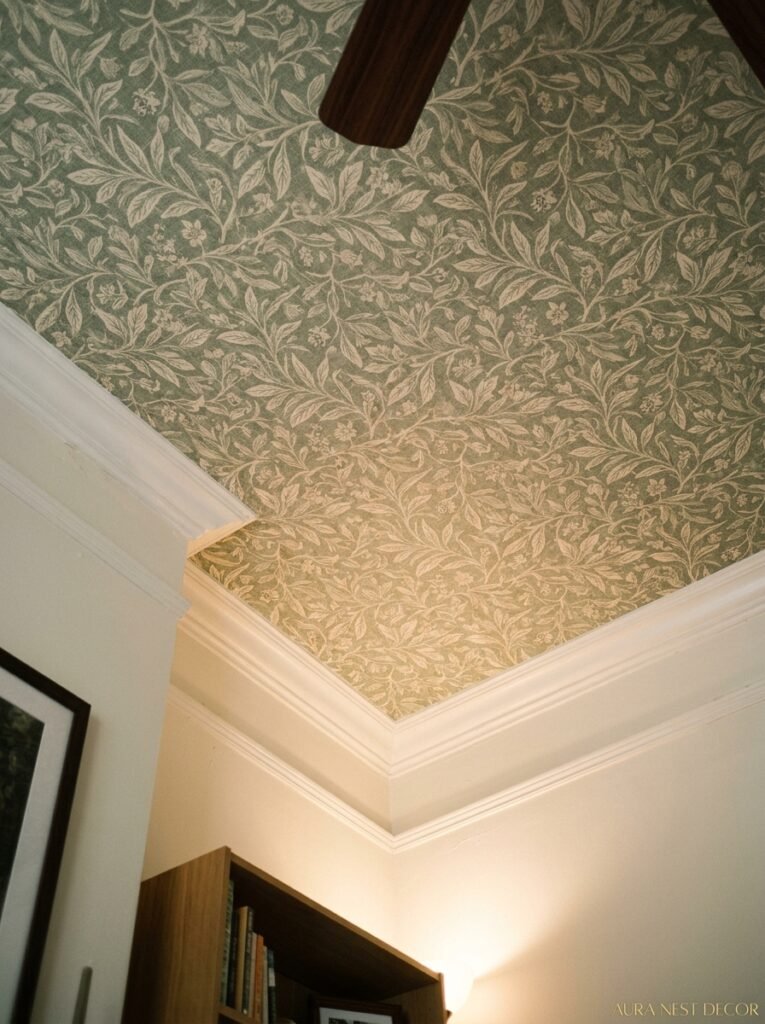
This one divides people and I love it for that. Ceiling wallpaper isn’t new — it’s actually very old, very grand, and it’s back in a big way. But the new version isn’t the fussy Victorian damask of your imagination. It’s botanical prints. Geometric patterns. Tonal textures. Abstract shapes in colors that tie back to something in the room.
The reason it works so well in a living room specifically is that you actually spend time in there looking at the ceiling. Lying on the sofa, chatting with someone, staring upward during a film. The ceiling is in your field of vision constantly. So putting something visually interesting up there isn’t extravagant — it’s practical.
A few things that make ceiling wallpaper successful rather than chaotic: keep the pattern relatively small-scale (big repeats can feel dizzying), pick a paper that ties to at least two other elements already in the room, and consider leaving the ceiling white if there’s a lot happening on the walls. The ceiling wallpaper works best as the feature in a room that’s otherwise fairly calm. Give it space to be the interesting thing.
Side note — dark botanical papers on ceilings in bathrooms got very famous on Pinterest, and now people are bringing the same logic into living rooms. It’s a good call.
—
6. The Light Fixture Relationship: Why Your Ceiling and Your Pendant Were Made to Work Together
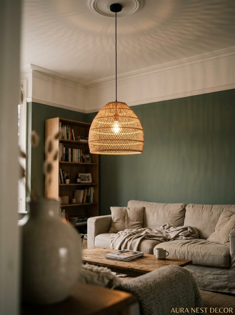
Here’s something that gets overlooked constantly: the ceiling design and the light fixture aren’t separate decisions. They’re in a relationship. They affect each other. And if you choose them separately, you’ll end up with two things that are both fine and somehow don’t look right together.
A sculptural pendant — say, a rattan globe or a clustered glass piece — needs a plain ceiling to breathe. Put that same pendant against a heavily coffered ceiling and it gets lost, or worse, it looks cluttered. Coffered or beamed ceilings tend to work better with something simpler: a flush mount in a warm metal, or a very clean cone pendant in brass or matte black.
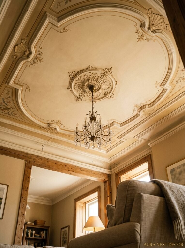
Ceiling roses are their own thing and they’re underused. A proper plaster ceiling rose around a pendant mount is one of those small choices that makes a room feel like it was decorated rather than furnished. You can get them for very little and install them in an afternoon. The impact is disproportionate to the effort.
Recessed lighting grids bother me, I’ll just say it. A grid of downlights on a plain ceiling is efficient and completely joyless. If you’re going recessed, go for two or three positioned asymmetrically, supplemented with floor and table lamps. The ceiling doesn’t need to carry all the light. It just needs to not look like a dropped commercial ceiling.
—
7. The Tray Ceiling Trick Nobody Talks About Enough
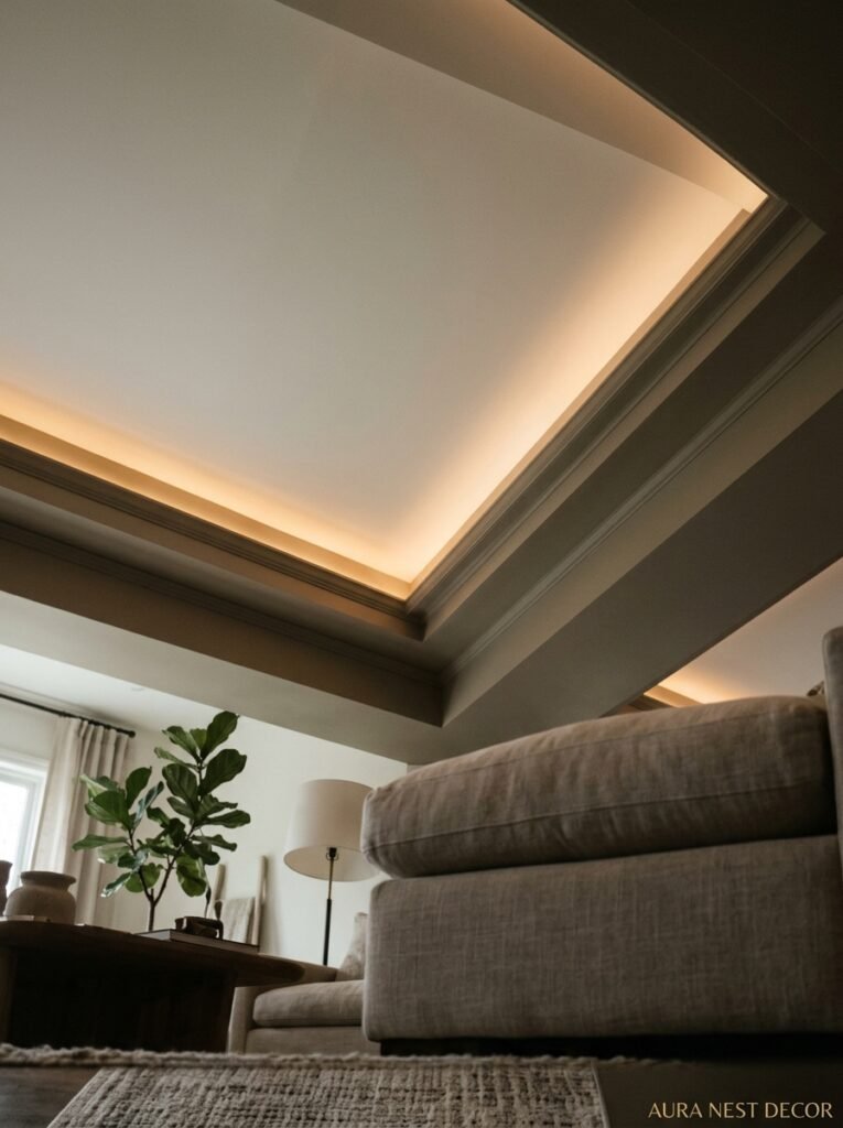
A tray ceiling — where the center section is recessed upward, creating a layered effect — sounds like something that already needs to exist in your house. It doesn’t. You can create a faux version with molding and a paint technique that costs almost nothing.
The trick is using the color shift. Paint the outer “border” your wall color. Paint the recessed center a contrasting color — usually deeper, but not always. The eye reads this as genuine architectural depth even when it’s flat. It’s basically trompe l’oeil for ceilings. Takes a day, maybe two if you’re doing the molding yourself, and it makes a standard 9-foot ceiling feel like something a proper designer signed off on.
The real version — if your builder is doing it structurally — also gives you a home for LED strip lighting tucked into the tray ledge. That ambient uplighting at ceiling level is the secret behind every living room that looks like it belongs in a magazine. It’s warm, it’s indirect, and it makes the ceiling glow from within rather than being lit from below.
“The ceiling that glows is the one that makes every guest quietly wonder what it is about this room that just feels so good.”
—
8. Why Victorian Cornicing Is Trending in American Living Rooms Right Now
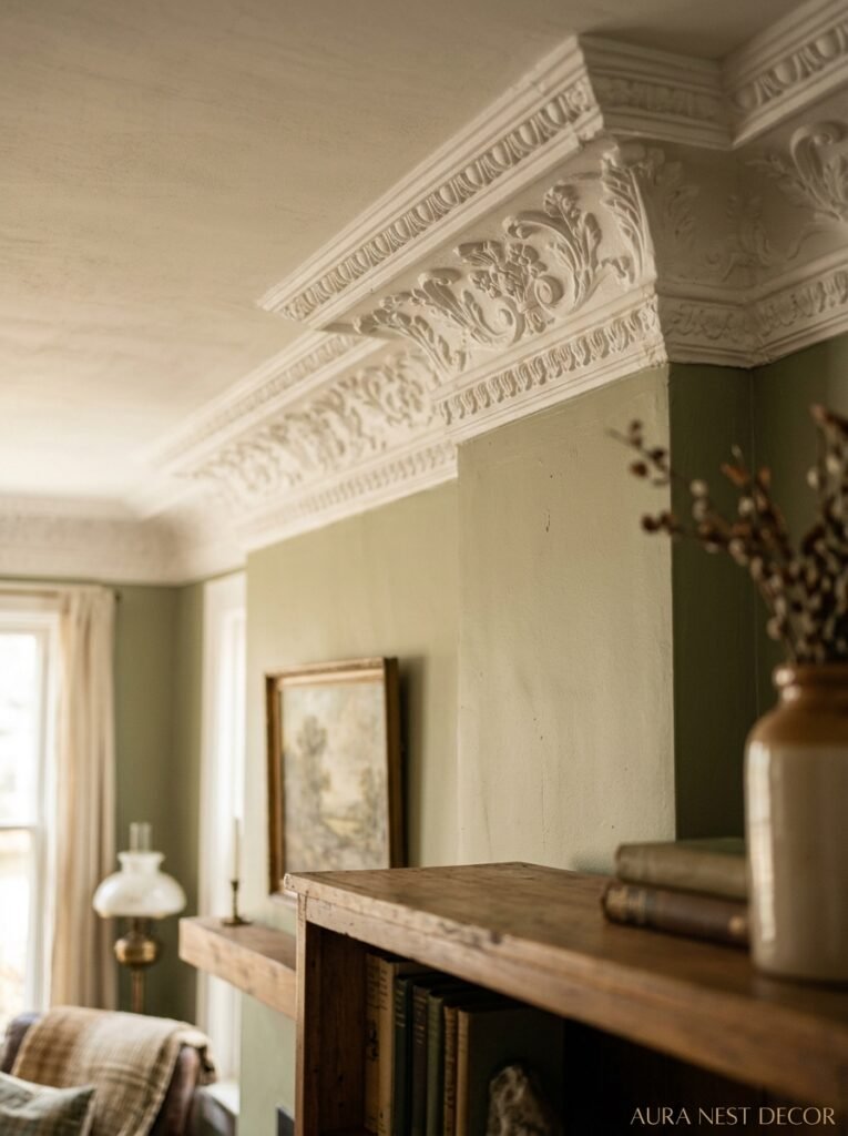
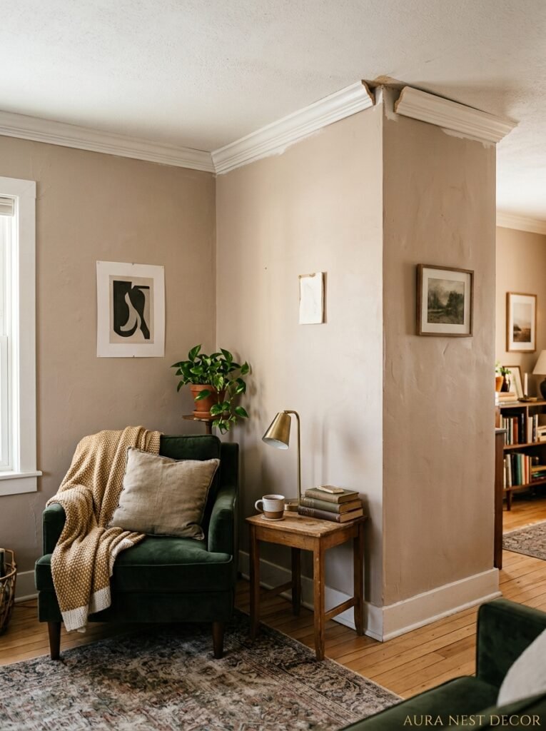
British homeowners have had this forever and Americans are finally catching on. Plaster cornicing — that decorative molding running around the junction of the wall and ceiling — does something almost structural to a room’s proportions. It closes off the top of the room in a deliberate way. The wall ends. The ceiling begins. And that clear delineation makes both surfaces feel more intentional.
The modern version of this in American living rooms isn’t the elaborate egg-and-dart molding of a Victorian terrace. It’s cleaner. Deeper. More architectural. A chunky, simple profile in three or four inches that reads as a design choice rather than a period feature.
And the paint trick that goes with it: paint the cornice the same color as the ceiling, not the wall. This makes the room feel taller because the ceiling “starts” lower — your eye follows the molding color upward. It’s counterintuitive but it genuinely works.
For UK readers, if your cornicing has been painted over seventeen times and has completely lost its detail — which is very common in Victorian and Edwardian houses — it’s worth getting it cleaned back or replaced. Fuzzy, shapeless cornicing is almost worse than none at all.
—
9. The Small Living Room Ceiling Trick That Makes a Huge Difference
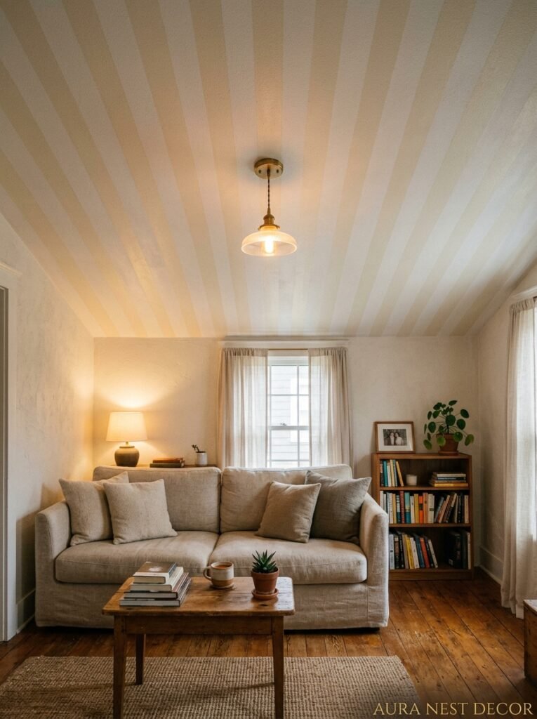
Small living rooms get the worst ceiling advice. “Keep it white! Don’t draw attention to it!” But actually, doing something interesting with a low or small ceiling can make it feel deliberately intimate rather than accidentally cramped.
The key is vertical lines. A series of narrow painted or molded lines running from the top of the wall onto the ceiling — even just 18 inches onto the ceiling — tricks the eye into perceiving height that isn’t there. The visual flow doesn’t stop at the wall-ceiling junction, so neither does your sense of the room’s size.
Another one: hanging a fabric panel or a textile from the ceiling, just above a seating area. It sounds odd. It looks like a canopy, the kind of layered cozy thing that makes a corner feel private and purposeful. In a small room, that kind of overhead definition can make the low ceiling feel like a feature, not a flaw. Kind of like a restaurant booth — the enclosure is part of what makes it feel special.
And please, if you have a small living room, skip the ceiling fan. I know they’re practical. But a fan with a light kit in a small room with a low ceiling is doing real damage to the visual sense of space. Get a good floor lamp and a table fan if you need air movement.
—
10. The Color That Keeps Showing Up in Every Beautiful Living Room Ceiling Right Now

It’s not white. And it’s not black. It’s that particular dusty, smoky blue-green — the color of old copper, of sea glass, of the inside of an oyster shell. It goes by different names depending on the brand: some call it duck egg, some call it mineral blue, some call it verdigris.
And it’s everywhere because it does something genuinely unusual. On a ceiling, that particular blue-green reads as neutral in most light conditions but comes alive in evening light. Under warm lamp light, it goes almost sage. In morning light it goes slightly grey. It shifts, and that shifting makes a room feel like it has atmosphere rather than just decoration.
It works especially well in living rooms with natural wood, cream fabrics, and any kind of warm metal hardware. Which, honestly, describes a lot of current living rooms. So if you’ve been looking for a ceiling color that feels interesting but not risky — that’s the one.
—
11. The Budget Version of Every Single Ceiling Trend (Because Not All of Us Are Doing a Renovation)
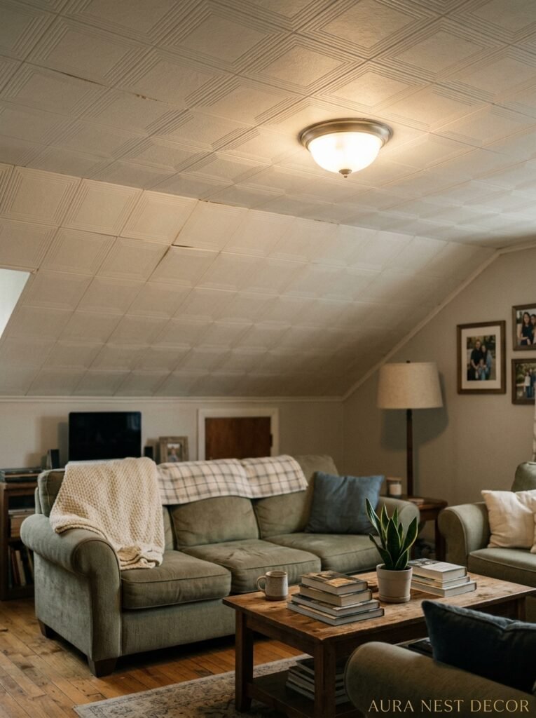
Real beams cost money. Real cornicing costs time. Wallpaper on ceilings requires confidence and probably a professional if your ceiling isn’t flat. I hear you.
But almost every ceiling trend has a version you can do on a Saturday without destroying your budget or your mind.
Faux beams made from lightweight polyurethane foam — they look like wood, they weigh almost nothing, they go up with adhesive and a few nails. A faux coffered ceiling with MDF strips from any hardware store. Ceiling paint in an interesting color — that costs the same as white ceiling paint, literally just a different color in the same can. Peel-and-stick wallpaper on the ceiling, which sounds terrifying but works in rooms with good humidity control.
The most underused budget option? A painted ceiling medallion. You don’t need an actual medallion. Tape off a circle around your light fixture, paint it a different color or in a contrasting sheen, and you have a feature. Takes an hour. Looks like you meant to do something architectural there and followed through.
—
12. The One Ceiling Mistake That Makes Even Beautiful Rooms Look Unfinished
Visible seams on a skim coat or plasterboard ceiling that hasn’t been fully prepared before painting. I know that’s specific. But it’s SO common and it’s so distracting once you see it.
If you’re going to do anything interesting with your ceiling — and now I hope you are — you have to start with a properly prepared surface. That means filling any cracks, sanding the seams of any plasterboard, using a proper ceiling primer, and doing at least two coats of the finish paint. A ceiling with great color over an unprepared surface looks worse than a flat white ceiling that was done correctly.
The other mistake: choosing a ceiling treatment that doesn’t connect to anything else in the room. Coffered ceilings in a room with zero other architectural details look oddly formal and lonely. Shiplap in a very sleek modern room looks like a set change. Whatever you do up there should feel like it was always the plan — even if it wasn’t.
—
❓ FAQ
Q: What’s the cheapest way to make a living room ceiling look more interesting? A: Honestly, just paint it a non-white color — something warm and interesting in the same palette as your walls but a few shades lighter or slightly different in undertone. It costs the same as painting it white and it completely changes the room’s atmosphere. That’s your easiest starting point before anything structural.
Q: Can I add ceiling beams to a low ceiling without it feeling claustrophobic? A: Yes, if you go with painted beams the same color as the ceiling rather than dark wood. The contrast is what creates visual weight. Tone-on-tone beams give you the texture and architectural interest without the heaviness, and they tend to work really well in rooms under 8 feet where dark beams would feel oppressive.
Q: Is ceiling wallpaper hard to install and will it come down easily? A: Regular wallpaper on a ceiling is genuinely tricky — gravity is working against you and you’ll want a second pair of hands. Peel-and-stick wallpaper is more manageable solo. In terms of removal, most wallpapers come off cleanly with the right technique and a steamer, but prep the surface well when you’re putting it up so removal doesn’t take the plaster with it.
—
💭 Final Thoughts

The ceiling is the one room decision that most people are still leaving to chance — and I think that’s exactly why touching it makes such an outsized difference. You’re doing something the room didn’t expect. You’re completing a space that was previously half-finished without anyone quite realizing it.
You don’t have to do all of this at once. You barely have to spend anything to start. One interesting color, one string of well-placed molding, one ceiling rose around a pendant you already love — that’s enough to make the room feel like someone really thought it through.
So the question is: when’s the last time you actually looked up?




