
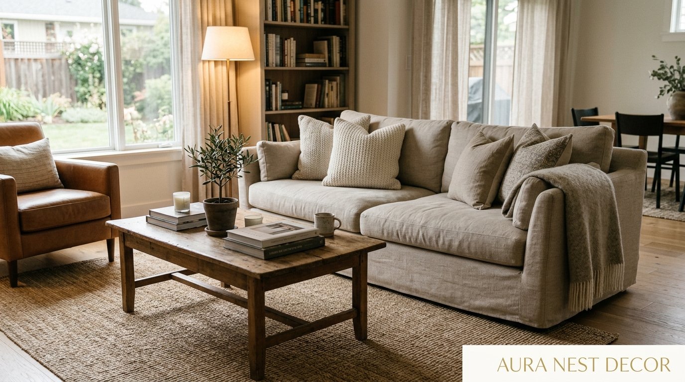
The Living Room Glow-Up That Doesn’t Require a Single Trip to IKEA
You know that feeling when you walk into someone’s living room and immediately want to live there? Like, you don’t want to leave. Ever. That’s not magic — it’s choices. Specific, intentional, sometimes surprising choices that most people don’t think to make.
—
1. The Lamp Placement Mistake Almost Every Living Room Is Making Right Now
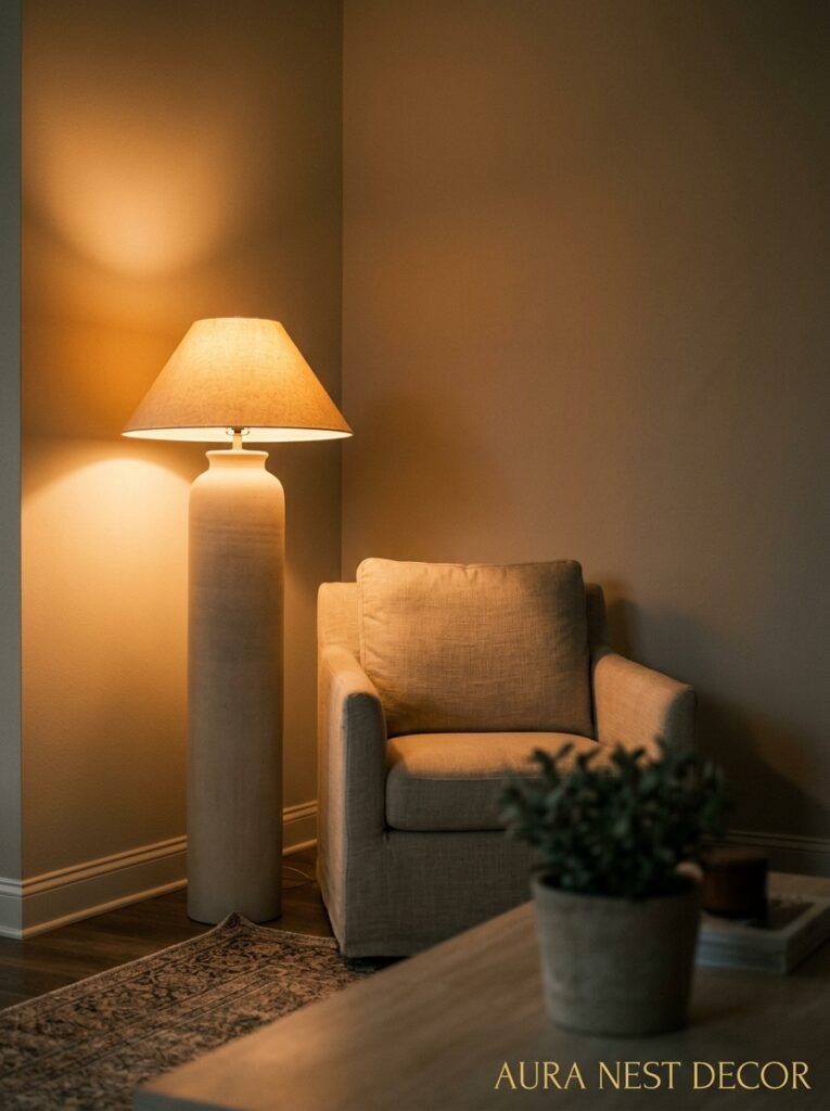
Let’s talk about overhead lighting for a second. It’s ruining your room. I know that sounds dramatic, but hear me out — a single ceiling light pointed straight down at your sofa creates this flat, slightly sad quality that no amount of throw pillows can fix. It makes beautiful rooms look like waiting rooms.
The fix is lamps. Plural. Positioned at different heights. Not one floor lamp in the corner doing all the work, but a table lamp on the sideboard, a reading lamp angled near the chair, maybe a little plug-in sconce on the wall if you’re feeling ambitious. The goal is layered light at different levels, so the room kind of wraps around you when you sit in it.
I switched to this approach about two years ago and I genuinely can’t overstate the difference. My living room at 7pm now has this warm amber quality that actually makes people stop mid-conversation to comment on how good it feels in there. That’s not the sofa. That’s not the rug. It’s where the light is coming from and how many sources there are. Get rid of the overhead habit. It’s the single fastest thing you can do.
“Overhead lighting is where living rooms go to feel institutional. Lamps are where they come alive.”
2. The Color That Keeps Showing Up in Every Beautiful Living Room Right Now
It’s not sage green. Sage had its moment, it was a beautiful moment, but something else is happening now.
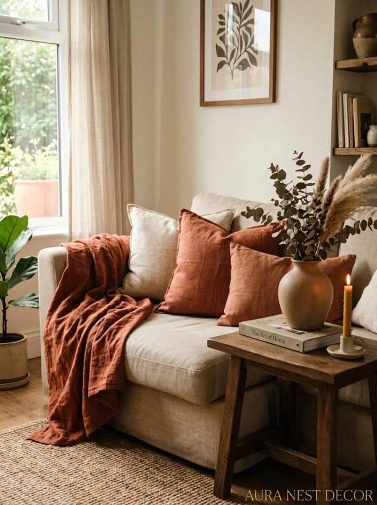
Deep warm terracotta is everywhere — and not in a trendy, it’ll-look-dated-in-three-years way. In a very old, very European, this-color-has-been-on-walls-for-centuries way. You’re seeing it in London townhouses, you’re seeing it in Brooklyn brownstones, you’re seeing it in California bungalows. And it works because it does something really specific: it makes every other color in the room feel warmer and more expensive-looking. Your existing white pillows look creamier. Your wood tones look richer. Your gold hardware looks intentional.
Don’t want to commit to a full wall? I get it. But even one terracotta accent — a large vase, a woven throw, a couple of cushions — shifts the energy in ways that are genuinely hard to explain. It’s a grounding color. Like the room exhaled.
The other thing happening right now is people mixing it with dark navy or deep forest green, which sounds a bit chaotic on paper but looks incredible in reality. The contrast is punchy without being aggressive. Worth trying before you dismiss it.
3. What Your Sofa Is Actually Telling People About You (And How to Change the Conversation)
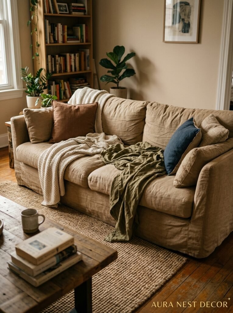
Most people choose their sofa by size and price and then wonder why the whole room feels off. The sofa isn’t just furniture — it’s the anchor. Every other decision radiates out from it. So when the sofa is wrong, everything else is fighting against it.
Here’s what I mean. A low, sprawling sectional says one thing. A high-backed Chesterfield says something completely different. Neither is wrong, but if the sectional is trying to coexist with formal curtains and a Persian rug, there’s a conversation happening in that room that nobody wants to have. The pieces are arguing.
The easiest way to pull a living room together if you’re not starting from scratch? Figure out what your sofa’s personality is and then dress the room to match it. Slouchy, casual, slipcovered sofa? Go toward natural linen, chunky knits, worn wood. Structured velvet sofa with clean lines? Lean into it — add some brass, some sculptural art, a sleek coffee table with a bit of an attitude.
And side note — if your sofa is beige and you’re bored of your room, the sofa isn’t the problem. Beige sofas are actually incredibly versatile. The problem is probably the rug.
4. The Rug Sizing Chart Everyone Ignores Until It’s Too Late
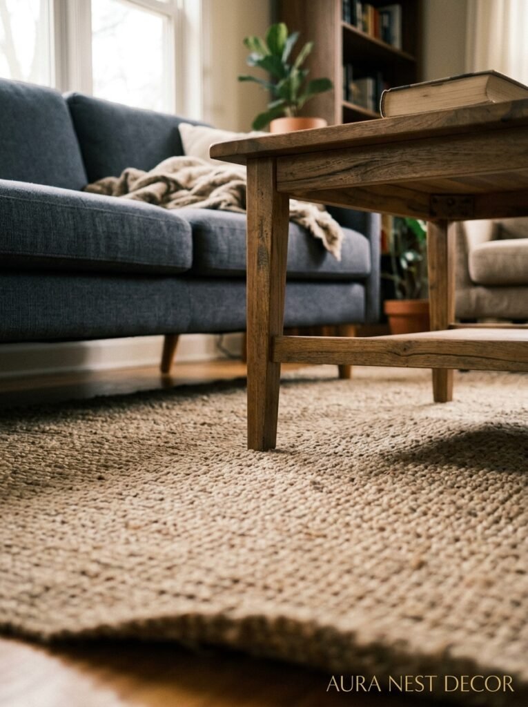
Too small. Almost every living room rug is too small. This is the number one mistake I see on room inspo boards, in home tours, everywhere. A tiny rug floating in the middle of a room doesn’t define the space — it just looks like you ran out of budget and tried to pretend otherwise.
The standard rule: at minimum, the front legs of all your seating should sit ON the rug. Ideally, you want the whole sofa on it. I know larger rugs cost more. But a 9×12 rug will make a medium living room look like a completely different, much larger, much more intentional space. It’s one of those purchases where the visual return is completely out of proportion to the effort.
“If you can see too much floor around your rug, the rug is lying to your room about its own size.”
Natural fiber rugs — jute, sisal, wool — are having a serious moment right now and honestly they deserve it. They add texture in a way that feels organic rather than decorative. Layer a smaller vintage-style rug on top of a jute base and suddenly you’ve got a room that looks like it was styled by someone who really knows what they’re doing.
5. Gallery Walls That Don’t Look Like They Came From a Template
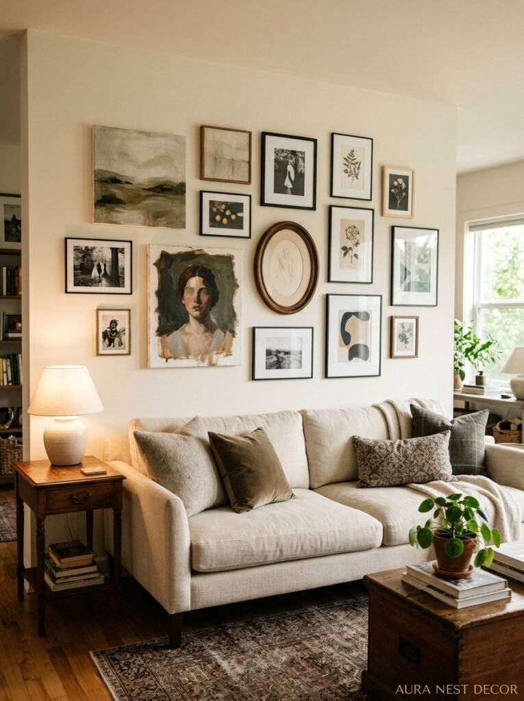
I’m a little tired of the perfectly curated grid gallery wall, if I’m honest. The one where every frame is the same color, every piece of art is a similar vibe, and it’s all centered with mathematical precision over the sofa. It looks fine. It also looks like a hundred thousand other rooms.
What’s interesting right now is the more casual, slightly imperfect approach. Frames in different finishes — some black, some wood, one or two in a surprising color. Art that doesn’t all match in mood: a botanical print next to a graphic abstract next to a black-and-white photo from somewhere you’ve actually been. Different sizes arranged with some actual breathing room between them, not packed tight like a grid.
The thing that makes this work instead of just looking messy is usually one or two large anchor pieces. If everything is small and the same size, it reads as scattered. But one or two genuinely large pieces — at least 18×24 or bigger — give the eye somewhere to land and everything else can be more casual around them.
Don’t overthink the arrangement. Lay it out on the floor first. Trust your gut more than the ruler.
6. The Forgotten Surface That’s Making Your Living Room Look Unfinished
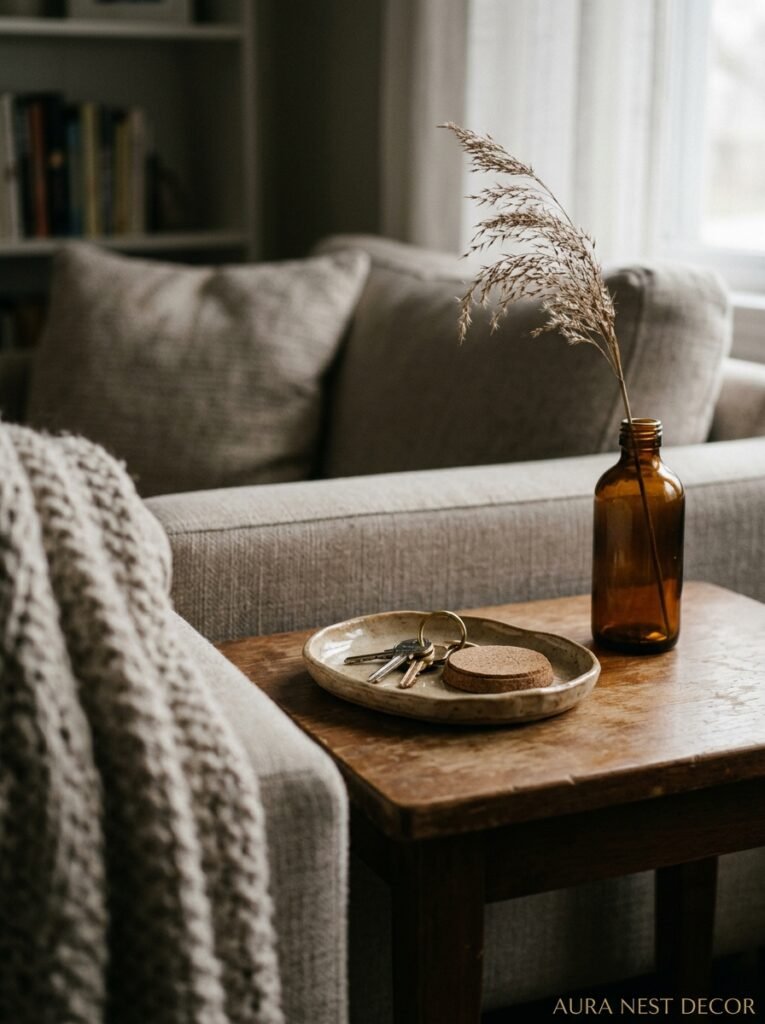
The windowsill. Oh my gosh, the windowsill.
People style their coffee tables with obsessive attention. They agonize over shelf arrangements. And then they leave their windowsills completely bare or, worse, piled with random stuff that somehow migrated there. A windowsill is actually prime real estate. It’s backlit. It has natural light hitting it all day. It’s one of the most visible surfaces in the room and it’s almost always an afterthought.
A couple of small plants that can handle the light levels. One or two interesting objects — a piece of found pottery, a small stack of books, a single tall candle. That’s it. Not cluttered, just considered. The difference between a styled windowsill and an empty one is significant in a way that’s weirdly hard to put your finger on. The room just feels more cared-for.
This goes for fireplace mantels too, but those at least get some attention. Windows almost never do.
7. Why the “Matching Suite” Furniture Look Reads as Dated Now
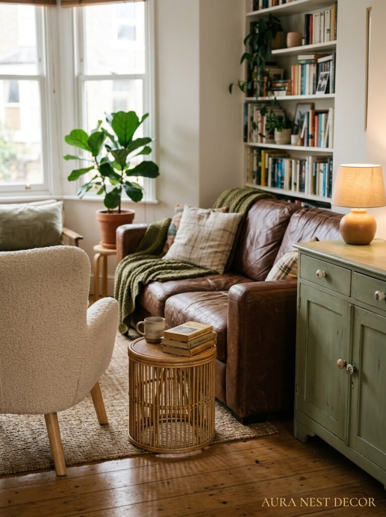
There was a long time when buying the matching sofa, armchair, and loveseat set felt like the safe, sophisticated choice. Coordinated. Intentional. Put-together. And I get why — it takes some of the guesswork out of decorating.
But matched furniture suites have this quality now that’s hard to shake: they make a room feel like a showroom floor rather than somewhere a real person lives. Everything matches too well. There’s no tension, no surprise, no sense that the room collected itself over time.
The approach that actually looks expensive right now is mixing. A sofa in one fabric, an armchair in something completely different — a contrasting color or texture that you wouldn’t automatically pair. A second chair that doesn’t match the first but somehow works. The key is usually keeping some consistency somewhere: maybe the legs are all the same material, or the colors are all pulled from the same warm or cool family, even if the pieces themselves are different.
“The rooms that feel the most lived-in and loved aren’t the ones that match. They’re the ones that fit.”
8. Curtain Heights That Are Doing Your Windows a Massive Disservice
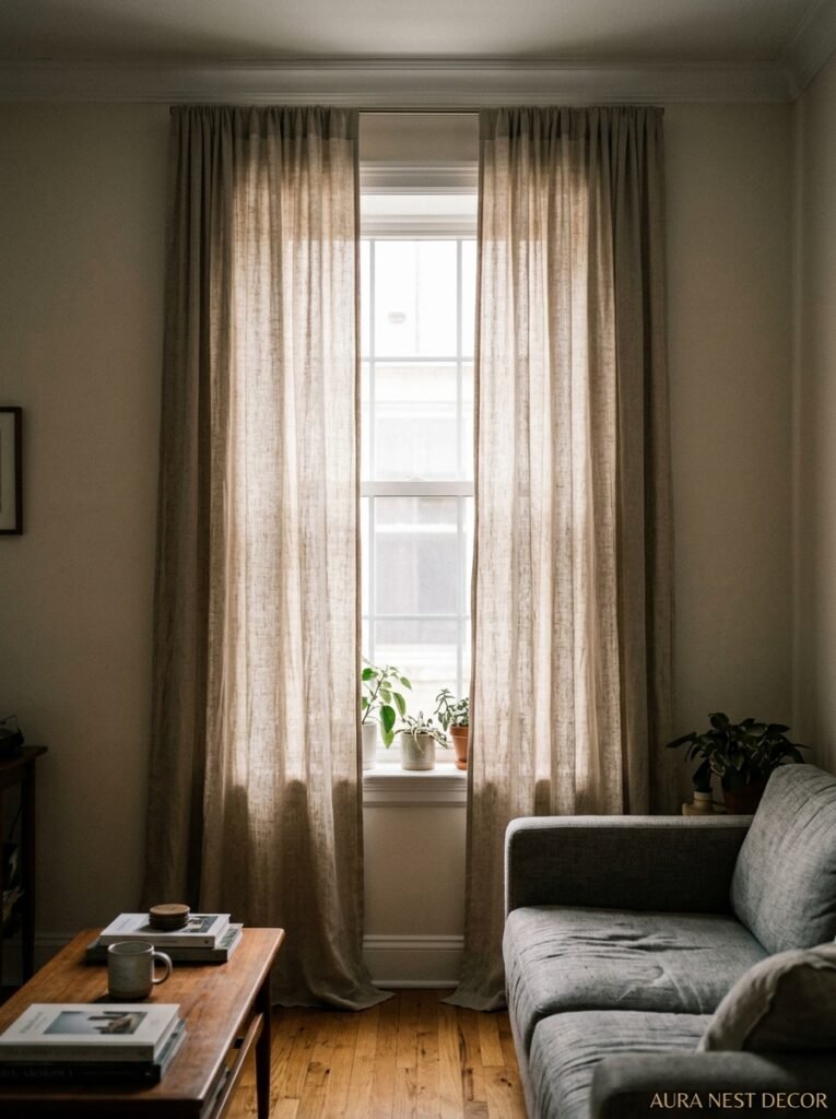
Floor-to-ceiling curtains hung from as high as possible are not optional. They’re not a design extra. They are the thing that tells the eye “this is a real room with real height and real intention.” And yet the number of rooms where curtains stop awkwardly just above or right at the window frame is genuinely startling.
Curtains hung at window height make your windows look shorter. They make your ceilings look lower. They make the whole room feel compressed and kind of unresolved. The fix is easy — hang the rod as high as you can, ideally right near the ceiling, and get curtains long enough to just skim or slightly pool on the floor.
If your existing curtains aren’t long enough, you can actually add a complementary fabric panel at the bottom to extend them. It’s a slightly unconventional move but it works better than you’d think, especially if the bottom fabric has a little bit of interest — a subtle texture or a tone slightly different from the main curtain.
Wide panels matter too. When curtains are pulled back they should look full and generous, not two sad flat rectangles.
9. The Coffee Table Arrangement That Actually Looks Good in Real Life (Not Just in Photos)
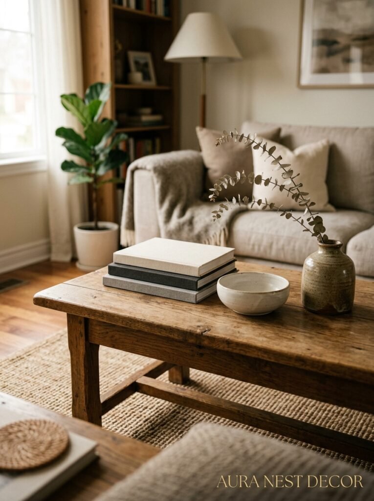
Coffee table styling is almost a genre at this point. You’ve seen the stacked books with an object on top, the tray with a candle and some succulents. And those things work — but they can start to feel like you’re following a recipe, and the result looks like a set rather than your actual living room.
What I’ve found works better in practice: one anchor object that’s genuinely interesting. Not pretty-interesting, but actually interesting — something that has a story, that’s made of an unusual material, that was found somewhere. Then a living element, which can be flowers but doesn’t have to be (a small trailing plant, a branch, something with movement). Then something with height variation, which is often just a stack of books but could be a sculptural object.
The biggest mistake on coffee tables is symmetry. Two identical piles, one on each side, with matching objects on top. Nope. Offset everything. Let one side be a bit taller than the other. Let there be more going on in one corner. Asymmetry reads as confidence.
10. The Bookshelf Move That Interior Designers Use Constantly and Nobody Talks About
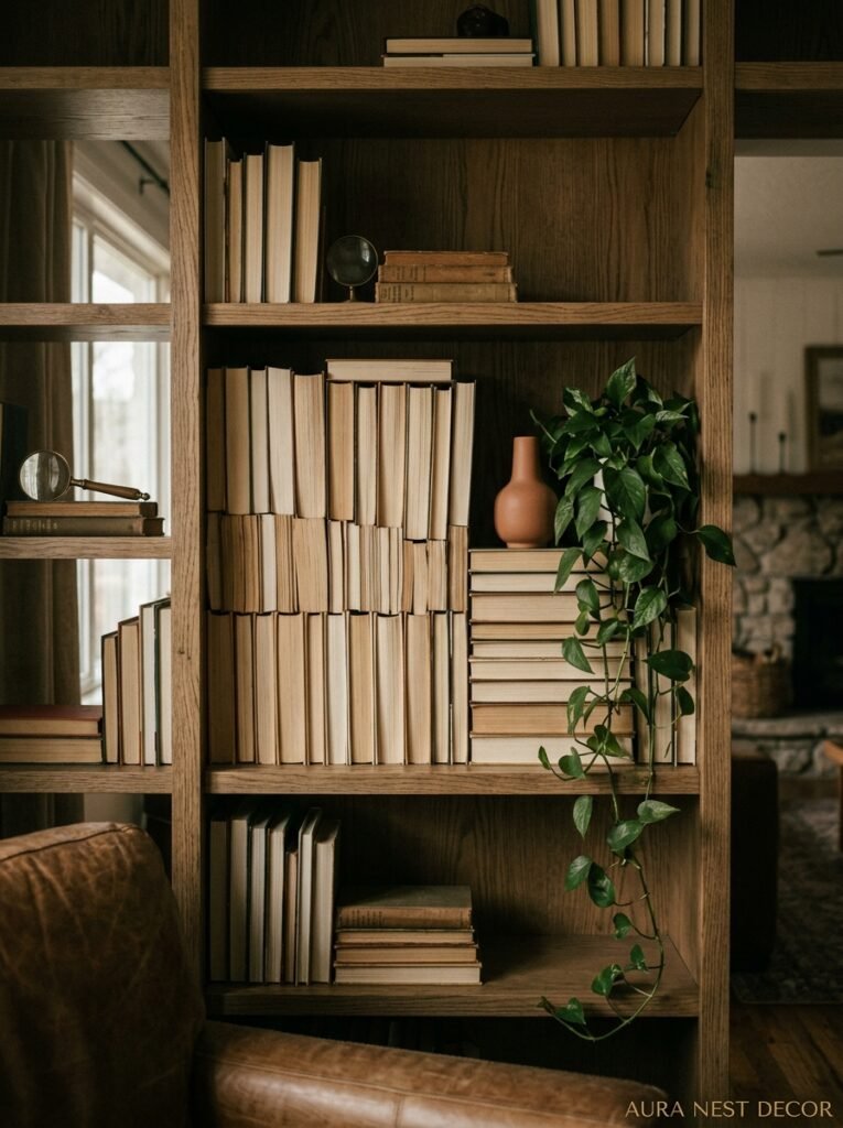
Facing some books backward. Specifically, turning books spine-in so you see the pages rather than the covers. It creates these lovely blocks of creamy white texture that break up the visual noise of a hundred different colored spines, and it makes a full bookshelf suddenly look curated rather than just full.
You don’t have to do all of them. In fact, don’t. Mix spine-out and spine-in books, use the backward ones to frame objects or create little landing spaces for a plant or a photograph. The contrast between the colorful spines and those quiet white blocks is really satisfying.
Also — and this one’s a bit controversial — it’s okay to cull your bookshelf. You don’t have to display every book you own. Some can live in a closet or a bedroom. The ones on the shelf in your living room can be a selection, a considered collection, rather than everything. The shelf will breathe. The room will breathe.
11. Soft Furnishings That Make a Room Feel Rich Without Spending Much
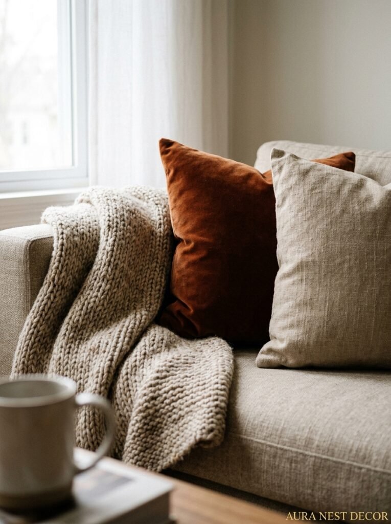
Texture is the cheat code. Not color, not furniture, not art — texture. When there’s enough variety of texture in a room, it registers as luxurious in a way that’s almost subconscious. You walk in and think “wow, this feels nice” without knowing exactly why.
The trick is thinking in material categories: something smooth (a velvet cushion, a ceramic vase, a lacquered tray), something rough or natural (a jute rug, a woven basket, a linen throw), something soft and yielding (a chunky knit, a faux fur accent, a plush cushion), and ideally something with a bit of sheen (a brass object, a mirror, a glass vase). You don’t need much of each. But when all four categories are present in some way, the room feels rich.
A single high-quality throw draped casually over a sofa arm does more for a room than most people realize. Especially in autumn and winter — a really good throw in a tactile fabric changes the whole warmth of the space.
12. The One Small Thing That Ties Every Style Together — But Almost Nobody Mentions It
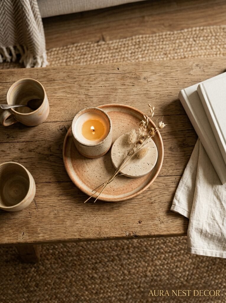
Scent. Actual, physical scent. Bear with me.
I know this sounds like candle-sales territory, but I mean it practically. A room that smells good has a totally different quality when you walk into it — it feels intentional, like it’s been thought about. And it puts you in a different state almost immediately. It’s impossible to fully separate how a room looks from how it smells because they’re processed together, even if you’re not consciously noticing it.
This doesn’t have to mean expensive candles. A small diffuser with a simple wood or clean linen scent. A dried lavender bundle near a lamp (the warmth of the bulb carries it faintly). Beeswax candles, which smell incredible even unlit and also look beautiful. Fresh flowers, obviously, when they’re in season and you feel like it.
The point is that scent is atmosphere. And atmosphere is what you actually remember about a room long after you’ve forgotten what the rug looked like. It’s the thing that makes someone say “I love this room” without being able to say exactly why. Make the room smell like itself, like somewhere you’d choose to be.
—
❓ FAQ
Q: What’s the easiest single change to make a living room look more expensive? A: Honestly, lighting. Specifically, replacing overhead light use with layered lamps. It immediately makes the space feel warmer, more considered, and more expensive — and you can do it without buying anything new if you already have lamps that aren’t being used.
Q: How do I make a small living room feel bigger without knocking down walls? A: Two things that genuinely help: hang your curtains as high as possible (even close to the ceiling) and keep the floor space as clear as you can, which means choosing a coffee table that’s a bit lower and lighter-looking. Mirrors help too, but only if they’re large — small mirrors don’t do much for the sense of space.
Q: Do I need to redecorate everything at once or can I do it in stages? A: Stages, always. Honestly, rooms decorated in stages often end up more interesting because they have more variety and personality. Start with the things that have the most visual impact — lighting, rug, curtains — and then let the rest evolve. There’s no rule that says a room has to be finished all at once.
—
💭 Final Thoughts
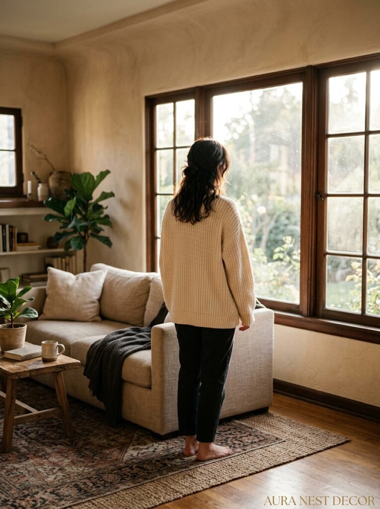
Your living room doesn’t have to be done to be good. It just has to feel like yours — like somewhere a real person actually wanted to sit down and stay for a while. The best rooms I’ve ever been in weren’t the most expensive or the most perfectly styled. They were the ones where you could tell someone had paid attention, made real decisions, and cared about how it felt to be in there. That’s the whole thing, really. Just care about it. Does your living room feel like somewhere you want to be?




