
Why Sage Green and Grey Belong Together (And How to Pull It Off Without It Looking Like a Dentist’s Waiting Room)
You know that feeling when you walk into a room and your shoulders just… drop? That’s what a well-done sage green and grey living room does. Not every room achieves it. But when it works, it really works.
—
1. The Reason This Color Combination Keeps Showing Up Everywhere Right Now
It’s not a trend. Or — okay, fine, it started as one, but it’s sticking around because it actually does something to your nervous system that most color schemes don’t. Sage green is basically nature’s neutral. It’s not as demanding as forest green, not as cheerful as mint. It just sits there, quietly asking nothing from you, and somehow making everything around it look more considered. Grey does the same thing in a different way — it pulls back, makes space, doesn’t compete.
Together, they create a room that feels genuinely calm without feeling boring. That’s the hard thing to pull off in interior design, honestly. Calm without boring. Most people end up with one or the other. Sage and grey manage both, and I think it’s because neither color is trying to be the main character. They’re supporting each other. The whole room becomes the main character instead, which is kind of a beautiful design principle when you think about it.
“Sage and grey aren’t trending. They’re just right.”
And there’s something about the undertones, too. Sage has grey IN it already — that muted, slightly desaturated quality is what makes it sage rather than just green. So pairing them isn’t contrasting two different things, it’s more like building a family of shades that already belong together. Side note — this is why the combo rarely looks jarring. The colors already know each other.
—
2. The Exact Shade of Grey That Doesn’t Kill the Vibe
Not all greys are created equal and getting this wrong is probably the most common mistake people make. Cool greys — the blue-leaning ones — can fight with sage and make the whole room feel cold and slightly clinical. That’s the dentist’s waiting room problem. Nobody wants that.
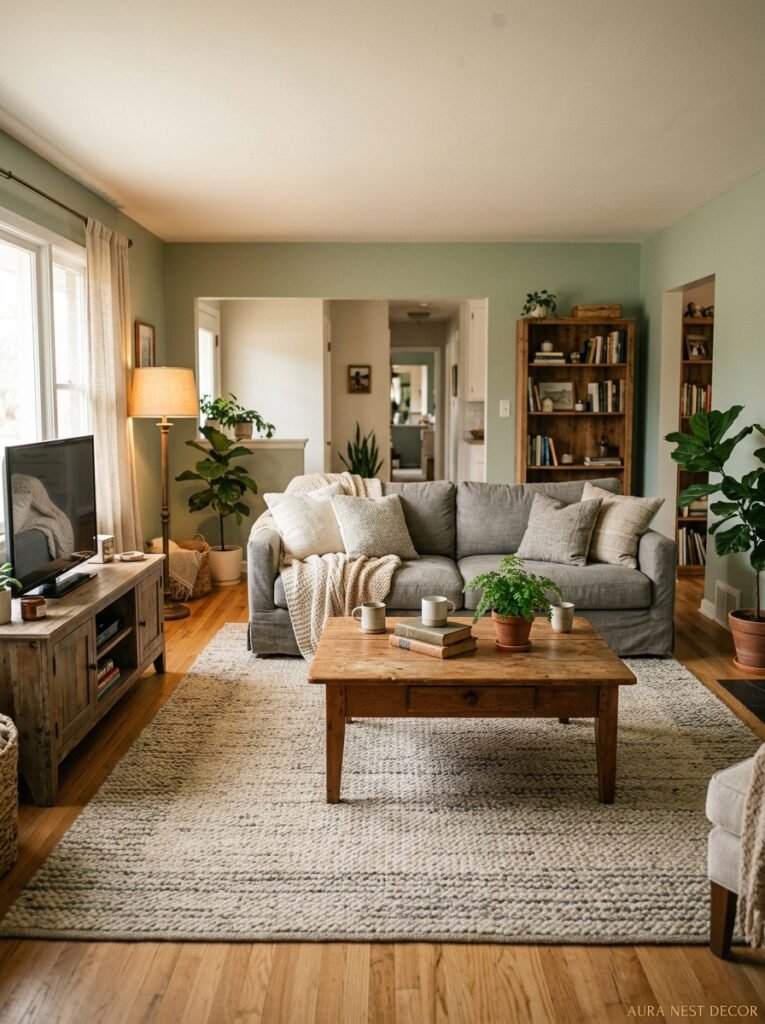
What you’re looking for is a warm grey. Think tones with just a whisper of brown or green in them. Farrow & Ball’s Purbeck Stone is a classic for a reason. Benjamin Moore’s Revere Pewter (yes, still) does the job beautifully if you want something more accessible. Dulux Warm Pewter is a go-to for UK readers and it genuinely reads as warm even on a grey British November day, which is saying something.
The test I always do: hold your grey paint swatch up against your sage element — whether that’s a wall, a sofa, a cushion — and look at them in actual daylight, not store lighting. Store lighting lies. Natural light shows you the undertones, and that’s where your answer is. If the grey goes a bit blue or lavender against the sage, keep looking. If it goes slightly greige or stone, you’ve found it.
—
3. Where to Actually PUT the Sage (This Changes Everything)
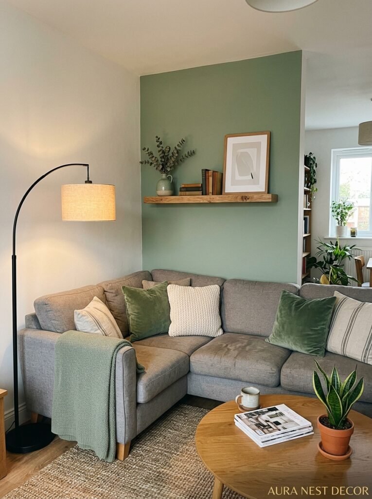
Here’s where people freeze. Do you paint the walls sage? One wall? Get a sage sofa? Throw in some cushions and call it a day?
All valid. But they do different things to the room.
Sage walls are BOLD. They make the room the statement. Every piece of furniture becomes part of a curated gallery almost automatically. This works brilliantly in rooms with decent natural light — in a dark room, sage walls can go a bit flat and muddy, which isn’t the look. If your living room faces north and gets limited sun, I’d go sage on the furniture and accessories instead and keep walls in a warm light grey.
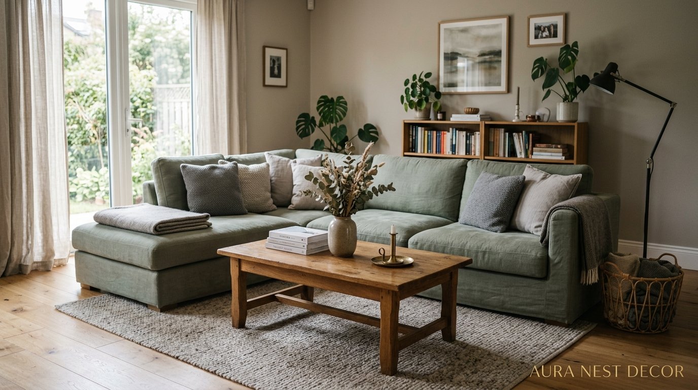
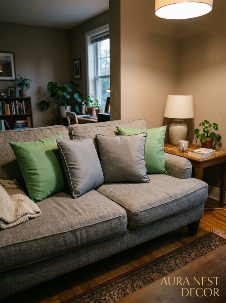
A sage sofa in a grey room is honestly one of my favorite combinations. The sofa becomes the focal point without screaming for attention — it’s just THERE, quietly lovely. Pair it with grey walls, natural wood floors, and cream or linen textiles and you’ve got something that photographs like a dream and also feels genuinely livable.
Sage as an accent — through cushions, throws, a single armchair, a lamp base — works well if you’re not ready to commit or if you’re renting. But be honest with yourself: if you only have three sage cushions on a white sofa surrounded by beige walls, it’s not a sage and grey room, it’s just a room with some sage cushions. More isn’t always more, but sometimes it is.
—
4. The Textures That Make Sage and Grey Feel Rich Instead of Flat

Color does a lot of work, but texture is doing more than you think. In a palette this quiet, texture is what prevents the room from feeling sterile.
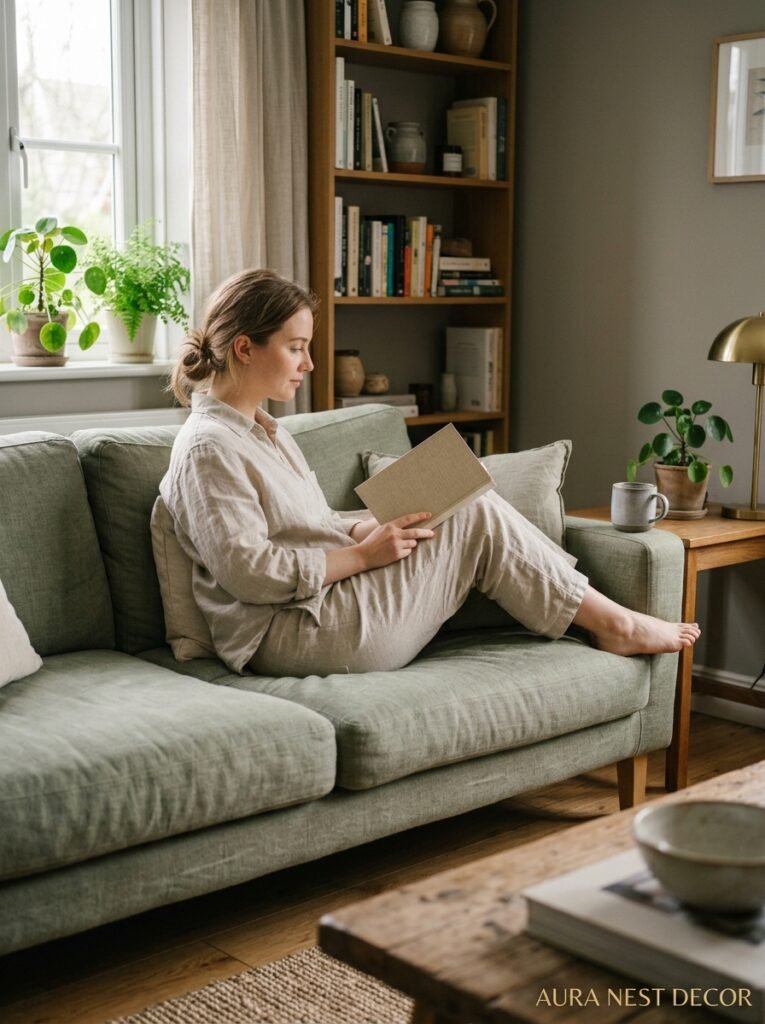
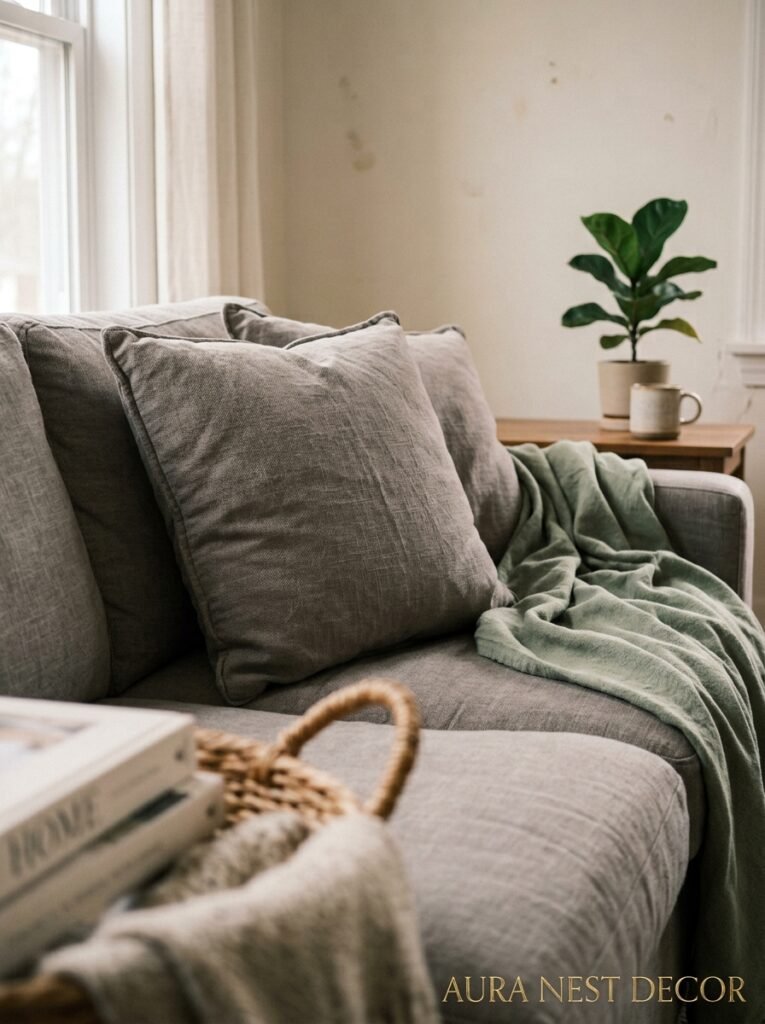
Linen is non-negotiable. Linen cushions, linen curtains, linen throw — all of it in natural, cream, or off-white tones. The slight roughness of linen catches the light differently at different times of day and keeps the palette feeling alive. Velvet in sage or deep grey also works extraordinarily well — there’s something about the way velvet absorbs and reflects light that makes those muted tones look almost luminous.
For hard textures: rattan and cane bring warmth in a way that wood alone doesn’t quite achieve. A rattan coffee tray, a cane side table, a basket by the hearth — these things pull the room back from any risk of feeling too sleek or cold. Stone and concrete accessories can lean into the grey beautifully if you want something more minimal or modern.
“Texture is color’s quieter, harder-working sibling.”
Rugs, specifically, are where a LOT of people underinvest. A thin, cheap rug in a beautiful sage and grey room is like wearing a stunning outfit with bad shoes. The rug grounds everything. Go bigger than you think you need, always.
—
5. The Lighting Secret Nobody Puts in Pinterest Captions
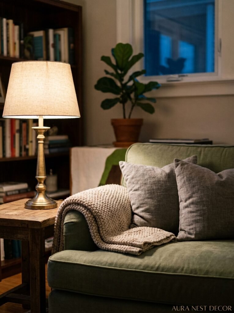
Instagram and Pinterest photos of sage and grey rooms are always gorgeous. They also lie to you a little bit, because most of them are shot in perfect afternoon light. What those pictures don’t show you is what the room looks like at 8pm under ceiling lighting, which is where most of us actually LIVE in our living rooms.
Cool overhead lighting kills sage and grey. It strips the warmth out of everything and makes the sage look almost khaki and the grey look hospital-blue. Warm bulbs — genuinely warm, 2700K or lower — are what keep those colors looking like they did when you fell in love with them in the showroom.
Layer your light sources. A floor lamp in the corner, table lamps, maybe some candles if you’re that person (I’m that person). The goal is to never have one single light source dominating the room. Specifically, the light you want from a sage and grey room at 7pm is something like amber, something low, something that makes the whole room feel like it’s breathing out.
—
6. The Warm Wood Tones That Stop Everything From Feeling Too Serious
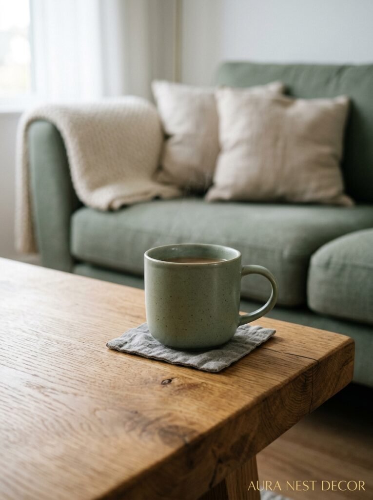
Grey and sage without wood is a mistake. I feel strongly about that, or maybe it’s just personal preference — honestly, I think it’s both.
Natural wood — particularly mid-tone oak, walnut, or ash — brings the earthy quality that completes the whole story these two colors are trying to tell. Oak floors are absolutely ideal. Walnut furniture (a side table, a bookshelf) adds depth and a little richness without feeling heavy. Even small wooden elements — a turned wooden lamp base, some wooden picture frames — are enough to warm things up if the rest of the room is more contemporary.
What doesn’t work so well? Very dark, almost-black stained wood can drag the room toward feeling gloomy, especially with grey. Very pale, washed wood can work but requires a lot of care — it tends to read as too Scandinavian-minimalist unless you balance it with plenty of warmth elsewhere. Mid-tones are your sweet spot. Not too light, not too dark, just right in a very Goldilocks sort of way.
—
7. Plants That Were Basically MADE for This Color Scheme
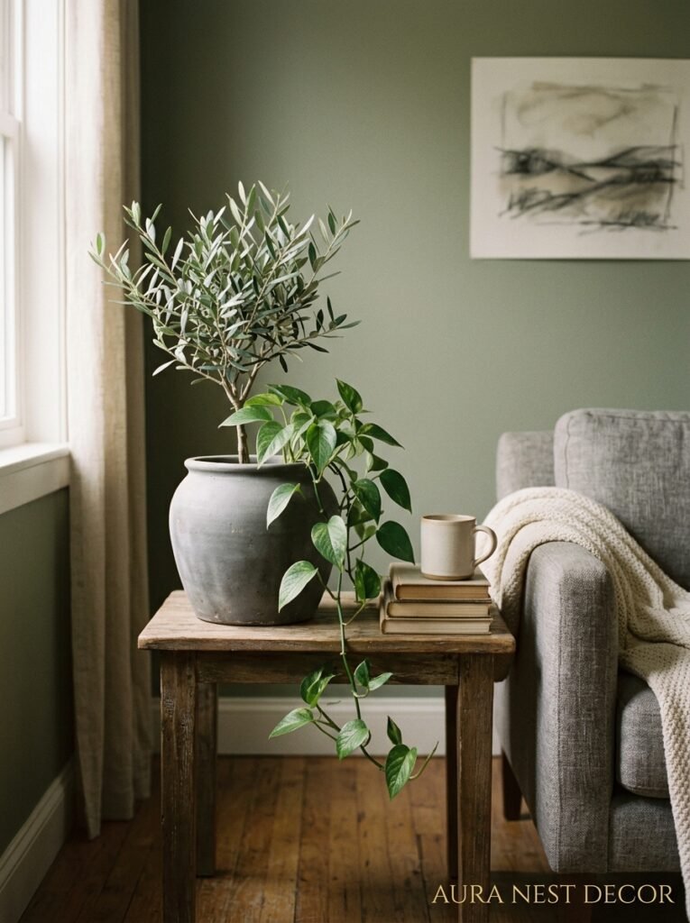
Obviously plants, right? Sage and grey is practically calling for greenery. But not just any green — there’s something specific that works.
Trailing plants — pothos, philodendron, string of pearls — bring movement and life without competing with the palette. Olive trees in woven baskets are having a permanent moment and for good reason; that silvery-grey-green of the leaves is like a living echo of the whole color story. Eucalyptus (fresh or dried) essentially IS the sage and grey aesthetic in plant form.
“An olive tree in a woven basket doesn’t just decorate a room. It finishes it.”
For pots and planters: terracotta works beautifully here, especially aged terracotta with that dusty, matte quality. White ceramic is clean and classic. Concrete planters tie directly into the grey and look genuinely architectural. What I’d avoid? Anything too bright or glossy — shiny colorful planters would stick out like a sore thumb in this palette and not in a fun way.
—
8. The Case for ONE Bold Thing (And Why You Shouldn’t Skip It)
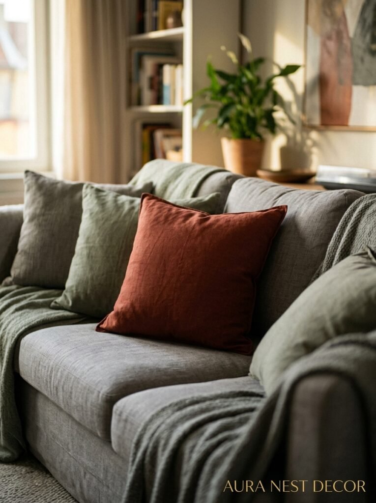
Every beautiful room needs at least one thing that surprises you a little. Not a lot. Just one thing that makes your eye stop and go oh.
In a sage and grey room, that could be a burnt sienna cushion. Or a single terracotta-toned artwork. Or a deep navy velvet armchair that plays against both colors and creates the most satisfying contrast. Mustard yellow actually works beautifully here too — slightly unexpected, earthy enough not to jar, warm enough to offset any coolness in the grey.
The danger of playing it safe with EVERYTHING in a sage and grey room is that you end up with something beautiful on Instagram and forgettable in person. A room needs some tension to be interesting. One element that isn’t quite like the others is what gives the whole thing personality. It’s the thing your guests notice and comment on. It’s what makes the room feel styled rather than just decorated.
Don’t overdo it, though. One bold thing. Not five. One.
—
9. What British and American Homes Need Differently in This Color Scheme
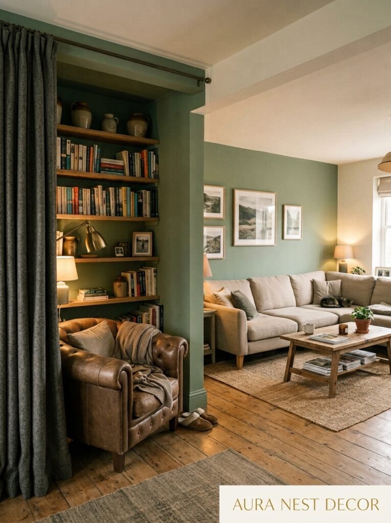
Not gonna lie, this is something I find genuinely interesting and most articles skip right over it. The light is different. The architecture is different. The approach needs to be slightly different too.
British homes, particularly older ones, tend to have smaller windows, lower ceilings, and less direct sunlight year-round. In those spaces, sage and grey can go quite dark if you’re not careful. The solution is usually to go lighter on both tones — a very pale sage, a warm light grey — and rely heavily on warm lighting and mirrors to bounce light around. Farrow & Ball’s Mizzle (a light, slightly grey sage) is practically built for a cosy British semi-detached.
American homes, especially in sunnier states or in homes with large windows, can handle deeper, more saturated versions of both colors. A richer sage, a more definitive charcoal grey. The abundant light stops them from feeling oppressive. In states with strong, yellow-toned natural light, the sage might even pick up golden undertones, which is stunning.
—
10. The Sage Green Sofa Deep-Dive (Because Everyone Wants to Know)
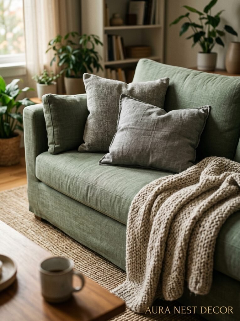
If you’re considering a sage sofa specifically, I have thoughts. Many thoughts.
Velvet is the BEST fabric for a sage sofa. Full stop. It makes that color sing. Linen runs a close second — more casual, perfect for a laid-back living room or if you have kids or pets. Bouclé in sage is having a moment and looks absolutely beautiful but I’d gently warn that it’s a texture that can be hard to keep clean if your life involves any combination of red wine or small humans.
For the sofa shape: simple, clean lines work best because the color is already doing a lot of the work. A curved sofa in sage velvet is genuinely stunning if your room has the space for it. Low-profile designs feel very contemporary. Chesterfields in sage are wonderful and feel quite English in the best possible way — that traditional form in an unexpected color is always a successful combination.
—
11. The Accessories That Tie the Whole Room Together Without Looking Themed
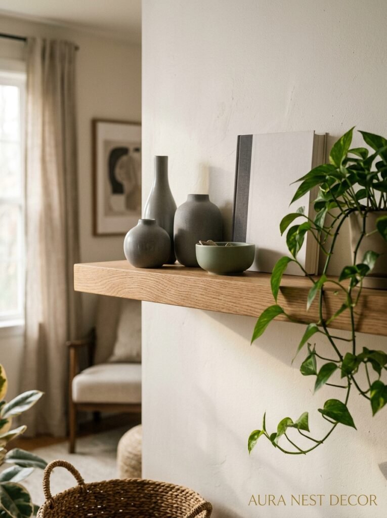
The risk with sage and grey is that it becomes a “theme” — like you went to a home store and bought everything in one go. The way to avoid that is to mix sources, mix periods, mix levels of formality.
A very simple modern vase next to a vintage ceramic figure. A sleek geometric candle holder beside a misshapen artisan bowl. Shop vintage markets for things in the right tones rather than everything from the same contemporary collection. It takes a bit more effort but the result is a room that looks curated over time rather than assembled in an afternoon.
Books are surprisingly important here. A bookshelf with books in muted green, grey, cream, and earthy tones ties directly into the palette and adds richness that no accessory can quite match. Some people turn books around to show the pages rather than the spines — I’m personally on the fence about that, but it does create a beautiful neutral backdrop.
—
12. The One Mistake That Makes a Sage and Grey Room Look Cheap
White walls. Or more specifically — bright white walls with sage and grey furniture and accessories. Because bright white is a cool tone and it fights with everything. It makes the sage look a bit washed out and makes the grey go slightly blue.
If your walls are white and you’re committed to sage and grey elements, shift to a warm white. Warm white is a completely different thing — something like Farrow & Ball’s All White or Benjamin Moore’s Chantilly Lace, which have just enough warmth to play nicely with the palette without going obviously cream or ivory. It’s a small change that makes an enormous difference. One of those aha moments where you swap one thing and the whole room suddenly makes sense.
The other mistake — too much grey, not enough sage. You can accidentally end up with just a grey room with some plants. The sage needs enough presence to read as a genuine second color, not just a hint.
—
❓ FAQ
Q: What colors go well with sage green and grey in a living room? A: Warm neutrals like cream, off-white, and natural linen work beautifully as a backdrop. For accent colors, burnt sienna, mustard, terracotta, and warm navy all pair well without overwhelming the palette. Natural wood tones are almost always a good addition.
Q: Is sage green a good color for a north-facing living room? A: It can be, but you need to be careful with undertones and saturation. Go for a lighter, warmer sage rather than a deep, cool-toned one. Pair it with warm lighting (2700K bulbs) and warm grey tones rather than anything blue-leaning. Plenty of mirrors don’t hurt either.
Q: Should my sofa or my walls be sage green? A: Honestly, it depends on your room and your confidence level. Sage walls make a bigger statement and require good natural light to avoid feeling heavy. A sage sofa gives you the color impact with more flexibility — you can always change a sofa more easily than repainting. If you’re unsure, start with the sofa.
—
💭 Final Thoughts
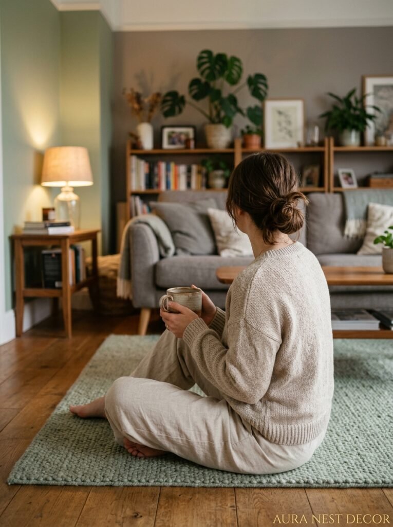
Sage green and grey isn’t a trend you need to chase before it disappears — it’s a combination that keeps working because it taps into something genuinely human about wanting to feel calm, at home, and quietly surrounded by beauty. The rooms that get it right feel personal without being precious. Layered without being cluttered. So: what would you do first — commit to the sage sofa, or go bold with the walls?




