
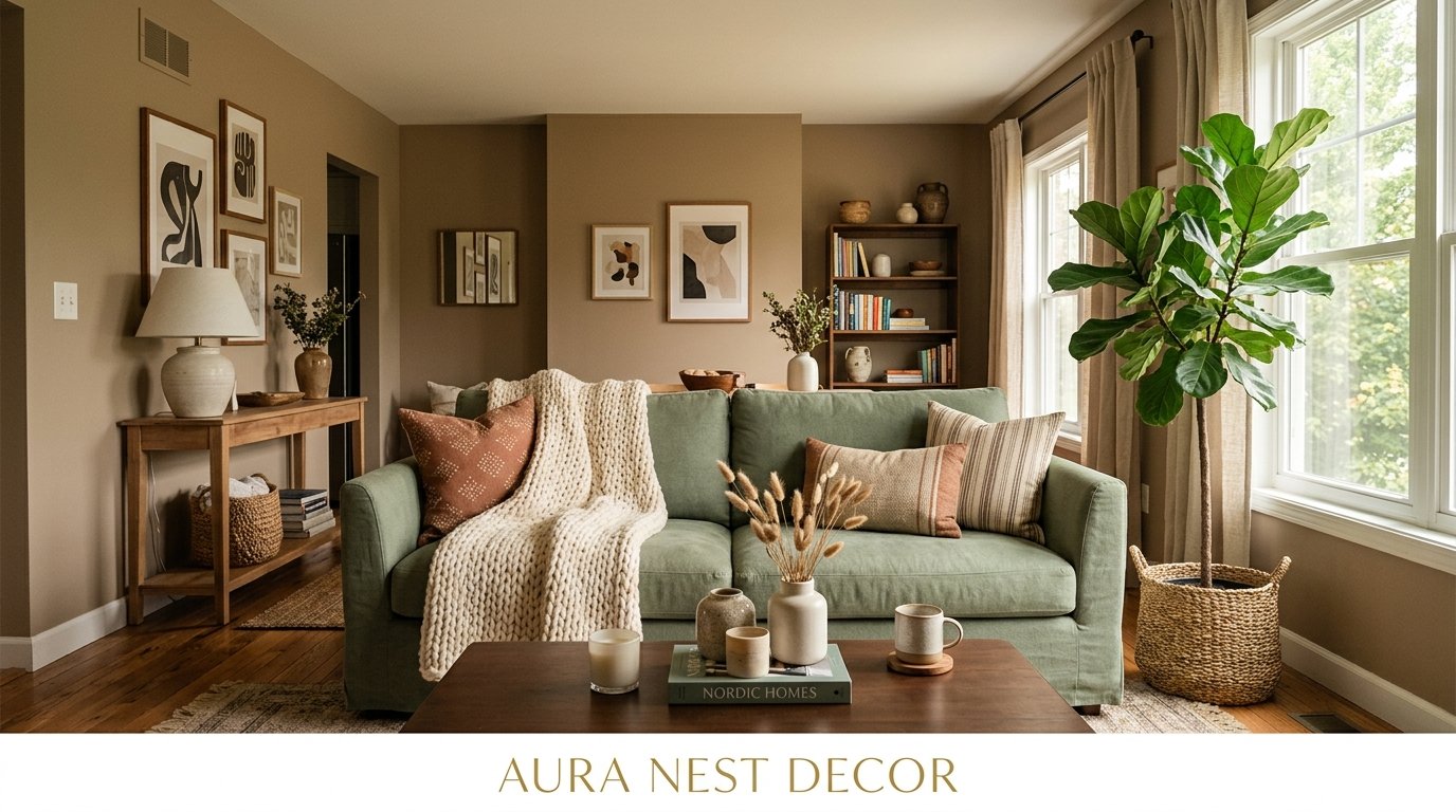
The Quiet Color Combination That’s Making Every Living Room Feel Like a Deep Breath
My friend called me last spring, almost annoyed. “I painted my living room this weird sage color and now I can’t stop sitting in it.” That’s it. That’s the whole pitch.
—
1. Why This Pairing Hits Different Than Any Other Trend Right Now
Here’s the thing nobody talks about when they list out the reasons neutral-and-green works: it’s not really a trend. Not in the way blush-and-gold was a trend, or the whole millennial grey era that we’re all still quietly recovering from. This is something older. Something that your eye already knows.
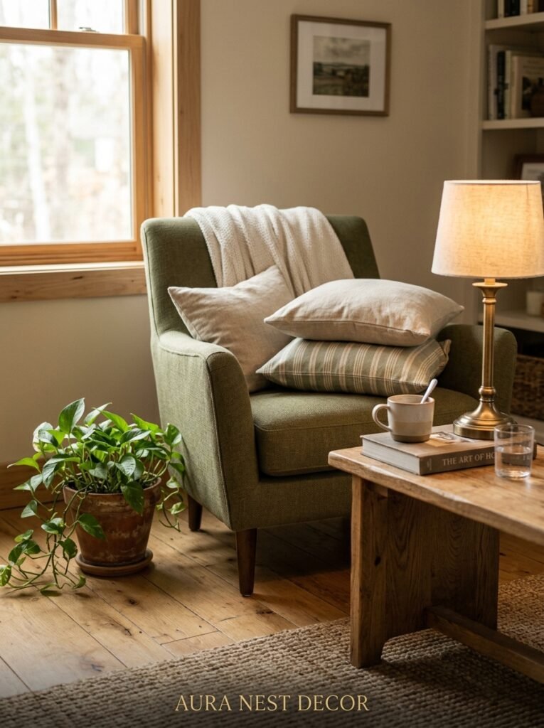
Humans spent a very long time living around earthy tones and plants. The brain just… relaxes. When you walk into a room that’s warm off-white on the walls, linen on the sofa, and then some quiet, dusty green in the cushions or the curtains or a big potted fig tree in the corner — it reads as safe. I know that sounds unscientific but honestly, there’s decent research behind it and also, you already know it’s true. You’ve felt it in a room before.
The other thing? It doesn’t age. Beige on its own looks dated fast. Green on its own can tip into statement territory, which not everyone wants. But together, they balance each other in this way that makes the room feel curated without being exhausting to live inside.
—
2. The Green That’s Actually Winning in Living Rooms Right Now (It’s Probably Not the One You Tried First)
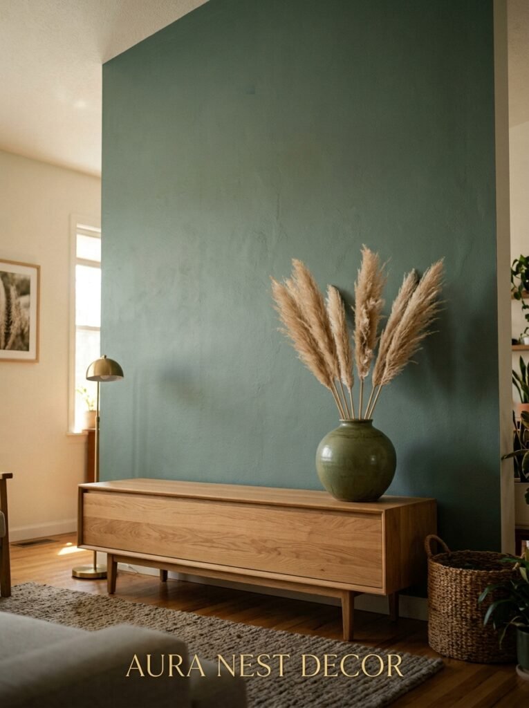
Emerald had its moment. It was gorgeous, a little maximalist, very Instagram 2020. But the green that’s everywhere in the living rooms people can’t stop pinning right now? It’s quieter. Dustier. More grey in it than you’d expect.
Sage. Eucalyptus. That specific muted olive that almost looks brown in certain light, then turns green when the sun hits it differently at 4pm. These are the ones.
They work in a neutral room because they don’t fight anything. A true bright green is assertive — it wants your attention. These softer, chalky greens just… exist. And somehow that’s exactly what makes them noticeable. Not in a demanding way. In a “wait, what IS that color, I love it” way.
“The green that works isn’t the one that says ‘look at me.’ It’s the one that makes you wonder why the whole room feels so calm.”
For UK homeowners especially, where natural light is doing its thing in a very specific, often grey-filtered way — these dustier greens are incredible. They don’t go flat the way brighter shades do under cloud cover. They just shift and stay interesting.
If you’re shopping for paint, look at anything in the sage-to-eucalyptus family. Farrow & Ball’s Mizzle is one. Benjamin Moore’s October Mist was literally named Color of the Year a couple years back and it hasn’t stopped being relevant since. In the US, Behr has some great chalky greens in their Marquee line that won’t wreck your budget.
—
3. Neutrals Are Not All the Same and This Actually Matters
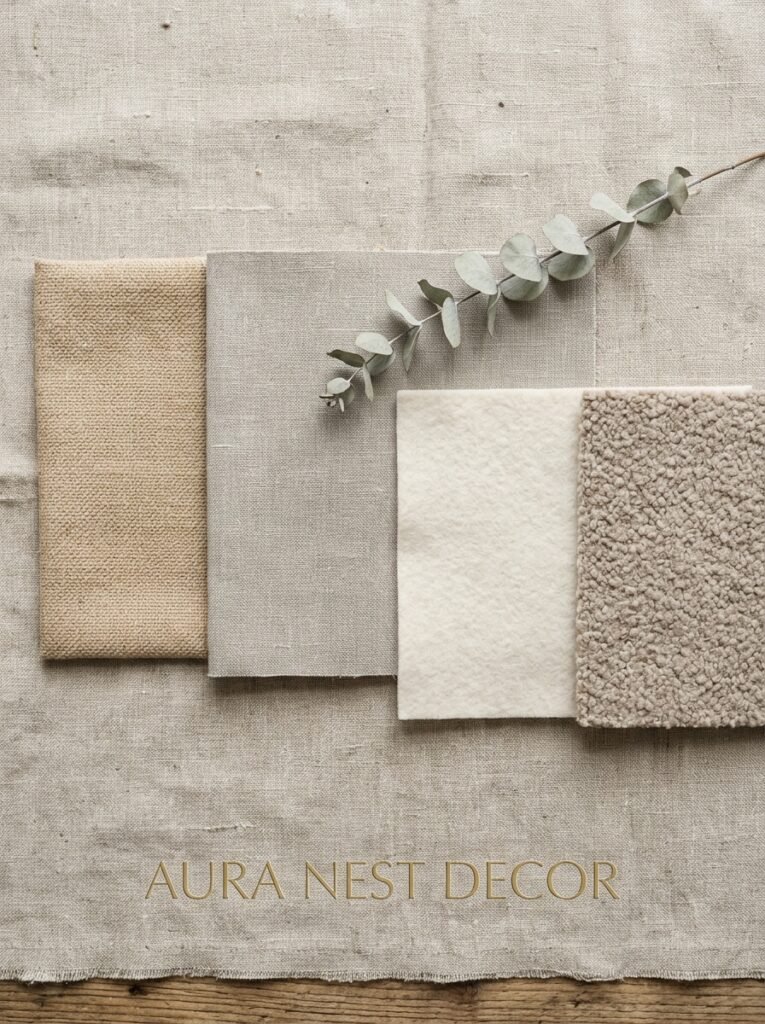
Okay, real talk: “neutral” is doing a lot of heavy lifting in the design world and we need to unpack it a little. Because picking the wrong neutral with your green is the #1 reason this combo sometimes looks flat or slightly wrong.
Warm neutrals — think biscuit, oatmeal, camel, warm white with yellow undertones — they go with green in a completely different way than cool neutrals do. Warm neutrals make the green feel almost botanical, earthy, like a forest floor situation. Very cozy. Very Northern European farmhouse without actually committing to the whole genre.
Cool neutrals — grey-whites, blue-whites, soft greiges — push green in a slightly different direction. Cleaner. More Scandi. A little more editorial.
Neither is wrong. But you’ve got to pick a lane. Mixing a warm off-white wall with cool grey linen and a warm sage — that’s where rooms start feeling like they can’t figure themselves out. Cohesion doesn’t mean matching, it means temperature-matching. Warm stays warm, cool stays cool. That’s the rule I’d tattoo on the inside of people’s eyelids if I could.
—
4. The Sofa Decision That Sets Everything Else in Motion
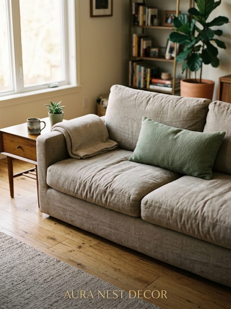
People agonize over whether to get a green sofa or a neutral sofa. I’ve been in that specific paralysis. And honestly? In a green-and-neutral living room, the neutral sofa wins almost every time.
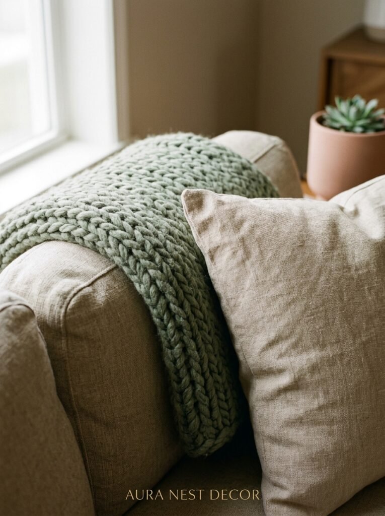
Not because a green sofa is wrong. It’s not, and it’s a bold choice that can look spectacular. But a linen, oatmeal, or warm-white sofa becomes your anchor, and then you get to USE the green. Throws. Cushions. A single accent chair. The big painted wall behind the gallery. That flexibility is worth a lot, especially when you want to update the room in two years without replacing a sofa.
Texture on that neutral sofa matters enormously. Flat cotton blend? Fine. But boucle, linen, ribbed velvet, woven fabric with some variation in it — that’s what stops the room from feeling like a staged property listing. You want it to feel lived-in immediately. The texture does that.
“A neutral sofa isn’t the safe choice. It’s the smart one — it gives every other decision room to breathe.”
If you’re in the UK and hunting for a good linen-look sofa at an accessible price, Dunelm and Loaf both do well here. In the US, Joybird has lovely options and Article has some pieces that punch above their price point.
—
5. Plants Are Load-Bearing Elements, Not Decoration
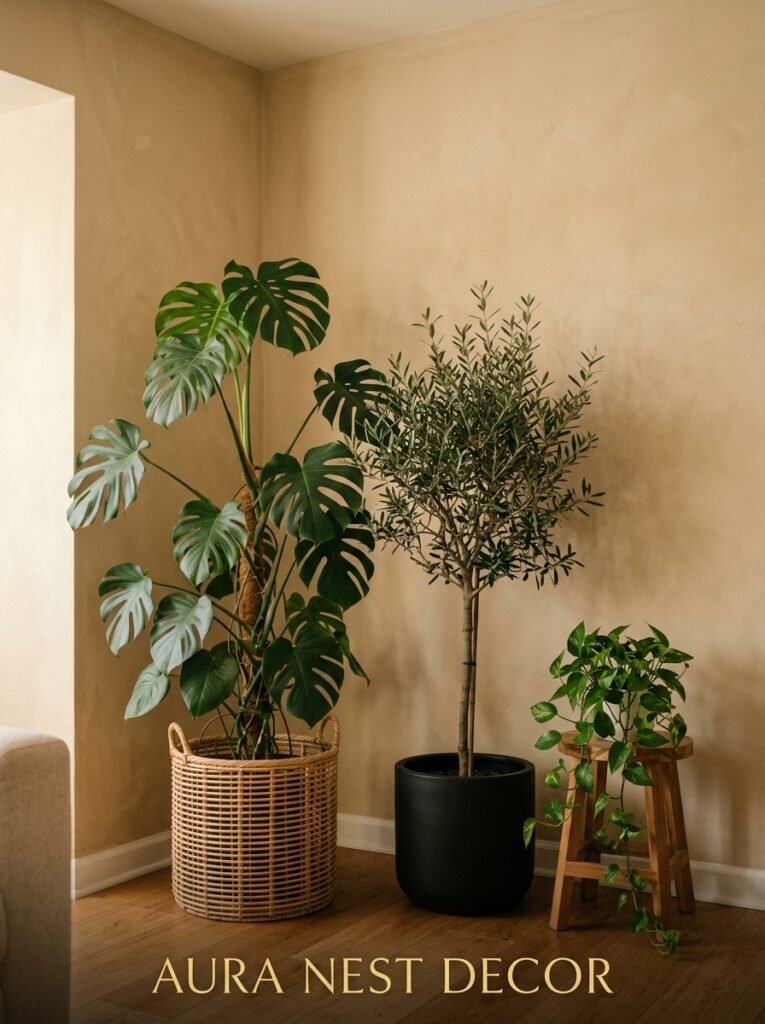
I need you to hear this. Plants in a green-and-neutral living room are not optional accessories, like a throw pillow you add at the end. They are structural. They bring the green INTO the room in a way that no paint or fabric can fully replicate, because they’re alive, they move slightly, they cast shadows, they change.
One large plant does more than six small ones. I’m so serious. A big fiddle-leaf fig or a massive olive tree (fake or real, I’m not judging) in a cream or terracotta pot in the corner of the room will anchor the entire space. The eye lands on it, registers “green, organic, living” and then the painted sage on that one accent wall and the eucalyptus cushions on the sofa all become part of the same IDEA.
That coherence is the goal. The plants sell it.
Side note — terracotta pots with green plants against a neutral background? Outstanding. The warmth of the terracotta bridges the gap between the earthy neutrals and the cool green. It’s a small thing that does a big job.
—
6. What You Put on the Floor Can Make the Green Feel Rich or Completely Kill It
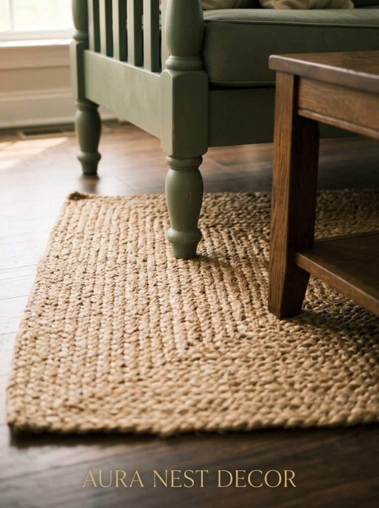
Floors. We skip over this so fast and then wonder why the room doesn’t look like the Pinterest board.
Pale oak or bleached wood floors: beautiful with green and neutral, very fresh, works especially well with lighter sages and the more Scandinavian take on this palette.
Dark walnut or deep brown wood: ALSO beautiful, but shifts the whole mood. More moody. More evening. The greens will look richer, almost jewel-like against it, even the muted ones.
Grey-toned floors (which a lot of UK homes have thanks to the grey laminate era of 2012-2019, we all lived through it): these can work but they push the room cooler, so you’ll want to really lean into warm neutrals in the textiles to compensate.
Rugs matter as much as the actual floor. A jute or sisal rug in any of these scenarios adds a layer of texture that warms everything. A cream or ivory rug with some texture in the weave will brighten a darker floor and keep the room feeling airy. A terracotta-toned rug adds that warm third note that keeps the green-and-neutral pairing from feeling too predictable.
—
7. Lighting Is Where This Palette Actually Lives or Dies
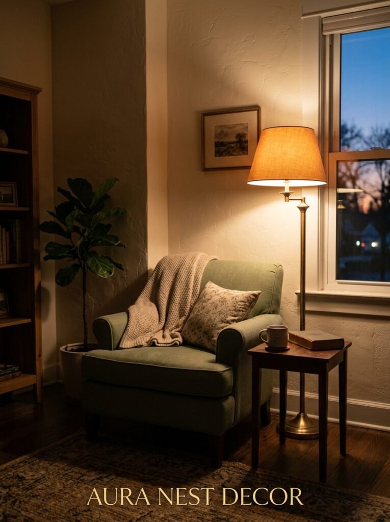
Natural light changes everything in a green-and-neutral room, and so does how you supplement it.
Cold overhead lighting — the standard kind, white and flat — will flatten your greens and make your neutrals look clinical. Which is not the vibe. The vibe is the amber glow of a table lamp at 7pm, the soft pool of light from a floor lamp in the corner, warm bulb temperature (2700K is your friend here), multiple light sources rather than one ceiling-dominating fixture.
Layer your lighting. A ceiling fixture for when you actually need to see things. A floor lamp in the reading corner. A table lamp or two. Maybe some candles, obviously. The room should have different lighting moods that you can switch between, not one setting.
“The right green in daylight is peaceful. That same green under warm lamp light at night becomes something completely different — something almost glamorous.”
In the US you’re working with more hours of direct sunlight in most climates, which is great. In the UK, you’re maximizing every bit of natural light, so positioning mirrors on walls opposite windows is genuinely worth doing — it doubles what you have.
—
8. The One Accent Color That Keeps Showing Up in the Best Versions of This Look
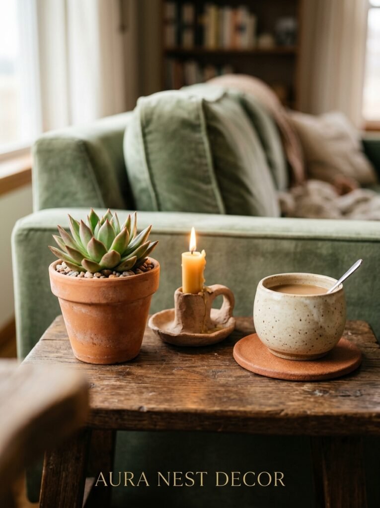
You’d think a green-and-neutral room should stay strictly in those two lanes. And you can absolutely do that. But the rooms that feel most complete — the ones you save and come back to — almost always have one more note in there.
Most often? It’s terracotta. Sometimes a dusty blush. Occasionally a warm brass or aged bronze in the hardware.
Terracotta specifically: it’s warm, earthy, and it sits right next to green on the color wheel in a way that feels natural rather than designed. A couple of terracotta-toned cushions, one ceramic vase, the plant pot we already talked about — it doesn’t take much. It just stops the room from reading as two-dimensional.
Brass or bronze in the details — curtain rods, light switch plates, the feet of a side table — adds warmth without adding another color per se. It’s more of a temperature-warming tool than an accent. But it’s a good one.
—
9. Small Rooms: The One Rule That Makes the Whole Thing Feel Intentional
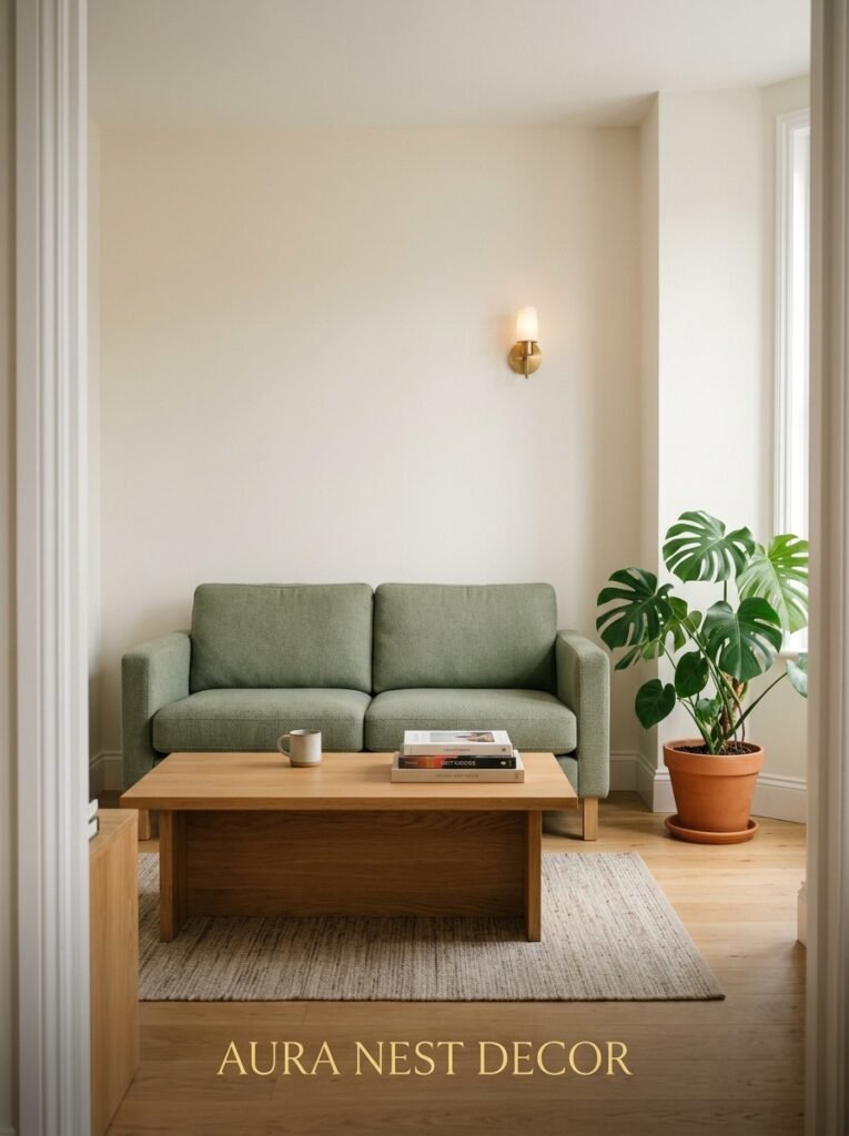
Small living rooms in green and neutral can be incredible. Or they can feel a bit cramped and confused. The difference is usually one thing: commitment.
Don’t try to neutralize a small room by going ALL neutral and then adding just a tiny bit of green. That reads as unfinished. Instead: pick your one green moment and make it count. Maybe it’s a deep sage-painted wall — one wall, the one behind the sofa. Maybe it’s an accent chair in a dusty olive velvet. Make it a choice, not a suggestion.
Then keep EVERYTHING else genuinely neutral, genuinely cohesive in temperature, and genuinely clean in terms of clutter. Small rooms can’t carry visual noise the way larger ones can. Every object has to have a reason to be there.
A large mirror in a warm-toned frame adds the sense of depth. Light window treatments — linen rather than heavy curtain panels — keep it airy. Keep the sofa off the walls slightly if you can; floating furniture even a few inches makes the room breathe.
—
10. What Pinterest Doesn’t Show You About Maintaining This Look
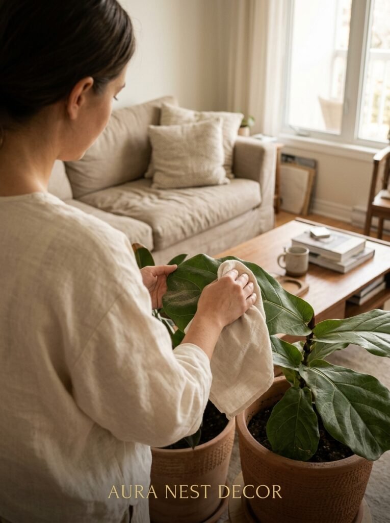
The green-and-neutral living room is genuinely low-maintenance in terms of styling, but there are a few things the perfectly lit photos don’t mention.
Light-colored linen sofas show pet hair. I’m just saying. If you have a black lab, factor that in before you go full cream boucle. Slipcovers and washable covers are your solution here, and they’ve gotten SO much more stylish in the last few years — no longer that sad beige fitted-sheet look.
Dusty sage walls also pick up fingerprints less than you’d think (the muted tone helps), but they do show scuffs more than a darker paint would. Keep a small amount of your wall paint for touch-ups. Always. This is not a drill.
Linen and woven textures wrinkle, and in a living room that’s actually USED, that’s part of the charm. But if wrinkles genuinely bother you, look for fabric blends that hold their shape a bit better — linen-cotton mixes, for instance.
—
11. How to Pull Off the Moody Version of This Palette (When “Light and Airy” Isn’t Your Thing)
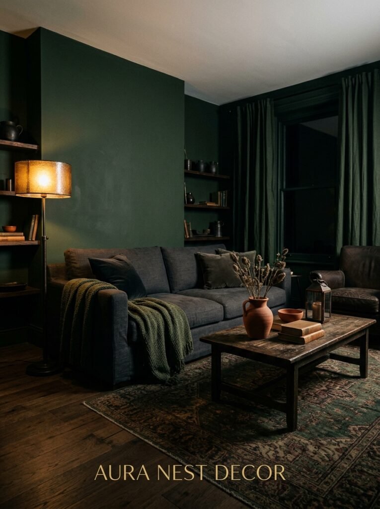
Not everyone wants the bright, Scandinavian, flooded-with-light version of this. And if that’s not you, great, because the moody version is honestly stunning.
Swap the light sage for a deeper forest green or an almost-black olive. Pair it with dark neutrals — charcoal, warm taupe, deep oatmeal rather than bright white. Add leather in a cognac or aged tan. Swap the bleached oak floors for something darker, or add a dark-ground patterned rug. Let the brass feel heavy and warm rather than delicate.
The result is something that feels like a Victorian greenhouse crossed with a very stylish library. It’s cozy in a different way — not airy and fresh but wrapped and enclosed. Good for rooms that don’t get a lot of natural light anyway. Leans into the dimness rather than fighting it.
Still green. Still neutral. Completely different mood. Same rules apply for temperature-matching and coherence, but you’re working in the darker half of both palettes.
—
12. Where to Start If You’re Looking at Your Living Room Right Now and Don’t Know What to Touch First
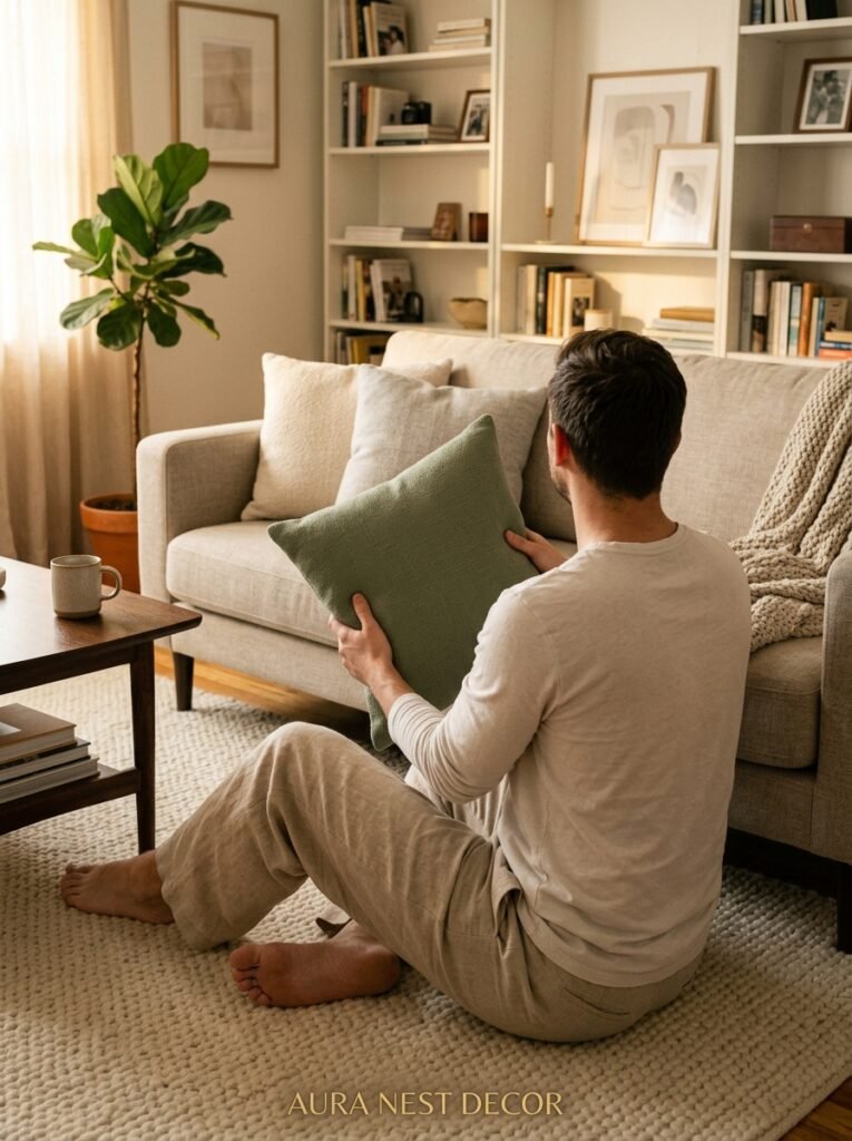
Start with paint. Or don’t even start there — start with one piece of fabric.
Go buy a sage-green cushion. One. Put it on your sofa and live with it for a week. Look at it in morning light, afternoon light, lamp light. If every time you walk into the room it makes you feel slightly good, that’s your answer. That’s all the confirmation you need.
Then paint the wall behind the sofa in a warm neutral if it isn’t already — something with just enough yellow or pink undertone to stay warm. Then start adding: a throw in a slightly different green, or a woven texture in the same neutral family as the walls, a plant in a terracotta pot.
It doesn’t have to happen all at once. It’s actually better when it doesn’t. The rooms that look the most lived-in and genuinely personal aren’t the ones that were styled in a single afternoon. They accumulate. They grow.
The palette is patient. You can be too.
—
❓ FAQ
Q: What paint colors work best for a neutral and green living room on a budget? A: You don’t need designer paint to make this work. In the US, Behr’s Dusty Miller and Sherwin-Williams’ Oyster Bay are accessible and gorgeous. In the UK, Wilko’s own-brand and Crown’s Breatheasy range both have solid sage and warm neutral options that won’t eat your renovation budget. Always get a sample pot and test on your actual wall in both daylight and lamp light before committing.
Q: Can I do green and neutral in a rental where I can’t paint the walls? A: Absolutely, and honestly it’s easier than you think. Focus entirely on textiles — a sage green throw, a few cushions, a large area rug in earthy tones. One oversized plant in a corner does heavy lifting. If your walls are that standard off-white most rentals come with, that actually works fine as your neutral backdrop. You don’t need wall paint for this palette to land.
Q: Does green and neutral work with a grey sofa I already own? A: It can, but you’ll need to be deliberate. A warm, green-grey sofa in sage or eucalyptus tones will play nicely with the palette. A cool blue-grey sofa is trickier — lean into cooler greens and cooler neutrals to match its temperature rather than fighting it with warm oatmeal tones. Adding warm brass accents and terracotta pots helps bridge the gap.
—
💭 Final Thoughts

There’s something genuinely restful about a room that doesn’t try too hard. Green and neutral does that — it’s the palette equivalent of someone who’s very comfortable in their own skin. You want to be around it. You don’t know exactly why.
If you’re sitting in your living room right now and it doesn’t feel like that yet, you’re not that far away from it. The pieces are probably more affordable and more accessible than you think.
What one change would make the biggest difference in your living room right now — the color on the walls, or everything that’s piled on top of them?




