
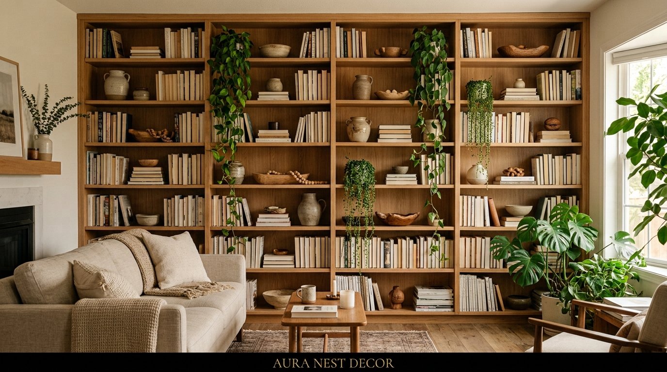
The Living Room Shelf Glow-Up Nobody Talks About (But Everyone Needs)
My friend called me last week just to say “my shelves look like a storage unit and I don’t know how it happened.” And honestly? I’ve been there. I think most of us have.
The thing is, living room shelves are one of those spots where good intentions go to die. You start with a vision — something editorial, something that looks curated and effortless — and somewhere between the stack of paperbacks and the candle you bought at TJ Maxx, it just… becomes a pile. A really visible pile.
But getting it right isn’t actually complicated. It’s just a few things you probably haven’t heard put plainly yet.
—
1. The Reason Your Shelves Feel “Off” Has Nothing to Do With What’s On Them
It’s the negative space. Or rather, the lack of it.
This is the thing nobody tells you upfront. You can have beautiful objects — genuinely lovely candles, interesting books, a piece of pottery you brought back from somewhere — and the shelf STILL looks cluttered if there’s no breathing room between things.
Think of negative space the way you’d think about silence in a conversation. It’s not empty, it’s necessary. It gives the eye somewhere to rest. And when everything is packed in tight, your brain reads it as chaos, even if every single item in isolation is beautiful.
The general guideline I come back to? Aim for roughly 30% of each shelf to be clear. Not stuffed with a vase “just because there’s room,” not a stack of magazines you’ll definitely read one day. Just. Clear.
“Negative space isn’t what you left out. It’s the thing that makes everything else worth looking at.”
It takes restraint. That’s the hard part. But once you leave a few deliberate gaps, the whole thing shifts — suddenly it looks considered instead of accumulated.
—
2. What “Odd Numbers” Actually Means (and When to Break the Rule)
You’ve heard it: style things in threes. Group in odd numbers. It’s design advice so old at this point it’s practically furniture itself.
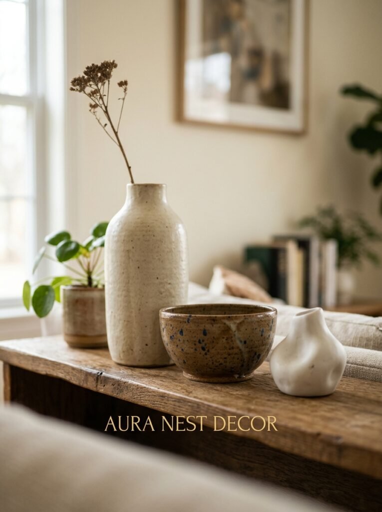
And it works. It genuinely does. Three objects at varying heights create a visual triangle that draws the eye upward and keeps it moving. It’s satisfying in a way that’s almost biological.
But here’s where people trip up. They apply the rule UNIFORMLY across every shelf, so every section has a tidy little trio, perfectly spaced, and then the whole unit looks like a display at a department store. Too composed. A little sterile.
The trick is to use odd numbers as a STARTING point and then deliberately break it somewhere. One shelf that’s mostly books with a single object sitting alone. One section that’s just a tall lamp or a leaning print with nothing else around it. The inconsistency is what signals “a person lives here” rather than “this was arranged by a committee.”
—
3. The Color You’re Probably Ignoring (And Why It’s Holding Everything Back)
Books.
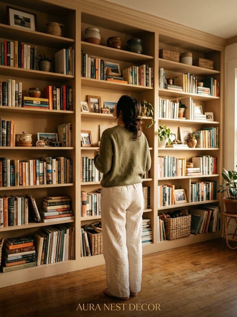
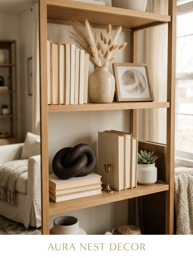
I’m serious. Most people don’t think of books as a color decision, but they are. A row of books is a color block. And if your shelves are covered in spines of every color — red, yellow, green, teal, that horrible bright orange thriller from 2019 — your eye doesn’t know where to land.
There are a few ways to handle this. You can arrange books by color, which looks incredible in photos and slightly unhinged in real life, honestly, but if it works for you, go for it. You can turn books backward so the white pages face out, which is very Pinterest and very polarizing — people HATE it or love it. Or you can do what I actually think looks best: group similar tones together loosely. All the dark spines together, pale paperbacks together, and let it be slightly imperfect.
The key is that the books stop being visual noise and start being texture.
—
4. The Lamp You’re Not Putting On Your Shelves (But Should Be)
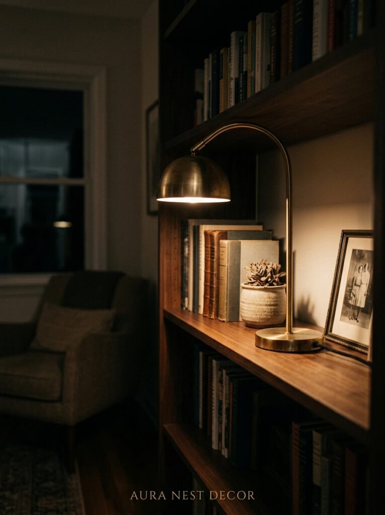
Not every shelf needs to be a built-in unit flanking a fireplace. But if yours is? Or if it’s a tall freestanding bookshelf? Put a small lamp on one of the shelves.
Not a big one. A small plug-in table lamp or a cordless rechargeable one — there are some genuinely good rechargeable options now that look like actual lamps and not like they belong in a camping kit.
The amber glow of a warm bulb at about eye level, sitting between a stack of books and a small plant, does something to a room that overhead lights simply cannot. It layers the light. It creates depth. It makes the shelf feel like it belongs to the room instead of just standing against a wall.
Side note — this is also incredibly helpful in UK homes where rooms tend to be darker and the ceiling pendant is doing ALL the heavy lifting. A shelf lamp changes everything and it costs almost nothing.
—
5. Stop Buying “Shelf Decor” and Start Shopping Everywhere Else
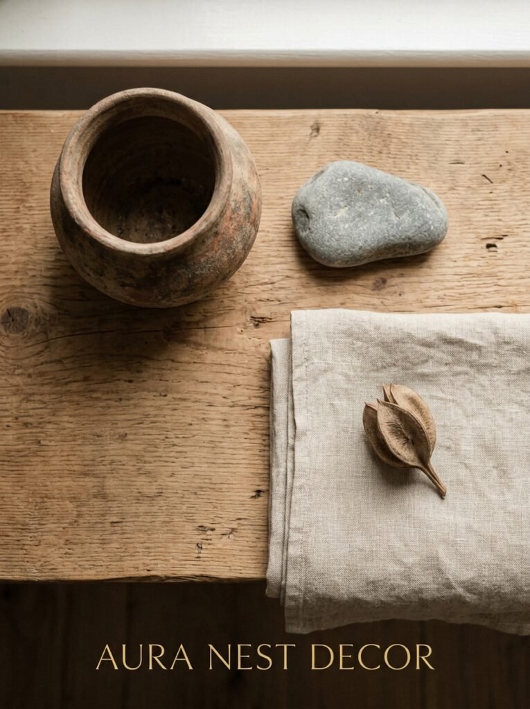
Here’s my strong take: the best things on shelves weren’t bought for shelves.
The ceramics section of a market. A found stone from a beach in Cornwall or Maine. A tiny framed photograph from a charity shop. A vintage brass candlestick from an estate sale. A coffee table book you actually wanted to read.
Things bought specifically as “shelf decor” — you know the ones, the little wooden words that say HOME or the generic geometric sphere — they LOOK like shelf decor. There’s a sameness to them. They don’t have a story and the eye kind of knows it.
“The objects that make a shelf feel personal are almost never the ones sold as decorative objects.”
When you look at a shelf and think “why doesn’t mine look like that,” it’s often because the person’s shelves tell you something about who they are. Yours will too, once you stop buying filler.
—
6. The Height Trick That Fixes Boring Rows of Same-Sized Things
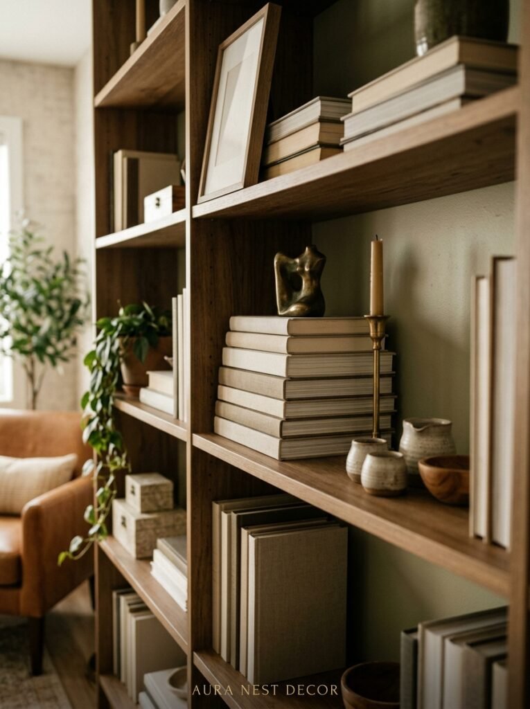
If everything on a shelf is roughly the same height, the eye reads it as flat. And flat is boring. Your brain skims right past it.
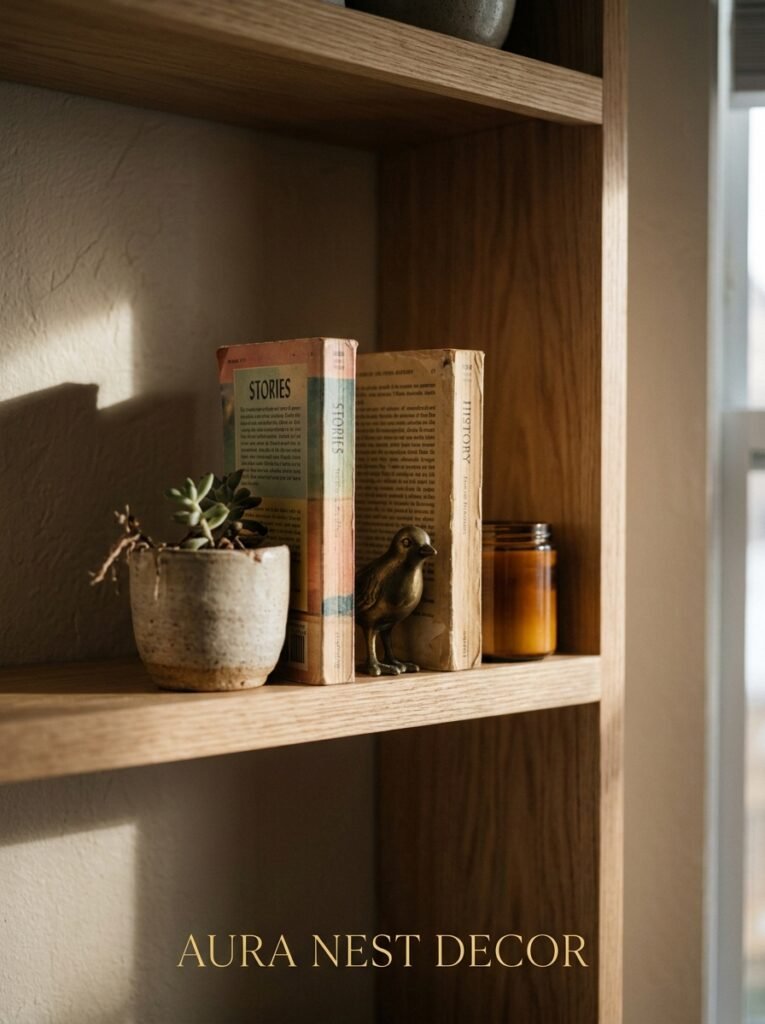
The fix is simpler than it sounds: you stack things. A small pile of books laid flat can elevate something shorter. A plant on a stack of two hardbacks suddenly has height. A low candle in front of a taller vase creates foreground and background.
Think of it like a tiny landscape. Hills, not a flat field.
This also solves a really common problem, which is that not everything you love is tall or interesting in silhouette. Small things get lost. Stack them up. Give them a plinth, even if that plinth is just a novel you’ve already read.
—
7. The Plant Rule That Actually Makes Sense for Shelves
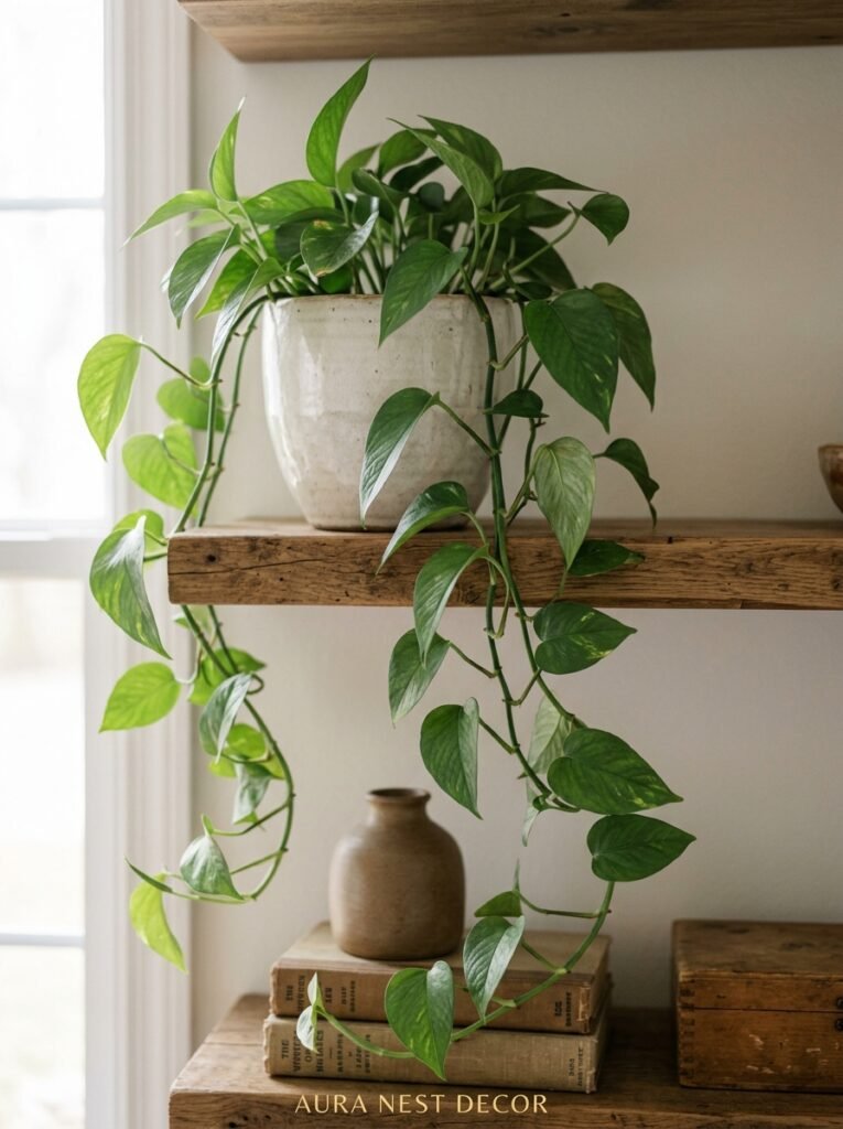
Not every plant works on shelves. I know we all want the lush trailing pothos draping beautifully over the edge, and yes, that can look gorgeous — but it also needs light, and a lot of built-in shelving sits in lower-light areas.
Real talk about what actually survives in there: pothos (yep, genuinely good), heart-leaf philodendron, and ZZ plants if you keep forgetting to water things. For trailing, string of pearls can be stunning but it’s picky. Don’t put a fiddle leaf on a shelf — it’ll sulk, it needs the floor and a bright window.
For UK homes in particular, where natural light is precious and sometimes non-existent from October to March, I’d go for a very convincing faux stem or eucalyptus in a good ceramic vase over a real plant that’s going to die slowly and make you feel guilty every time you walk by.
—
8. The Arrangement Strategy That Actually Works (The “Big, Medium, Small” Method)
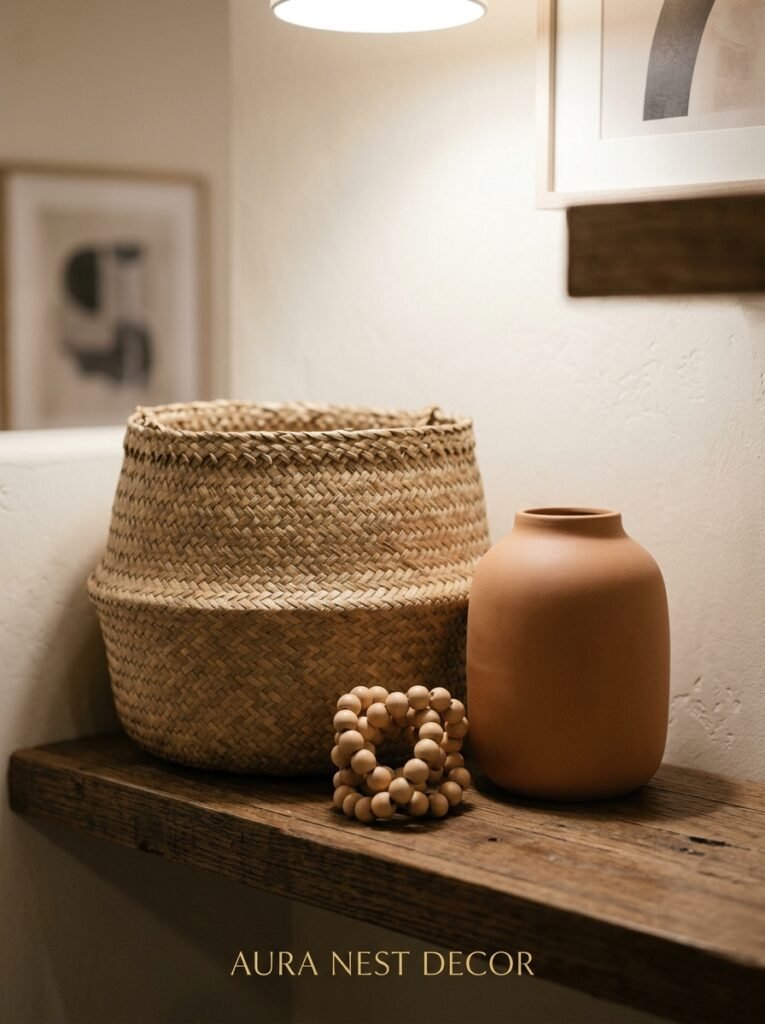
This is the one practical formula that I keep coming back to because it never fails.
On each shelf, anchor with one big element — a tall vase, a stack of thick books, a large piece of art leaning against the back. Then add a medium element beside or in front of it. Then tuck in something small — a small candle, a stone, a tiny figurine, a single stem in a thin vase.
Big. Medium. Small. Not necessarily left to right. Not necessarily all in a line. But those three scales present on each shelf create a rhythm that reads as intentional without looking like it was planned by a graphic designer.
The key is that the big thing doesn’t have to be dramatic. A tall stack of books IS a big element. You don’t need a giant sculptural object.
—
9. When Matching Shelf Decor Sets Are Actually Killing Your Vibe
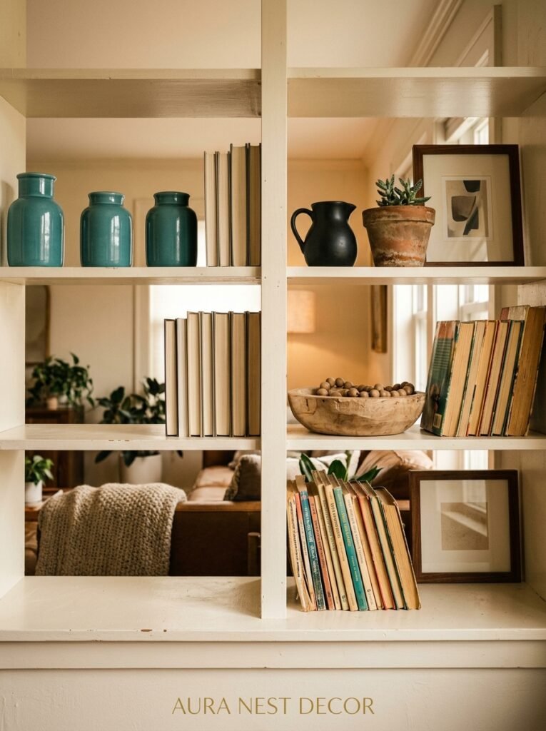
You know those sets? The ones that come in a trio — three different-sized vases, all the same color, sometimes sold as a bundle. Or the matching bookend pair plus coordinating dish.
There’s nothing wrong with any individual piece, but when it’s obvious they came together, it has a slightly flat, catalog-y energy. Like the shelf was decorated in one shopping trip and never thought about again.
The fix isn’t to avoid similar colors — it’s to separate the pieces. Put one of the vases here, one there. Let them have a little distance. They’ll still work together visually because the color connects them, but they won’t scream “set.”
Or better yet — buy things separately over time, from different places. Shelves that look collected feel more alive than shelves that were solved in an afternoon.
—
10. The One Mistake That Makes Expensive Objects Look Cheap
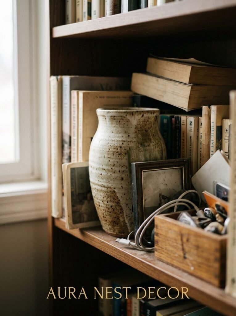
Pushing things all the way to the back of the shelf.
That’s it. That’s the mistake.
When everything is flat against the back wall, you lose any sense of depth. The shelf looks like a backdrop, like a stage flat. Even expensive, beautiful ceramics lose their presence.
Pull things forward. Let some objects sit near the front edge. Let others sit mid-shelf. Tuck a smaller piece behind a larger one. Now there’s depth, there’s layering — and suddenly things that cost fifteen dollars look like they cost a lot more because they’re in an actual composition rather than a lineup.
“A shelf isn’t a mantelpiece. It’s a landscape. Depth is the whole point.”
This is the single quickest fix. You can do it right now, before you buy a single new thing.
—
11. The Case for Having One Shelf That’s Basically Useless (In the Best Way)
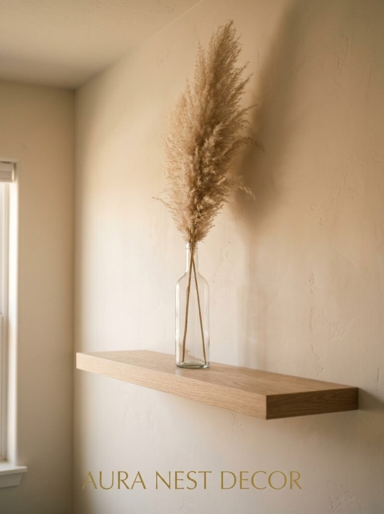
One shelf. Just one. No books, no practical items, no candles that you’re technically going to burn eventually.
Just the things you love looking at.
Maybe it’s a piece of ceramics you saved up for. A family photograph in a frame you found at an antique fair. A small painting. A collection of stones or shells that means something to you. Whatever it is — it doesn’t have to make sense, it doesn’t have to be “styled,” it just has to be there because YOU want to look at it.
This is the shelf that makes your space feel like yours and not a showroom. The shelf guests notice and ask about. The one that, when you walk into the room, gives you that small, quiet feeling of being home.
Every set of shelves deserves one section like this. Not everything needs to be curated. Some things just need to be present.
—
12. How to Know When Your Shelves Are Actually Done
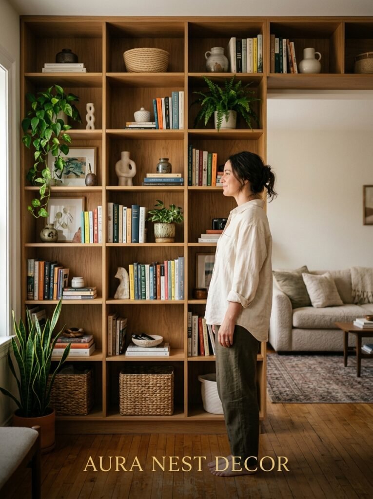
Here’s the honest truth: most people never stop fiddling.
And that’s okay, kind of. Shelves should be a little alive — you swap things out as seasons change, as you find new objects, as you get tired of looking at the same arrangement. But there’s a difference between organic evolution and anxious endless rearranging.
My actual test? I walk out of the room and come back in. First impression only. If your eye goes straight to something you love — a plant, a lamp, a ceramic piece — the shelf is working. If your eye gets confused and just kind of… scans around without landing anywhere, something’s not right. Usually it’s too much stuff. Usually.
The other test is to photograph it. Shelves look completely different through a lens. What looks fine in person suddenly shows you that everything is the same height, or the colors are fighting each other, or there’s a random cable sticking out that you’d completely stopped seeing.
Take the photo. Trust the photo. Fix what you see.
And then, actually, leave it alone for a bit. Let it be imperfect and lived-in and yours.
—
❓ FAQ
Q: How do I style shelves without making them look cluttered? A: Start by taking everything off and putting back only what you genuinely love — about 60-70% of what was there before. Leave deliberate gaps between items, vary heights using book stacks as risers, and resist the urge to fill every inch. Less is almost always more here.
Q: What’s the best way to mix books and decorative objects on shelves? A: Don’t treat them as separate categories. Mix them. Stack some books horizontally, lean a small object against a vertical row, tuck a candle in front of a paperback stack. Books are texture and color — they work with objects, not just around them.
Q: How do I make built-in shelves look good if they’re not symmetrical or an awkward shape? A: Lean into the asymmetry rather than fighting it. Don’t try to mirror each side — instead, let each section have its own little composition. One taller arrangement on one side, a lower grouped cluster on the other. Asymmetry only looks wrong when you’re trying to hide it.
—
💭 Final Thoughts
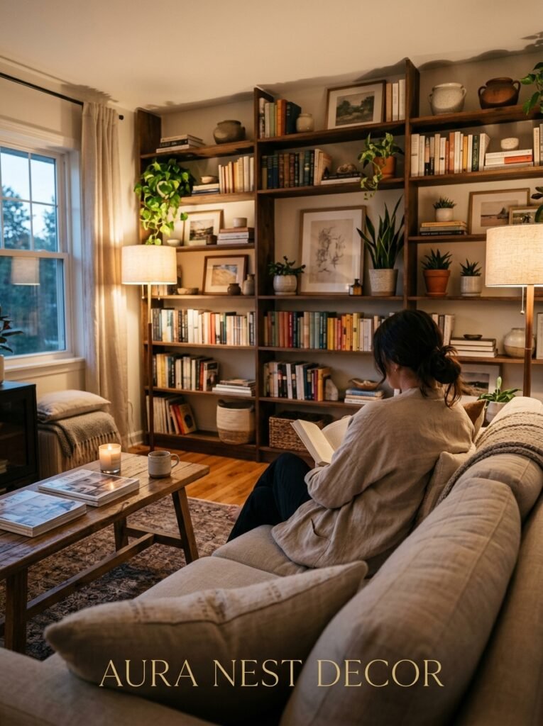
Shelves are one of those things that everyone has and almost nobody feels great about, which is kind of wild when you think about how much potential they hold. You don’t need to spend anything to make yours feel like they belong in a home you love — sometimes it’s just a matter of pulling things forward, clearing a little space, or finally taking down the stuff you only kept because it seemed wrong to get rid of it.
Your shelves should feel like you, not like you tried.
What’s the one object currently sitting on your shelves that you’ve been meaning to move for months — and why haven’t you?




