
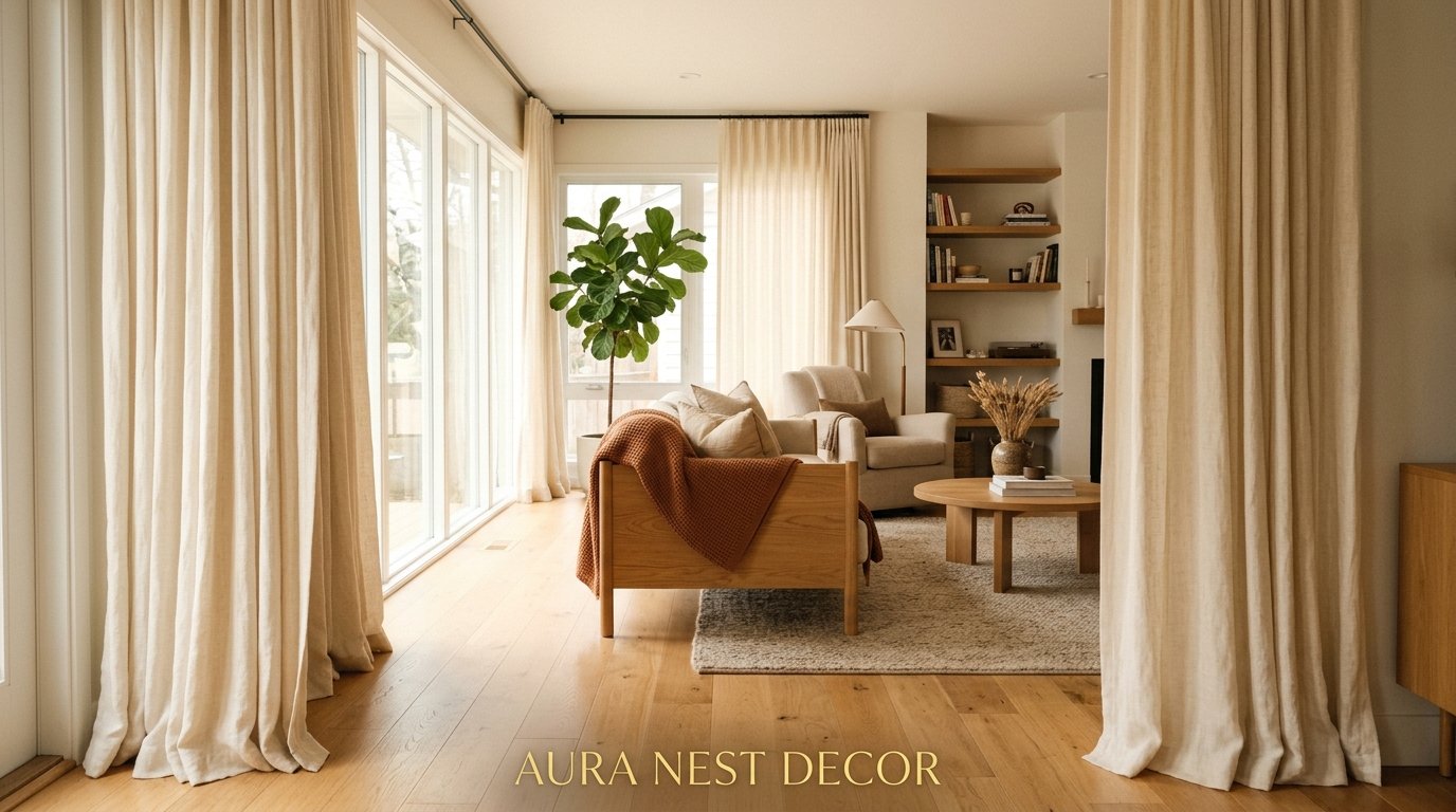
The Curtain Choices That Are Making Living Rooms Look Expensive Right Now (And The Ones That Aren’t)
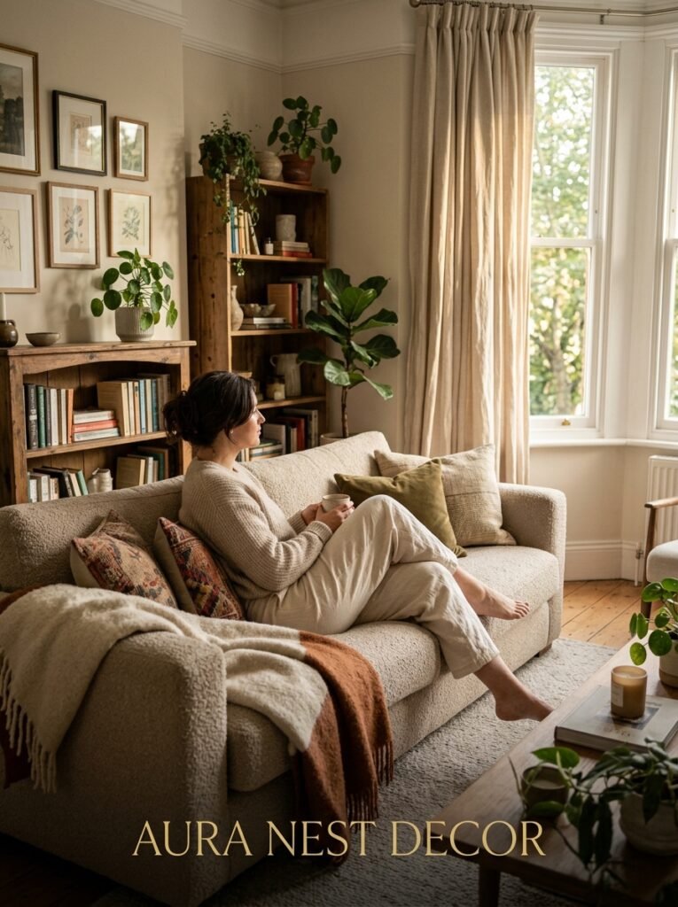
My neighbor Karen redid her whole living room last spring — new sofa, new rug, new side tables. Beautiful pieces, genuinely. But something felt off every time I walked in, and it took me an embarrassingly long time to figure out what it was. The curtains. Thin white panels from a big box store, hanging about four inches below the ceiling, barely grazing the floor. A room that spent thousands of pounds — dollars — whatever you want to call it, quietly undermined by something most people don’t even think about.
Curtains are the part of the room everyone sees but nobody clocks. Until they’re wrong.
—
1. The Height Rule Nobody Told You About (And Why Your Current Curtains Might Be the Problem)
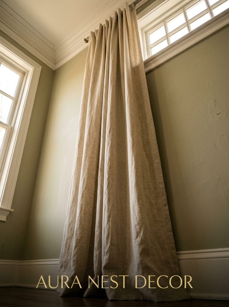
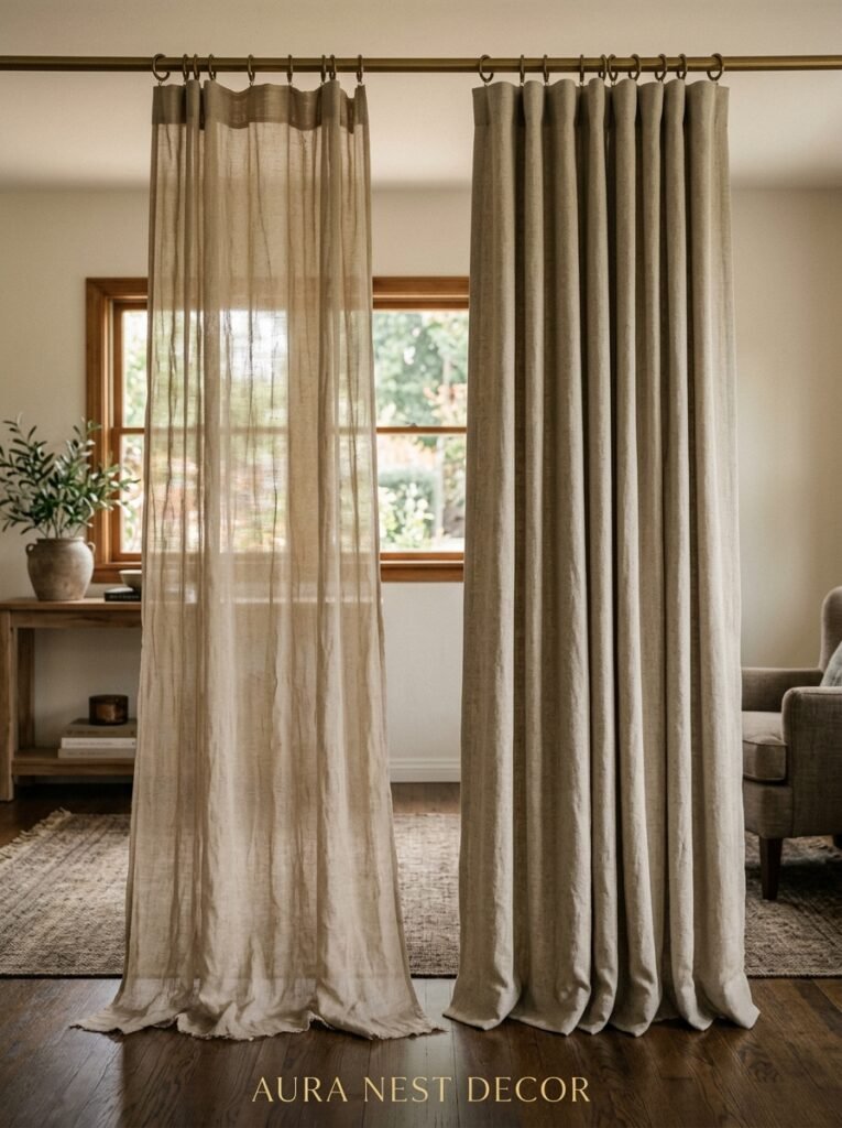
Hang them high. I know you’ve heard this before, but I don’t think people understand HOW high. We’re talking ceiling-height or within three to four inches of it. Not the top of the window frame. Not halfway between the window and ceiling. The ceiling.
When curtains start high, your eye travels up and keeps going, and suddenly a room with 8-foot ceilings reads like it has 10. It’s basically a visual trick that costs nothing extra if you’re already buying curtains anyway.
The other part of this equation is the drop. Floor-length at MINIMUM. If you can manage a slight puddle — an inch or two of fabric resting on the floor — even better. It reads luxurious in a way that’s hard to explain until you see it in person. A curtain that hovers awkwardly above the floor, like it’s nervous about touching it, will undermine even the most gorgeous fabric.
I cannot stress this enough: the rod placement and the length matter more than the actual curtain design. Start here before you spend a single dollar or pound on fabric.
“A curtain that hovers awkwardly above the floor, like it’s nervous about touching it, will undermine even the most gorgeous fabric.”
—
2. Why Linen Is Everywhere Right Now and Whether It’s Actually Worth the Hype
Short answer? Yes.
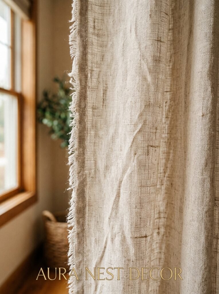
Longer answer: linen curtains have this soft, slightly rumpled quality that makes a room feel like someone actually lives in it — warmly, happily, without trying too hard. They filter light beautifully. During the day you get this diffused golden glow that honestly no synthetic fabric replicates. At night they provide privacy without completely blocking the outside world, which in a living room is usually exactly what you want.
Belgian linen is the name you’ll see everywhere, and it IS different. Heavier, more substantial, with a natural texture that holds its shape. It’s not cheap, but it doesn’t need to be dry-cleaned every five minutes either, which is a selling point for anyone with kids or dogs or, you know, a life.
If linen’s out of budget, look for linen-cotton blends. They’re more forgiving and still carry most of that lived-in softness. What I’d steer away from is anything with a high polyester content — it catches light strangely and can look faintly clinical, which is the opposite of what you want in a living room.
—
3. The Color That Keeps Showing Up in Every Beautiful Living Room Right Now
Warm white isn’t white. Let me explain.
The curtain world is full of whites that read blue, green, or grey depending on the light in your room. Bright white curtains in a warm-toned living room can make the whole space feel slightly cold and disconnected, like a guest who’s dressed for the wrong party.
What’s working instead is the warm end of the spectrum: aged linen, oat, warm ivory, pale mushroom. These tones don’t fight your walls or your furniture. They recede beautifully, letting everything else read as more intentional. And they happen to look incredible in both morning light and lamplight, which is more than bright white can usually claim.
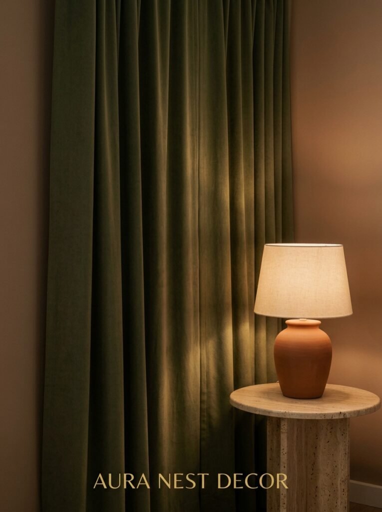
That said — don’t be afraid of color entirely. A deep sage green, a dusty terracotta, or a soft steel blue can anchor a room and add a layer of personality that neutral curtains never will. The key is committing. Half-hearted color looks like an accident. Rich, intentional color looks like a decision.
—
4. Pinch Pleat vs. Eyelet — The Debate That Actually Matters
This one’s a bit of a hill I’m willing to die on.
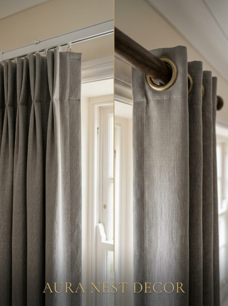
Eyelet curtains — the ones with the big metal rings punched directly through the top of the fabric — are fine. They’re easy to hang, they’re everywhere, and they get the job done. But they also create that very specific fan-fold at the top that somehow reads as “rental property” to my eye, not gonna lie. Especially in a living room you’ve put real thought into.
Pinch pleat curtains, where the fabric is gathered into neat little pinches at the top, hang with a fullness and a formality that immediately reads as more considered. They take a bit more fabric, which adds cost, but the drape is genuinely different — softer, more architectural, more deliberate.
If pinch pleat feels like too much commitment, pencil pleat is the middle ground. Slightly more casual but still with that gathered fullness. And wave heading, which is big in the UK right now, gives you this gentle continuous ripple that works beautifully with heavier fabrics.
The heading is where the character lives. Don’t just default to whatever the curtain came with.
—
5. The One Rule That Makes Patterned Curtains Work Instead of Overwhelm
Scale.
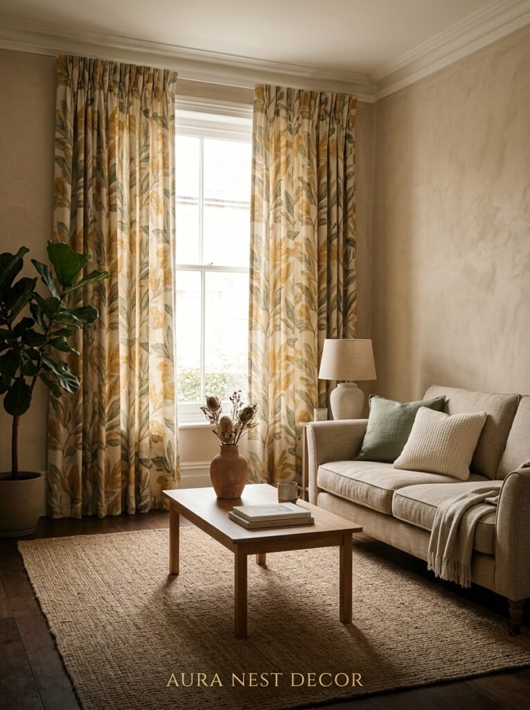
If your sofa has a small pattern, go big with the curtains. If your rug is bold and geometric, your curtains probably want to be quiet. Pattern mixing is wonderful and completely achievable — but you need contrast in scale, not chaos in competing motifs.
Botanical prints are having a genuine moment right now and I think they’ll have more staying power than a lot of people expect. Something about a large-scale leaf or branch pattern in a muted palette just makes a living room feel like it has a point of view. Not a loud one. Just… a considered one.
Side note — if you’re worried about committing to a pattern on large curtains, this is actually where those short panel curtains some people use under longer sheers become useful. You get the visual interest without the permanence, kind of.
“Pattern mixing is completely achievable — but you need contrast in scale, not chaos in competing motifs.”
—
6. Sheers Are Back, But Not the Way Your Grandma Used Them
Sheer curtains have this reputation. Lacy, frilly, vaguely hospital-adjacent. That’s not what’s happening right now.
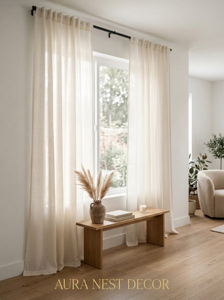
The sheers that are working in modern living rooms are gauzy, barely-there layers in undyed linen or raw cotton. Sometimes they’re the ONLY curtain — no heavy drape behind them, just this whisper of fabric that catches the breeze and softens the window without blocking anything.
Layering is the more versatile option though. A sheer linen panel behind a heavier curtain gives you incredible flexibility. Full privacy at night when both are drawn, that soft diffused light during the day when the heavy drapes are open. And the texture layering itself just looks rich, even with fairly modest fabrics.
In a south-facing room — and this matters a lot in the UK specifically, where you’ve actually got to think about the direction your room faces — sheers do real practical work. They knock back the harsh midday light without making the room feel closed off.
—
7. The Curtain Fabric That Photography Loves (And Why It Shows Up on Every Pinterest Board)
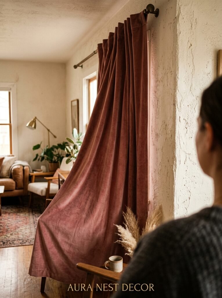
Velvet. Not the stiff, slightly shiny velvet of the nineties. The kind that’s soft and slightly crushed, that changes shade as it moves — darker in the folds, lighter at the peaks.
Velvet curtains photograph like a DREAM. But more importantly, they feel incredible in person. In the evening, when lamps are on and the room is doing its best impression of a boutique hotel lounge, velvet curtains absorb and reflect light in a way that genuinely changes the atmosphere. You feel it more than you see it, if that makes sense.
They’re heavy, which means they hang beautifully without needing much fullness. And they insulate — proper thermal barrier on a cold January night, both in Chicago and Manchester.
The colors that work best? Deep jewel tones: midnight navy, forest green, a slightly bronzed burgundy. These are colors that look extraordinary under warm artificial light and still hold up during the day without looking try-hard.
—
8. Why Your Curtain Rod Is Probably Letting the Whole Look Down
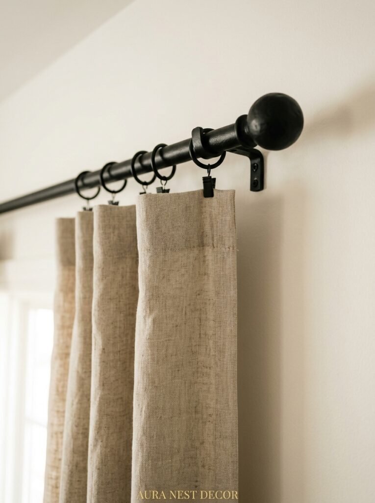
Here’s the thing nobody mentions on Pinterest but everyone should know. An inexpensive curtain rod in the wrong finish can make even beautiful curtains look cheap. And an ugly rod that the curtain doesn’t quite cover is a distraction every single time your eye lands on it.
Brushed brass is the finish of the moment, genuinely. Not yellow gold, not chrome, not rubbed oil bronze — brushed brass. Warm without being flashy, which is a hard balance to hit in hardware. It works with warm neutrals, with jewel tones, with natural linens, with pretty much anything that isn’t aggressively modern and grey.
Width matters too. The rod should extend at least 6 to 8 inches past each side of the window frame, ideally more. This means that when the curtains are open, they’re completely off the glass, framing the window rather than eating into it. Stack back, it’s called. And it makes the window look significantly wider without touching a single wall.
Black matte rods are having a real moment right now, especially in more contemporary living rooms. Just make sure the finish throughout the room has some continuity — a black rod in a room full of warm brass light fittings just creates visual static.
—
9. The “Too Many Windows” Problem and What Actually Fixes It
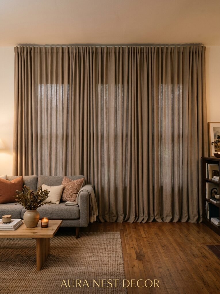
Living rooms with multiple windows, bay windows, or those long runs of windows on two adjacent walls — they’re beautiful and they’re a real pain for curtains.
The instinct is to treat each window separately. Independent rod, independent pair of curtains. This often ends up looking choppy and confused, especially in smaller rooms.
The better approach in most cases: run a continuous rod across the entire wall, floor to ceiling or close to it, and let the curtains form a unified sweep of fabric across the whole thing. Windows become part of a larger composition rather than competing individual elements. In a bay window situation especially, this creates something genuinely architectural.
For the two-wall problem — adjacent windows on a corner — floor-to-ceiling curtains on both walls with a clean internal corner bracket tends to work better than any other solution I’ve tried. It reads as intentional rather than “I wasn’t sure what to do here.”
—
10. The Texture Combination That Looks Expensive on Almost Any Budget
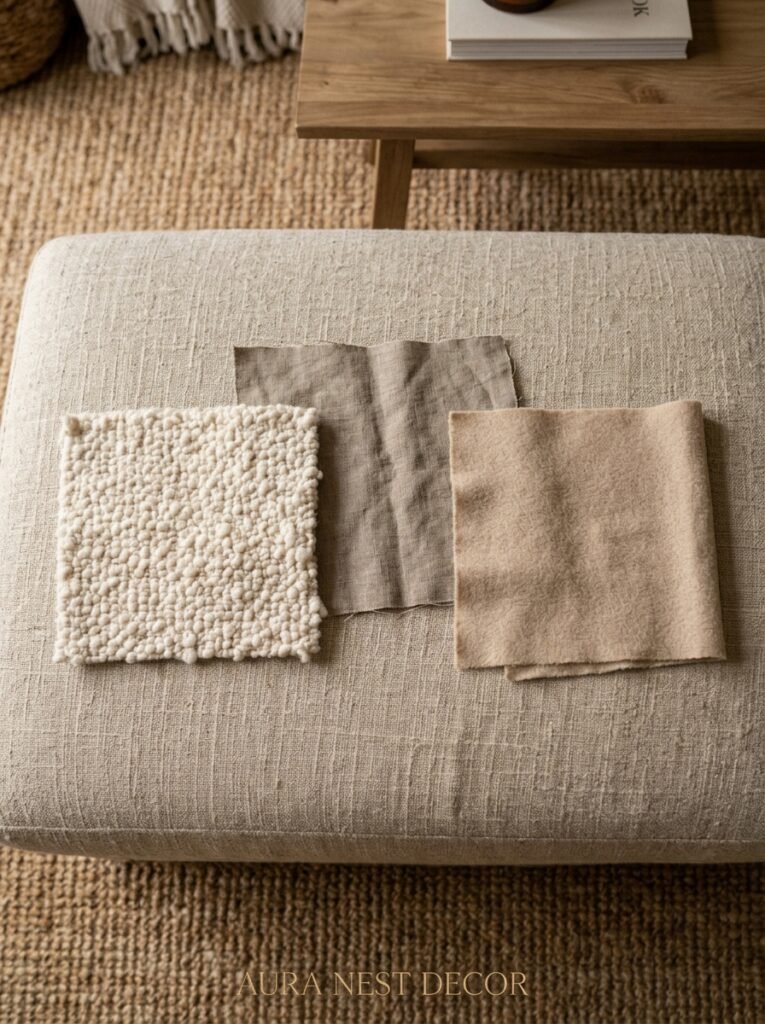
Rough and smooth. That’s basically the whole formula.
If your curtains are a heavy matte linen, pair them with polished brass rings and a smooth plaster wall. If you’re going velvet, the rod and the wall treatment can be softer and more textured — rough limewash paint or exposed brick behind velvet curtains is genuinely stunning and it doesn’t cost a fortune to achieve.
What doesn’t work is too much of the same texture on the same surface. Textured curtains against a heavily wallpapered wall, both the same scale of pattern and visual weight, creates a kind of flat busyness where nothing comes forward. One thing needs to win the room. The curtains or the walls. Let the other one support.
—
11. The Cold Truth About Cheap Curtains (And Where to Spend vs. Save)
I’m not here to sell you on expensive everything. That’s not realistic and it’s not honest.
But I will say: fabric quality is where cutting corners shows most visibly. Thin, slightly transparent panels in a living room look unfinished. They also don’t hang well — they pucker, they bunch, they catch static. In a living room where you’re looking at the curtains every single day, this matters more than in a bedroom.
Where you can genuinely save: the rod. A simple, well-proportioned rod in the right finish doesn’t need to be expensive. IKEA’s RÄCKA system with decent finials looks perfectly fine when the curtains are good. The curtains do the heavy lifting visually.
Where I’d spend if I could only pick one: the fabric weight and fullness. Buy less expensive fabric if you have to, but buy MORE of it. Curtains that are two to two-and-a-half times the width of the window, with real fullness when they’re gathered — that’s what reads as luxury. Skimpy coverage never looks intentional, no matter how nice the material.
“Buy less expensive fabric if you have to, but buy MORE of it. Skimpy coverage never looks intentional, no matter how nice the material.”
—
12. The Small Detail That Ties the Whole Room Together (Most People Skip This One)
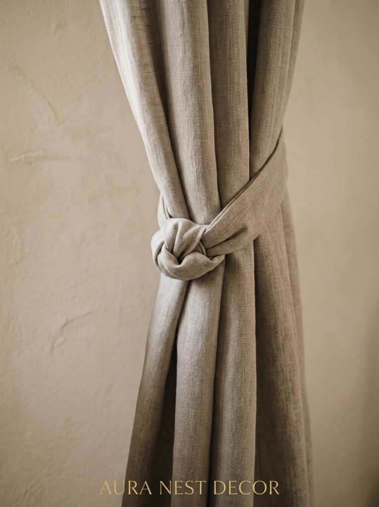
Tiebacks and holdbacks. Not the plasticky hooks or the braided cord from a discount pack. Something considered: a simple leather strap, a polished knot of the same fabric, a smooth stone ring, a sculptural brass arm mounted to the wall.
When curtains are open during the day, how they’re held back IS part of the room. It’s a moment. A little visual punctuation mark at mid-height on your wall.
The position matters too. A tieback placed too low makes curtains look droopy and weighed down. Placed at about two-thirds of the way up the curtain’s length — so maybe 5 feet up on a floor-to-ceiling panel — and the curtain billows gracefully outward. It looks like it’s been styled. Because it has been.
This is genuinely one of those tiny finishing details that photographs well, that visitors notice without knowing why, and that takes about five minutes to get right once you know where to aim.
—
❓ FAQ
Q: How do I make my living room look bigger with curtains? A: Hang your rod as close to the ceiling as possible, extend it well past the window frame on both sides, and choose curtains that are floor-length or slightly longer. Light-filtering fabrics in neutral tones help too — they let light in while still providing privacy, which keeps the room feeling open rather than closed in.
Q: What’s the best curtain fabric for a living room that gets a lot of sun? A: Linen and linen blends hold up well to sun exposure and fade more gracefully than synthetics. If you’re in a very sunny south-facing room, look for lined curtains with an interlining — the extra layer protects the face fabric and dramatically improves how the curtain hangs. Velvet, while gorgeous, can fade and flatten in direct sunlight, so save it for rooms that aren’t sun-drenched.
Q: Should living room curtains match throughout an open-plan space? A: They don’t need to match exactly, but they should feel like they’re from the same family. Same fabric in different colors, or same color in slightly different fabric weights, tends to read as cohesive without being matchy-matchy. What creates visual chaos is wildly different styles — heavy drapes in one area and sheer panels in another — because your eye keeps noticing the contrast instead of settling into the space.
—
💭 Final Thoughts
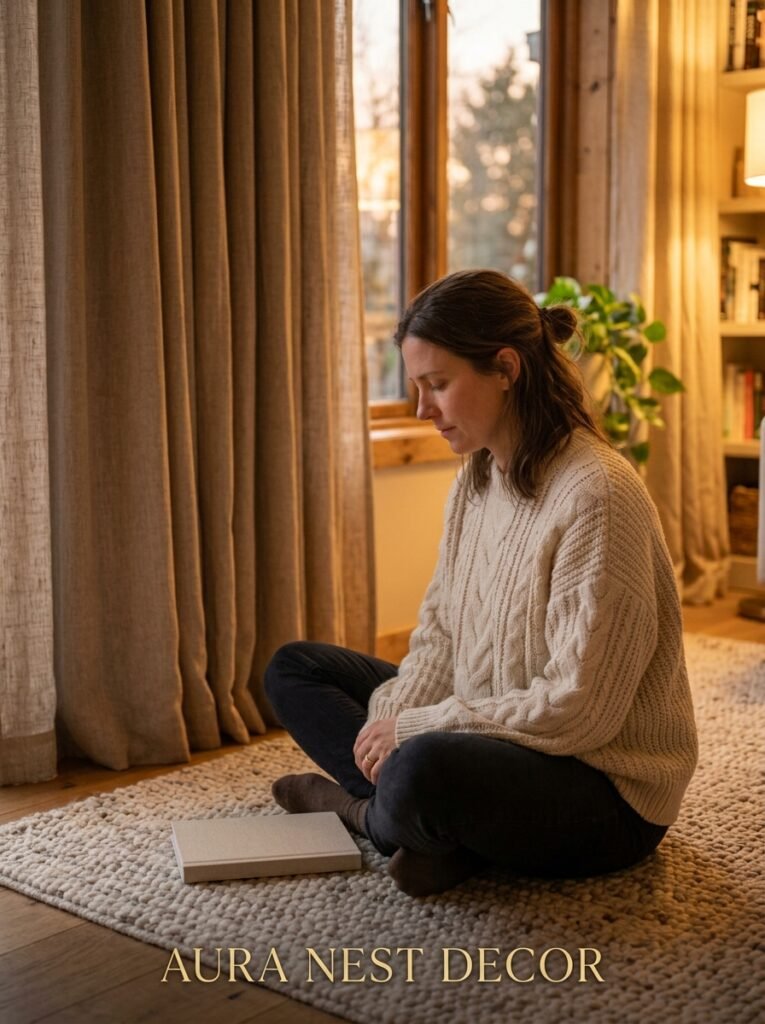
Curtains are one of those things where the right choice is almost invisible — the room just feels complete and you can’t entirely say why. But get them wrong, even slightly, and something nags at you every time you sit down in your own living room.
The good news is most of the fixes are about placement and proportion, not expensive fabric. Hang them higher. Let them touch the floor. Give them room to breathe.
What’s the one curtain mistake you keep seeing in living rooms — and have you made it yourself?




