
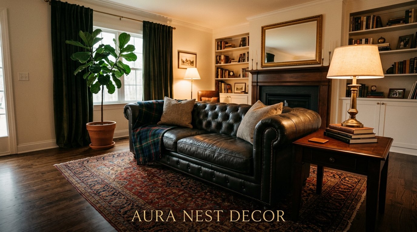
The Ralph Lauren Living Room Look Doesn’t Cost What You Think It Does
My friend Sarah walked into my living room last spring and said “when did you go full Ralph Lauren?” I hadn’t bought a single thing from the brand. Not one item.
That’s the thing about this aesthetic — it’s not a shopping list, it’s a feeling. And once you understand what actually creates it, you can build it for a fraction of what people assume.
—
1. The Specific Shade of White That Ralph Lauren Designers Actually Use (It’s Not White)
Here’s what most people get wrong first. They paint the walls white. Crisp, clean, fresh white — and then wonder why the room doesn’t feel like those moody, layered Ralph Lauren catalog images.
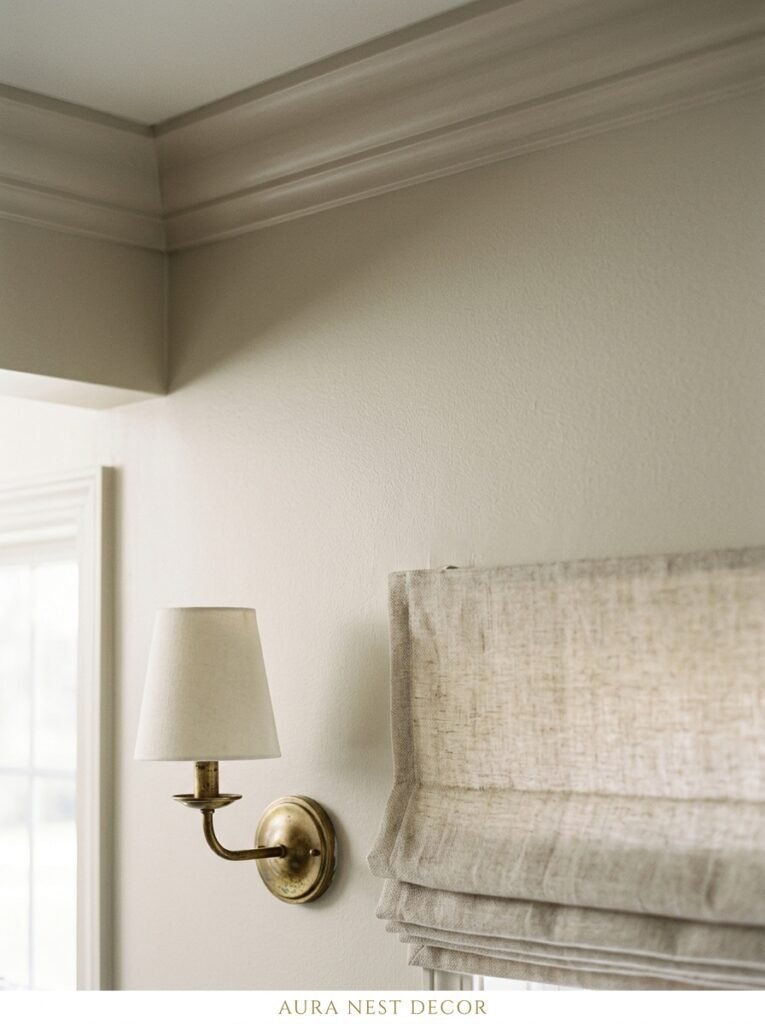
It’s because Ralph Lauren’s version of “white” is almost always an off-white with a warm undertone. Think aged linen, old bone, the color of a worn cotton shirt that’s been washed a hundred times. Shades like Navajo White, Antique White, or the very specific Ralph Lauren Paint shade called “Country Cream” sit in this space — they’re creamy without being yellow, warm without being beige.
The difference between a cold white and this kind of warm off-white is actually dramatic when you light it at night. Cold white walls under lamps look flat and slightly clinical. Warm off-white walls glow. There’s no other word for it. The amber of a table lamp hits differently against an aged linen wall, and THAT is where the magic starts.
So before you buy a single piece of furniture, look at your walls.
—
2. Why the Sofa You’re Probably Eyeing Is the Wrong Move
Not gonna lie — this one’s going to be a slightly unpopular take.
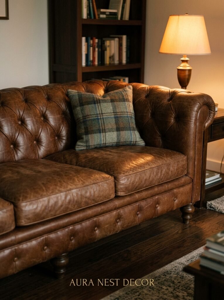
A lot of people trying to achieve this look go hunting for a big, grand tufted sofa. Chesterfield-style, deep button tufting, maybe in a rich cognac leather or dark green velvet. And yes, that can work. But it’s also the most expensive route and honestly not always the most successful one.
The Ralph Lauren living room is built more on TEXTURE than on showpiece furniture. What reads as luxurious in those images isn’t usually one statement piece — it’s the accumulation of worn, layered, tactile things all in the same room together.
“The sofa that photographs best in this aesthetic is almost always the one that looks like someone actually lives on it.”
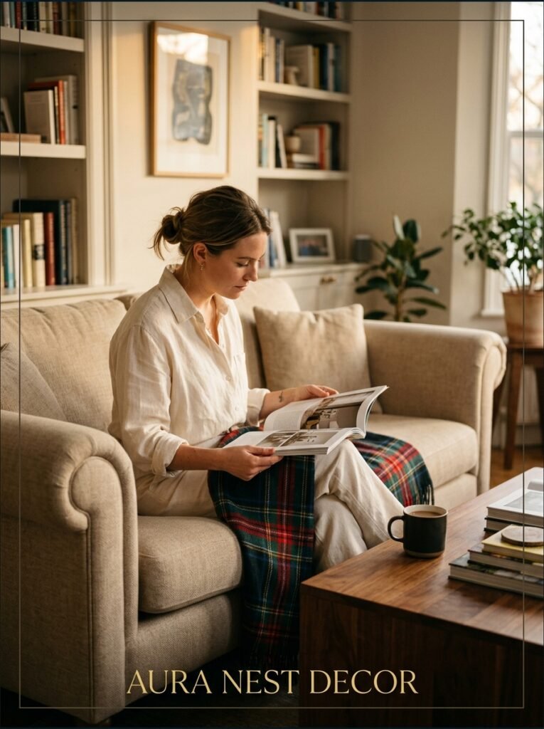
A wide, slightly slouchy linen sofa in oatmeal or natural with a few throw pillows in different textures — chunky knit, worn cotton, maybe one faded stripe — does more for this look than a brand new velvet Chesterfield. Because new things fight the aesthetic. Slightly broken-in, slightly lived-in, slightly found things build it.
If you’re in the US, Pottery Barn and Arhaus have options. UK readers, check Loaf. Their sofas arrive looking like they’ve been in the family for a decade, which is entirely the point.
—
3. The Color Palette That Shows Up in Every Single Room That Looks Like This
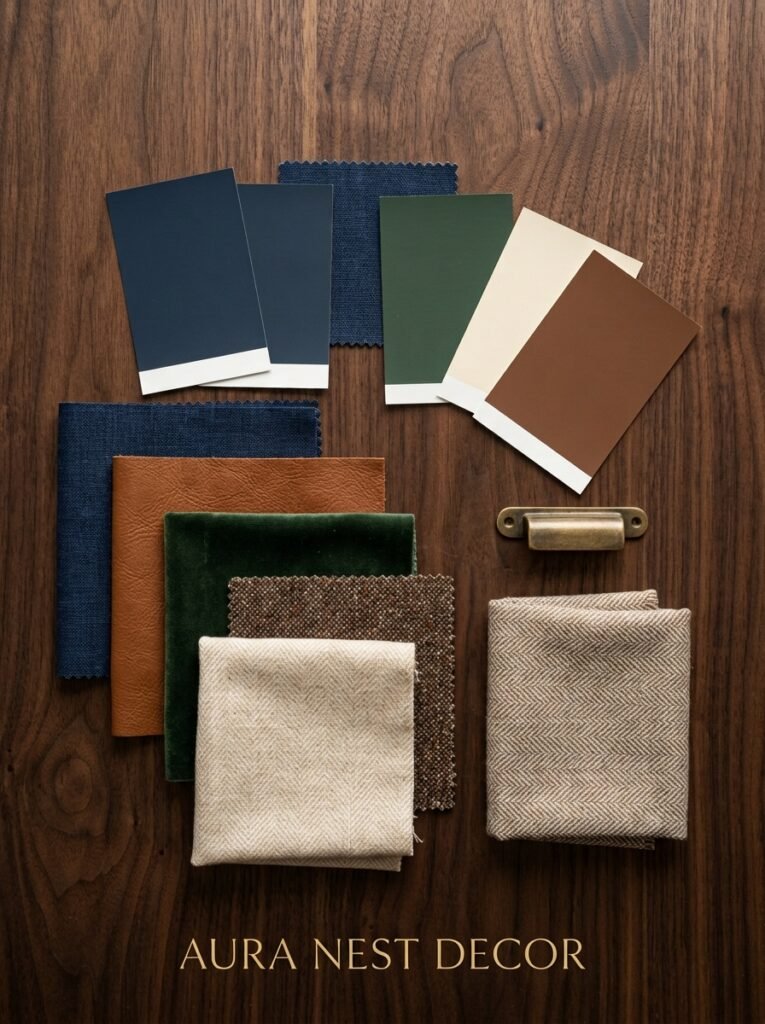
Navy. Camel. Cream. Forest green. Burgundy. Rust.
You don’t have to use all of them — you’d probably use two or three — but you’re almost always pulling from this specific set. These aren’t trendy colors. They’re not dusty pink, they’re not sage green, they’re not whatever color everyone’s discovering on TikTok this month.
They’re old. Worn. Classic in a way that feels slightly masculine without being cold, slightly British without being stiff.
The combination that tends to work best? A neutral base (cream, oatmeal, linen) with one deep accent color (navy or forest green) and then camel or tan as the warm bridge between them. Add burgundy carefully — a wine-red throw, a single cushion — because it tips the whole room into autumn and you want it to feel year-round, not seasonal.
Side note — if you’re in a UK Victorian terrace or an older American colonial-style home, this palette is practically built into the architecture. The ceiling height does half the work.
—
4. The One Thing You Can Buy at a Flea Market That Changes the Whole Room
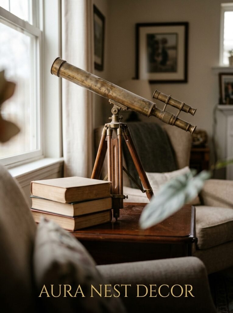
An old oil painting. Or something that looks like one.
I cannot overstate how much this matters. A single large oil painting — landscape, hunting scene, portrait, really anything that looks like it was painted rather than printed — anchors the whole Ralph Lauren vibe in a way that almost nothing else does.
And you don’t need to spend a lot. Flea markets, charity shops (UK readers, Oxfam furniture stores are underrated for this), estate sales, eBay — genuinely, wildly affordable options exist if you’re not precious about the specific subject matter.
“One dark-framed oil painting above a fireplace does more for this aesthetic than almost any piece of furniture you could buy.”
The frame matters almost as much as the painting. Dark wood, gilded, chunky, slightly ornate. Not a clean modern frame. Not a gallery wrap. Something with weight.
What subject? Honestly, landscapes are most versatile. Rolling hills, coastlines, woodland — these feel timeless and neutral. Hunting prints and equestrian scenes are VERY Ralph Lauren but they’re a specific choice, more English country house than American lodge. Know which vibe you’re going for.
—
5. Throw Pillows Without the Throw Pillow Problem
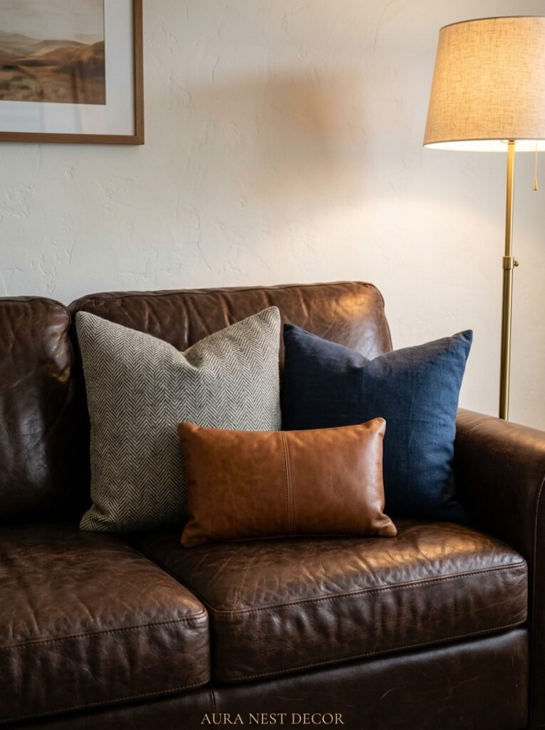
Most people own too many throw pillows and none of them are the right ones.
Here’s the actual approach. Limit yourself. Five pillows maximum on a full sofa, three on a smaller one. And vary them in three ways: texture, pattern, scale.
One large pillow in a neutral texture (linen, canvas, cotton twill). One with a classic pattern at medium scale — a plaid, a small check, a simple stripe. One in something soft and tactile — velvet, chunky wool, worn leather. Then maybe a fourth that introduces your accent color.
That’s it. Done. Stop there.
The mistake is collecting pillows from too many different style worlds. One buffalo check pillow, one global-print pillow, one velvet monogram pillow — these don’t talk to each other. Ralph Lauren pillows all feel like they came from the same heritage, the same slightly old, slightly prep, slightly outdoors world.
—
6. Lighting That Doesn’t Look Like You Tried Too Hard
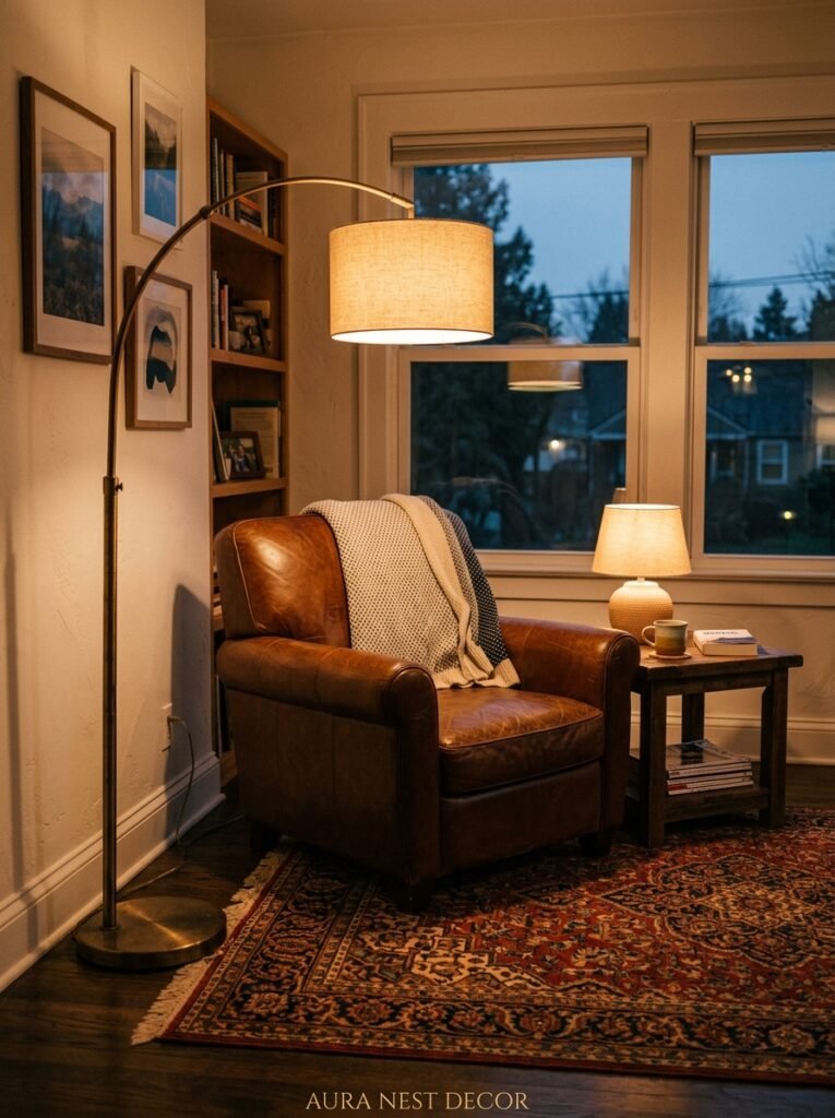
Overhead lighting is mostly ruining your living room. There, I said it.
In a properly put-together room in this aesthetic, you’re probably not turning the overhead light on after about 4pm. You’re relying on table lamps, a floor lamp, maybe candlelight. Multiple low light sources at different heights — that’s the whole strategy.
Table lamps with ceramic or brass bases, linen or empire shades. Not drum shades (too modern), not paper shades (too student flat). Empire shades in cream or ivory, or a deep green banker’s lamp if you’re going more of an English library direction.
Brass is the metal. Not polished, not chrome — aged brass, or something that reads warm and slightly imperfect. This applies to lamp bases, to candlesticks, to picture frames, to hardware on furniture.
One floor lamp in a reading corner — a pharmacy-style or a tripod with a directional shade — and you’ve basically styled a room. The room starts to feel like somewhere you’d actually want to stay.
—
7. The Bookshelf Situation (This Is Where People Either Nail It or Wreck It)
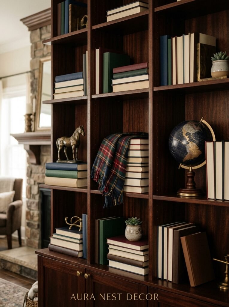
Books are non-negotiable. Real books, not decorative ones, not books with their spines turned around to show only white pages — that look peaked about three years ago and now just reads as slightly odd.
Real books, actually read, in a loose and imperfect arrangement. Stacked horizontally, then some vertical, then horizontal again. A few objects mixed in — a brass candlestick, a small framed photo, a stone or wooden object, a vintage globe if you can find one that doesn’t look too kitschy.
The colors of the books actually matter here. You want spines that tend toward muted: cream, tan, navy, burgundy, dark green. Old Penguin Classics, old hardbacks from charity shops, leather-bound anything — these are the visual ones. Modern books with very bright or very graphic spines can throw off the whole shelf if you’re not careful.
But don’t be TOO precious about it, either. A shelf that looks completely styled and perfectly curated reads as fake. A few random paperbacks that don’t perfectly fit the palette? That’s fine. That’s human. Leave them.
—
8. Rugs: The Place Where the Real Money Goes (or Doesn’t Have To)
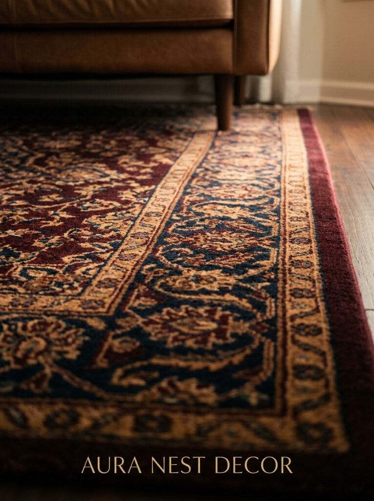
A proper wool Oriental or Persian-style rug is the authentic move. And yes, genuine antique rugs can be expensive. But here’s the thing — they also hold their value and they never, ever look dated. A rug like this is probably the single best investment you can make in this kind of room.
That said. You can absolutely find Persian-style or kilim rugs at a fraction of the price through estate sales, rug dealers who carry second-hand inventory, or even Wayfair’s vintage-style section if you’re patient about quality. UK readers, check rugs from Nook or The Rug Seller — both carry genuinely good options that won’t bankrupt you.
“A worn, faded rug doesn’t look cheap. It looks inherited. And that’s EXACTLY what you want.”
The rug should be large. Larger than you think. Ideally, the front legs of all your seating sit on it. A too-small rug is one of the most common styling mistakes and it makes the whole room feel like the furniture is floating.
Colors: warm reds, navy, faded gold, cream, muted green. The denser and more intricate the pattern, the more grounded the room feels.
—
9. What to Do With a Fireplace (and What to Do If You Don’t Have One)
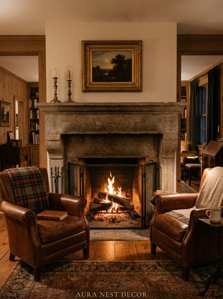
If you have a fireplace, it’s the heart of this room. It’s where everything faces, everything references, everything builds around.
The mantel arrangement matters a lot. Asymmetric but balanced — a large mirror or that oil painting mentioned earlier centered on the wall above, and then objects arranged on the mantel itself that vary in height and material. Tall candlesticks on one side, a small stack of books on the other, maybe a clock in the middle. Something natural — a small plant, a dried botanical, a stone.
Don’t fill the hearth with candles if you have an actual working fireplace. Use it. Nothing in this aesthetic competes with a real fire.
If you’re in a flat or a home without a fireplace — honestly, a chimenea-style console table against a wall can approximate the visual anchor. Stack logs beside it for texture. Add the mirror above it. It reads.
—
10. Curtains That Make Ceilings Feel Taller (and Rooms Feel Richer)
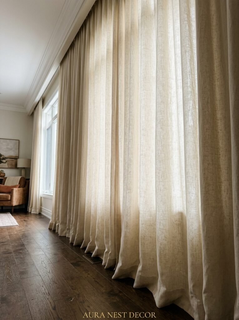
Floor-length. Always. Without exception.
Curtains hung as high as possible — close to the ceiling, not at the window frame — and dropping all the way to the floor. This is the single cheapest way to make any room feel more expensive and more intentional.
Fabric: linen, velvet, heavy cotton. Unlined linen for a lighter, more casual room. Velvet or heavy lined cotton for drama and warmth. In navy, forest green, dark burgundy, or natural linen depending on your palette.
Avoid anything with a very obvious pattern unless it’s a classic stripe or a very small check — busy curtains fight everything else in this room and there’s a lot going on already. The curtains should frame, not compete.
UK Victorian houses with sash windows look INCREDIBLE with proper full-length curtains. If you’re not already doing this, please. Please do this.
—
11. Small Objects That Do Surprisingly Heavy Lifting
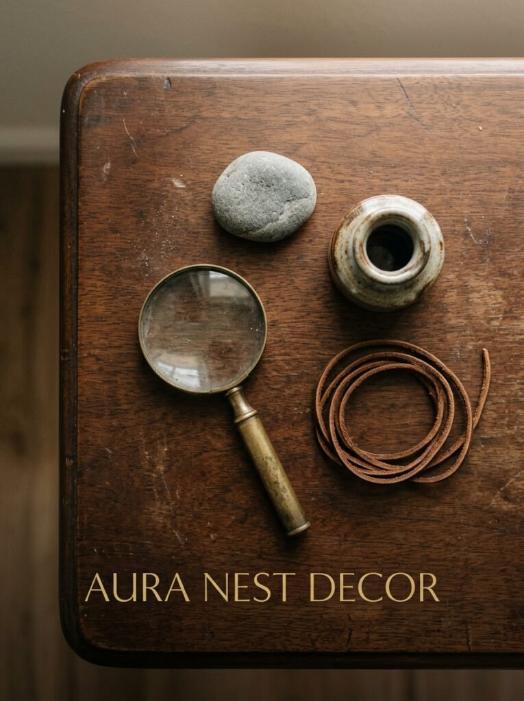
This is kind of the secret weapon section, honestly.
A single equestrian or polo-related object — a small sculpture, an old trophy cup, a vintage rosette — costs nothing at a market and communicates the whole aesthetic in an instant.
Old maps framed in dark wood. A vintage decanter and two glasses on a silver or brass tray. A small leather-bound journal left on a side table. A classic white orchid in a plain ceramic pot. A magnifying glass. A pair of reading glasses no one actually uses.
These are props in the best possible sense. They tell a story. They say: someone interesting lives here, someone who reads and travels and has collected things slowly over time.
The key word is SLOWLY. Nothing in this room looks like it was bought in a single shopping trip. It looks like things arrived from different decades, different trips, different people who lived here before.
—
12. The Version of This Room That Works in a Smaller Modern Space
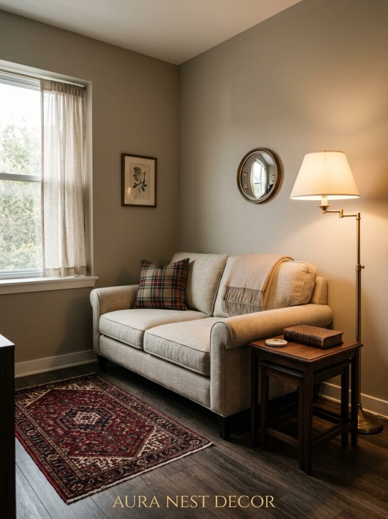
Because not everyone has a Victorian manor. Or a pre-war apartment. Or even particularly high ceilings.
The good news is that this aesthetic scales down better than almost any other. The key is restraint. One good rug instead of several small ones. One statement piece of furniture instead of trying to layer a lot. Two or three really considered accessories instead of filling every surface.
In a smaller room, the palette matters even more — stick to a tight range of three colors maximum or the space feels cluttered rather than layered. Let the walls breathe, let there be some empty surface, and let the pieces you choose be genuinely good ones even if there are fewer of them.
A small flat in London or a New York apartment can absolutely carry this look. You’re not trying to recreate a country house, you’re borrowing the feeling of one — permanence, calm, care, and a sense that beauty matters here.
That feeling doesn’t require square footage.
—
❓ FAQ
Q: Do I have to use Ralph Lauren Paint specifically, or can I use other brands? A: You definitely don’t need the actual brand. The color matters more than the label. Farrow & Ball’s “String,” “Pointing,” or “Shaded White” all hit similar notes for UK readers. In the US, Benjamin Moore’s “White Dove” or “Navajo White” get you very close. Ralph Lauren Paint is gorgeous but it’s a premium price, and the effect is mostly about the specific warm undertone, not the brand.
Q: I rent and can’t paint or change major fixtures — can I still get this look? A: Yes, and it might be easier than you think. Focus on textiles and objects rather than walls and architecture. A large Persian-style rug, floor-length curtains (you can use tension rods that don’t damage walls), warm-toned lamps, throw pillows, and one or two key objects like a framed oil painting or a stack of good books do an enormous amount. You’re building the feeling from the inside out.
Q: What’s the biggest mistake people make when trying this look? A: Buying everything new at the same time. This aesthetic depends on the appearance of accumulation over time. If everything in your room arrived in the same fortnight from the same three stores, it’ll look like a showroom rather than a home. Mix your sources — one thing from a market, one inherited, one genuinely old, one new but classic. Take your time building it.
—
💭 Final Thoughts
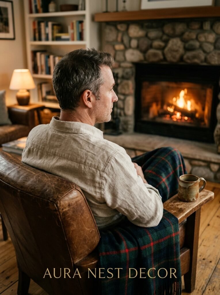
There’s something genuinely relaxing about a room that feels like it’s always been there — like it wasn’t designed so much as it slowly became itself. That’s what this whole look is really chasing. Not wealth, not status, just the quiet feeling of permanence in a world that moves fast.
You don’t need the budget for it. You need the patience.
What’s the one piece in your living room right now that you think might be fighting everything else?




