

Why Navy Is the One Living Room Color That Actually Gets Better the Longer You Live With It
My friend Jen repainted her living room navy on a whim last spring. She called me two days later, not to say she loved it — but to say she didn’t know she could love a room this much.

—
1. The Color That Half the Internet Is Afraid Of (and the Other Half Swears By)
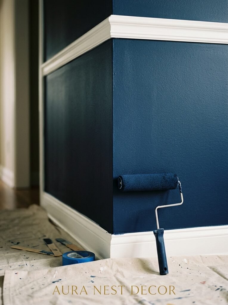
There’s this fear around navy. People stand in paint stores holding little swatches against their wrist like they’re checking for a pulse. They squint. They put it back. They take it out again. “Isn’t it too dark?” someone always asks, as though darkness is automatically the enemy of a beautiful room.
It’s not.
Navy is the color that looks completely different at 9am in bright light — crisp, almost slate-like — than it does at 7pm when the lamps come on and the whole room turns into something that feels borrowed from a much more interesting person’s house. That shift is the thing. That’s what makes it worth committing to.
And it doesn’t matter if you’ve got a Victorian terrace in Edinburgh or a modern craftsman in Portland — navy adapts. It pulls from whatever the room already has, deepens it, makes it feel decided. Like someone actually thought about it.
“Navy doesn’t shrink a room. It focuses it.”
Not every dark color does that. Navy specifically has this quality where instead of feeling heavy, it feels intentional. Which is, honestly, the vibe we’re all going for.
—
2. What “Navy” Actually Means (Because Not All Navy Is the Same)
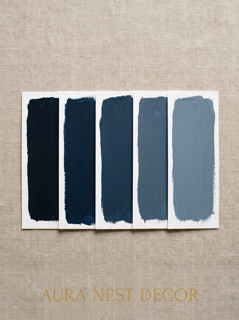
Here’s something the paint companies don’t shout about: navy is a huge category. There’s navy that leans purple. Navy that goes almost black in low light. Navy with a green undertone that makes it feel more like the sea and less like a school uniform. Cool grey-navy. Inky midnight navy.
Getting this wrong is the most common mistake I see.
If your living room gets a lot of natural light — south-facing windows, big open plan — you can go darker, almost ink-black navy, and it’ll still breathe. If your room is north-facing, or smaller, you want something that holds onto that blue quality even in shadow. Look for navies with a slight warm undertone. They read as sophisticated, not gloomy.
Some favourites that work brilliantly in both US and UK homes: Hague Blue by Farrow & Ball (which is more of a deep teal-navy — spectacular), Naval by Sherwin-Williams (clean and true), Midnight by Benjamin Moore, and Newburyport Blue if you want something a touch lighter that still commits.
Do your sample tests. On multiple walls. At different times of day. I know you know this. Do it anyway.
—
3. The Furniture Colors That Navy Turns Into Something Unexpected
This is where it gets fun.
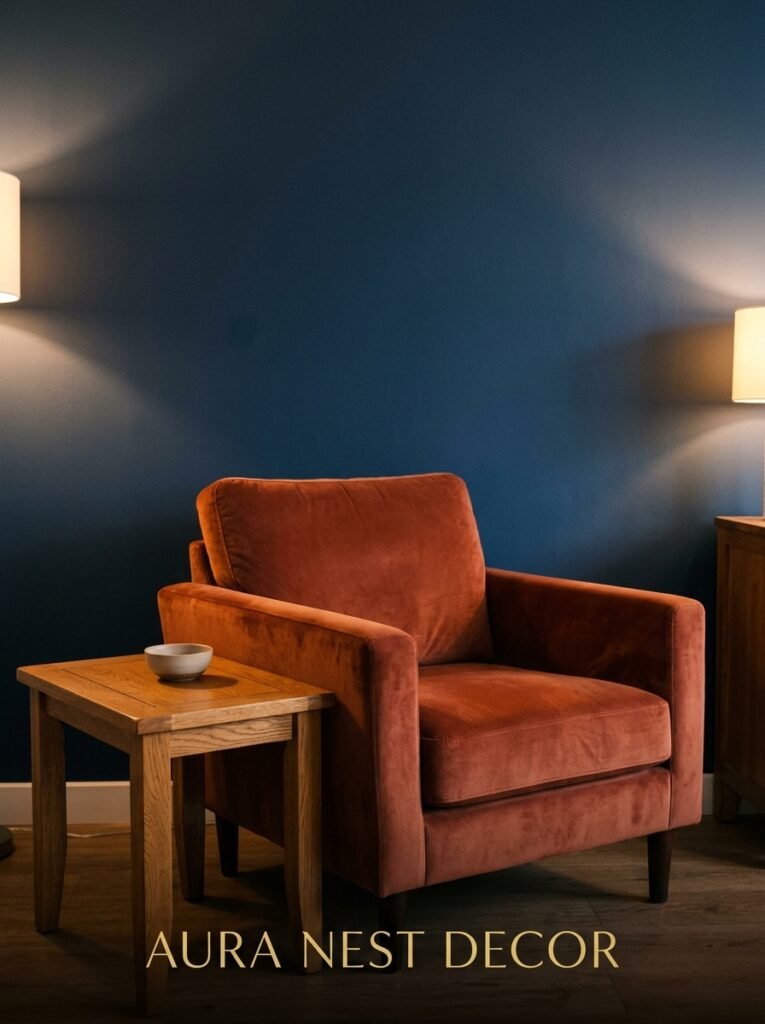
Navy makes cream look antique-warm rather than just off-white. It makes natural wood glow in a way that white walls don’t — something about the contrast pulls out the grain and the honey tones you barely noticed before. And with brass? Oh, it’s almost unfair how well that works. The brass just sings against navy. Every lamp, every handle, every small candle holder — suddenly it all looks chosen.
Terracotta against navy is maybe my favourite combo right now. It shouldn’t work on paper — bold warm against bold cool — but it really, truly does.
White furniture on navy walls is very crisp, very graphic, slightly Hamptons. It’s a look. But if you want something with more warmth and less magazine-styled precision, go for linen, oat, or that slightly worn cream. Lived-in and layered rather than perfectly composed.
Velvet sofas are just MADE for navy rooms. Forest green velvet. Dusty rose. Even a camel-toned velvet sofa against a navy wall looks like something you’d see in a boutique hotel in Bath.
—
4. The Lighting Truth Nobody Tells You Before You Pick Your Paint
You can have the most perfectly chosen shade of navy and still ruin it with bad lighting.
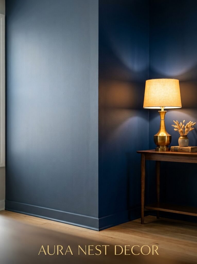
Cold, bright overhead light strips all the warmth out of navy and turns it flat. Slightly clinical. That’s not the vibe. What navy needs — what it genuinely responds to — is layered warm light. The amber glow of an Edison bulb at 7pm. A table lamp in the corner with a cream linen shade. Candles, if you’re the kind of person who actually lights them rather than just buying them.
Side note: floor lamps in a navy room do something extraordinary. Because the walls are dark, the pools of warm light from floor lamps create these little islands of glow that feel very intentional and very cozy. It’s the reading-nook effect, but for the whole room.
“The walls absorb the light. What’s left is the mood.”
Recessed lighting alone will not save you here. You need warmth coming from below eye level. At least two or three lamp sources. Trust me on this one.
—
5. Small Navy Living Room? Here’s the Only Rule That Matters
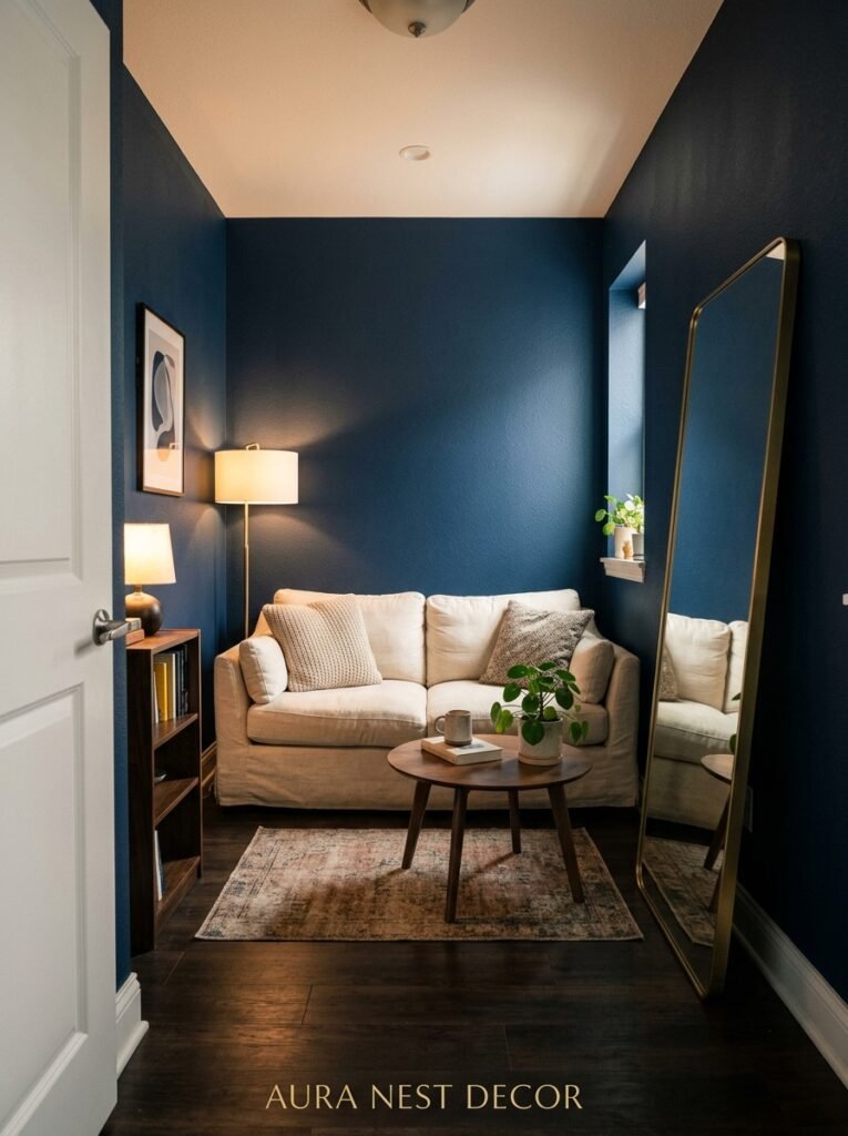
A lot of people assume that if their living room is on the smaller side, navy is automatically off the table. That’s not quite right.
The rule is: keep the ceiling light. Full stop.
Paint your ceiling white, cream, or even a very pale greyed-out white. Let it lift. What happens in a small room with dark walls and a light ceiling is actually pretty magical — the room feels like a jewel box rather than a cave. The eye goes UP, the walls recede slightly, and the whole thing feels curated rather than cramped.
I’d also keep the larger furniture pieces — sofa, main armchair — in lighter or mid tones. Cream, natural linen, warm grey. You don’t want navy walls and a dark sofa and dark rug all competing for the same visual space. Give the room somewhere to breathe.
Mirrors help enormously. Not a huge formal mirror necessarily — a collection of smaller ones in brass or dark wood frames, scattered a bit unevenly, works beautifully and moves light around in a way that feels organic rather than decorator-prescribed.
—
6. The Rug Choice That Pulls a Navy Room Together (or Destroys It)
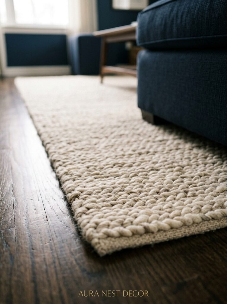
Navy on the walls gives you enormous freedom with rugs — probably more than any other wall color, because it’s both bold AND neutral in its own weird way.
A jute or natural fiber rug is the safe, good answer. Always works, always warm, grounds the room without competing.
But if you want the room to feel really layered, look for rugs with warm terracotta, cream, rust, and maybe a touch of gold in a traditional or distressed Persian pattern. The navy walls will pick up the blues in the rug’s pattern and the whole room suddenly feels like it was designed by someone who absolutely knew what they were doing. Even if you absolutely didn’t.
Avoid: anything too cool-toned. Grey rugs, cool blue rugs, anything with a lot of silver or icy tones — they’ll make the room feel cold and a bit flat.
—
7. Curtains in a Navy Room: The Decision Most People Get Wrong
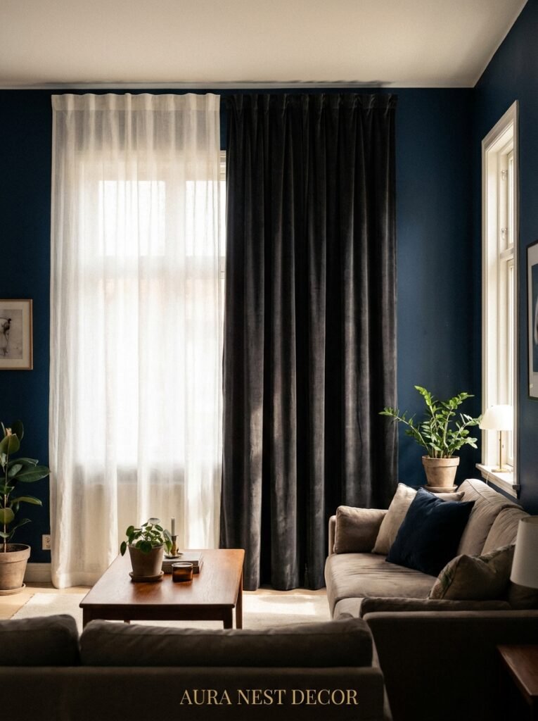
People default to white curtains because it feels safe. And white curtains against navy walls do look lovely — there’s that crisp contrast, very clean, very tailored.
But white curtains in a north-facing room or a room that doesn’t get much sun can look slightly harsh against navy. A bit stark.
What I’d actually suggest instead? Linen in a warm natural tone. Or even a warm-toned stripe — navy and cream, navy and rust, or an earthy buffalo check. The texture of linen especially works brilliantly because it softens the whole wall and creates depth without adding another solid block of color.
For drama — and I mean really committing to the drama — ceiling-to-floor curtains in a deep velvet, either matching the navy or going full forest green or rust, look INCREDIBLE. Especially in older homes with high ceilings. You have to lean into it. Go long. Go full width. Let it be a lot.
—
8. Art and Gallery Walls in a Navy Room (This Changes Everything)

This is the thing people don’t think about until they’re standing there with a hammer and a bunch of frames wondering why it’s not working.
Dark walls change how you hang art.
Light frames disappear. White frames, thin gold frames, anything delicate — they kind of fade into the wall and lose their impact. What works on navy is heavier contrast: thick black frames, chunky natural wood frames, warm antique gold. You want the frame itself to be visible and intentional.
Art choices: warm-toned botanicals are incredible on navy — the burnt sienna, the deep greens, the cream backgrounds. Abstract art with gold, orange, or cream tones. Vintage maps. Black-and-white photography in black frames, clustered together.
“Against navy, art doesn’t just hang — it pops.”
One thing I’d really encourage: don’t fill every wall. Let some of that beautiful navy just breathe. A single large piece of art on one wall and a smaller cluster on another is more interesting than every surface covered. The dark wall is doing work — let it.
—
9. The Shelf Styling That Actually Works in a Dark Room

Open shelving and bookcases in a navy living room have a specific mood to them. They can feel very curated, very library, very “I definitely read all of these books” (whether or not you did).
The key is contrast. Don’t load the shelves with all dark objects — dark books, dark frames, dark vases — because everything will merge together into a visual muddle. Bring in warm wooden objects, cream candles, a brass lamp or two, plants with bright green leaves. Stack some books horizontally and lean a few objects against the back. Make it slightly imperfect.
Actually — painting the inside of shelving units navy while the exterior stays white or cream is a gorgeous look. It creates this surprise of depth when you look at the shelf, and it avoids the full commitment of painting all the walls dark while still getting that moody, layered quality.
—
10. Metallics, Texture, and the Small Stuff That Finishes a Navy Room

Brass. Start there. It’s not even a contest.
Brass switch plates, brass curtain rods, brass legs on a coffee table, a brass-framed mirror. Not shiny-shiny polished brass — the warmer, slightly matte antique brass finish that’s everywhere right now. It glows against navy in a way that chrome and silver simply don’t.
But beyond brass: texture matters enormously in a navy room because the walls don’t reflect light the way pale walls do. You need texture to create visual interest. Chunky knit throws. A ribbed velvet cushion. A ceramic table lamp with a slightly uneven finish. Wicker and rattan accessories. A linen-textured cushion cover in burnt orange. Layer it up and make it tactile.
And please, some houseplants. The deep green of trailing pothos or a big fiddle-leaf fig against navy walls is the kind of color combination that makes you want to sit in the corner with a good book and not come out for approximately four hours.
—
11. The One Navy Approach That Almost Always Goes Wrong
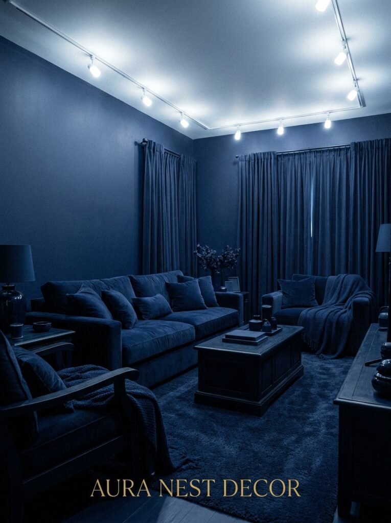
Not going to sugarcoat this: all-navy everything, with no contrast, no light relief, no texture variation — it reads as oppressive rather than moody. There’s a difference.
If you’ve got navy walls AND a very dark navy sofa AND dark curtains AND a dark rug all in the same small-to-medium room, it stops feeling intentional and starts feeling a bit forgotten. Like the room gave up.
The people who get navy living rooms RIGHT are the ones who balance the depth with deliberate lightness. One cream sofa. Natural wood floors. White ceiling. Brass lamps. A light jute rug. They’re using navy as the dramatic backdrop, not the entire cast.
Think of it like seasoning. Navy is the thing that makes everything else taste more like itself.
—
12. When to Not Paint All Four Walls (and Why That’s Sometimes the Better Move)
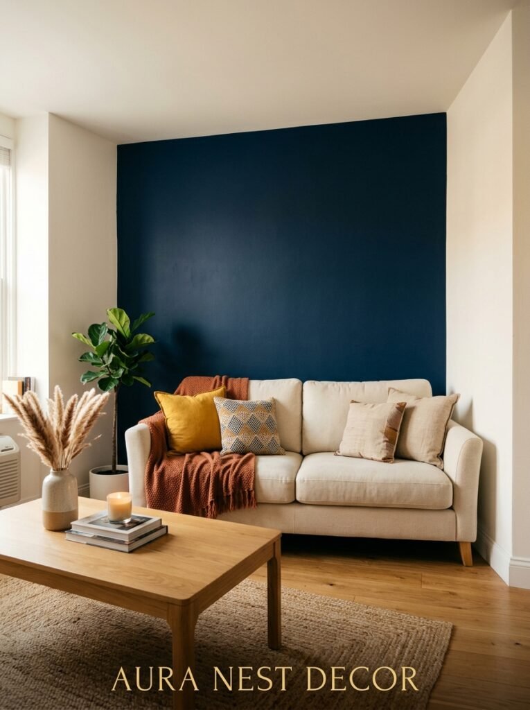
Sometimes the full commitment isn’t right for the space. And that’s fine.
One navy accent wall — ideally the wall behind the sofa or the fireplace wall — can absolutely give you that dramatic, grounded feeling without making the room feel smaller or darker overall. It’s a good starting point if you’re genuinely nervous, and honestly, in some rooms it looks better than all four walls.
Another option that’s having a real moment right now: painting just the lower half of the walls navy, with a picture rail or painted trim dividing it from a lighter upper half. This is very traditional British décor, a bit Farrow & Ball in the best possible way, and it gives you that depth and richness at eye level without closing the room in from above.
And built-in shelving painted navy? That’s a commitment that pays off for years. It looks expensive in a very quiet, confident way. You don’t have to do all the walls. Sometimes the shelving is the statement.
—
❓ FAQ
Q: Will navy make my living room look smaller? A: Not necessarily — it depends more on lighting and what you pair it with than on the color itself. A navy room with warm layered lighting, a light-colored ceiling, and some well-placed mirrors can actually feel more intimate and intentional than a small room painted pale that just emphasizes its awkward proportions. The key is contrast and warmth.
Q: What’s the best way to add navy to a living room without committing to paint? A: Navy throw pillows and a navy throw are the fastest route, and they work. But if you want more visual impact without painting, a large navy area rug or a navy velvet sofa really moves the needle. Even navy roman blinds or curtains can shift the whole feel of a room without touching the walls.
Q: Does navy work with grey flooring or grey sofas? A: It can, but you need to be careful. Cool grey against cool navy can go flat and a little cold — add warmth through your accessories and soft furnishings. Brass, terracotta cushions, warm wood tones, and plants will do the work of bridging that coolness. A warm greige (beige-grey) sofa tends to work better with navy than a stark cool grey.
—
💭 Final Thoughts

Navy is the rare color that rewards you for being brave. It doesn’t give you everything immediately — it opens up slowly, differently in morning light and evening light, differently in winter than in summer. And once you’ve lived with it a while, the rooms that felt “safe” start to look a little pale by comparison.
What would you do differently in your living room if you weren’t afraid of going dark?




