
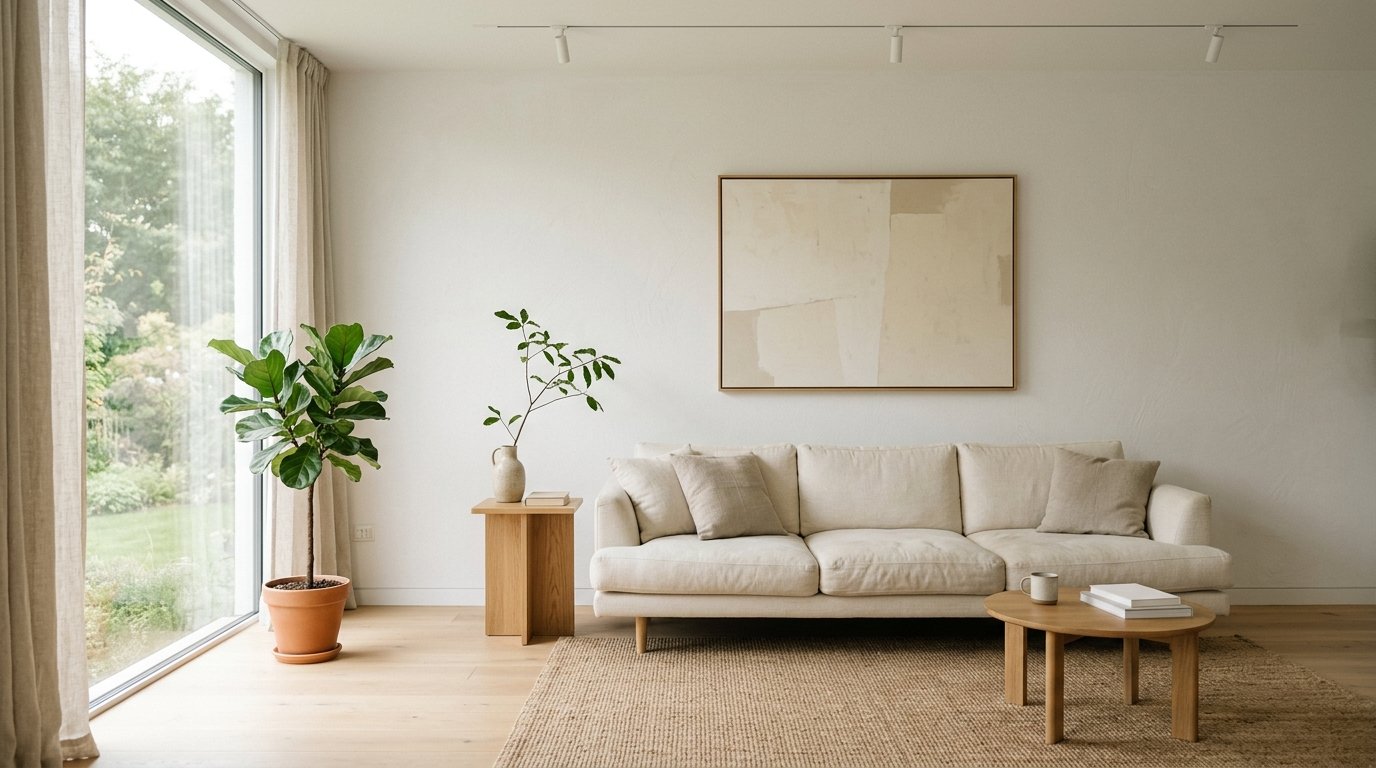
Why White Living Rooms Feel So Expensive Right Now (And It’s Not the Furniture)
My friend Priya texted me last week: “I’ve repainted my living room white three times. It still looks like a hospital.” And honestly? I knew exactly what she meant.
White is deceptively hard. Harder than dark colors, harder than pattern, harder than anything — because it strips away all the hiding places. Every awkward corner shows up. Every cheap throw screams. But when it works? There’s nothing like it. A white minimalist living room done right doesn’t just look clean. It looks like someone who has their entire life figured out.
—
1. The White That Actually Photographs Well Isn’t the One You Think
Everyone reaches for bright white. Pure, flat, blinding white. And then they’re confused when the room feels cold, or worse — weirdly yellow in the evenings.
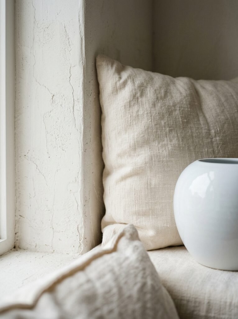
The whites that look stunning in photos (and in real life, which matters more) are almost never pure white. They’re slightly warm. Just enough to pick up natural light without going cream. Think white with a whisper of something — the faintest hint of grey or stone or sand underneath. The kind of white you’d describe as “almost white” but can’t quite pin down.
This one shift is responsible for maybe 60% of why some minimalist living rooms feel expensive and others feel clinical. It’s not the furniture. It’s the undertone.
Pull up your paint deck and look at the ones that are two to four shades down from pure white. Hold them in your actual room, in your actual light, at different times of day. The color that looks best at 11am and also at 7pm? That’s your white.
“White is the most forgiving color in theory and the most unforgiving in practice.”
—
2. Texture Does the Job That Color Would Do Anywhere Else
In a non-white room, you’ve got color to add visual interest. In a white room, you’ve got nothing. Which means texture isn’t optional — it’s the ENTIRE game.
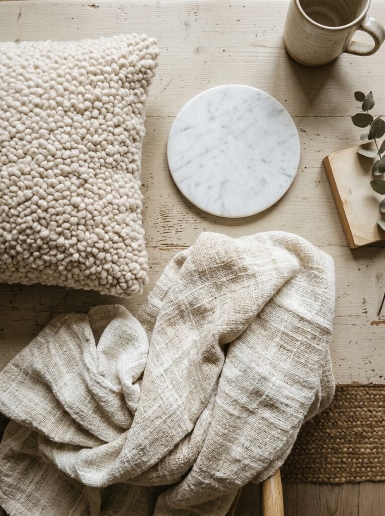
A white sofa needs to be in a fabric that has some depth to it. Bouclé is obviously popular right now and not without reason — that loopy, slightly rough surface catches light differently from every angle. Linen is quieter but equally good. Velvet works if you keep everything else extremely restrained.
The floor is where a lot of people go wrong. A flat, low-pile rug in a white room just disappears. You need something with actual physical depth — a chunky knit, a shaggy wool, a woven jute that you can practically feel from across the room. Not just visually textured, but textured in a way that looks like you could run your hand across it.
Mix your textures deliberately. Smooth plaster walls, rough natural fiber rug, matte ceramic vase, glossy coffee table surface. The contrast between them is what makes the room feel layered rather than empty.
—
3. The Part Every Minimalist Gets Wrong About Negative Space
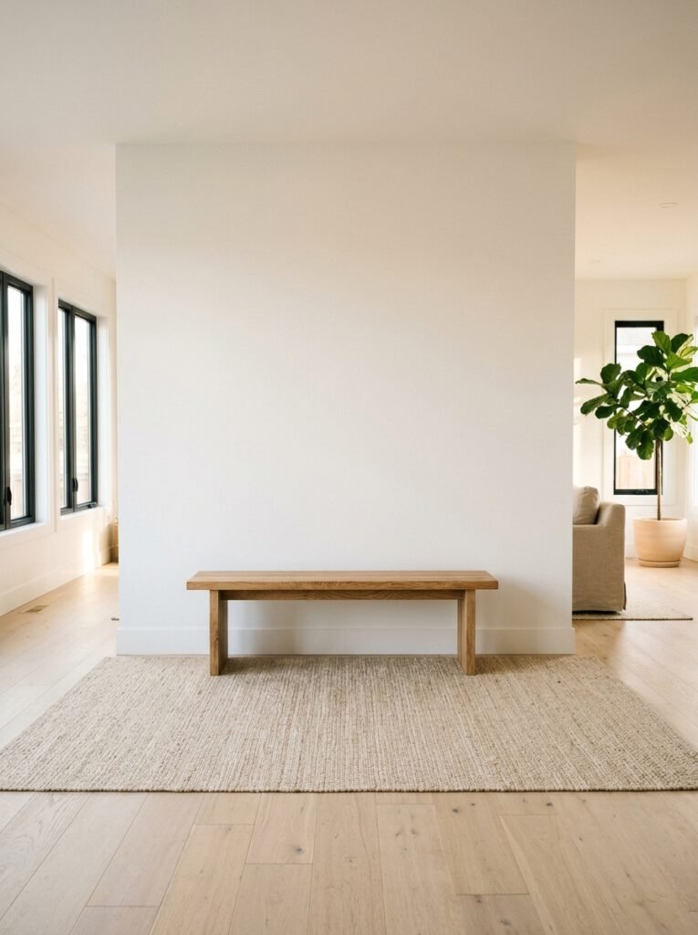
Here’s the thing about “less is more.” It doesn’t mean less stuff. It means less CLUTTER. There’s a difference, and it’s enormous.
Negative space in a minimalist living room should feel intentional, not like you ran out of budget. An empty corner isn’t minimalism. An empty corner with a single sculptural floor lamp that throws a wash of light up the wall — that’s minimalism. One does something. The other just exists.
Every piece of negative space in the room should be doing quiet work. A long empty stretch of wall is a choice that makes the one piece of art you did hang feel monumental. An open shelf with three objects on it forces you to look at each one. Space isn’t absence in a well-done minimalist room. It’s emphasis.
This is genuinely the hardest thing to get right. Because it requires confidence. You have to be willing to sit with a room that feels “not quite finished” for a few weeks, and trust that it’s finished.
—
4. Why Every Beautiful White Room Has Something Dark In It
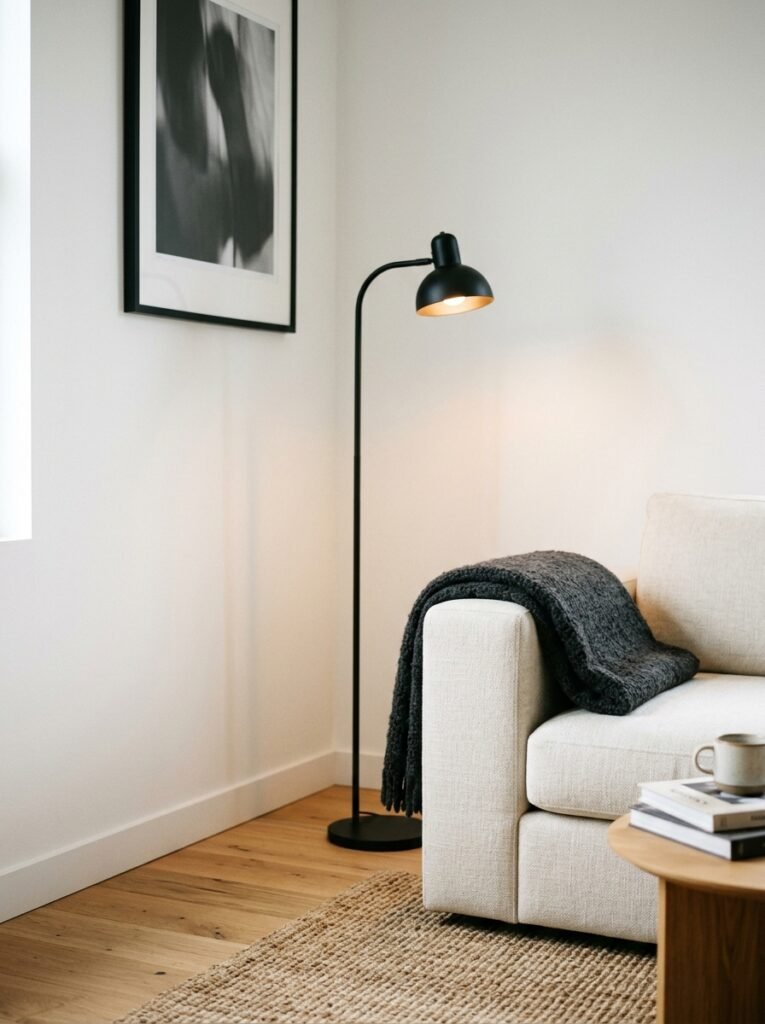
Go look at any minimalist white living room you’ve ever saved on Pinterest. Any of them. I’d bet actual money there’s at least one dark element — a black frame, a dark wood surface, a charcoal cushion, a very deep walnut shelf.
Because without it, a white room doesn’t read as intentional. It reads as unfinished, or worse, unlived in.
The dark element anchors everything. It gives the eye a place to land and rest. It’s like punctuation — you don’t notice it when it’s there, but you’d miss it completely if it wasn’t.
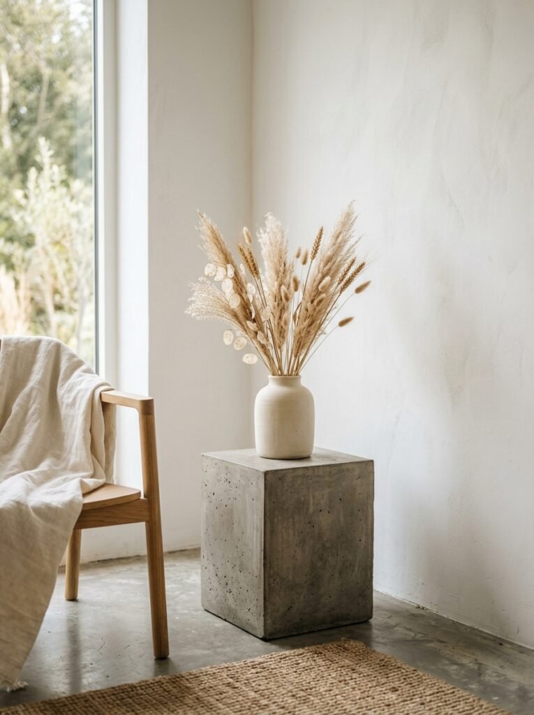
It doesn’t need to be a big statement. A stack of dark-spined books. An iron candle holder. One raw timber side table in a deep, cool tone. The ratio can be 95% white and 5% dark and that 5% completely transforms the room.
“One dark thing in a white room isn’t a contradiction. It’s the whole point.”
—
5. The Lamp Situation (Because Overhead Lighting Is Ruining Your Minimalist Room)
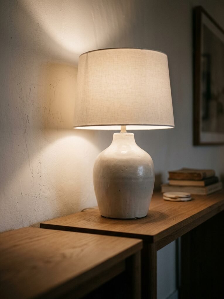
If your white living room doesn’t look right in the evenings, I’d bet it’s the lighting before I’d bet it’s anything else.
Overhead ceiling lights in a minimalist white room are brutal. They flatten everything, kill all the texture you worked hard to add, and make the space feel like a waiting room at a physio clinic. Not the vibe.
You want multiple light sources at different heights. A floor lamp in one corner — the kind with a linen shade that diffuses light warmly. A table lamp on a side table or console. Maybe a candle or two if you’re in for the night. The goal is to light the room from the sides and below rather than from above.
The specific quality of light matters too. Warm bulbs — genuinely warm, not just “warm white” on the box, but actually 2700K or lower. At 8pm, the room should feel amber and soft and slightly dim in the right places. That’s when a white room earns its keep.
—
6. What To Do With White Walls That Have Zero Architectural Interest
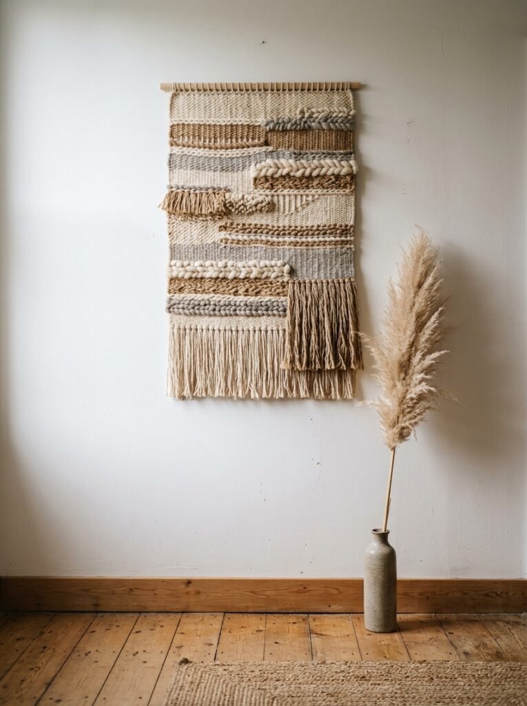
Not every living room has crown moulding and original skirting boards. Some of us are working with smooth, flat drywall and one sad window. And a white minimalist room in that situation can feel… a lot like nothing.
The fix is adding architectural interest artificially, which sounds fancier than it is. Vertical wall panelling — even simple flat slats with a thin reveal between them — adds enormous depth and structure to a plain wall. Paint them the same white as the wall and suddenly the room has bones.
Alternatively, one large piece of art on an otherwise completely bare wall. Not a gallery wall (gallery walls and minimalism are genuinely at odds with each other, fight me on this). One piece. Big enough to feel like a decision. The wall around it becomes part of the composition.
Or —and this is underrated — do nothing. Leave the wall completely bare. But then make sure every other element in the room is SO considered that the bare wall reads as a deliberate exhale rather than an oversight. This takes nerve. Worth it.
—
7. The Plant Rule That Most White Minimalist Rooms Break
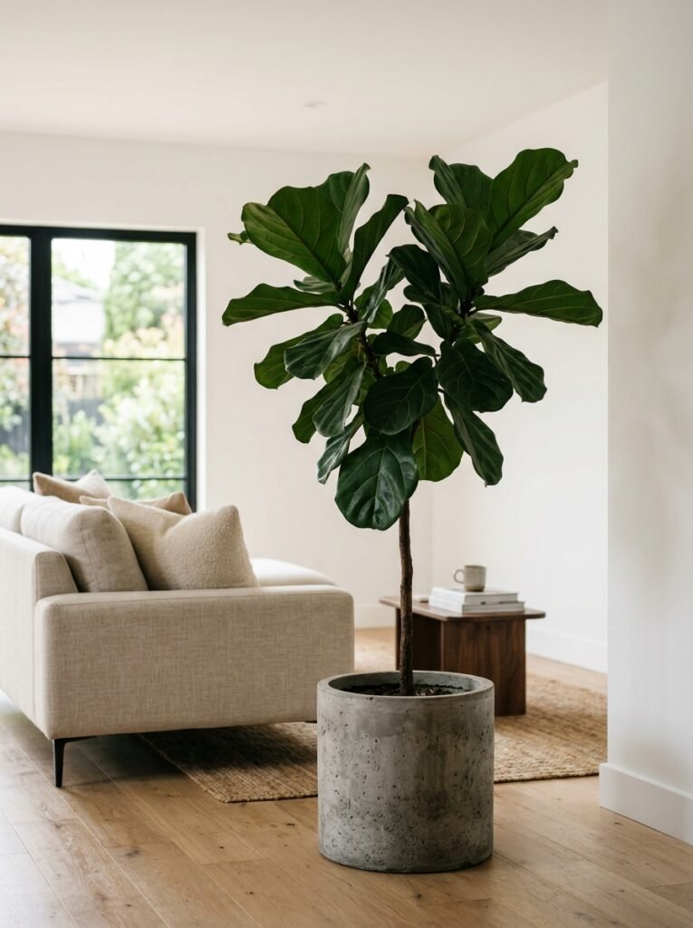
One big plant is better than several small ones. Every time. No exceptions.
I know this sounds harsh but I’ve tested it enough times to feel confident about it. A cluster of small plants in a white minimalist room looks busy. It looks like a person who couldn’t commit. A single, genuinely large plant — a fiddle leaf fig, a monstera that’s actually grown into itself, a tall sculptural olive tree — becomes an architectural element. It’s furniture. It belongs.
The pot matters as much as the plant, by the way. A terracotta pot in a warm white room works beautifully. Matte white ceramic is clean and disappears nicely. Plain concrete can look extraordinary against plaster walls.
Keep it to one corner. Let it take up space. Let it be slightly surprising how large it is.
—
8. The Color Trick That Looks Like You Spent More Than You Did
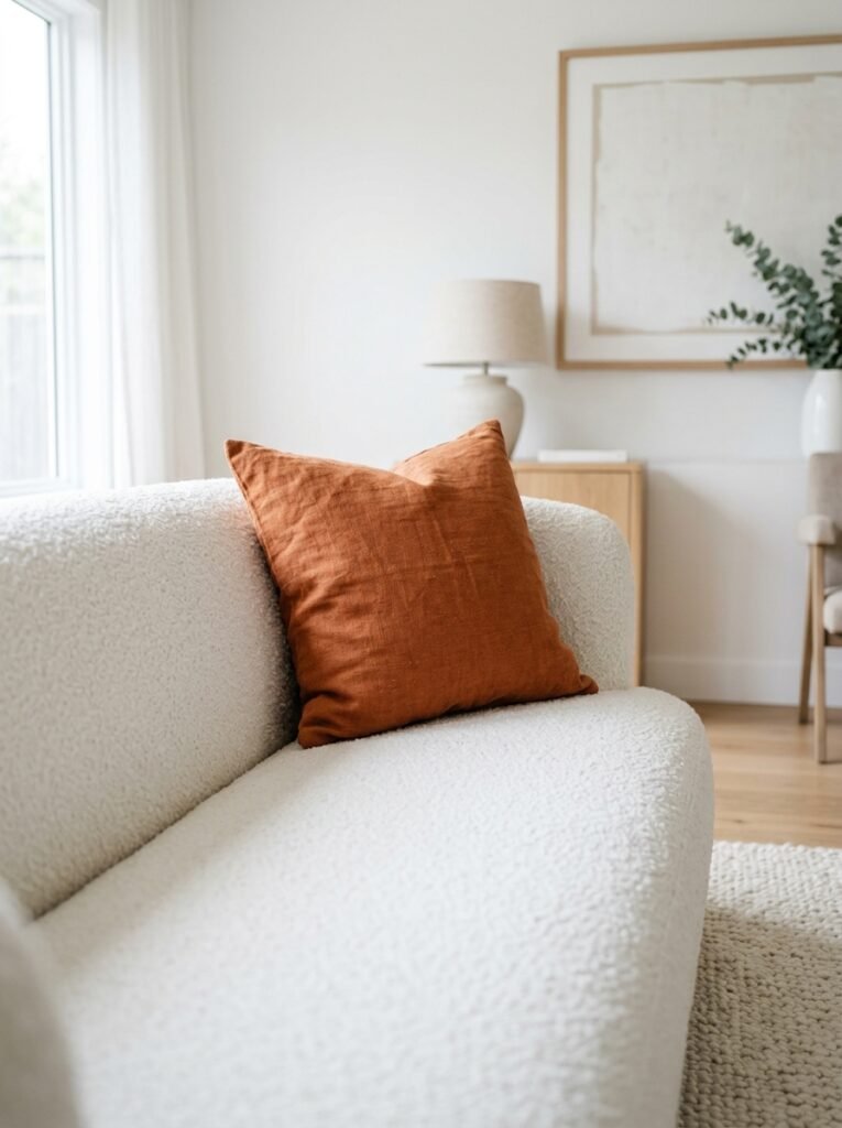
Carry one material through the whole room and it’ll look like you planned everything from scratch, even if you assembled it over three years.
It doesn’t have to be a color, exactly. It can be a material — natural linen appearing in the curtains, a cushion cover, and the lamp shade. Or a tone — the same warm putty showing up in a cushion, a small ceramic bowl, and the trim on the rug. Or a metal finish — brushed brass in the lamp base, a small tray on the coffee table, the curtain rod.
This is the quiet version of what designers call “repeating a note.” It makes a room look edited. Curated. Like one person with a clear vision assembled it, rather than a series of slightly panicked online orders.
Side note — this is probably the cheapest thing on this list. Because you likely already own pieces with a consistent tone. You might just need to edit out the ones that don’t fit.
—
9. Curtains That Make the Ceiling Feel Higher Without Touching It
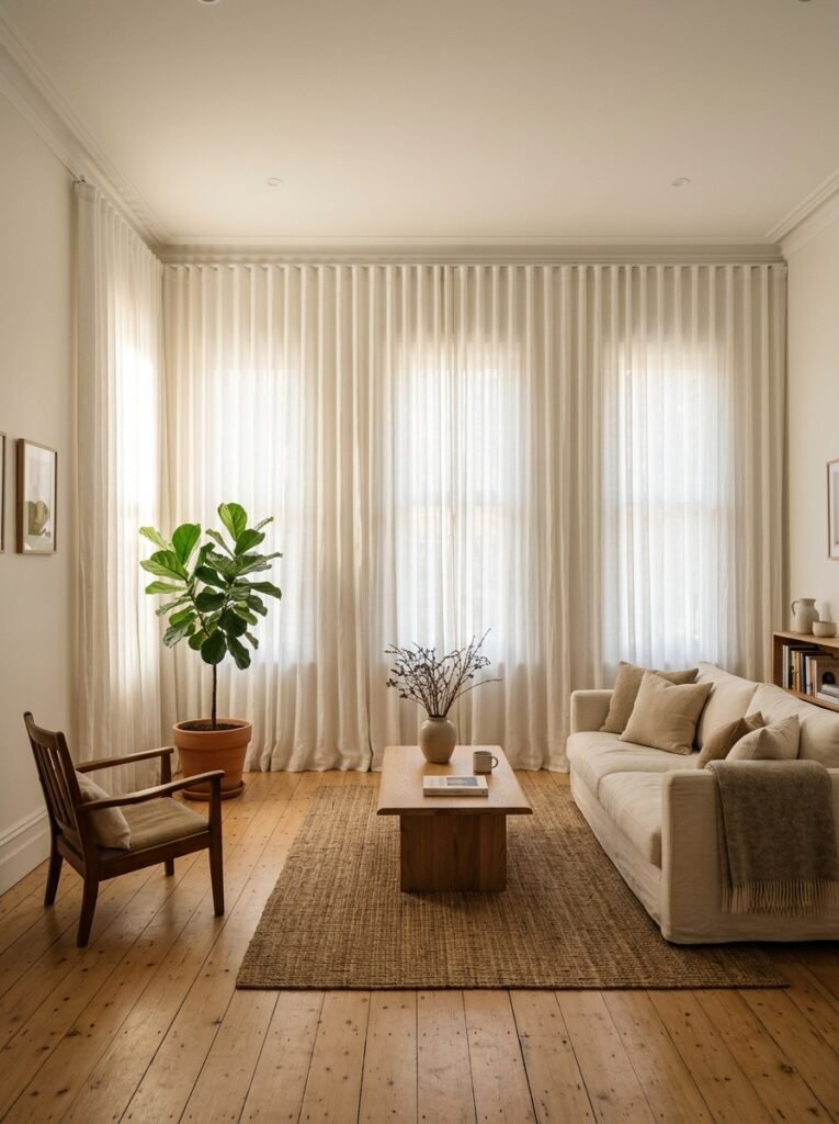
Hang them high. Hang them wide. This is not negotiable.
Curtains mounted just above the window frame make any room — white or otherwise — feel boxy and low. Curtains hung 6 to 8 inches from the ceiling and extending 8 to 12 inches beyond the window frame on each side do something genuinely visual-trick-y. The ceiling appears higher. The windows appear larger. The room feels like a different room.
In a white minimalist living room specifically, go for curtains in white or very close to white, in a fabric with some weight to it — linen, cotton linen blend, or even a textured weave. They disappear into the walls in the best possible way, while making the windows feel enormous.
“Curtains aren’t just for privacy. They’re walls that move.”
—
10. Why Your Sofa Might Be Working Against You
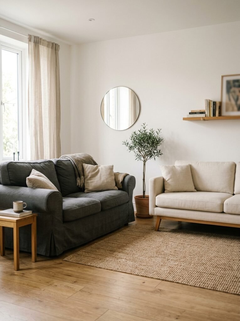
A minimalist white living room needs ONE dominant piece that sets the tone. Usually that’s the sofa.
But here’s the problem with a lot of sofas you’ll find in the mid-price range: they’re trying to do too much. Big rolled arms, lots of cushions included, contrasting piping, slightly curved backs. In any other room, these details might read as “character.” In a white minimalist room, they read as noise.
The silhouette should be clean. Arms that are either very low or very simple. A profile that’s unambiguous. You don’t need to spend a fortune — you need to find a piece where the lines are confident. No fussiness. A sofa that could be described in five words or fewer: “low, linen, long, natural, simple.”
If you can’t replace the sofa right now, a white or natural linen slipcover can genuinely change the reading of a heavily detailed sofa. It flattens the ornament and lets the shape lead.
—
11. The Coffee Table That’s Actually Worth the Hype Right Now
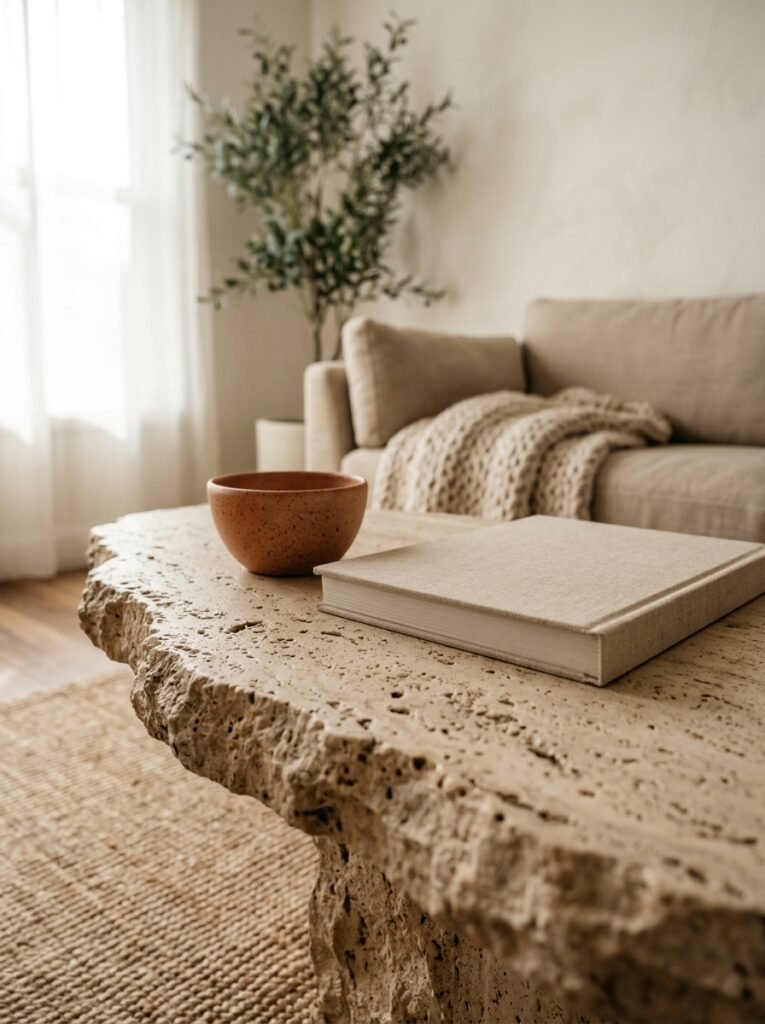
The travertine moment is very real and I’m not ready for it to be over.
Natural stone coffee tables — travertine in particular, in that warm cream and tan marbled situation — are doing enormous work in white minimalist living rooms right now. They add color (barely), texture (obviously), pattern (subtly), weight (visually and literally), and a sense of permanence that no wood or glass table quite manages.
But if travertine is out of reach, honestly? Solid wood with a very natural, unstained finish works almost as well. The grain of the wood does the same job: it adds depth and warmth to all that white without introducing an actual color. A simple rectangle or oval, legs that don’t over-complicate things.
What doesn’t work: glass. I know. A lot of people love glass coffee tables in minimalist rooms for exactly the reason I don’t — they visually disappear. In a white room, you need the coffee table to be a grounding presence, not an absence.
—
12. The Final Edit That Most People Skip (But Shouldn’t)
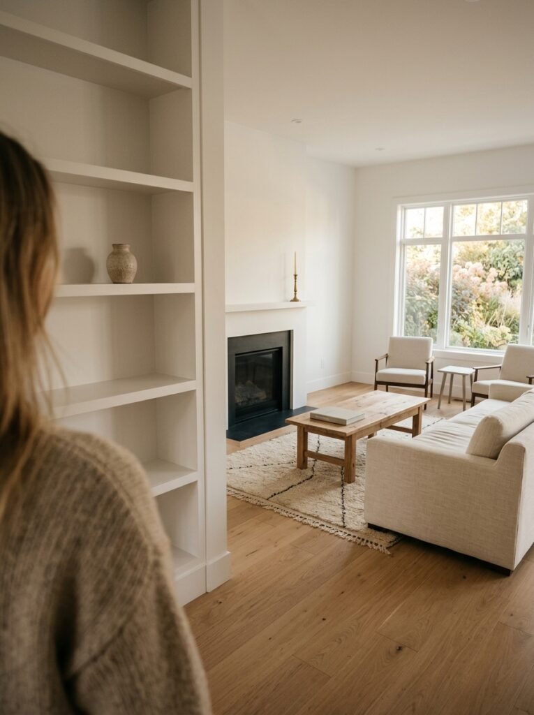
Once the room is “done” — stand in the doorway and look at it like you’ve never seen it before.
Look for anything that’s slightly apologizing for being there. A throw blanket that isn’t quite the right tone. A small decorative object that you kept because you spent money on it, not because it belongs. A lamp that works fine but doesn’t quite commit to the vibe.
Remove those things. Not permanently — put them in a box in another room for a month. If you don’t miss them in the room, they were never right for it.
This edit is where a minimalist room actually becomes minimalist. Not in the buying phase. In the subtracting phase. And it’s genuinely satisfying in a way that adding things never quite is. You’ll walk in, see the room stripped to only what belongs, and feel something settle.
That’s the feeling. That’s what we’re after.
—
❓ FAQ
Q: How do I stop a white minimalist living room from looking cold or sterile? A: Warmth comes from undertone and texture, not color. Choose a white with warm undertones (even slightly sandy or grey-ish), layer in natural materials like linen, jute, and raw wood, and make sure your lighting is genuinely warm — ideally 2700K bulbs or lower. Cold white rooms are almost always a lighting problem combined with a texture problem.
Q: Can I have a minimalist white living room if I have kids or pets? A: Yes, and people do it successfully all the time. The key is choosing fabrics with care — performance linen or tightly woven bouclé holds up better than you’d think, and many can be spot-cleaned or have removable covers. You’ll also rely more on dark accent pieces that don’t show wear as visibly, and keep the actual furniture choices simple so they’re easy to refresh when needed.
Q: How many decorative objects is too many for a minimalist living room? A: There’s no exact number, but a good test is this: can you describe the purpose or meaning of each object on display? If something’s there just because it filled a space, it probably shouldn’t be there. Most well-done minimalist living rooms have between 5-10 intentional decorative objects total in the entire main space. Less than you’d think. More than zero.
—
💭 Final Thoughts
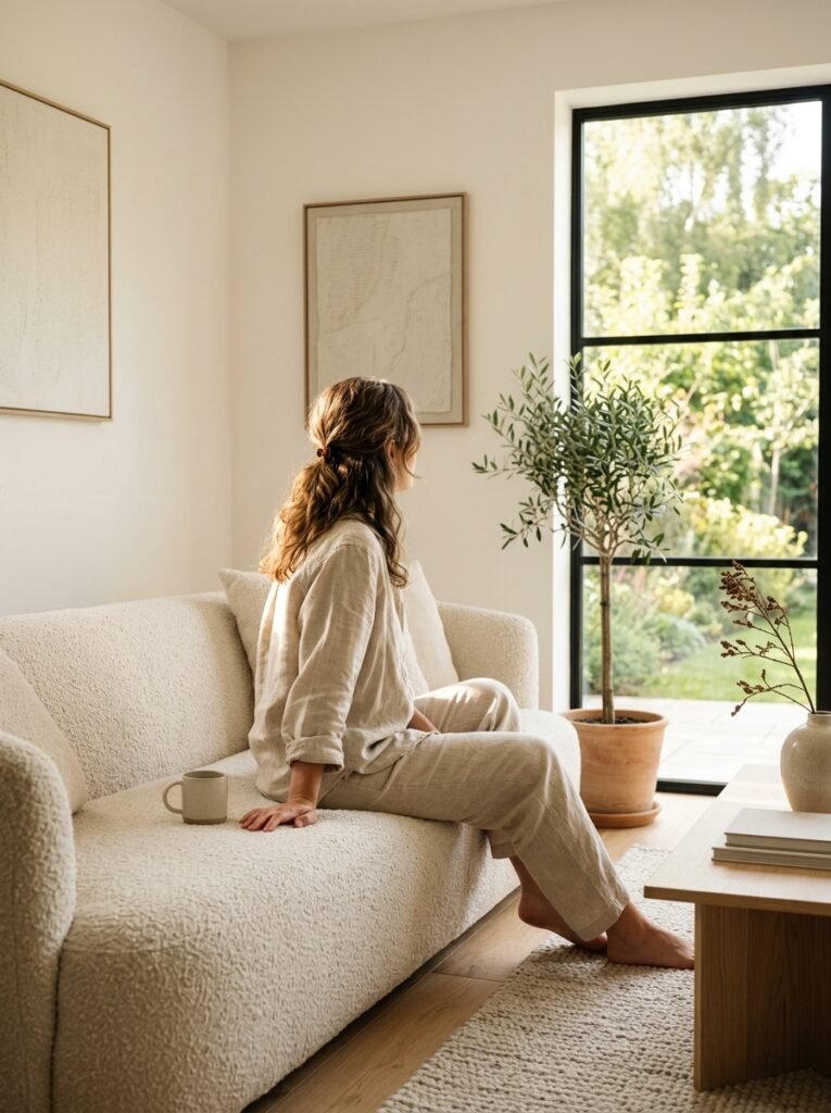
A white minimalist living room isn’t a trend, exactly — it’s more like a permanent argument about restraint. About trusting that less, genuinely done well, is more interesting than more. It takes confidence to sit with a room that feels almost empty and believe it’s almost perfect.
The best version of this style always has a little warmth hidden in it. A worn linen cushion. A candle that’s been burned. A plant that’s slightly unruly at the edges.
So I’ll ask you this: what’s one thing in your current living room that you’re keeping purely out of habit — and what would the room feel like without it?




