
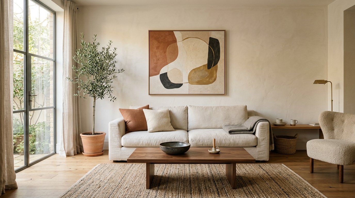
The Quiet Wall: Why Less Is Actually More Stunning in Your Living Room
My friend looked at my living room wall and said, “So you’re just… leaving it like that?” And I said yes. And honestly, that was the moment I knew I’d finally figured it out.
—
1. Why Your Overcrowded Gallery Wall Might Be Killing the Room
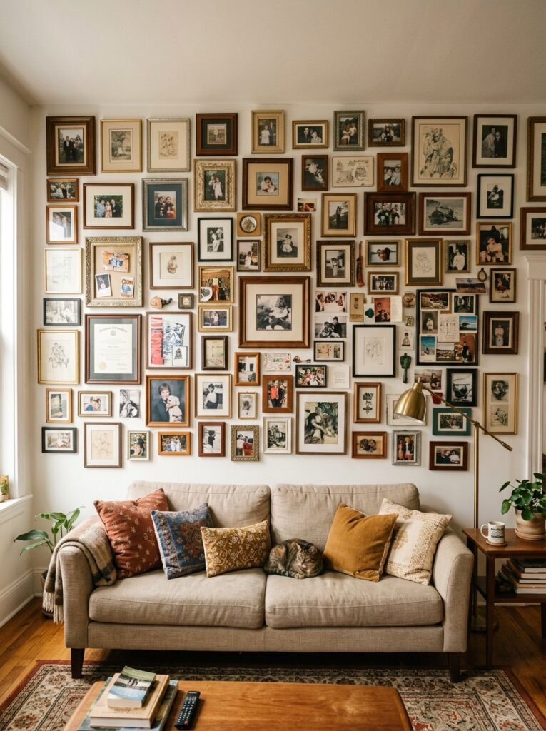
Here’s the thing nobody says out loud: a wall covered in sixteen frames, three woven baskets, and a macramé hanging isn’t cosy. It’s noise. Visual noise. And your brain registers it as clutter even when your heart insists it’s “curated.”
Minimalist wall decor isn’t about having nothing. It’s about having something that actually lands. One large piece you stop and look at. A cluster of three frames that breathes, really breathes, with space around each one. A single sculptural element that makes a person walk into the room and go — oh. That.
I spent years piling things onto my walls because I thought more meant more interesting. It didn’t. It meant my living room felt like a waiting room at an indecisive art fair.
“The walls that stop people in their tracks are almost always the ones with the most restraint.”
The shift isn’t dramatic once you actually make it. You pull one thing down. Then another. Then you sit across the room and look. And the wall starts to breathe, and so do you.
—
2. The One-Piece Rule and Why It’s Not as Boring as It Sounds
I know. One piece sounds lazy. It sounds like you gave up.
It’s not.
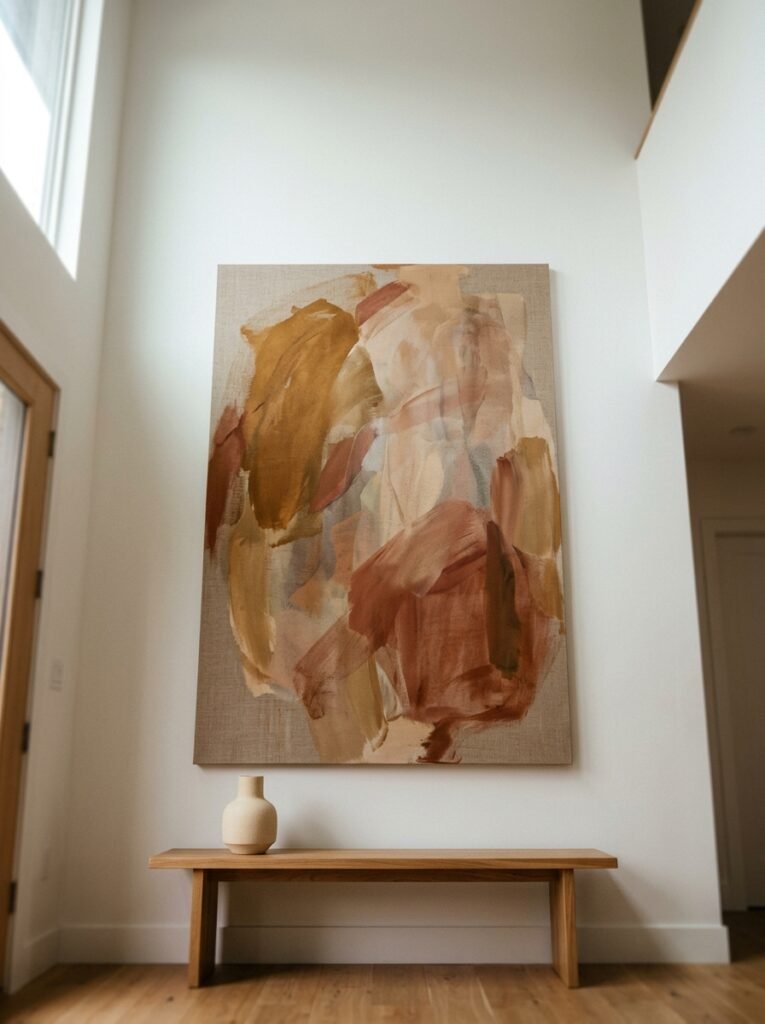
A single oversized print — something 24×30 inches or bigger — commands a wall in a way that twelve small frames simply cannot. There’s a confidence to it. The room knows what it is. And you, as the person sitting on the sofa watching TV, aren’t distracted by fourteen different things fighting for your attention.
The trick is scale. People consistently go too small. They hang a modest little 8×10 in the middle of a giant wall and then wonder why it looks lost. Go bigger than feels comfortable. Then go slightly bigger than that. The piece that made you think “this might be too much” is usually the one that’s just right.
For a typical living room wall, I’d say nothing under 20 inches wide unless it’s part of a deliberate, well-spaced grouping. And even then — breathe. Let things breathe.
—
3. The Color That Keeps Appearing in Every Beautiful Minimal Living Room
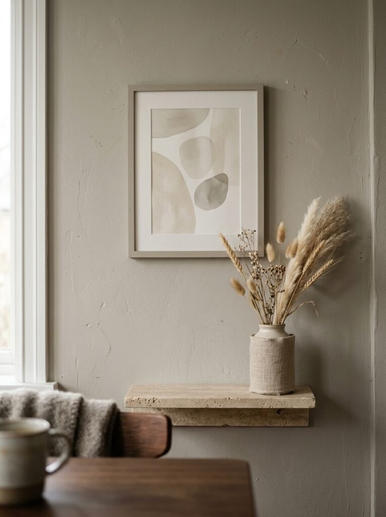
Warm off-white. Not pure white, not beige, but that specific shade that sits right between the two. And the reason it works so well as a backdrop for minimalist decor is actually kind of fascinating when you think about it.
Pure white walls make negative space feel cold and clinical. Like a gallery where you’re not allowed to touch anything. But warm off-white? That negative space becomes inviting. It glows a little, especially in the evening when the lamps are on. The wall itself becomes part of the decor without trying to be.
And against that warm backdrop, almost everything pops without effort. A single black line-art print. A piece of natural wood. A textured linen canvas. They all read immediately, clearly, beautifully. No competition.
If you’re in the UK, this pairs brilliantly with period features — cornicing, picture rails, original fireplaces. In the US, it works equally well in open-plan spaces where you need the walls to define areas without boxing them in.
“Your wall colour is the silence between the notes. Get it wrong and nothing sounds right.”
—
4. Framing Choices That Make Simple Art Look Seriously Expensive
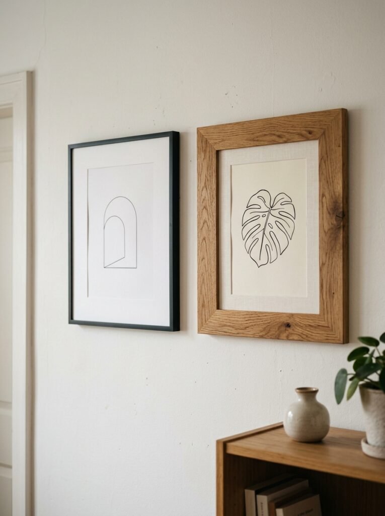
Okay, genuine opinion incoming: thin black metal frames are doing a LOT of heavy lifting in the minimalist decor world right now, and I don’t think they’re going anywhere. They’re clean. They’re graphic. They make everything inside them look intentional.
But there are two other frame styles worth knowing.
Natural wood frames — unfinished or lightly stained, not the dark mahogany stuff — bring warmth into a minimal space without softening it into something that feels generic. They work especially well if you’ve got wooden furniture or woven textures elsewhere in the room.
And then there’s floating frames, which I’d argue are criminally underused. A piece of artwork suspended inside a frame with visible space around it? It looks like you spent four times what you actually spent. Dramatic, but in that quiet way.
What I’d avoid: ornate gold or baroque frames on anything abstract or contemporary. Unless you’re going specifically for that eclectic juxtaposition, which — fine, do it, but own it completely.
—
5. The One Rule That Makes Any Blank Corner Feel Intentional
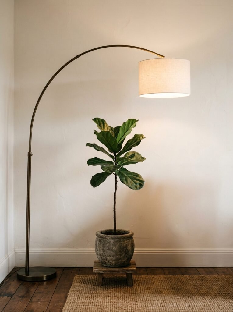
Don’t fill it. Or rather: don’t fill it with the obvious thing.
Most people’s instinct is to put a plant there, or a lamp, or a side table covered in objects. And look, those aren’t wrong. But the wall above that corner? That’s where something small and deliberate can do enormous work.
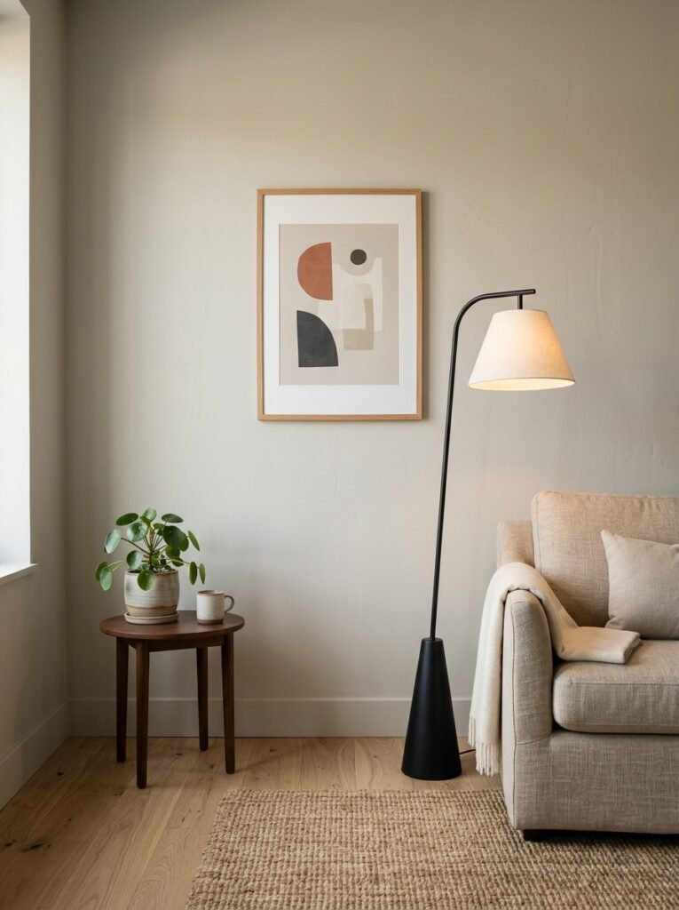
A single sculptural wall piece — think a hand-formed ceramic disc, or a simple arched metal outline — installed in an otherwise bare corner transforms the whole quadrant of the room. The furniture below it starts to feel like it was placed there on purpose. The corner has a reason to exist.
Side note — this is especially useful in British living rooms where corners can get oddly awkward due to old layouts and chimneybreast placements. One simple wall element and suddenly the room reads as designed, not accidental.
—
6. Line Art: Overused or Still Absolutely Worth It?
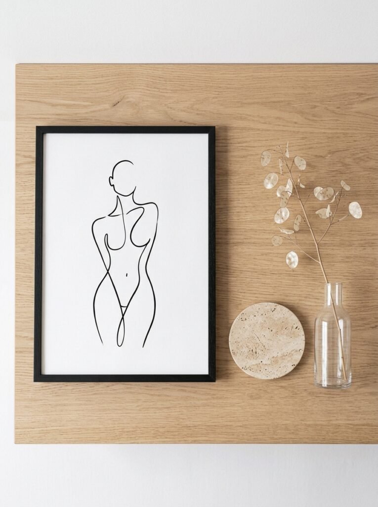
Still worth it. Barely overused if you do it properly.
The problem isn’t line art itself — it’s the specific prints that got replicated a thousand times and started appearing in every rental apartment in the country. You know the ones. The vague botanical. The ambiguous face. Those aren’t bad, they just got oversaturated.
But actual line art — bold, deliberate, specific — still hits exactly right in a minimal space. It adds graphic interest without adding visual weight. A thick-lined abstract on an off-white background costs almost nothing and reads like it cost a great deal.
The key distinction: go for something with CHARACTER. A line drawing with a clear point of view, not something that feels generated by algorithm. You want to look at it and feel like someone made a decision.
And if you can find original work from an independent artist — bonus. Etsy, local markets, anywhere someone’s actually putting their own hand on the page — there’s a quality to that work that prints-of-prints genuinely can’t match.
—
7. How High You’re Hanging It (You’re Getting This Wrong)
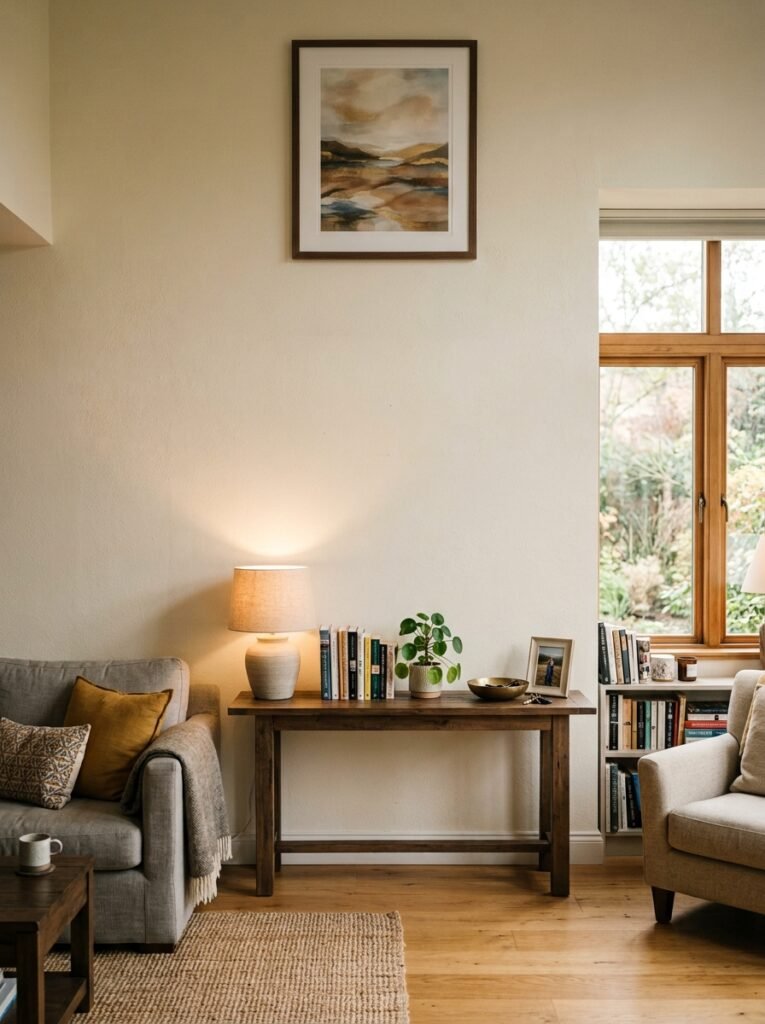
The standard advice is eye level. 57 to 60 inches from the floor to the center of the piece. That’s the museum rule.
And it’s often correct. But not always.
In rooms with LOW ceilings — particularly common in older UK terraced houses — hanging art slightly higher than eye level can create the illusion of more height. Not dramatically higher. Just a few inches. The brain reads it as “ceiling is far away” and the room suddenly feels less squished.
In rooms with very high ceilings, the museum rule can leave artwork looking weirdly stranded in the middle of an enormous wall. In that case, cluster pieces rather than hanging one lone thing. Or go taller with the artwork itself.
The other mistake I see constantly: hanging things over sofas way too high. The bottom of whatever you’re hanging should sit about 6-8 inches above the sofa back. Any higher and it looks like it floated away from the furniture below it.
—
8. Texture as Decor: When You Don’t Need a Single Frame
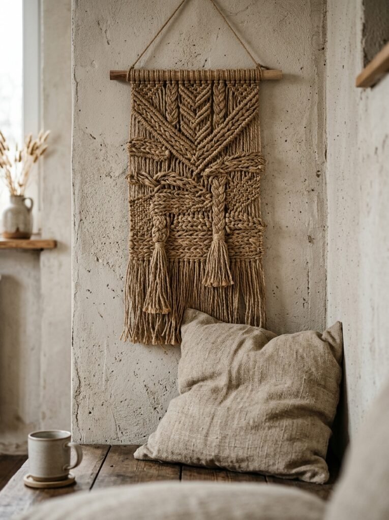
This is genuinely underrated. Not every wall solution has to be flat.
A large woven wall hanging in a neutral tone — not a busy boho patterned one, just something textural — adds dimension to a minimal living room in a way that framed prints simply can’t. You’re adding light, shadow, depth. The wall becomes three-dimensional.
Same goes for wooden wall panels arranged asymmetrically, or a single large macramé piece in a simple design (the key word there is simple — minimal rooms can handle one statement texture, not a whole mood board’s worth).
Even something like a group of small ceramic wall discs, arranged loosely rather than in a rigid grid, reads as art. More interesting than it sounds. And the shadows those discs cast in afternoon light — genuinely beautiful.
“Texture does what colour can’t. It changes how a room feels depending on the light and the time of day.”
—
9. The Specific Arrangement That Always Works for Two or Three Pieces
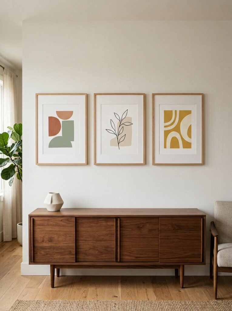
I’ve tested a lot of gallery arrangements. This is the one I come back to.
For two pieces: hang them side by side with exactly four inches of wall space between them. Not three, not six. Four. Close enough to read as intentional pair, spaced enough to breathe individually. Keep them the same height at center, not at the top.
For three pieces: resist the horizontal line. Try a tight cluster instead — one piece slightly higher, two slightly lower and offset. Almost triangular. The negative space inside the cluster is part of the arrangement. Let it be irregular. That irregularity is what makes it look collected rather than decorated.
The absolute worst thing you can do with three pieces is hang them in a perfectly spaced horizontal row of identical frames. Unless you’re going ultra-modern and geometric on purpose. And even then — think hard about it.
—
10. What Nobody Tells You About Black and White Photography on a Minimal Wall
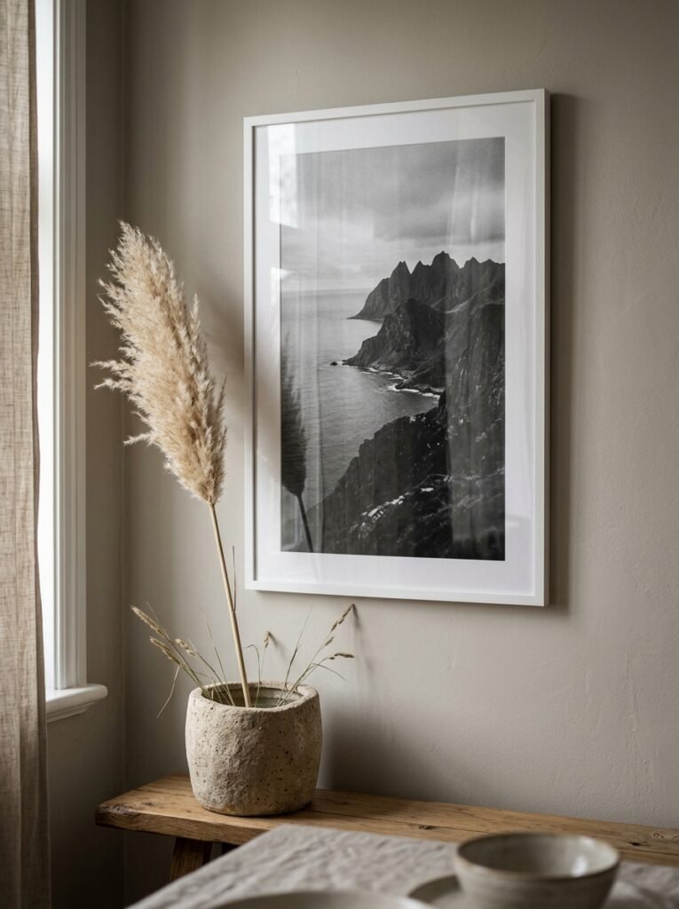
It WORKS. Immediately, every time. But there’s a version of it that works better than the rest.
The problem with black and white photography in a minimal room is that it can read as cold if you’re not careful. All that contrast, all that graphic tension — it needs something soft somewhere to balance it. Not in the photo itself. In the room.
A linen throw. A jute rug. Something organic within eye line of the wall. That contrast between the sharpness of the black and white print and the tactile softness nearby — that’s the sweet spot.
Also: SCALE matters even more with photography than with abstract art. A small black and white photo on a large wall looks unfinished. A large one — 24 inches and up — looks editorial. Like you pulled it from a magazine. Which, honestly, is the exact energy most of us are going for.
—
11. Mirrors Aren’t a Cop-Out, They’re a Strategy
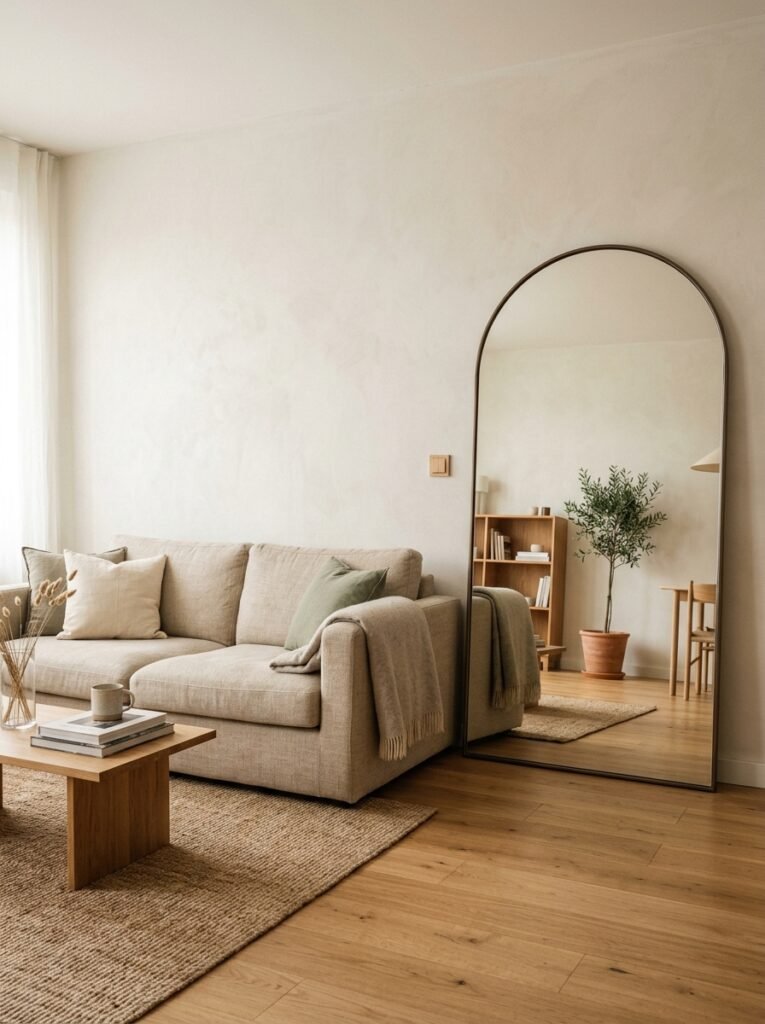
I used to be kind of snobbish about mirrors as living room wall decor. Like, it’s a mirror. Where’s the thought?
I was wrong about this one.
A large, simple mirror — particularly an arch-shaped or oversized rectangular one with a minimal frame — does something no print can do. It reflects the room back at itself. The light in the evening, the plant in the corner, the person reading on the sofa. The wall becomes alive because of everything that’s already in the room.
In smaller living rooms, this is especially smart. The wall disappears and the room effectively doubles. It’s not a trick, not really — it’s just physics working in your favour.
The style note: minimal rooms need minimal mirror frames. A thin brass edge, a simple black metal outline, raw wooden edge. Anything ornate and the mirror fights the rest of the room instead of complementing it.
—
12. The Last Thing You Should Add (and When to Stop)
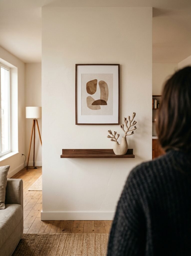
Here’s where I’d land after all of this: the last piece you hang should feel like a full stop, not a comma.
Most of us — me included, for years — keep going. One more frame. One more small shelf. One more little thing. And each addition makes sense individually. But the wall becomes a run-on sentence.
Pick your main element. Let it breathe. Add one supporting piece if the wall calls for it. Then step back across the room. Sit on the sofa. Look at it for sixty seconds. If your eye rests somewhere and stays, you’re done. If it keeps scanning, looking for somewhere to land — you either need one more piece or you need to take one away.
Usually it’s the latter.
That’s the whole secret, honestly. It’s not about what you add. It’s about knowing when what you have is enough.
—
❓ FAQ
Q: How do I make a minimalist living room wall look cosy and not cold? A: Texture is your best tool here. A woven or linen-textured canvas, a wooden element, or a soft wall hanging in a warm neutral immediately takes the edge off. Also — warm lighting. The amber of a table lamp at dusk does more for a minimal room than any extra decor piece.
Q: Is it okay to leave one wall completely bare in a minimalist living room? A: Absolutely yes. In fact, a bare wall often works better as a backdrop for furniture and soft furnishings than as a display space. Not every wall needs to do something. Restraint is the whole point.
Q: What size art is too small for a living room wall? A: Anything under 16 inches wide tends to disappear unless it’s part of a carefully considered grouping. For a standalone piece, 24 inches wide is a reasonable minimum for most living room walls, and larger is almost always better. When in doubt, cut a piece of paper to the size you’re considering and tape it to the wall. It’ll tell you immediately.
—
💭 Final Thoughts
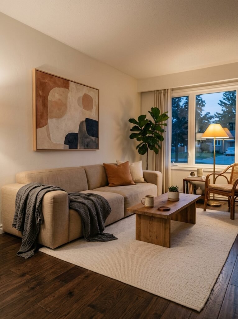
There’s something genuinely calming about a wall that’s been edited. Not emptied — edited. Every piece chosen, everything else let go. It takes more confidence to do less, and I think that’s why so many of us resist it.
But when you get there — when the room finally breathes — you’ll wonder what you were holding on to all those other things for.
What’s the one piece on your living room wall that you’d keep if you could only keep one?




