
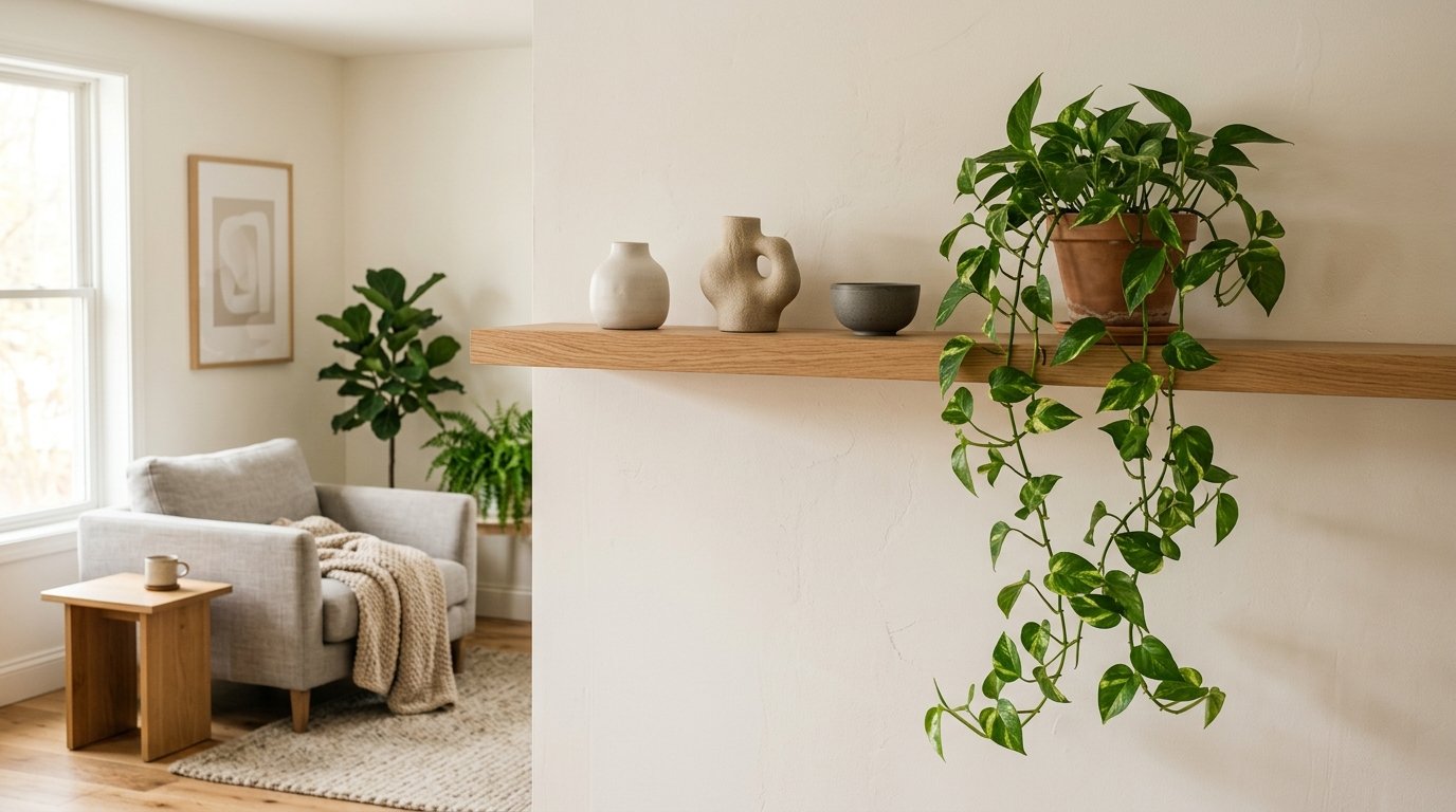
The Shelf That Finally Made My Living Room Look Like I Had My Life Together
I stared at it for three years. Just… stared. Stuff piled on, stuff moved around, a few candles, some books I’d never read, a plant that kept dying. Nothing worked and I couldn’t figure out why.
Turns out I was thinking about it completely wrong.
—
1. The One Mistake That Makes Every Shelf Look Cluttered (Even When It’s Not)
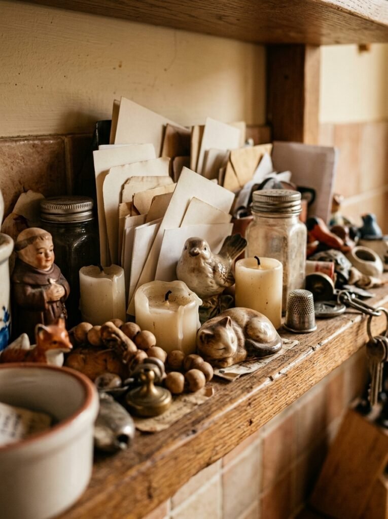
Too much stuff at the same height. That’s it. That’s the whole mistake.
When everything sits at eye level and nothing rises or dips, the shelf reads as a flat wall of objects, and your brain can’t find a place to rest. It’s visually exhausting. And the wild part? You can have FEWER items on a shelf and it’ll still look cluttered if they’re all the same size.
The fix is almost embarrassingly simple: vary your heights dramatically. A tall vase next to a low stack of books. A small object tucked in front of a taller one. Something hanging slightly off the edge. You want the eye to travel — up, down, in, back out.
The minimalist shelf isn’t about owning less. It’s about arranging what you have so intentionally that each thing seems chosen on purpose. Because it was.
“A shelf that looks ‘done’ isn’t empty — it’s just deliberate.”
—
2. Why Odd Numbers Work and You Should Just Trust This
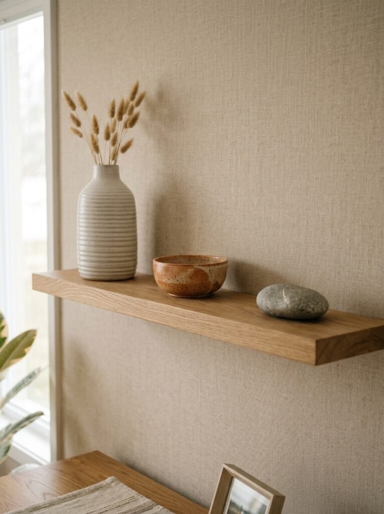
Three objects. Five. Seven. Not four, not six.
Designers have known this for ages and honestly it can feel a bit woo-woo until you actually try it and go “oh, WAIT.” An even number of things creates symmetry, and symmetry — while lovely — reads as formal, closed, finished. Odd groupings have a slight tension to them. An openness. The eye keeps moving because there’s no clean mirror image to settle on.
So if you’ve got a little cluster on a shelf, pull one thing out. See what happens.
Not gonna lie, this one single tip changed more about my shelves than anything else. Suddenly they looked curated instead of just… full.
—
3. The Color Rule Minimalists Actually Follow (It’s Not “All White Everything”)
You’ve seen the all-white shelf. Pure, clean, aspirational. Also kind of sterile after a while, like you’re living in a particularly nice dentist’s office.
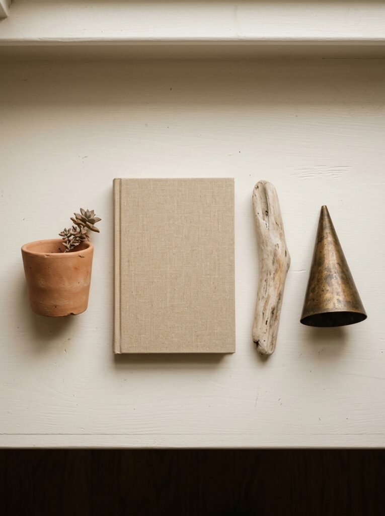
Real minimalist shelves — the ones that feel warm and lived-in while still looking clean — tend to work in a narrow palette of two or three tones, not one. Usually something neutral, something warm, and one accent that pulls from either the room’s existing colors or something you love.
Mine ended up being warm cream, dark walnut wood tones, and a dusty sage green from a little ceramic pot my sister brought back from Portugal. It wasn’t planned. But once I stopped forcing all-white and let those three tones do the work, everything clicked.
Also, the texture thing is huge. A matte ceramic next to a glossy vase next to a rough linen cover — that variation is doing more than color, honestly.
—
4. Books Are Furniture, Not Just Filler — Here’s How to Treat Them That Way
Stop turning all your books spine-out if the spines are ugly.
I know that feels like heresy. But some books have terrible spines — harsh fonts, clashing colors, that weird shiny laminate that photographs like a headache. Those ones? Turn them around. Face them back. You get a neutral, textured block of cream-white pages and it looks intentional.
Then let a few beautiful spines face out. The contrast is what makes it work.
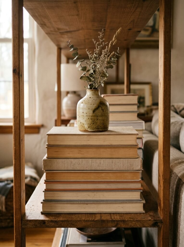
Some people also stack books horizontally instead of standing them up, which gives you a little platform to place objects on top. Two or three stacked books under a small sculpture or a trailing plant — that’s a composition right there. You’ve made something dimensional instead of just a row.
Don’t forget to pull a few books slightly forward so they’re not all flush with the edge. Again: depth. Depth is everything on a shelf.
—
5. The Plant That Belongs on a Minimalist Shelf (And the Ones That Don’t)
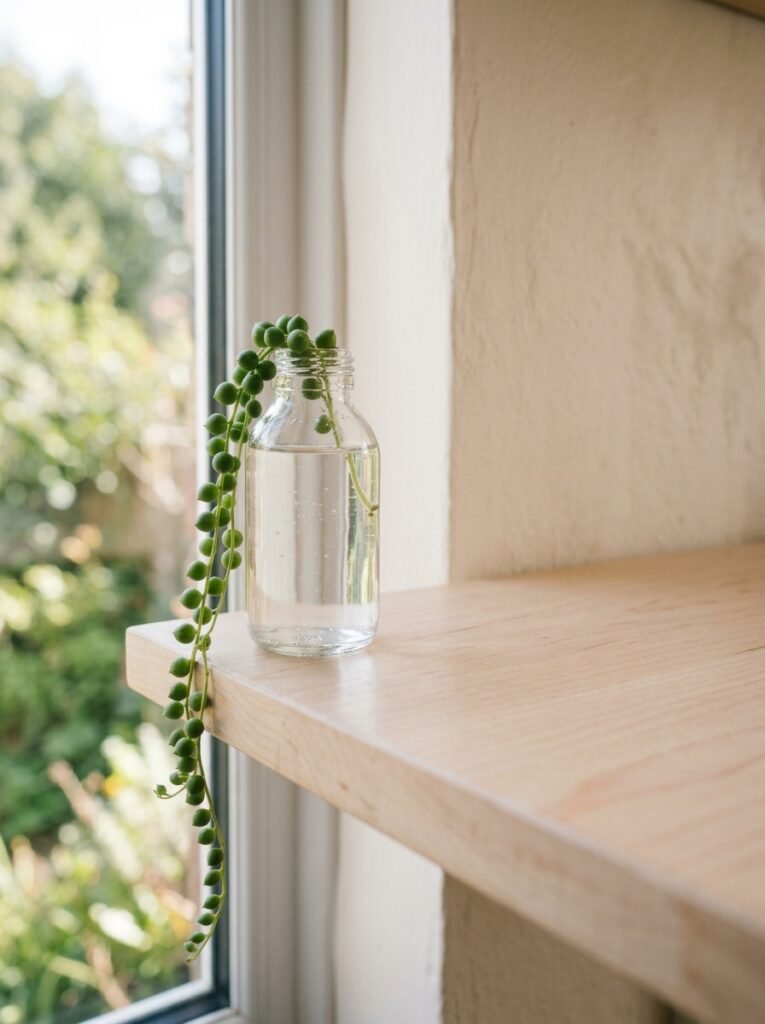
Trailing plants are your best friend. Full stop.
Something with a vine that drapes down the front of the shelf — a pothos, a string of pearls, a heartleaf — it does this thing where it makes the whole shelf feel alive without adding visual weight. It softens the edges. It doesn’t take up precious horizontal space because it FALLS.
Upright plants are trickier. A single tall one can look amazing but the wrong shape in the wrong spot just adds more clutter visually. If you want upright, go architectural — something with clean lines and distinct structure. Nothing that looks like it’s just sort of… sprawling in all directions.
And please, if the plant is dead, remove it. I’m saying this with love.
“A trailing plant does more work for a shelf than almost anything you can buy.”
—
6. What “Negative Space” Actually Means When Your Shelf Isn’t That Deep
Every shelf styling article says “leave negative space” and it sounds so simple. And then you try it and you’ve just got a shelf with a gap in it and it looks like you forgot to put something there.
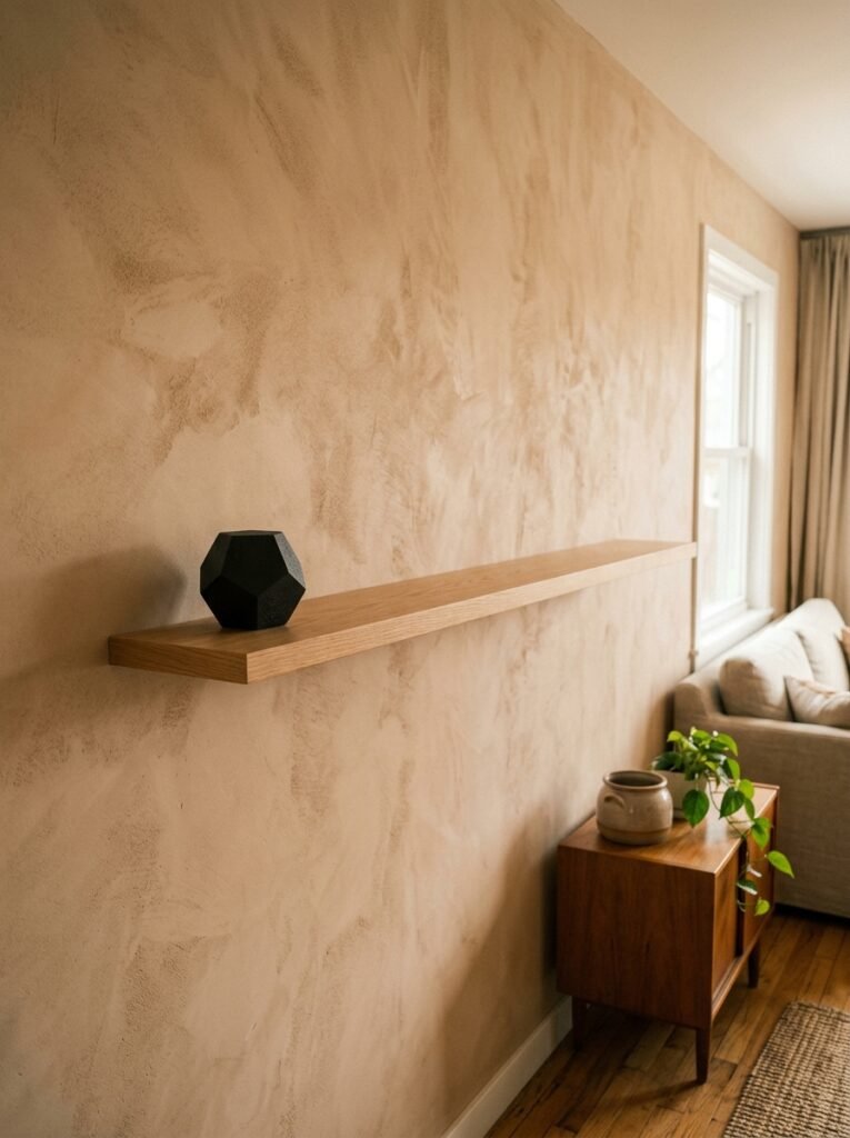
Here’s what negative space actually is: it’s intentional breathing room that makes the objects next to it feel more important. The key word is intentional. A gap in the middle of a random cluster doesn’t read as negative space — it reads as an accident.
So group your objects together on one side or in one area. Then let the other section be genuinely, deliberately empty. That emptiness is doing a job. It’s framing what’s there.
For a shelf that isn’t very deep — maybe 10 or 12 inches — this is even more important because you can’t layer much front-to-back. Width becomes your design tool. Use it.
—
7. The Case for One Object That Has No Business Being on a Shelf
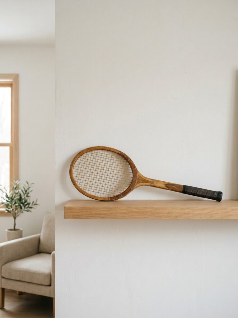
Every great shelf has at least one thing that slightly surprises you. Something that isn’t “shelf decor” in the traditional sense.
A worn leather notebook. A smooth stone from a beach trip. A vintage camera that doesn’t work anymore but looks incredible. One piece of fruit in a small dish — a lemon or a fig — depending on the season.
This is the thing people can’t quite put their finger on when they look at your shelf and say “it looks so good, how?” It’s that one unexpected object that makes it feel like a real person lives here, not a staging company.
Minimalism gets cold without personality. That one surprising object is the personality.
—
8. Shelf Height Changes Everything and Nobody Talks About It Enough
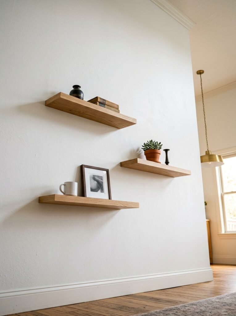
Where the shelf actually IS in the room matters enormously and I feel like this gets totally glossed over in every “style your shelf” article ever written.
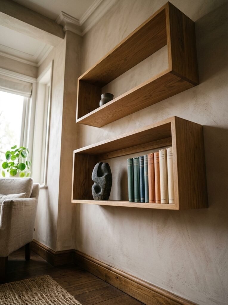
A shelf mounted low — around 48 to 54 inches from the floor — reads as grounded and intimate. It feels like the decor is at conversation level, which is cozy and approachable. Great for living rooms where you want warmth.
A shelf mounted higher up, closer to 64 to 70 inches, draws the eye up and makes the ceiling feel taller. But the styling has to be more bold for it to read from below — smaller objects get lost.
Built-in shelves that go floor to ceiling are their own whole thing. If that’s what you’re working with, the trick is to NOT style every shelf the same way. Let some be full, some sparse, one almost empty. Treat the whole unit as a composition rather than a series of individual shelves.
—
9. Candles on Shelves — More Complicated Than You’d Think
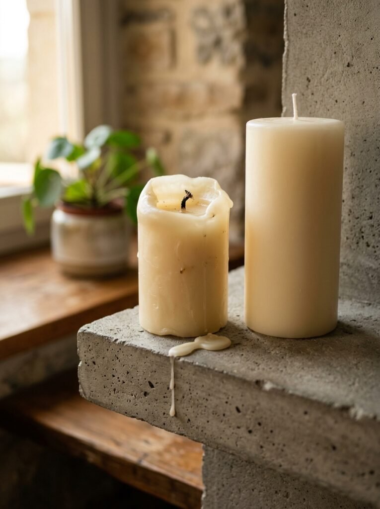
The problem with candles on shelves isn’t the candles. It’s the WAX DRIP ANXIETY.
Okay but practically speaking — taper candles drip. Jar candles don’t. If you love the look of taper candles (and I do, desperately), put them in holders with a small plate or dish underneath on the shelf. And maybe only light them on special occasions, or accept that candle wax is part of the aesthetic. Some people do. No judgment.
Unlit candles still look beautiful, for what it’s worth. A clean cream pillar candle in a simple ceramic holder reads as texture and height and warmth even if you never burn it.
Side note — don’t put tea lights directly on a wooden shelf. I learned this the extremely obvious way.
“An unlit candle does more work than most people give it credit for.”
—
10. The Color of the Shelf Itself Matters More Than Your Decor
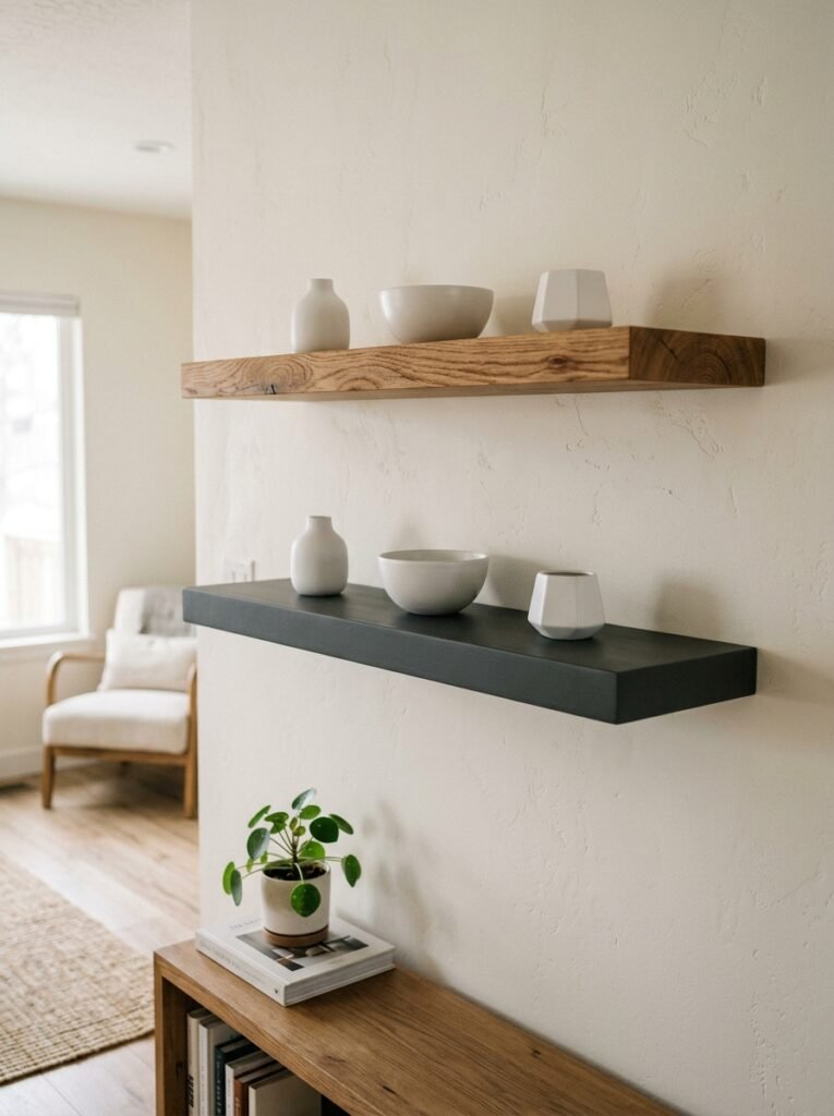
Real talk: if your shelf is a harsh, flat white that was clearly painted once in 2009 and never touched again, even perfect styling is fighting uphill.
The shelf surface, the wall behind it, the material of the shelf itself — this is the canvas. A warm white versus a cool white makes a MASSIVE difference. A natural wood shelf versus a painted MDF one completely changes the vibe.
If you can’t replace the shelf, the easiest upgrade is painting the wall behind it a slightly deeper tone — even a warm greige or a soft sage can suddenly make everything sitting on the shelf look more intentional. It gives the objects something to be in front of.
This is especially true in UK homes where the light tends to be cooler and flatter. Warm up the background and you warm up everything.
—
11. The Minimalist Shelf Is Actually Ongoing, Not a One-Time Project
This is the part nobody tells you and it slightly annoyed me when I figured it out.
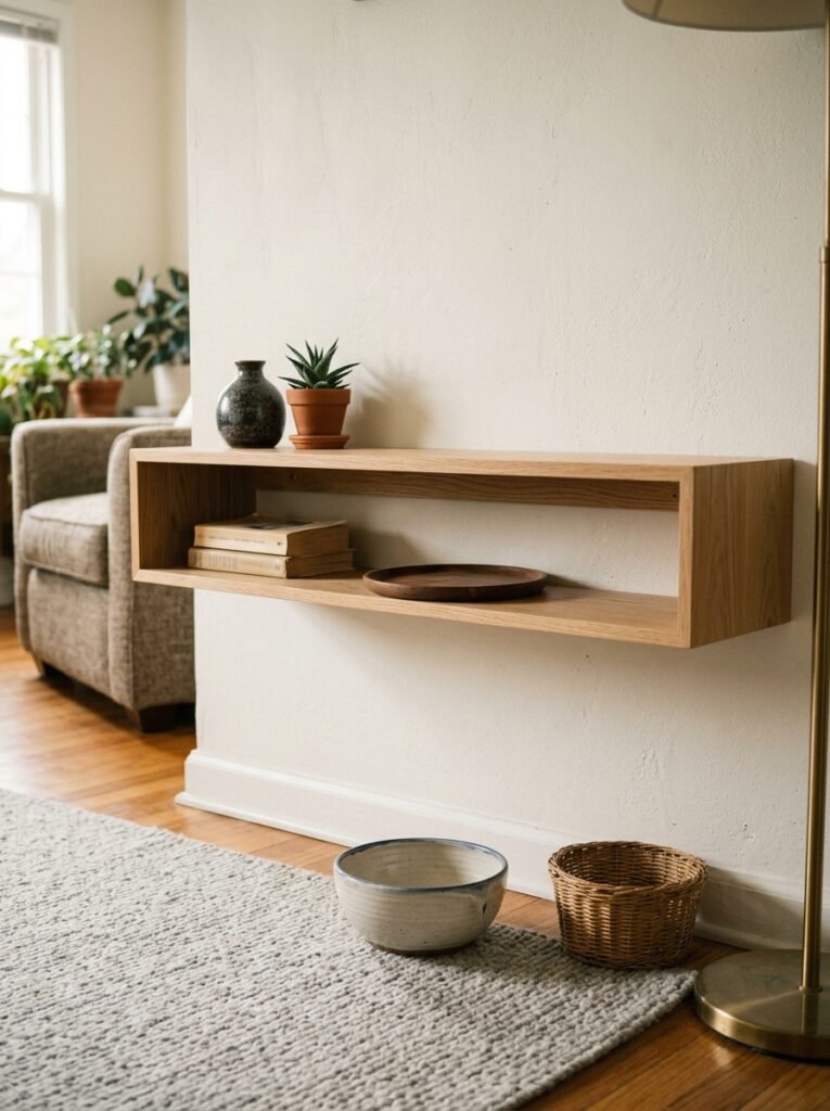
A minimalist shelf that looks great in January might look wrong in July. Not because you did something wrong, but because the light changed, your other decor shifted, you got a new sofa and now the color story is slightly different. Shelves are dynamic.
The really good news is that because there’s less on them, swapping things is easy. Take one thing out, try something else in its place. Rotate the plant to somewhere it gets better light. Move the books to a different shelf entirely for a month and see how it feels.
I edit my main shelf every six to eight weeks or so. Nothing dramatic — usually just one or two changes. But it stays fresh. It stays intentional. And honestly? It’s kind of fun, in the same way rearranging furniture is satisfying in a way that’s hard to explain to non-decorating-obsessed people.
Or maybe it’s the opposite — maybe some people set it once and leave it and it looks great for years. I guess both approaches are valid.
—
12. The Thing That Will Make Your Shelf Look Done Tomorrow, Not Eventually
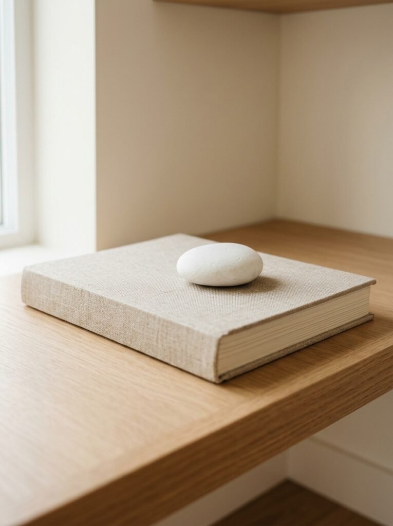
One meaningful object.
Not a collection. Not a theme. One thing that you actually love — not because it looks like shelf decor, not because it was on sale, but because it means something or it’s genuinely beautiful to you specifically.
When that object is on the shelf, everything else arranges itself around it. It becomes the anchor. The rest of the styling is just supporting cast.
This is honestly the hardest advice to follow because we’ve all been conditioned to buy “decor” rather than just… buy things we love. But the shelf you see on Pinterest that makes your heart do something? It’s almost always built around one piece someone genuinely cared about. You can feel it through the screen.
Find your thing. Start there. The rest really does follow.
—
❓ FAQ
Q: How many items should I put on a minimalist shelf? A: Fewer than you think, more than zero. A general rule is to leave at least 30–40% of the shelf visibly empty, but there’s no magic number. Start by putting everything out, then remove items one by one until it feels like it can breathe. You’ll know when you’ve hit it.
Q: Can I have a minimalist shelf if my living room isn’t otherwise minimal? A: Absolutely, and this is actually really common. A clean, thoughtfully styled shelf in a more layered room creates a visual rest point — somewhere for the eye to pause. You don’t need a whole minimalist home for one beautiful shelf to work well.
Q: My shelves are built-in and different sizes — how do I style them cohesively? A: Stick to your two-or-three color palette across all the shelves so there’s visual consistency even if the individual arrangements differ. And don’t try to make each shelf symmetrical to the others — let each one be its own composition. The unity comes from the palette, not from matching layouts.
—
💭 Final Thoughts
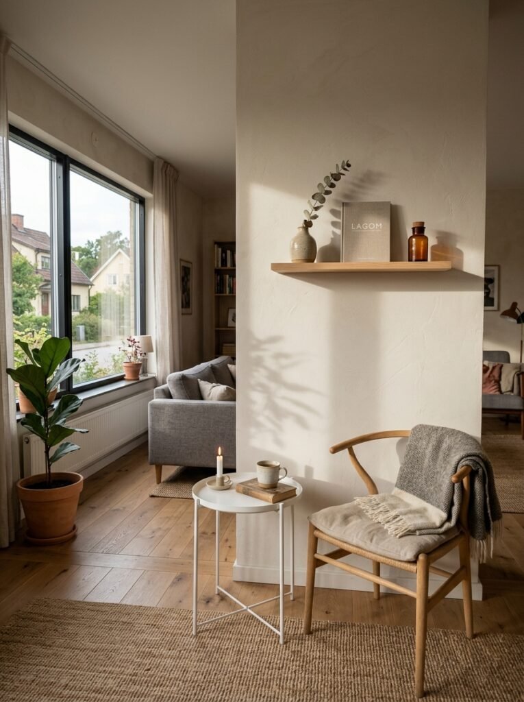
There’s something quietly satisfying about a shelf that actually looks right. Not magazine-perfect, not staged — just right. Like it was always going to be that way.
The minimalist shelf isn’t really about minimalism as a lifestyle or an aesthetic commitment. It’s just about making space for the things that matter enough to be seen.
What’s the one thing sitting on your shelf right now that you genuinely love — and does it have enough room to breathe?


