
The Minimalist Living Room Guide for People Who Actually Like Their Stuff
My friend looked around my living room last spring and said, “It feels like I can breathe in here.” She didn’t mean it as a compliment at first — she was confused. She’d been expecting the usual. Cushions. Candles. That third decorative tray nobody needs.
—
1. Why Most “Minimalist” Living Rooms Feel Cold (and How to Avoid That)
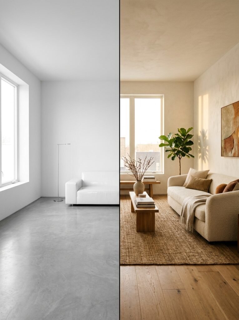
Here’s the thing nobody tells you: minimalism done badly is just sad emptiness with good lighting. You’ve seen it. The Pinterest board that looks like a hotel lobby designed by someone who doesn’t believe in joy. Everything white. Nothing personal. Not a single object that makes you feel anything.
Real minimalism isn’t about removing things until you hate the room. It’s about keeping only what earns its place. And in a living room — the place you actually LIVE — that bar should be set by how something makes you feel, not by whether it passes some invisible aesthetic test.
The rooms that stop people mid-scroll? They’re not empty. They’ve got texture, warmth, one or two genuinely beautiful objects. They just don’t have clutter pretending to be decor.
So before you start pulling things off shelves, the question isn’t “does this spark joy.” It’s closer to: does this do something — visually, emotionally, practically? If it doesn’t, it’s using up space that could be breathing.
“Minimalism isn’t a look. It’s a decision you make about what actually belongs.”
—
2. The Color That Keeps Showing Up in Every Beautiful Minimal Living Room Right Now
It’s not white. Not anymore.
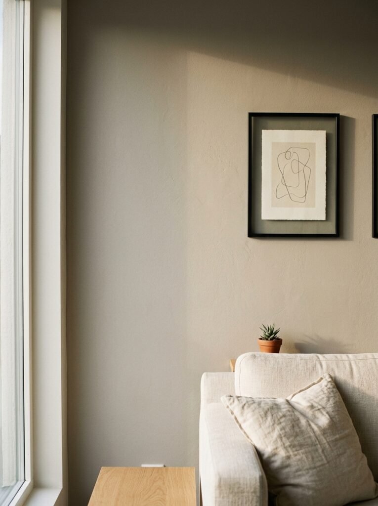
Warm greige — that slightly toasty, almost-beige-but-smarter neutral — is everywhere in rooms that actually feel finished. Not stark. Not cold. It reads differently depending on the light, which is partly why it works so well. In morning sun it’s almost honey-colored. On a grey British afternoon it goes softer, almost chalky. In the evening, with a lamp on low, it wraps the whole room in something that feels genuinely cozy rather than designed.
If you’ve been defaulting to bright white walls because you thought minimalism demanded it, I’d honestly push back on that. White shows every shadow, every scuff, every awkward corner. Warm neutrals are more forgiving AND more interesting.
One thing I’d suggest trying: paint a single wall in a deeper tone — terracotta, dusty sage, a proper muted olive — and keep everything else light. It gives the room a spine. Something to anchor around. And it means you’re not starting over if the all-white experiment feels too clinical three weeks in.
—
3. The One Furniture Rule That Makes a Small Living Room Feel Intentional
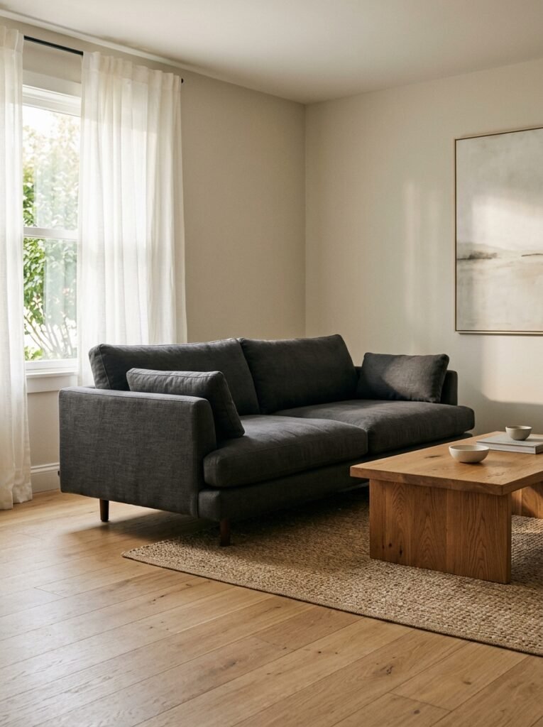
Buy less furniture than you think you need.
Seriously. Most living rooms are overfurnished by at least one piece. There’s the sofa, the coffee table, the side table, the TV unit, the accent chair nobody sits in, and then somehow a bench at the end that’s mostly decorative. It’s a lot.
The shift that actually works? Pick your hero piece and let everything else support it. Usually that’s the sofa. Get the sofa you actually love — the shape, the fabric, the depth of the seat — and then make deliberate choices about what sits alongside it rather than filling space out of habit.
A low-slung sofa in oatmeal or charcoal linen. One substantial coffee table. Maybe a single armchair if the room genuinely has room to breathe. That’s often genuinely enough.
Side note — the accent chair thing is a real trap. Everyone thinks they need one. Most people’s accent chairs end up being the place where clean laundry lives for three days before it gets put away. Be honest with yourself about whether you’ll actually use it.
—
4. What “Good Texture” Actually Means (and Why It Replaces Half Your Decor)
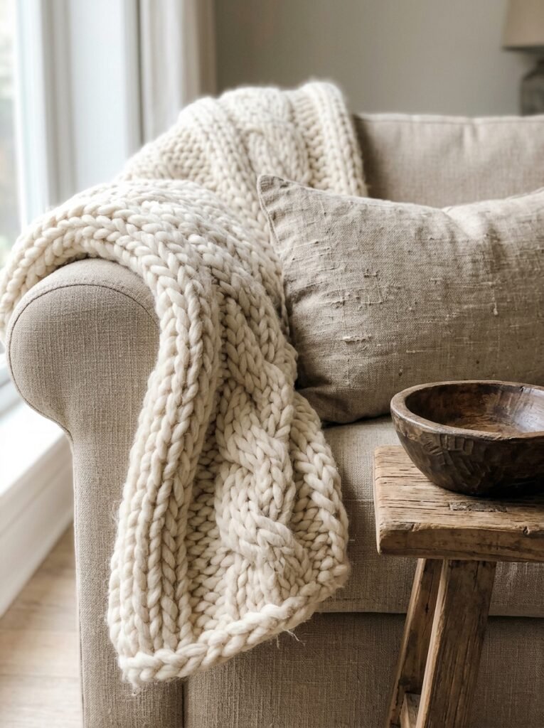
You don’t need a lot of objects when the objects you have feel interesting to look at — and to touch. That sounds slightly abstract so let me be specific.
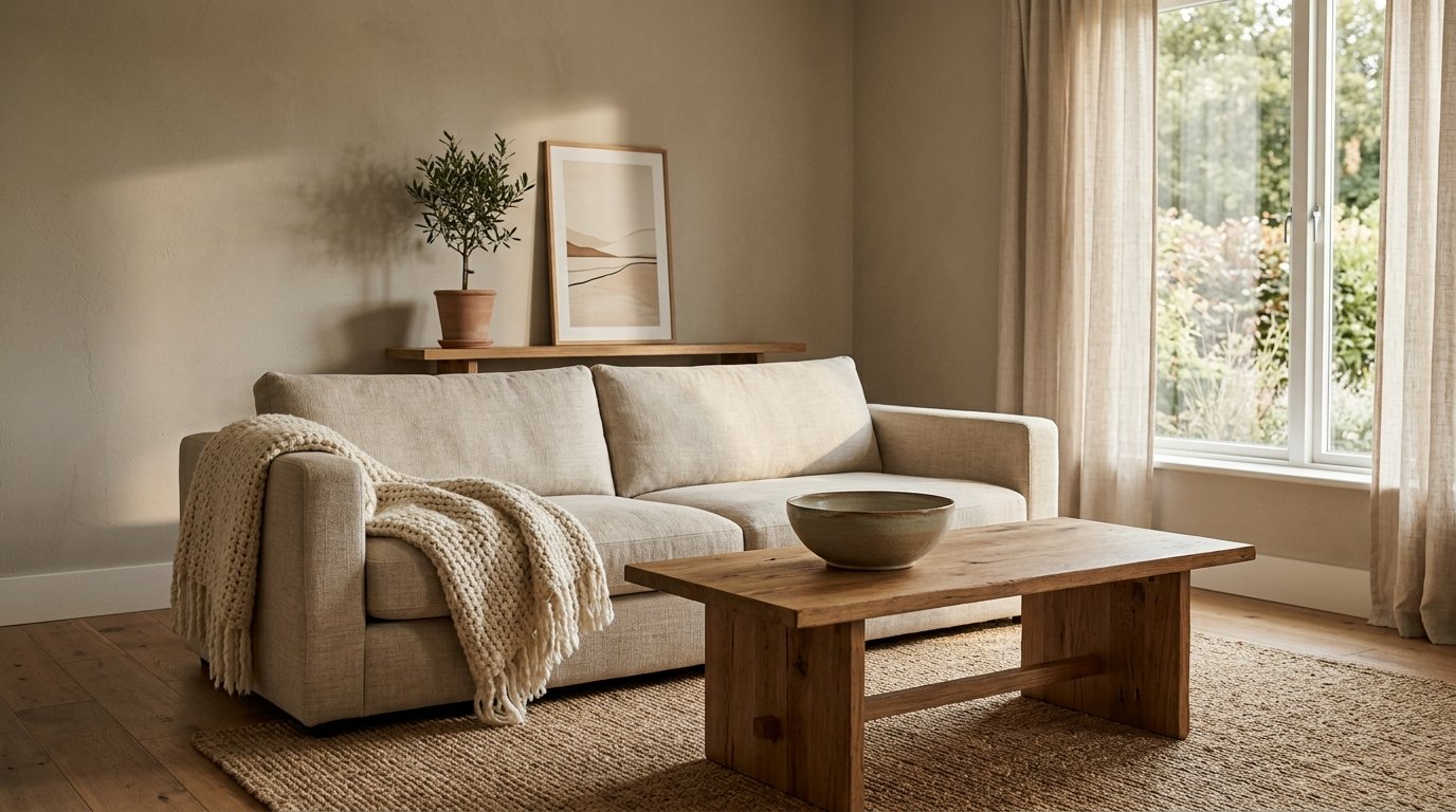
A chunky woven throw over the arm of a sofa does more visual work than four decorative cushions. A rough linen cushion cover reads differently from a smooth one, even in the same color. A low wooden bowl with slightly uneven edges — the kind that looks handmade, because it is — has more presence than a stack of glossy coffee table books.
Texture is what keeps a minimal room from tipping into boring. It creates contrast without clutter. And it photographs BEAUTIFULLY, which — if you’re saving this to a board — matters.
The materials worth looking for: natural linen, washed cotton, warm-toned woods with visible grain, hand-thrown ceramics with slight irregularities, woven jute, matte metals (not shiny). These things layer interest without adding visual noise. They’re doing the heavy lifting quietly.
—
5. The Lighting Setup Nobody Talks About Enough
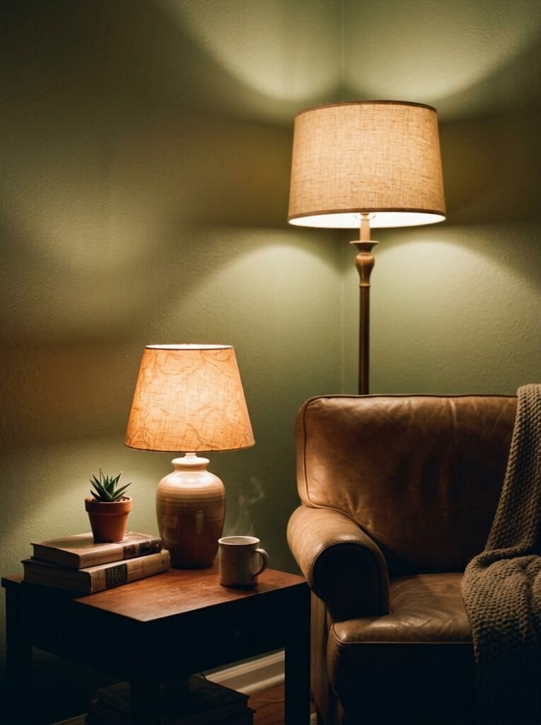
Overhead lighting is the enemy of a good living room. I’ll die on this hill.
Most living rooms in both the US and UK were built with a single ceiling fixture in the mind, and it makes every room look like an office at 9pm. Flat, shadowless, unflattering to everything including your face.
The fix is embarrassingly simple: turn off the overhead light and replace it with two or three lamps placed at different heights. A tall floor lamp in one corner. A smaller table lamp on the opposite side. Maybe a little something lower — a bedside-style lamp on a low shelf — if you want to get specific.
“The amber glow of a lamp at 7pm will do more for your living room than any decorative purchase you’ve made this year.”
The rule of thumb: warm bulbs only. 2700K or lower if you can find it. And dimmers, where possible, because the difference between 100% brightness and 60% is the difference between a room you tolerate and a room you want to be in.
—
6. How to Display the Things You Love Without It Looking Like a Junk Shelf

The zero-object approach is fine in theory. But most people have things they actually love — a piece of pottery from a trip, a photograph, a little stack of books they’ve actually read — and minimalism shouldn’t mean hiding all of it in a cupboard and pretending you’re someone else.
The trick is grouping with intention and leaving space around the group.
Three objects of different heights, in related tones, with empty space on either side. That’s it. That’s basically the whole formula. The negative space around a display is what makes it look considered rather than accumulated.
What doesn’t work: spreading objects across a whole shelf at regular intervals (it looks like a shop display, but not in a good way). What also doesn’t work: filling every surface and calling it “curated.” Curation means making choices, and choices mean leaving some things out.
One shelf, properly styled, beats six shelves of stuff every time.
—
7. The Plant Situation — How Much is Too Much
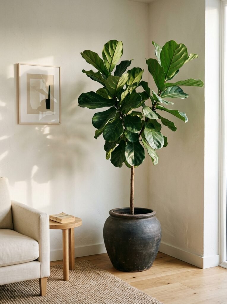
One well-placed plant beats a jungle of small ones. Mostly.
A big, architectural plant — something with presence, like a large leafy variety that fills an empty corner and makes you feel like the room has been alive longer than it has — does something that no small succulent collection can replicate. It gives the room scale and a natural focal point.
That said, I’m not anti-small-plant. A couple of smaller plants grouped on a windowsill work because they’re contained. They know where they live. The problem is when plants start appearing on every surface with no apparent logic, and suddenly you’re not decorating minimally, you’re running a small greenhouse.
One big statement plant, or a small contained grouping. Not both, probably. And honestly? A single dried stem in a narrow vase on a sideboard can be quietly perfect in a way that a plant sometimes isn’t. Lower maintenance, too.
—
8. The Rug Size Mistake That Makes Every Room Look Smaller
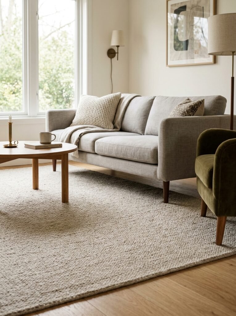
Too small. Every time, too small.
I’ve seen it so many times — a beautiful room, good furniture, decent palette, and then a rug that floats in the middle like a sad little island. All four sofa legs should be on the rug. Or at minimum the front two. If the rug is too small for even that, it’s making the room feel more cramped and disjointed, not less.
For a typical living room, you’re looking at roughly 8×10 feet as a starting point. Bigger is almost always better in a living room context. A generous rug makes the seating area feel intentional — like it was designed, not assembled.
And the texture rule from earlier applies here too. A flat-weave rug in a graphic pattern adds interest without height. A low-pile wool rug in a warm oatmeal tone is basically the definition of quiet luxury. Both are minimal. Both work.
“Get the bigger rug. I promise you. The bigger rug.”
—
9. What to Actually Put on Your Coffee Table (a Surprisingly Controversial Topic)
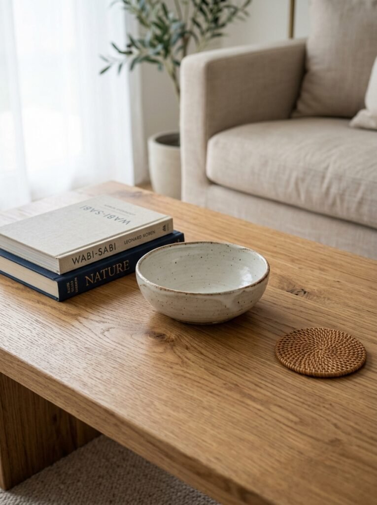
Three things, maximum. And one of them should be functional.
I’m genuinely a bit tired of the coffee table styling photos where there are seven objects arranged across the surface like an art installation. You have to put your tea somewhere. You need actual surface.
My current approach: one object that’s interesting to look at (a low bowl, a sculptural candle holder, a small stack of books — not a tower, just two or three), one thing that’s actually functional (a coaster, a small dish for remotes, whatever you need), and then space. Actual empty space.
That’s the thing about coffee table styling in a minimal room — the restraint IS the style. The empty surface communicates that you made a choice, not that you forgot to put something there.
—
10. The Curtain and Window Treatment Thing Nobody Gets Right
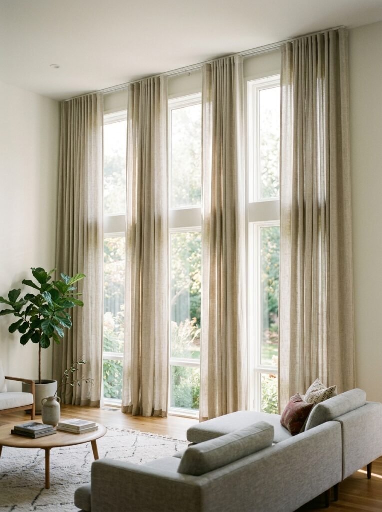
Floor to ceiling. Full stop.
Curtains hung just above the window frame, stopping at the sill — or worse, the radiator — are doing no favors to anyone. They make the ceiling look lower, the window look smaller, and the whole room feel a bit apologetic.
Hang your curtain rod as close to the ceiling as you can get it. Let the fabric fall all the way to the floor, with just a small break or a gentle puddle if you’re going for something softer. The effect is immediate: the room gets taller, the window gets grander, everything reads as more deliberate.
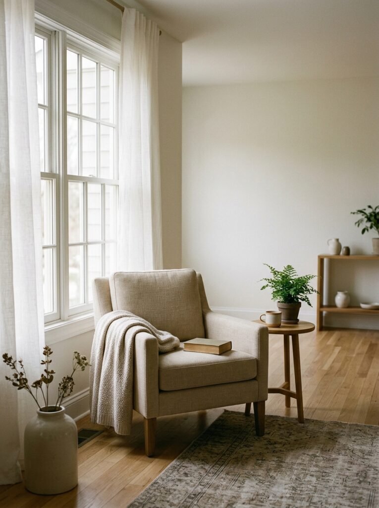
For a minimal palette, linen or linen-look curtains in an undyed natural tone are genuinely hard to beat. They filter light beautifully — that soft, diffused glow on a bright morning — and they don’t compete with anything else in the room.
—
11. When to Leave a Wall Completely Bare (This Is Harder Than It Sounds)
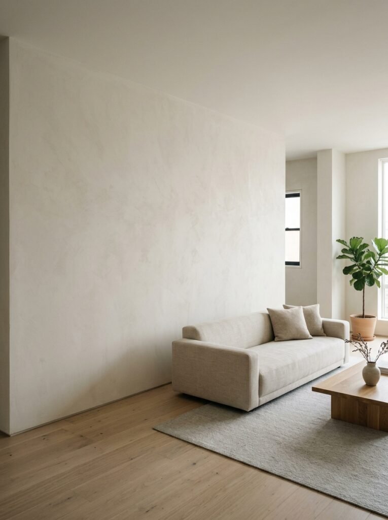
There’s real pressure to fill walls. Empty wall space gets described as “wasted” by people who’ve never experienced a well-proportioned blank wall doing exactly what it’s supposed to do.
A bare wall in a minimal living room isn’t nothing. It’s a decision. It makes everything else in the room feel more intentional. It gives the furniture and the objects space to be seen. And sometimes — particularly with a beautiful textured paint or a wall in a strong color — the wall itself is the thing worth looking at.
The problem is most people hang something out of discomfort rather than intention. If you’re putting a piece of art or a print on a wall, it should be because that piece is genuinely worth looking at, not because the wall feels naked. An empty wall beats a mediocre piece hung at the wrong height any day.
That said — one large piece of art, hung lower than you think (eye level, not crown molding level), can anchor an entire room. Singular. Not a gallery wall. Not in a minimal space.
—
12. The Last Edit: How to Know When You’re Actually Done
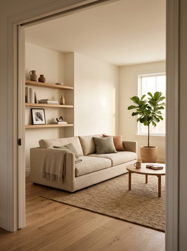
Here’s the test I use, and I sort of stole it from a designer friend who’d probably want credit but hasn’t asked: stand in the doorway of your living room. Look at it like you’ve never been in it before. Count what you see first.
If you’re counting individual objects before you’re registering the room as a whole, there’s more editing to do. If the first impression is the feeling — calm, warm, considered — you’re there.
It’s not about counting objects or hitting a specific number. It’s about whether the room has a mood before it has a list of contents. Minimal rooms should feel like an exhale. Not a museum. Not a show home. Something that has your fingerprints on it, just quietly.
One last thing: don’t do it all at once. The best minimal living rooms I’ve ever been in were built slowly. One thing removed, one thing moved, a gap left for a while before filling it. Patience is honestly the most underrated minimalism tool there is.
—
❓ FAQ
Q: Can a minimalist living room still feel warm and cozy? A: Absolutely — and it should. The key is texture and lighting, not emptiness. Warm-toned neutrals, natural materials like linen and wood, and lamps instead of overhead lighting will make a minimal room feel genuinely inviting rather than clinical.
Q: How do I start decluttering a living room that already feels overwhelming? A: Don’t try to do the whole room at once. Pick one surface — the coffee table or one shelf — and edit just that. See how it feels for a week. The momentum usually builds naturally from there, and you’re making deliberate decisions rather than panic-clearing.
Q: Do I need to spend a lot to get a minimal look? A: Not really. Minimalism is genuinely one of the more budget-friendly approaches to decorating because you’re buying fewer things. The money you don’t spend on unnecessary decorative objects can go toward one or two better-quality pieces — and quality matters more when there’s less to look at.
—
💭 Final Thoughts
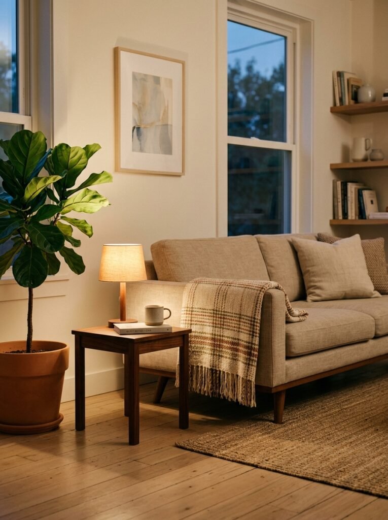
The thing I keep coming back to is that minimalism isn’t a style in the way that maximalism or midcentury modern is a style. It’s closer to an editing practice — an ongoing relationship with your space. And in a living room, where so much of actual life happens, that practice has to make room for the actual life.
The rooms that get saved the most on Pinterest aren’t the most stripped-back ones. They’re the ones that look lived-in and deliberate at the same time. Like someone made careful choices, and then stopped.
What’s the one thing you keep putting back every time you try to simplify your living room — and does it actually belong there?