Why the Most Beautiful Living Rooms Right Now Are Refusing to Play It Safe with Color
My friend walked into my living room last spring and said, “Oh, you actually did it.” Like she was surprised. Like choosing color was some radical act.
And honestly? In a world of greige walls and linen everything, maybe it is.
—
1. The Quiet Death of the “Safe” Living Room (and Why Nobody’s Mourning It)
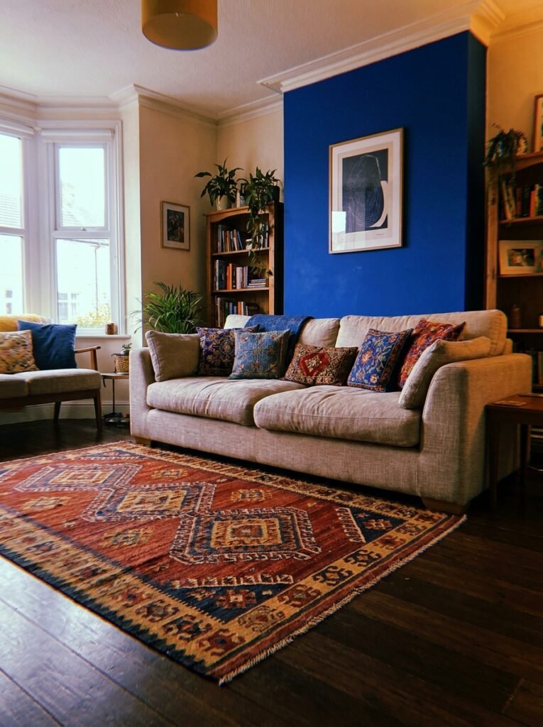
For a while there, it felt like every gorgeous living room on the internet looked basically the same. Warm white walls. A chunky knit throw. Some pampas grass in a terracotta vase. Beautiful, sure — but also sort of… interchangeable?
People got tired. Not dramatically, not overnight, but slowly and then all at once, the way these things tend to go. And now what’s actually stopping the scroll is COLOR. Real color. Committed color. The kind that makes you think whoever lives there has an actual personality.
I’m not talking about an accent wall. I’m not talking about one forest green velvet cushion you bought because a stylist told you it counted as “a pop.” I mean rooms where color is the whole point, where it’s baked into the bones of the space, and where it somehow feels completely RIGHT even when your instinct says it shouldn’t work.
That’s what we’re getting into today.
—
2. The Color That Keeps Showing Up in Every Beautiful Living Room Right Now
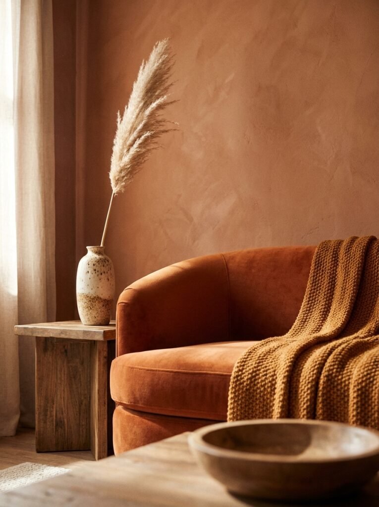
Terracotta gets all the headlines, but honestly? The color I keep seeing that makes me stop and stare is a deep, warm cobalt blue — not navy, not royal blue, something in between. It shows up on statement sofas, on painted bookshelves, occasionally on an entire wall paired with natural wood and rattan.
It’s got this depth to it that changes completely depending on the light. In the morning, it reads almost dark and serious. By late afternoon when the sun hits it sideways, it goes warm and almost jewel-like.
“The rooms that feel genuinely alive are the ones where color was chosen because someone loved it — not because it was trending or ‘safe enough.'”
Cobalt pairs absurdly well with terracotta (yes, even though you’d think they’d fight), with warm brass hardware, with cream textiles, and with dark wood floors. It’s also one of those shades that looks equally at home in a cozy Victorian terrace in Manchester and a light-flooded apartment in Austin. Not many colors can claim that.
—
3. How to Build Around One Bold Color Without Making Everything Feel Like a Mood Board Exploded
Here’s where people go wrong: they find a color they love, and then they try to match everything to it. Same family, different shades, little variations. And the result is a room that feels a bit… monochromatic and stiff. Like it was assembled rather than lived in.
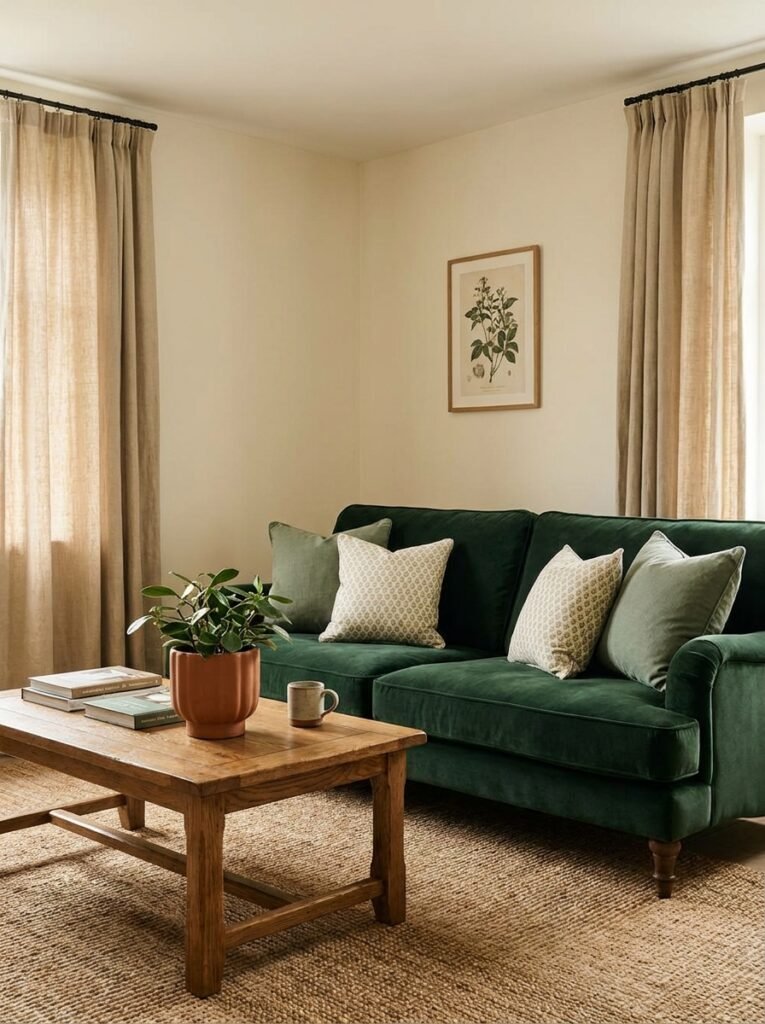
The trick — and it’s so simple it’s almost annoying — is contrast. Not just in color, but in texture and weight. If your sofa is a bold color, the rug should be something quieter. Woven jute. A worn, faded pattern. Something that’s been lived on.
Bring in at least one thing that doesn’t match AT ALL. A rust-orange ceramic lamp. A stack of books with yellow spines. A trailing plant that’s going slightly rogue on a shelf. The slightly-wrong thing is what makes a room feel real.
And please — different textures everywhere. Velvet next to linen next to matte wood next to something shiny. Color rooms need texture variety the way a recipe needs acid. It keeps everything from feeling flat.
—
4. The One-Third Rule That Actually Works (Unlike Most “Rules” in Decorating)
I’m generally skeptical of decorating rules. Most of them are either too vague to be useful or so rigid they squeeze the life out of a space.
But the one-third rule? It holds up.
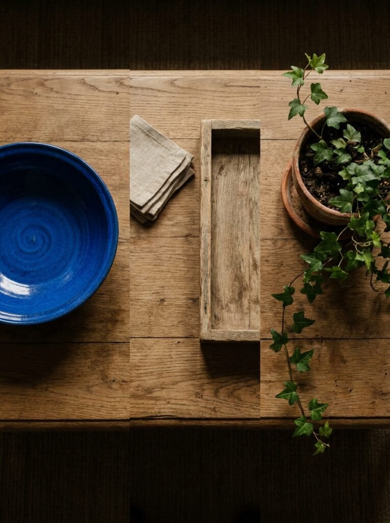
Roughly one-third of your visible color palette should be your main bold choice. One-third should be a neutral (not necessarily white — warm cream, natural linen, aged wood all count). And one-third should be the things that react to both: accent colors, art, plants, pottery.
Side note — this isn’t a math problem. You don’t need to literally measure. It’s more of a vibe check you do when you stand back and squint at a room. Does one color feel like it’s screaming over everything else? Or does it feel like the room is having a conversation with itself?
A room having a conversation with itself. That’s what you want.
—
5. Dark Walls Aren’t Dramatic — They’re Actually the Cozy Option
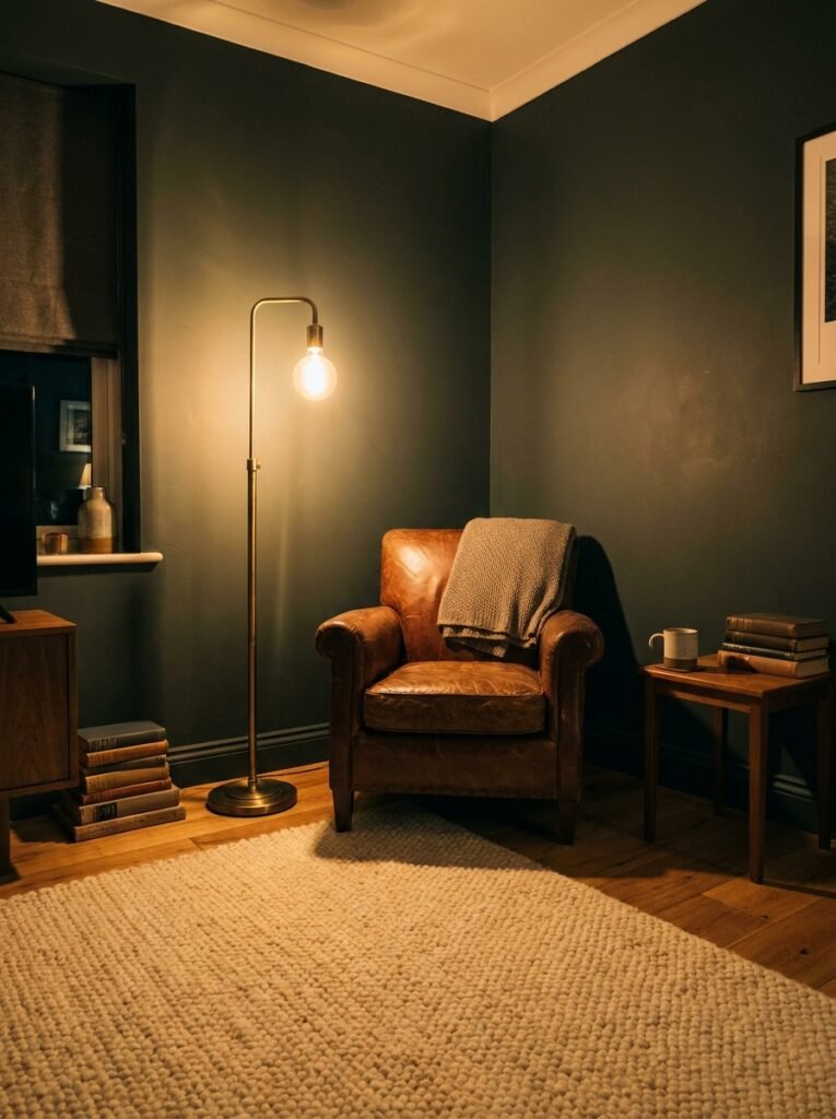
I know this goes against every instinct, especially in smaller rooms. But hear me out.
Dark walls — deep green, rich plum, a moody navy — don’t make a room feel smaller. They make the WALLS disappear. Suddenly you’re not aware of where the room ends. All you see is the furniture, the art, the lamplight. And at night, with candles or the amber glow of a floor lamp at about a 70-watt equivalent, a dark-walled room feels like the most private, settled place in the world.
“Dark walls don’t shrink a room. They fold it around you.”
In a British terrace with high ceilings and cornicing, dark paint is practically designed for the architecture. In a lower-ceilinged American home, pair it with warm lighting and pale, reflective surfaces — a large mirror, light-colored furniture — and it works just as beautifully.
The ceiling stays white or very pale, nearly always. That’s non-negotiable for me. Let the room breathe upward.
—
6. The Furniture Piece That Changes the Whole Conversation
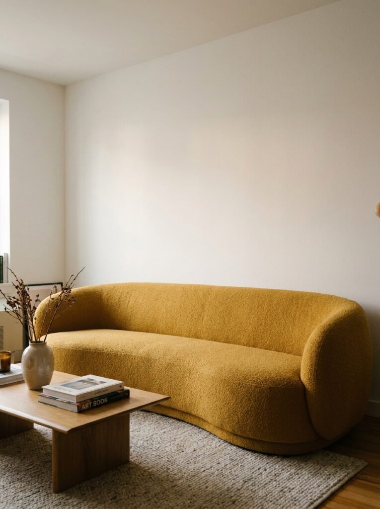
Here’s a strong opinion: if you want color in your living room but you’re genuinely too nervous to touch the walls, BUY THE SOFA.
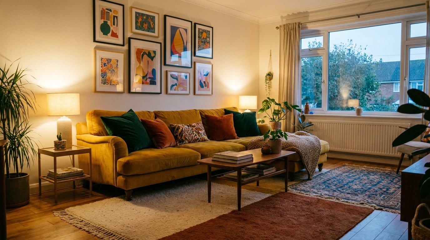
A colored sofa is the most committed, decisive thing you can put in a room, and it’s also the most transformative. Not a subtle dusty blush that reads almost neutral in bad light — an actual color. Bottle green. Marigold. Deep rust. A proper, standing-its-ground color.
People are weird about this because sofas feel permanent. And sure, they’re an investment. But you’re going to look at that sofa every single day, so you might as well look at something that actually makes you feel something. The beige sofa that goes with everything also goes with nothing.
Pair it with a rug that has at least a touch of the same color woven in — not matchy, just echoed — and suddenly the room has a logic to it that feels very intentional without being designed-within-an-inch-of-its-life.
—
7. How Art Does the Heavy Lifting in a Colorful Room
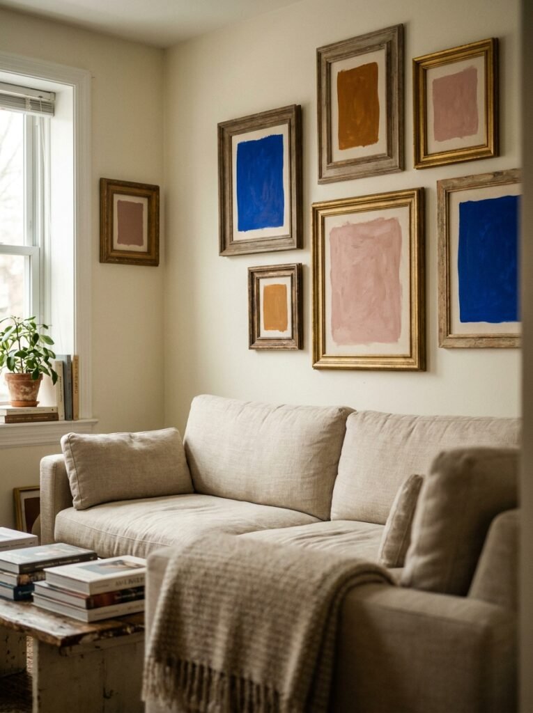
This is sort of the secret weapon that nobody talks about enough.
Art isn’t decoration. In a colorful room, art is infrastructure. It’s what connects the dots between your big color choice and all the smaller decisions around it.
If your walls are a warm terracotta, you don’t need the art to have terracotta in it — you need it to contain a color that answers terracotta. Teal. A deep sage. Gold. Something that feels like a response.
Gallery walls work really well here, but not the matchy-matchy kind where everything’s in the same frame and the same palette. Mix frame colors. Mix print sizes. Let one thing be slightly unexpected — a vintage print next to something very modern, a botanical illustration next to abstract color blocks. The mismatched gallery wall is so much more interesting than the curated one, and it’s easier to build over time without agonizing over each piece.
—
8. Plants Aren’t a Trend. But the Way You’re Using Them Might Be.
Not gonna lie, the “plant in a rattan basket in the corner” thing is getting a little tired. And I say that as someone who still has three of them.
The thing about plants in colorful rooms is that green isn’t neutral — it’s a color too, and it’s WORKING in the room whether you’re thinking about it or not. Dark botanical greens (fiddle leaf, monstera, rubber plant) do something different than the silver-green of an olive branch or the bright, almost lime of a pothos trailing off a shelf.
Think about which shade of green earns its place. In a blue room, a deep monstera green adds richness. In a terracotta room, something paler and more silvery feels better. Against a dark wall, you almost want something bright and slightly unruly, something that reads as alive against all that depth.
A big tip: get them off the floor sometimes. Hang one, put one up high on a shelf, let it trail down. Height variation in a room full of strong color keeps things from feeling heavy.
—
9. The Color Combination That Looks Expensive Even When It Isn’t
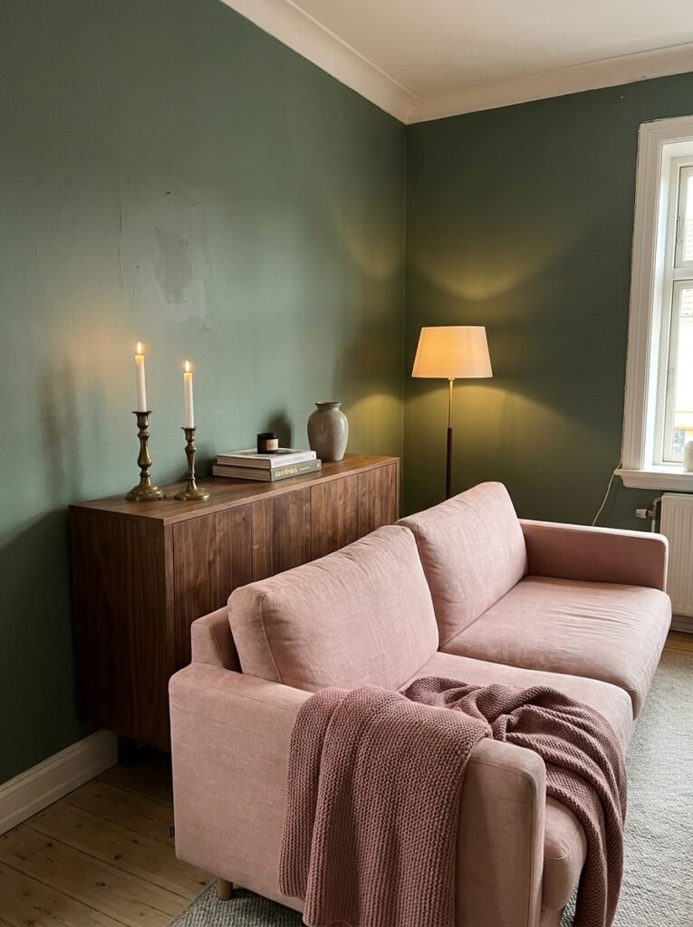
Okay. Burnt orange and sage green. I know. Stay with me.
On paper it sounds like it belongs in a 1970s rec room. In practice, when the sage is dusty and muted rather than bright and the orange is deep and warm rather than cartoon-pumpkin vivid, it looks incredibly rich. Layered. Like a room that’s been collected over time rather than ordered all at once.
Linen and clay pottery work brilliantly here. Dark wood floors. Brass fixtures, but worn-looking brass not polished. And ideally some black — a matte black lamp base, a thin black picture frame somewhere — to stop it from feeling too warm and sweet.
“The best living room color combinations are the ones that look like a happy accident but definitely weren’t.”
It’s not cheap to execute badly. But done right, with patience and an eye for the right shades, this combo photographs beautifully and feels genuinely original.
—
10. What British and American Rooms Actually Do Differently With Color
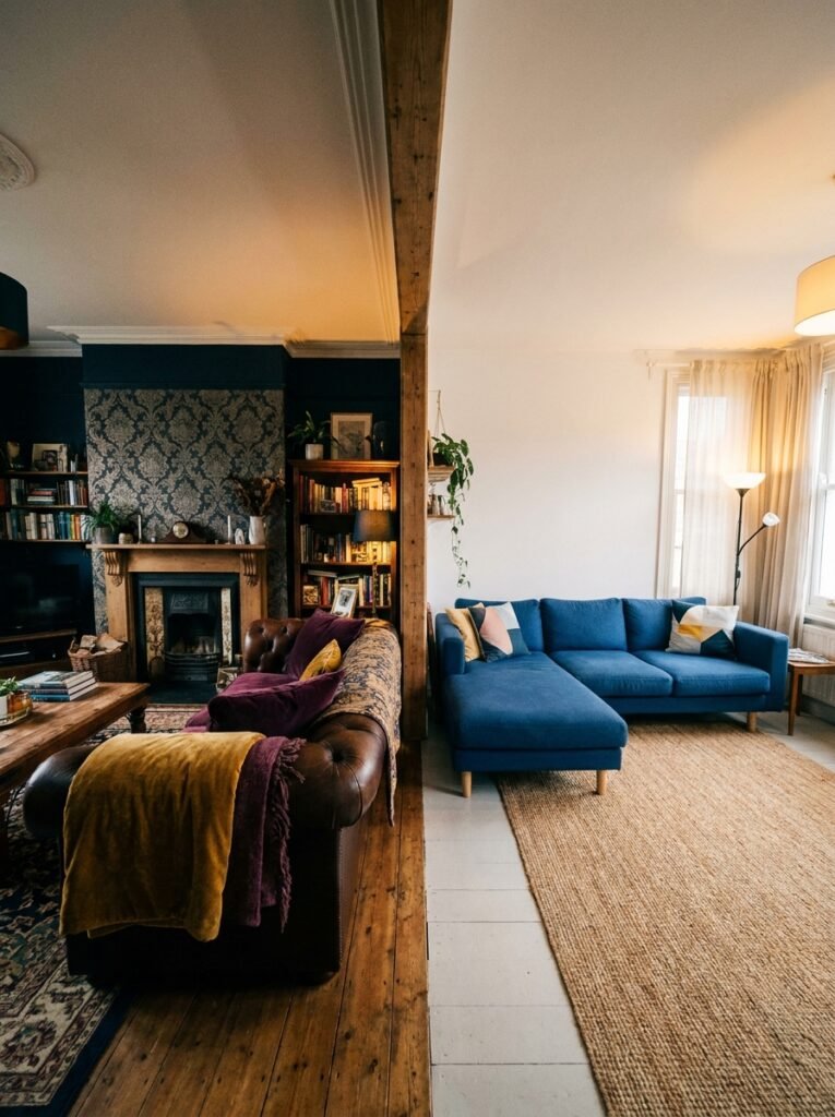
This is a generalization, so take it accordingly. But having looked at approximately one million living rooms across both countries (or so it feels), there are patterns.
British rooms tend to go darker and more historical. Deep jewel tones that nod to Victorian and Georgian architecture. A bit more pattern tolerance — florals, plaids, the occasional chintz cushion that shouldn’t work but somehow does. There’s a comfort with mixing old and new that feels very specifically British.
American rooms tend to go brighter and more layered. Cleaner contrasts. More likely to paint an accent wall a bold color while keeping everything else fairly restrained. Also way more likely to do a really confident maximalist gallery wall.
Neither approach is better, which is kind of the point. Color doesn’t have a nationality. The constraint is just architecture and light — Victorian ceiling heights versus open-plan ranch houses, rainy grey light versus Texas sunshine. Work with what you’ve got. A dark emerald that looks brooding in a bright LA apartment looks absolutely perfect and intentional in a dim Edinburgh flat.
—
11. The Single Mistake That Makes Colorful Rooms Look Chaotic Instead of Curated

Too many colors trying to be the lead.
Every vibrant, beautiful, magazine-worthy living room has a hierarchy. There’s a dominant color. There’s a secondary color that supports it. And then there are the accents — small, scattered, not trying to compete. The minute three different colors all try to be the main event, the room starts to feel like it’s arguing with itself.
Pick your champion. Commit to it. Let everything else know its role.
This sounds obvious but when you’re buying things piece by piece over months — a cushion here, a vase there, a new rug — it’s genuinely easy to lose track of the original vision. Keep a photo of your room on your phone. Pull it out in the shop. Ask the real question: does this help my main color WIN, or does it start a new conversation nobody asked for?
—
12. The Room You’ll Actually Want to Come Home To
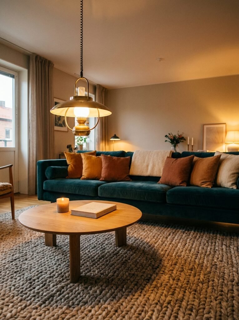
Here’s the thing about colorful living rooms that I don’t think gets said enough.
They feel like somewhere. Generic rooms feel like anywhere. And there’s a real difference.
When you walk into a room that has color, that has character, that has some personality baked into the walls and the furniture and the art — your nervous system actually responds to it. It feels like a place that was made by a person, for a person. It has intention. And that intention is restful, even when the color is bold, maybe ESPECIALLY when the color is bold.
The beige room is exhausting to maintain because nothing ever looks quite right in it. The colorful room is easy to maintain because everything looks right — the clutter on the coffee table, the dog-eared books, the morning-light dust motes floating in front of the velvet sofa.
Color forgives. And that’s maybe the best argument for it.
—
❓ FAQ
Q: How do I add color to my living room if I’m renting and can’t paint the walls? A: Focus on furniture, textiles, and art — these carry a surprising amount of weight. A boldly colored sofa or a large-scale rug in a strong shade does more for a room than most people expect. Oversized art leans against walls beautifully without any commitment, and removable wallpaper has actually gotten quite good in recent years if you want something more dramatic.
Q: What’s the easiest first step into a more colorful living room without it feeling risky? A: Start with cushions and throws, but go bolder than feels comfortable. The biggest mistake people make is buying muted versions of colors they actually want — a dusty rose when they really wanted terracotta, a pale grey-blue when they wanted proper cobalt. Get the real version of the color and live with it for a week. You’ll know almost immediately whether you love it or want to go further.
Q: Can colorful living rooms work in small spaces, or does color make a room feel smaller? A: Color can absolutely work in small rooms — the key is confidence, not caution. A room that’s fully committed to one bold color reads as intentional and cozy rather than cramped. It’s actually the half-hearted use of color (one bright cushion on an otherwise beige sofa in a white room) that tends to look off in small spaces. Go all in or go neutral, but don’t hover in between.
—
💭 Final Thoughts
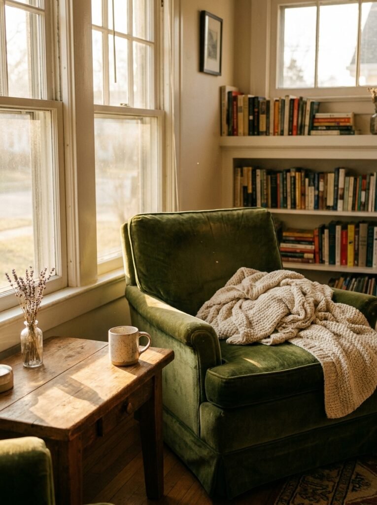
The most colorful rooms I’ve ever loved weren’t designed by people with perfect taste. They were designed by people who knew exactly what made them feel something — and then just kept adding more of it.
That’s really all this is. Chasing the feeling.
What’s the one color you keep gravitating toward but haven’t quite committed to yet?