
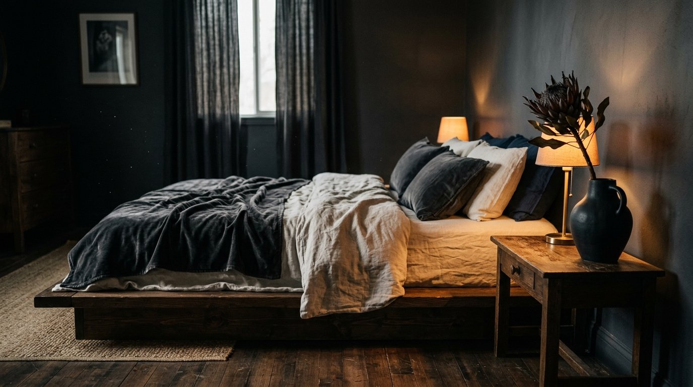
Dark Feminine Bedroom on White Walls: Why the Contrast Is the Whole Point
A friend told me last spring that she’d painted over her white walls because they felt “too cold.” And I’ve been thinking about that ever since, because I think she got it exactly backwards.
—
1. White Walls Aren’t the Problem — They’re the Canvas You’ve Been Underusing
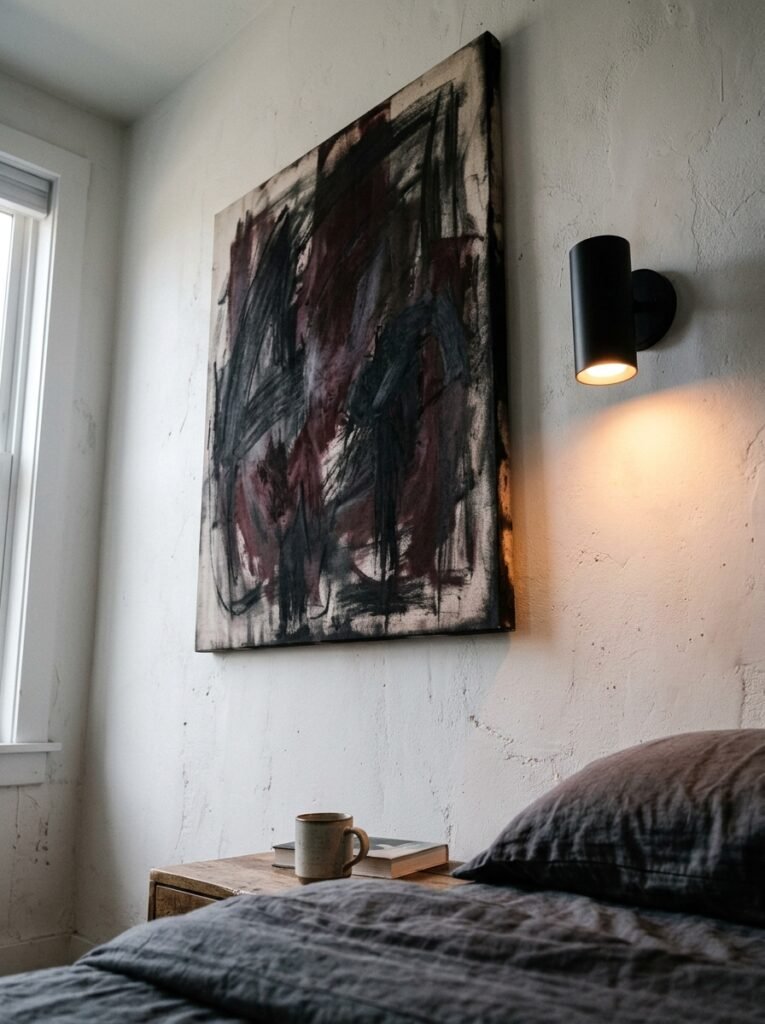
Here’s the thing about white walls. Everyone either loves them or spends six months convincing themselves to paint over them. And most of the people who hate them are thinking about white walls the wrong way — like the white is the design, instead of the background.
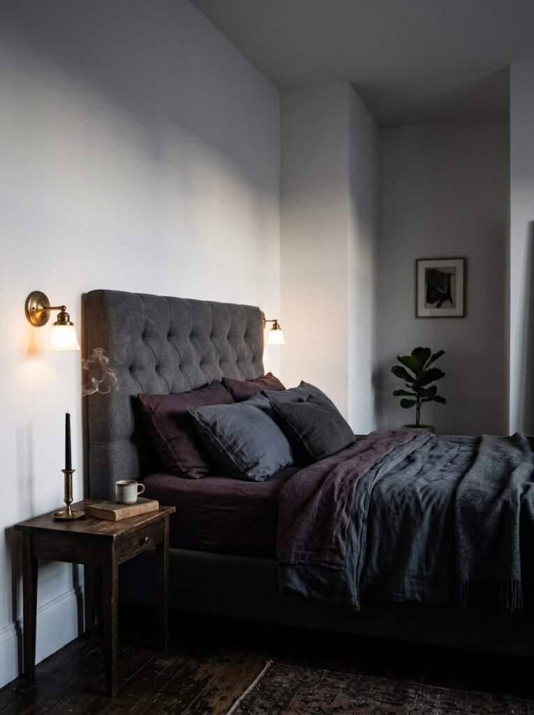
Dark feminine style is actually built for white walls. The contrast is kind of the whole point. When you layer deep, moody tones against a bright white backdrop, you get this visual tension that feels intentional in a way that an all-dark room just… doesn’t. A charcoal linen duvet on white walls looks considered. That same duvet in a charcoal room looks like you gave up.
White reflects light back into the room, which means your dark accents stay rich instead of muddy. Your plum velvet throw stays plum. Your black iron candle holder actually reads as black instead of disappearing into a dark wall behind it.
Don’t paint the walls. Not yet, anyway.
—
2. The Color Nobody’s Talking About That Belongs in This Bedroom
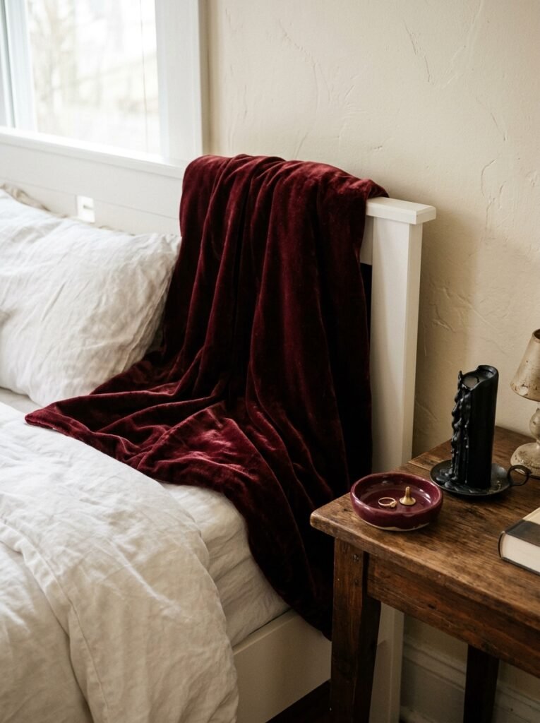
Dusty mauve. I’m convinced it’s the most underrated shade in home decor right now, and it belongs in every dark feminine bedroom that has white walls.
Not bright pink. Not blush. Not that washed-out millennial pink from 2017. Dusty mauve — the kind that looks almost grey in certain light and then suddenly, DEEPLY pink when the afternoon sun hits it from the right angle. It’s moody without being dramatic. It’s feminine without being girlish.
“Dusty mauve looks grey at 8am and gorgeous at sunset. That kind of color is doing real work in a room.”
Layer it in your textiles first. A duvet in this shade on white walls with a few dark accents — a black side table, a smoked glass vase, maybe a small framed mirror with a brass edge — and the room looks like something from a boutique hotel, but more lived-in. Warmer.
Pair it with deep forest greens if you want the room to feel a bit more lush. Go burgundy and you’re into something almost gothic, which I personally love.
—
3. The Lighting Rule That Separates a Good Dark Bedroom From a Great One

I’ll be blunt: overhead lighting is ruining bedrooms. All of it. Every bright ceiling fixture pointed directly downward is actively working against the atmosphere you’re trying to create.
In a dark feminine bedroom on white walls, you need light that grazes surfaces instead of flooding them. The amber glow of an Edison bulb at 7pm. A table lamp with a linen shade that makes the light feel like it’s been strained through something soft. A small sculptural wall sconce that throws a little halo on the white paint above it.
The white walls do something specific here — they catch and diffuse light in this gentle way that darker walls just can’t. You get a warm, slightly uneven glow across the room rather than harsh shadows. It feels romantic without trying too hard.
If your bedroom’s got a ceiling light you can’t remove, put it on a dimmer. Or just stop turning it on. Honestly.
—
4. How to Make Black Accents Feel Soft Instead of Stark
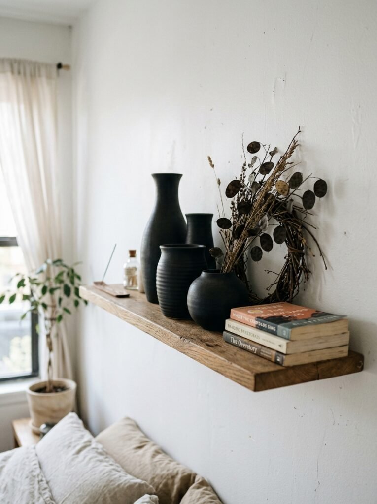
This is where a lot of people get nervous. Black accents on white walls can look clinical — like a dentist’s waiting room that got too ambitious. The key is texture.
Matte black. That’s it. That’s most of the secret.
Matte black iron, matte black ceramic, matte black wood stain — all of these absorb light slightly instead of bouncing it back, which makes them feel grounded and organic rather than sharp. A glossy black bedside lamp on white walls can feel a bit modern-office. The same lamp in matte black feels collected.
Then it’s about scale. Don’t go too small. A tiny black vase on a white wall gets a bit lost — but a tall, substantial matte black candlestick, or a larger piece of dark wall art with real presence, that reads with intention. Pair matte black with aged or brushed metals (gold, brass, bronze — nothing too shiny) and suddenly the room has depth without feeling heavy.
—
5. The Bedding Combination That Actually Looks Good in Real Life, Not Just on Pinterest

I’ve tried a lot of things. Dark grey everything looks flat. All white reads hospital-adjacent. The sweet spot — the one that photographs BEAUTIFULLY and also feels incredible to climb into — is mixed textures in a tight, moody palette.
Start with a base of deep charcoal linen. Slightly wrinkled, because linen looks better that way and fighting it is exhausting. Layer a chunky knit throw in dusty mauve or deep plum at the foot of the bed. Add two sleeping pillows in white (yes, white — the contrast matters) and two accent pillows in something tactile: velvet in wine, boucle in cream, or even a dark floral print if you want a bit of pattern.
“The bed is the loudest thing in the room. If you get the bedding right, everything else can be quiet and it still works.”
The white walls behind all of this make the colors pop without competition. You’re not fighting the walls. They’re holding everything up.
—
6. Plants That Fit the Vibe (and Won’t Die When You Forget About Them)
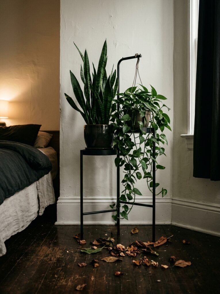
Not all greenery works for dark feminine spaces. Bright, cheerful tropical leaves — big and lime-green and enthusiastic — kind of undercut the mood. What you want is plants that feel a little more gothic. A bit dramatic. Plants that look like they’d thrive in a forgotten manor house.
Dark-leafed varieties work beautifully here. A deep burgundy rubber plant with its waxy, dark red leaves. A black raven ZZ plant. Trailing pothos in a darker pot that lets the green fall naturally without looking too curated.
Side note — white walls actually help these darker-leafed plants a lot, because the light background makes those deep tones visible in a way they wouldn’t be against a dark wall. The plant reads as the feature.
Keep the pots simple. Terracotta that’s been slightly aged, matte black ceramic, or a rough stoneware with an uneven glaze. Nothing plastic, nothing too glossy.
—
7. The Scent Layer That Most People Forget About Until It’s Too Late
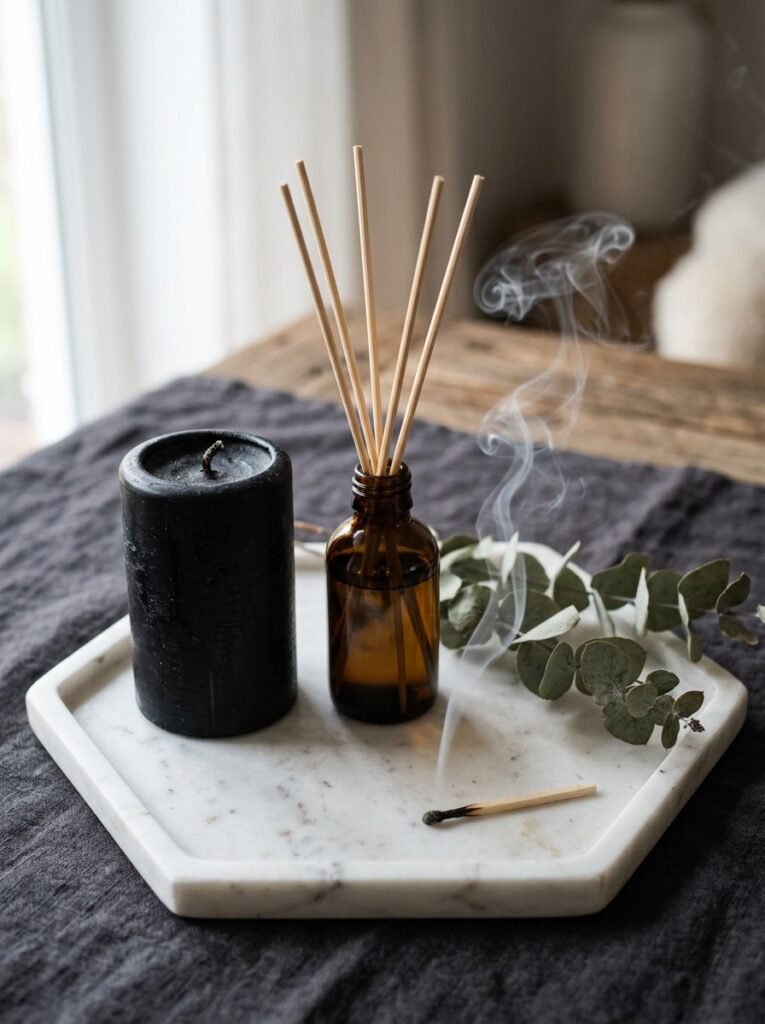
A bedroom is an immersive experience. And if it looks moody and beautiful but smells like nothing, or worse — like a synthetic plug-in air freshener — you’ve broken the spell.
Dark feminine bedrooms smell specific. Sandalwood and amber. Black fig and musk. A candle that burns slow and warm and leaves a little woodsy residue in the air. You’re not going for a clean, fresh scent here. You want something that feels like it’s been layered over time, like the room has history.
A reed diffuser can do a lot of the sustained background work. A candle with a wide vessel (the kind that throws scent when it’s not even lit) handles the rest. Pair your scent with the color story of the room — if your palette leans burgundy and brass, a spiced amber scent makes the whole thing cohesive in a way that’s hard to explain but immediately felt.
Don’t skip this. It’s not a finishing touch, it’s part of the design.
—
8. The Mirror That Changes Everything Without Touching the Walls
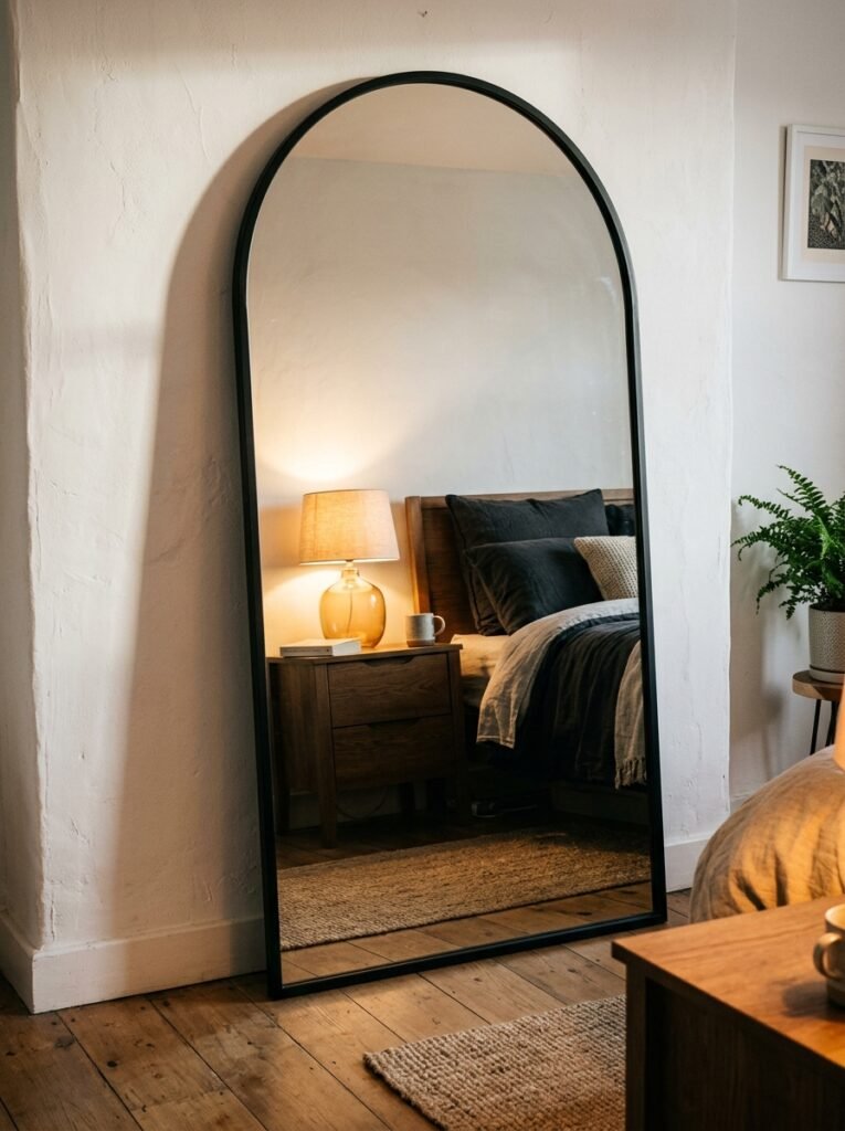
Mirrors in a dark feminine bedroom need to feel found rather than bought. Or at least, they need to look that way.
What doesn’t work: a plain rectangular mirror with a thin chrome frame. It’s fine, but it’s not doing anything interesting. What does work is a mirror with character — an arched shape, a heavy dark wood frame, an ornate vintage style, or a smoked or antiqued glass that reflects things back slightly imperfectly.
That slight imperfection matters. Smoked mirror glass has this quality where the reflection is real but muted, like looking at the room through a memory. It adds depth without adding bulk, and against white walls it makes the space feel simultaneously larger and more intimate.
Position it to catch your best light source — across from a window, or near a lamp you actually use. Let it bounce that amber glow around the room at night. It makes everything feel more considered.
—
9. One Wall Treatment That’s Not Paint and Doesn’t Involve a Landlord Negotiation
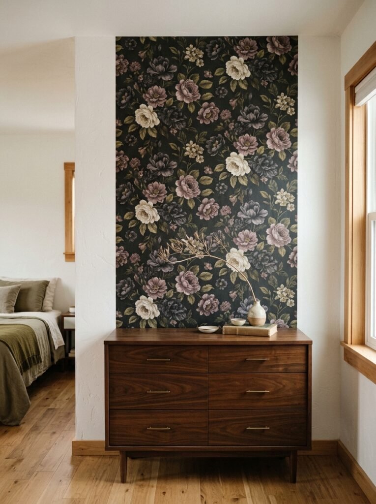
Textured wall panels. Specifically the kind that add a soft, dimensional quality without requiring you to commit to a full repaint — and crucially, without looking like you’ve glued craft supplies to your bedroom wall.
Fabric-backed wall panels in a muted tone work brilliantly against existing white walls. You install them on just one wall — usually the one behind the bed — and they bring texture, a subtle color shift, and an instant sense of depth. The white walls flanking them make them look intentional rather than random.
Another option that’s genuinely underused: pinned fabric. A large piece of heavyweight linen or velvet in a deep shade, stretched and pinned or hung like a canvas behind the bed, creates a kind of DIY upholstered headboard wall effect. It’s softer than a painted accent wall. Warmer.
And you can take it down when you move. Which, if you’re renting, is kind of priceless.
—
10. The Detail That Reads as Expensive But Costs Almost Nothing
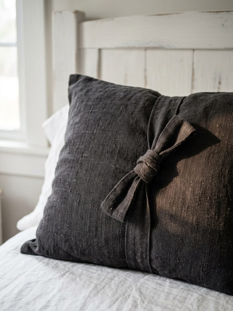
Taper candles on a handmade-looking candlestick. That’s it. I’m completely serious.
There’s something about a tall, unlit taper candle — especially in a dark color, a deep wine red or near-black — on a substantial candlestick holder, sitting on a bedside table or a small shelf, that makes a room look like someone who KNOWS things lives there. It’s specific. It suggests ritual without being weird about it.
Against white walls, a dark taper candle reads as a small art object. The contrast is subtle but real. Add a small trinket tray, a dried flower stem or two (not a big bouquet — one stem, maybe two), and suddenly your bedside table is a styled vignette, not just a surface where your phone charges.
“One deliberately chosen thing always beats five things that are sort of okay. Your bedside table should follow this rule harder than anywhere else in the room.”
—
11. The Floor — Because the White Walls Are Doing a Lot and the Floor Needs to Pull Its Weight
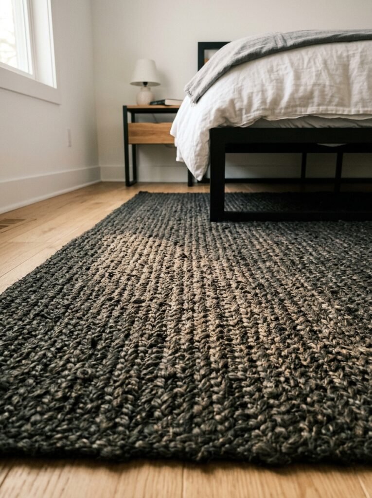
White walls and a light wood or beige carpet floor will make your dark bedroom accents float in a pleasant but vaguely unfinished way. The room needs grounding, and the floor is how you do it.
A large, dark-toned rug does most of the work here. Doesn’t have to be black — a deep charcoal, a faded burgundy, a dusty forest green, or even a rich kilim pattern with dark tones threading through it. The rug anchors the bed area, makes the whole bedroom feel like a room within a room, and it ties the moody palette to a horizontal plane so the whole design feels considered rather than floaty.
Size matters more than most people think. Go bigger than you think you need to. The rug should extend at least a foot or two out from either side of the bed — maybe more. A small rug that only sits under the foot of the bed looks like an afterthought, and this room doesn’t do afterthoughts.
—
12. What the Finished Room Actually Feels Like to Walk Into
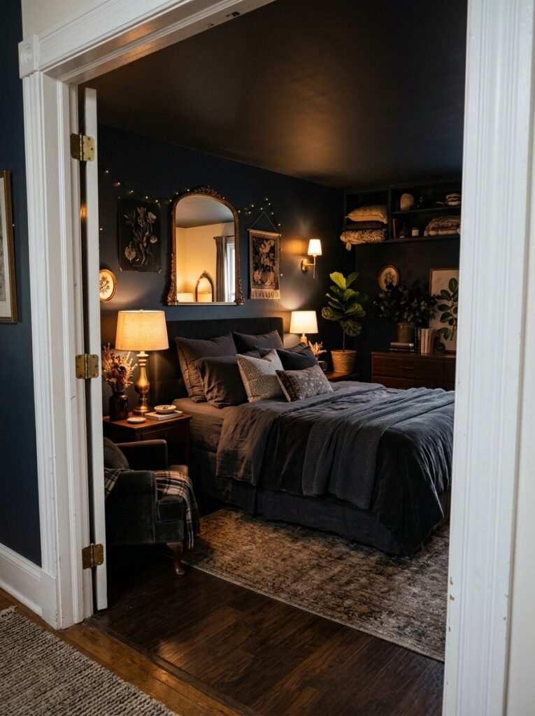
There’s a quality that the best dark feminine bedrooms have — on white walls or otherwise — that’s hard to name exactly. It’s not “cozy” quite, though it can be. It’s not “moody” exactly, though it leans that way.
I think it’s private. It feels private. Like the room has closed itself off from the ordinary world a little, and you’re being allowed in.
White walls somehow make this MORE achievable, not less — because the brightness keeps the room from feeling closed in or heavy. The dark accents give it weight, give it intention. And the contrast between them creates this charge in the air, this sense that the room was designed, not decorated.
Walk into it at 9pm with three candles lit and a lamp glowing warm in the corner. That’s the feeling. That’s what you’re building toward.
It’s worth every single decision that got you there.
—
❓ FAQ
Q: Can I do dark feminine decor if I rent and can’t paint my white walls? A: Absolutely, and honestly white rental walls might be the best starting point. Focus everything on dark textiles, moody lighting, and removable wall accents like hung fabric or peel-and-press panels. Your landlord doesn’t need to be involved in any of it.
Q: What’s the difference between dark feminine and gothic bedroom style? A: Gothic leans into drama — heavy drapery, cobwebby details, very dark everything. Dark feminine is quieter and more sensory. It’s still moody and intentional, but it’s built around comfort and texture rather than a specific aesthetic reference. Think of it as gothic’s more livable sister.
Q: My bedroom gets a lot of natural light — will dark accents still work? A: A bright, light-filled bedroom actually works brilliantly for this style. The natural light keeps things from feeling heavy, and those dark accents will look incredibly rich against white walls in strong daylight. If anything, it’s easier than a dim room. Lean into it.
—
💭 Final Thoughts
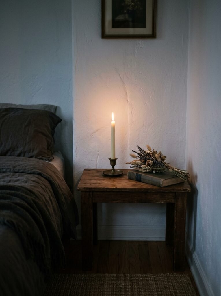
The bedroom you’re picturing — the one with a certain mood to it, a feeling you can’t quite describe but know immediately when you walk in — that room is built on contrast. On specificity. On a few right decisions made with intention rather than a hundred safe ones made by committee.
White walls give you more to work with than you think. They’re not the obstacle. They’re the starting point.
What’s the one thing in your bedroom right now that’s actually working — and have you figured out why?