The Dark, Moody Bedroom Colors That Actually Feel Luxurious (Not Depressing)
Someone told me dark bedrooms feel heavy. Oppressive, even. That you’d wake up feeling like you’re still asleep.
I’ve been sleeping in a deep plum bedroom for three years. I’ve never slept better.
—
1. Why the “Keep It Light” Bedroom Advice Is Outdated
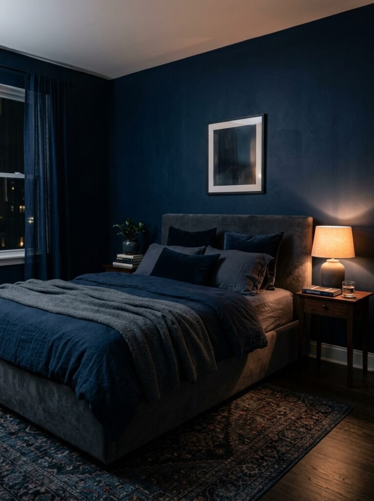
We were all told the same thing. White walls, light linens, mirrors to bounce light. And sure, that works. But it’s not the ONLY thing that works, and honestly, I think we’ve been a little brainwashed by staging advice designed to sell houses, not to actually live in them.
A dark bedroom doesn’t feel heavy if it’s done well. It feels like a cave — and I mean that as a compliment. Caves are quiet. They’re cocooning. Your nervous system actually calms down faster in a visually contained space, which is exactly why so many people who switch to dark bedroom palettes say they sleep better.
The shift happening right now in interior design is real. People want their bedrooms to feel like something. A sanctuary with intention, not just a room that happened to get a coat of white paint.
So. Let’s get into the actual colors.
—
2. The Dusty Plum Family and Why It Beats Plain Purple Every Time
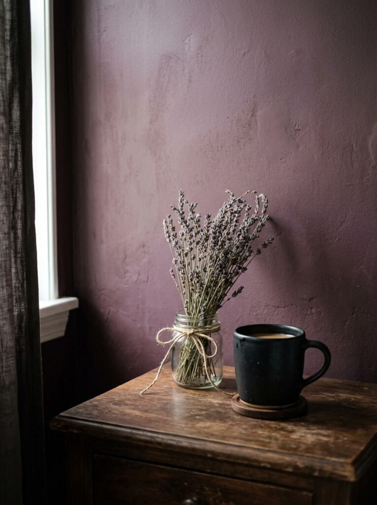
Plain purple is a kid’s bedroom. Dusty plum is something else entirely.
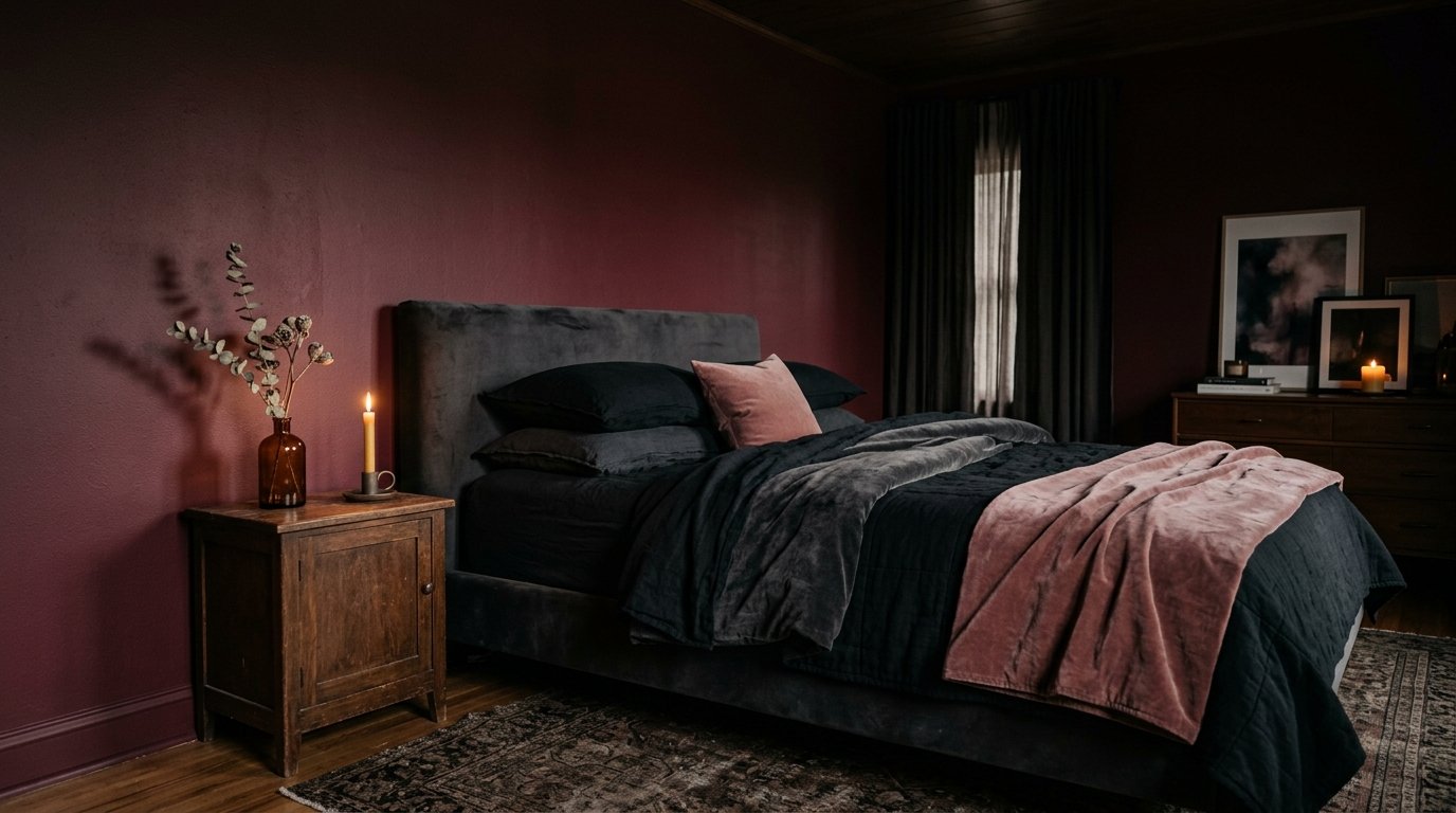
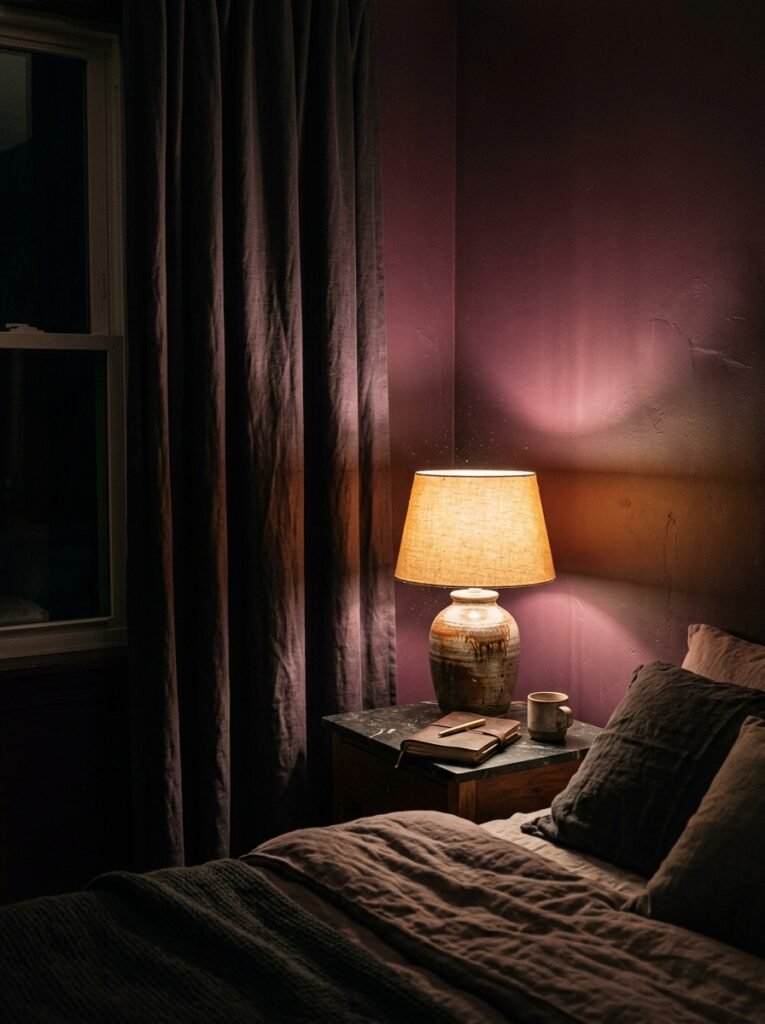
We’re talking about plum with grey in it, muted lavender-mauve hybrids, colors that can’t quite decide if they’re purple or brown and are stunning BECAUSE of that indecision. These tones photograph beautifully and live even better. In low evening light, a dusty plum wall looks almost velvet. In morning light, it shifts warmer and softer.
“The colors you want for a dark feminine bedroom aren’t saturated or loud — they’re the ones that look different depending on what time of day you walk in.”
What makes this palette specifically feminine without being precious? The restraint. Dusty plum paired with aged brass, heavy linen the color of old cream, a single dark wood nightstand — it doesn’t shout. It just holds the room in this incredibly still, low-lit way that makes you want to stay in it.
If you’re starting here, paint the wall behind your bed first. Just that one. Live with it for a week before committing to the whole room. You’ll know within two days whether it’s the right shade.
—
3. Forest Green, But Make It Feel Like Sleeping in a Moss-Covered Library
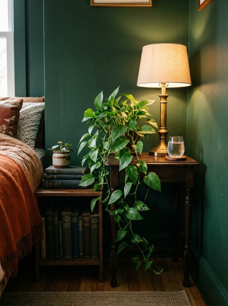
Forest green bedrooms have been everywhere, and I don’t care. They’re everywhere because they work.
But there’s a version of this that’s gone wrong in a lot of homes — the too-yellow, too-bright “sage but darker” situation that ends up looking like a nursery at night. The greens you want for a dark feminine palette are almost black-green, hunter, deep emerald with a cool undertone, or a rich botanical green that has enough brown in it to feel grounded rather than peppy.
The specific magic of dark green in a bedroom is that it’s inherently quiet. Something about our nervous systems reads green as natural, as safe. You add dark green walls, warm linen, something textural — a chunky knit throw, a woven wall piece — and the room starts to feel like the inside of a very beautiful thought.
Side note — I once saw a bedroom with two walls of deep hunter green and a ceiling painted to match, with bare wooden beams. I think about it at least twice a month.
Don’t be afraid of the ceiling. That’s the thing most people skip, and it’s the thing that takes a room from “nice” to “actually incredible.”
—
4. The Color That Keeps Showing Up in Every Gorgeous Dark Bedroom Right Now
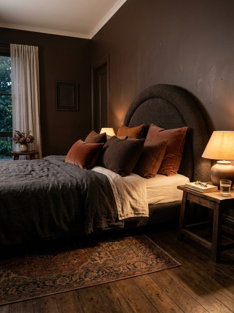
Midnight navy.
Not royal blue. Not navy-as-in-classic-nautical. Midnight navy, the kind that’s so dark it reads almost black until light hits it and suddenly you see the blue underneath. It’s moody without being gothic, dramatic without being theatrical.
This color does something interesting in a bedroom — it absorbs light instead of reflecting it, and the effect is strangely calming. Rooms feel more sealed-off, more private. Which, in a bedroom, is the whole point.
Pair it with warm metallics (not chrome — aged gold, burnished brass), ivory or ecru linens, and something soft and organic like a natural fiber rug. The contrast between the coldness of the midnight navy and the warmth of those naturals creates tension, and tension in a room is what makes a room interesting.
—
5. Charcoal and Warm Black: What Actually Separates Them and Why It Matters
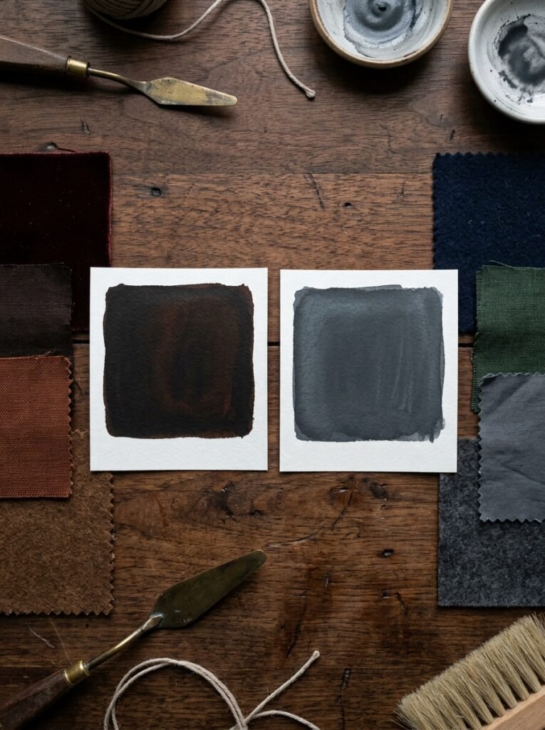
People say “I want a dark bedroom” and then paint it true black and hate it. Because true black can be flat, harsh, kind of bleak. You need to be very intentional with a true black room.
Charcoal, on the other hand, is almost always more liveable. It’s got enough warmth in it — or enough cool, depending on the specific shade — to feel like a color, not just an absence of color. In lamplight, charcoal walls go warm and almost bronze. In daylight, they’re serious and architectural.
“Charcoal does the one thing true black can’t — it shifts. And a room that shifts depending on the light is a room that never gets boring.”
Warm black is different again. Think of it as black with brown or red undertones — the kind of deep, rich shade you see on old furniture, antique ironwork. A warm black bedroom looks almost ancestral. In a good way. Heavy curtains, soft lighting, a velvet headboard in wine or deep teal against warm black walls, and suddenly your bedroom looks like it belongs in a country house that’s been in someone’s family for generations.
—
6. The Case for Berry Tones Nobody Talks About Enough
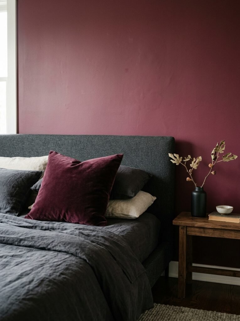
Cranberry. Deep rose that’s almost red. Blackberry. These are the underrated members of the dark feminine palette and they deserve more attention.
Here’s why they work: they’re warm in a way that plum and navy aren’t. A bedroom painted in deep cranberry doesn’t feel cold at night — it feels like being wrapped in something. The warmth is literal and psychological at the same time, kind of.
The risk is going too pink. Too bright, and you’ve got a Valentine’s Day disaster. You want berry tones that have been quieted by grey, brown, or even a little black. The colors that look almost edible. The ones that make you think of figs, or the inside of a pomegranate, or wine that’s been in the glass a while.
These tones pair oddly well with pale blush — not as a wall color, but in textiles. A blackberry-walled bedroom with blush linen and aged brass fixtures has this incredibly feminine layering that doesn’t read as overly romantic. It reads as deliberate.
—
7. One Rule That Makes Any Dark Bedroom Feel Intentional, Not Accidental
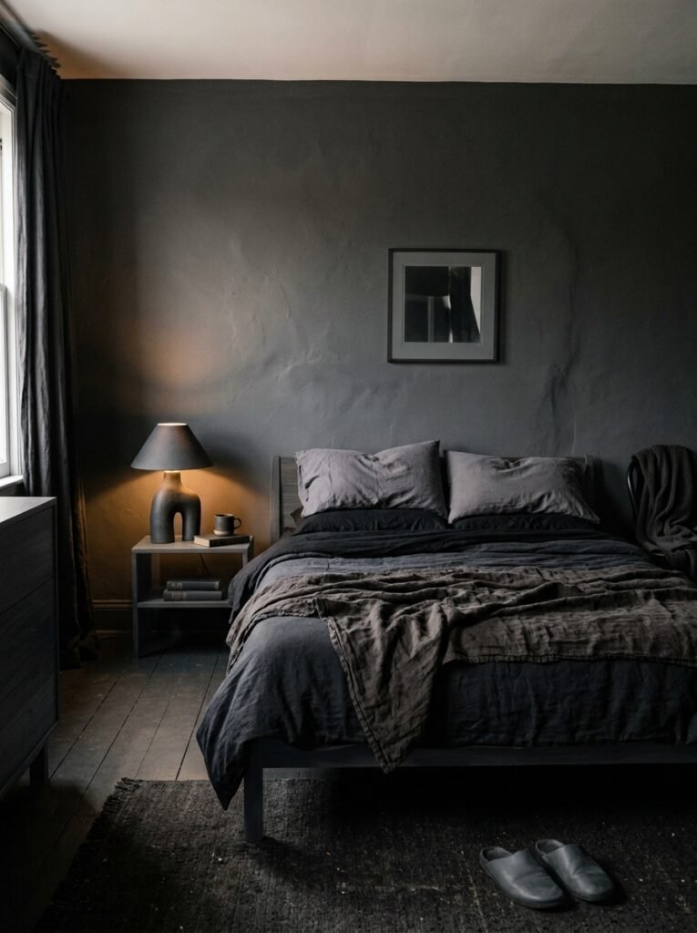
Keep your darks and lights in different textures.
This sounds simple, but it changes everything. The reason some dark bedrooms feel heavy and some feel luxurious comes down almost entirely to texture. If your dark wall is matte and your bedding is also matte and your curtains are also matte, the room just reads as flat. Flat dark is depressing. Layered dark is rich.
So: dark matte walls. Velvet cushions that catch light differently. A linen duvet with natural, visible weave. A silk or semi-sheen pillowcase that reflects lamplight back. A rough woven rug underfoot. Your eye moves around the room collecting different kinds of darkness, and it reads as intentional, curated, CHOSEN.
This is the actual secret, by the way. Not the colors themselves. The texture contrast between them.
—
8. How Low Light Makes or Breaks a Dark Feminine Palette
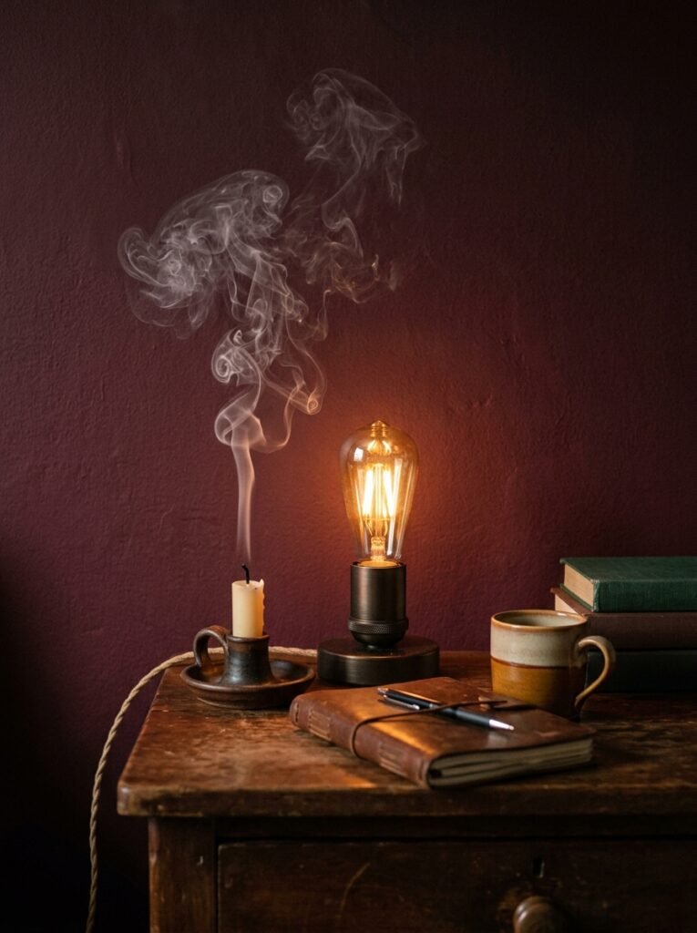
Let’s talk about lighting because it doesn’t get enough attention in these color conversations.
A dark bedroom lit with overhead lighting — especially a central ceiling fixture — is going to look terrible. I’ll just say it. Overhead lighting flattens everything, makes dark colors look muddy, and creates shadows where you don’t want them.
What you actually want:
- Bedside lamps with warm-toned bulbs (we’re talking amber, around 2700K or lower)
- A floor lamp in the corner that throws upward light
- If you can swing it, a wall sconce or two for that amber glow at 7pm that makes the whole room look like a painting
Candles also. Obviously. A dark bedroom with candlelight is almost unfair how beautiful it is.
The point is: the lighting plan is as much a part of the color palette as the actual wall color. Get the bulbs wrong and even the most perfect shade of midnight navy will look flat and grimy. Get them right and a simple charcoal wall looks architectural and intentional.
—
9. What to Do With a Small Dark Bedroom So It Doesn’t Feel Like a Cave (The Bad Kind)
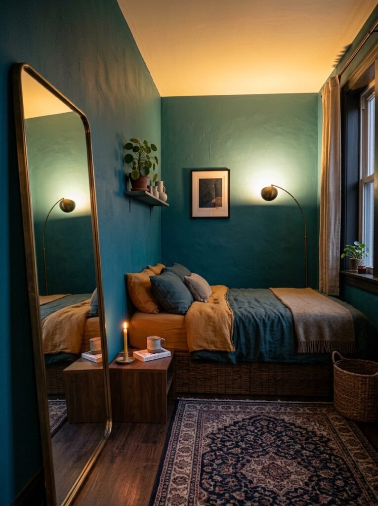
Okay so you want the dark palette but your bedroom is not exactly spacious. Here’s what I’ve figured out.
The issue isn’t usually the dark walls — it’s the ceiling. Paint a low ceiling in the same dark color as your walls and yes, the room will feel like a crawl space. But paint the ceiling one or two shades lighter than your walls, or in a warm white or cream, and suddenly the room has height. The eye reads the contrast and perceives more space.
Also: mirrors, but placed strategically, not randomly. One large mirror that reflects a lamp or a window will double the perceived depth of a room. Multiple small mirrors are just decorative. They don’t do the spatial work you need.
“The ceiling is the one surface people forget, and it’s the one that controls how the room feels more than anything else.”
Curtains should be hung high — close to the ceiling — and fall all the way to the floor. Every time. A curtain that stops at the window frame cuts the visual height of a room dramatically. Hang them high, let them puddle slightly, and a small room suddenly has drama instead of limitation.
—
10. Pairing Dark Walls With the Metals That Actually Work
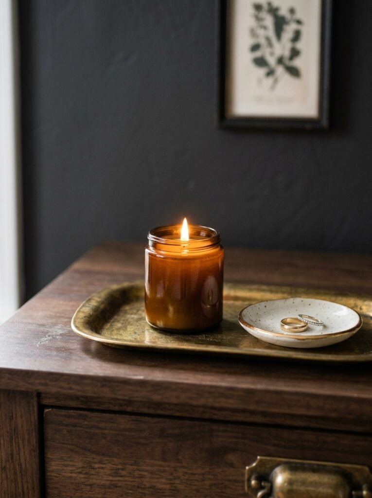
Not all metals play nicely with dark feminine palettes. Here’s the quick version.
Aged brass and burnished gold are almost universally flattering against dark walls. They add warmth, they catch lamplight in that soft, slightly uneven way that always looks expensive. Cold polished gold can feel cheap against dark backgrounds — it’s the aging that matters.
Chrome and brushed nickel? Hard no in most dark feminine spaces. Too cold, too clinical. They work in bathrooms, maybe in a very modern space, but in a bedroom with plum or navy walls they’ll look like an accident.
Antique bronze and aged iron are beautiful and underused. They’re darker than brass but still warm, and they have a weight to them that suits the mood of a dark bedroom. Think candlestick holders, curtain rods, picture frames, cabinet hardware if you have built-ins.
Warm rose gold can work in certain palettes — specifically the berry and plum tones. But it’s a narrow window and you don’t want too much of it.
—
11. The Textures You Need in Every Dark Feminine Bedroom
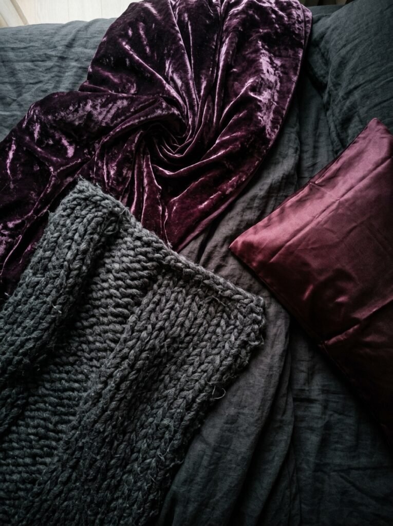
I sort of got into this earlier but it deserves its own space.
Velvet. If there’s a single textile that defines this aesthetic, it’s velvet. Not the shiny kind, the kind with a deep pile that changes color slightly when you move it. A velvet headboard in deep wine or forest green, velvet cushions in a contrasting tone. Even a small velvet ottoman at the foot of the bed completely changes the room’s personality.
Linen in unbleached tones — the natural, slightly wrinkled linen that looks casual but is actually the most deliberate choice you make. It softens dark walls in a way that crisp white bedding doesn’t. White bedding can look stark against very dark walls. Natural linen looks like it belongs.
Silk or silk-adjacent fabrics — not for the whole bed, but in touches. A silk pillowcase, a satin ribbon on a cushion. These catch light differently and that’s exactly the point.
Heavy curtains. Floor-to-ceiling, as mentioned. In velvet if you’re going full commitment. In linen if you want something more relaxed. Either way, they should feel substantial. Thin curtains in a dark room look wrong.
—
12. Starting Over Isn’t the Only Option — Small Changes That Actually Do Something
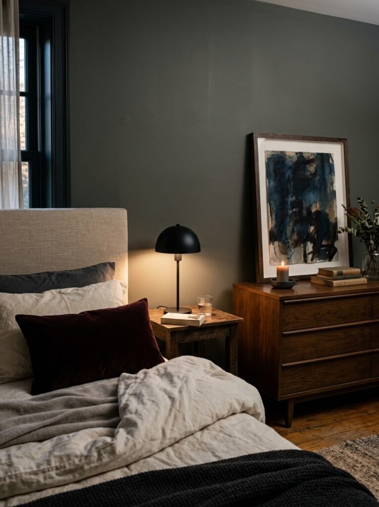
Maybe you’re not ready to repaint. Maybe you rent. Maybe you’re just not sure yet.
Honest truth — a dark feminine palette isn’t only available to people who own their homes and can repaint at will. You can do a surprising amount with what you’re allowed to change.
Start with the headboard or hang a large piece of dark-toned fabric or a tapestry behind your bed. It creates the visual anchor of a dark accent wall without touching the walls. Add dark velvet or linen cushions. Swap your lampshades for something warmer-toned, even dark, so the light that comes out is amber and moody rather than bright and cheerful. Change your bedside lamp to a warmer bulb.
Get a dark-toned vase, some dried botanicals, a few candles in vessels that feel intentional. These sound like tiny changes. They’re not tiny. Together they shift the energy of a room substantially, and they’ll tell you whether you want to commit to the full palette before you spend any real money.
Or maybe you realize the little version is enough. That’s fine too. Not every room needs to be a full transformation. Sometimes it just needs a vibe adjustment, and a berry velvet cushion and an amber bulb will get you most of the way there.
—
❓ FAQ
Q: Will a dark bedroom make my room look smaller? A: Not necessarily — and this is the biggest misconception people have. Dark colors can actually make the boundaries of a room feel less defined, which reads as expansive rather than cramped. The key is to paint the ceiling lighter than the walls and to use strong lamplight rather than overhead lighting. Scale and texture matter more than color when it comes to perceived size.
Q: What if I want the dark bedroom look but I can’t repaint because I’m renting? A: Work with what you can change — bedding, curtains, soft furnishings, and accessories. A large dark fabric panel hung behind the bed, dark velvet cushions, warm-toned lampshades, and dried botanical arrangements can shift a room dramatically without touching the walls. It’s more than you’d think.
Q: Do dark feminine palettes have to look gothic or overly romantic? A: Not at all. The difference is restraint. If you keep metals warm and aged, use natural textures like linen and woven materials, and avoid anything too ornate or theatrical, dark palettes read as sophisticated and calm rather than dramatic. Less is genuinely more here. One dark wall and intentional accessories can be more powerful than an all-black maximalist bedroom that tries too hard.
—
💭 Final Thoughts
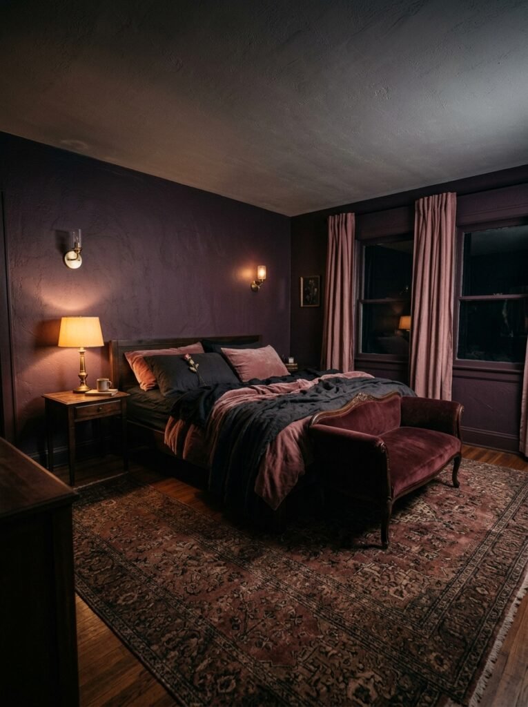
Dark bedrooms done well aren’t about drama for drama’s sake. They’re about creating a room that actually feels like yours — one with a little mystery in it, a room that holds the day off at the door.
The palette is just the beginning. The texture, the light, the things you put in the space — that’s where the real character lives. I think the best dark bedrooms always look like someone made a hundred quiet decisions rather than one loud one.
What would your version of this look like — which color is calling you first?