
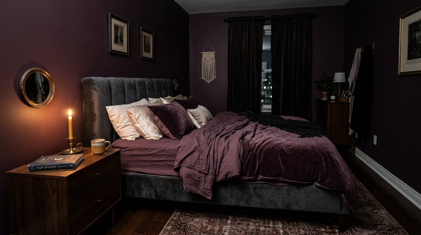
Dark Feminine Bedroom Ideas in Purple That Actually Feel Luxurious (Not Spooky)
Someone told me my bedroom looked like a “witch’s lair” and honestly? I took it as a compliment.
But I get it. Dark feminine design is one of those things that looks STUNNING on Pinterest and then somehow ends up feeling either too dramatic or — worse — kind of sad and cave-like in real life. Purple especially. It’s a color that promises so much and then absolutely humbles you if you get the balance wrong.
So here’s everything I’ve learned about making it work.
—
1. Why Purple Hits Different Than Any Other Dark Color for This Aesthetic
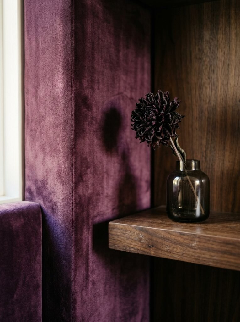
Most dark bedrooms lean on navy or forest green. Safe choices. Gorgeous, both of them. But purple does something that those colors genuinely can’t — it sits right at the edge of warm and cool at the same time, so it reads as both mysterious and intimate depending on the light. At noon with sunlight coming through sheer curtains, a deep plum wall looks almost jewel-like. At 10pm with a single lamp on, that same wall wraps around you like velvet.
That duality is why it’s the backbone of dark feminine design. It doesn’t just set a mood. It shifts the mood, which is what makes a bedroom feel alive rather than just decorated.
The key distinction to understand early: there’s a spectrum here. Lavender and dusty mauve are soft femme, dreamy and romantic. Then there’s the deeper end — aubergine, violet, blackened plum, wine-tipped purple. That deeper end is what we’re working with. Rich, intentional, and not trying to be anyone’s guest room.
—
2. The Wall Color Choice That Will Either Make or Break the Whole Room
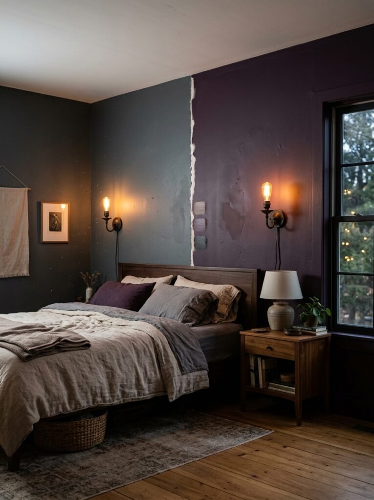
Here’s what nobody tells you. You don’t need all four walls purple.
Actually, I’d argue that for most bedrooms — especially rooms that aren’t enormous — going all-in on four walls in a dark plum can backfire fast. One deeply saturated feature wall behind the headboard, though? Stops you in your tracks.
“One wall done RIGHT will always out-perform four walls done just okay.”
Go for something in the eggplant-to-violet range rather than a red-leaning berry, which can start to feel a bit… teenager’s first flat. The deeper, cooler purples — think almost-twilight, a hint of grey in there — tend to photograph beautifully and age well. They’re the ones that look expensive at £12 a tin, and that feel like a deliberate decision rather than a phase.
If you’re renting or just commitment-shy, a purple limewash or textured finish on one wall creates depth without permanence. The imperfect, organic quality of it softens the drama slightly, which is usually a good thing.
—
3. Bedding That Doesn’t Compete (And the One Mistake Everyone Makes)
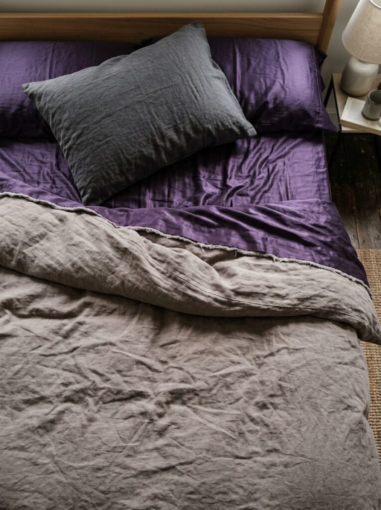
Right. Bedding. This is where most dark feminine bedrooms fall apart.
People go dark purple walls and then pile on more dark purple bedding and suddenly the bed disappears into the wall and the whole thing looks like a hotel room for vampires. Slightly on the nose. Not the vibe.
The contrast is everything. You’ve got a few strong routes here. First option: deep ivory or off-white linen — not bright white, which reads clinical, but that warm, slightly aged white that looks like it’s been slept in for centuries in the best possible way. It sits against the purple wall like a painting.
Second option: go tonal but go LIGHTER. A dusty lilac or a soft grey-violet against a deep plum wall creates this layered, almost foggy effect. Moody in a different way.
Third option, and honestly my personal favourite: chocolate brown. Dark, warm, unexpected. Brown and purple together shouldn’t work and they absolutely do. Something about it feels old-money and quietly confident.
Avoid: matching the exact wall colour in your bedding. It’ll flatten the whole space.
—
4. The Lighting Rule That Every Dark Room Absolutely Needs
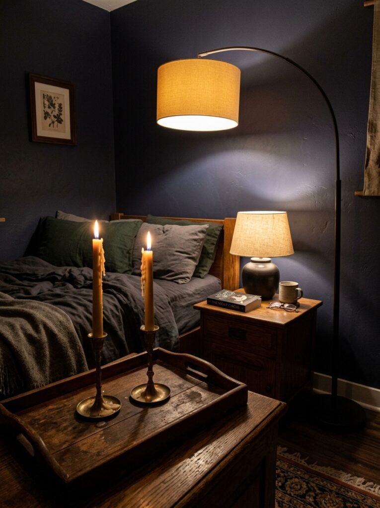
Don’t do overhead lighting. Just don’t.
A central ceiling light in a dark purple bedroom is the fastest way to make it look like an interrogation room. You need LAYERS. Multiple lower sources, all warm-toned, all on the dimmer side.
Think a pair of wall sconces either side of the bed, the glow sitting just at shoulder height. A table lamp on a bedside table with a linen shade that diffuses the bulb rather than broadcasting it. Maybe a floor lamp in the corner if the room’s big enough — one of those arched ones that throws light upward and lets it fall back down. Candles if you’re actually disciplined about it (I’m not, but I admire the people who are).
The amber glow of an Edison bulb at 7pm against a plum wall is one of those combinations that makes your bedroom feel like a bar you actually want to stay in all night. That sounds odd. You’ll understand when you see it.
One thing that genuinely surprised me: a small lamp with a deep jewel-toned shade — amber, ruby, even emerald — casts coloured light onto the wall and adds this incredible richness without any extra furniture. It’s basically free atmosphere.
—
5. Textures That Make a Purple Room Feel Expensive Instead of Heavy
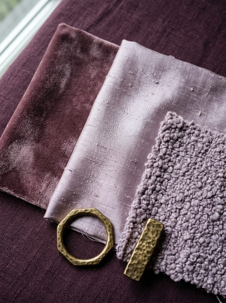
Dark rooms need texture the way bread needs butter. Without it, all that colour just sits flat.
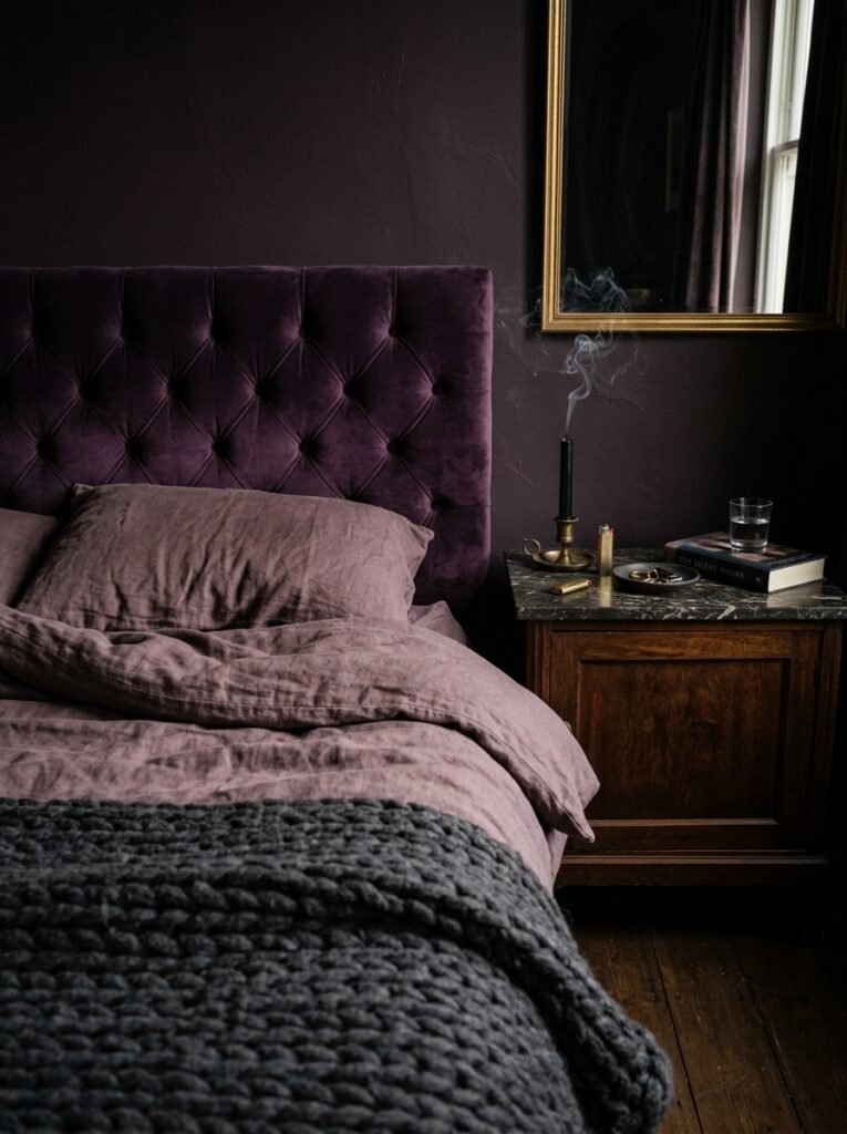
Velvet is the obvious one and I won’t apologize for recommending it, because it’s obvious for a reason. A velvet headboard in deep plum or midnight purple does something genuinely special — it absorbs light differently at every angle and adds this quiet sense of weight and importance to the bed. It’s the piece the whole room organizes itself around.
But you can’t stop there. Layer in something rough: a chunky knit throw, a woven jute rug, raw linen cushions that haven’t been ironed within an inch of their life. The contrast between the velvet’s smoothness and something more textured keeps the eye moving.
“Velvet absorbs light. Linen reflects it. A room with both never looks boring.”
Satin pillow covers add a subtle sheen that catches the lamp light. A faux fur draped at the foot of the bed brings in that softness that reads as feminine without being frilly. And a gathered silk curtain — or even a good faux silk — puddles slightly on the floor and adds movement. Movement matters. Static rooms feel staged.
—
6. Furniture Tones That Work Beautifully With Deep Purple Walls
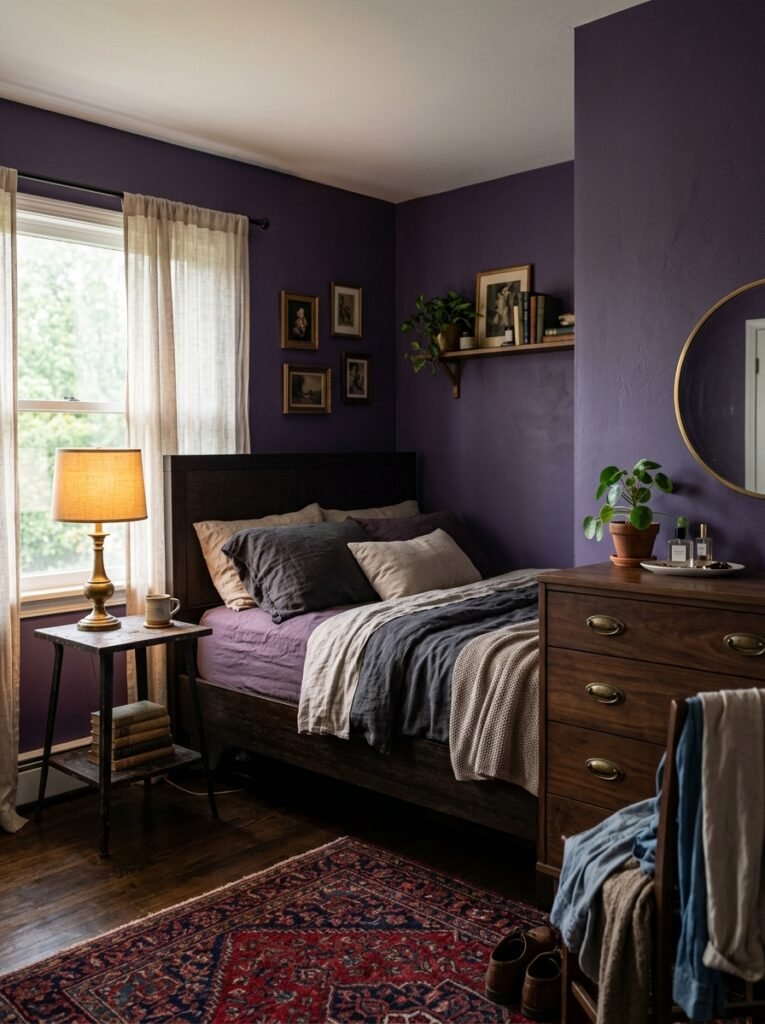
The furniture is where you anchor the whole thing or accidentally derail it.
Dark walnut or mahogany finishes are MADE for this. The warmth of the wood against a cool plum wall creates the kind of tension that interior designers actually mean when they talk about “balance.” Not everything should fight the wall. Not everything should match it. The furniture should feel like its own presence in the room.
Brass hardware is non-negotiable, in my opinion. Little drawer pulls, the frame of a mirror, a small bedside lamp base — brass reads as both warm and old-world in a way that suits this aesthetic completely. Gold is too shiny and bright. Brass is quiet about it.
Black furniture works too, especially matte black. It grounds the room and stops the purple from floating away into dreaminess. A matte black bedside table with a little stack of books and a brass lamp sitting on it is genuinely one of the most satisfying combinations in this aesthetic.
What doesn’t work: very pale blonde wood. Washed-out light oak furniture tends to read as Scandinavian minimalism and it’ll clash with the richness of everything else. Not because it’s bad — it’s lovely elsewhere — but it belongs in a different story.
—
7. The Mirror Placement Trick That Feels Like a Design Degree
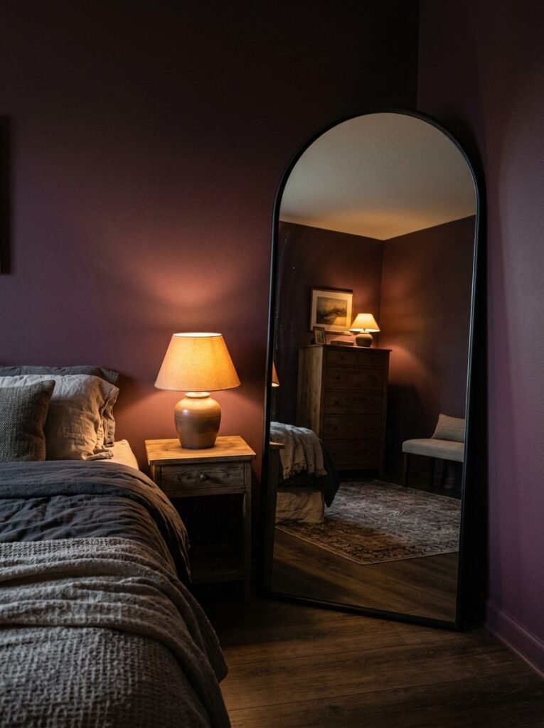
Mirrors in dark rooms. This is underrated.
Most people slap a mirror above a dresser and call it done. And fine, that works. But in a dark feminine bedroom, the mirror is actually one of your most powerful tools for managing light and depth — and placement is where you get to be clever.
A large, full-length mirror opposite a window? It doubles whatever natural light comes in and adds the impression of another room beyond the wall. In a purple room this is particularly dramatic, because the reflection picks up all that colour and bounces it around in a way that makes the room feel genuinely larger and more luminous at the same time.
An arched mirror with a dark frame leaning against the feature wall rather than hanging on it gives you that casually-curated-apartment feeling. It says “I didn’t overthink this” in a way that requires significant overthinking.
Side note — small, aged brass-framed mirrors clustered in a group on a lighter wall can work beautifully too. Not matching, slightly different shapes. It looks collected rather than bought.
—
8. The Canopy Trick That Makes Any Bed Look Like a Main Character
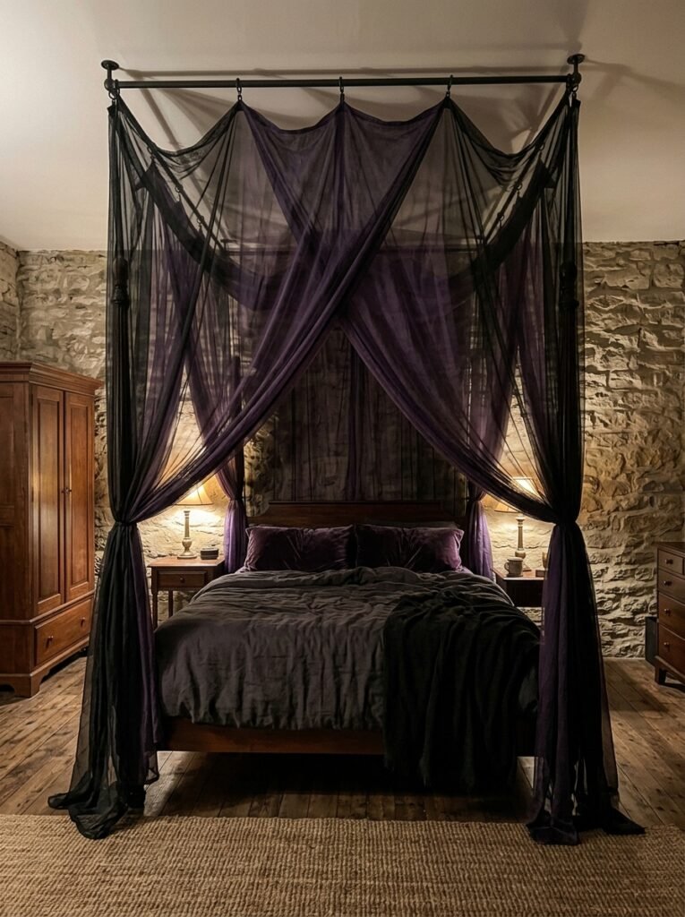
A canopy or draping above the bed is one of those additions that feels extremely extra and absolutely delivers.
You don’t need a four-poster frame for this. A simple ceiling hook above the center of the bed, with a length of sheer fabric — deep violet, dusty mauve, even a soft blackened gauze — draped out and down either side creates this cocoon effect. The bed becomes an event.
It also adds vertical interest to the room, which is something dark horizontal colours can sometimes suppress. Your eye travels up, the ceiling feels taller, and the whole space suddenly feels more dramatic in the right way.
For UK terraced houses or flats with lower ceilings, keep the draping closer to the wall and let it fall in soft gathers rather than a wide tent shape. Same effect, scaled for reality. It still works.
—
9. Plants and Organic Elements That Don’t Look Out of Place
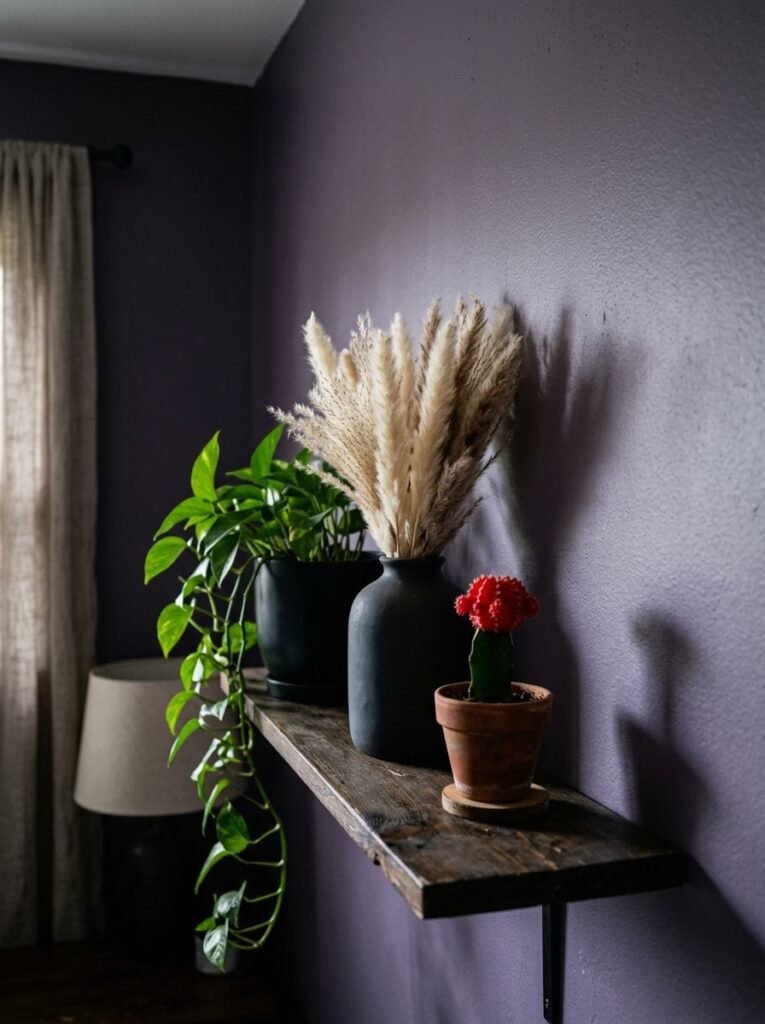
Hear me out on plants.
I know “plants in a dark bedroom” sounds counterintuitive. And yes, your full-sun loving herbs have no business in here. But there are plants that actually SUIT a moody purple room — not despite the darkness, but because of it.
A large, architectural plant with dark foliage works especially well. Deep green or near-black leaves against a plum wall have this quiet, jewel-box quality. Trailing plants with long tendrils that drape off a shelf or bedside table add organic movement. Dried botanicals — black-dyed or deep wine eucalyptus, dark pampas, preserved magnolia leaves — are low-maintenance and look genuinely beautiful.
Dried flowers are, not gonna lie, having a serious moment right now and they suit this aesthetic perfectly. A small vase of dried lavender and dark anemones on a bedside table? Effortlessly moody. Absolutely no watering required.
—
10. Art and Wall Decor That Feels Curated, Not Cluttered
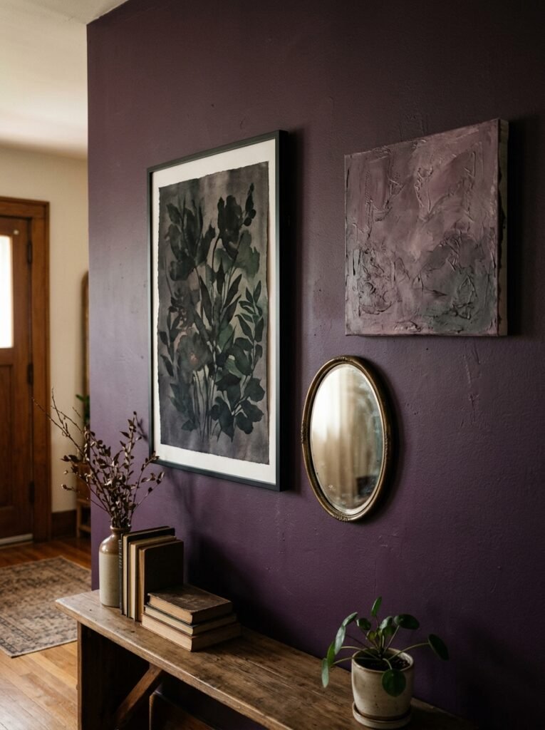
The art you choose says a LOT in a dark room.
Heavy, ornate gold frames with classical or botanical prints are one direction — old-world, grand, slightly gothic in a good way. Think pressed botanical illustrations, vintage celestial charts, or dark oil-painting-style prints. You can find inexpensive prints and put them in vintage-looking frames and the result looks far more expensive than it is.
Line art in white or cream on a dark background is the other direction — more minimal, modern-dark rather than gothic-dark. A single large piece with a simple floral or figure drawing can anchor a wall without competing with the purple.
“The art that works best in a dark room doesn’t fill silence — it deepens it.”
What to avoid: anything too bright and poppy, anything primary-coloured, gallery walls that are too dense. In a dark room, white space — or in this case, purple space — is part of the composition. Let the walls breathe between pieces.
—
11. Small Details That Pull the Whole Room Together Without Overdoing It
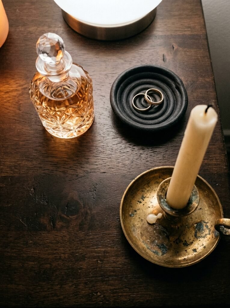
The small stuff is where personality lives.
A tray on the bedside table holding a small candle, a crystal or dark stone, a single dried flower in a bud vase. Not decorating exactly — more like a tiny tableau. It looks intentional without being try-hard.
Dark, moody books with interesting spines stacked rather than filed upright. A small dish for jewellery in a deep purple or amber glass. The little rituals of a room that look as good as they function.
One thing I’d add: scent. A candle or reed diffuser with something unexpected — black fig, oud, dark rose, tobacco flower — adds a sensory layer that makes the room feel truly immersive. You walk in and the smell matches the visual. The whole space clicks into place. It’s a small thing and somehow it makes everything else land harder.
Get ONE beautiful, interesting piece that genuinely surprises you. A vintage brass candlestick. An ornate hand mirror you found at a car boot sale. Something with a story or an edge to it. Rooms with a single unexpected thing feel designed. Rooms without one feel decorated.
—
12. The Ceiling Question Nobody Thinks to Ask Until It’s Too Late
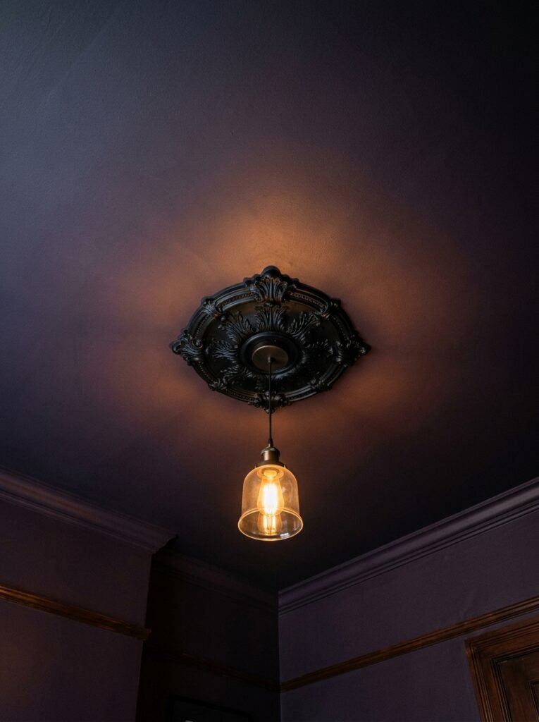
Ceilings. We ignore them constantly. And in a dark feminine bedroom, that’s a missed opportunity.
Most people paint the ceiling white and call it neutral. Fine. But if you’re already committing to a plum feature wall and a room full of dark, rich elements, consider carrying the purple ceiling — slightly lighter than the walls, or the exact same shade for a full immersive effect.
A darker ceiling is one of those moves that sounds reckless and then looks incredible. It lowers the visual height of the room in a way that feels cozy rather than cramped, like being inside something rather than just having walls around you. In a bedroom, that cocoon feeling is the POINT.
Even if you don’t go full colour, a ceiling in a warm deep grey — that lavender-grey that sits between purple and charcoal — ties the whole thing together and keeps your white ceiling from feeling disconnected from everything below it.
Painting the ceiling same as the walls, trim in a deep satin black, all with warm brass accents — this is the formula that looks like a boutique hotel and costs you a weekend and a few tins of paint.
—
❓ FAQ
Q: Will a dark purple bedroom make my room feel smaller? A: It can, if the lighting isn’t right — but it doesn’t have to. The key is layered warm lighting at multiple levels, at least one large mirror, and keeping some lighter elements in the bedding and soft furnishings. Dark rooms feel cozy, not small, when the light is working with the colour instead of against it.
Q: What shade of purple actually works best for dark feminine bedrooms? A: Deep, slightly cool purples — aubergine, blackened violet, deep plum with grey undertones — tend to work best. Avoid purple with a strong red or pink base unless you want something that reads more dramatic and maximalist. The cooler, darker shades photograph beautifully and feel genuinely luxurious rather than loud.
Q: Can this work in a small bedroom or a rental? A: Absolutely. You don’t need to paint at all — a dark purple tapestry or fabric panel behind the bed creates a similar feature wall effect without touching the walls. A dark bedding palette, layered velvet and linen textures, warm lighting and some of the smaller details covered here can build the entire aesthetic even in a box room with magnolia walls.
—
💭 Final Thoughts
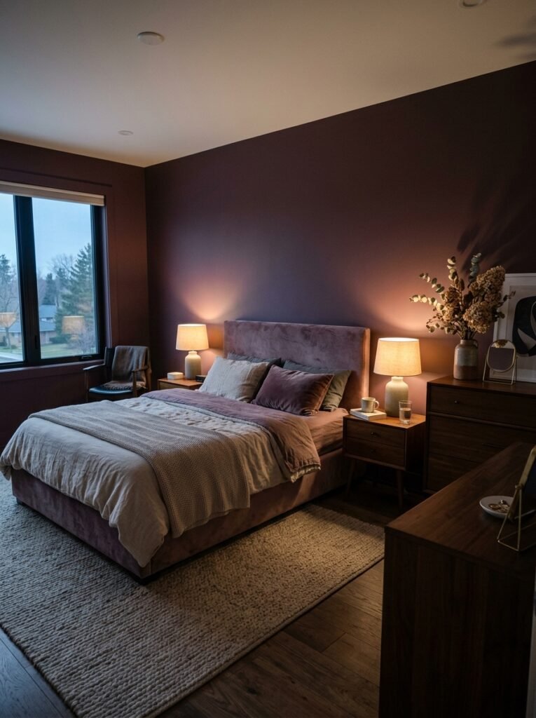
There’s something about a dark bedroom done well that feels like the room was designed specifically for the person sleeping in it. Not for guests. Not for a listing photo. For you, at the end of a long day, when you want the world to go quiet.
Purple — the right purple, at the right depth, with the right things around it — does that better than almost any other colour I’ve worked with. It’s private. It’s serious about itself. It doesn’t apologize.
The question I’d leave you with: what would your bedroom look like if you stopped decorating for anyone else’s approval?