
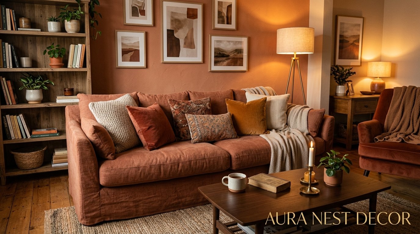
The Warm Living Room You’ve Been Pinning But Haven’t Built Yet — Here’s Why That Changes Today
There’s a version of your living room that already exists in your head. You’ve pinned it. You’ve bookmarked it. You’ve whispered “someday” at it a hundred times while scrolling at midnight. And the thing is — it’s not as far away as you think.
Warm colors aren’t a trend. They’re a feeling. And they’re easier to pull off than anyone told you.
—
1. The Specific Shade of Terracotta That Actually Works (and Why Most People Get It Wrong)
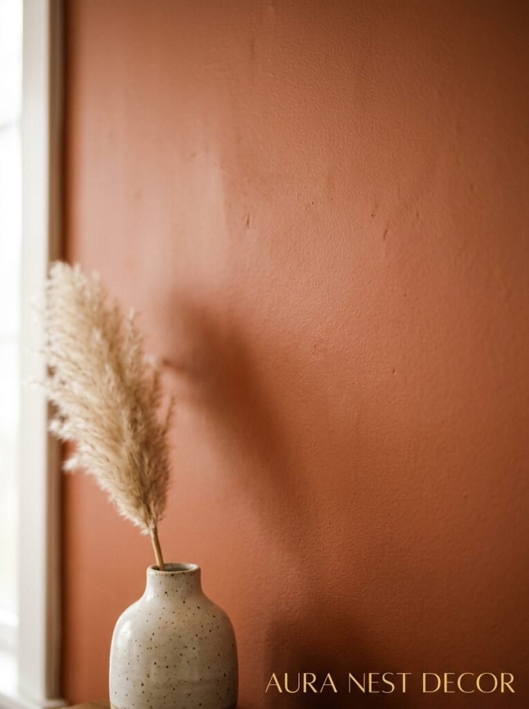
Not all terracotta is created equal. I know that sounds obvious but trust me, most people walk into a paint shop, grab something labeled “terracotta” and end up with a wall that looks like the inside of a McDonald’s. The stuff that photographs beautifully and actually feels warm in real life — in both daylight AND lamplight, which matters enormously — tends to lean slightly brown rather than orange. Think dusty, sun-aged, almost Mediterranean. Not traffic cone.
Benjamin Moore’s “Pueblo” is a good reference point. So is Farrow & Ball’s “Red Earth,” which reads more burnt sienna than red in practice. The rule nobody tells you: always test your paint at 5pm when natural light is leaving the room. That’s when terracotta either glows or screams. If it glows at 5pm, it’s the one.
And here’s what really separates a beautiful terracotta room from a bad one — the undertone. A terracotta with pink undertones will fight against warm wood floors. One with brown undertones will sink into them, in the best possible way. Look at the bottom of the paint chip, not the top.
“Test your terracotta at 5pm when the light is leaving. That’s when you’ll know.”
—
2. Why Amber Lighting Is Doing More Work Than Your Furniture
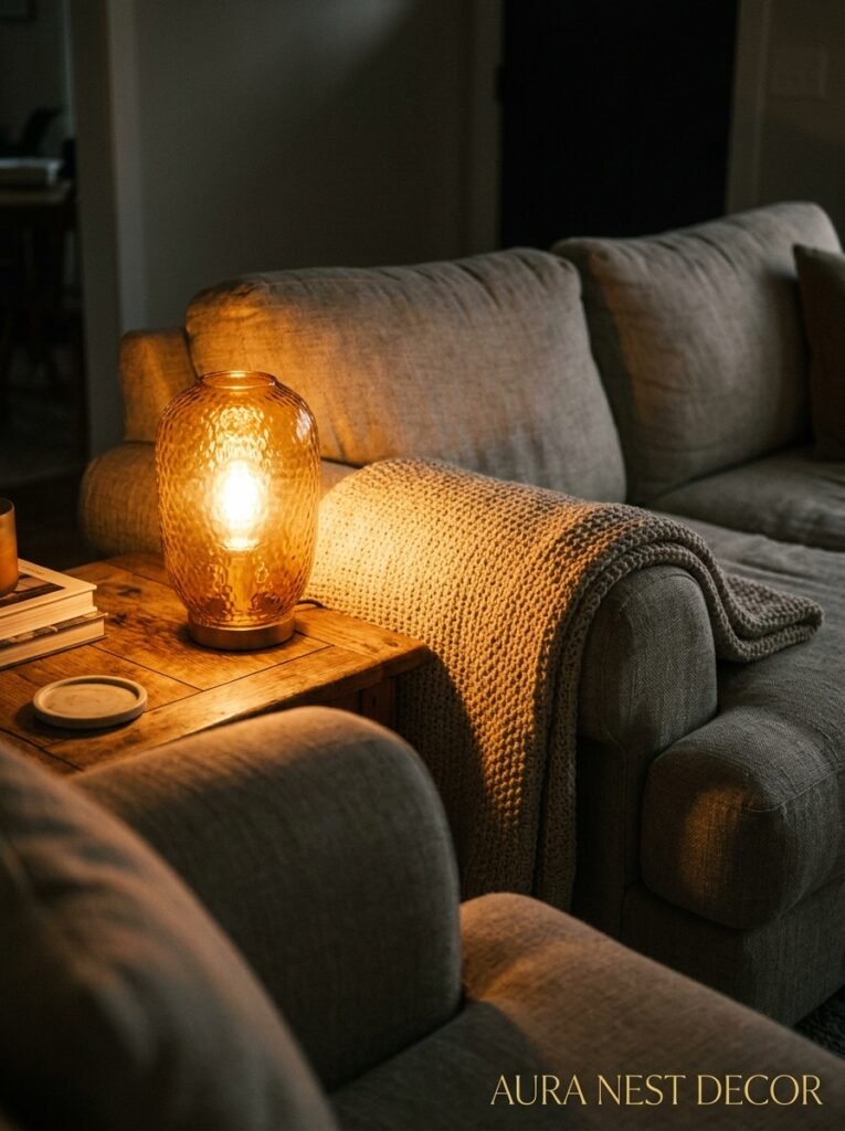
Okay so here’s the thing about warm color schemes that nobody leads with: the lighting is doing AT LEAST half the work. Maybe more.
You could have the most beautiful rust-colored sofa and sage linen curtains and the whole thing will feel cold and flat under bright white overhead lighting. I’ve seen it happen. It’s heartbreaking, honestly. But put an Edison bulb at 7pm in a terracotta corner and suddenly even a beige room feels like it has a soul.
For a warm living room, you want bulbs between 2700K and 3000K. That’s the warm white to soft warm range — the amber, golden kind. Anything above 3000K starts to cool off. Anything labeled “daylight” is actively working against you and should be removed immediately. No negotiation on that one.
Layer your light sources too. Table lamps at seated eye level. A floor lamp in a dead corner. Candles if you’re not a fire hazard (and even then, wax warmers do a similar job). Overhead lighting should be dimmable, and honestly it should mostly be dimmed. The ceiling is not where the magic happens in a cozy room. The magic happens at 3 to 4 feet off the ground, right where your eyes naturally land when you’re sitting.
Side note — warm lighting also makes warm paint colors look richer. It’s not just mood. The pigments actually respond to it differently. So if you’ve tested a paint color under a cold overhead bulb and thought “hmm, not sure,” try it again with a lamp nearby. Sometimes it changes everything.
—
3. The Sofa Color Nobody Thinks to Try (But Always Falls In Love With)
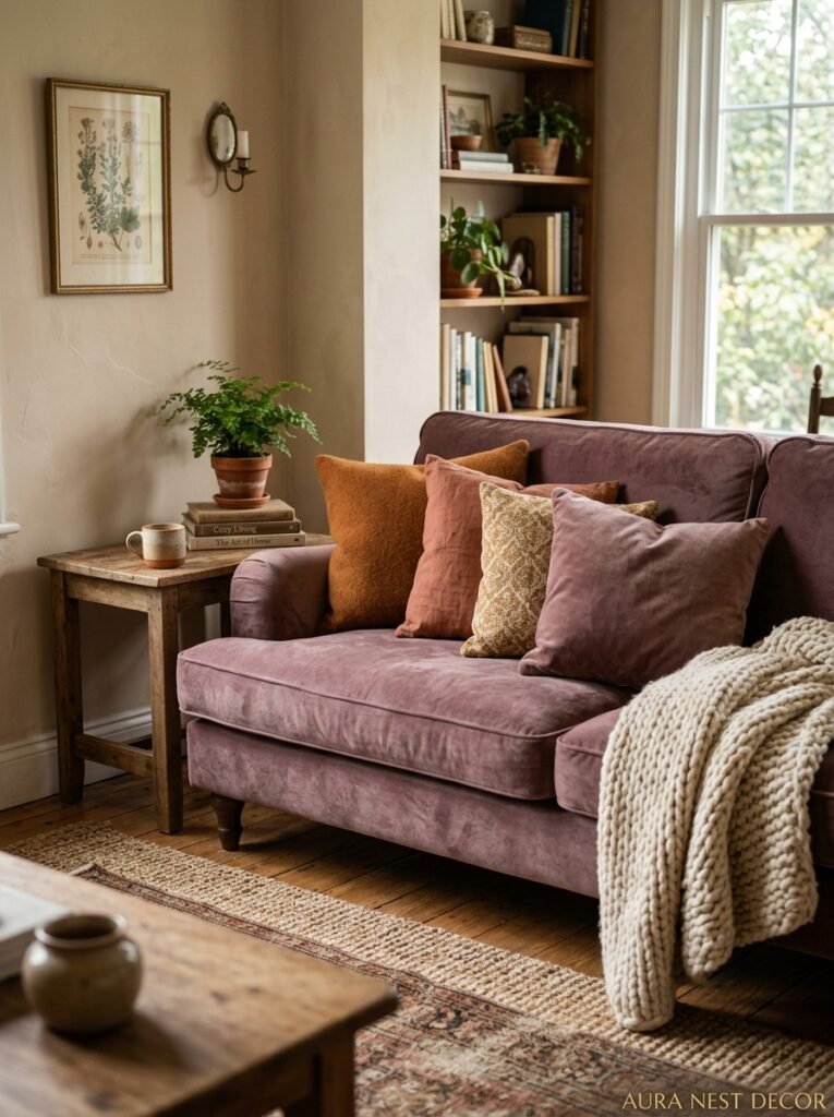
Rust. Deep, slightly muted rust. Not orange, not red, just that specific mid-point where both colors gave up trying and created something better.
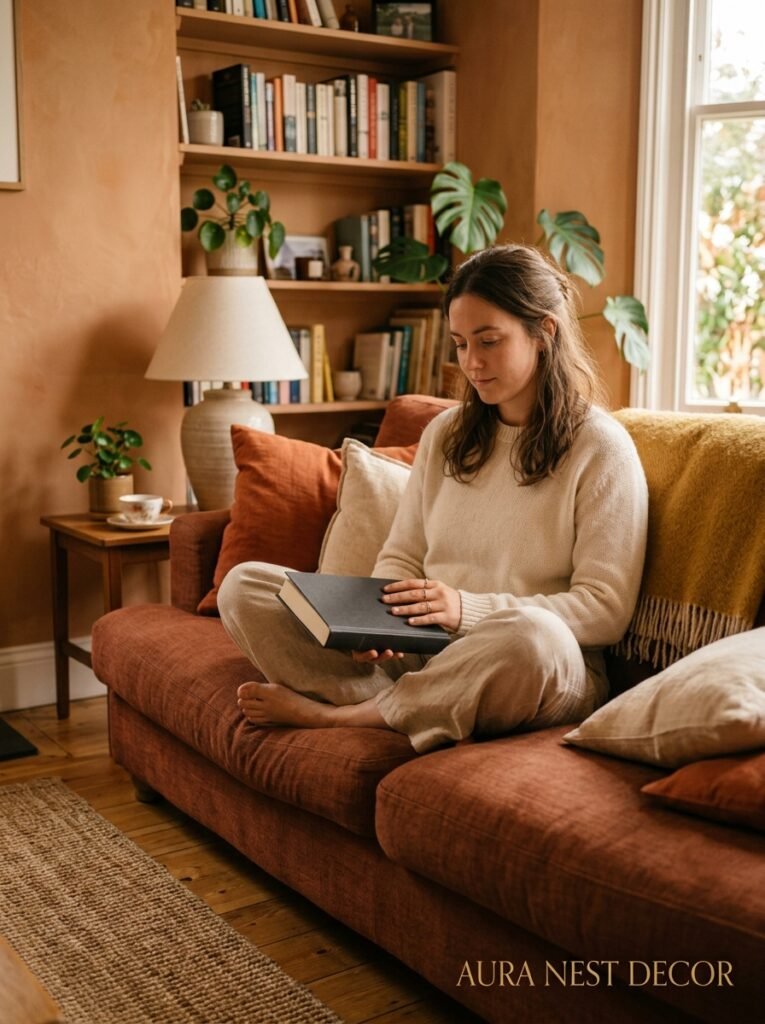
Most people default to grey, cream, or navy for a statement sofa. Which, fine. But if you’re building a warm living room, a rust or cognac sofa is basically doing the heavy lifting for you. Everything else — warm wood, brass hardware, cream walls, even plants — looks intentional the second a rust sofa enters the room.
In velvet, it’s obviously stunning. But a rust-toned linen sofa is actually easier to live with, easier to style around, and doesn’t show every cat hair in the same devastating way velvet does. Just saying.
The UK has some gorgeous options right now — MADE, Arlo & Jacob, and even some pieces from Dunelm that genuinely punch above their price. In the US, Anthropologie and Wayfair (specifically the higher-end brands on Wayfair, not the random ones) have rust upholstery options that photograph incredibly well.
What to pair it with? Warm cream or off-white walls. Wooden coffee table with visible grain. A chunky cream knit throw. You don’t need much else. The sofa is doing the talking.
—
4. The Rug Rule That Makes the Whole Room Land Differently
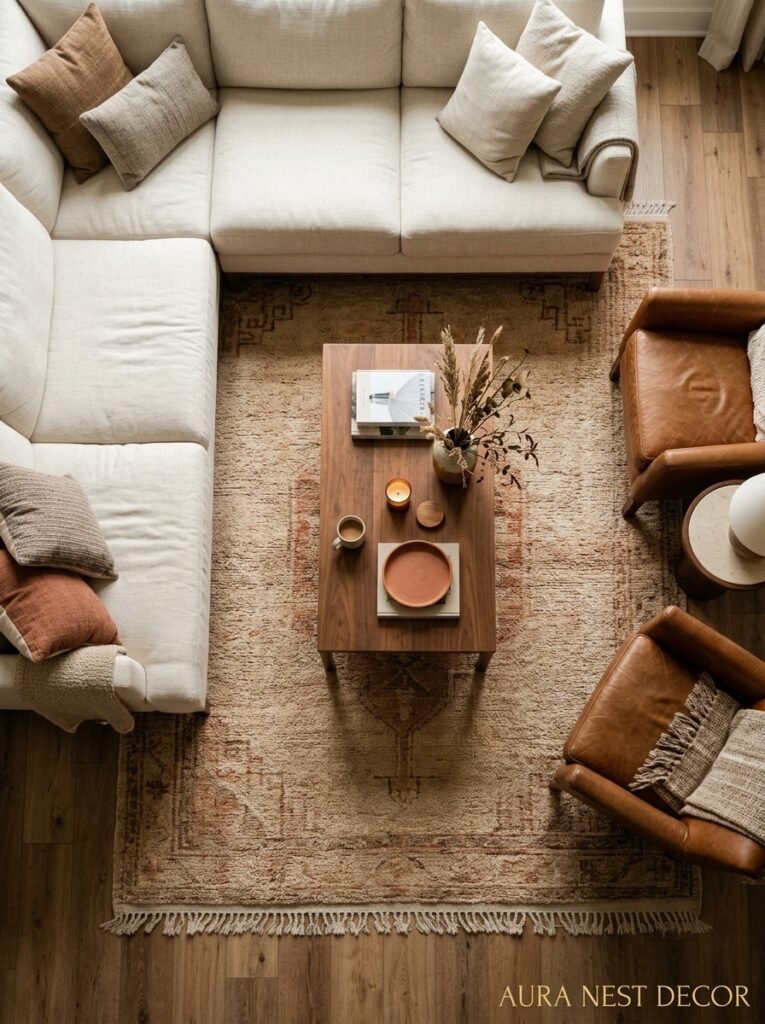
Here it is. Ready?
Go one size larger than you think you need.
That’s it. That’s the rule. And yet I still see pictures — beautiful rooms, otherwise great rooms — where the rug is just floating in the middle of the space like a postage stamp someone dropped. It doesn’t anchor anything. The furniture looks awkward. The whole composition falls apart.
In a warm living room especially, the rug is the floor-level warmth. It’s what ties the amber tones together from the ground up. And when it’s too small, there’s this gap between the edge of the rug and the furniture legs that just kills the coziness. It looks provisional. Like the room isn’t finished.
“If the rug looks like it might be too big, that means it’s probably the right size.”
For color, you don’t need to match. You need to harmonize. A warm-toned jute or sisal rug works in almost any warm living room because it adds texture without competing for attention. But a faded kilim in ochre and burgundy? Or a Moroccan-style wool rug in cream and terracotta? Either of those will make the room feel like it has a history, even if you bought it six months ago.
—
5. What “Warm Neutrals” Actually Means and Why Half the Internet Gets It Wrong
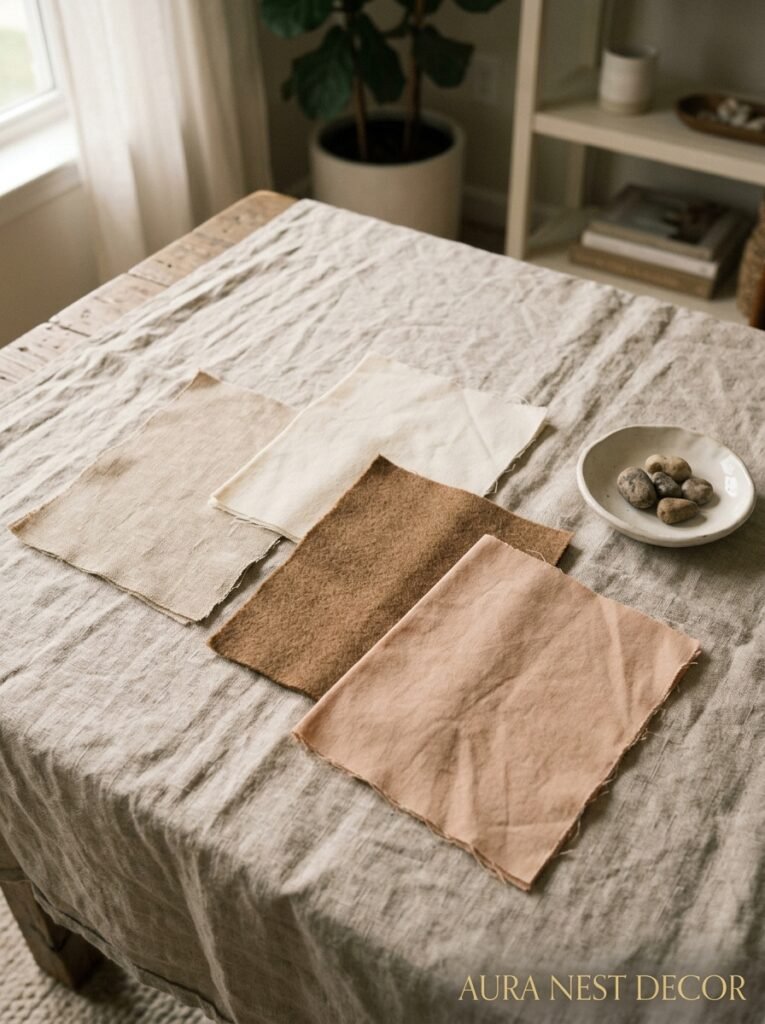
Beige isn’t a warm neutral. Or — it CAN be, but it isn’t automatically. Same with white. Same with cream.
Warm neutrals are neutrals with a yellow, orange, or red undertone baked in. They pull toward warmth rather than away from it. The ones you want: greige (grey-beige) with a brown lean, warm white like “Bone” or “Linen,” oatmeal linen textures, biscuit, mushroom, camel.
The ones that sneak in and cool everything down: stark white, cool grey, anything with a purple or blue undertone, and — I cannot stress this enough — “greige” paints with a cool lean that look one thing in the can and something else entirely on your walls in January.
The easiest way to test whether something’s a warm neutral: hold it next to a piece of actual warm wood. If it looks harmonious, warm neutral. If it looks weird or slightly grey or vaguely off, cool neutral. Your eyes will tell you immediately.
Warm neutrals work as a base coat — they’re the background that makes your rust sofa and your amber lamp and your terracotta cushion all look collected rather than chaotic. Don’t underestimate what a good off-white wall does for a room trying to be cozy.
—
6. Brass, Copper, or Gold — and Why You Shouldn’t Mix Them Randomly
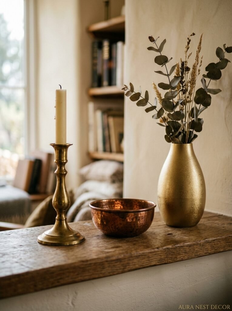
This is the one where people go rogue and then wonder why their room looks a bit… much.
Warm metal accents are ESSENTIAL in a warm living room. Brass lamp bases. Copper candle holders. A gold-framed mirror. These catch light, they add depth, they work with warm paint tones in a way that chrome or silver never quite does. But you have to pick a direction and mostly stick to it.
Brass and copper can coexist, but they need an anchor. Usually that anchor is wood — something deeply warm-toned like walnut or oak acts as a neutral between the two metals and stops them from fighting each other. If you’re mixing, keep one metal dominant and one in small accent doses. One copper bowl on the coffee table next to mostly brass lamps? Lovely. Equal quantities of both fighting across every surface? Not so lovely.
Gold is tricky because it reads differently in different lights. What looks warm and antique in daylight can look cheap and glittery under overhead light. Which is another reason overhead lighting should be minimal, but also — when you’re shopping for gold-toned accents, check them under multiple light sources before you commit.
The simpler approach: pick brass. It’s the most forgiving, the most versatile, and it’s having such a moment right now that there’s loads of affordable brass-toned hardware and accessories in both the US and UK markets. You don’t have to spend a fortune.
—
7. The Specific Plant That Makes a Warm Room Feel Alive (Not Just Decorated)
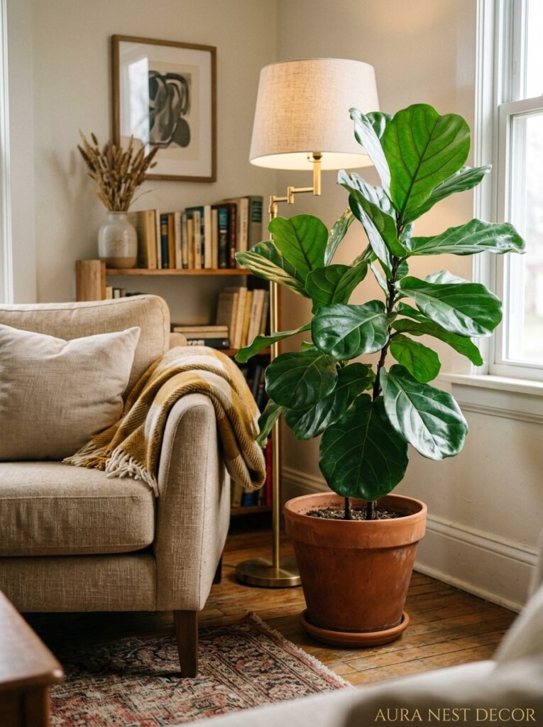
Not all plants read the same way in a warm-toned room. A big architectural cactus, for example — beautiful in the right context, but it can feel slightly stark and cool against terracotta walls. You want something lush. Soft. A little bit wild at the edges.
Pothos is the obvious one and the obvious answer is obvious for a reason. It trails, it grows fast, it’s forgiving when you forget to water it for two weeks (which I definitely don’t do, obviously), and it adds that organic softness that warm rooms need to feel alive rather than just styled.
“A warm room without plants is a warm room that’s trying too hard.”
But the really beautiful choice? A large fiddle-leaf fig in a warm terracotta pot. Or a monstera that’s been allowed to actually get big — like, really big, taking-over-the-corner big. The deep green of those leaves against warm walls and warm-toned furniture creates this incredible contrast that doesn’t cool the room down at all. Green, strangely, is a warm color’s best friend when the shade leans olive or forest rather than lime.
Pots matter too, by the way. A terracotta pot (the actual clay kind, not the painted kind) in a warm room is just chef’s kiss. Rattan baskets work. Worn wooden containers work. Bright white plastic pots — you already know the answer.
—
8. The Forgotten Detail That Separates “Nice” From “This Room Feels Like a HUG”
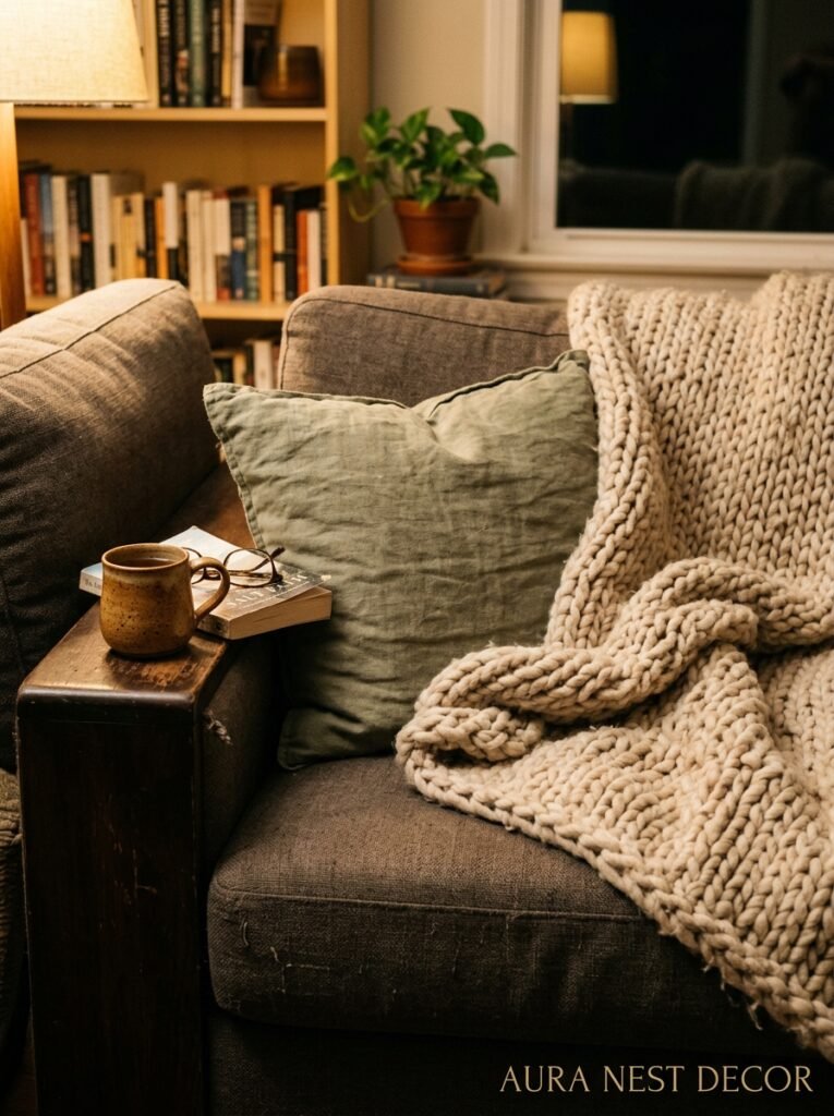
Texture. Specifically, layered texture at eye-level when you’re sitting down.
Here’s what that means in practice: a chunky knit throw folded over one arm of the sofa. A linen cushion with a slightly rough weave next to a velvet one. A woven wall hanging that catches the lamplight differently than a flat print would. Wooden beads on the coffee table that have actual weight to them when you pick them up.
This is the stuff that doesn’t photograph dramatically but that changes everything about how a room FEELS when you’re actually in it. Your nervous system registers texture even when your eyes are just drifting. A room that’s all smooth surfaces — even with beautiful warm colors — can feel slightly clinical. Like a hotel that’s trying to be cozy. Texture is what makes a room feel genuinely lived-in and genuinely warm.
And the specific combination that works every time without fail: chunky knit (cream or oatmeal), linen (any warm neutral), and one piece of actual leather or faux leather — a small pouf, a cushion, even just a leather-bound book on the table. That trio of textures hits differently than any individual piece could on its own.
—
9. How to Handle the Wall That Gets No Light (Without Painting It Into a Cave)
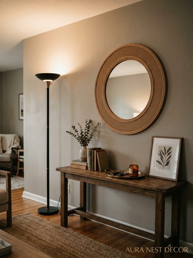
This is the one everyone emails me about. Or DMs me about. Or stops me to ask about, apparently.
Dark walls in low-light spaces are not automatically bad. But they require intention. If you’ve got a north-facing room (UK readers especially know this pain — the north-facing living room is practically a national experience at this point), you have two real options: lean INTO the darkness with a rich, moody color, or fight it strategically with warm reflective surfaces.
Fighting it strategically looks like this: large mirror across from the window, not on the window wall. Warm-toned reflective surfaces — brass, amber glass, even a large piece of metallic-framed art. Keeping furniture legs visible (i.e. not buying a sofa that goes to the floor) so the eye can travel under and through the room. And painting the dark wall in the WARMEST possible version of your color — not a deep terracotta, but a soft ochre, a warm sand, something that bounces what little light there is rather than absorbing it.
Or, alternatively, lean into the cave and make it beautiful. Dark olive walls with warm brass lamps and a cream rug? Actually gorgeous. The room will read moody and intentional rather than dark and sad. It’s about committing to the direction.
—
10. The Color Combination That’s Everywhere on Pinterest Right Now — and Deserves Every Pin
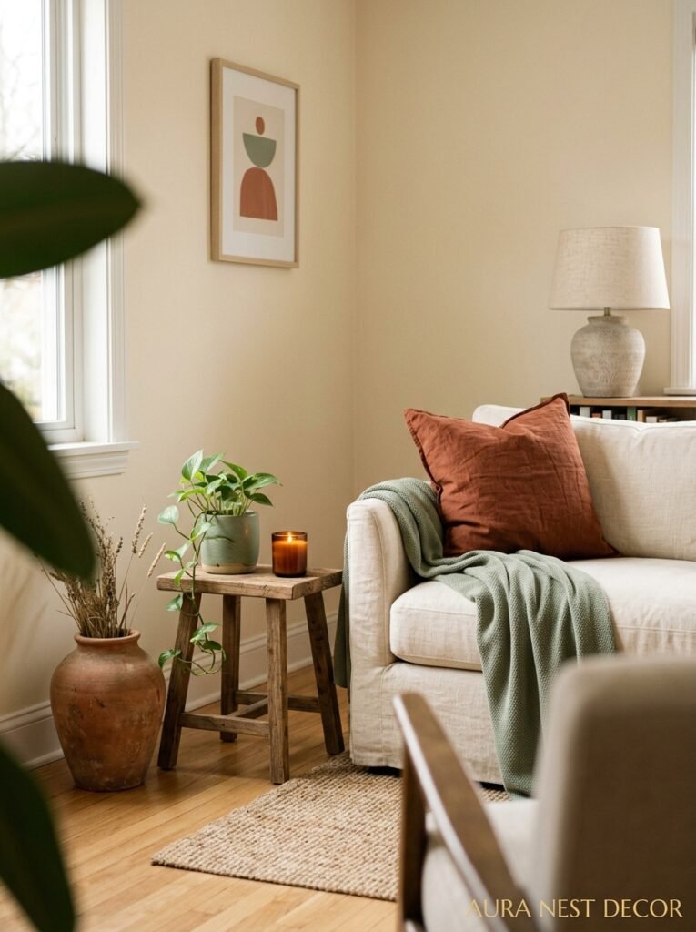
Terracotta and sage. You’ve seen it. You know it. And here’s my hot take — it’s everywhere because it GENUINELY WORKS, not because it’s just a trend that Pinterest is pushing.
The reason it works is contrast. Terracotta is warm, advancing, energetic. Sage is cool, receding, calm. Together they create a balance that feels like it belongs outdoors — like clay soil and grey-green herb gardens at golden hour. The eye relaxes into it.
But the key is proportion. Don’t do 50/50. Terracotta should be dominant (walls, large textiles, bigger accents) with sage as the counter (cushions, plants, a single chair, a few smaller accessories). When sage takes over, the warmth disappears. When terracotta takes over without sage, it can feel slightly intense, sort of relentless. The sage is the exhale.
Add cream as a third element and you’ve got something genuinely special.
—
11. Why Curtains Are the Last Thing People Think About and the First Thing That Changes a Room
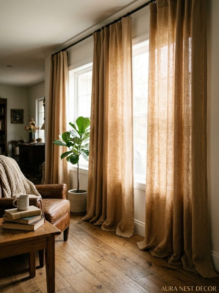
Floor-length. Always. Floor-length.
Not floating above the floor, not stopping at the window frame, not ending at the windowsill. Floor-length, ideally with a slight puddle or at least grazing the floor. This is the single fastest visual change you can make to a room and it costs the same as short curtains. It makes ceilings look taller, rooms look more expensive, and spaces feel more intentional than almost any other intervention.
For warm living rooms specifically: linen curtains in cream, warm white, or a soft ochre. Or — and this is a bolder call — terracotta linen curtains that pick up the wall or accent colors. In the evenings with warm lamplight coming through them, they glow. Genuinely glow. There’s nothing quite like it.
Avoid blackout fabric in living rooms unless you specifically need it. Heavy, opaque curtains can work in bedrooms but in a living room they tend to kill the airiness that good curtains add. You want the light to bleed through a little at the edges even when they’re closed. That soft halo of daylight? That’s warmth too.
“Floor-length curtains are the cheapest-per-impact upgrade in interior design. I’ll die on this hill.”
—
12. The One Thing That Makes All of This Feel Like YOUR Warm Room and Not Just Someone Else’s Pinterest Board
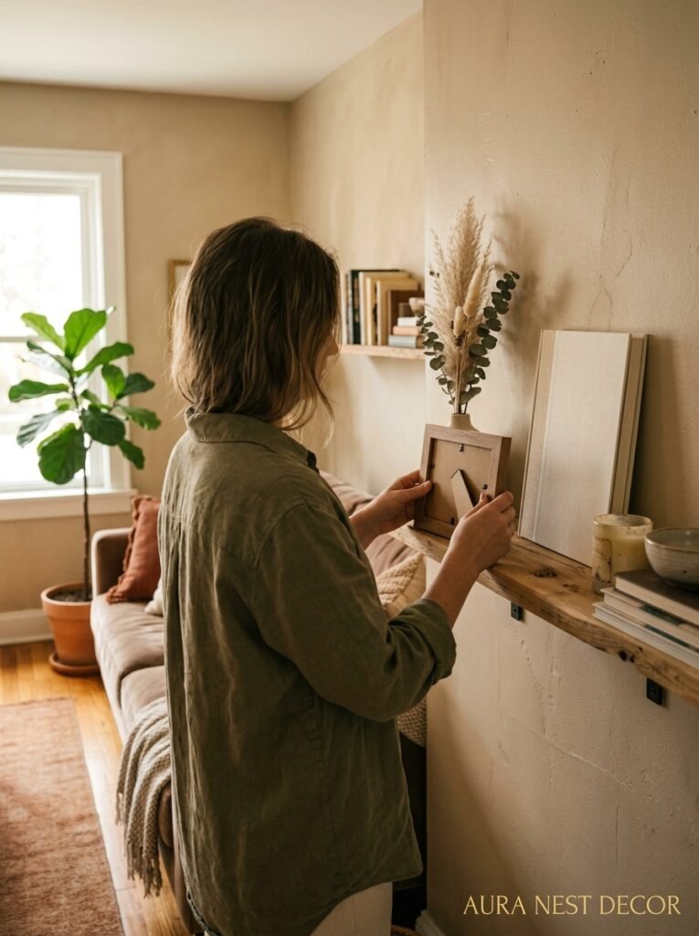
Something old. Something you actually chose.
A warm living room that’s been assembled purely from new purchases — even perfectly chosen ones — can feel strangely hollow. Not always. But often. What fills that hollow is something that has a story. A ceramic bowl from a market you visited years ago. A lamp inherited from a grandparent. A stack of books you’ve actually read. A framed print from that tiny shop you stumbled into on a trip you still think about.
These things don’t need to be expensive. They don’t even need to be beautiful in a conventional sense. They just need to be real — something that proves a human being lives here and loves this space.
Warm colors create the conditions for comfort. But it’s the objects with history that make a room feel like someone actually exists in it, someone with a life and a story and things they care about. That’s what people are responding to in those Pinterest rooms that stop your scroll cold. It’s not the terracotta or the brass or the linen. It’s the sense that someone real built this space and loves being in it.
Build that room. It’s closer than you think.
—
❓ FAQ
Q: What’s the best warm paint color for a small living room that doesn’t get much light? A: Warm ochre or a soft amber rather than deep terracotta — something that reflects light rather than absorbing it. Farrow & Ball’s “Hay” or Benjamin Moore’s “Filtered Sunlight” are good starting points, and always test in your specific light conditions before committing to a full room.
Q: Can I do a warm color scheme if my floors are grey or cool-toned? A: Yes, but you’ll need to bridge the gap with a rug. A warm-toned jute or wool rug laid over grey flooring creates a visual buffer that lets the warm walls and furnishings read as cohesive rather than fighting with the floor. The rug is doing serious heavy lifting here, so don’t go too small.
Q: How do I keep a warm color scheme from feeling too dark in winter? A: Layered warm lighting (2700K-3000K bulbs, multiple sources, nothing overhead-only), warm-toned mirrors to bounce available light, and keeping window treatments light enough to let daylight in while still looking cozy. The goal is warmth, not darkness — and the right lighting does more than anything else to maintain that through the grey months.
—
💭 Final Thoughts
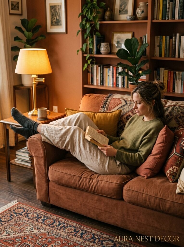
The warm living room isn’t complicated. It’s just specific — specific light, specific undertones, specific textures that all lean in the same direction. You don’t need to do everything on this list at once. One change — a new lamp, a rust cushion, floor-length curtains in warm linen — and you’ll feel the shift.
But the thing I keep coming back to is this: warm rooms feel loved. They feel chosen. They feel like someone decided, deliberately, that comfort matters more than cool restraint.
So what’s the first thing you’re actually going to change?




