
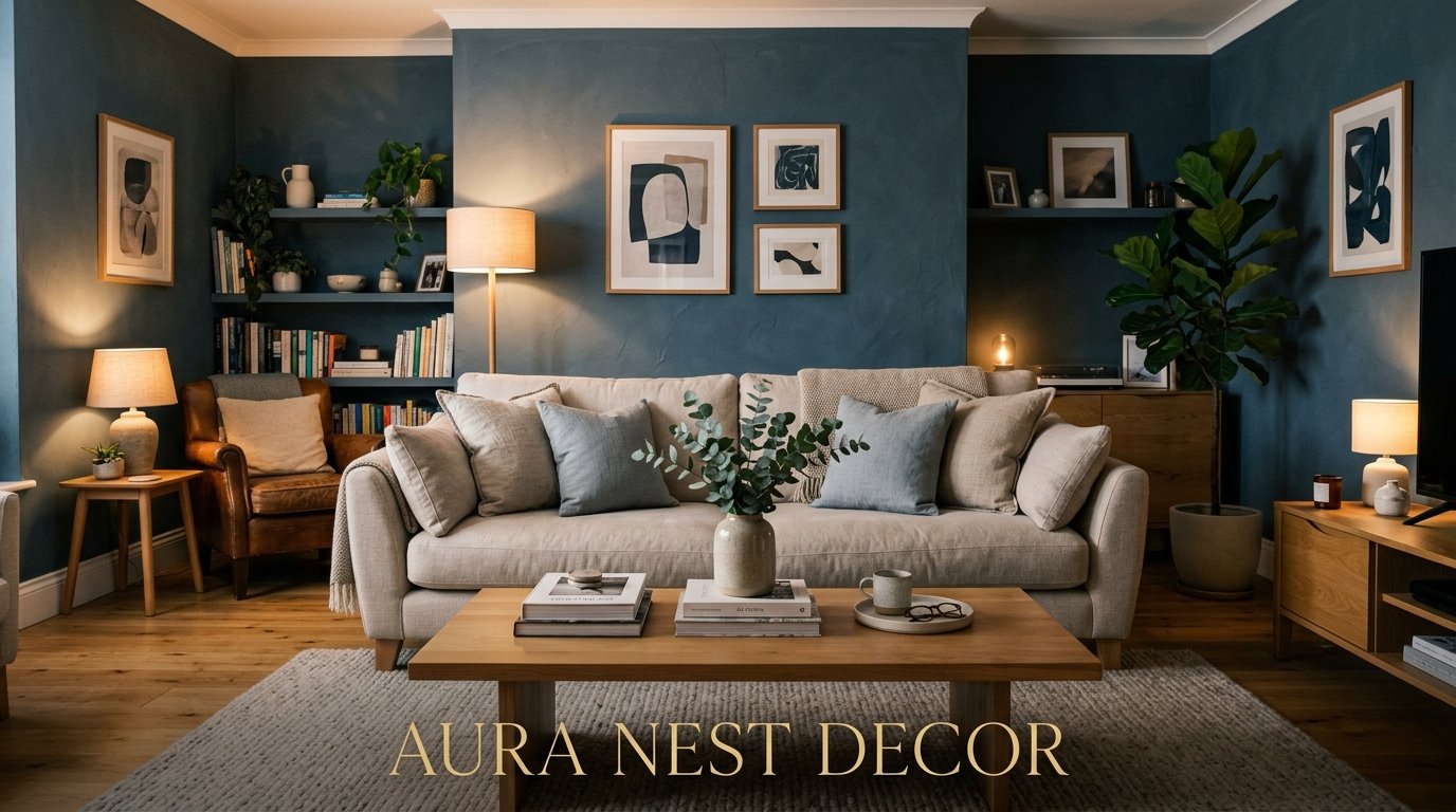
Why Blue Grey Is the One Living Room Color That Actually Gets Better Over Time
My friend Sarah repainted her living room three times in two years. Blush pink, then sage green, then some kind of off-white she found on a blog. And then she did blue grey and just… stopped. That was four years ago.

—
1. The Color That Looks Different at Every Hour of the Day — and That’s the Whole Point
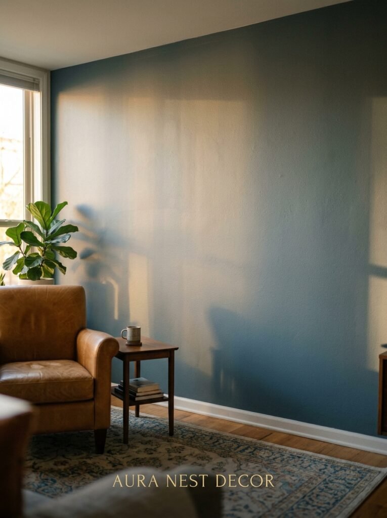
This is what nobody tells you upfront. Blue grey isn’t one color. It’s kind of a shapeshifter, and once you understand that, everything clicks.
In the morning, especially with north-facing light (which so many UK homes have, and a fair chunk of American ones too), it reads almost silvery. Cool, calm, a bit cinematic. By midday it flattens out slightly — honestly not its best hour, but it’s fine. Then 4pm hits and something shifts. The blue starts pulling forward and the grey recedes, and suddenly your living room looks like it belongs in a magazine you can’t afford.
But 7pm? That’s the moment. The amber glow from lamps catches the undertones and turns the whole room this deep, almost moody blue. It’s WARM. Which sounds wrong for a blue-based color, but that’s exactly what makes it different from a straight cool grey or a flat navy.
You’re not just painting a wall. You’re setting up a room that performs differently all day. And that’s worth paying for.
—
2. The Undertone Question Nobody Asks Until It’s Too Late
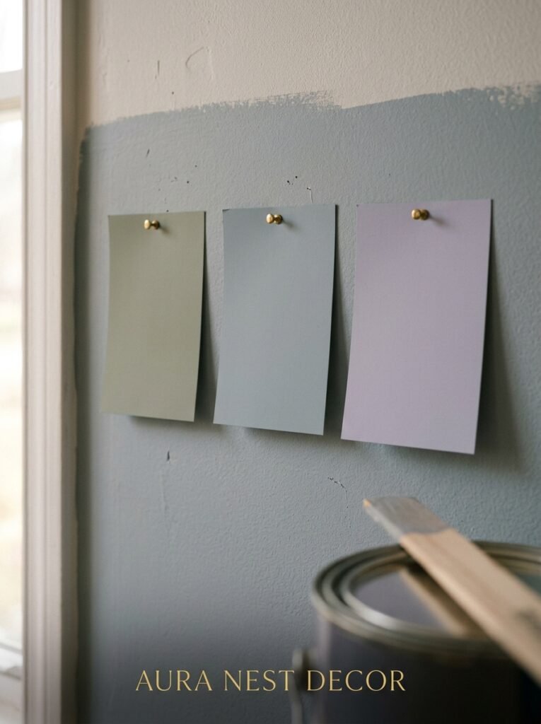
Here’s where I see people go wrong constantly. They pick a blue grey, it goes on the wall, and it either looks purple or it looks like the inside of a hospital. Both fixable, both avoidable, if you’d just looked at the undertones first.
Blue greys live on a spectrum. On one end you’ve got the ones that lean warm — they’ve got a tiny whisper of violet or taupe in them, and they read softer, almost dusty. Think the kind of color you’d find in an old country house, the walls worn and comfortable. On the other end are the cool, steely ones — more silver, more industrial, they’ll read almost blue on a bright day and almost charcoal at night.
“The difference between a blue grey that makes a room sing and one that makes it look like a waiting room is almost always the undertone — and almost always missed on the paint chip.”
Don’t pick from the chip alone. Get a sample pot. Paint an A4 (or 8×10) patch directly on your actual wall and look at it at morning, noon, and evening. Two days minimum. This is not optional advice. It will save you from one of those Sarah-style repaint situations.
A few names that consistently come up: Farrow & Ball’s Moles Breath (which is technically more grey-brown but goes incredibly bluish in low light), Dulux’s Denim Drift (a UK bestseller for good reason, very liveable), and Benjamin Moore’s Quiet Moments for anyone in the US who wants something a little more ethereal and soft.
—
3. The Furniture Colors That Hit Differently Against Blue Grey (Versus the Ones That Fight It)
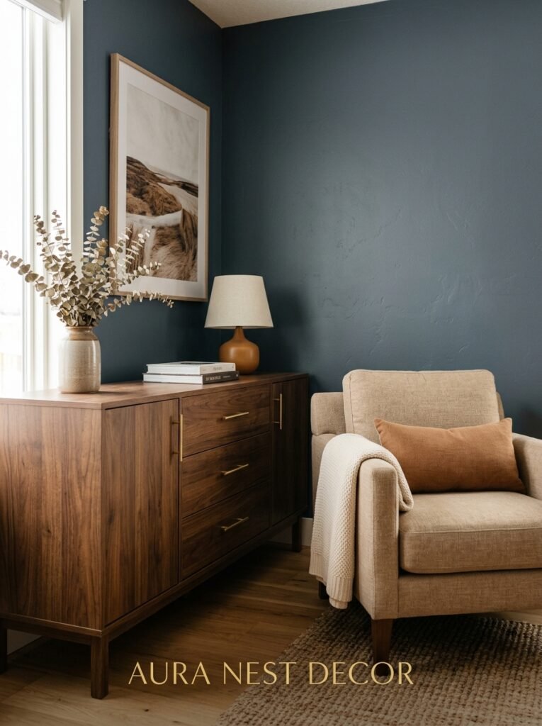
Warm wood. That’s it. That’s the secret.
I mean, there’s more to say, but if I had to give you one piece of advice about furniture in a blue grey living room, it’d be: get something with warm wood tones in it. Walnut, teak, light oak with a golden finish. The contrast between the cool wall and a warm wood coffee table or media unit is genuinely striking.
What doesn’t work as well? Cold metals without any warmth in them. Like, straight chrome or very bright brushed nickel can feel a bit clinical. Matte black works fine but it can be heavy depending on how much you use. Soft brass and aged bronze are better — they pull the warmth out of the grey without fighting the blue.
Sofas. White linen reads almost ethereally beautiful against blue grey, especially in good light. A tan or camel leather sofa is deeply satisfying — very traditional British study energy, but it works in an American farmhouse-style room too. Navy velvet is the bold choice, and it WORKS because the colors are close enough to feel cohesive but different enough to create depth.
Avoid: anything with a cool beige or greige that matches the grey part of the wall color. It’ll just… blend into nothing.
—
4. The One Rule That Makes a Small Blue Grey Room Feel Intentional Instead of Cramped
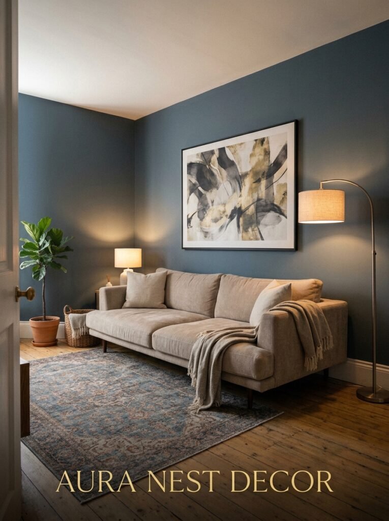
Keep the ceiling light. I cannot overstate this.
If you’re working with a smaller living room — and most of us are, honestly, especially in UK terrace houses or apartment living rooms on either side of the Atlantic — the instinct might be to go lighter on the walls to open things up. But blue grey done right actually doesn’t shrink a space. What shrinks it is bringing that color onto the ceiling.
White ceiling, blue grey walls. Keep the skirting boards (or baseboards, depending on where you’re reading this) white or off-white, because that clean horizontal line at the floor level tricks the eye into seeing the room as taller and wider. It’s a small thing but it works.
“A white ceiling above blue grey walls doesn’t look unfinished — it looks deliberate. And deliberate always reads as bigger.”
One more thing: mirrors. A good-sized mirror on the wall opposite your main window will bounce light around in a way that makes the blue grey glow rather than absorb. In a darker room this is basically essential.
—
5. How British and American Rooms Style This Color Completely Differently (Both Are Right)
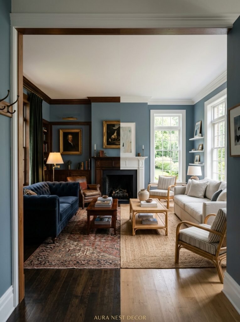
Not gonna lie, I find this genuinely fascinating.
In American homes, blue grey tends to get styled very cleanly. White trim, light oak floors, maybe some coastal or Scandi influence. The aesthetic leans fresh and bright, lots of white accessories, perhaps a woven jute rug. It’s incredibly Pinterest-friendly and really does look beautiful in that airy, editorial way.
British rooms go somewhere else entirely. Darker, richer, more layered. You’ll see blue grey paired with velvet, with antique finds, with Persian rugs and gallery walls with mismatched frames. The lighting is usually warmer and lower. The whole thing feels older somehow, like the room has been collected rather than designed.
Neither approach is wrong. They’re just different conversations the same color is having.
And there’s a third version, which is kind of a transatlantic hybrid — the room that’s got clean lines but with collected, personal objects in it. A warm rug, simple furniture, some plants, and one really specific art print that tells you something about the person who lives there. That version might actually be my favorite.
—
6. The Lighting Setup That Turns a Good Blue Grey Room Into a Great One
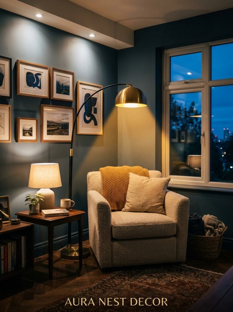
Overhead lighting. The enemy of atmosphere.
If your living room only has one overhead light source — a ceiling pendant or a central downlight — your blue grey walls will never look as good as they could. That top-down light flattens the color completely and kills the shadows that give it depth.
What you want instead is layered. A floor lamp in the corner with a warm bulb (2700K is the sweet spot — not too yellow, not too white). A table lamp on a sideboard or console, ideally with some kind of shade that diffuses the light. If you’ve got shelving, small clip or strip lights tucked behind books or plants do something really nice.
The Edison bulb thing is a bit played out at this point, I’ll admit, but there’s a reason people won’t let it go — that amber glow at 7pm does something almost unfair to blue grey walls. It’s the color at its absolute best.
Side note: if you’re in a basement flat or a room with very little natural light, go WARM with your artificial lighting and don’t fight it. A blue grey that leans slightly greener or more earthy will adapt better than a true cool blue grey in those conditions.
—
7. The Accessories That Look Like They Were Made for This Color (Even When They Weren’t)

Terracotta. Rust. Dusty blush. Sage green.
These are the accent colors that make blue grey rooms feel really considered rather than just paint-and-furniture. The contrast between warm earthy tones and a cool blue-grey base is incredibly satisfying — it feels balanced without being matched, which is the whole goal.
Terracotta especially. A terracotta pot, a rust-colored throw, even a copper vase — these things pop against blue grey in a way that no amount of white accessories can match.
“The best-looking blue grey rooms I’ve ever seen always had something warm and slightly imperfect in them — terracotta, worn leather, a rough linen cushion.”
Specific ideas that actually work:
- A rust-toned woven throw over a neutral sofa
- Sage green plants (the real ones or very good fakes) in terracotta pots
- A mustard yellow cushion — ONE, not three
- Aged brass candlesticks on a mantel or coffee table
- A cream sheepskin rug if the floors are dark wood
Don’t go matchy-matchy. Pick two of those elements, not all five. Restraint is what makes it look expensive.
—
8. The Blue Grey Shades That Work in Open-Plan Rooms (and the Ones That Don’t)
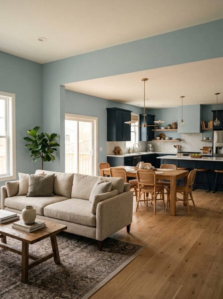
Open-plan is its own challenge. When a living room flows into a kitchen or a dining area, a strong blue grey can either anchor the whole space beautifully or create this jarring visual stop that chops the room in two.
The trick is saturation. In open-plan rooms, you want a slightly lower-saturation blue grey — something that reads as a color but doesn’t demand too much attention. The darker, more saturated blue greys (think almost petrol or slate) are better saved for rooms with actual walls and doors around them. They need boundaries to shine.
A softer blue grey — Dulux Denim Drift is the classic example, or Benjamin Moore’s Smoke for the US readers — transitions much better across an open space. It gives you the color without the drama, which is what you need when that same wall is also technically your kitchen.
—
9. What Flooring Actually Works (Because the Wrong One Ruins Everything)
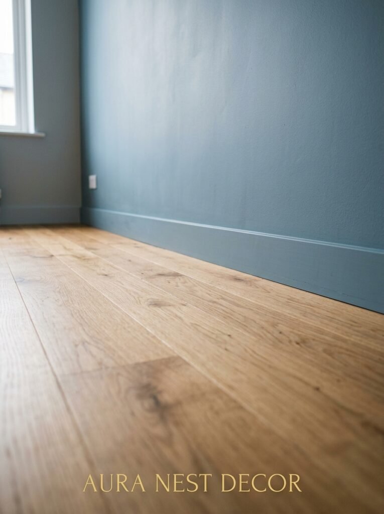
Light wood floors are the easiest yes. They warm up the blue grey from below and the contrast is just… right. Oak, ash, light pine — any of these work.
Dark wood floors work too, but they require more light in the room to keep it from feeling heavy. If you’ve got dark floors and dark blue grey walls and not much natural light, you might end up in a room that’s beautifully moody for about one Instagram photo and then genuinely too dark to live in.
Grey or stone-toned flooring — tiles, slate, concrete-effect vinyl — can be tricky. If the tones match too closely you lose definition between wall and floor. It works if there’s real contrast in the depth of the grey, but it’s the riskiest pairing.
White-painted floorboards, which are very much a thing in British Victorian and Edwardian homes, look STUNNING with blue grey. Almost too good, actually. The combination feels very Nordic without trying.
—
10. The Mistake Everyone Makes With Blue Grey Curtains
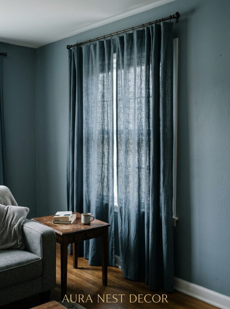
Matching the curtains to the walls. Don’t.
It seems logical — cohesive color, unified look — but what actually happens is the curtains disappear into the walls and the whole room reads as one flat wash of color with no punctuation. You need contrast at the windows.
White or cream linen curtains are the most forgiving choice and they work with basically any shade of blue grey. They soften the room and let the wall color be the feature. If you want something with a bit more weight, a warm oatmeal or stone color works beautifully.
If you’re feeling bold, a dark navy or even a deep forest green curtain against a lighter blue grey wall is surprisingly good. It reads layered and intentional, like you thought about it (even if you just got lucky).
What doesn’t work: curtains that are a slightly lighter or darker version of the exact same blue grey. It looks like you ran out of wall paint and used it on the fabric. Or like you tried to match and just missed. Neither story is the one you want your room to tell.
—
11. The Gallery Wall That Actually Belongs in a Blue Grey Room
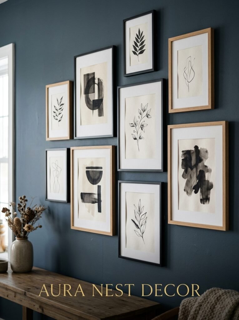
Black and white photography. Warm wood frames. And then one or two things that aren’t photographs at all.
That’s the formula that works, and I say formula even though I usually resist them. The reason is simple: black and white prints sit neutrally against blue grey and let the wall color be the backdrop, but warm wood frames (oak, walnut, anything with grain showing) add that warmth the room needs. It doesn’t compete. It completes.
The “one or two things that aren’t photographs” part is important. A small abstract print with some terracotta or ochre in it. A pressed botanical. A simple line-drawing print in a larger frame. These break up the grid and make it feel like it grew organically rather than being assembled from a kit.
Avoid: very bright or very saturated artwork against blue grey. It can work if the painting is exceptional, but usually it just fights the wall color and neither one wins.
Gallery walls also solve the north-facing-room problem that a lot of UK homes have. The prints reflect light. Warm wooden frames glow. Suddenly a wall that looked kind of flat in the daytime has texture and interest regardless of what the light’s doing.
—
12. The Rooms That Proved Blue Grey Isn’t Trendy — It’s Just Good
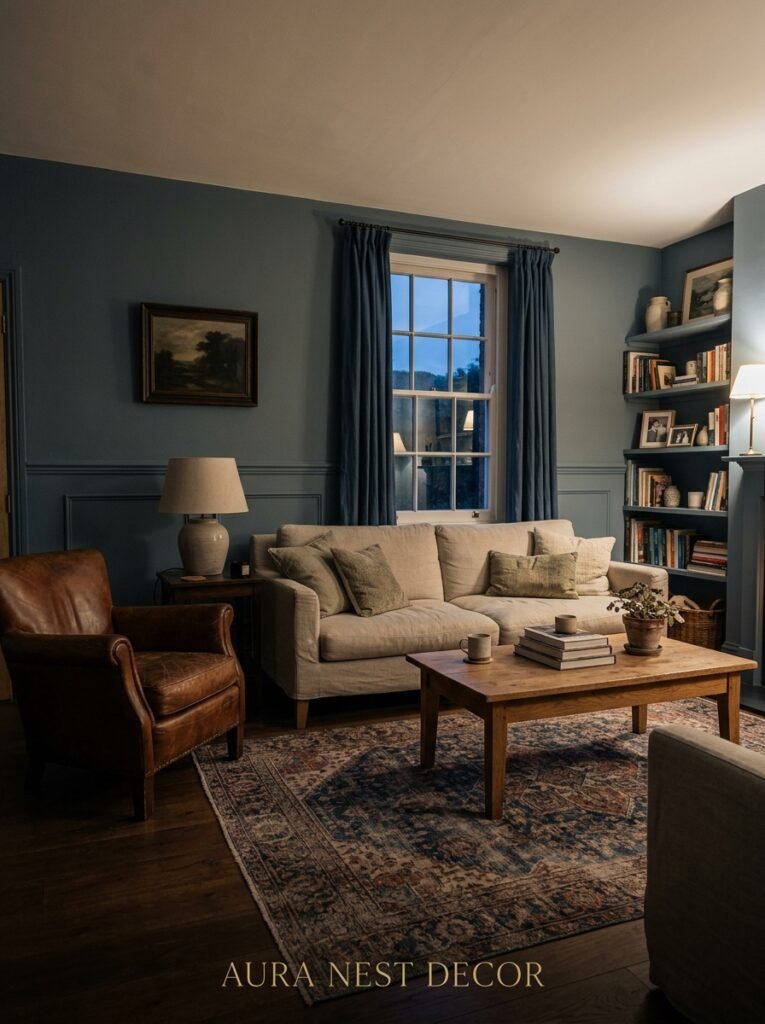
There’s a reason this color has been showing up in Georgian townhouses and 1970s American ranch homes and sleek new builds all at the same time. It doesn’t belong to one era. It doesn’t belong to one design style. It sort of belongs to good light and good taste, which sounds pretentious but is actually just true.
Trending colors come and go. A few years ago everyone was doing millennial pink and before that it was grey-greige (that slightly sad period we don’t need to revisit). Blue grey has been around through all of it, mostly because it’s not making a statement so much as it’s creating a feeling.
And the feeling is: settled. Calm. Considered. Not a room someone just moved into, but one someone actually lives in.
Sarah, the friend from the beginning — I visited her last month. Her living room still looks great. She’s just added a rust-colored armchair and some new plants. The walls haven’t changed. They didn’t need to.
—
❓ FAQ
Q: Does blue grey work in a living room that doesn’t get much natural light? A: It can, but choose your shade carefully. Go for a warmer blue grey — something with a slight taupe or earthy undertone rather than a pure cool grey. Compensate with layered warm artificial lighting (2700K bulbs) and mirrors. Avoid very dark or saturated blue greys in low-light rooms unless you’re specifically going for a moody, evening-only aesthetic.
Q: What’s the best blue grey paint for a living room in the UK? A: Dulux Denim Drift is the most-tried and most-loved for good reason — it’s soft, liveable, and works in a huge range of lighting conditions. If you want something slightly more sophisticated and don’t mind spending more, Farrow & Ball’s Mizzle or Oval Room Blue are worth sampling. Always test a physical patch on your wall before committing.
Q: Can I use blue grey in a rented home without painting the walls? A: Yes. Large area rugs, curtains, and soft furnishings in blue grey tones can shift a room’s whole feeling without touching the walls. Removable wallpaper panels exist now in gorgeous blue grey options too. And a large piece of artwork in the right tones can anchor a space more than you’d think.
—
💭 Final Thoughts
Blue grey is one of those colors that rewards patience. You don’t always love it on day one. But three months in, when the light changes with the seasons and the room shifts with it, something clicks. It starts to feel less like a paint color and more like an atmosphere. Is there another color that does that quite the same way?




