
Why Every Living Room I Fall in Love With Right Now Looks Suspiciously Scandinavian
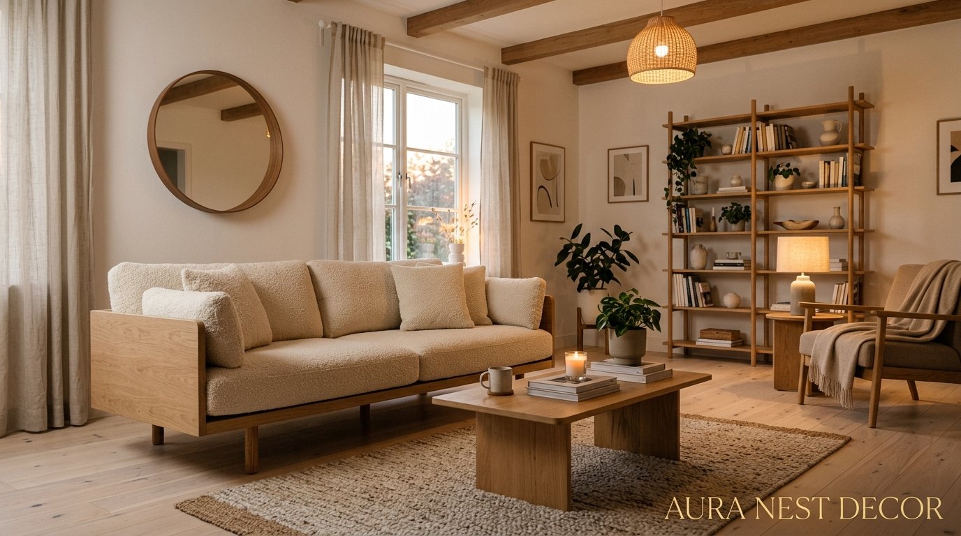
You know that feeling when you walk into a room and just… exhale? No clutter fighting for your attention. No trend shouting at you. Just light, and warmth, and this quiet sense that everything is exactly where it belongs. That’s what Scandinavian living rooms do. And I’ve become completely obsessed.
—
1. The “Less Stuff, More Feeling” Philosophy That Actually Works
Here’s what most people get wrong about Scandinavian design. They think it’s cold. Minimal, sure — but cold? No. That’s a misread.
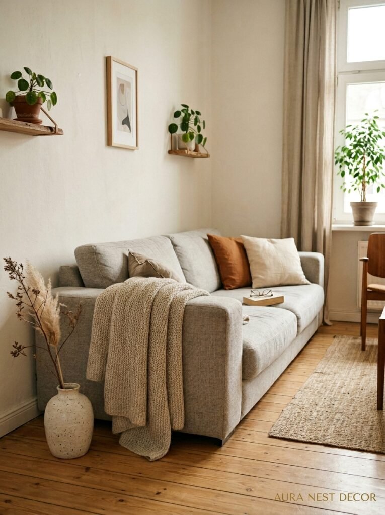
Scandinavian interiors aren’t empty. They’re edited. There’s a difference, and once you see it, you can’t unsee it. Every object in a well-done Scandi living room is there because it earns its place — the chunky knit throw draped over the arm of a sofa, the single ceramic vase that catches afternoon light, the stack of three books (okay, maybe four) on the coffee table. Nothing is accidental.
The philosophy behind it comes partly from the concept of lagom — a Swedish word that loosely translates to “just the right amount.” Not too much, not too little. I know that sounds frustratingly vague, but you feel it the second a room has it. It’s that sense of breathing room. Of space between things.
And here’s the part people don’t talk about enough: editing your living room down to what matters is genuinely hard. Harder than decorating. It requires you to make actual decisions about what you love versus what you just kept because moving it felt like effort. But the payoff is a room that doesn’t drain you when you walk in.
“A Scandinavian room doesn’t whisper ‘minimalism.’ It whispers ‘I actually like what I own.'”
—
2. The Specific Shade of White That Makes Everything Feel Warmer (Not Colder)
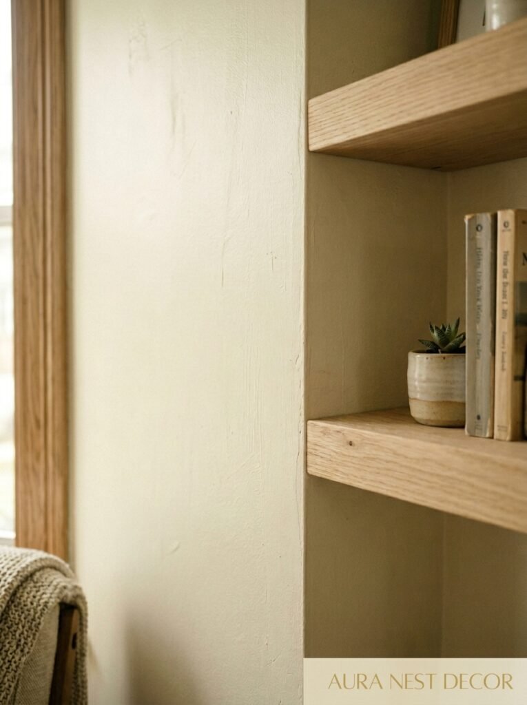
White walls in a Scandi living room don’t mean stark, clinical, “where’s the furniture” white. There’s a warmth to the whites that work best — soft whites with barely-there undertones of cream, greige, or even the faintest blush.
Think Farrow & Ball’s All White or Pointing, or Benjamin Moore’s Chantilly Lace if you want something cleaner. In UK homes especially, where natural light tends to be softer and more diffused (thanks, British skies), going with a white that has a warm lean makes a massive difference. The room won’t feel like a dentist’s office.
The trick is to test your white in the actual room at different times of day. Morning light, midday, late afternoon, lamp-lit evening. Because a white that looks gorgeous at noon can read blue and cold at 6pm, and that’s the hour you’re actually using your living room. I can’t tell you how many people paint a room and then wonder why it feels off — it’s usually the light, not the color.
Pair that warm white with natural wood tones, linen, and the occasional dark accent — a black iron lamp, a charcoal cushion — and the room starts to breathe. The contrast is what creates depth. Without it, all-white just looks unfinished.
—
3. The Floor That Changes the Whole Mood Before You Buy a Single Piece of Furniture
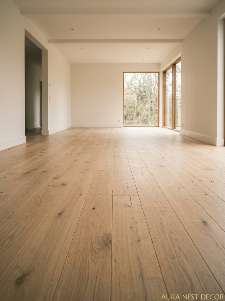
Pale wood floors. I don’t make the rules, they just work.
Specifically, light ash or pale oak — wide planks if you can swing it. The lightness of the wood is doing so much heavy lifting in Scandinavian spaces. It reflects light back into the room, it makes the space feel larger, and it gives that warm-but-airy quality that’s genuinely hard to fake with anything else.
Now, if you’re renting or you don’t want to redo your floors — totally fair — a large, light-toned rug can do a version of the same thing. A flatweave jute in a natural tone, or a simple wool rug in oatmeal or pale grey. It grounds the seating area and brings that same Scandi texture without committing to new flooring.
But if you ARE redoing floors? Go wide plank. Go pale. Don’t overthink the finish — matte or satin, never high-gloss, because gloss reads as shiny and Scandi spaces are all about quiet, not shine.
Side note — if you have dark floors and you love your Scandi aesthetic, it’s not game over. Layering light rugs and keeping walls and furniture very pale can still get you there. It just requires more intention.
—
4. Why Hygge Is More Than a Candle Situation (But Also Yes, the Candles)
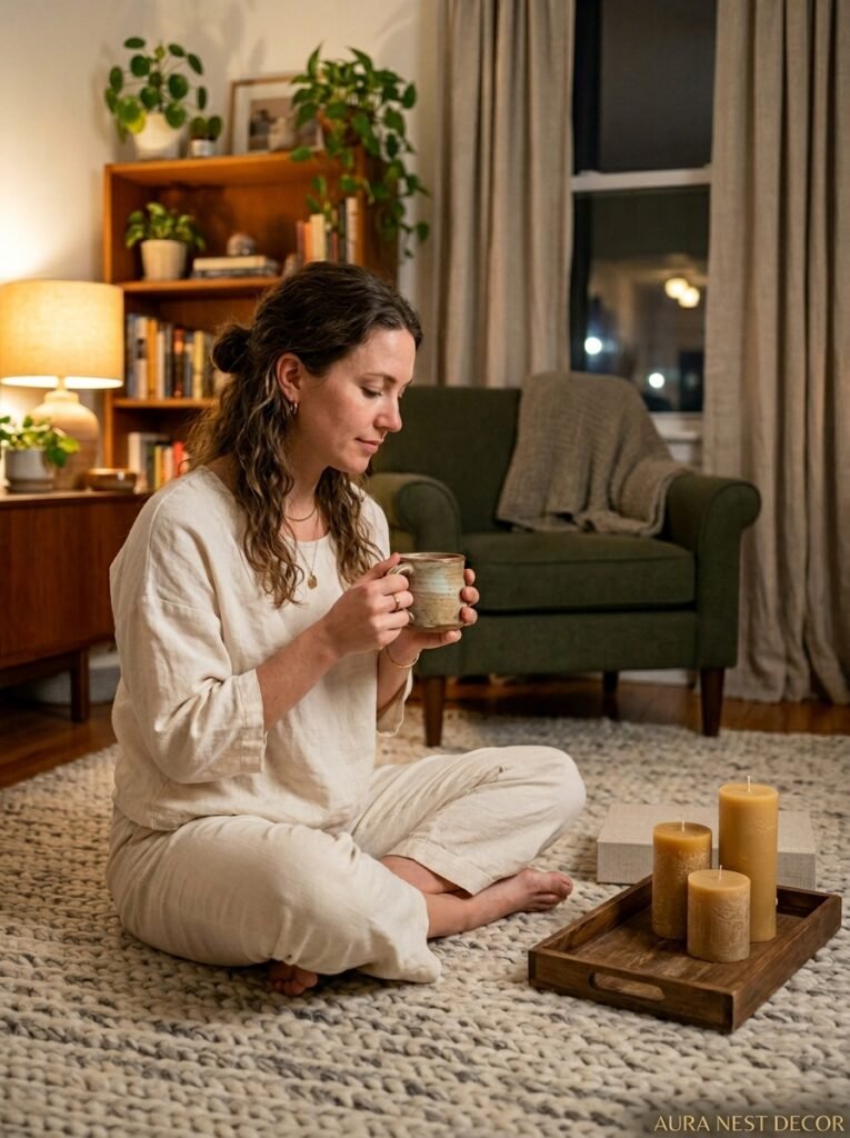
Okay. Hygge. The Danish concept of cozy togetherness that the internet discovered around 2016 and then mildly over-explained. I’m going to try not to do that.
Here’s what hygge actually means in the context of a living room: it’s about creating the conditions for comfort. The conditions. Not the performance of comfort. So yes, candles — a lot of them, in low holders, in the amber glow of early evening — but also: the sofa you actually sink into, the throw that’s genuinely warm and not decorative-only, the lamp placement that means you never have overhead lights on after dark.
That last one is HUGE. Overhead lighting kills hygge instantly. If your living room relies on a ceiling fixture as its main light source, that’s the first thing to change. Add floor lamps. Table lamps. A lamp in the corner that you barely notice during the day but completely transforms the room at 8pm. The goal is pools of warm light, not uniform brightness.
In Scandinavian countries, where winters are long and dark, this relationship with artificial light is almost sacred. People think carefully about how a room is lit after sundown because that’s when they’re actually in it. We could learn something from that, honestly.
“If your overhead light is on after 7pm, your living room will never feel truly cozy. Full stop.”
—
5. The Furniture Shape That Makes Every Scandi Room Look Intentional
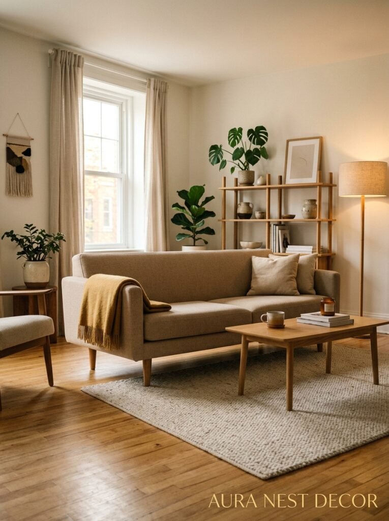
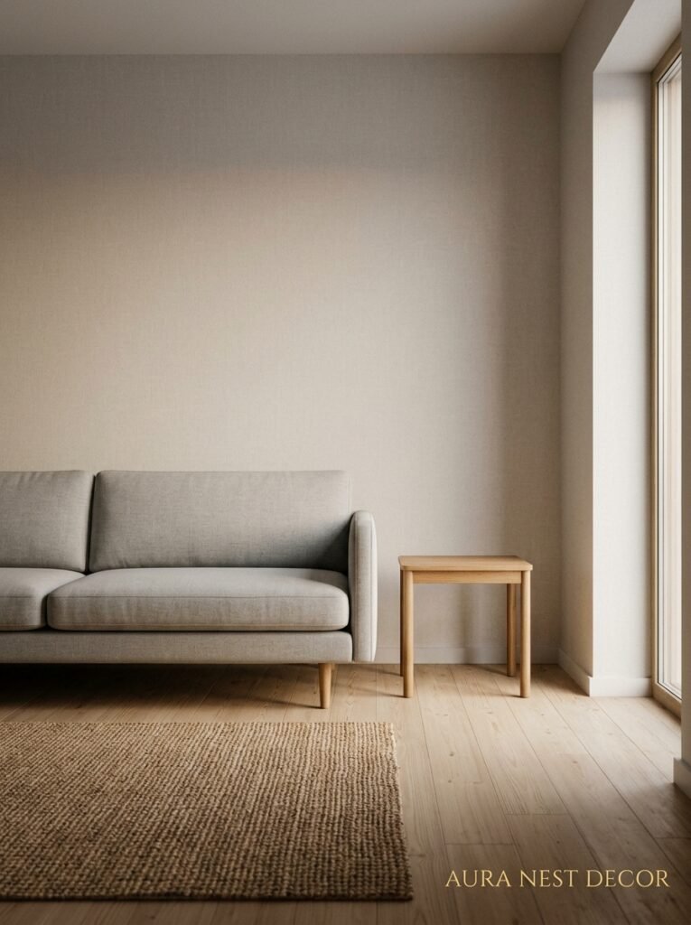
Low-profile. That’s the shape. Furniture that sits closer to the ground — sofas with clean, simple frames and low arms, coffee tables that don’t tower, shelving that’s open and airy.
The reason this works visually is that low furniture keeps your sightlines open. You can see more of the wall, more of the window, more of the light. The room feels bigger because you’re not cutting it horizontally with bulky furniture at eye height.
Look for sofas with visible legs — even just four inches of leg clearance underneath means light passes under the piece and the room breathes. A sofa that sits flat on the ground feels heavy. Same sofa, same fabric, lifted four inches on a tapered wooden leg? Completely different energy.
And shapes should be clean but not rigid. A slight curve on a cushion, a rounded corner on a coffee table — Scandi isn’t harsh and geometric the way some minimal design gets. It’s warm geometry, if that makes sense. Sort of soft-edged modernism.
The wood matters too. Natural, unfinished or lightly oiled, in pale tones. Not stained dark, not lacquered. You want to feel like it could be from a forest somewhere, not a factory.
—
6. Textures That Do All the Work Your Accessories Don’t Need To
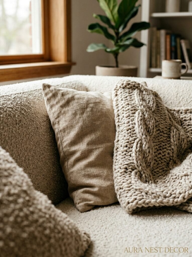
When you pull back on decorative objects — which you do, in a Scandi space — texture becomes the thing that keeps a room from feeling flat. And this is where it gets really fun.
A linen sofa cover in undyed natural fabric. A chunky woven wool blanket folded (loosely, not perfectly) over one armrest. A sheepskin draped over a chair — an actual sheepskin, not a synthetic one if you can help it, because the real thing has a depth and softness the fake versions just don’t match. A cushion in a slightly rougher boucle. A cotton knit on another.
The key is that all of these textures are in a tonal family. Creams, oatmeals, warm greys, soft whites. You’re not mixing textures AND colors — just textures. That’s what keeps it from looking busy. The eye can relax when the palette is quiet, even when the physical surfaces are varied.
I’ve seen people try to replicate the Scandi look and it falls flat, and usually it’s because they’ve got the colors right but everything is smooth. Flat fabric cushions, smooth wood, glass. With no texture variation, a minimal room just looks empty rather than intentional. Texture is the thing that makes emptiness feel like a choice.
—
7. The Plant Situation: Why Less Greenery Hits Harder
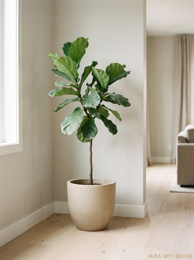
Don’t fill it with plants. I know that feels counterintuitive when every Pinterest board ever is dripping in monstera leaves and hanging pothos, but in a Scandinavian living room, one really good plant beats six average ones every single time.
A single large-leaf plant — a fig tree, a monstera, a snake plant that’s actually healthy and full — becomes a living sculpture in the room. It draws the eye. It fills a corner without cluttering it. And it makes the room feel like someone cares about the space without making it feel like someone runs a greenhouse.
Placement matters. Put it near your best light source, obviously — but also think about it compositionally. A tall plant in a low-slung room creates vertical interest. A plant in the corner softens what would otherwise be a dead space.
“One genuinely thriving plant tells more of a story than a shelf of struggling ones.”
Pot choice matters almost as much as the plant. Matte ceramic, neutral tones — sand, stone, off-white, terracotta if you want the one warm accent. No plastic nursery pots. No novelty pots. Just something simple and good.
—
8. The Thing About Shelving That Most People Get Completely Backwards
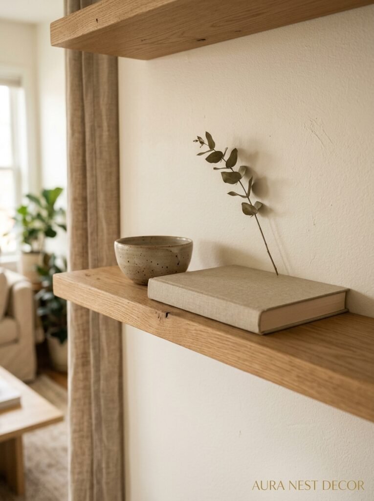
In Scandinavian living rooms, shelves are not storage. Shelves are display. And there’s a huge difference in how you approach them.
Storage-thinking means filling every inch. Display-thinking means leaving space. Deliberate, considered space between objects — a cluster of three items here, then nothing, then one taller object there. It looks curated because it is curated, and the negative space is part of the composition.
Books are always welcome on Scandi shelves, but arranged intentionally. You can organize by color (soft, tonal, not rainbow-sorted) or spine out for a more texture-focused look. Mixing in objects with books — a small sculpture, a bowl, a single framed print leaned casually against the back of the shelf — breaks the monotony.
What you don’t want: the “stuff shelf.” The shelf where things go to live because they have nowhere else to be. The miscellaneous candle, the too-many-frames situation, the shells from a vacation six years ago. If it doesn’t mean something or look good, it doesn’t go on the shelf. That’s the edit.
—
9. The Color Palette That Isn’t Actually All Grey
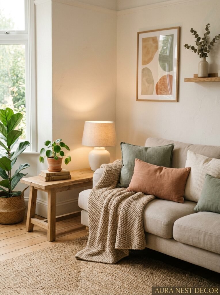
People assume Scandinavian design is grey. And yeah, grey’s in there. But the palette is richer than that — and the homes that do it best aren’t grey at all. They’re warm.
Think: the color of weathered driftwood. The inside of an almond. A cloudy morning sky. Dusty sage green. Deep slate blue used sparingly as an accent. Terracotta in very small doses — a single pot, one cushion — to add warmth without going boho.
The black accent is classic and it works. A matte black lamp frame, black metal on a coffee table leg, black picture frames. It gives the room visual weight and stops it from looking washed out. Without ONE dark anchor somewhere, a very pale room can start to feel a bit unfinished.
But the point is: don’t think grey. Think warm neutral. Think nature. The Scandinavian palette is basically what you’d find outside in late autumn — muted, beautiful, grounded.
—
10. Window Treatments That Let the Light Actually Win
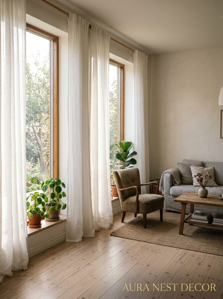
Scandinavians don’t cover their windows unnecessarily. Light is precious — especially in winter — and the instinct is to let in as much as humanly possible rather than blocking it with heavy curtains.
In practice, this means simple white or linen curtains hung HIGH (right up near the ceiling, not at the window frame) and wide (extending past the window edges on both sides). Hung this way, when you pull them open, they barely cover the window at all, and the room gets the full benefit of natural light.
Heavy velvet drapes, ornate curtain rods, elaborate tie-backs — none of that. The curtain hardware should be almost invisible. Simple brass or matte black rods, minimal rings, curtain panels that pool slightly on the floor if anything.
If you need privacy without losing light — hello, ground floor — sheer white panels or simple roller blinds in a warm white are your friends. They filter rather than block.
—
11. The Art Rule That’s Weirdly Specific and Works Every Time
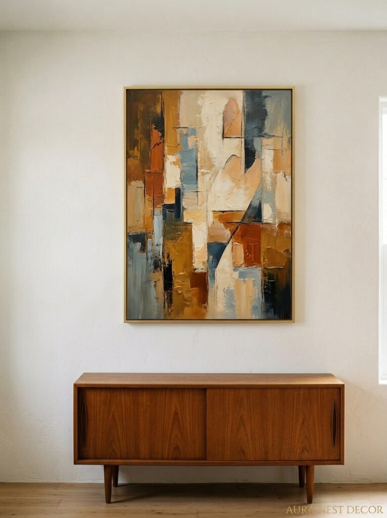
One large piece, or a very simple grouping. That’s mostly it.
Oversized art — and I mean actually oversized, like 60% of the wall height or more — does something to a Scandi room that a gallery wall just doesn’t. It creates a focal point. It’s calm. There’s no visual chatter.
A single large abstract print in neutral or earthy tones, a oversized black-and-white photograph, a simple line drawing blown up to poster scale — any of these works. The frame should be simple: thin black, thin natural wood, or honestly no frame at all (just the print clipped or pinned).
Gallery walls aren’t unwelcome in Scandinavian interiors, but they’re sparse ones. Three frames, max, with genuine spacing between them. Not the tightly-packed, frames-of-all-sizes situation. That reads more eclectic than Nordic.
Lean art rather than hang it when you can — it has an ease and informality that feels very natural in this kind of space. A large canvas leaned against a wall is somehow more casual and intentional at the same time.
—
12. The Part Nobody Talks About: How the Room Smells and Sounds
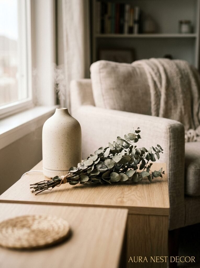
I know. Bear with me.
Scandinavian living rooms at their best engage more than just your eyes. There’s a whole sensory layer that’s easy to miss in the Pinterest version of this aesthetic. The smell of beeswax candles, the faint cedar from a wooden side table, a barely-there scent from a simple reed diffuser or a bowl of dried botanicals. Nothing perfume-heavy or artificial. Just the suggestion of something clean and natural.
And the sound, or the absence of it — these rooms are designed for quiet. Soft furnishings absorb noise. Rugs dampen the echo. There’s a reason a well-furnished Scandi room feels hushed, almost like a library. The acoustics are part of the experience, even if you never consciously think about it.
These are the details that make a real Scandinavian living room feel different from a room that just looks like one. You walk in and your whole nervous system does this sort of… settle. That’s the goal. Not a specific sofa or a certain type of cushion, but an overall environment that genuinely calms you down.
And honestly? We all need more rooms like that right now.
—
❓ FAQ
Q: Can I do Scandinavian style in a small living room or apartment? A: Absolutely — and honestly, small spaces suit this aesthetic really well. The low-profile furniture, pale palette, and minimal accessories all make a small room feel bigger than it is. Just keep the editing ruthless: every object has to earn its spot. One oversized art piece and a single good plant can do more for a tiny room than ten smaller items.
Q: How do I add Scandinavian style without replacing all my furniture? A: Start with textiles and lighting — they’re the fastest, cheapest fix. Swap out cushion covers for linen or boucle in neutral tones, add a sheepskin throw, replace one lamp with something warmer and more sculptural, and ditch the overhead light after dark. Then edit down your accessories to the ones you actually love. You’d be surprised how different a room looks when you just… take stuff away.
Q: Is Scandinavian style the same as minimalism? A: Close cousins, not the same thing. Minimalism can be quite cool and concept-driven — almost uncomfortable in its spareness. Scandinavian design is warmer, more livable, and more human. There’s always texture, always a nod to nature, always enough warmth that the room invites you in rather than daring you to touch anything. Hygge would not survive in a pure minimalist space.
—
💭 Final Thoughts
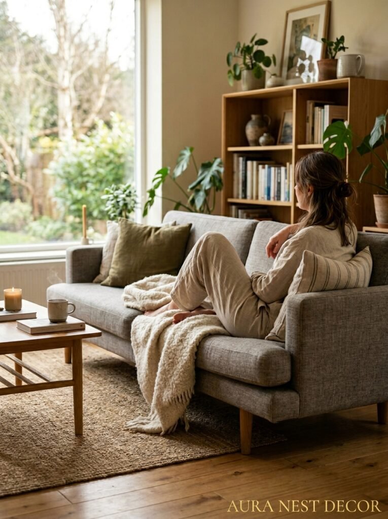
What I keep coming back to with Scandinavian living rooms is how honest they are. There’s no performance happening — no trying to impress, no visual noise competing for attention. Just a space that says: come in, sit down, stay a while. That’s harder to create than it looks, and more worth chasing than almost any other design trend I can think of. So — what’s the one thing in your living room that you’d edit out first?




